Author: pluto

  • Kunstsilo

    Kunstsilo

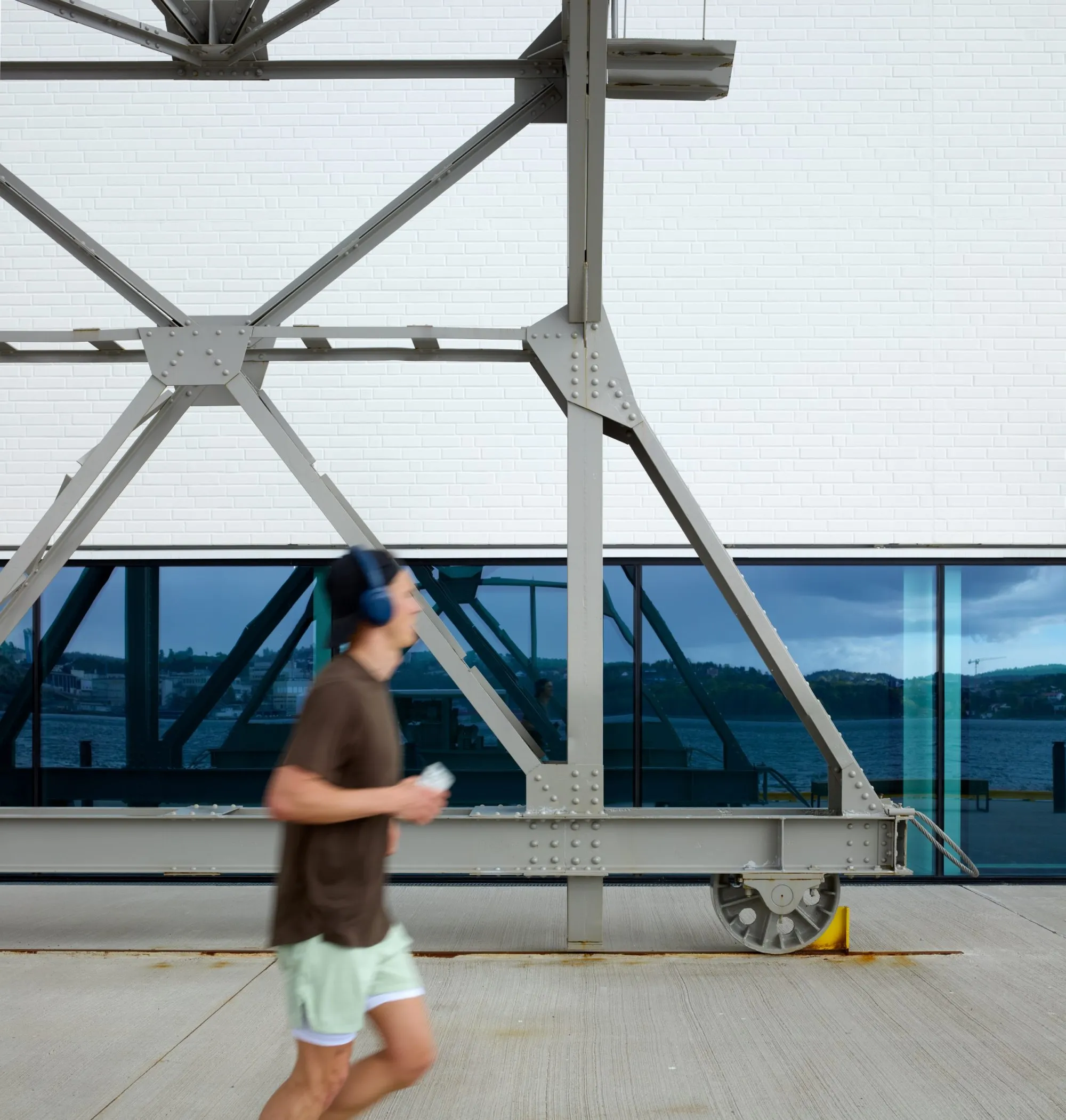
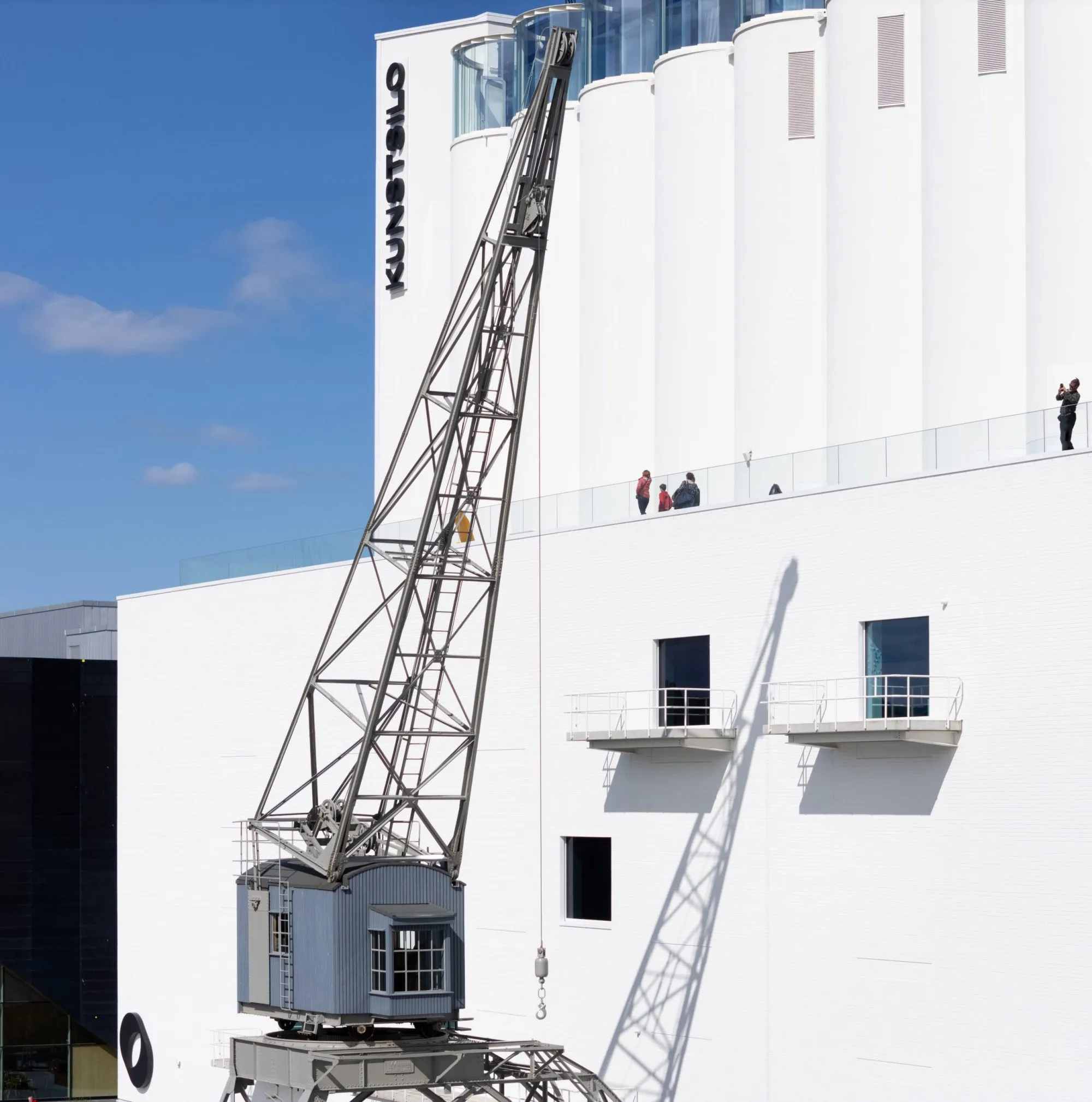
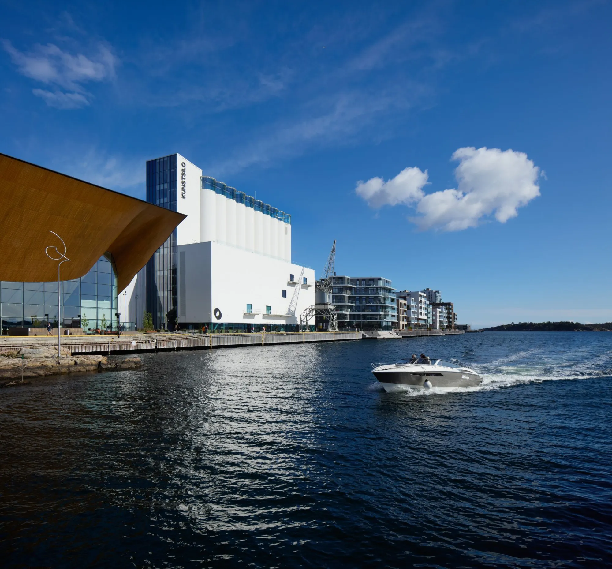
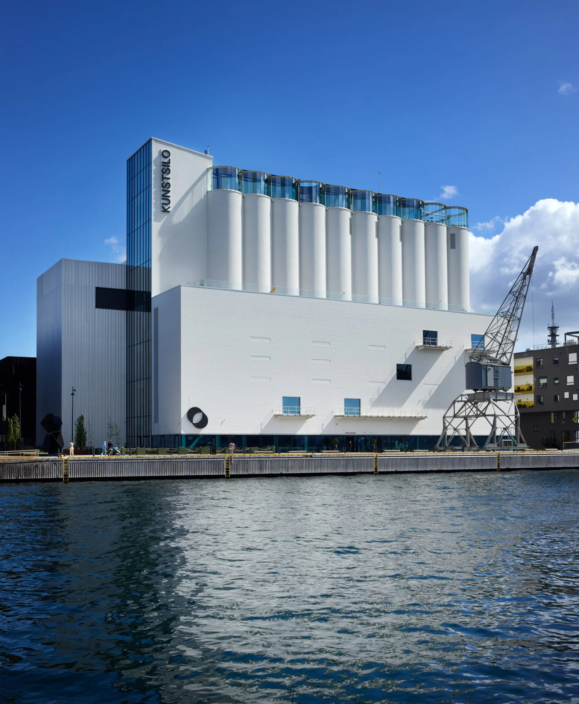
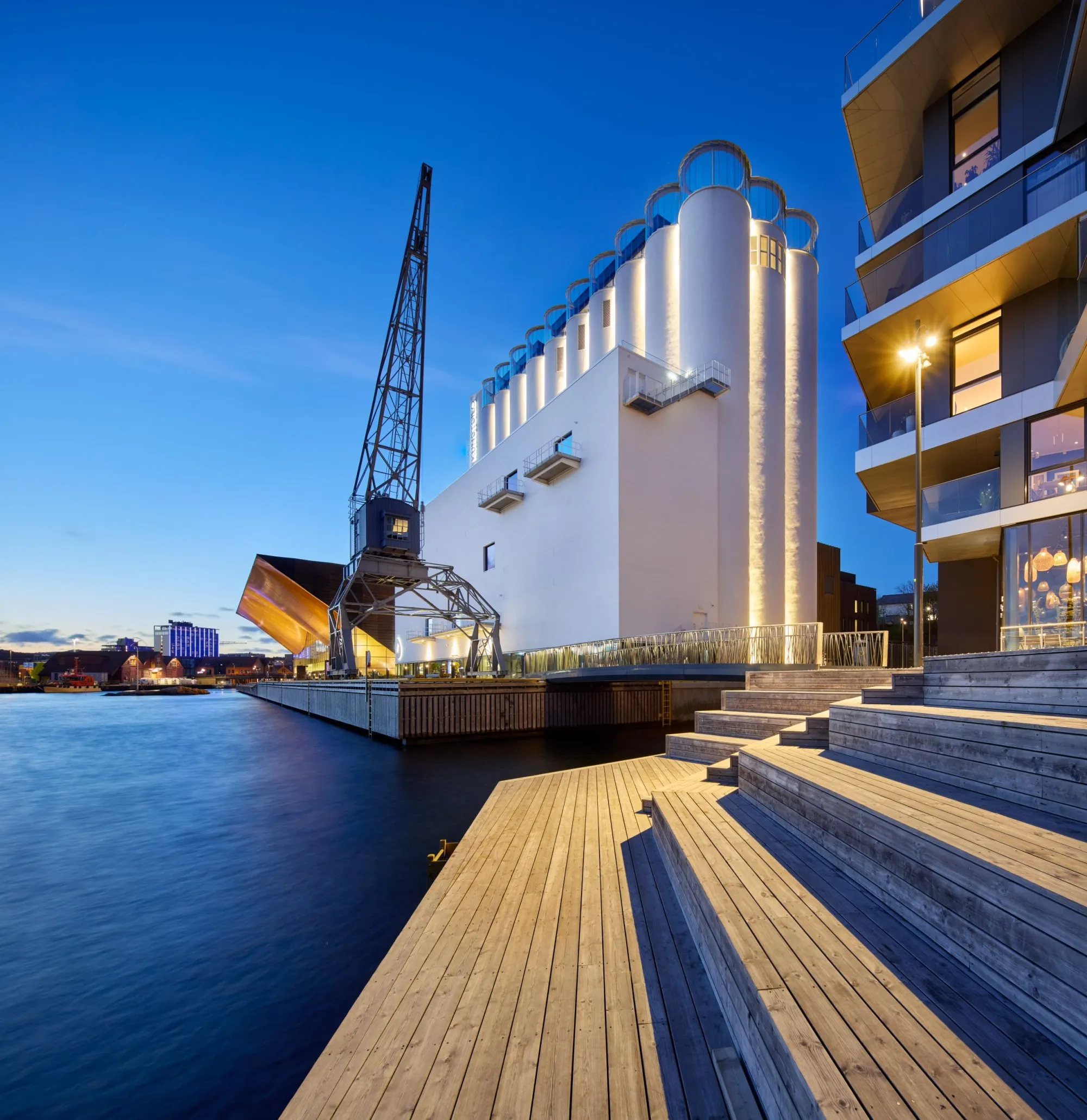
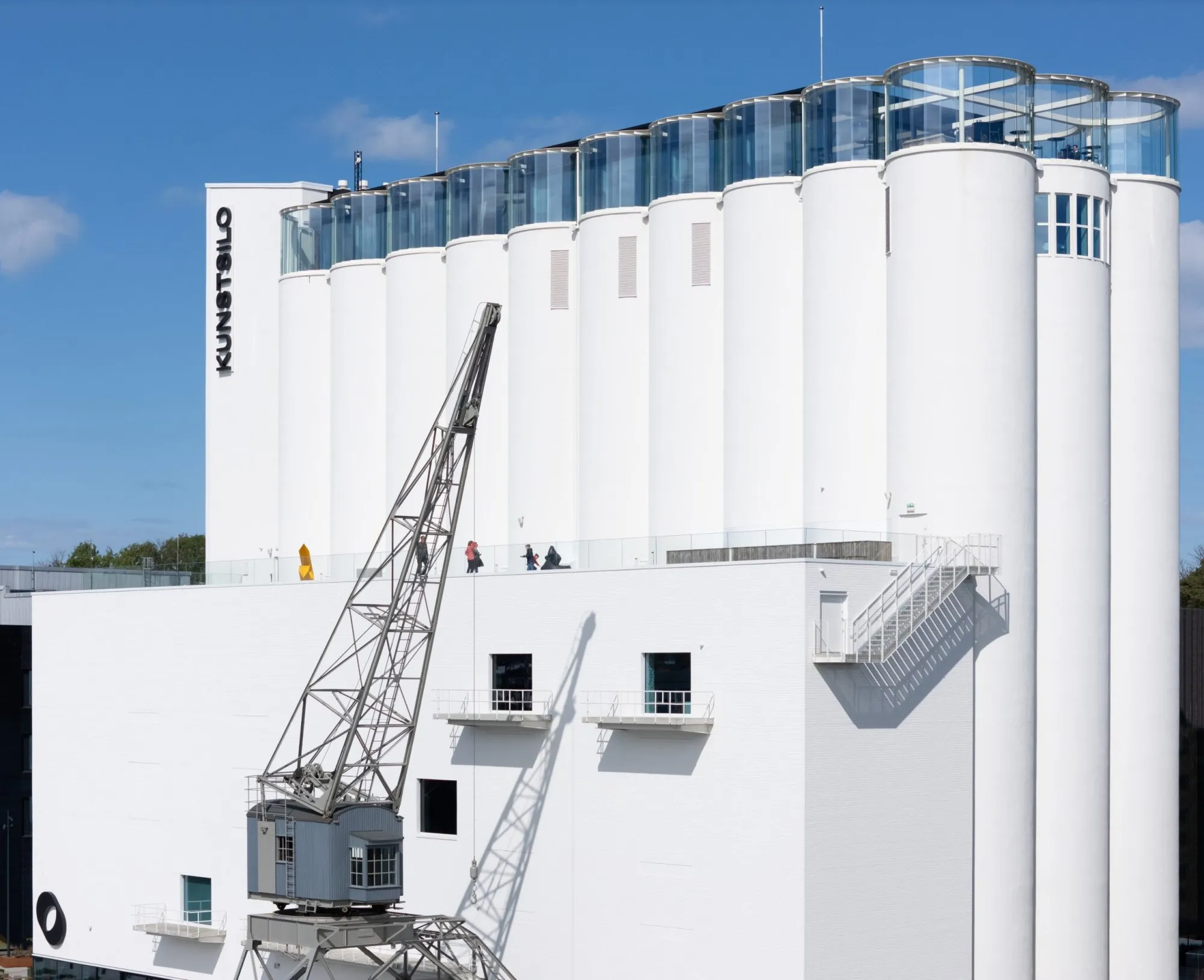
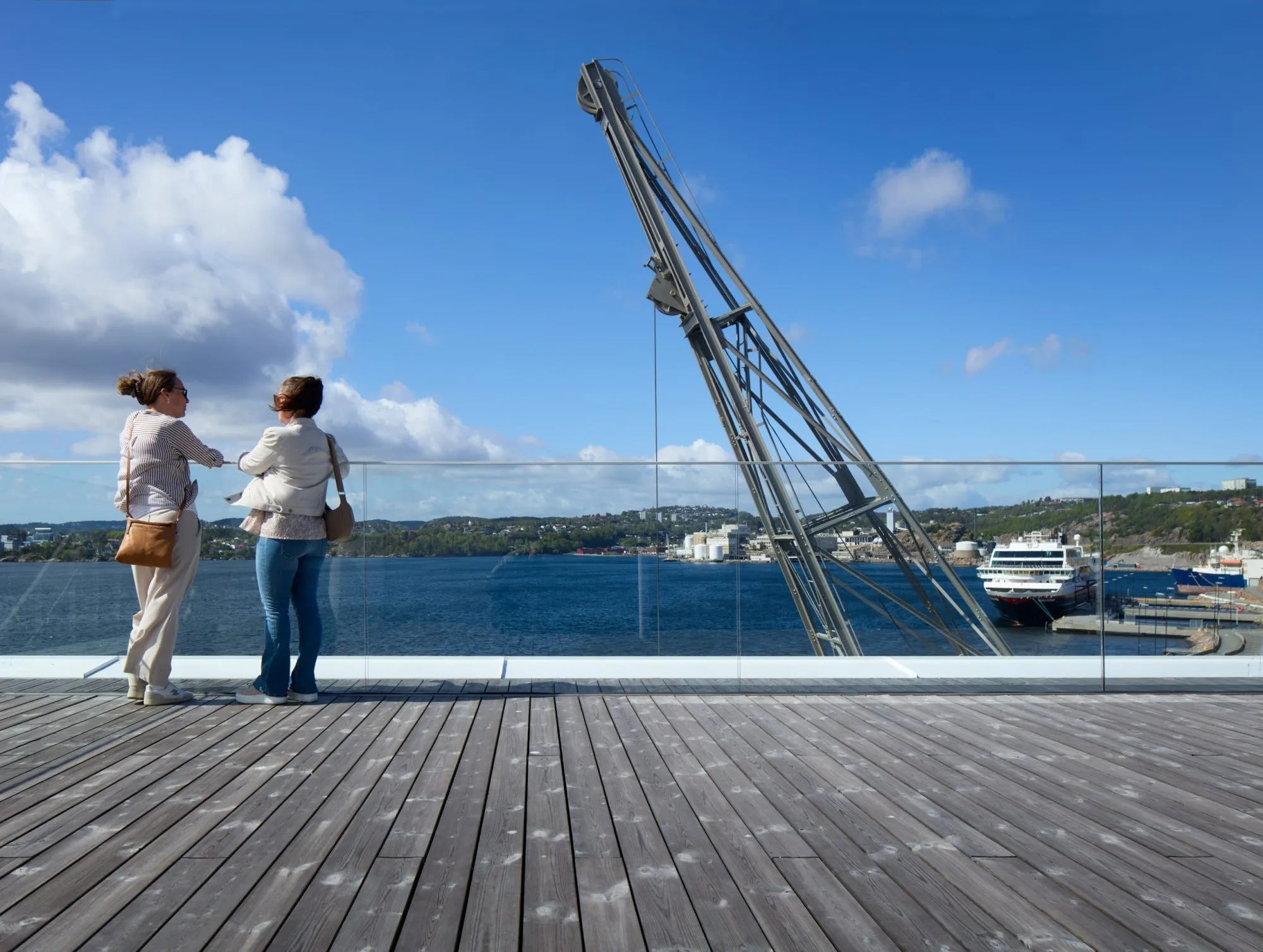
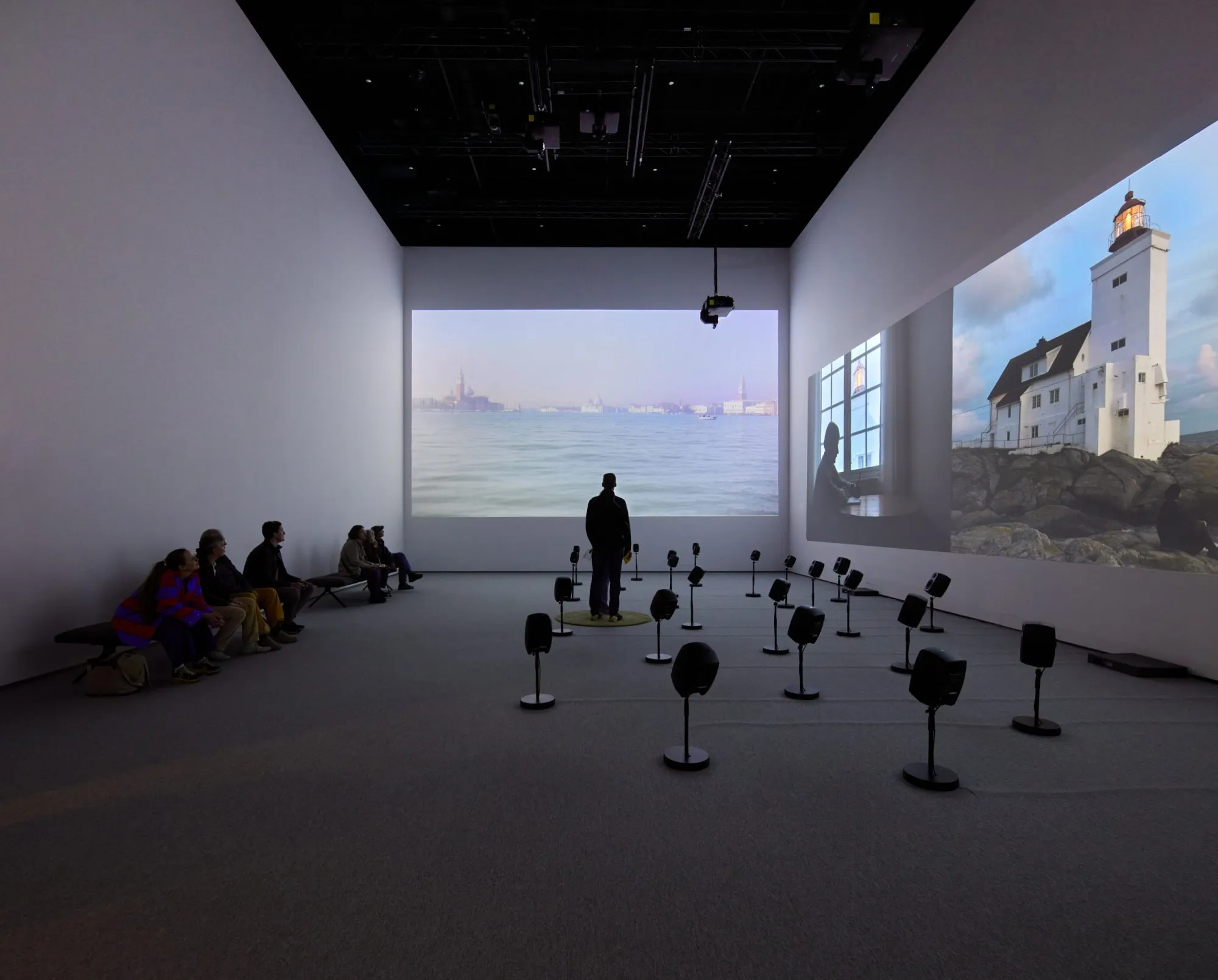
    A listed grain elevator from 1935 has been turned into a museum of contemporary art, organised around the retained concrete cylinders of the original structure. The silo was designed by leading figures of the country’s functionalist movement: its first phase had 15 cylindrical cells, a stair tower and a storage building, another 15 cylinders followed in 1939, and later additions completed the complex along the quay.

    The design, chosen through an open international competition in 2016, does not treat the silo as a shell around a new museum. The museum moves around, through, beneath and above the cylinders, so the industrial fabric remains the building’s strongest spatial presence.

    At the centre, selected cylinders were cut away to make the Silo Hall, an interior rising 21 metres beneath the remaining concrete tubes. Some cylinders keep their original concrete caps, others are open to the sky or covered with walkable glass, sending shafts of daylight down through the void. Formwork marks, surfaces polished by decades of grain and the saw cuts where cylinders were removed all stay visible, and new elements are kept restrained beside them.

    On the ground floor, the shop, auditorium, café and temporary exhibition rooms surround the hall. Entrances on the east and west let it work as an indoor public square within the surrounding cultural quarter. Galleries occupy the second, third and fourth floors, with foyers leading around and through the silo. White-box rooms in the east and west wings contrast with the tactile, irregular historic concrete, and placed windows reconnect the interior with the harbour, the town and the sea.

    A horizontal window opens the hall towards the harbour promenade, a vertical glazed facade on the north stair tower faces the town centre, and a transparent event space crowns the building. The museum covers 8,850 square metres, with 3,300 square metres for exhibitions, and its strongest gesture is a careful subtraction rather than an addition.
    Kunstsilo, view 1
    Kunstsilo, view 2
    Kunstsilo, view 3
    Kunstsilo, view 4
    Kunstsilo, view 5
    Kunstsilo, view 6
    Kunstsilo, view 7
    Kunstsilo, view 8
    Kunstsilo, view 9
  • Wave Cube

    Wave Cube

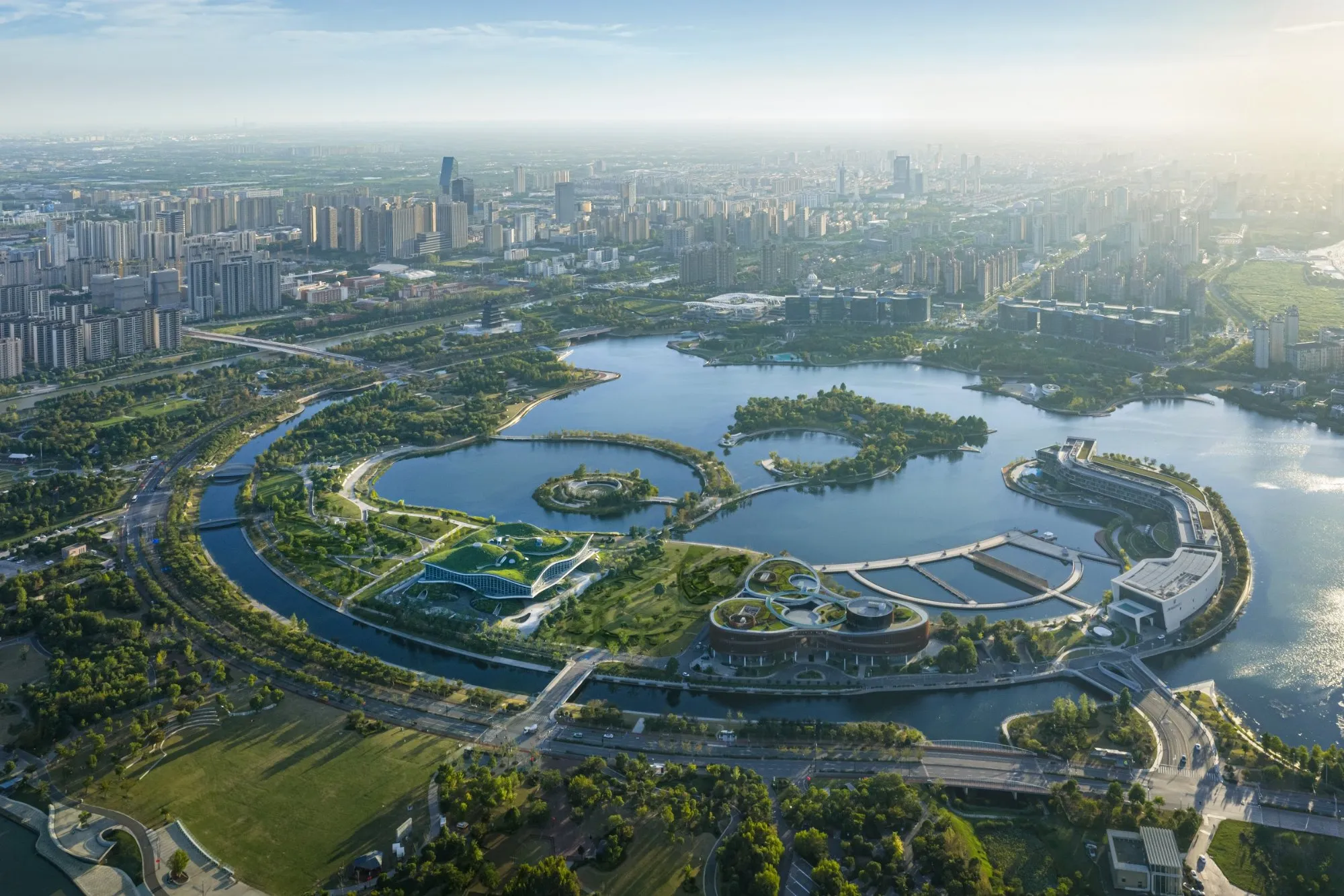
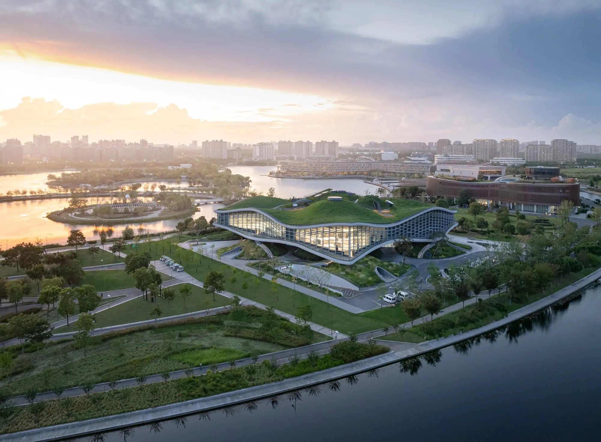
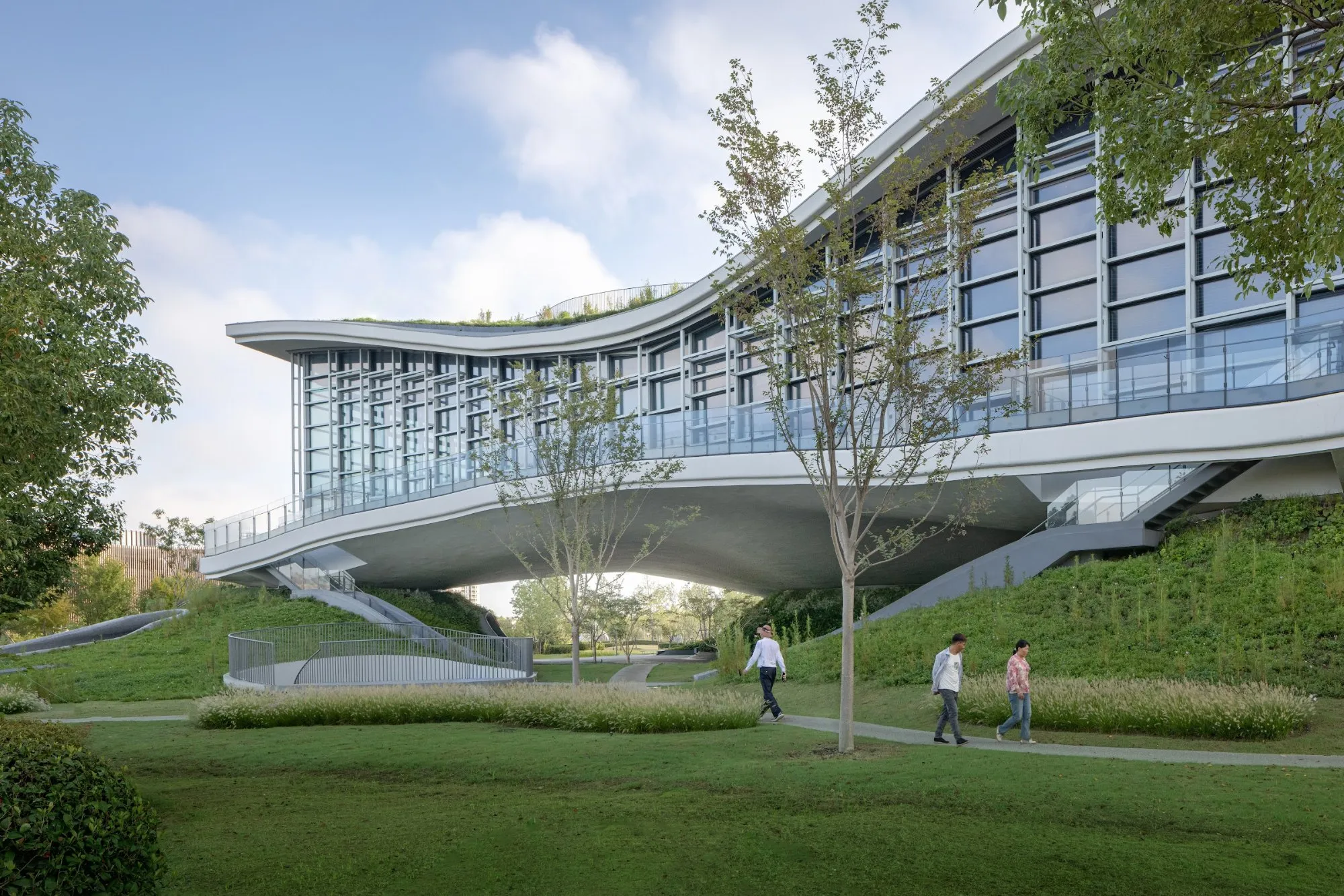
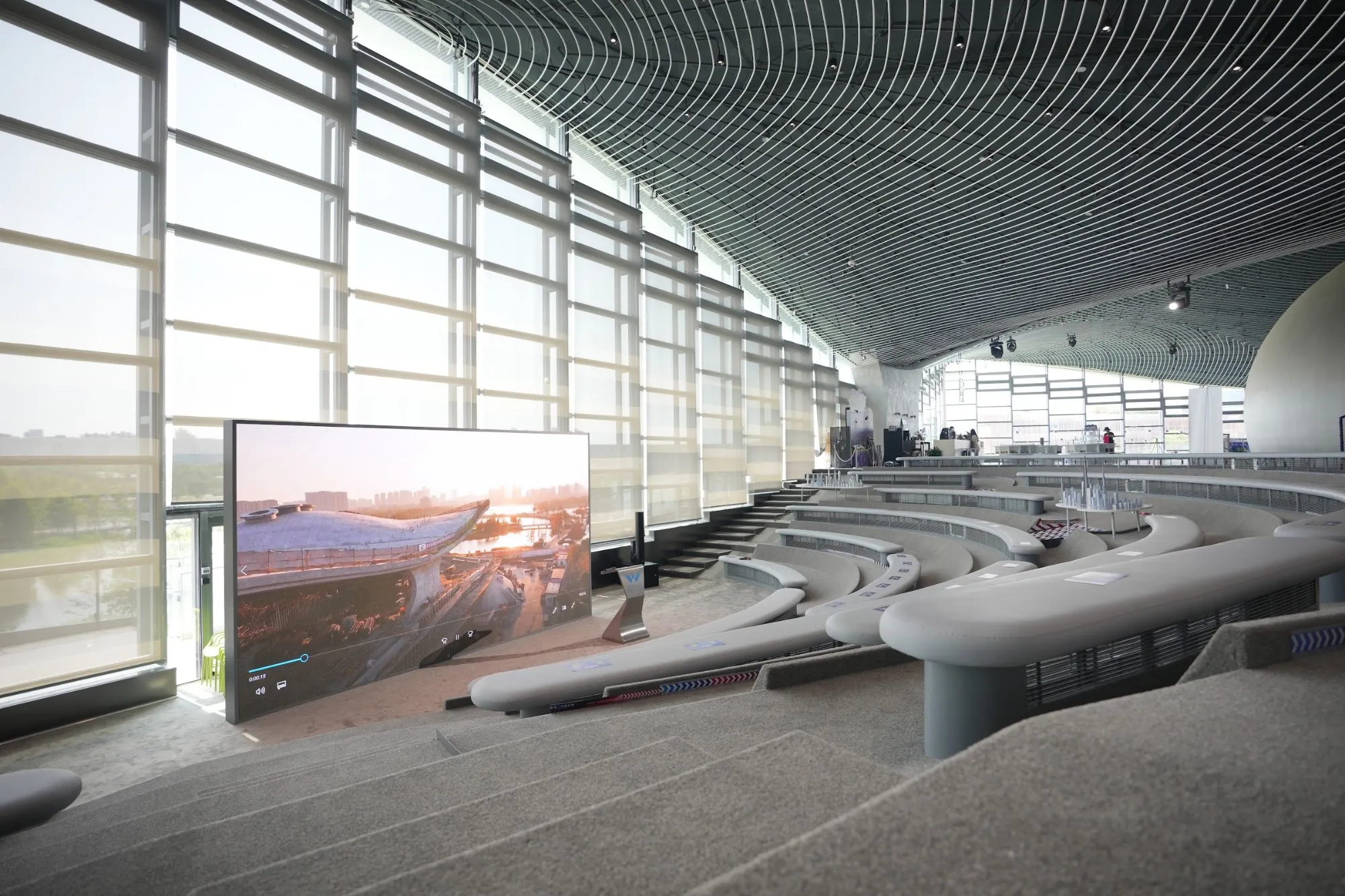
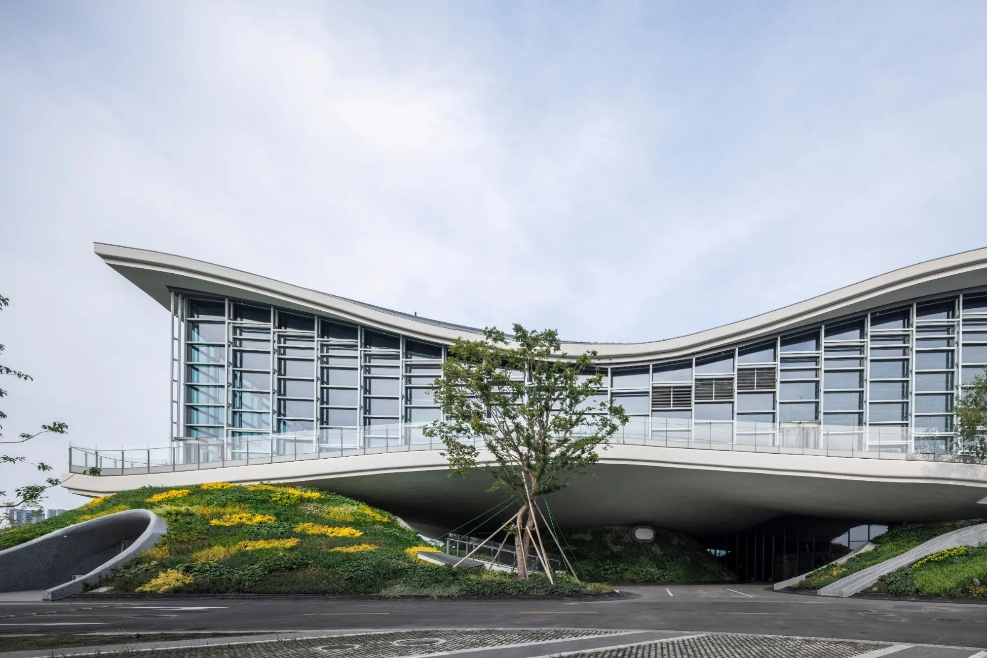
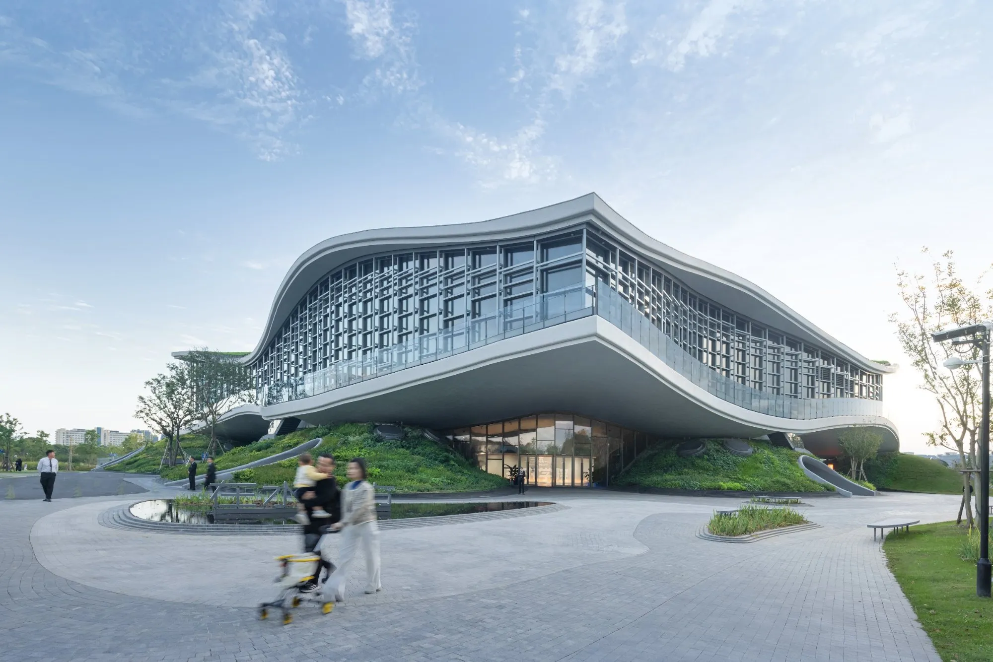
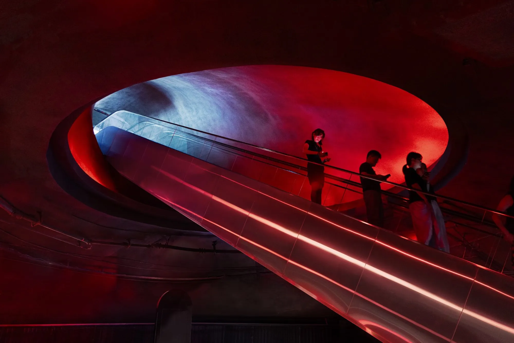
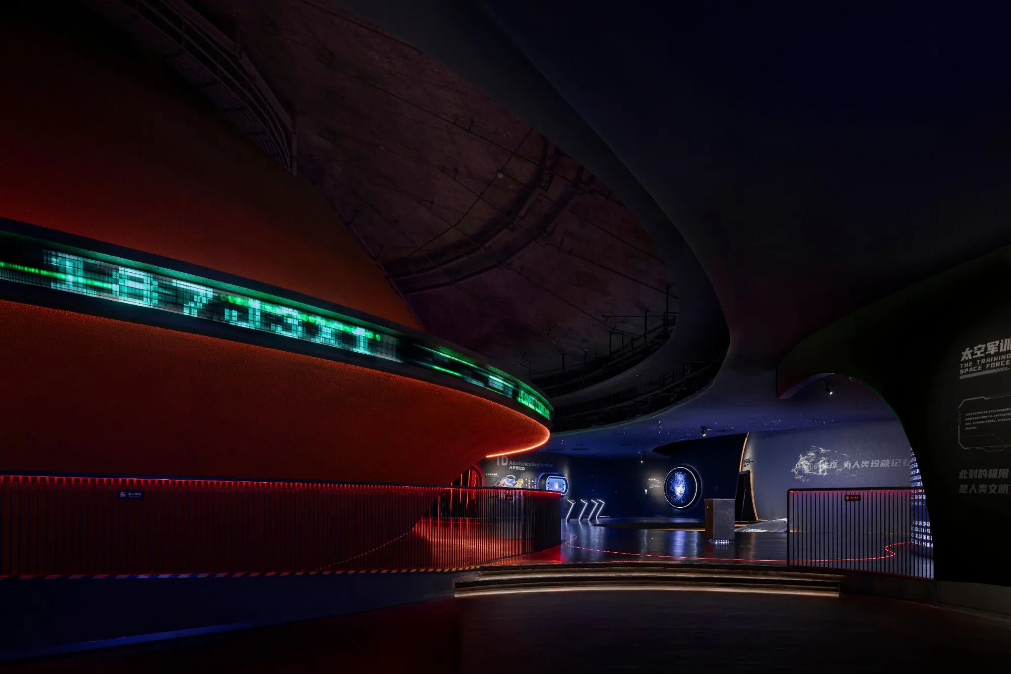
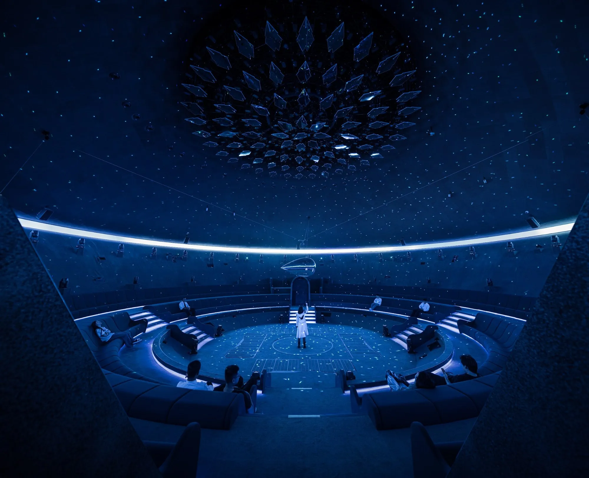
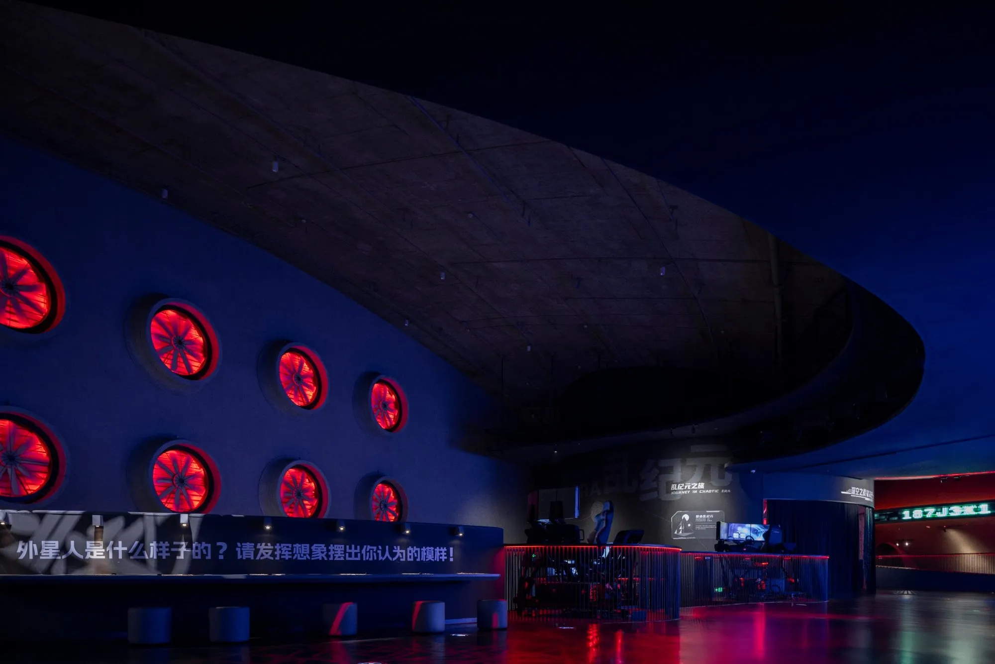
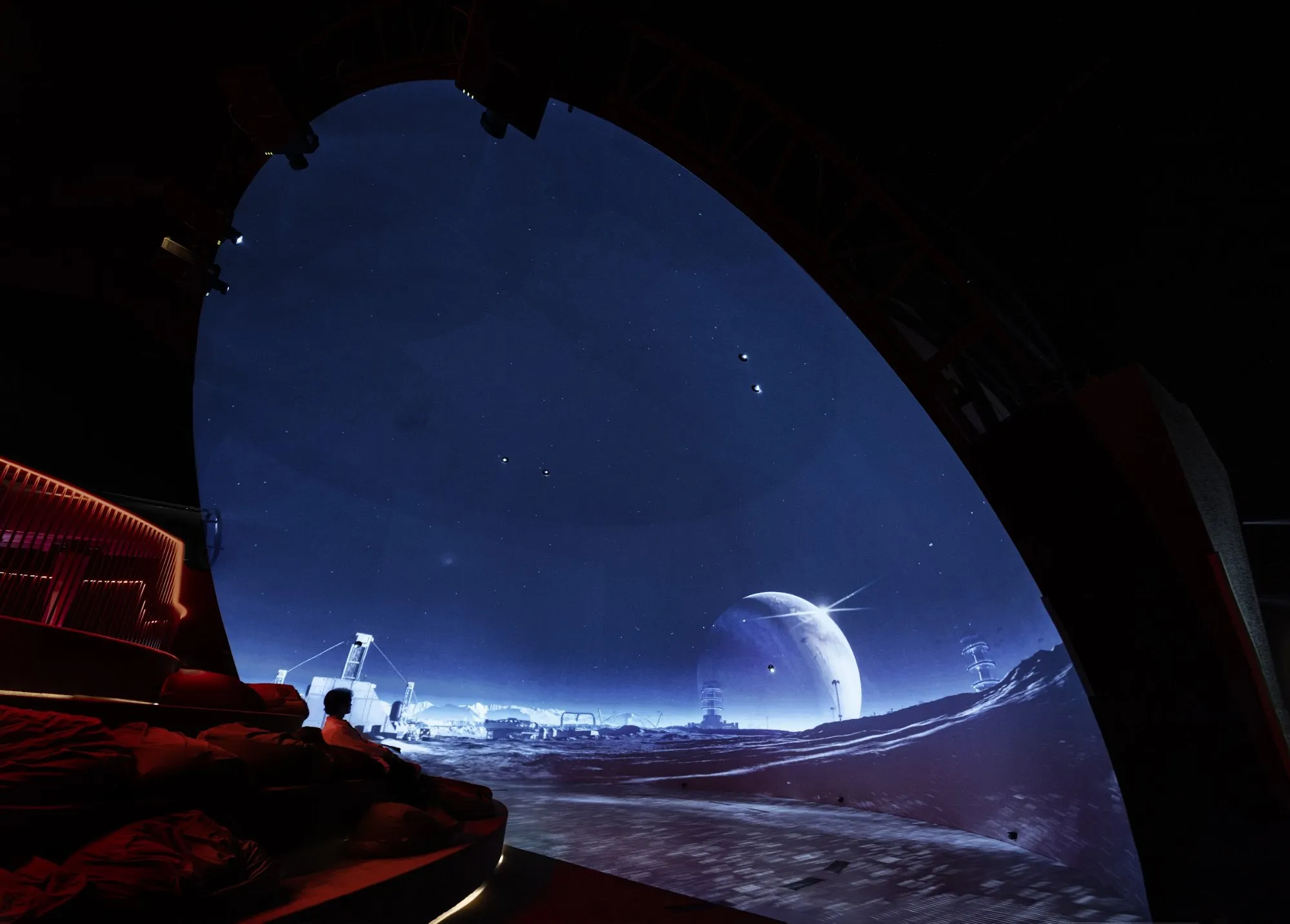
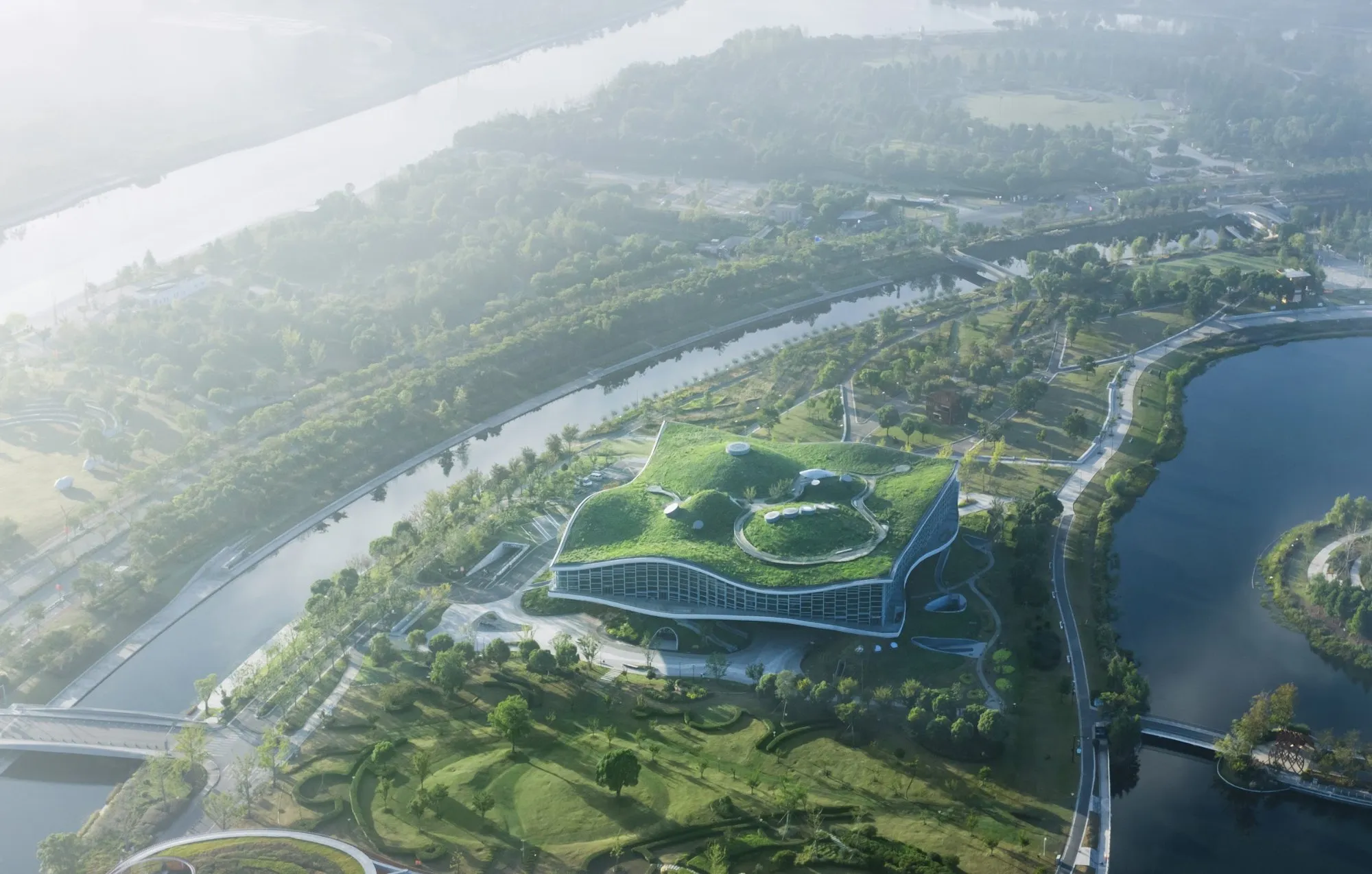
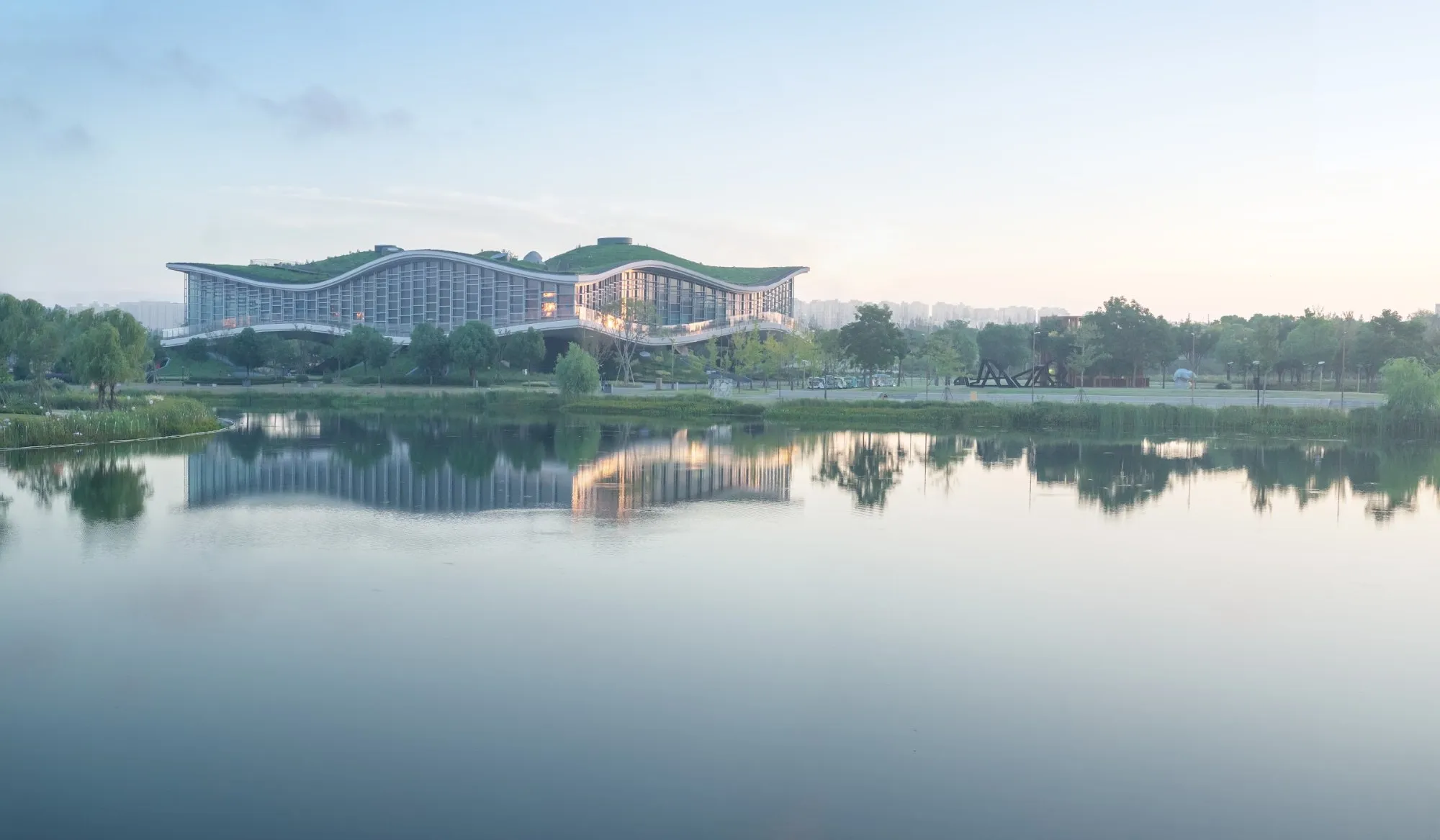
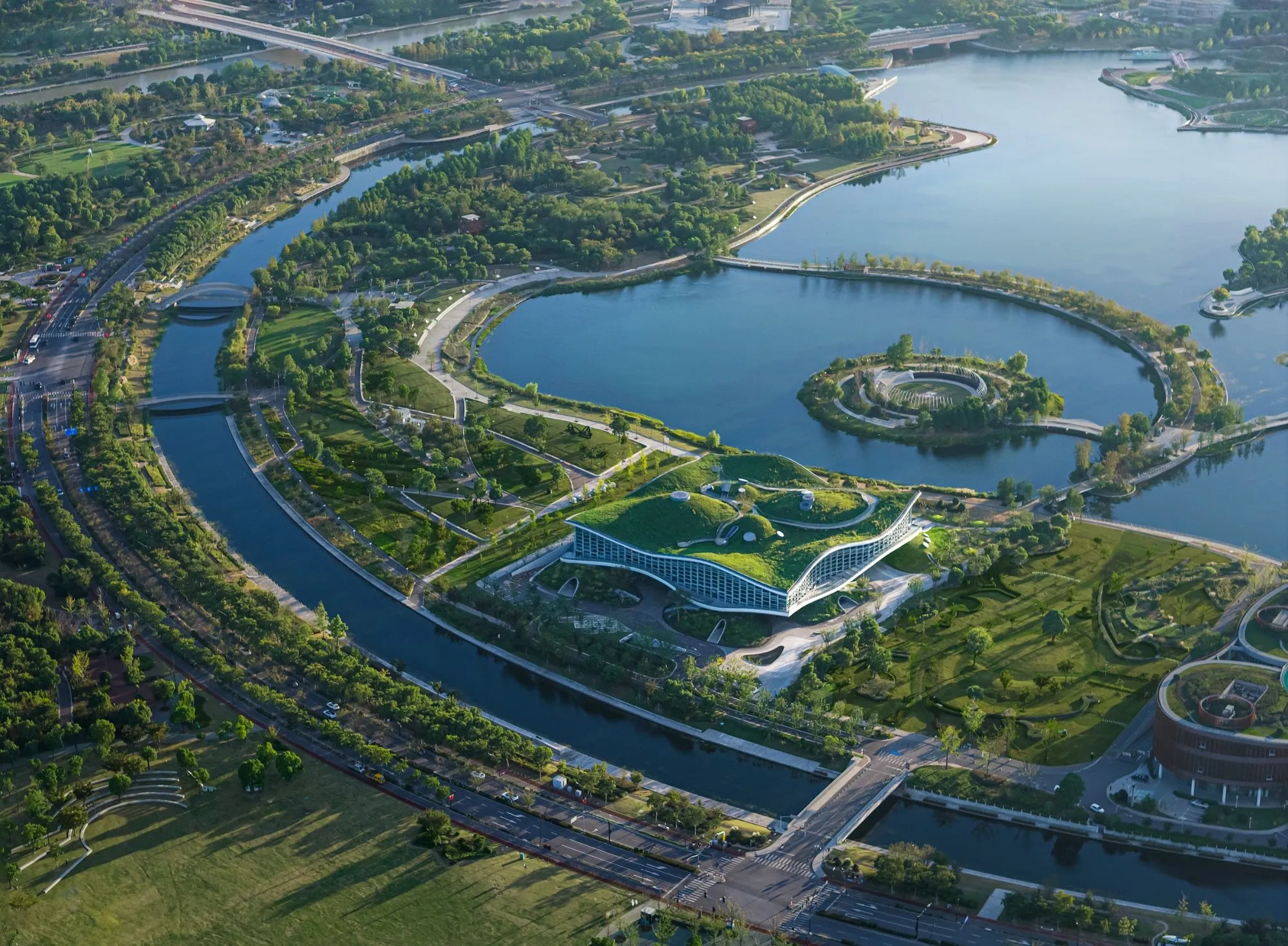
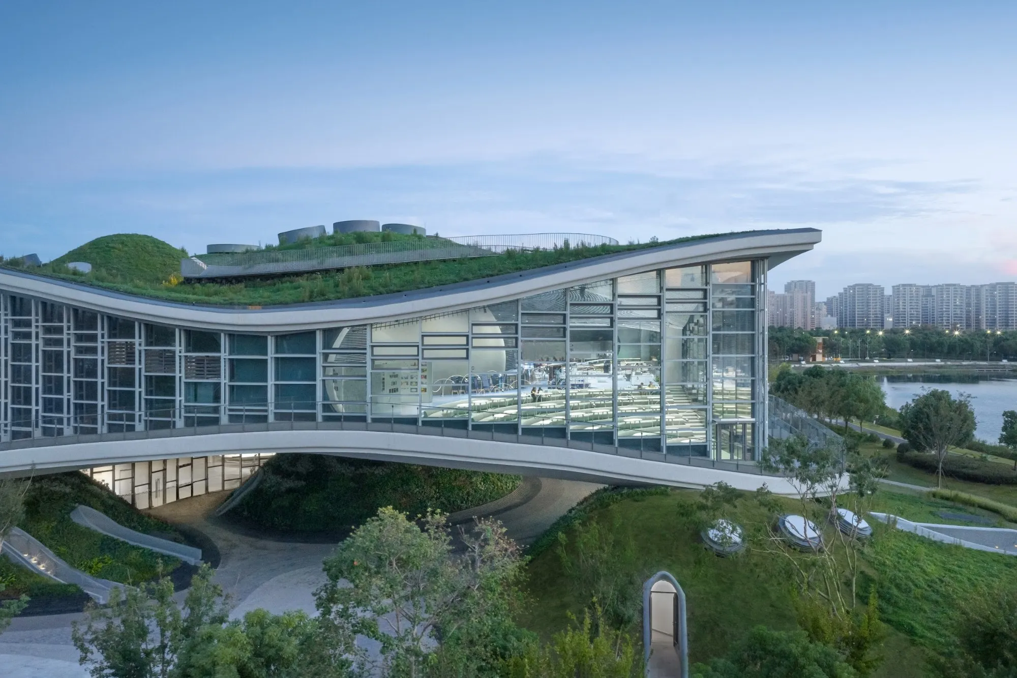
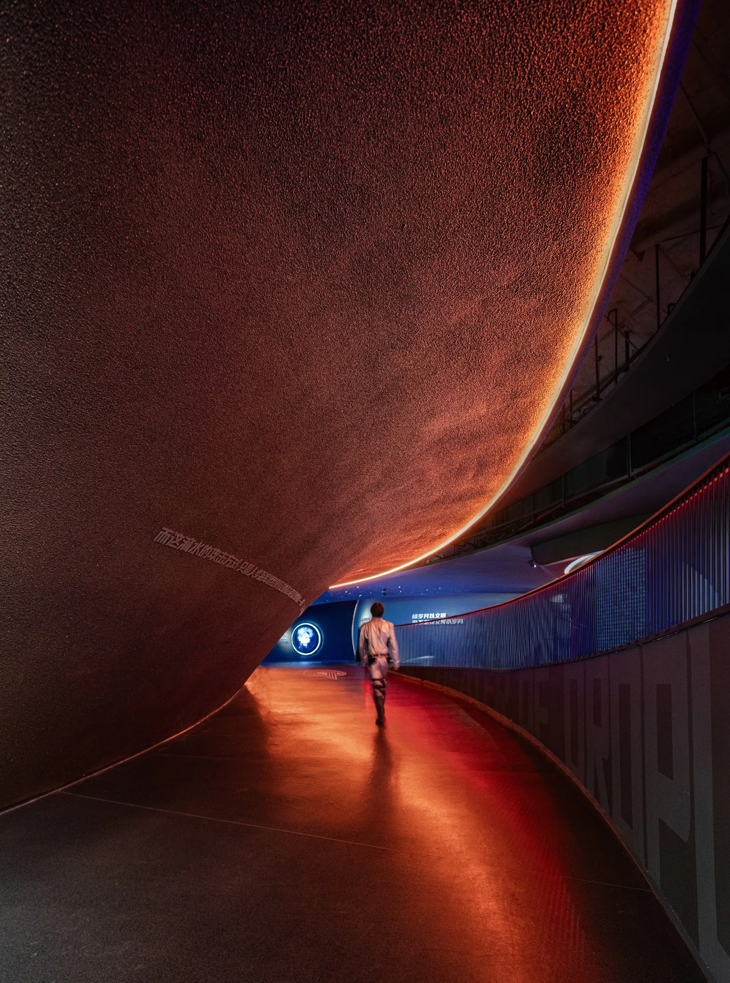
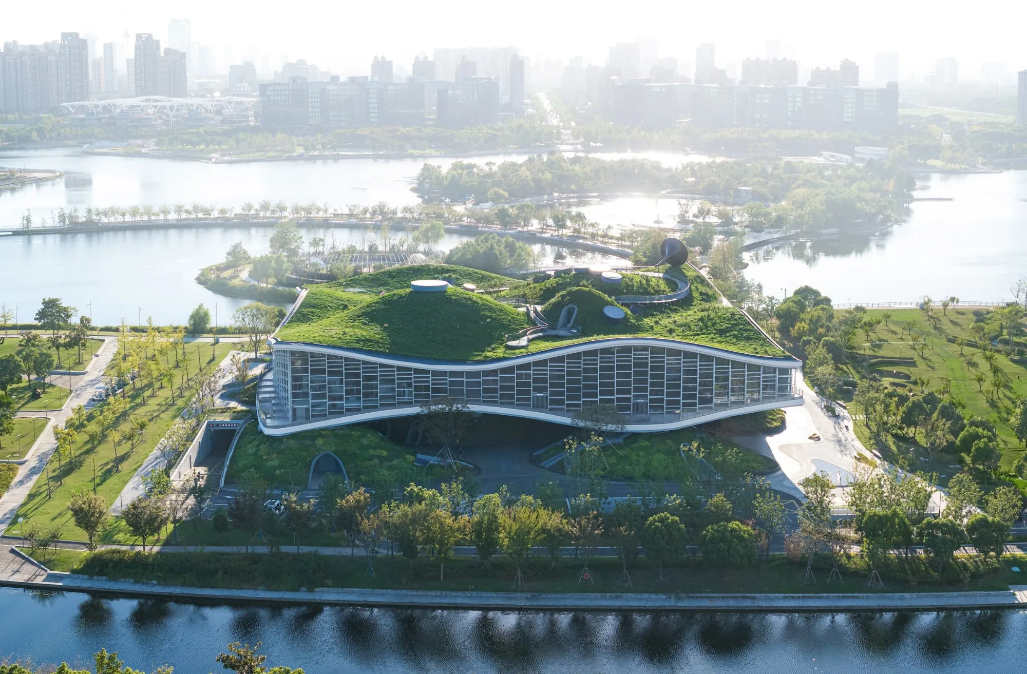
    On a nearly square site at the tip of a circular peninsula, with water on two sides, the building is a cultural landmark themed around science fiction. Its form had to sit with the green belt around the lake while giving the building its own presence, inside and out.

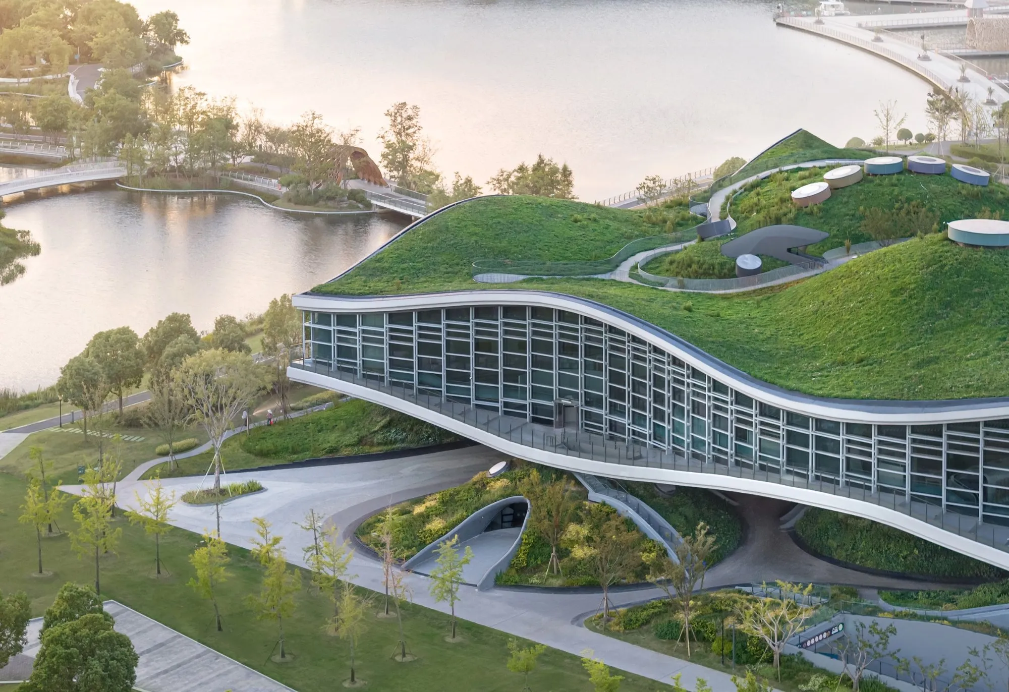
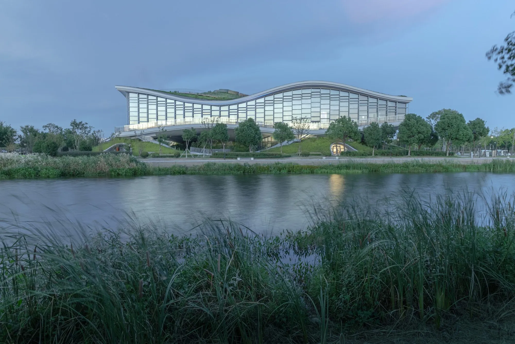
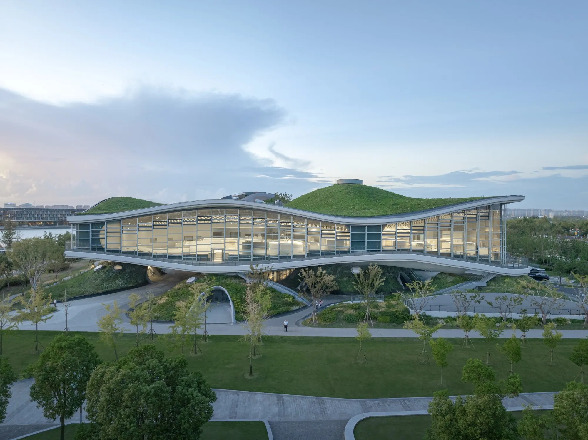
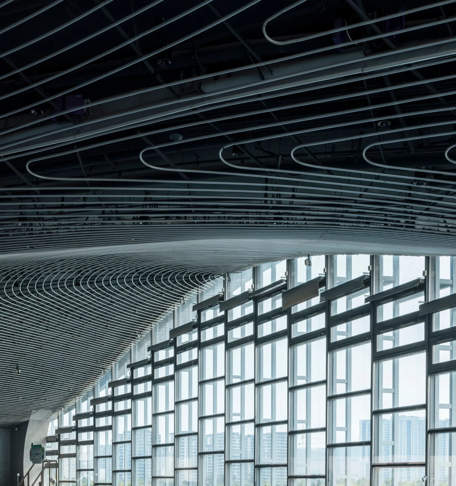
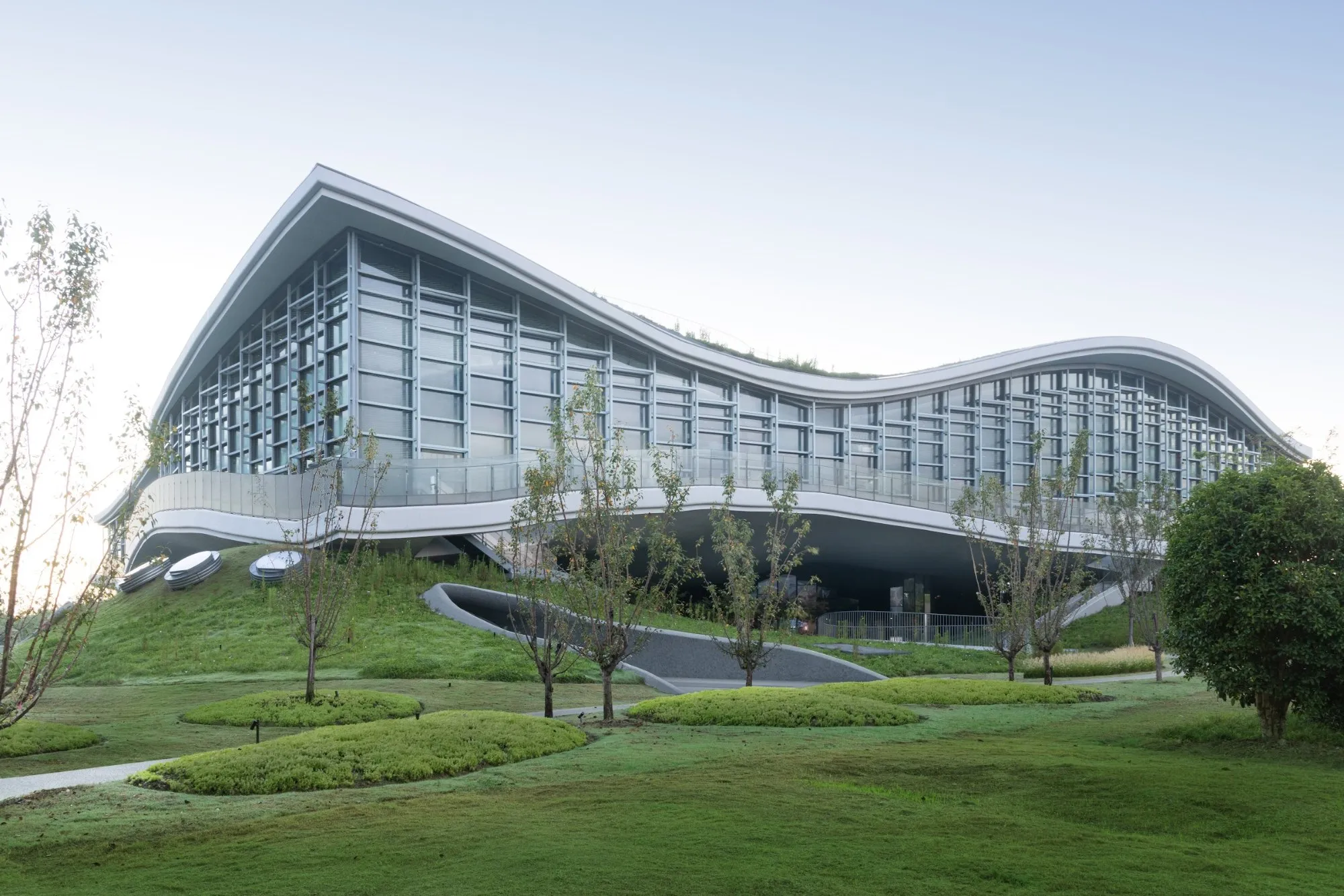
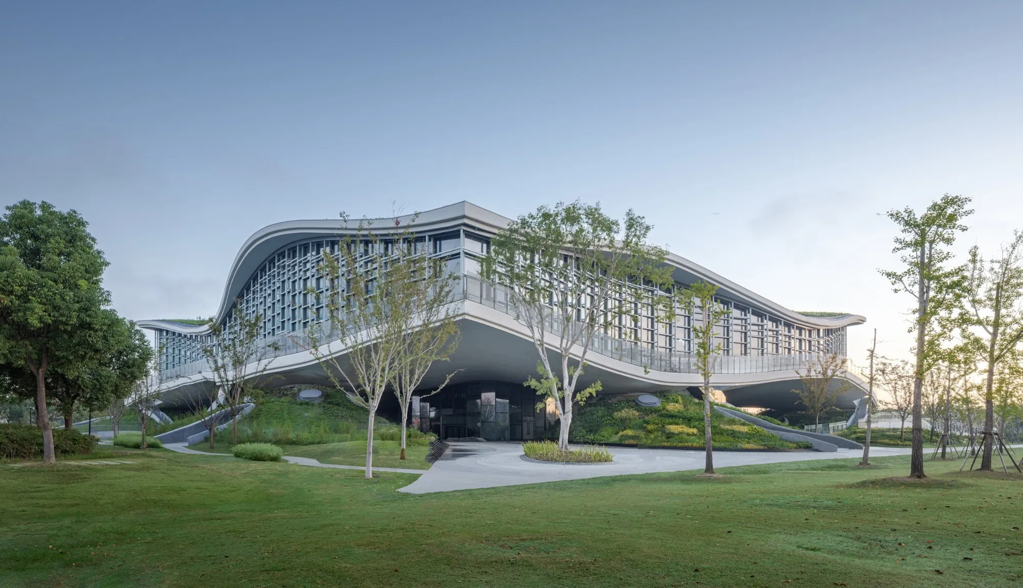
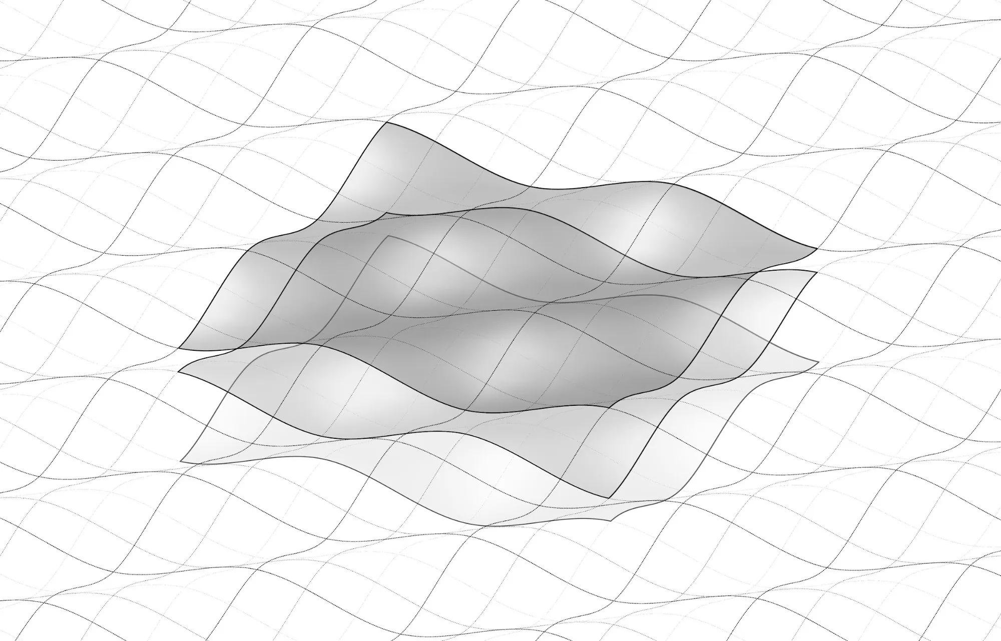
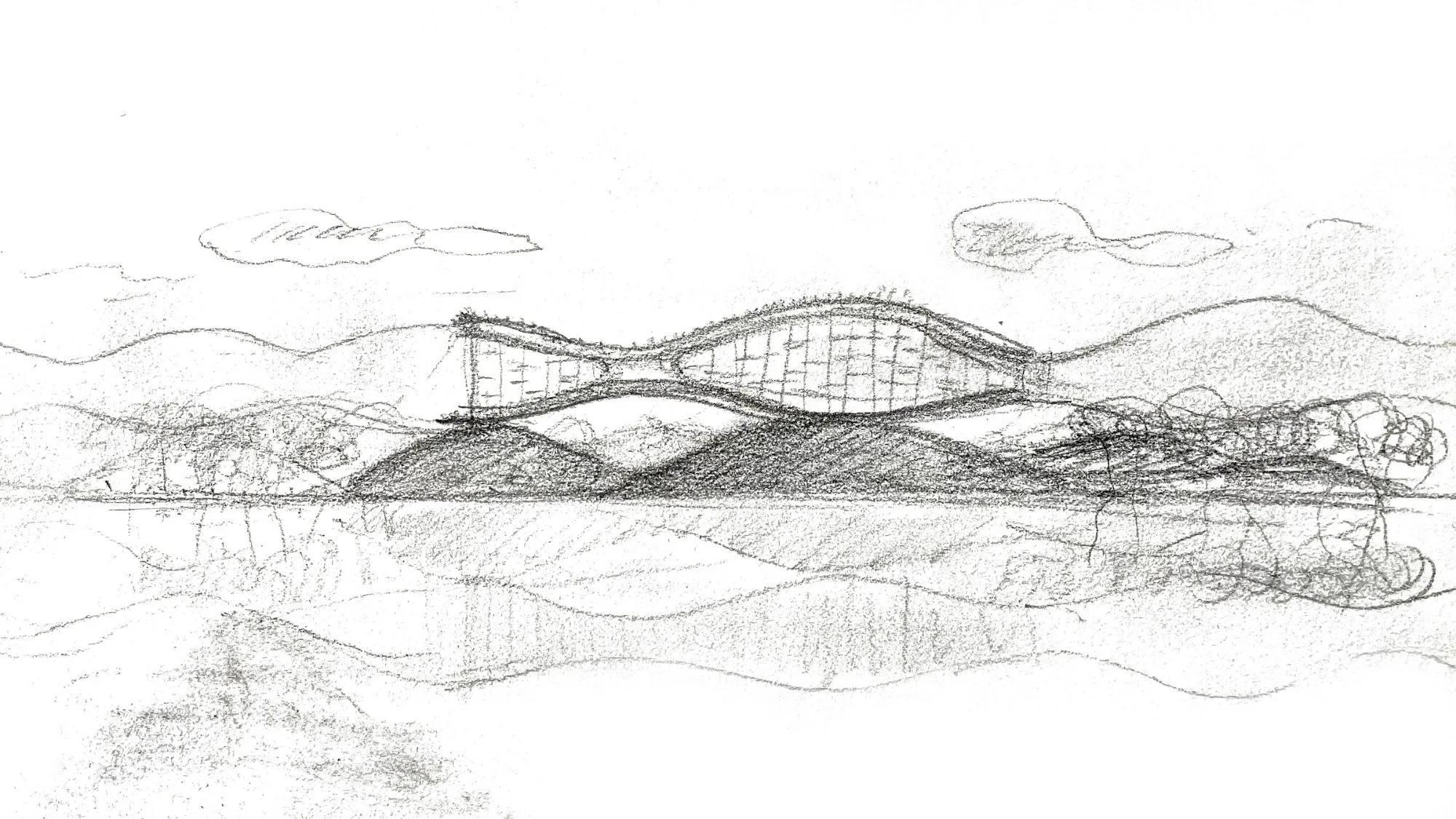
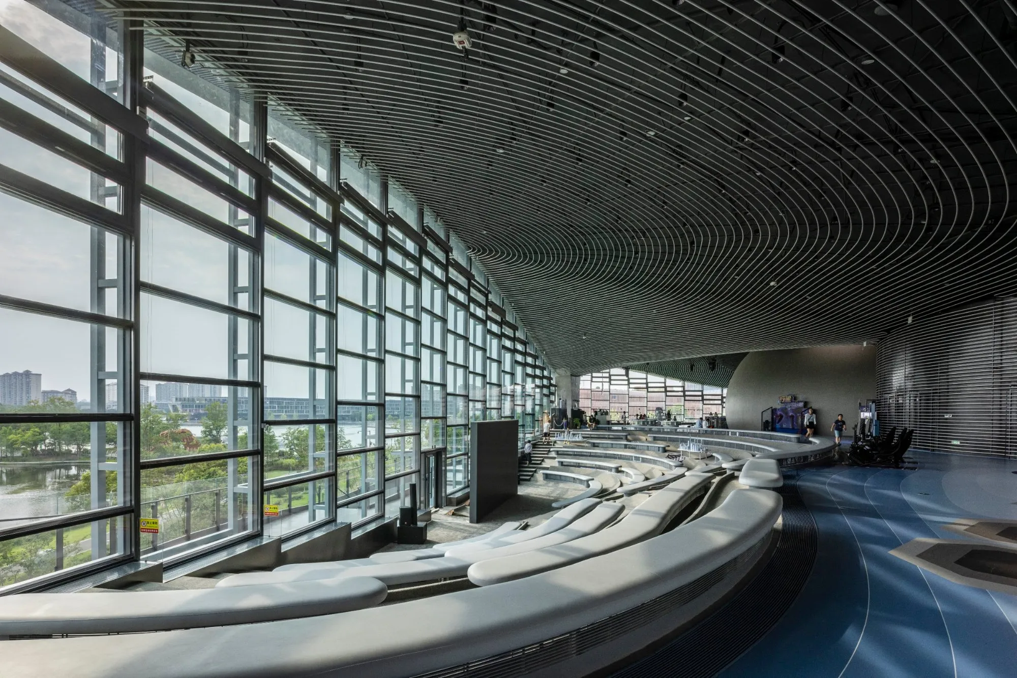
    The region is flat and rich in water, with few hills, so artificial hills became part of the idea early on. The design team imagined a settlement of wave-shaped units that could extend endlessly in three dimensions, then cut out a piece of about 80 by 80 by 20 metres. Three stacked wave surfaces form three layers of undulating space, with an amplitude of about 12 metres, a span of about 54 metres and cantilevers of about 27 metres.

    A pure sine-wave shell carries loads very differently from an arch, and a compression-only vault of this size would have needed a much higher rise and a thicker shell. Working with the structural engineers, the team arrived at a form between shell and folded plate that works in both compression and tension. Simplified folds traced the main paths for gravity and lateral forces, and a gradual shift from facets to curved shells resolved them, using reinforced concrete in compression and prestressing in tension.

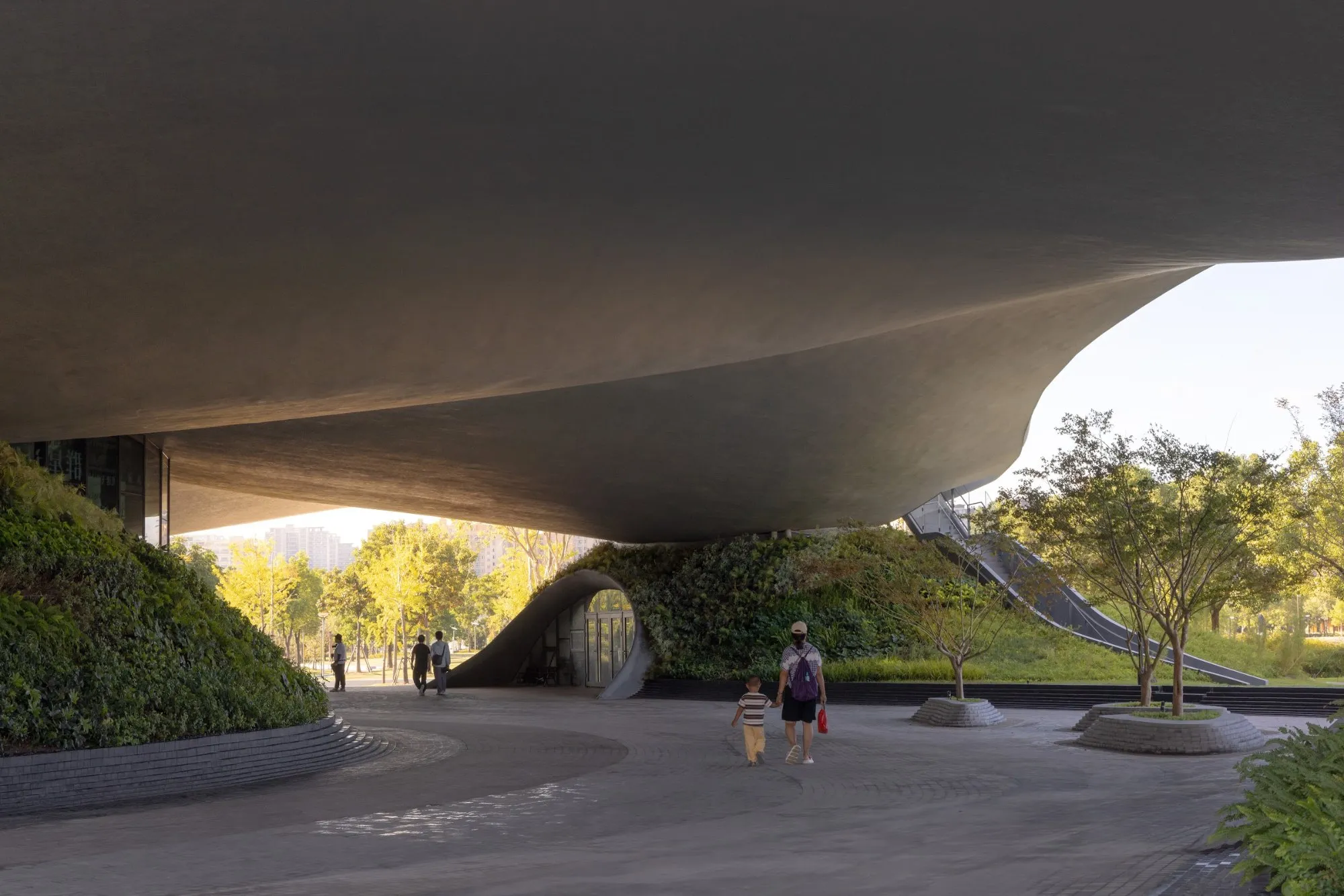
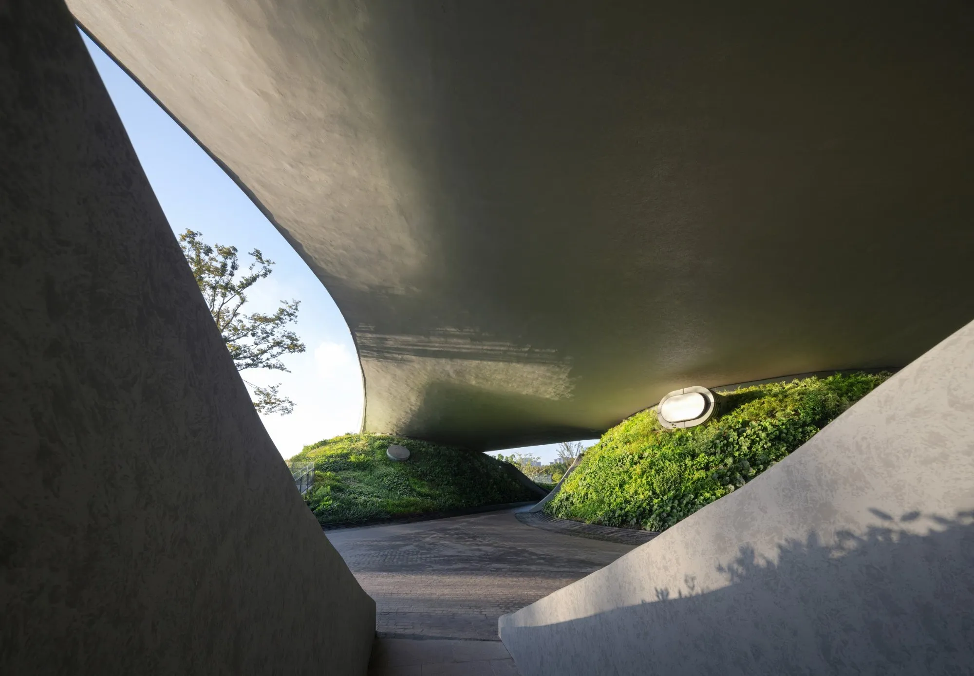
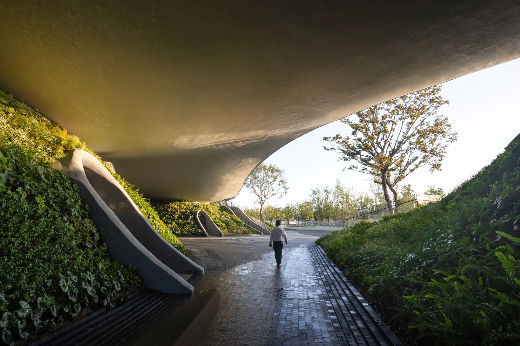
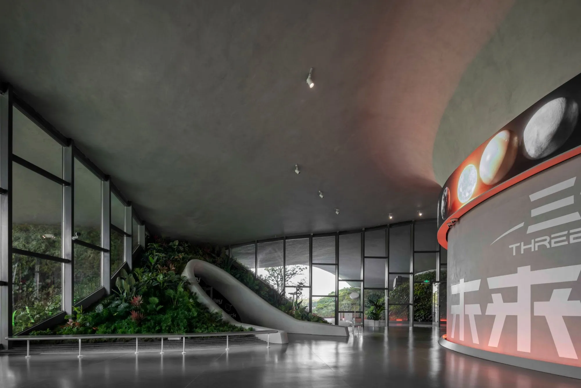
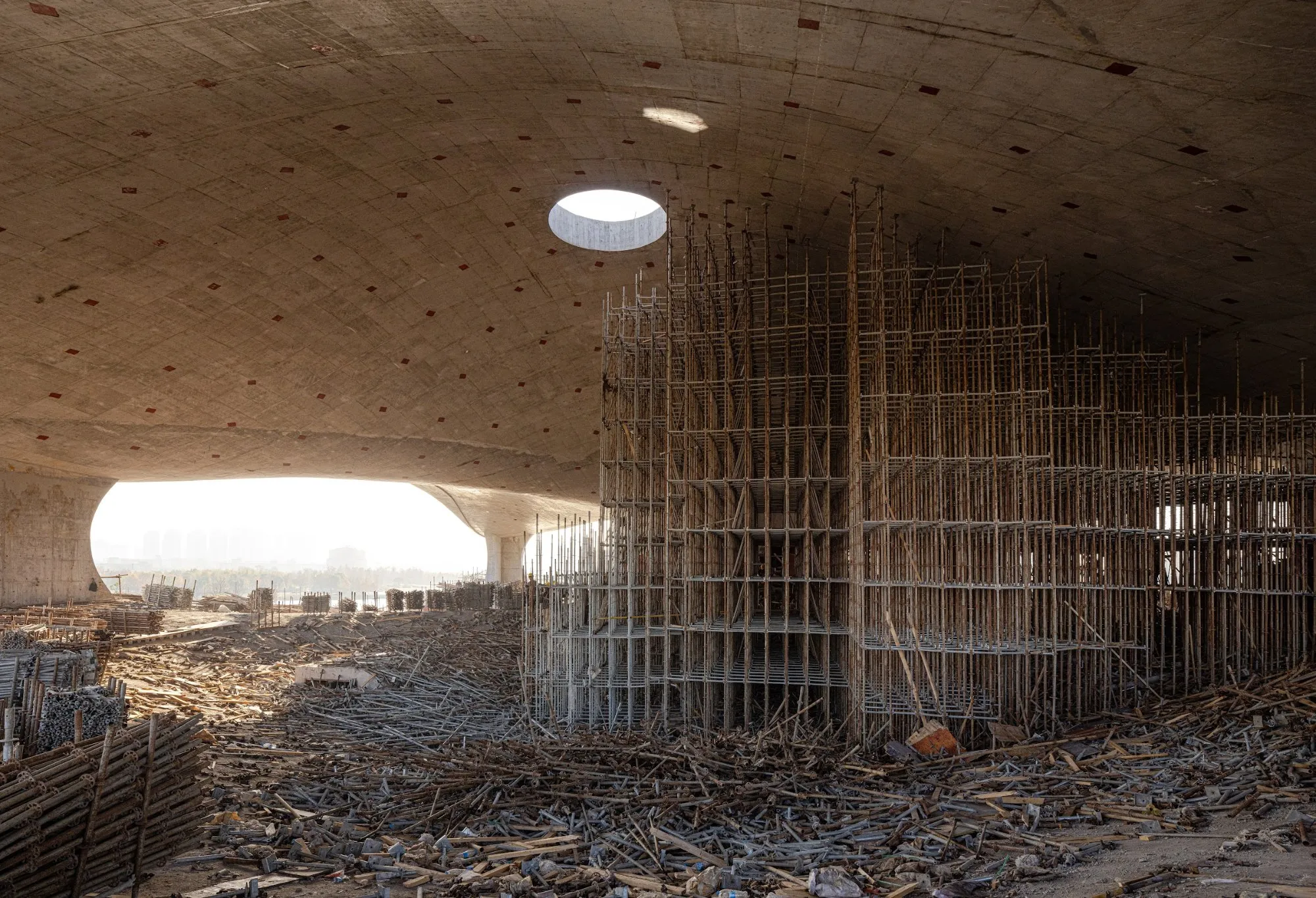
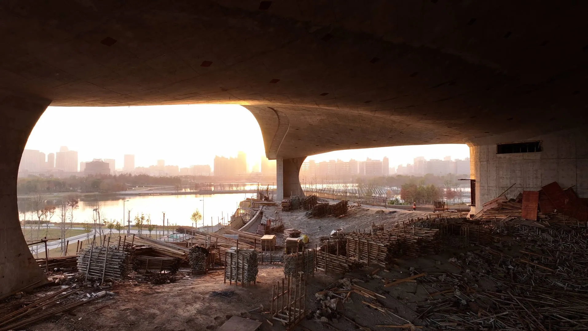
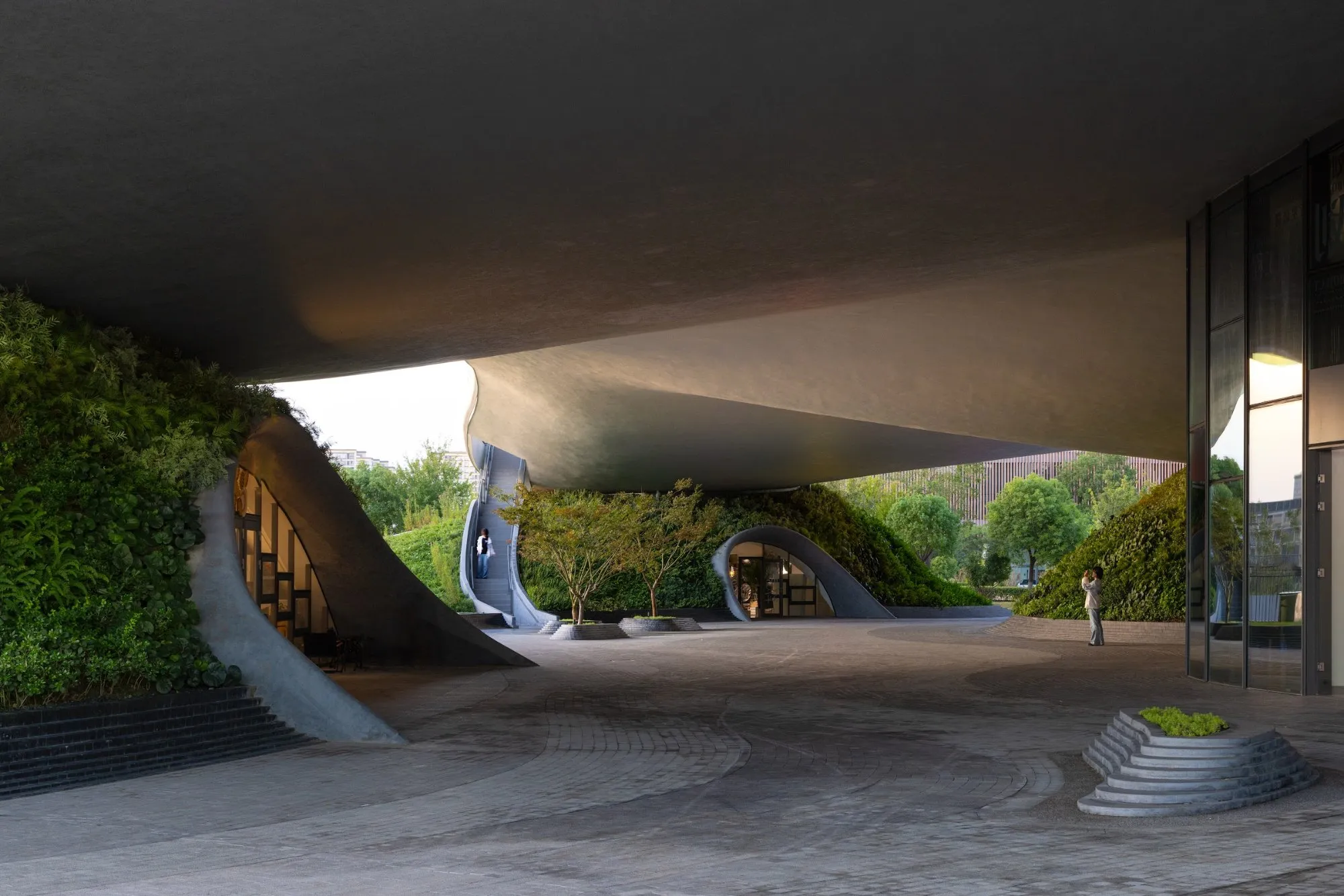
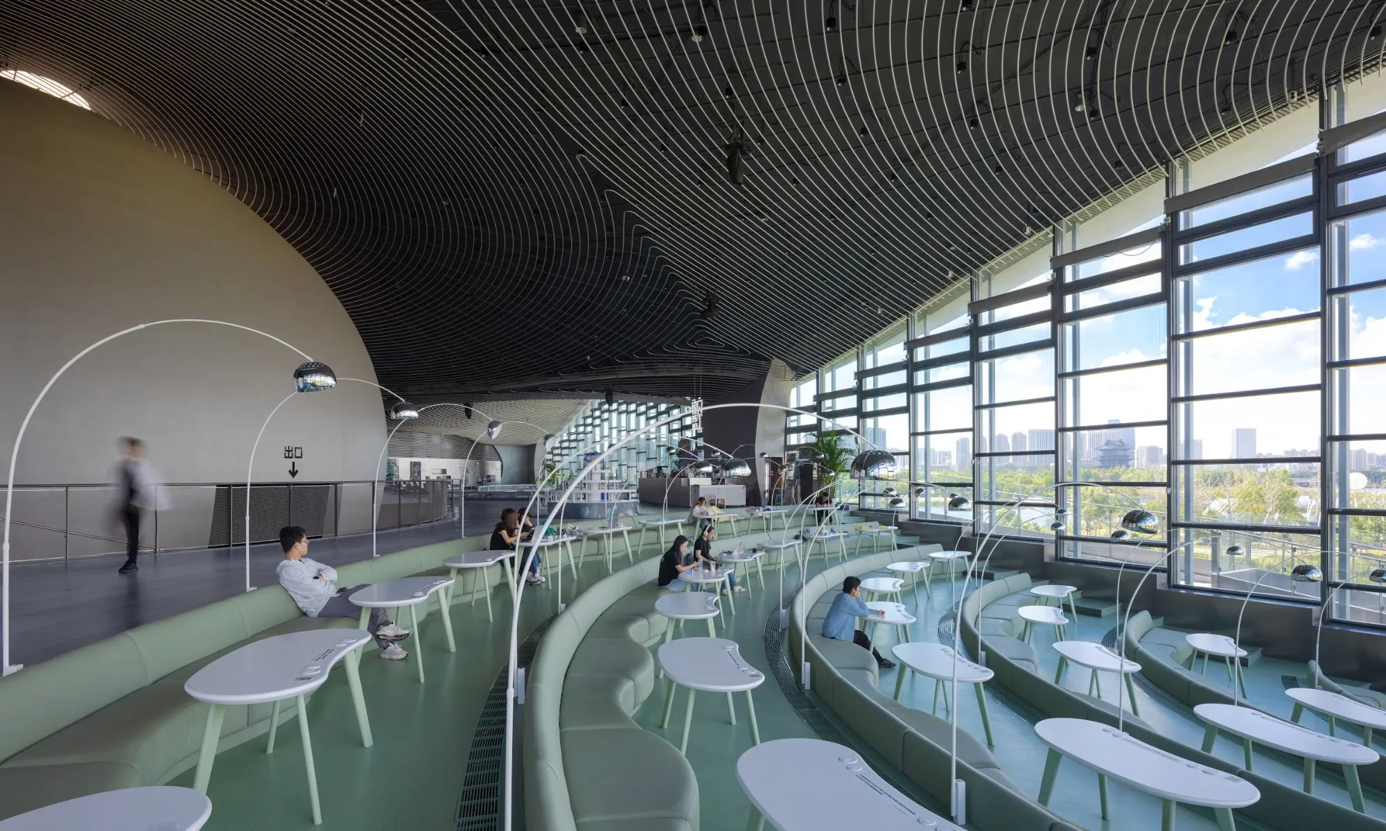
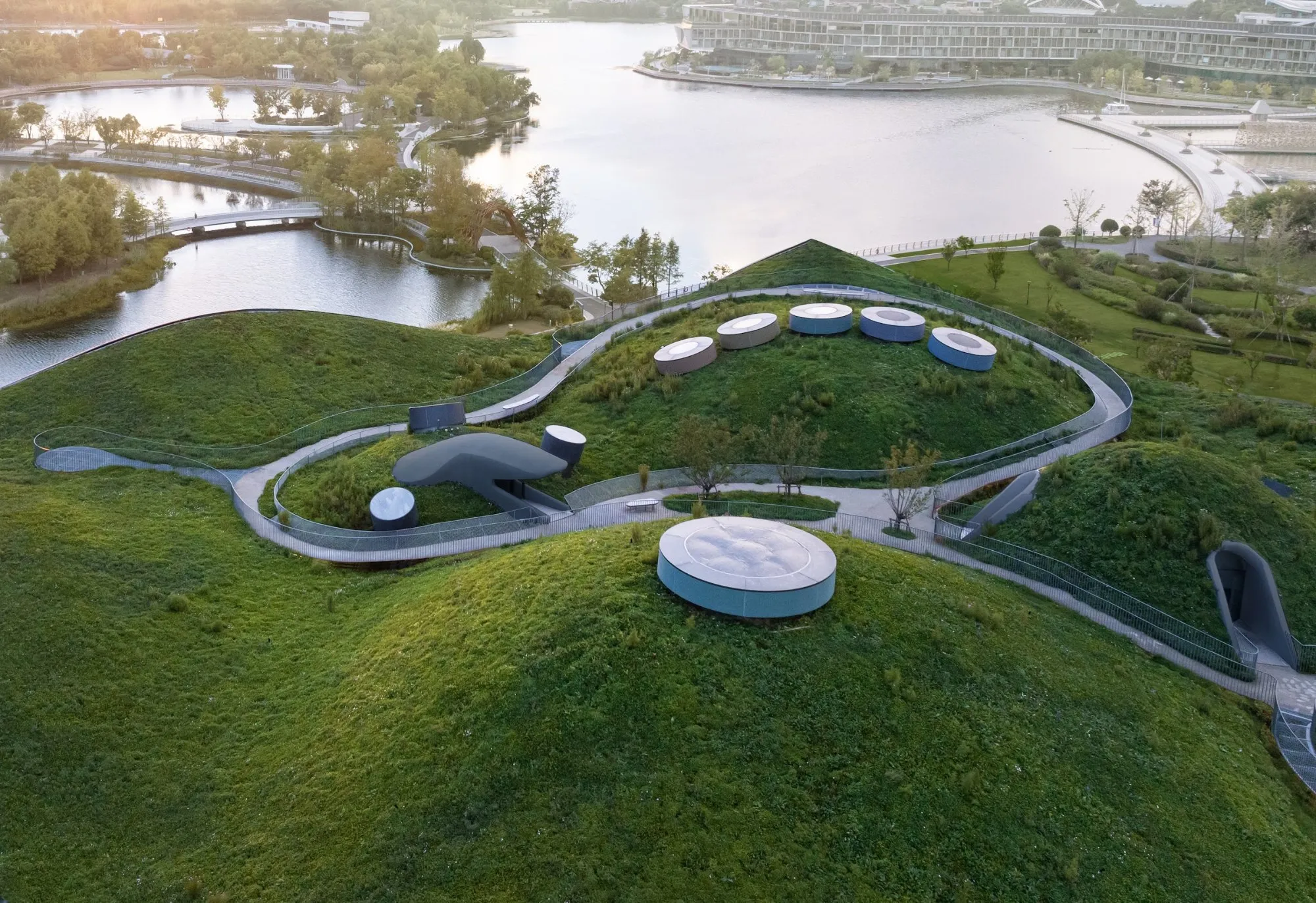
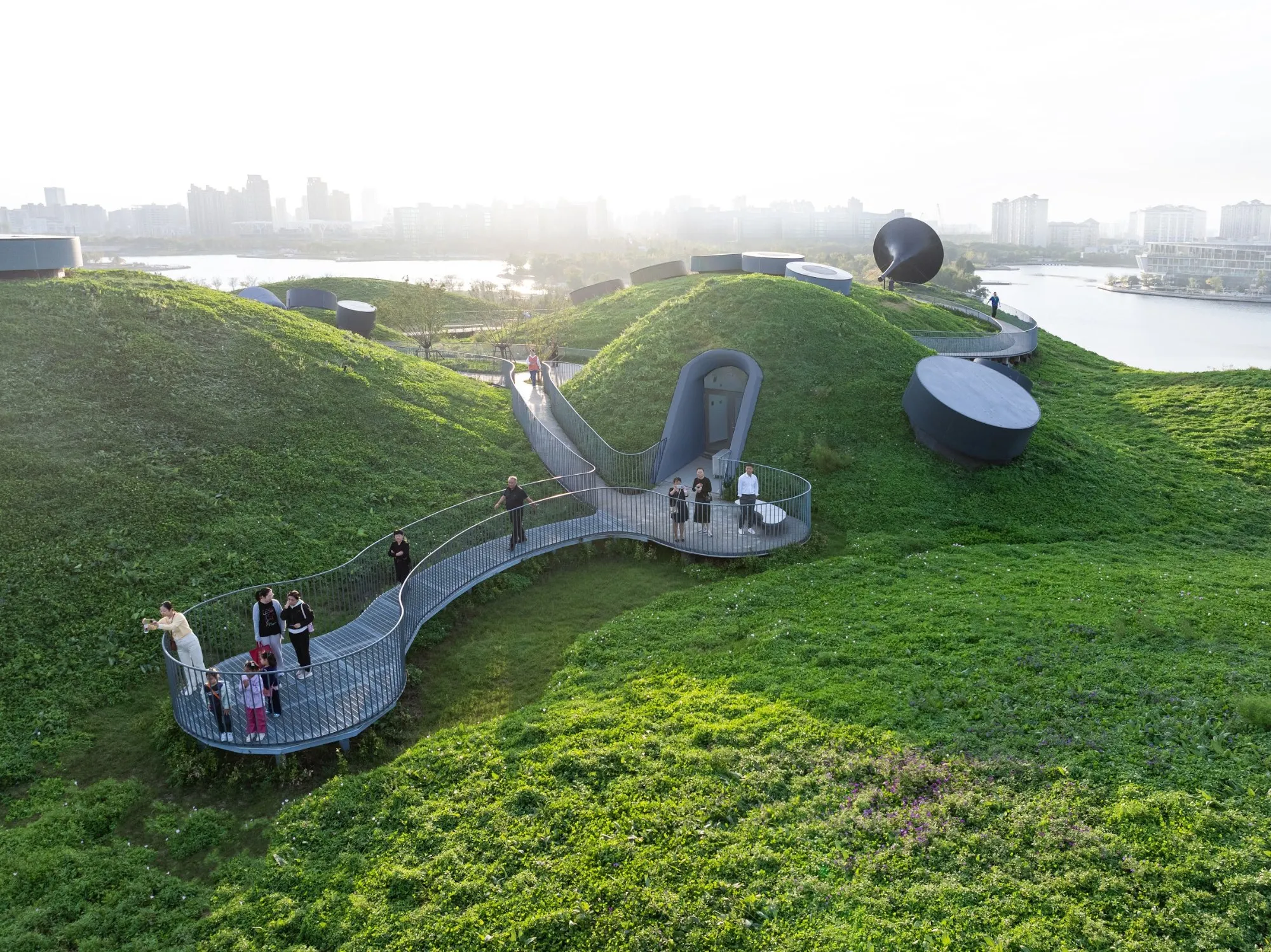
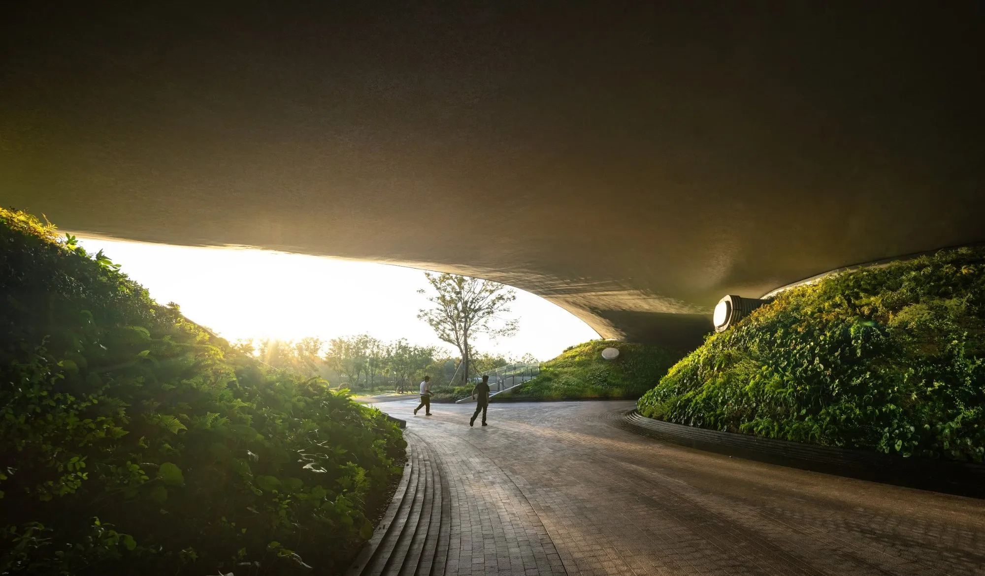
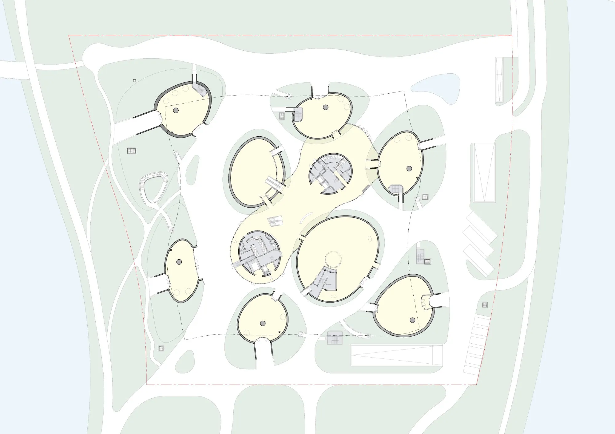
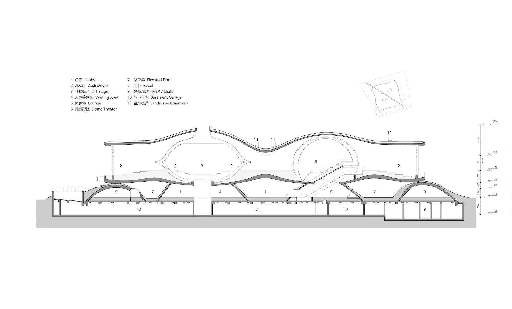
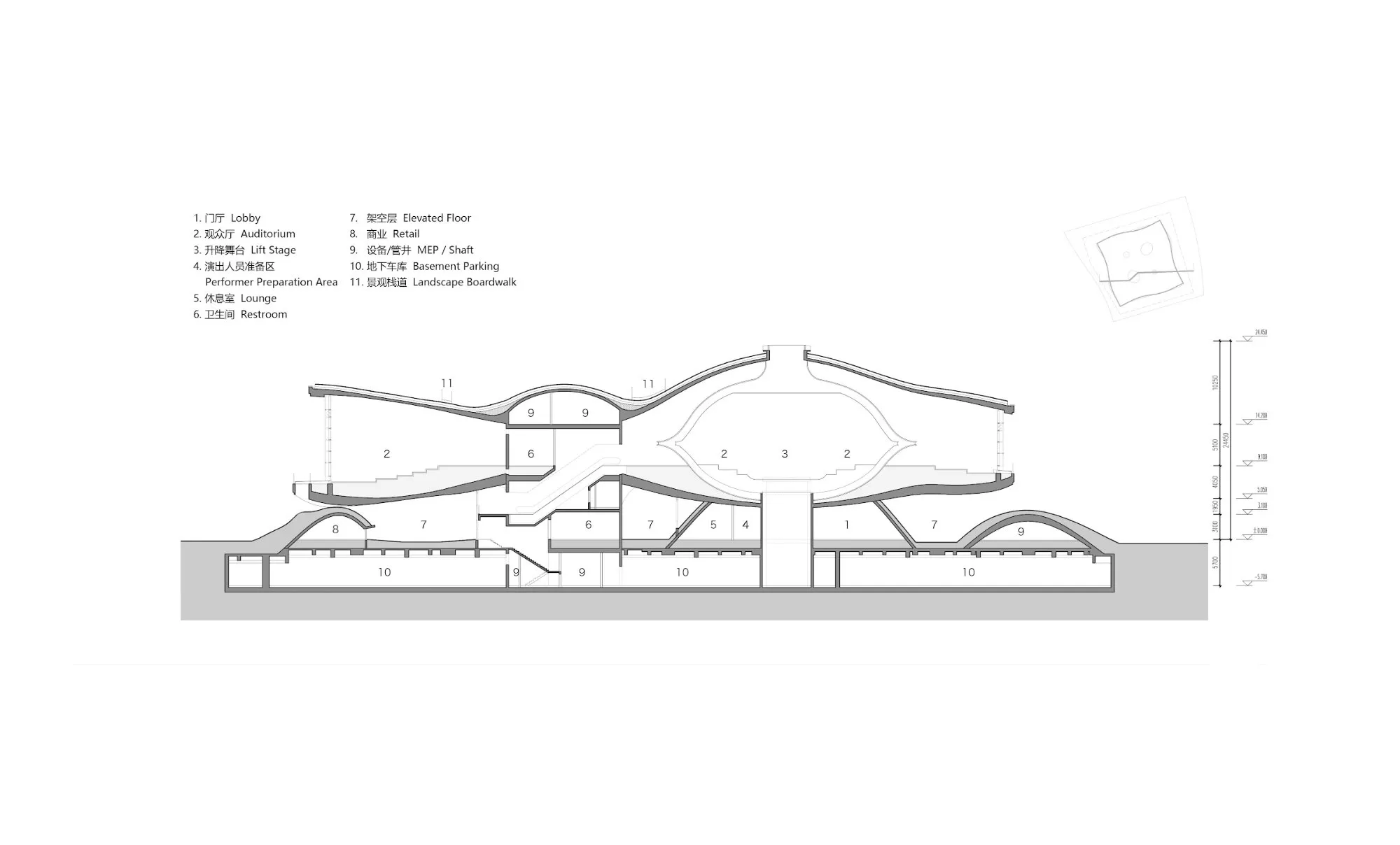
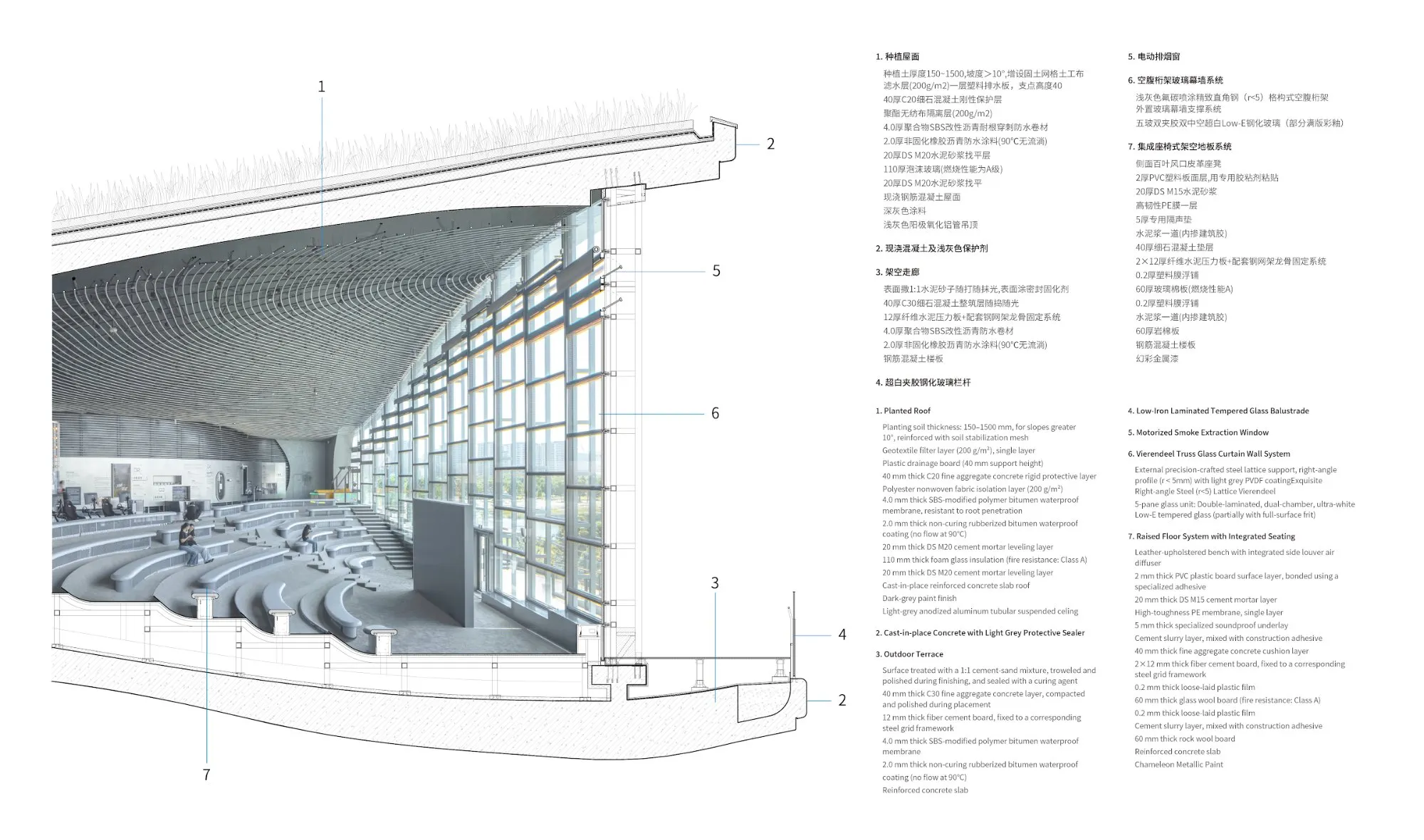
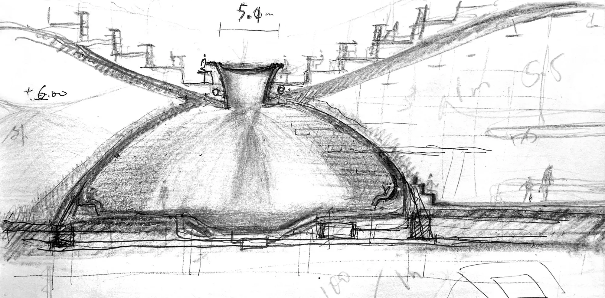
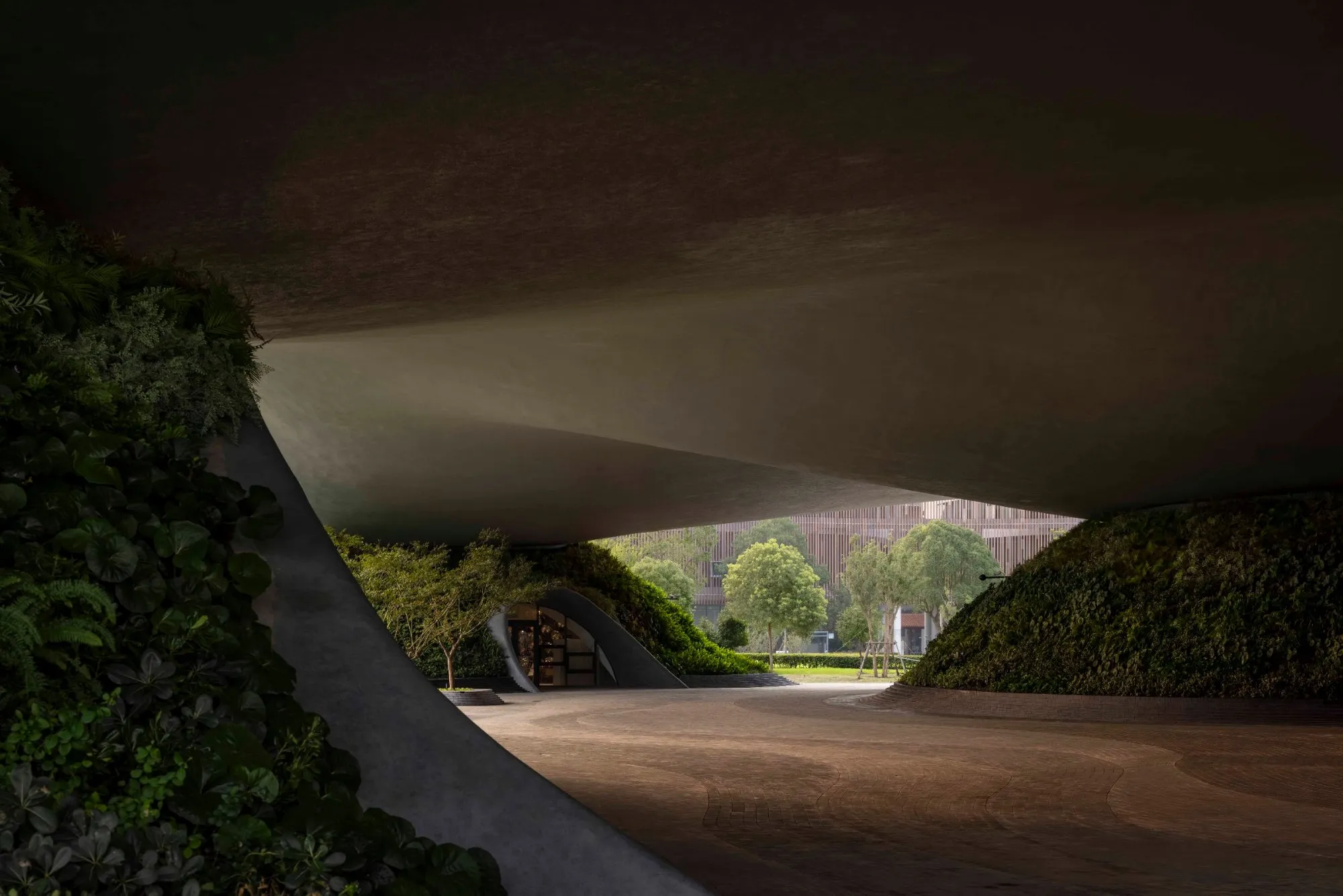
    The result has three parts. Below, eight concrete shells rise from the ground as green hills, holding exhibition rooms, a café, a bar, shops and plant rooms. Six of them and two cores carry the structure above, and the two central hills meet inverted shells hanging from the roof, leaving round openings for escalators and a lift stage. Between the hills, a continuous vaulted void forms an open ground floor: the lakeside path passes beneath, a glass-walled lobby sits at the centre, and paving flows between the hills like a stream.

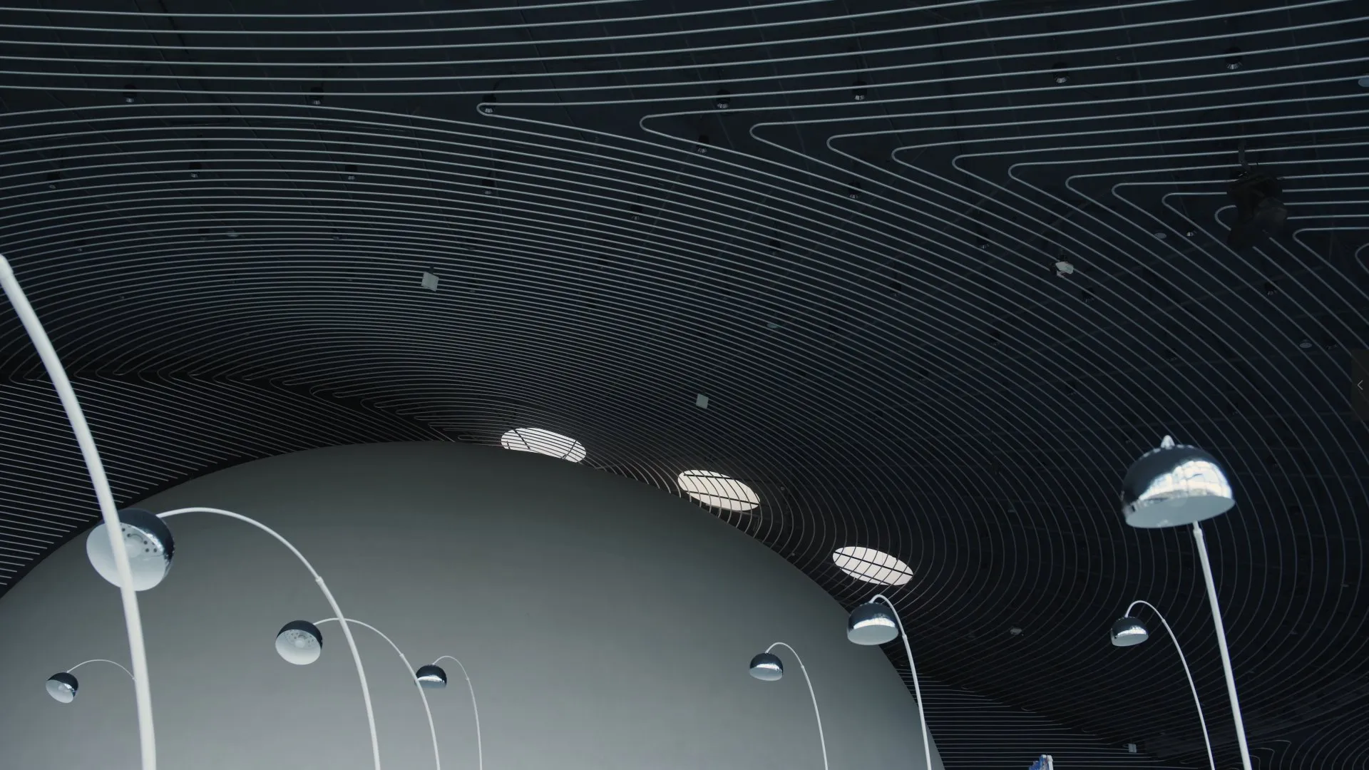
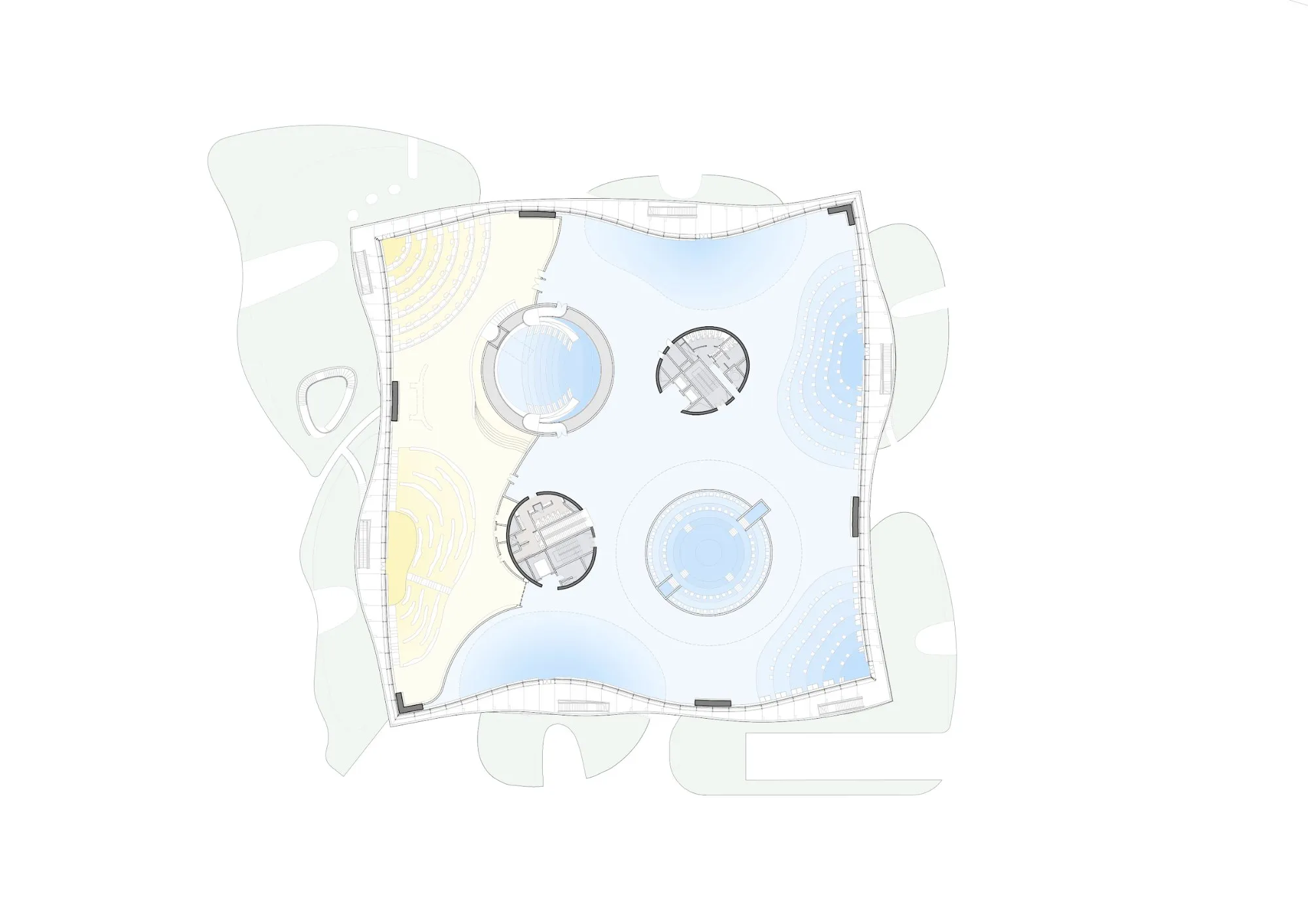
    Above, the wave pavilion is cast as symmetrical upper and lower prestressed shells. Supported at eight points by the two cores and six shear walls, it encloses about 6,400 square metres with clear heights between 4.5 and 12.5 metres, an interior park circled by a level walkway and eight sunken spaces of full, half and quarter circles, each beneath its own dome. Air conditioning runs between the lower shell and a raised floor so the structure overhead stays clear, and a glass wall on exposed trusses wraps the perimeter.

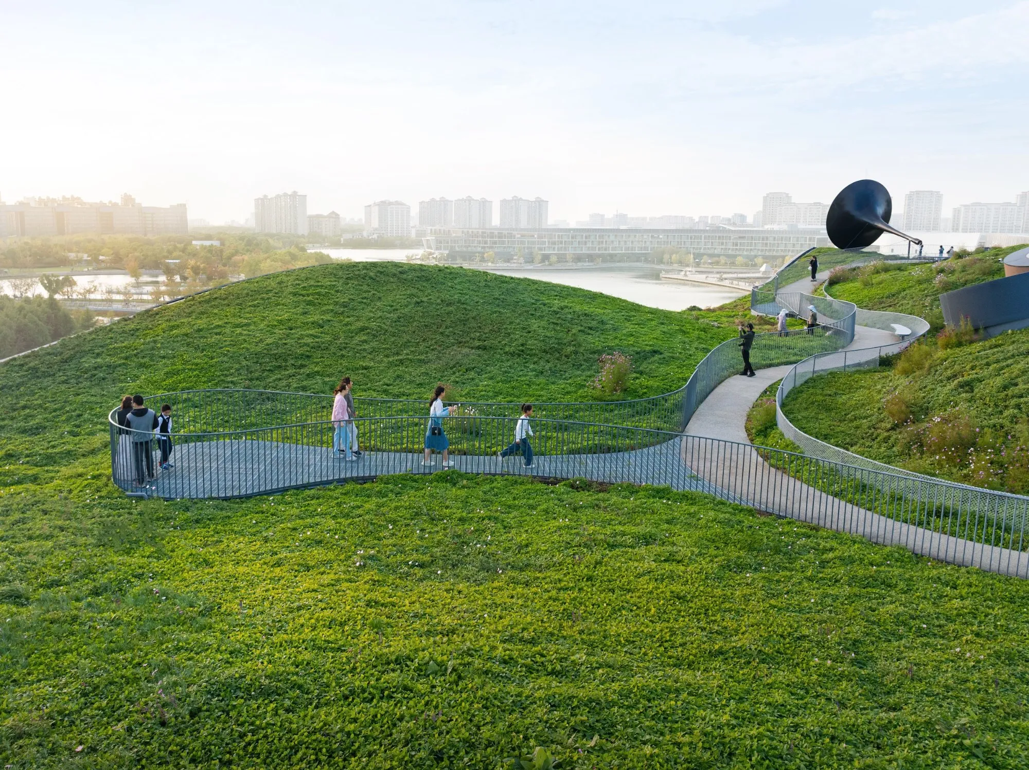
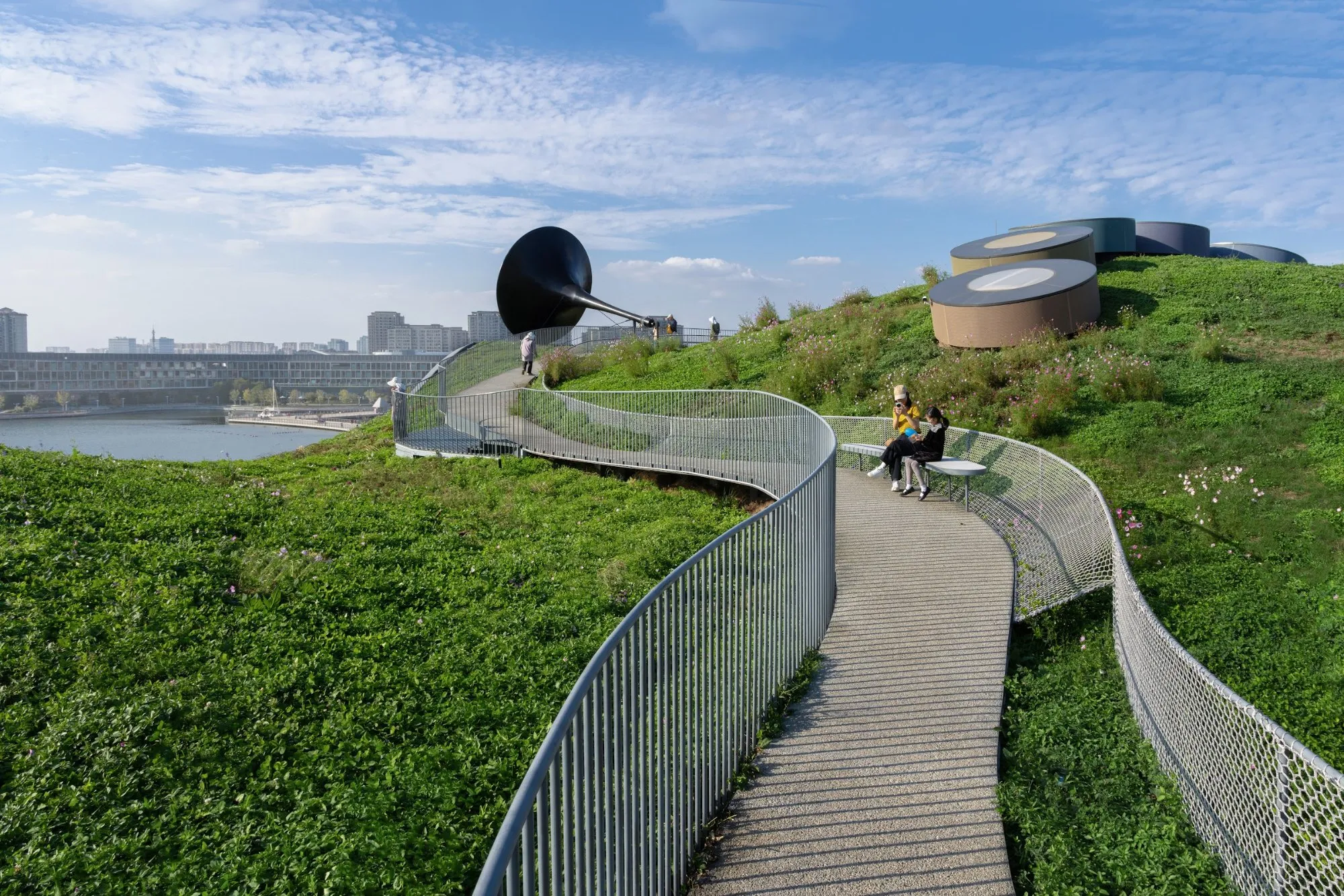
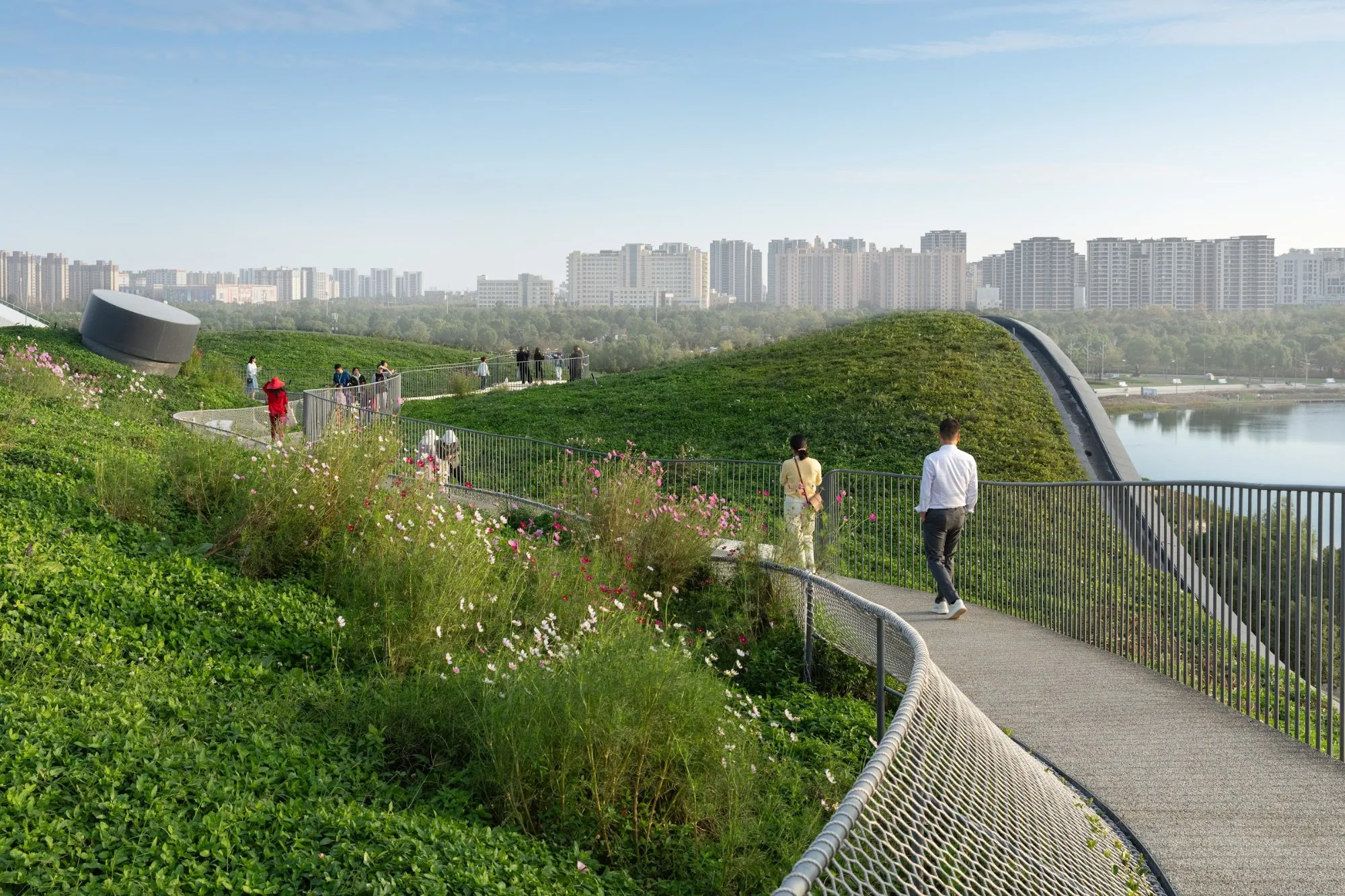
    Building it meant translating mathematical curves into load-bearing concrete. The formwork rested on a dense scaffold grid of 600 by 600 millimetres, tighter in places, and the contractor devised a clamp to hold the shaping pipes on the scaffold axes. Until the pour and prestressing closed the structure, it was as fragile as an eggshell. Concrete is left exposed inside and out with only small differences of finish, and the roof is covered with grass and wildflowers, crossed by a figure-eight path that widens into lookouts over the lake.

    Wave Cube, view 1
    Wave Cube, view 2
    Wave Cube, view 3
    Wave Cube, view 4
    Wave Cube, view 5
    Wave Cube, view 6
    Wave Cube, view 7
    Wave Cube, view 8
    Wave Cube, view 9
    Wave Cube, view 10
    Wave Cube, view 11
    Wave Cube, view 12
    Wave Cube, view 13
    Wave Cube, view 14
    Wave Cube, view 15
    Wave Cube, view 16
    Wave Cube, view 17
    Wave Cube, view 18
    Wave Cube, view 19
    Wave Cube, view 20
    Wave Cube, view 21
    Wave Cube, view 22
    Wave Cube, view 23
    Wave Cube, view 24
    Wave Cube, view 25
    Wave Cube, view 26
    Wave Cube, view 27
    Wave Cube, view 28
    Wave Cube, view 29
    Wave Cube, view 30
    Wave Cube, view 31
    Wave Cube, view 32
    Wave Cube, view 33
    Wave Cube, view 34
    Wave Cube, view 35
    Wave Cube, view 36
    Wave Cube, view 37
    Wave Cube, view 38
    Wave Cube, view 39
    Wave Cube, view 40
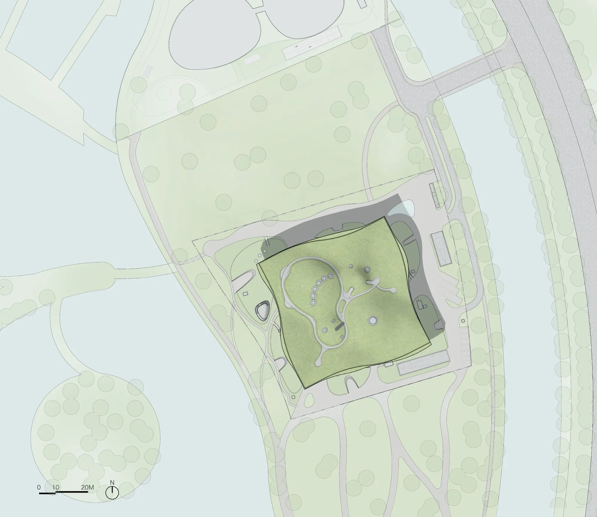
    Master plan
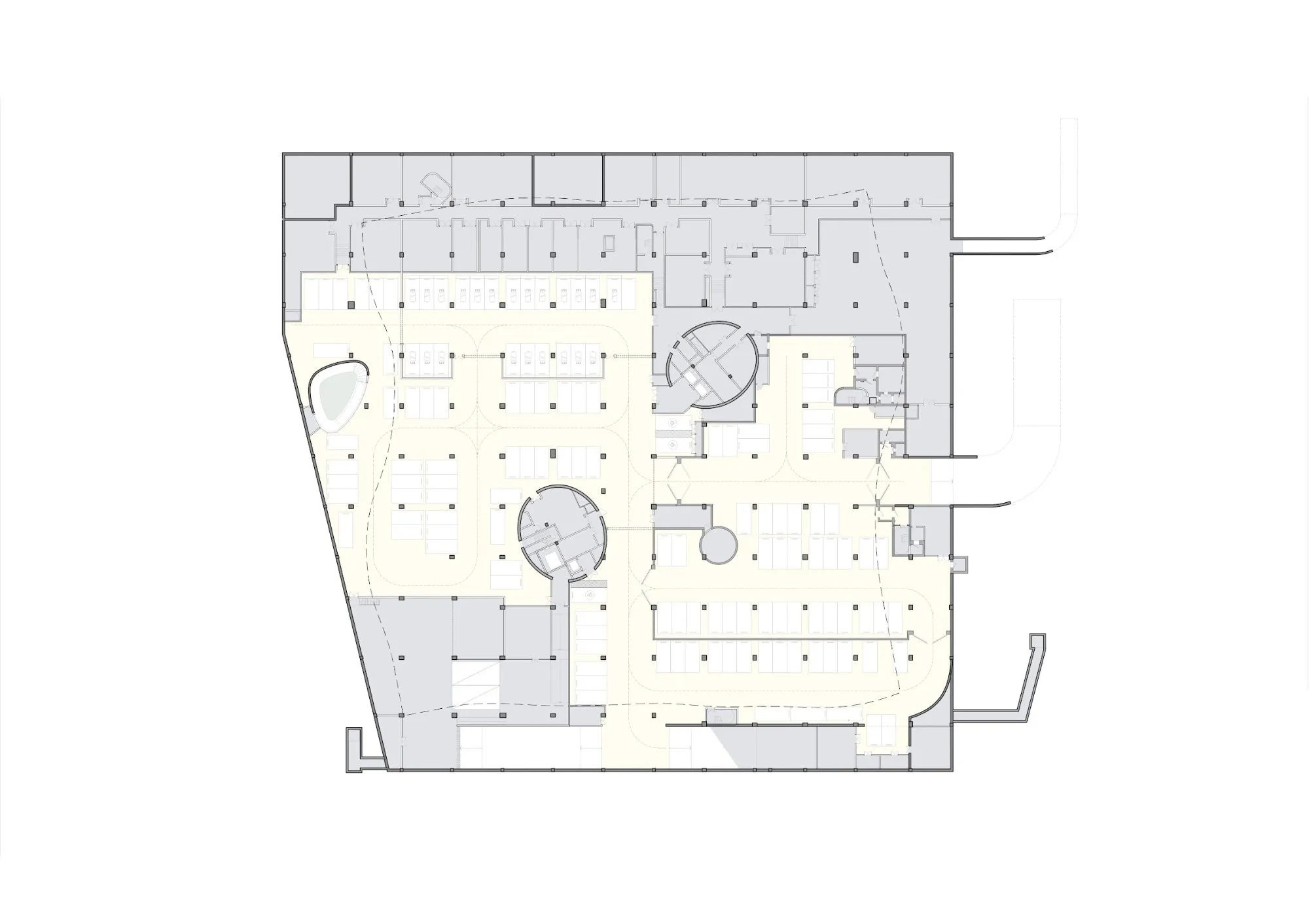
    Basement floor plan
    Ground floor plan
    Second floor plan
    Section
    Section
    Sectional perspective detail
    Diagram of the triple-layered wave surfaces
    Design sketch
    Sketch of the green hills and the wave pavilion
  • House with a White Column

    House with a White Column

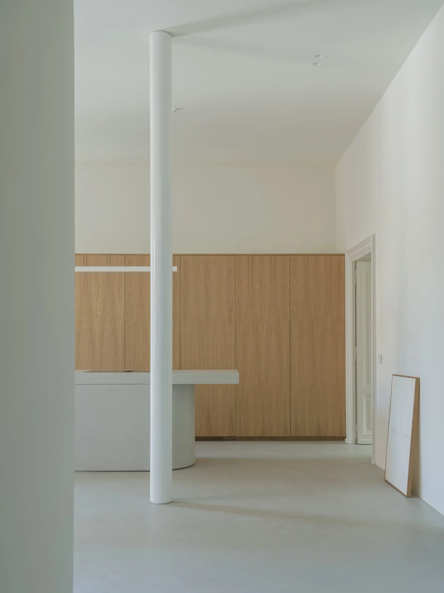
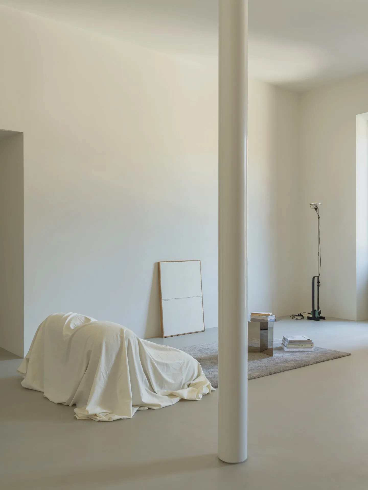
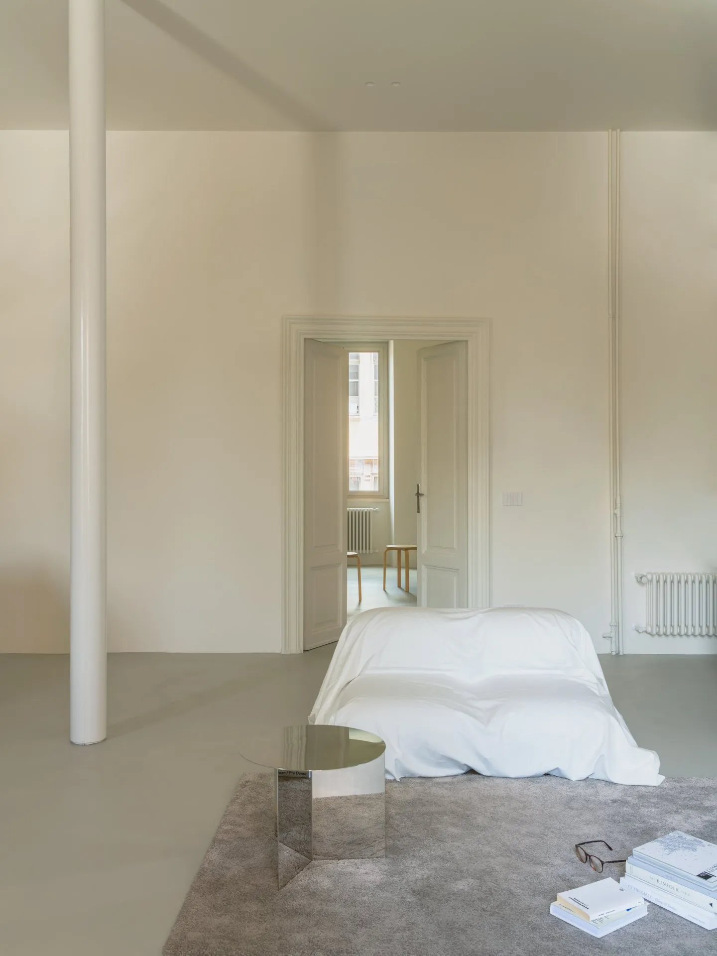
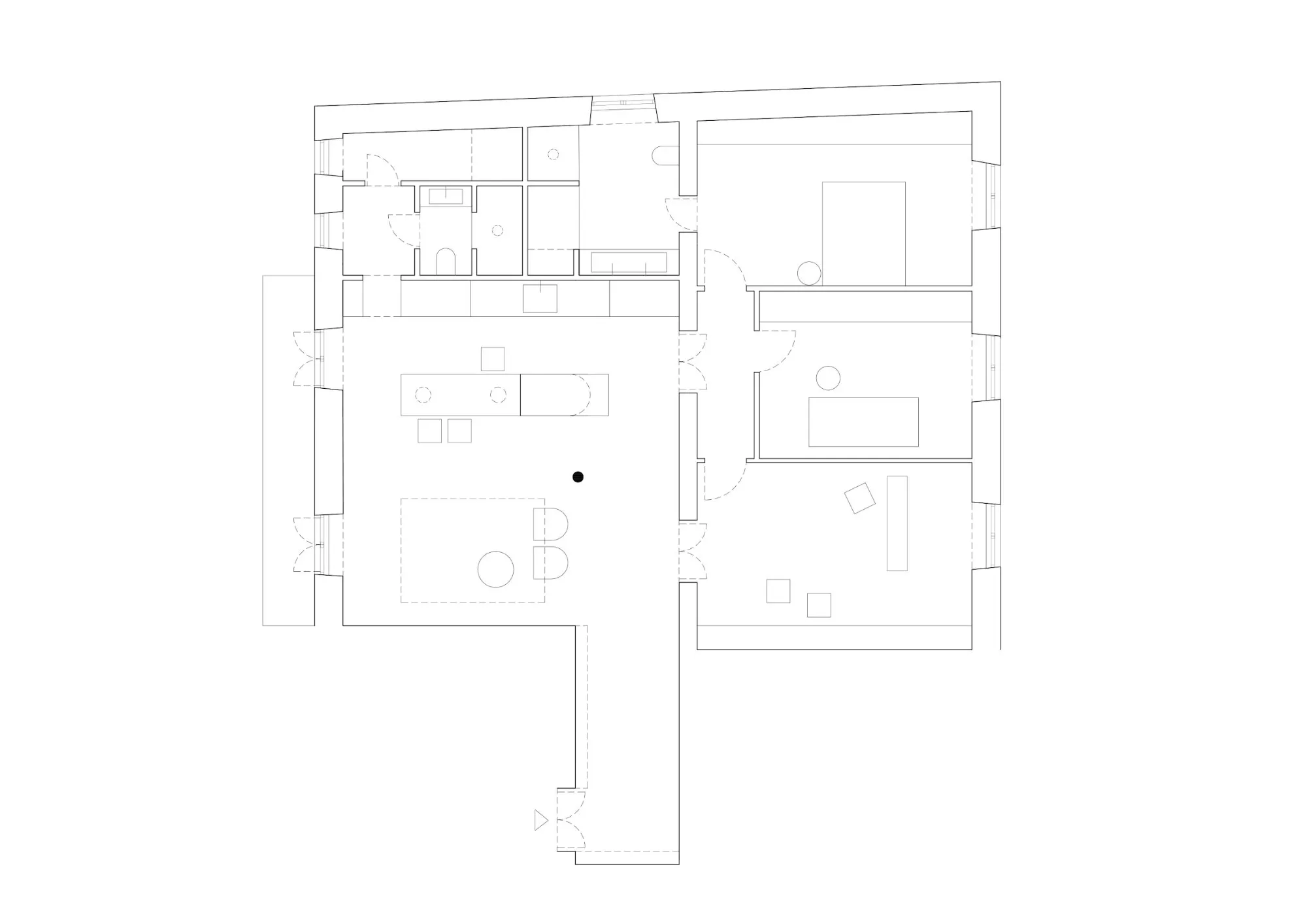
    The apartment is a city pied-à-terre for a family of international clients, a short walk from a major basilica. The brief asked for a calm, essential and flexible home that could serve the owners’ daily life and also be let for short stays.

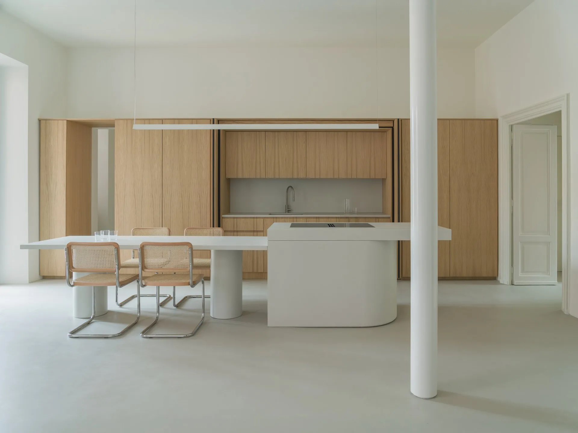
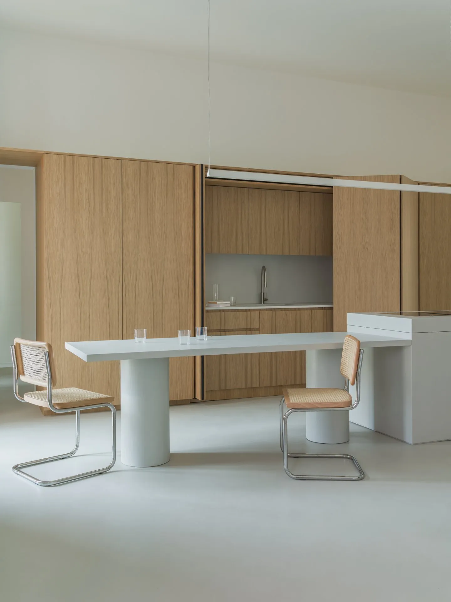
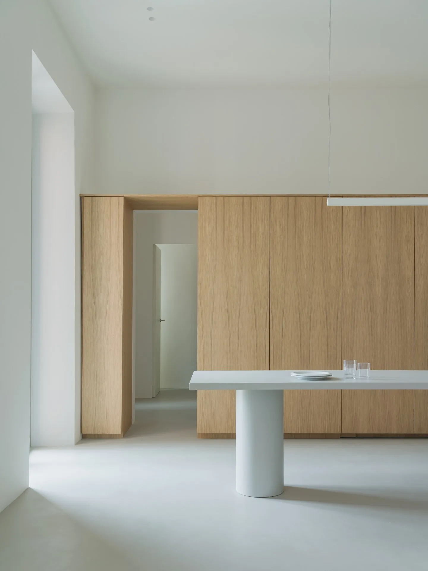
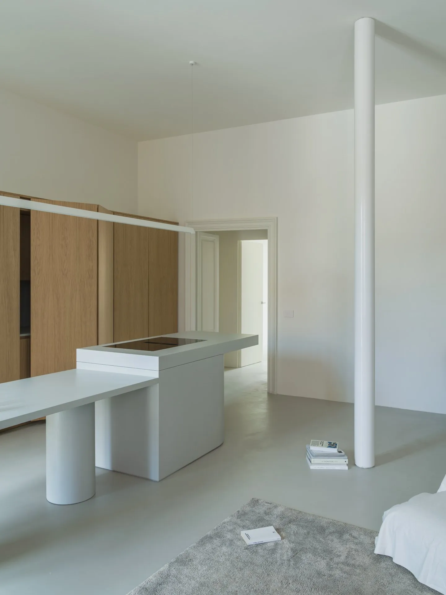
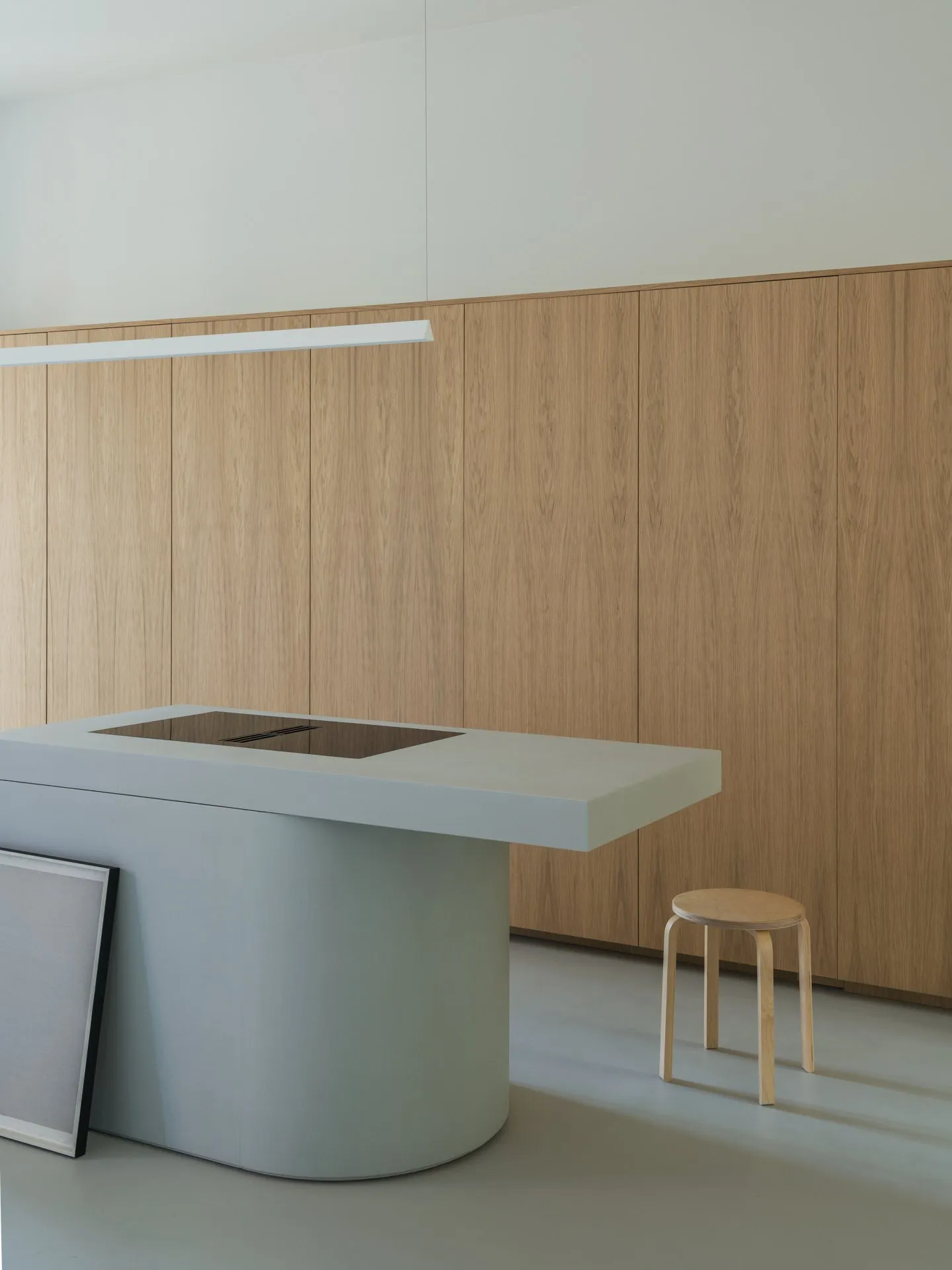
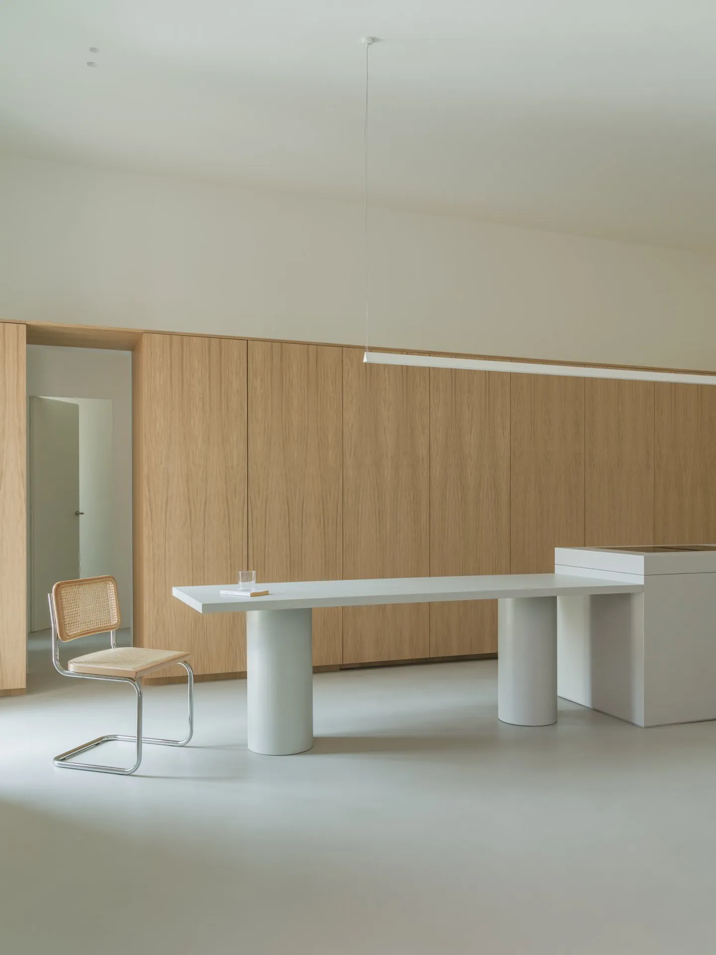
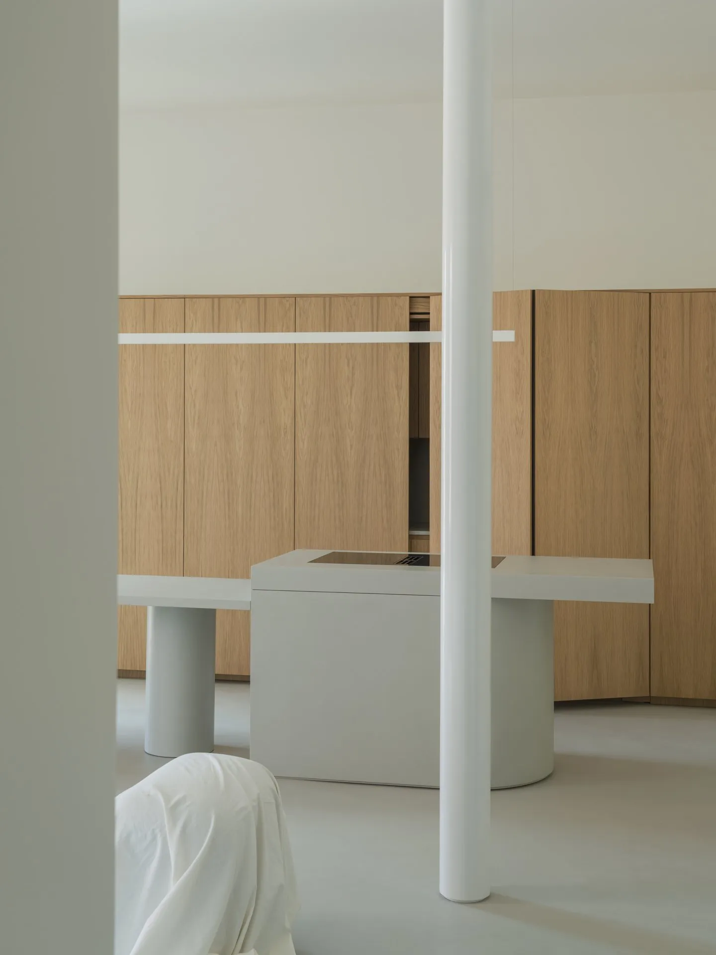
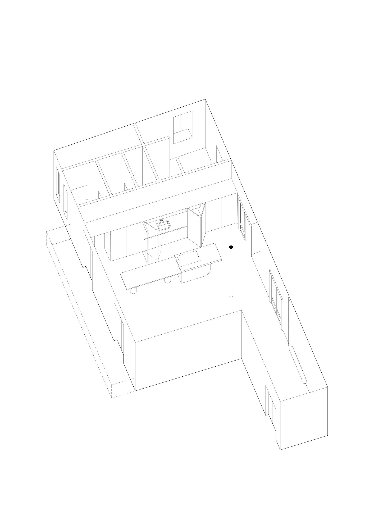
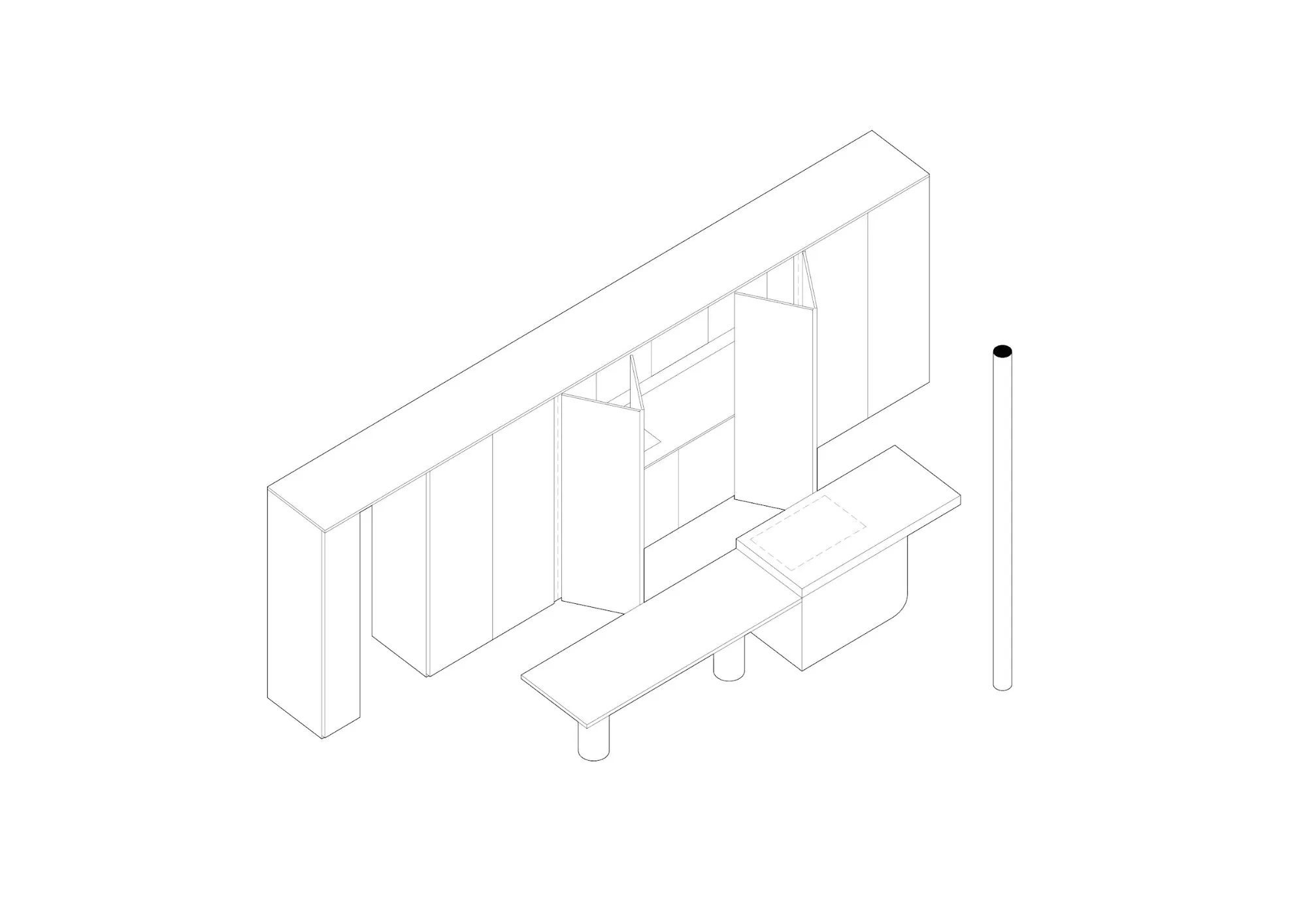
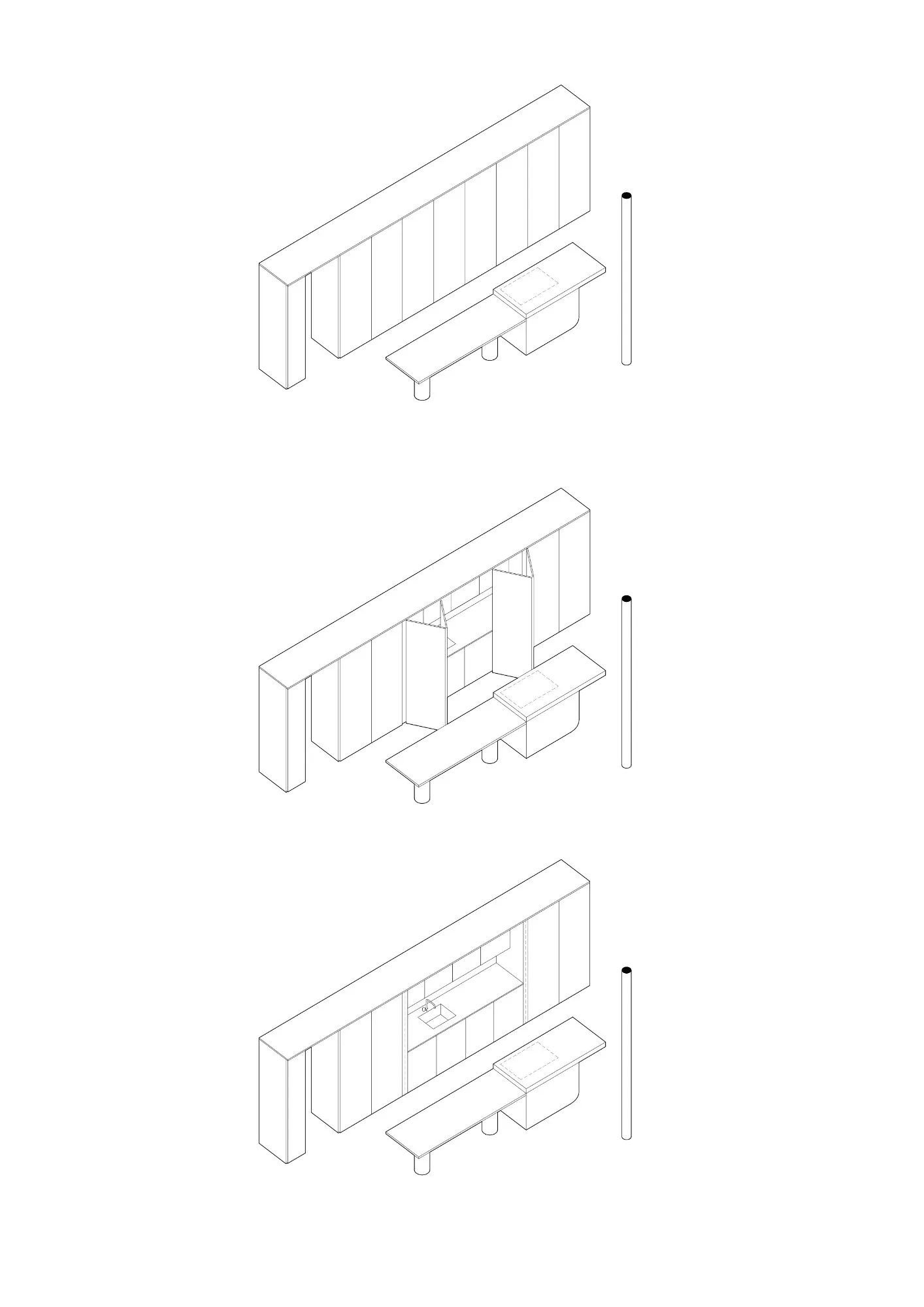
    The plan is organised around its fixed elements, the kitchen and the service core, leaving the remaining rooms open and adaptable. Made to measure in natural oak, the kitchen runs through the whole apartment as a permeable piece of domestic infrastructure and gives access to the service areas. Concealed doors close it off completely when not in use, so it recedes into the room.

    At the centre of the living area, a monolithic microcement island with an integrated table becomes the focus of daily life and the main place to gather.

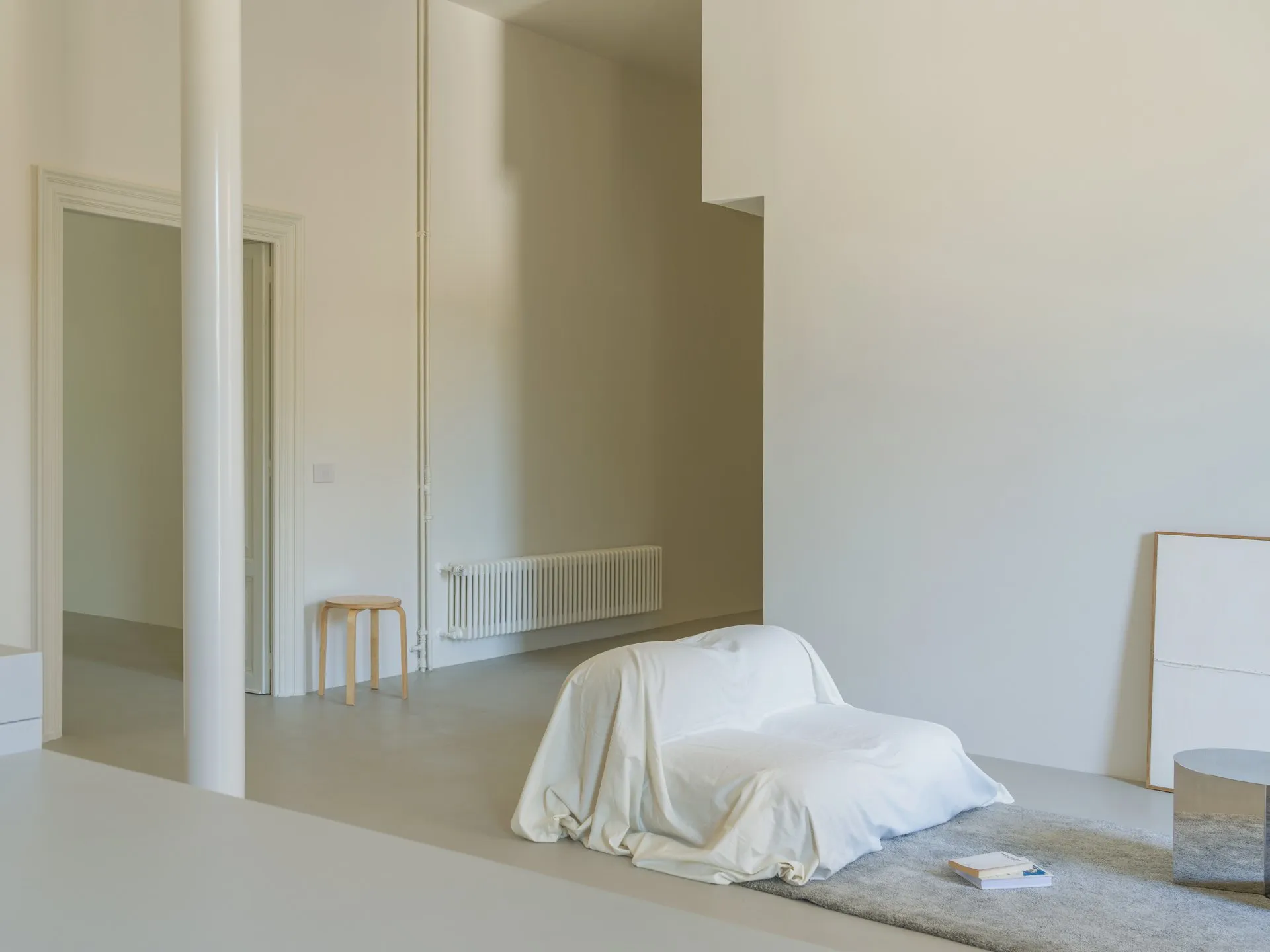
    During demolition, a column carrying the heating system was uncovered. Rather than hide it, the design team made it the project’s defining element: the whole layout is arranged around this white column, the visual and compositional anchor of the home.

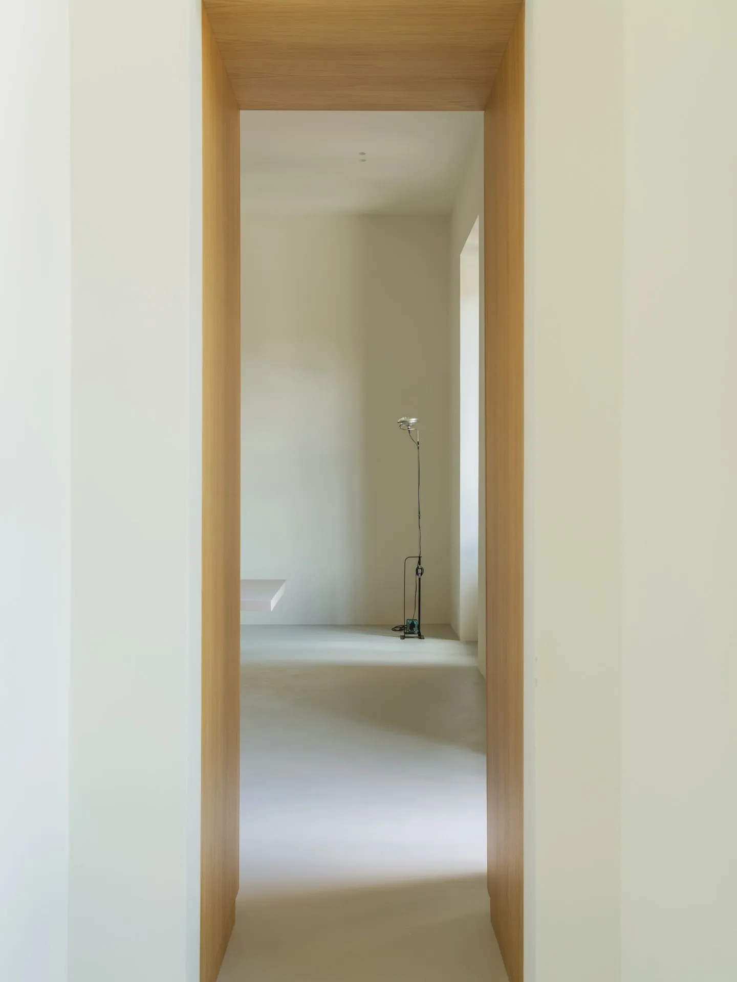
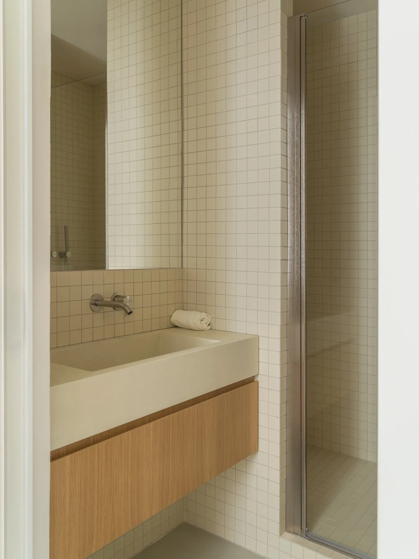
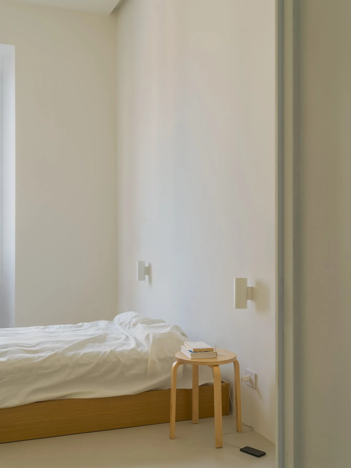
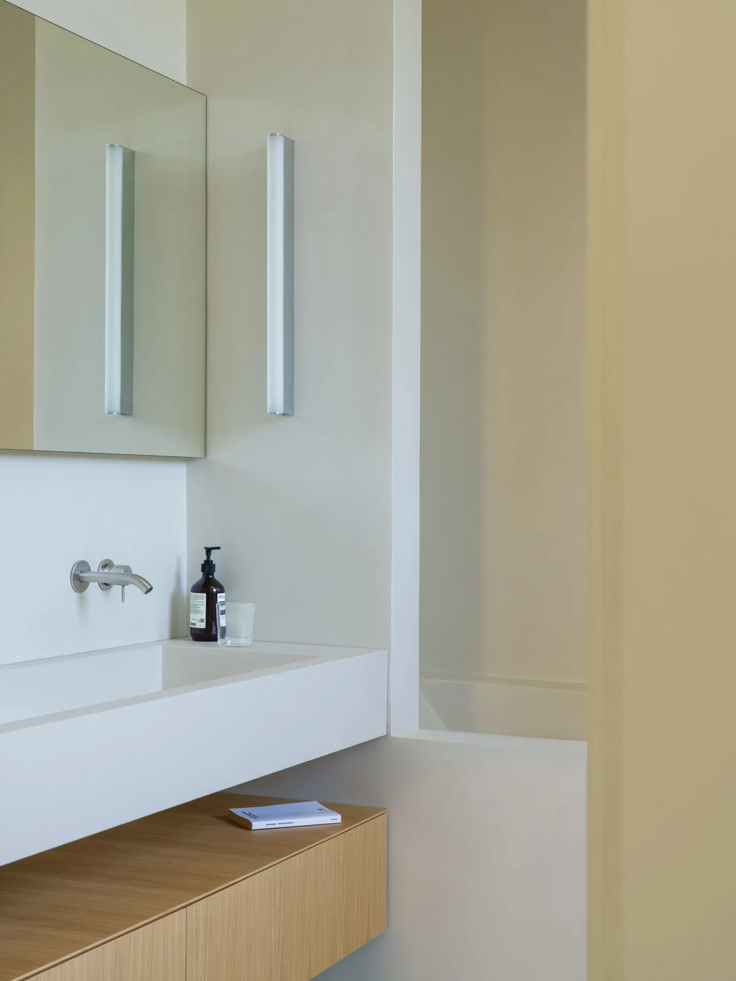
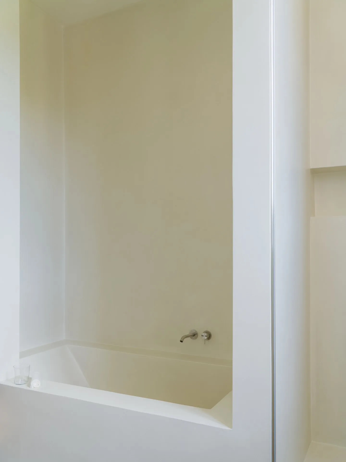
    The palette is kept to a few materials: a continuous microcement floor, natural oak for the built-in furniture, and white walls and ceilings throughout. The restraint makes the space read larger and gives the rooms a calm, luminous atmosphere.

    House with a White Column, view 1
    House with a White Column, view 2
    House with a White Column, view 3
    House with a White Column, view 4
    House with a White Column, view 5
    House with a White Column, view 6
    House with a White Column, view 7
    House with a White Column, view 8
    House with a White Column, view 9
    House with a White Column, view 10
    House with a White Column, view 11
    House with a White Column, view 12
    House with a White Column, view 13
    House with a White Column, view 14
    House with a White Column, view 15
    House with a White Column, view 16
    Plan
    Axonometric drawing
    Axonometric drawing
    Axonometric drawing
  • Limbo Engawa

    Limbo Engawa

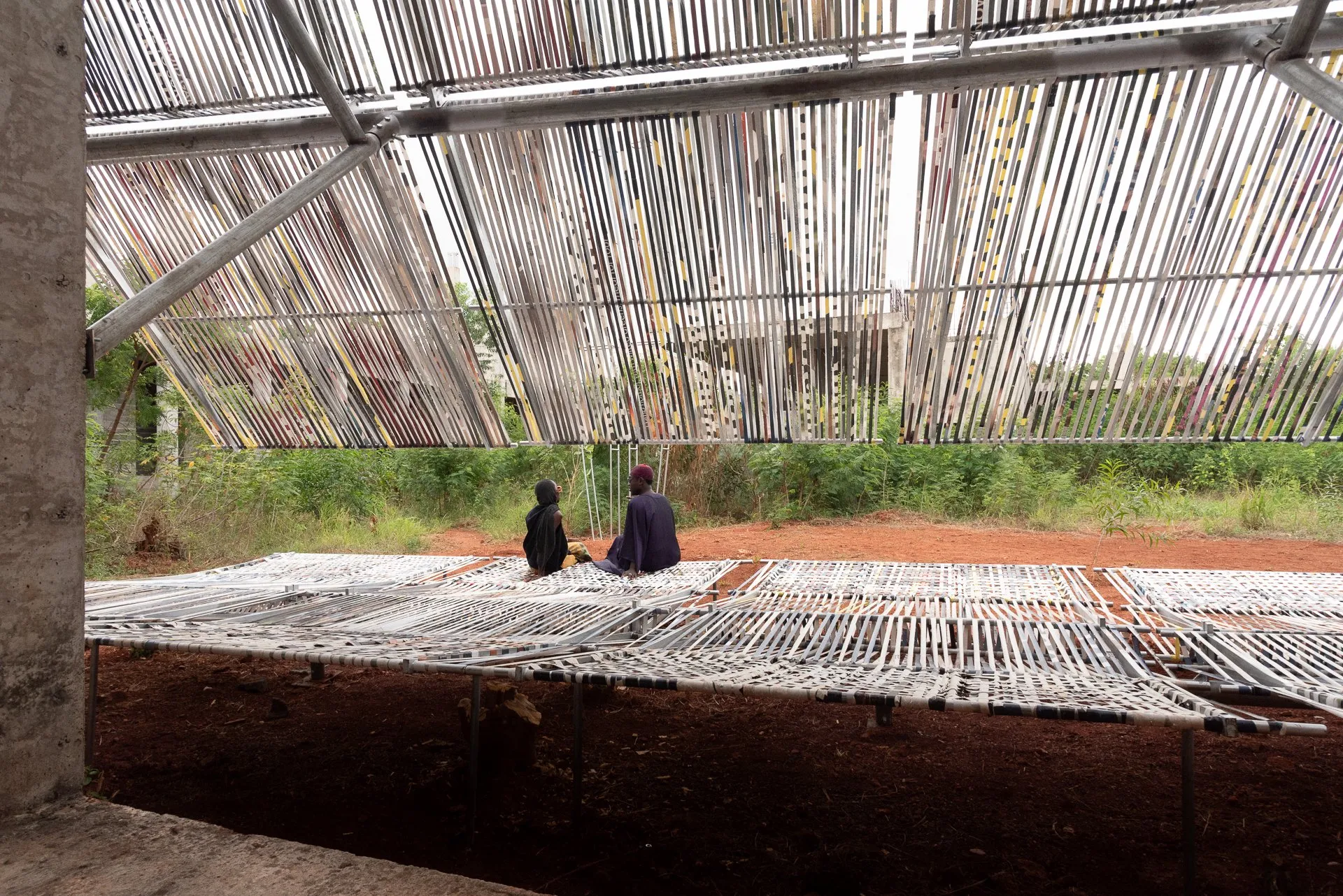
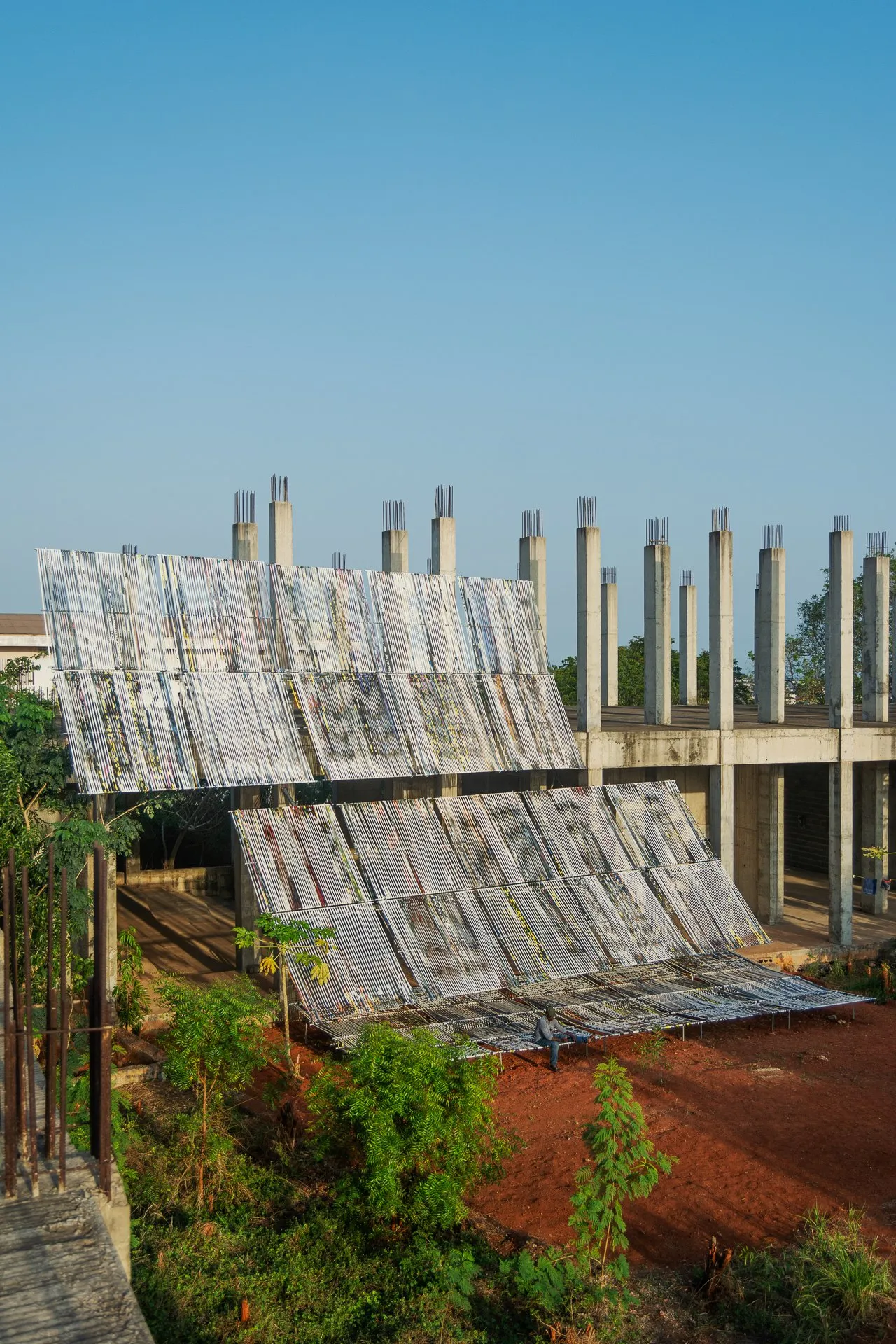
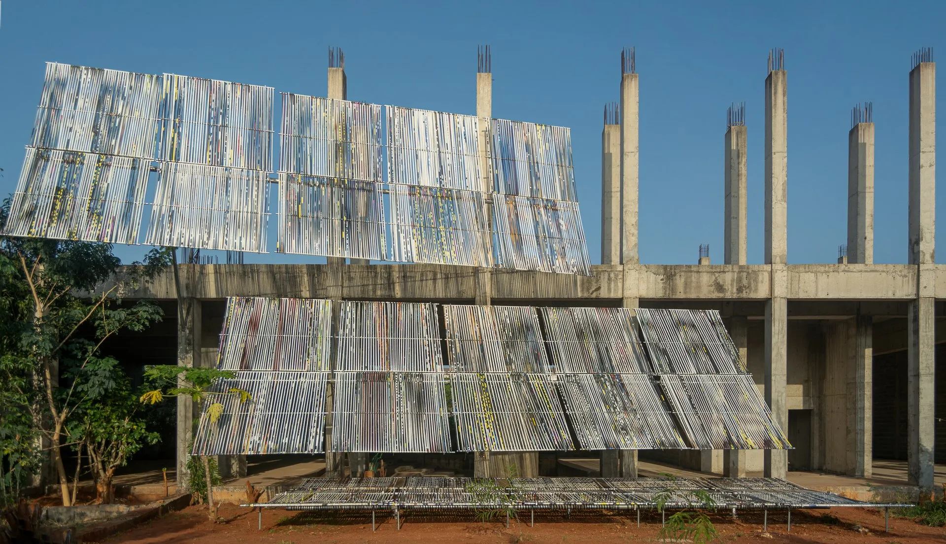
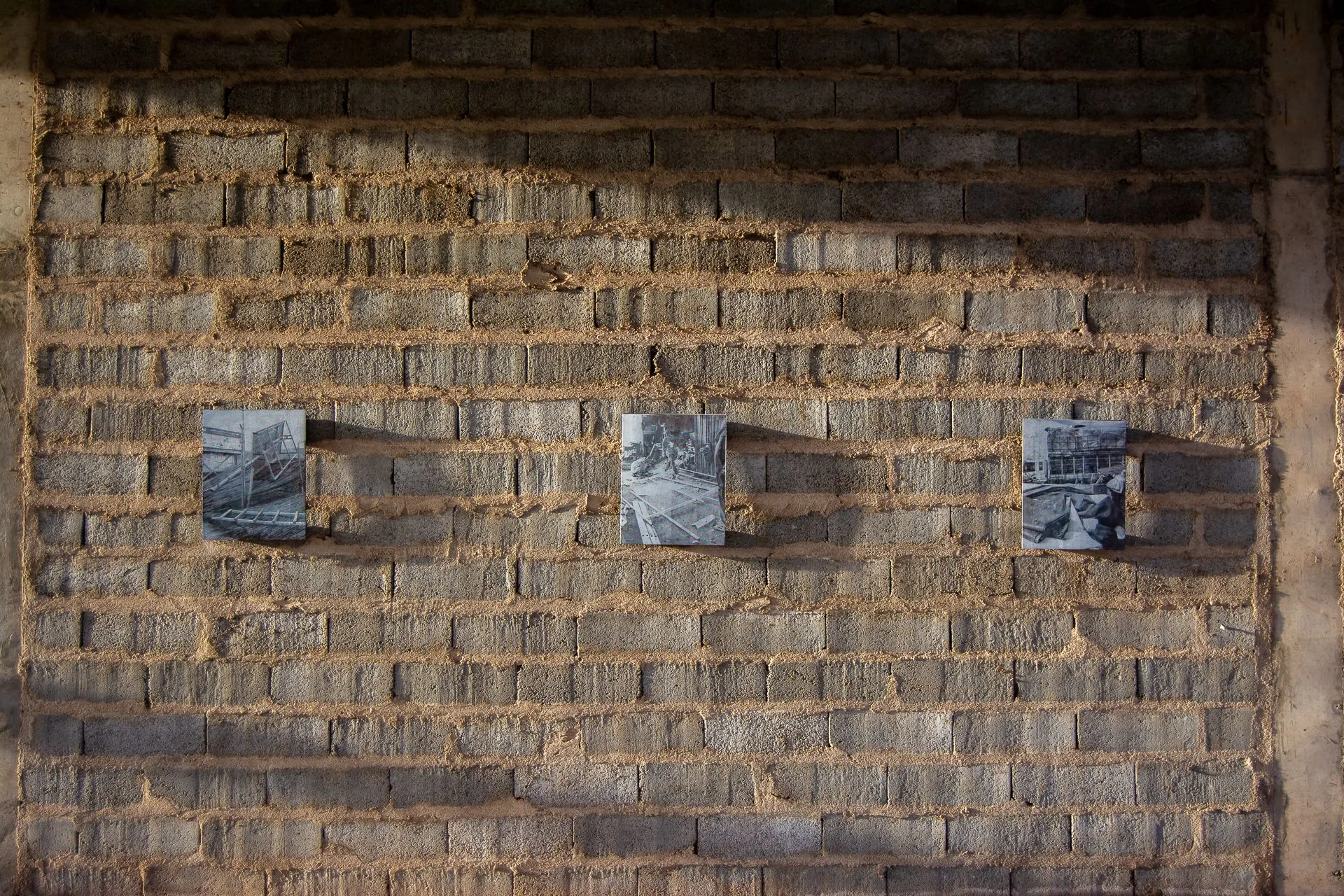
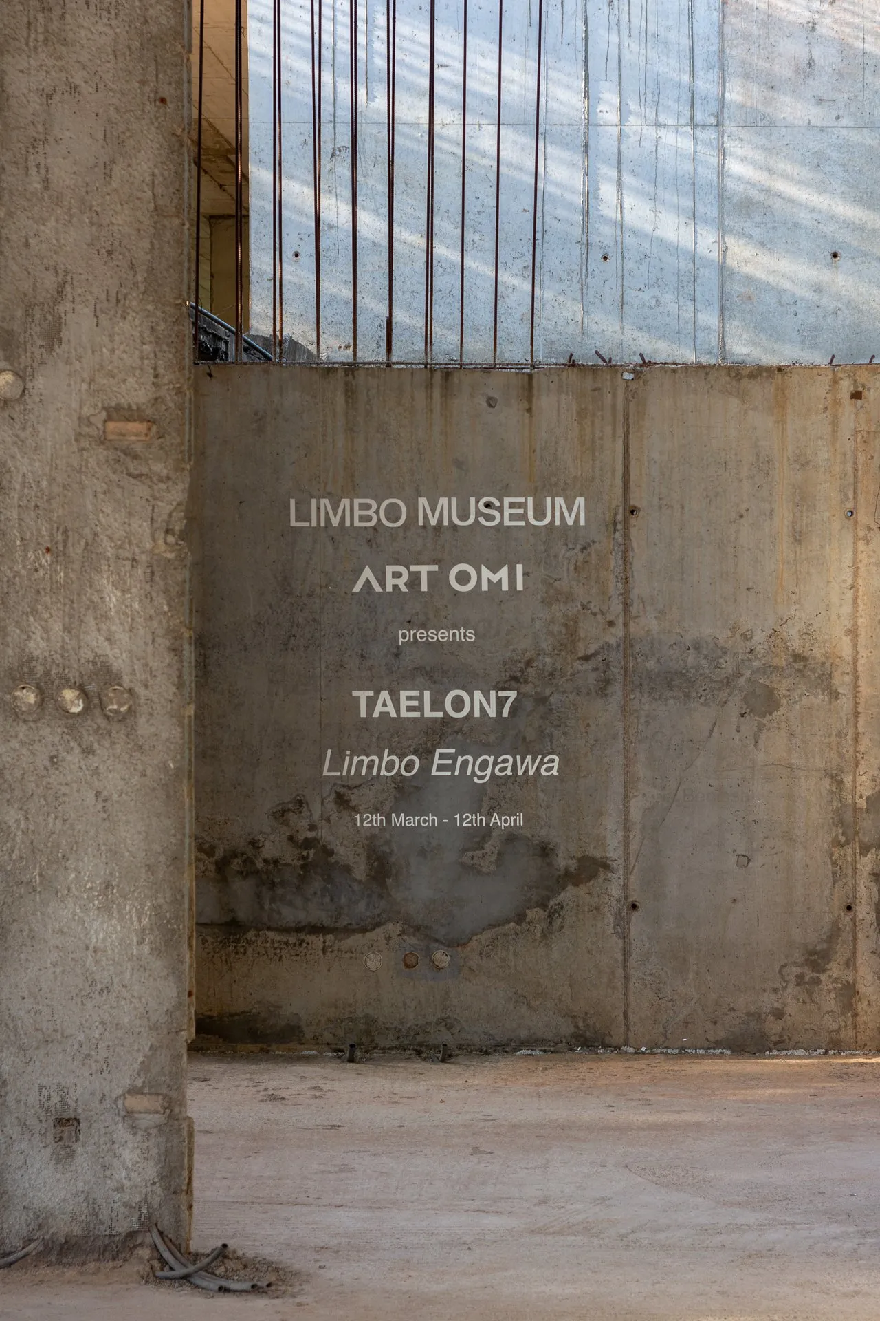
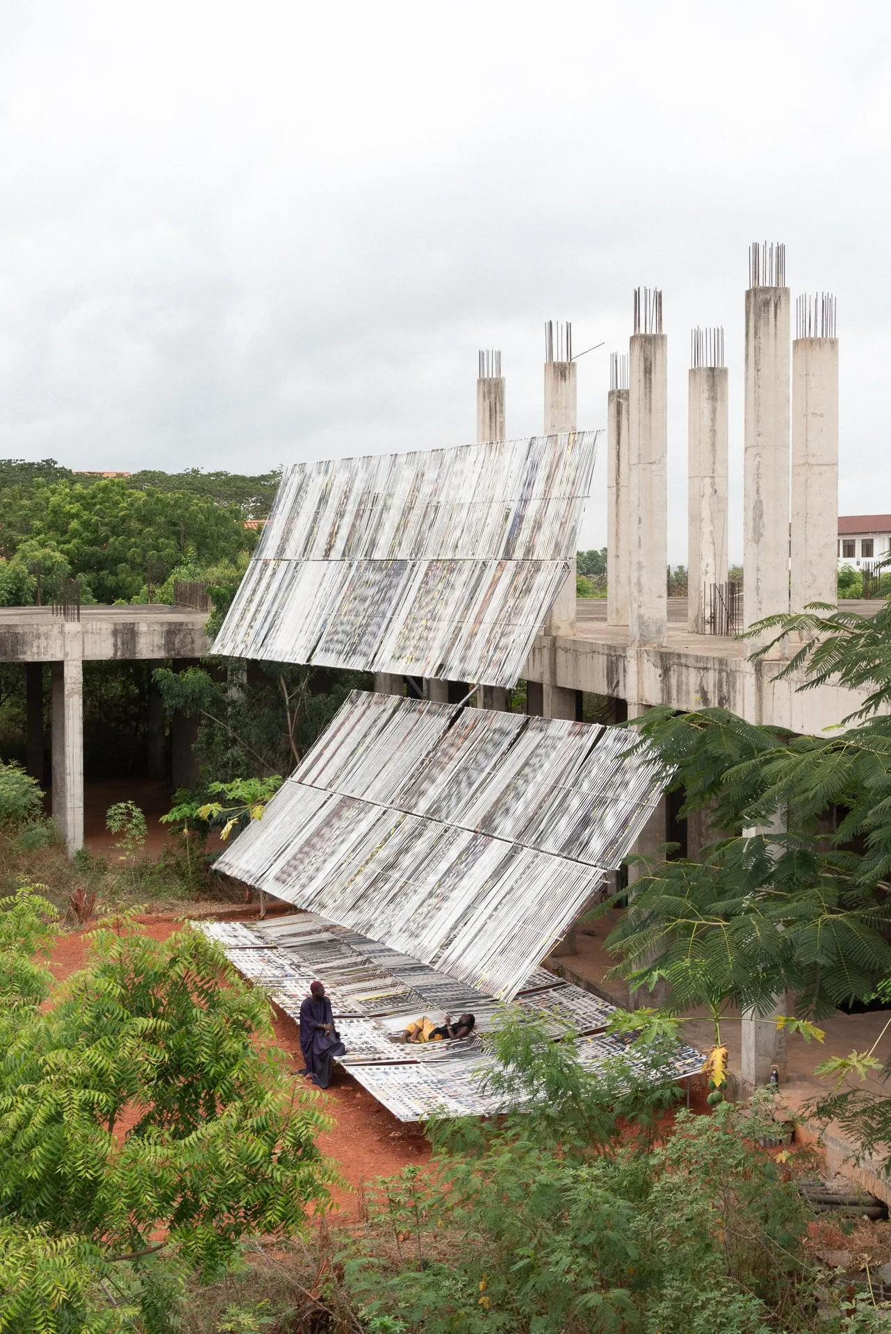
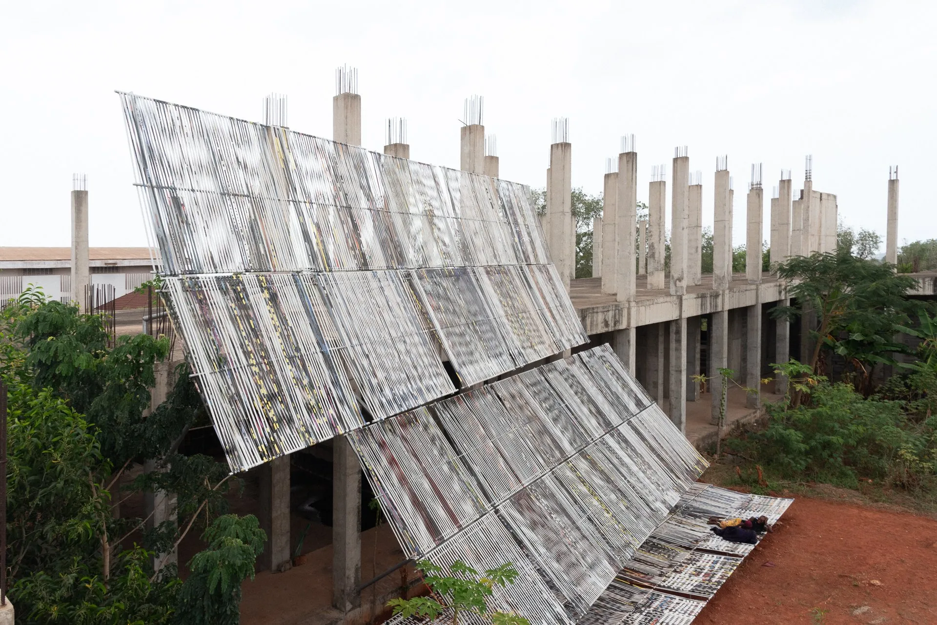
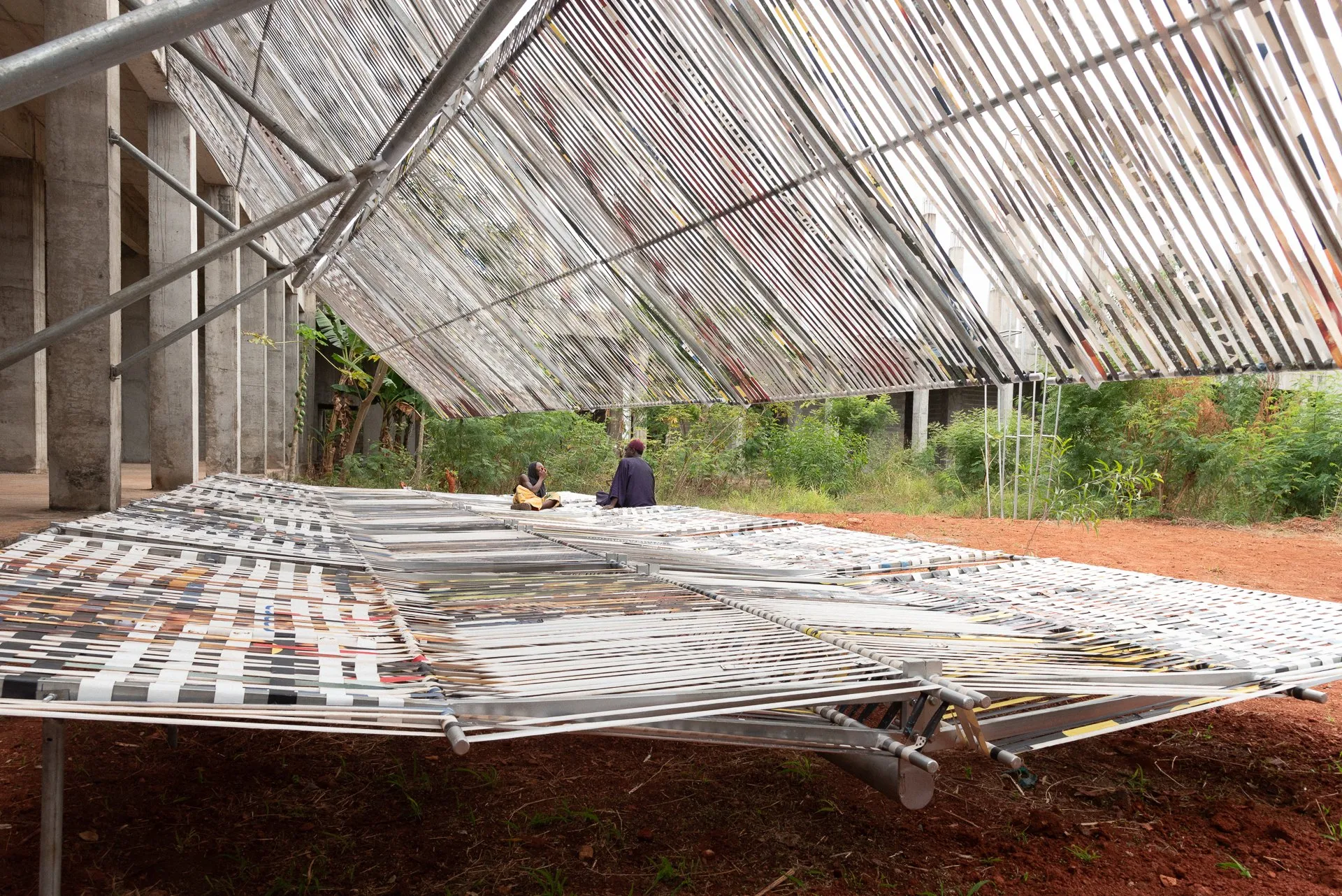
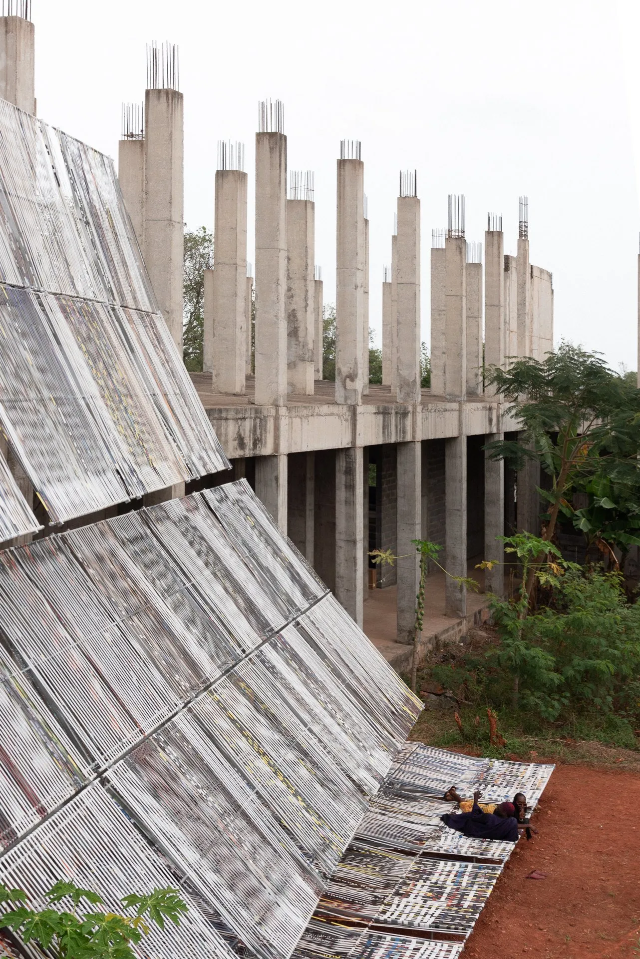
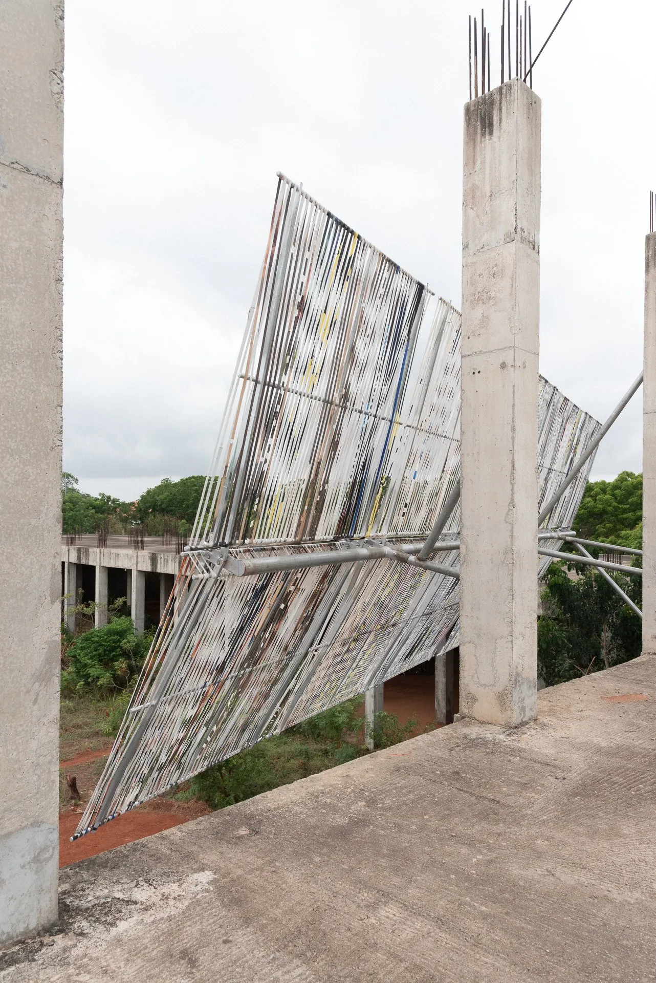
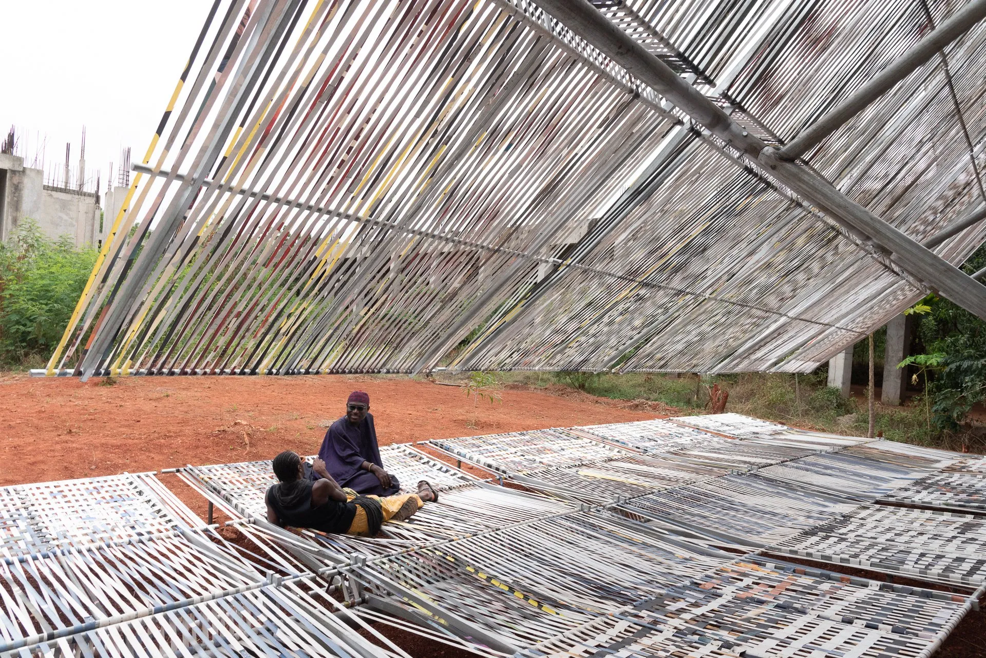
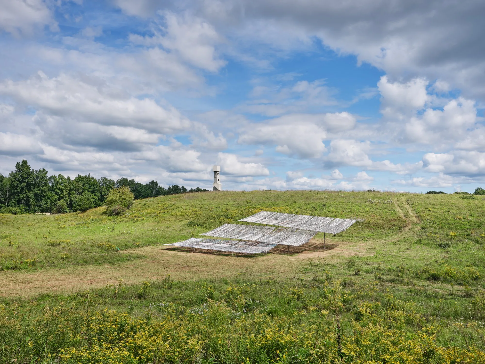
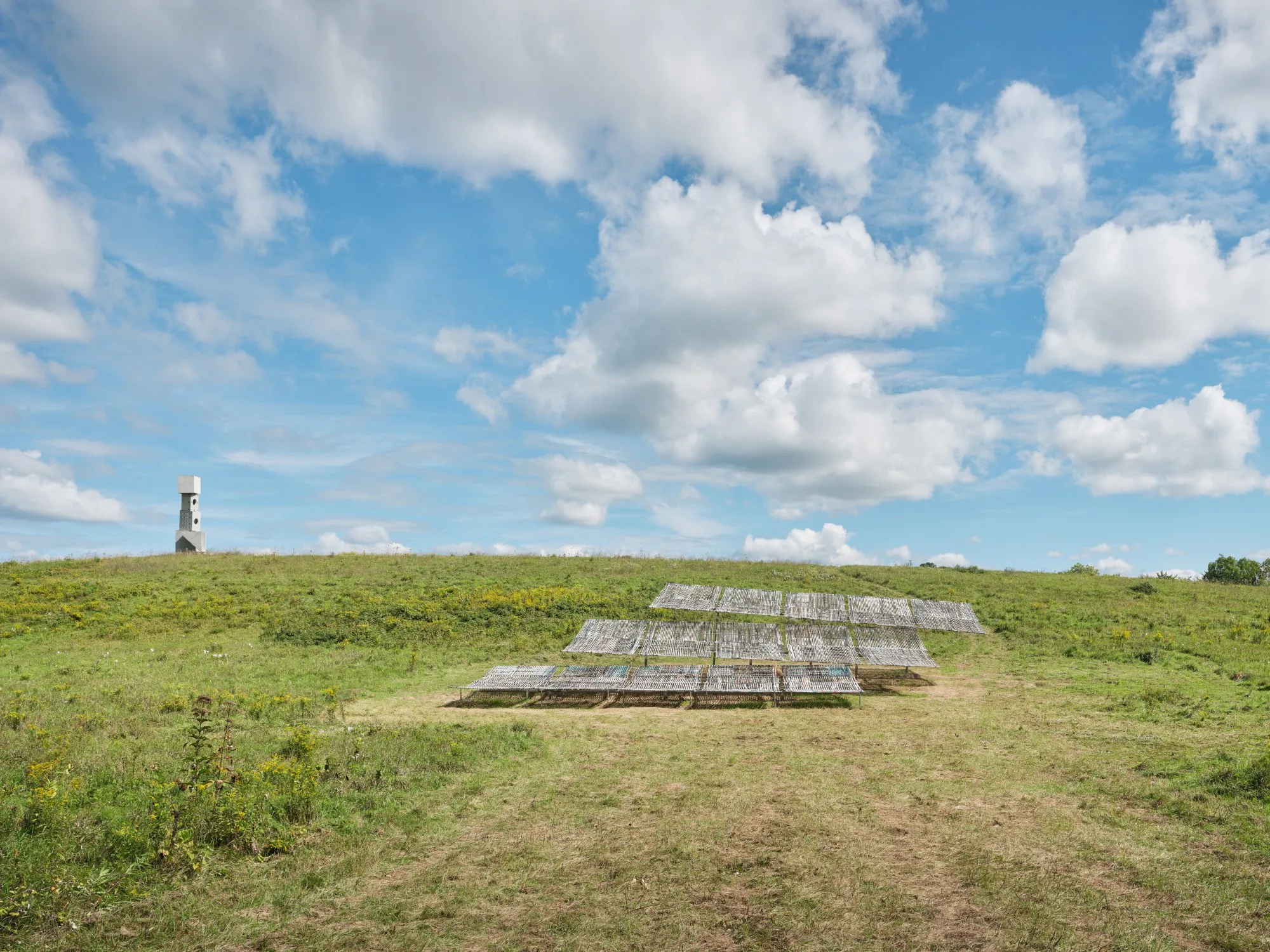
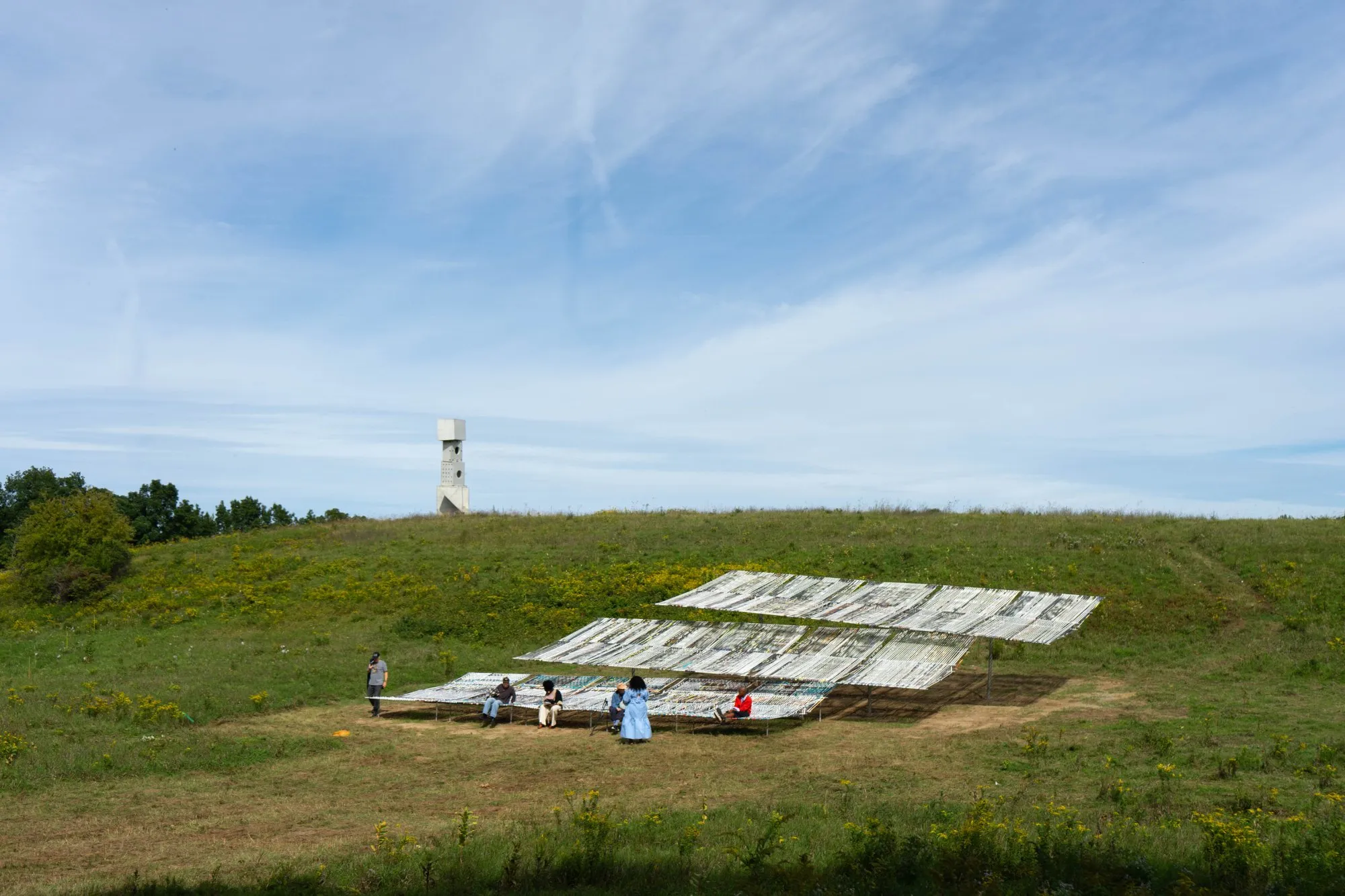
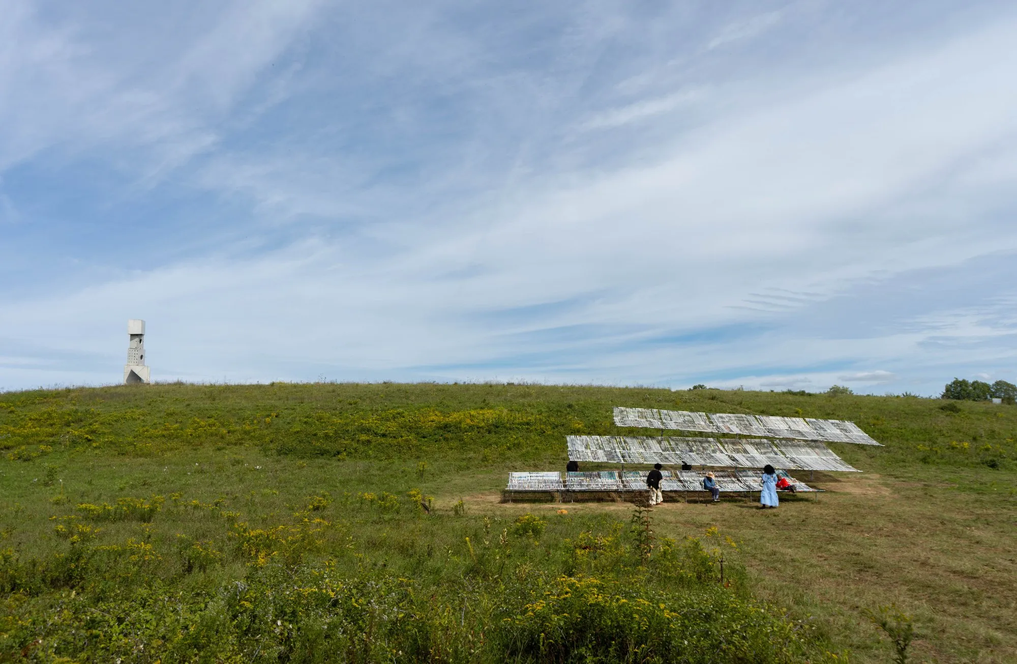
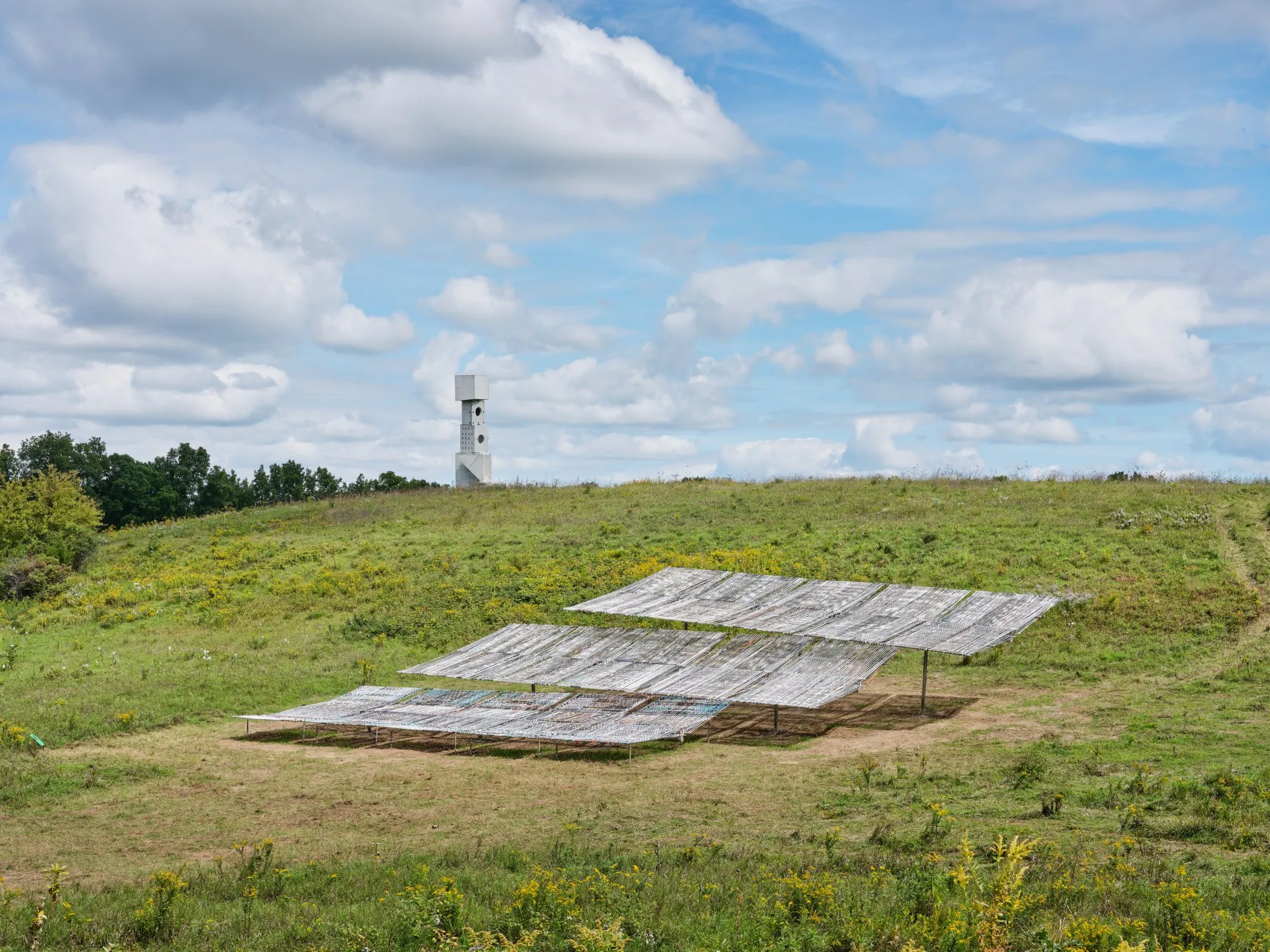
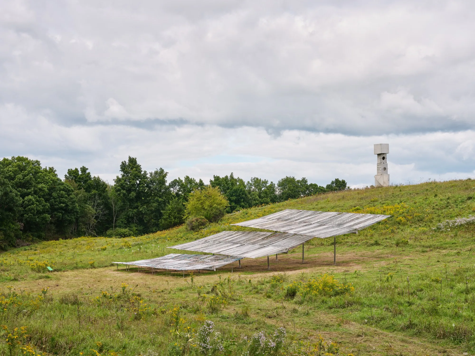
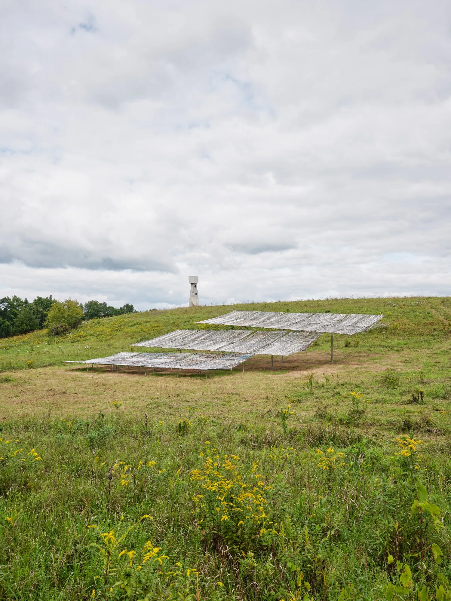
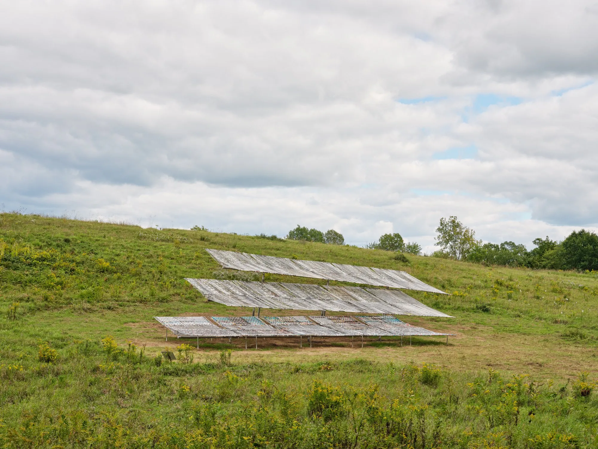
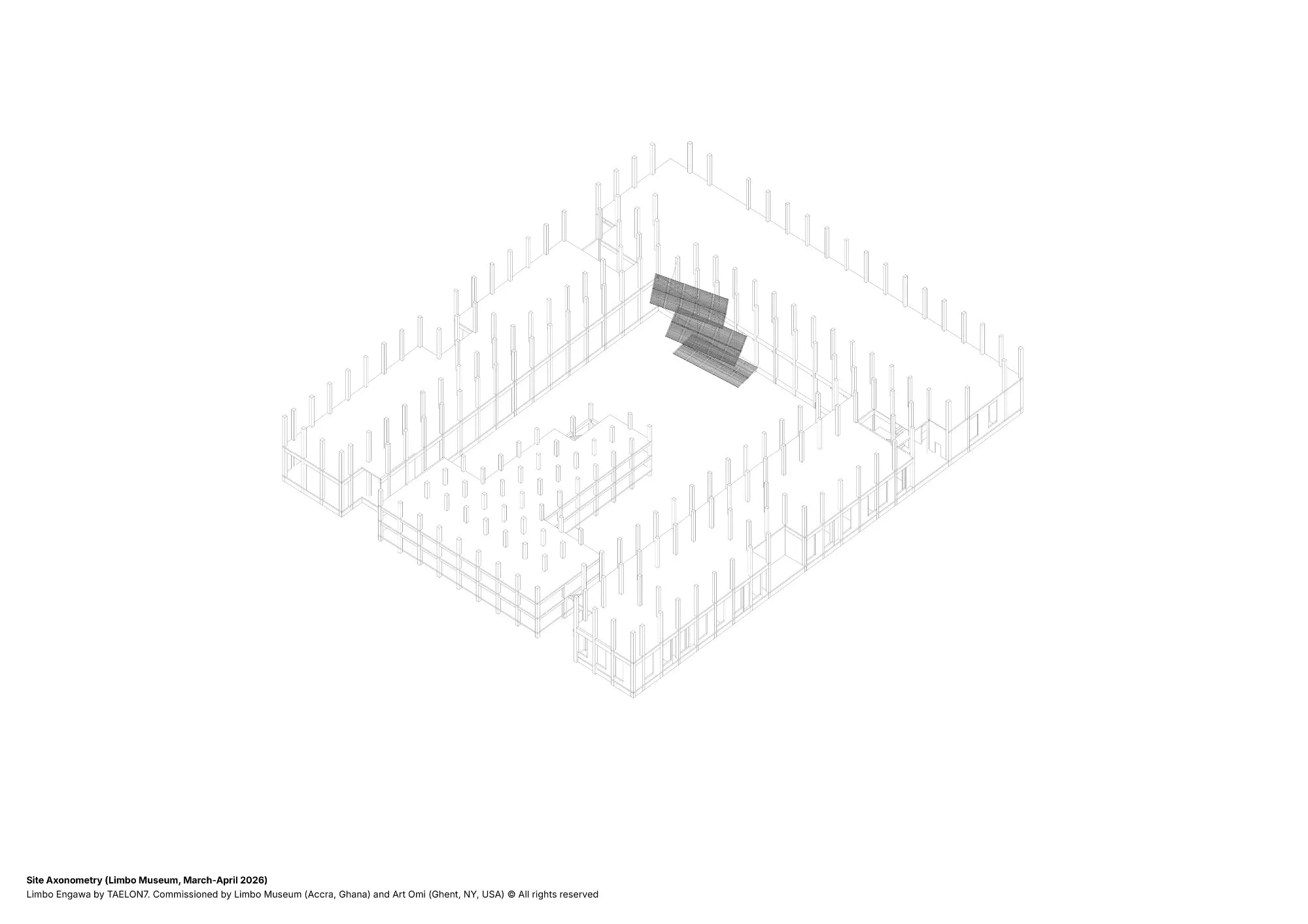
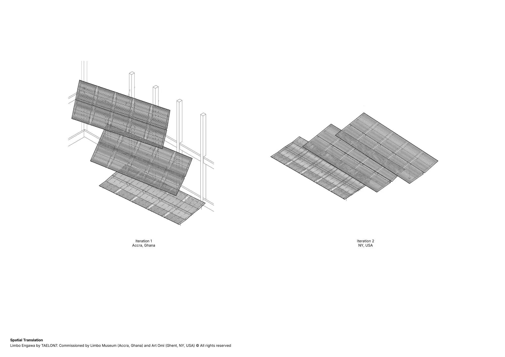
    The pavilion was conceived for two sites. It was first built inside the unfinished concrete frame of a museum in a fast-growing West African city, then taken apart, carried across the Atlantic and reassembled in a rural sculpture and architecture park, where it now stands permanently.

    Its name comes from the Japanese engawa, the in-between space that joins inside and outside, building and landscape, private and shared life. Across both sites, the project tests how one modular system can adapt to very different settings and set up new relationships between structure, ground and everyday use.

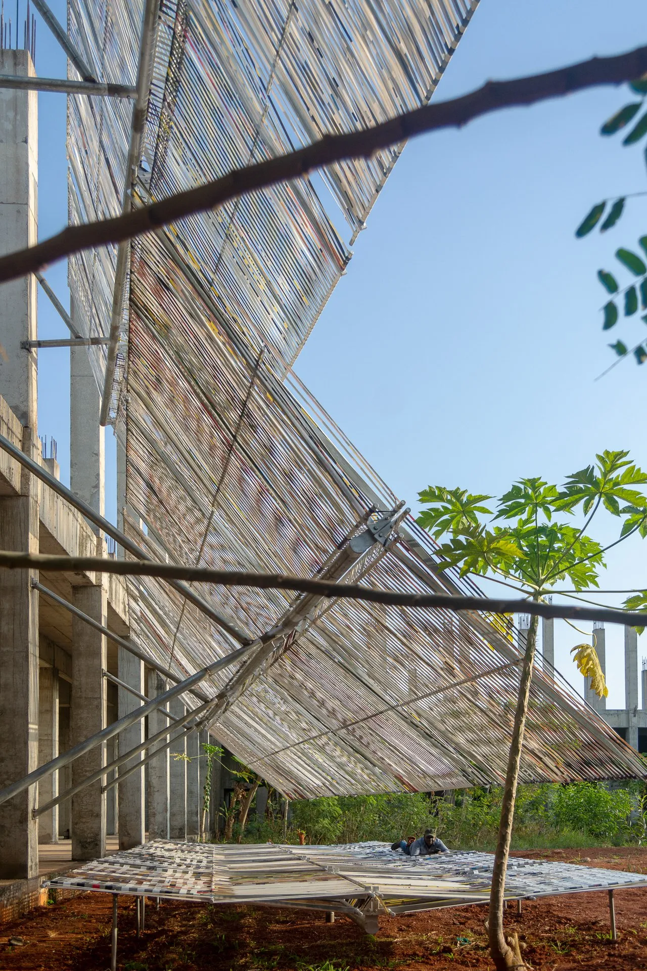
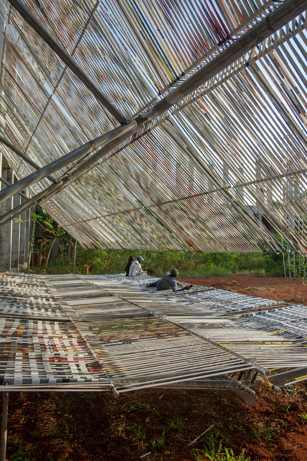
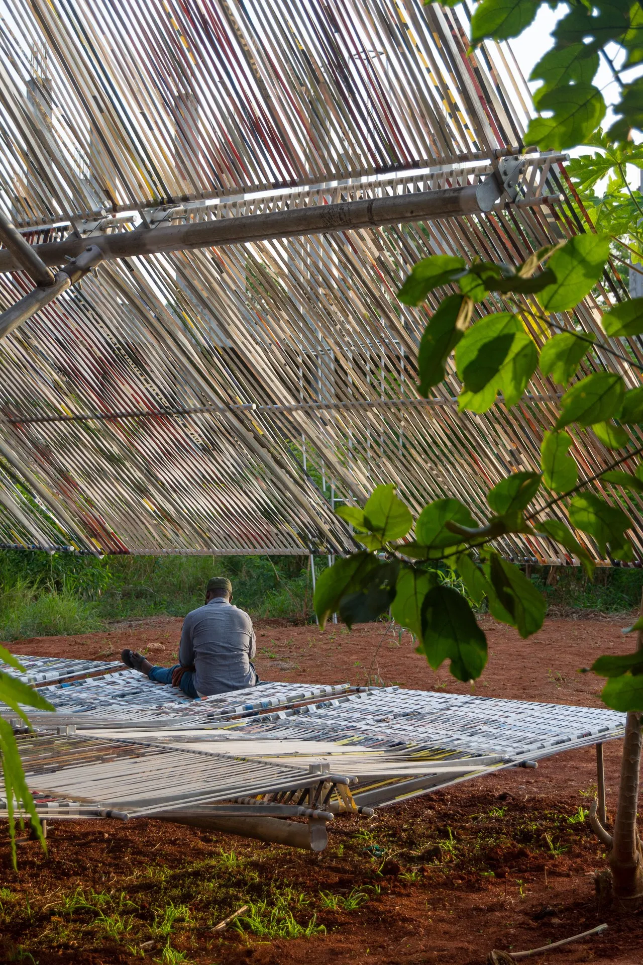
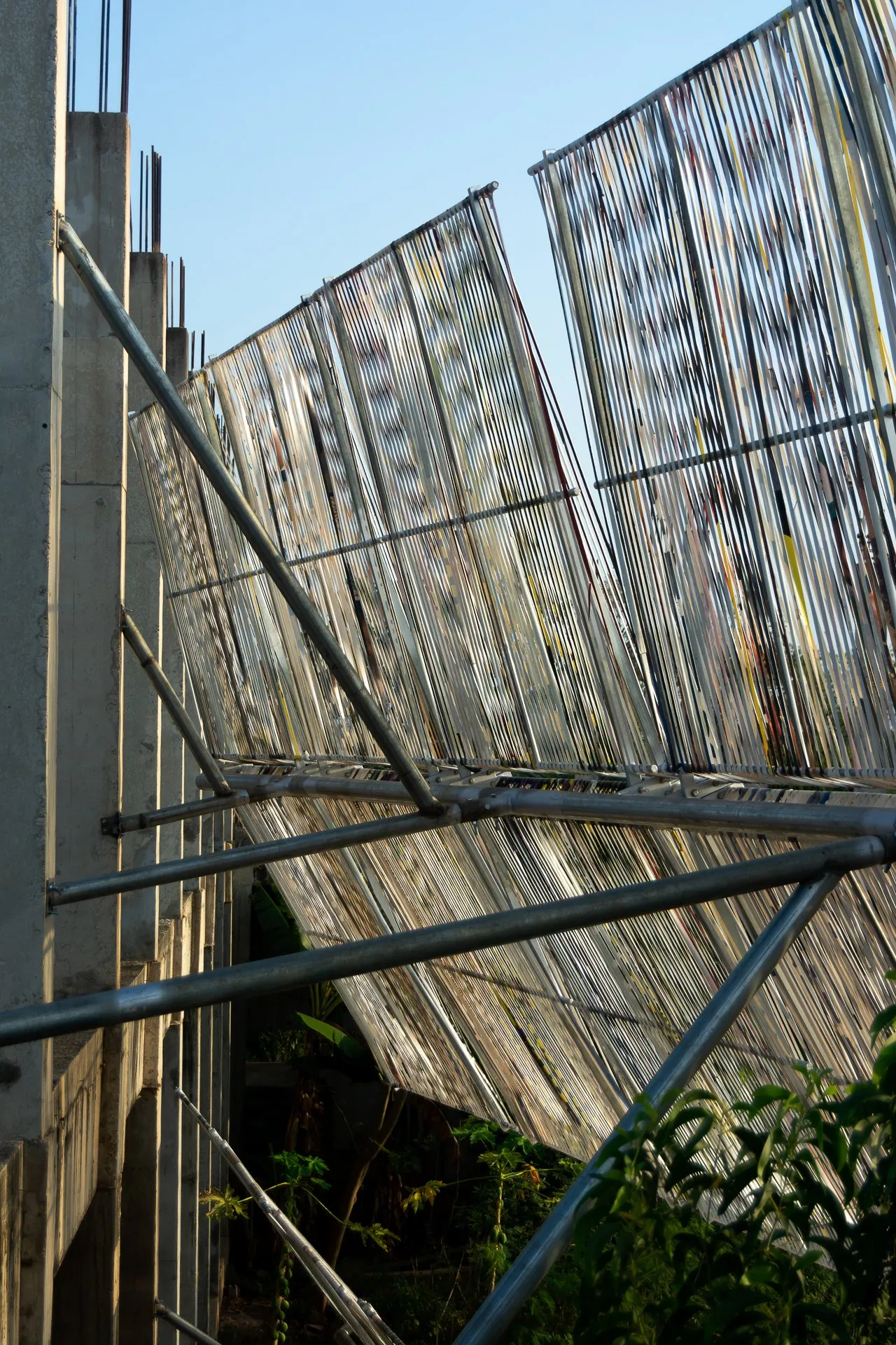
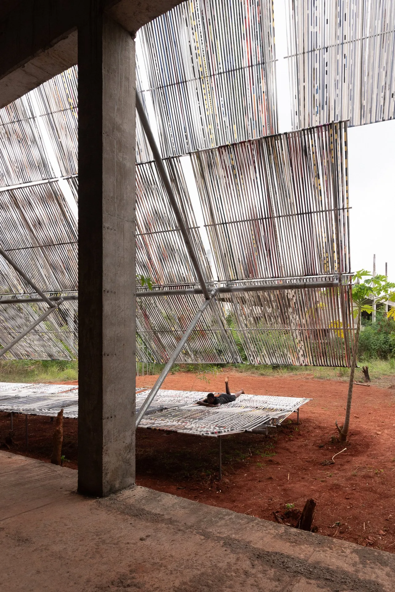
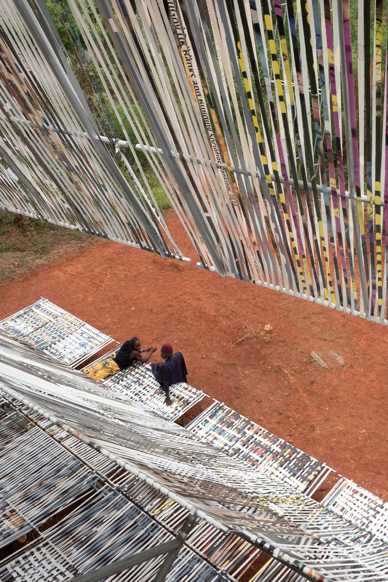
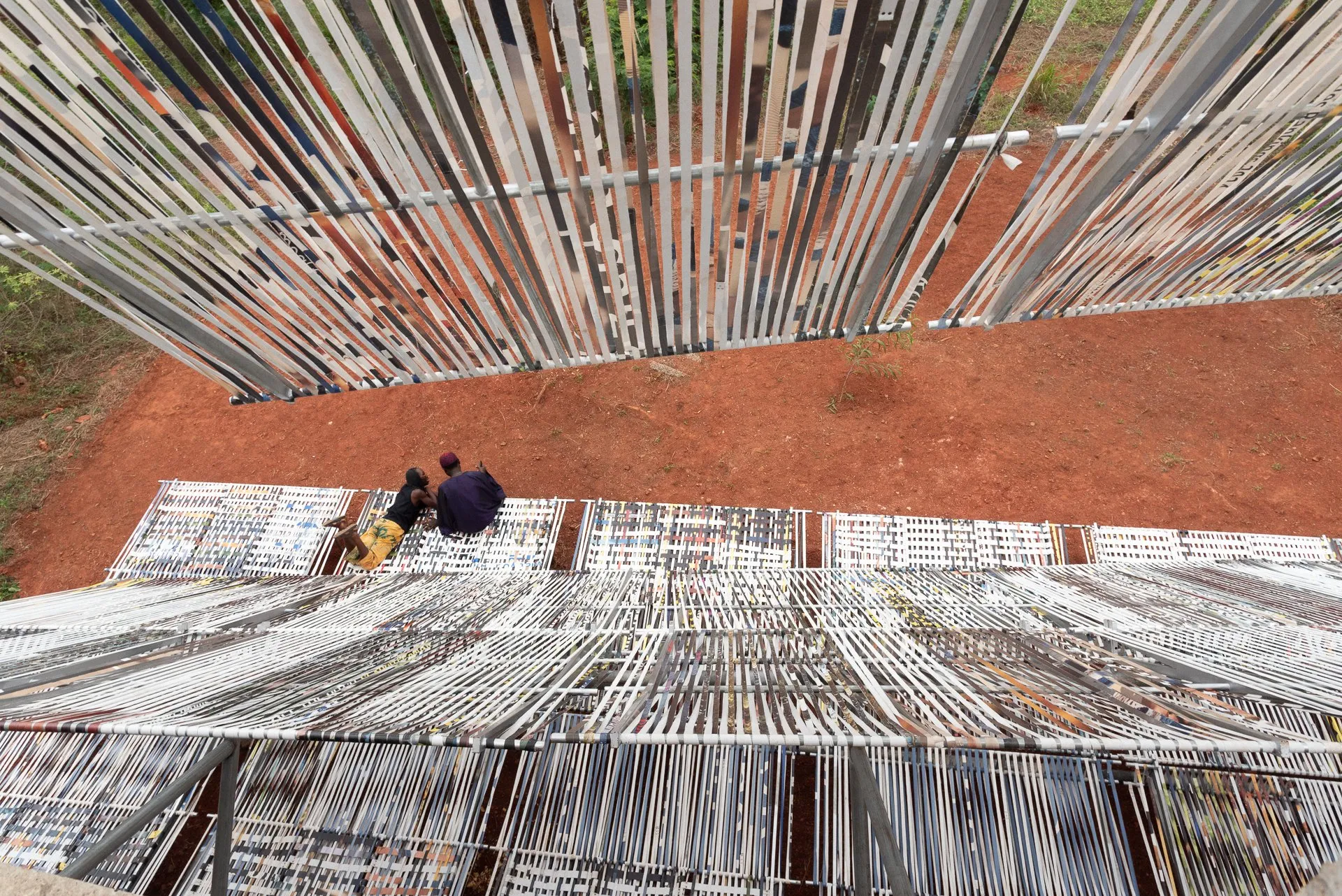
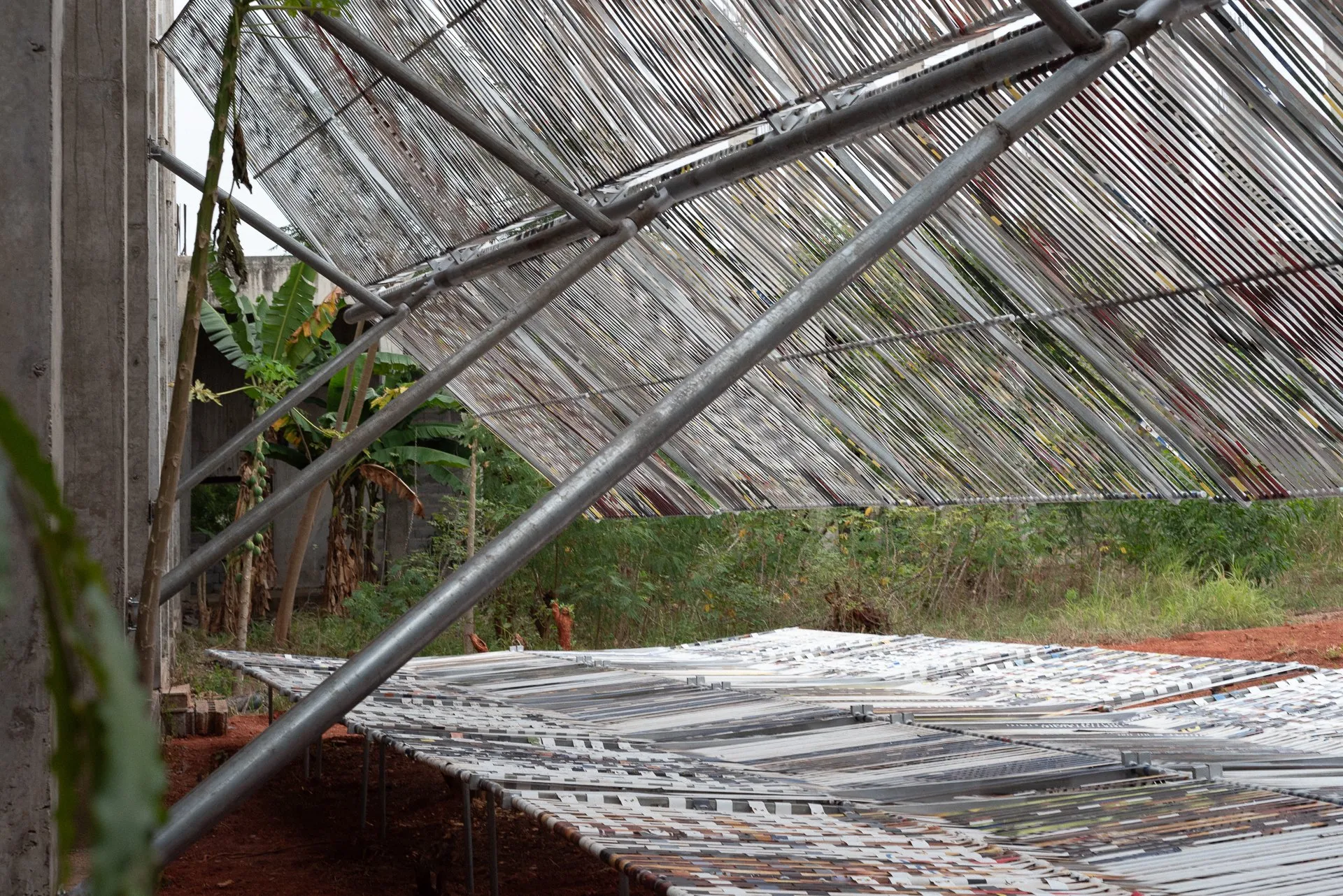
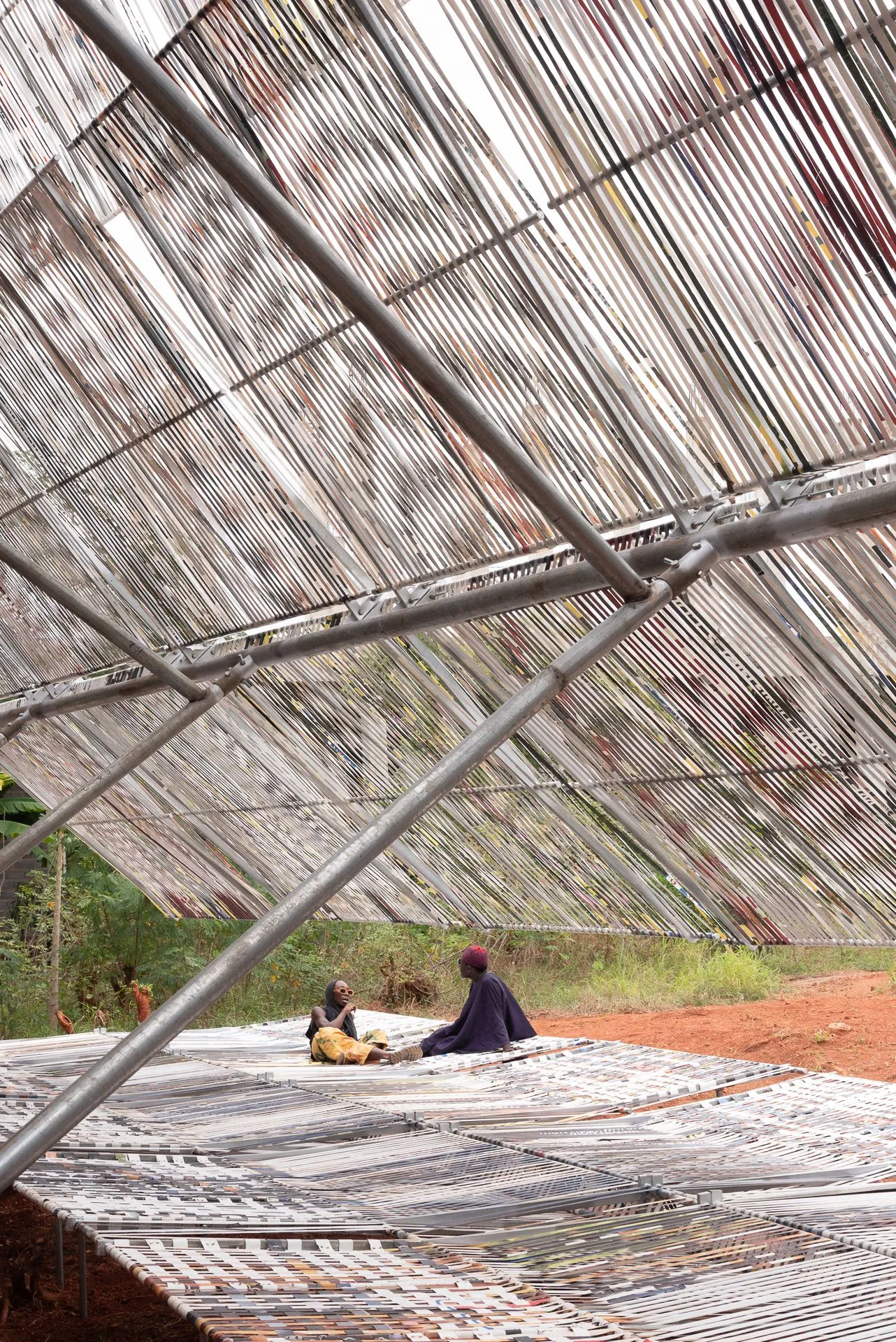
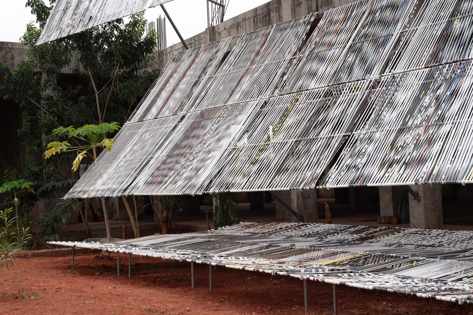
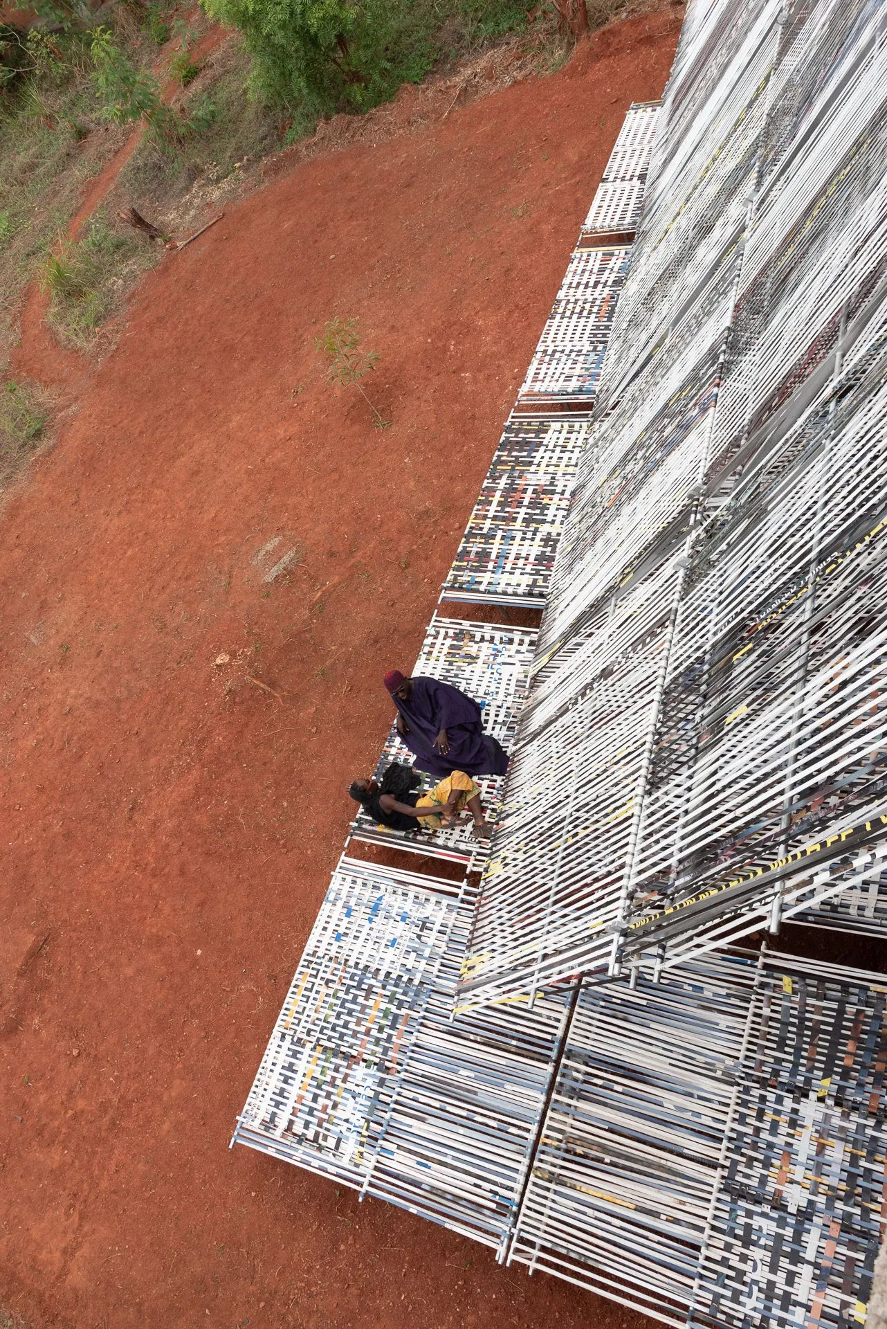
    At the first site, unfinished concrete buildings are often surrounded by what looks like leftover land. Neither is empty: the bare structures are lived in, and the ground around them is farmed. The pavilion occupied the edge between the concrete frame and the cultivated ground, softening a usually abrupt line. An oversized daybed, based on the woven beds found on building sites across the region, gave room to sit, lie down and gather, while raised planes filtered the sun and framed views. Farmers, caretakers and museum visitors met beneath it.

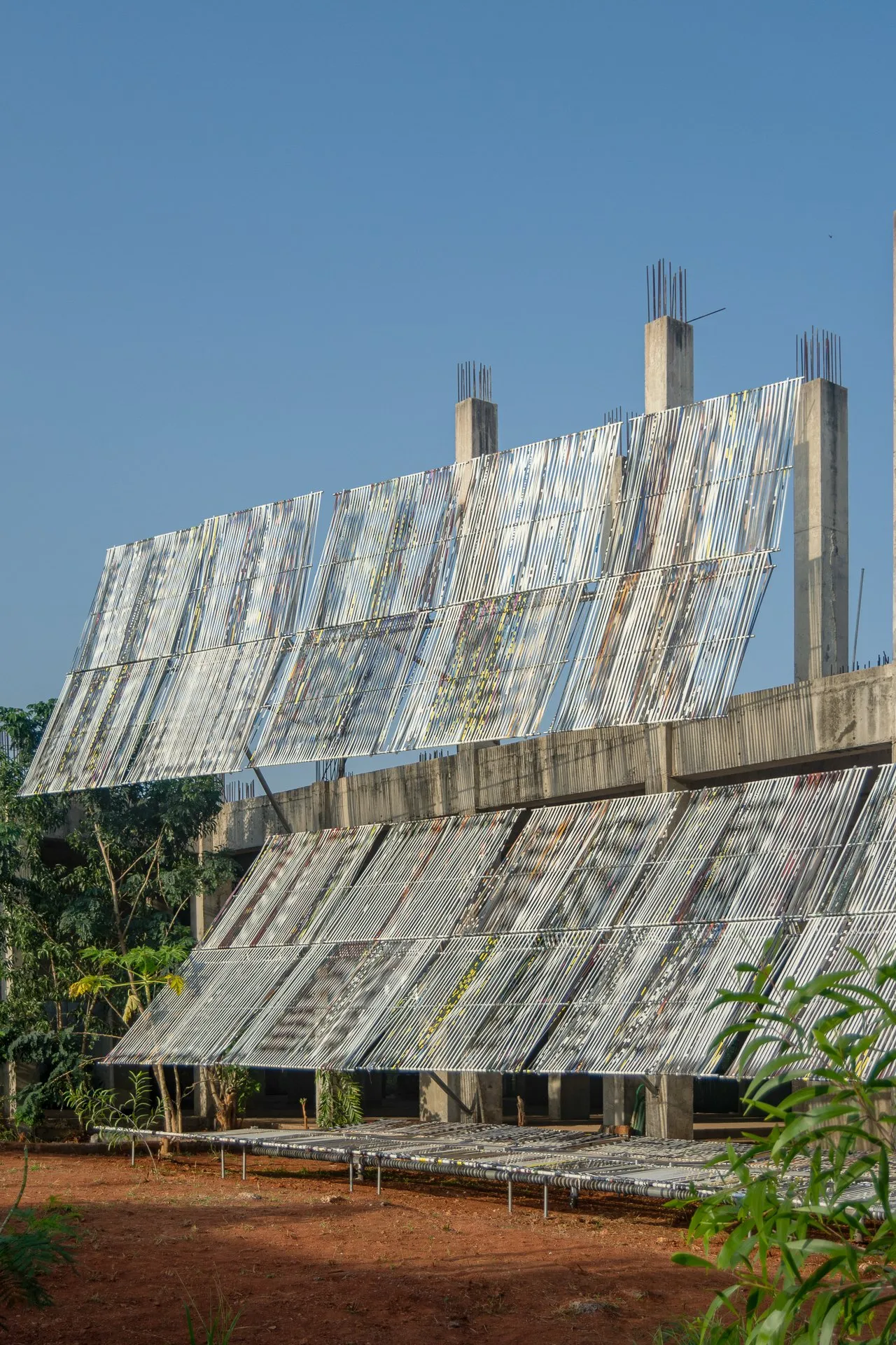
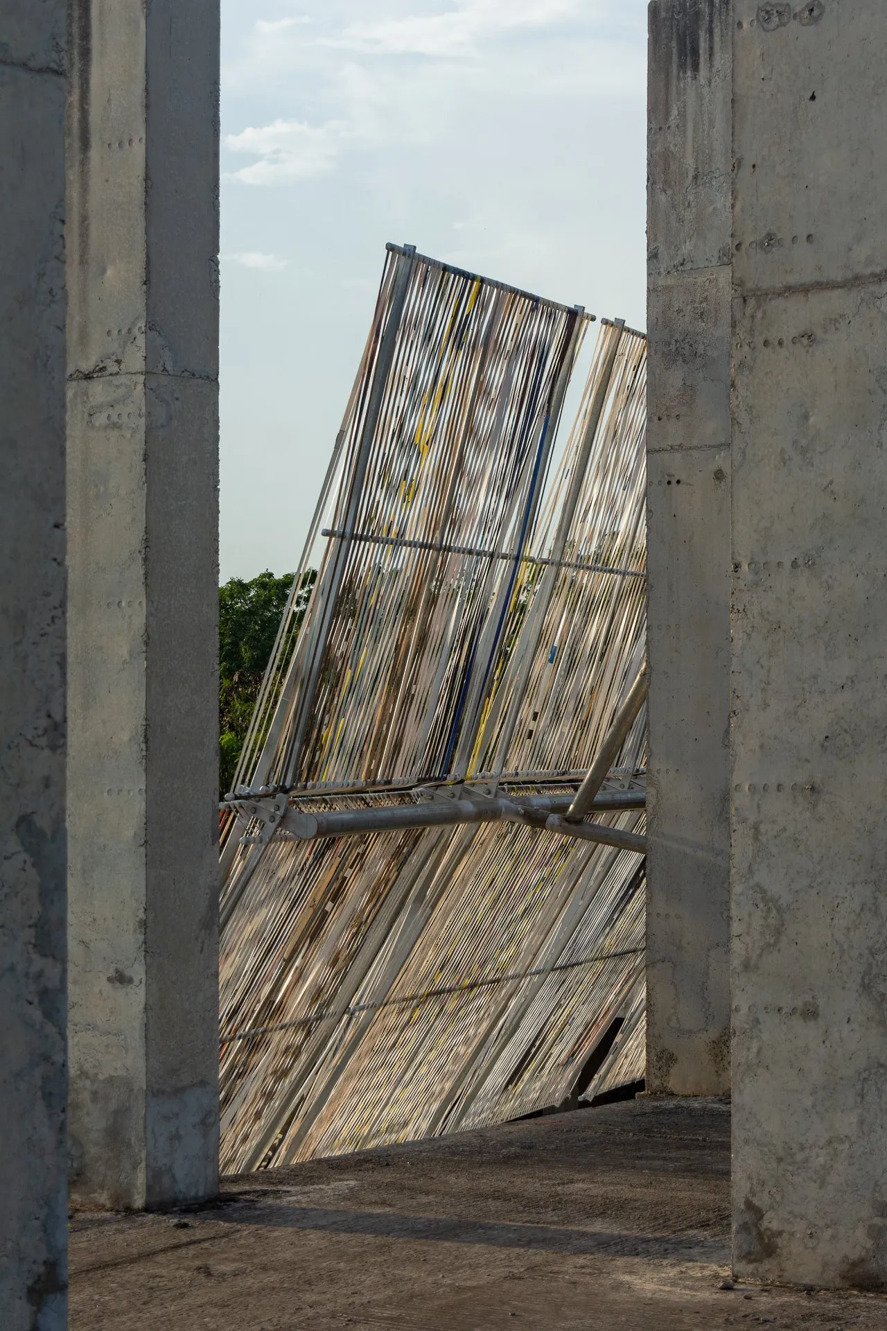
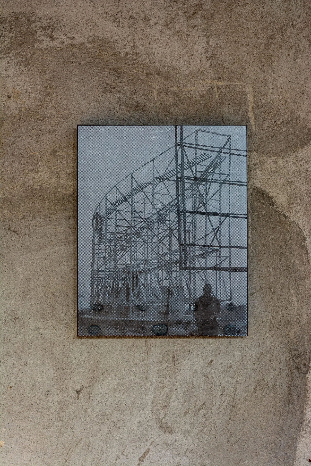
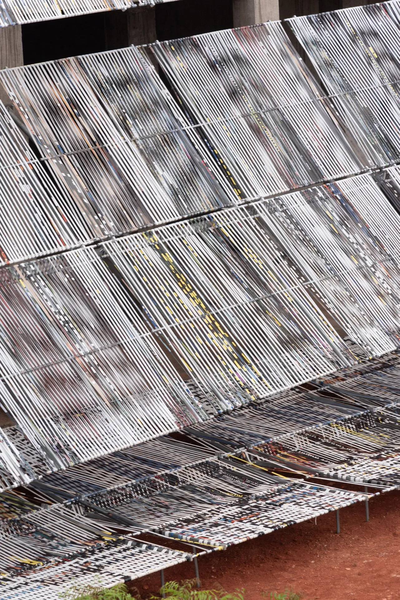
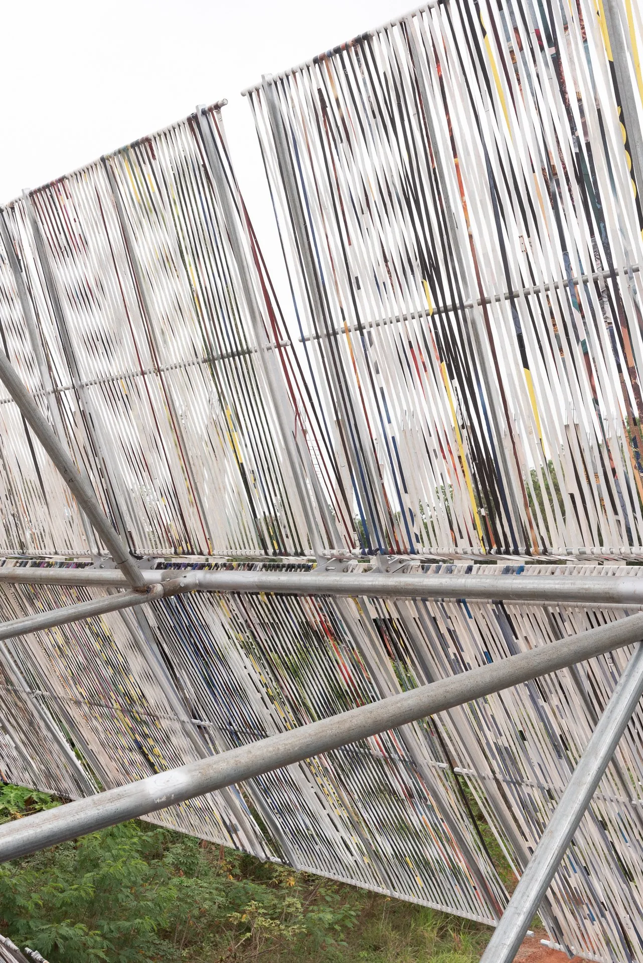
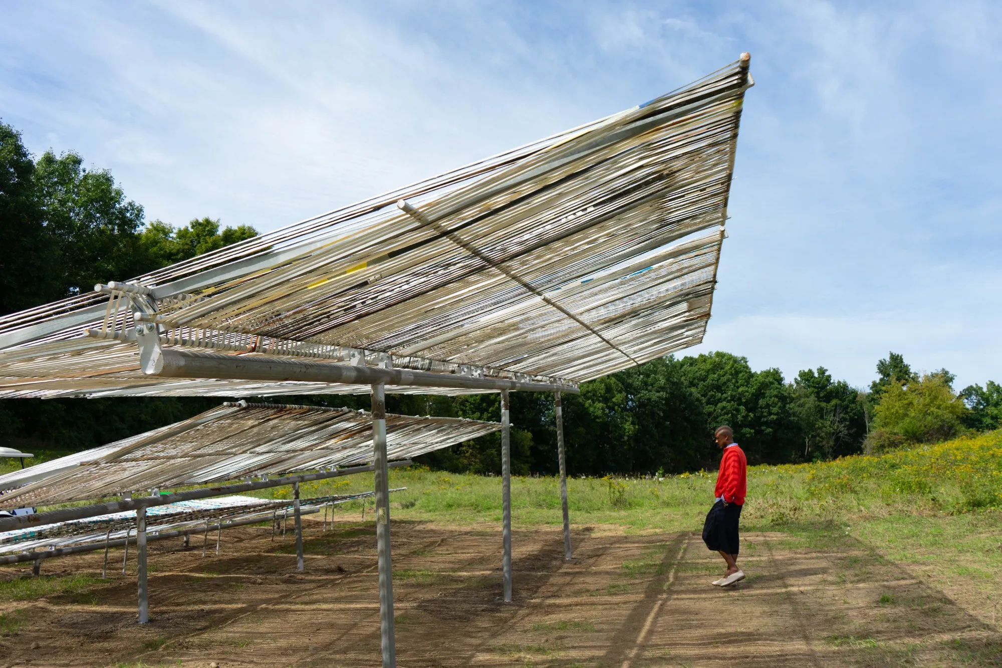
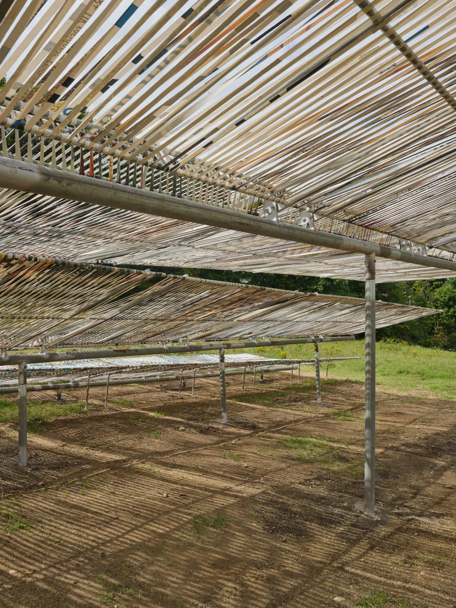
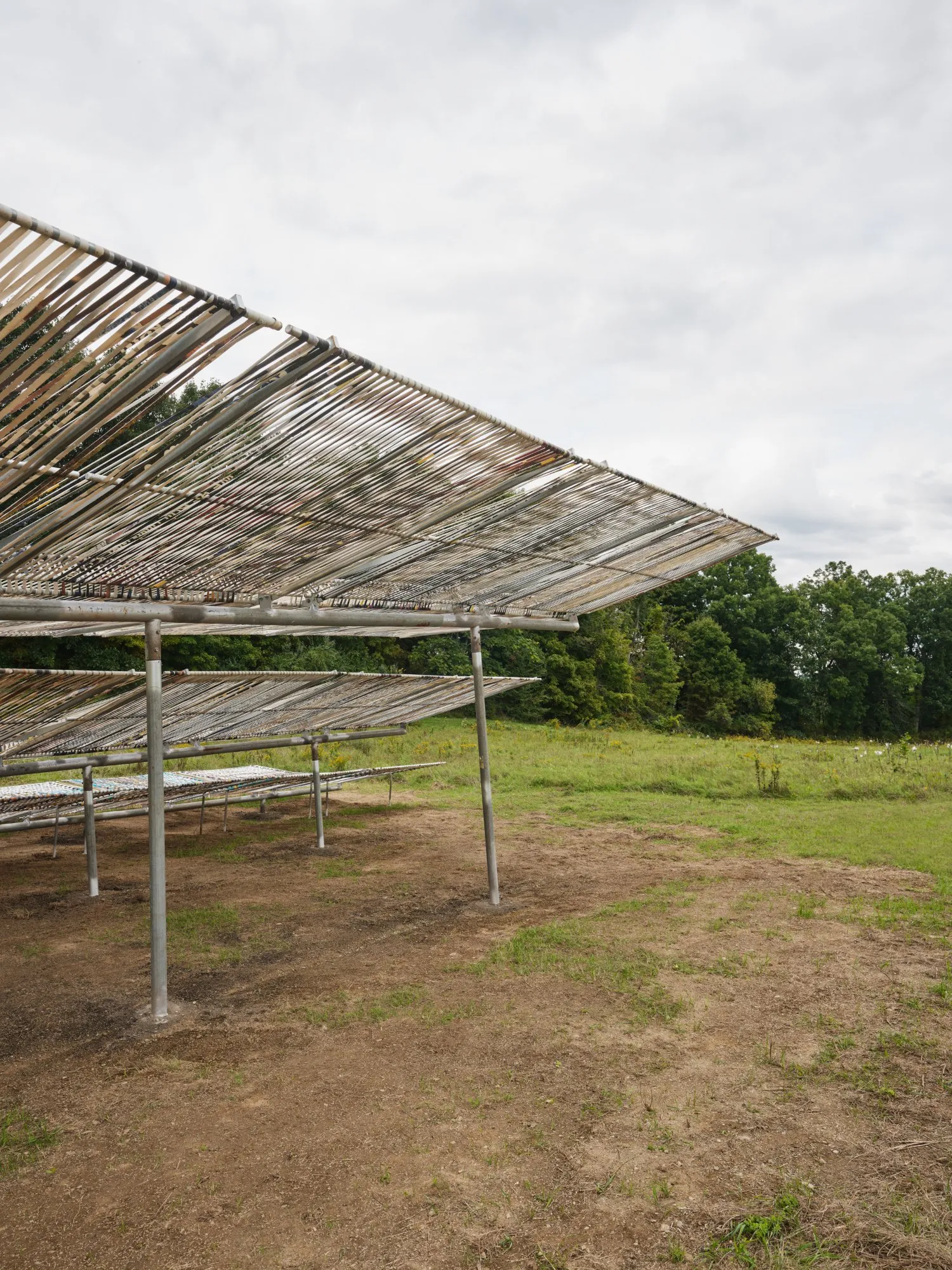
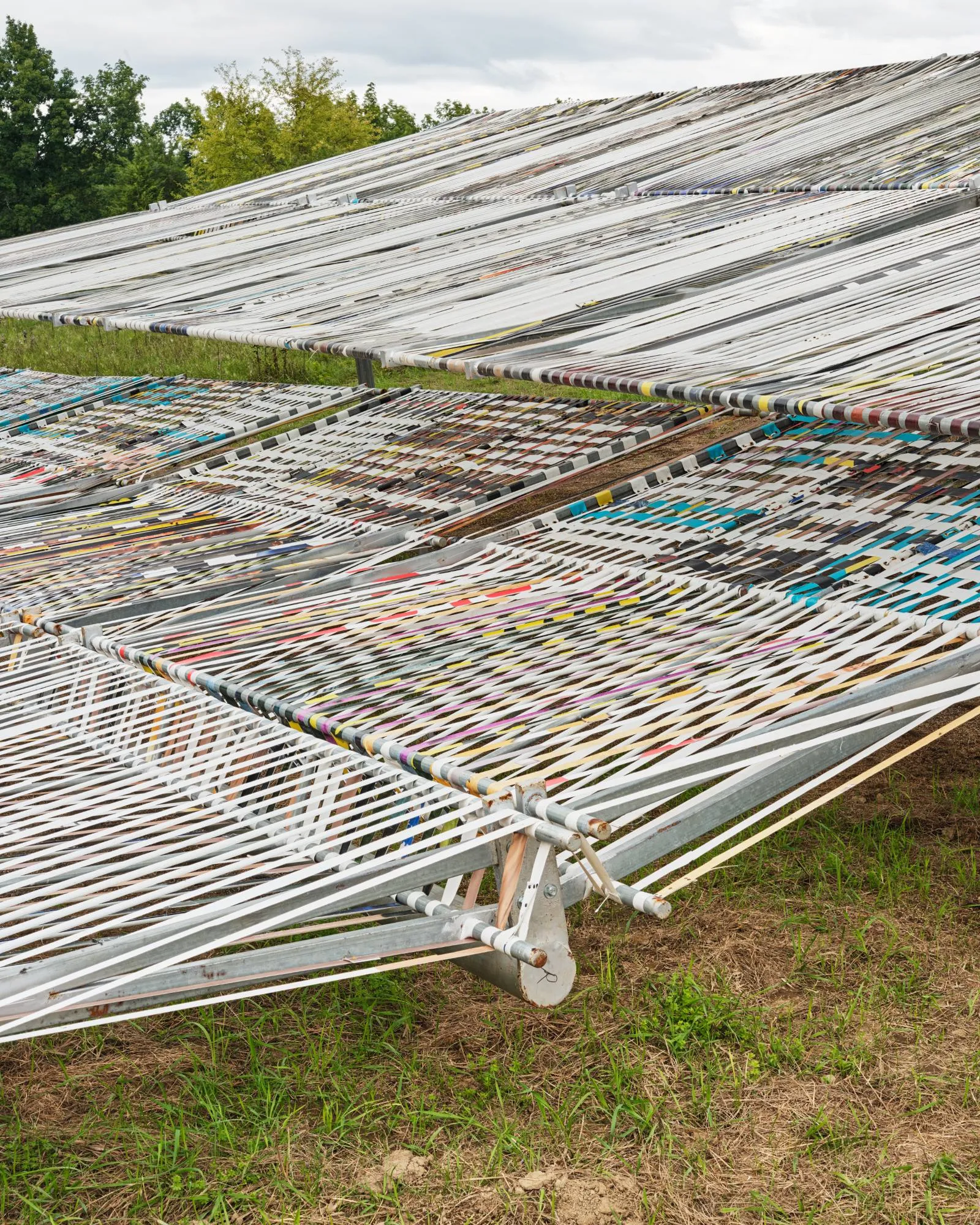
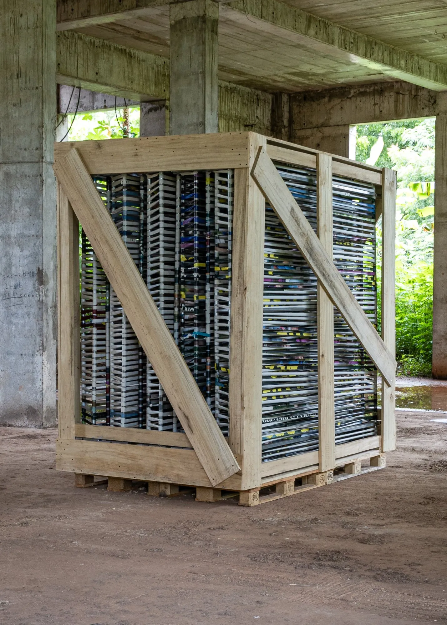
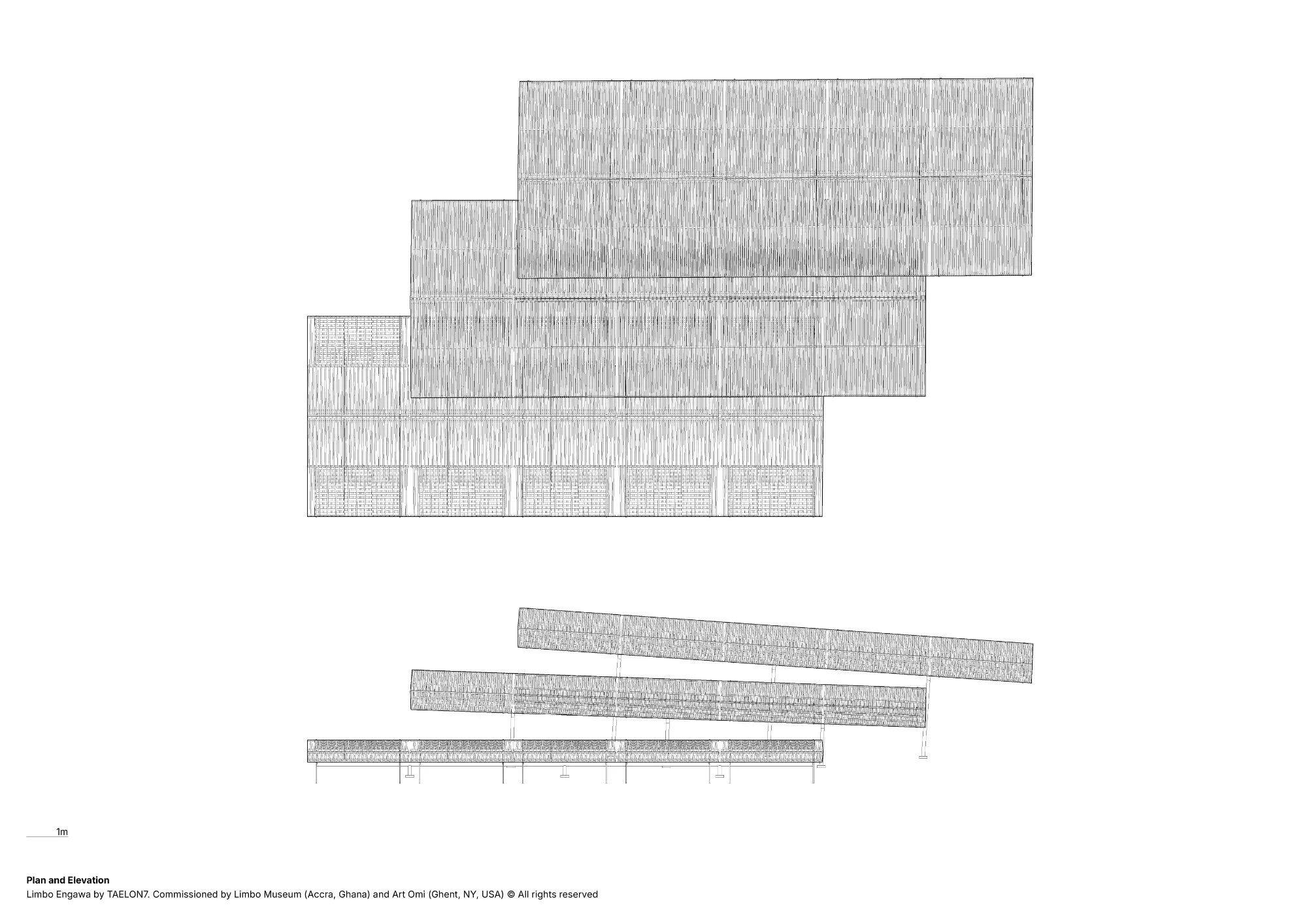
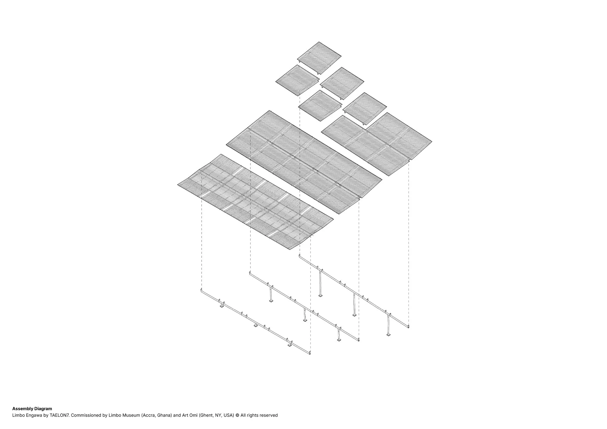
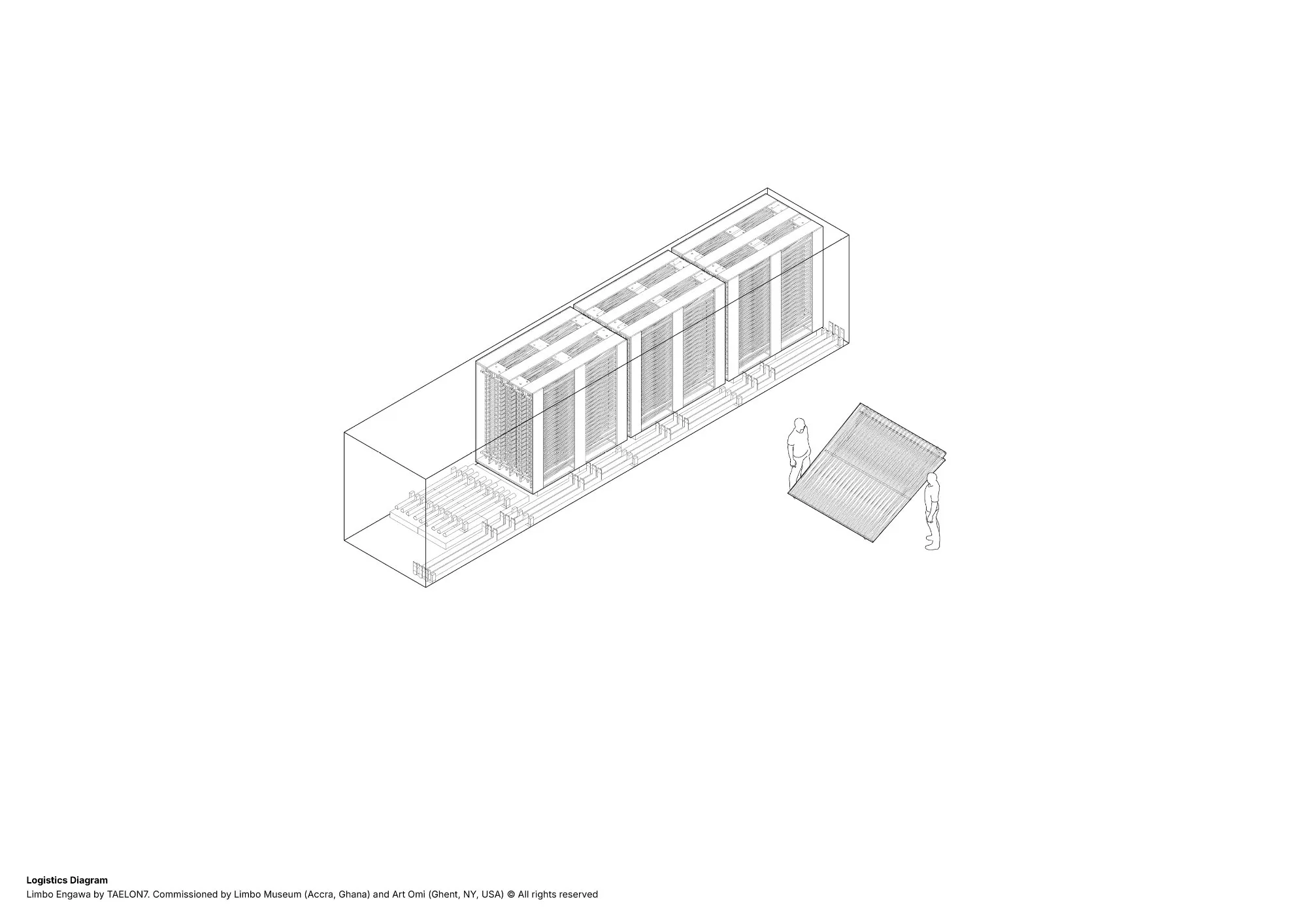
    The structure is a kit of light steel frames, each small enough for one person to carry. Its profiles and fabrication borrow from roadside kiosks and billboard structures. Salvaged billboard tarpaulin was cut into strips and woven by hand across the frames, making surfaces that filter light, air and views. Gathered into canopies and seats, the slender parts take on a civic presence, yet remain easy to dismantle and rebuild in a new arrangement.

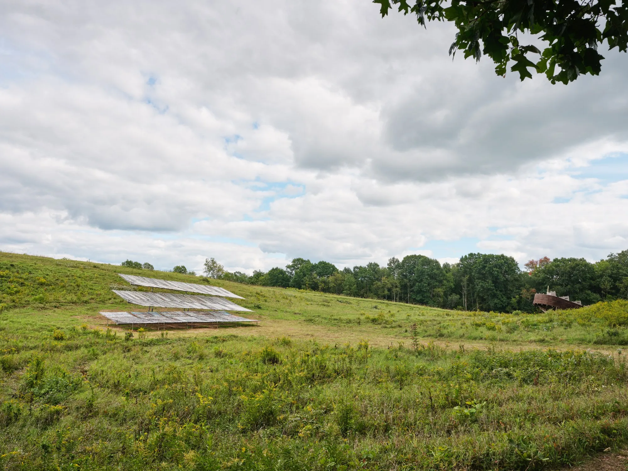
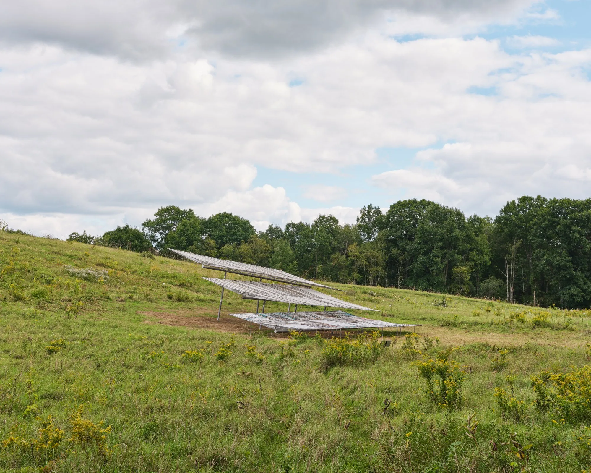
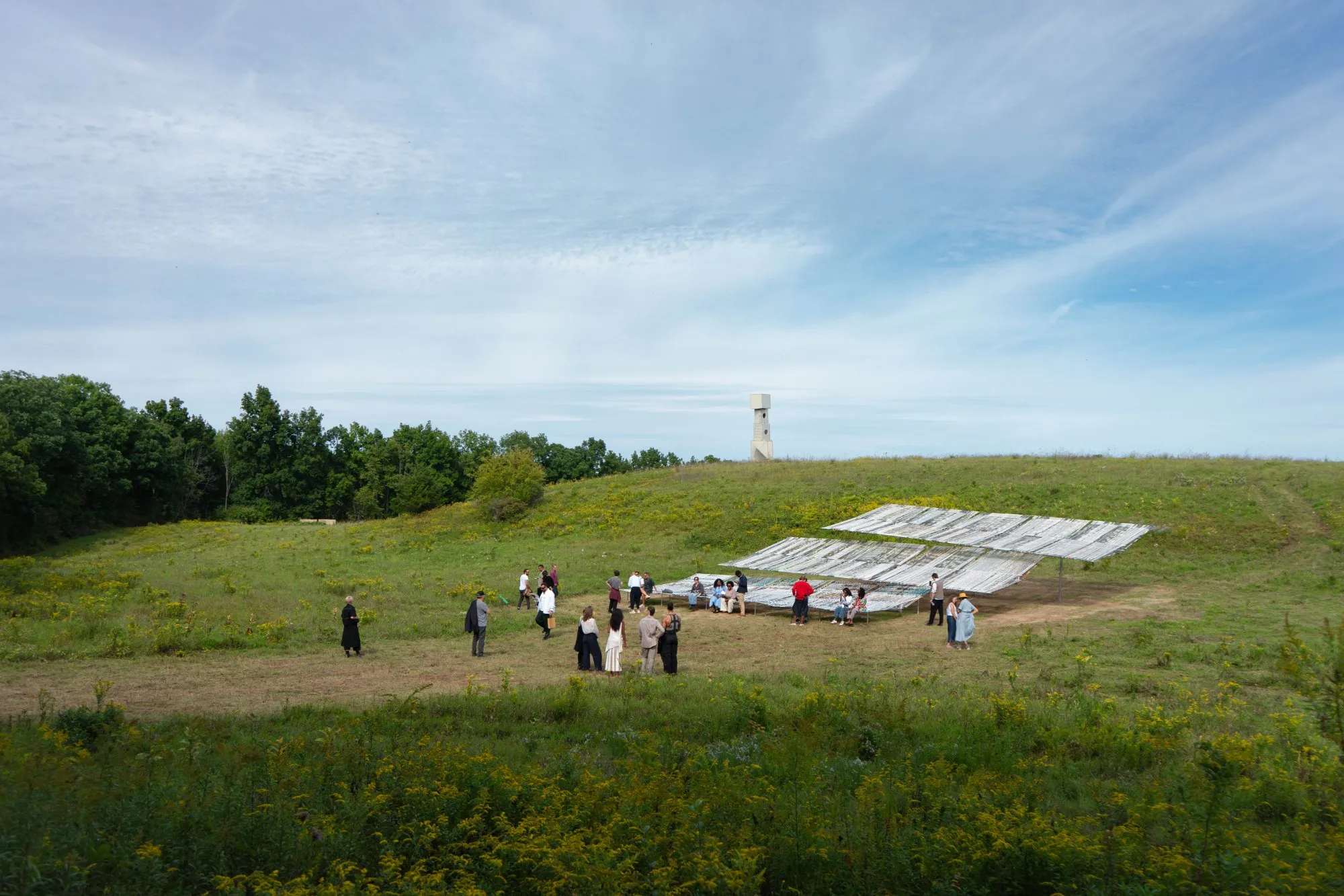
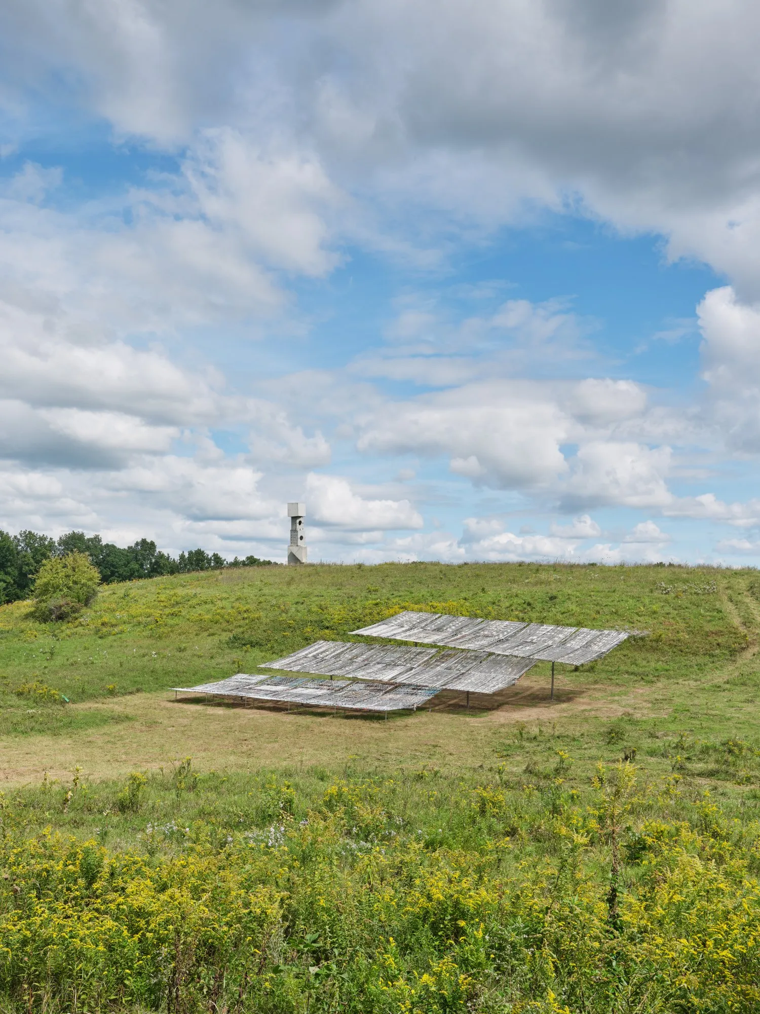
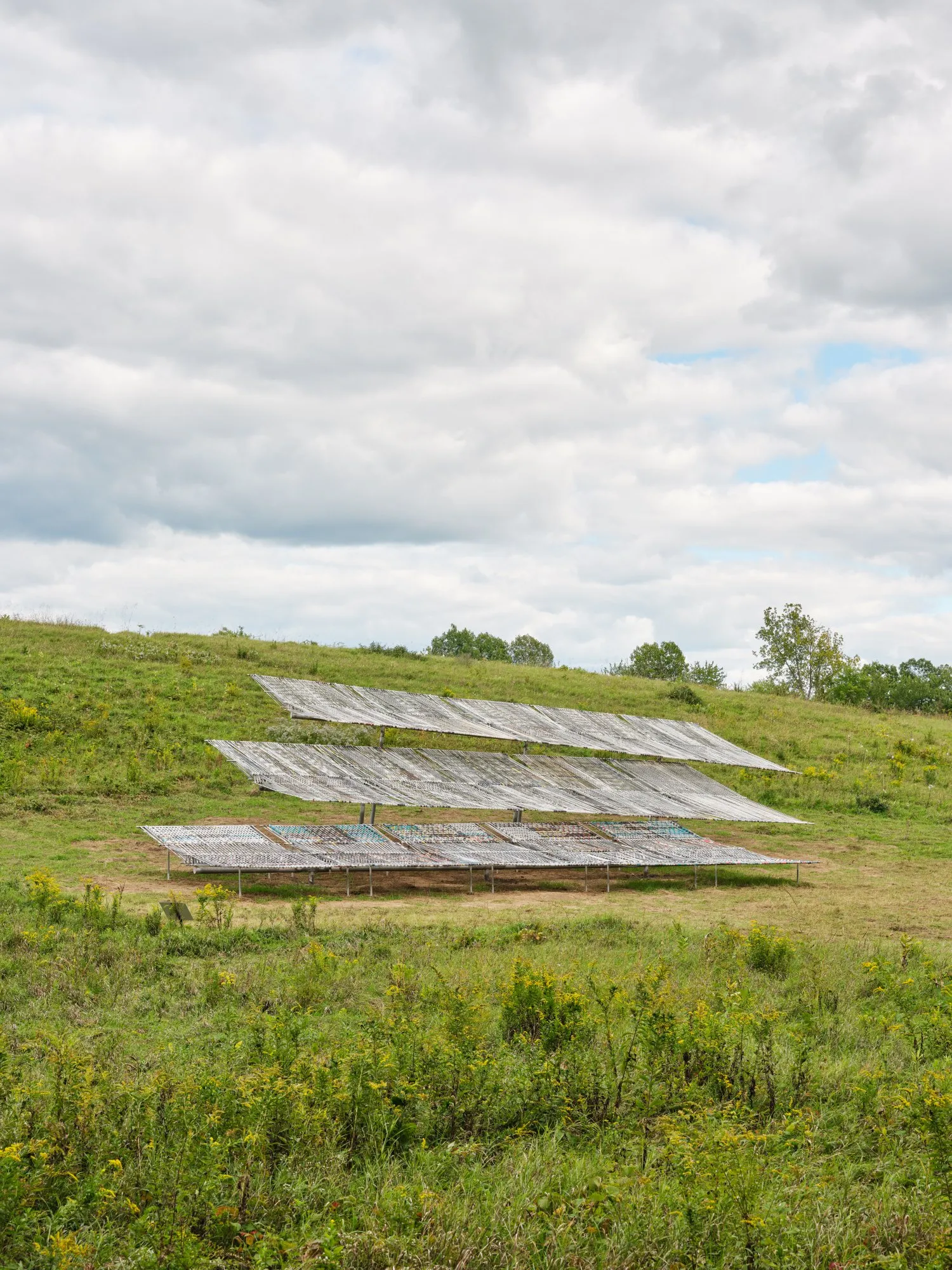
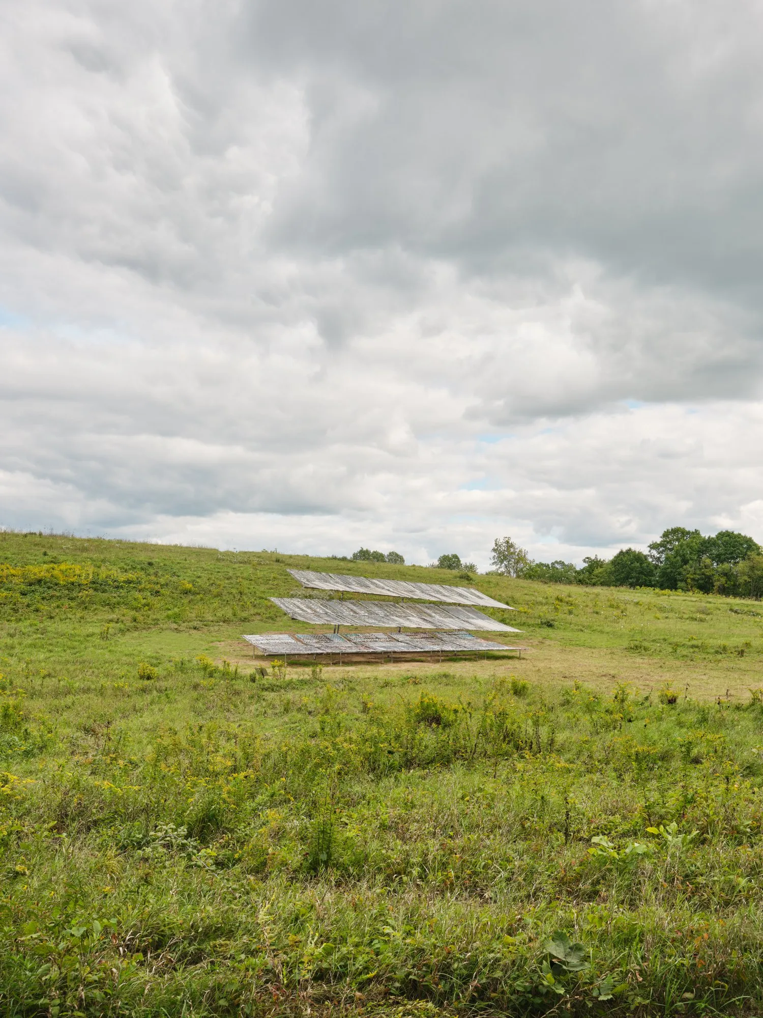
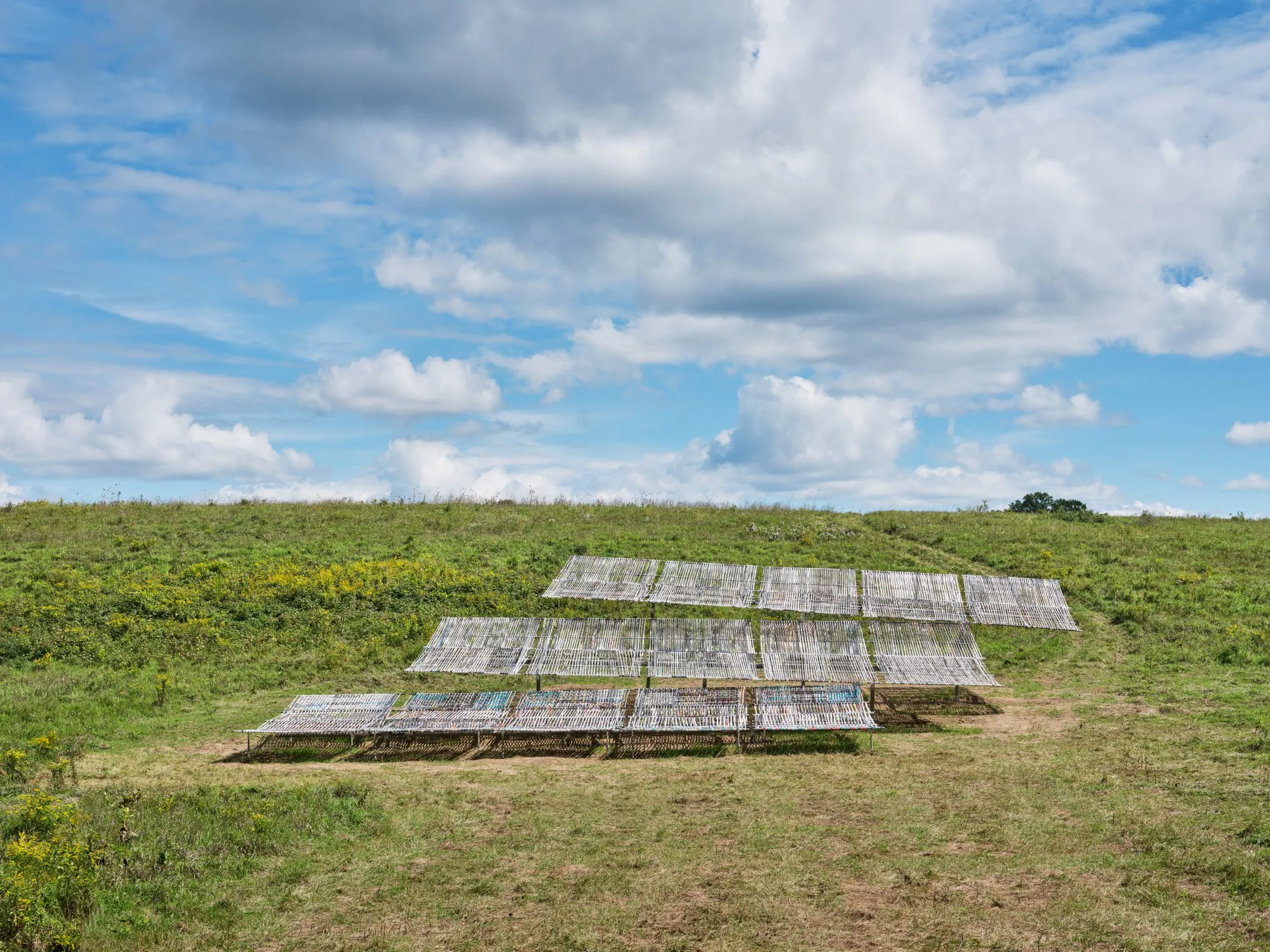
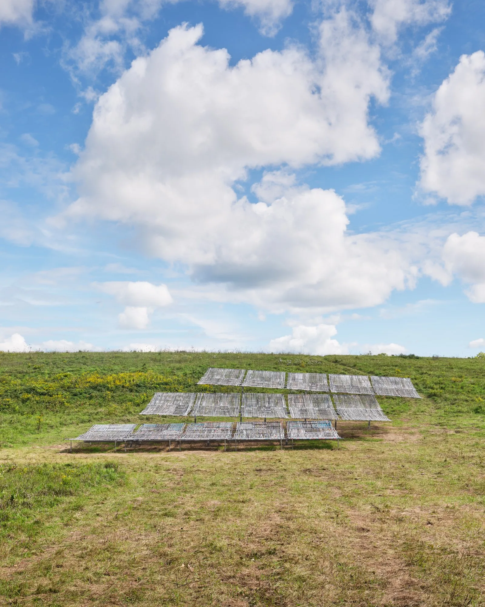
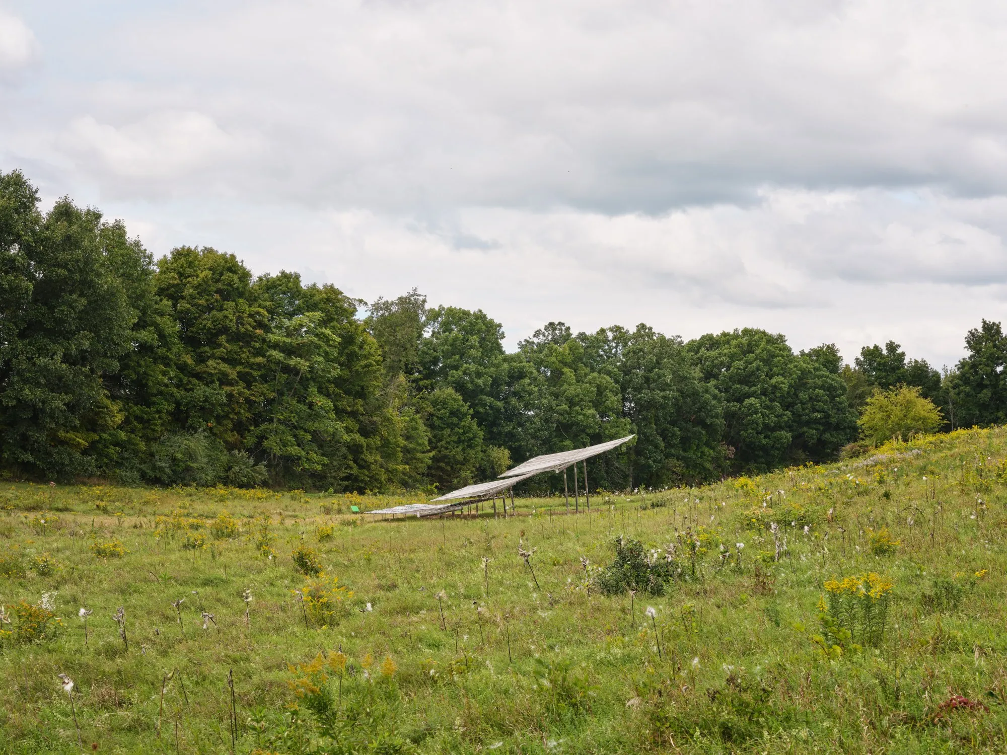
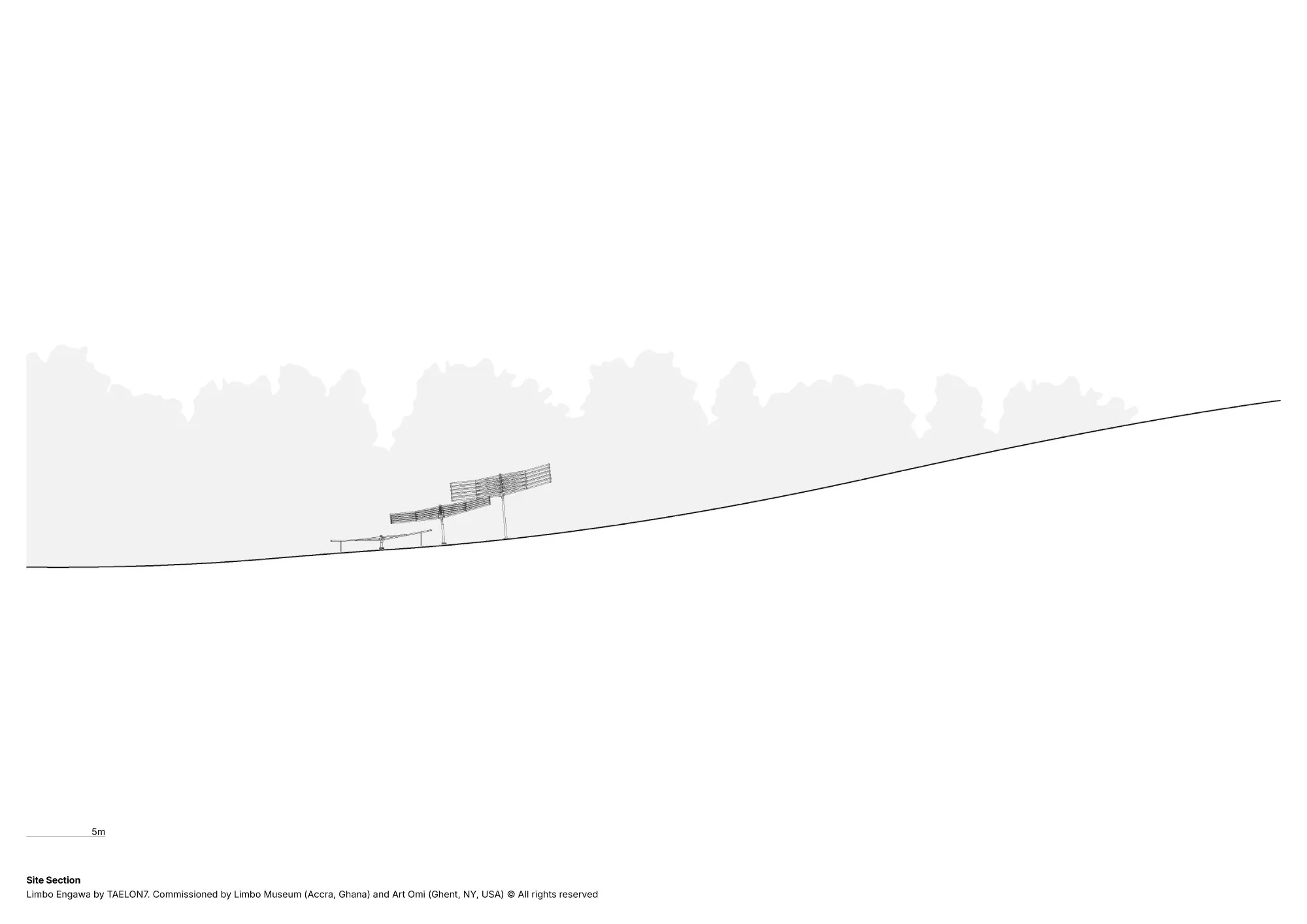
    At the second site, among fields and woodland, the pavilion stands on its own. Its upright arrangement was turned on its side, and a row of woven planes now runs across a hillside, drawing out the slope, setting shifting horizons and opening new paths through the park. It frames the landscape and offers shaded places to stop, gather and look, while touching the ground lightly.

    The components and materials stay the same, while their relation to ground and use changes. The move itself becomes part of the architecture, showing how a transferable system can take on new meanings in each place.

    Limbo Engawa, view 1
    Limbo Engawa, view 2
    Limbo Engawa, view 3
    Limbo Engawa, view 4
    Limbo Engawa, view 5
    Limbo Engawa, view 6
    Limbo Engawa, view 7
    Limbo Engawa, view 8
    Limbo Engawa, view 9
    Limbo Engawa, view 10
    Limbo Engawa, view 11
    Limbo Engawa, view 12
    Limbo Engawa, view 13
    Limbo Engawa, view 14
    Limbo Engawa, view 15
    Limbo Engawa, view 16
    Limbo Engawa, view 17
    Limbo Engawa, view 18
    Limbo Engawa, view 19
    Limbo Engawa, view 20
    Limbo Engawa, view 21
    Limbo Engawa, view 22
    Limbo Engawa, view 23
    Limbo Engawa, view 24
    Limbo Engawa, view 25
    Limbo Engawa, view 26
    Limbo Engawa, view 27
    Limbo Engawa, view 28
    Limbo Engawa, view 29
    Limbo Engawa, view 30
    Limbo Engawa, view 31
    Limbo Engawa, view 32
    Limbo Engawa, view 33
    Limbo Engawa, view 34
    Limbo Engawa, view 35
    Limbo Engawa, view 36
    Limbo Engawa, view 37
    Limbo Engawa, view 38
    Limbo Engawa, view 39
    Limbo Engawa, view 40
    Limbo Engawa, view 41
    Limbo Engawa, view 42
    Limbo Engawa, view 43
    Limbo Engawa, view 44
    Limbo Engawa, view 45
    Limbo Engawa, view 46
    Limbo Engawa, view 47
    Limbo Engawa, view 48
    Limbo Engawa, view 49
    Site axonometric drawing
    Plan and elevation
    Site section
    Assembly diagram
    Assembly diagram
    Logistics diagram
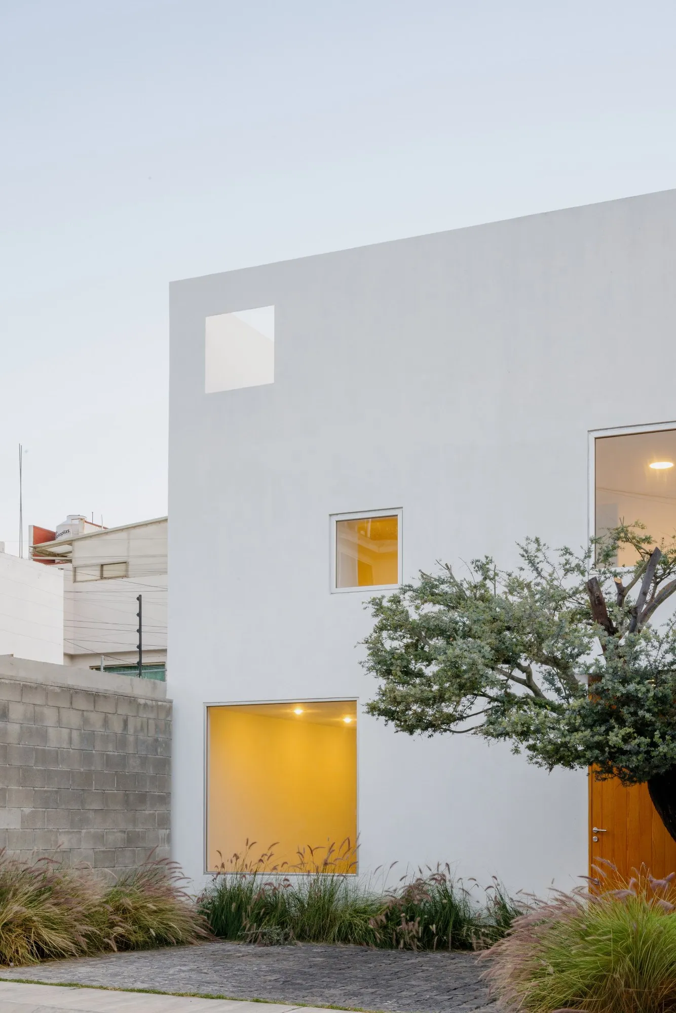
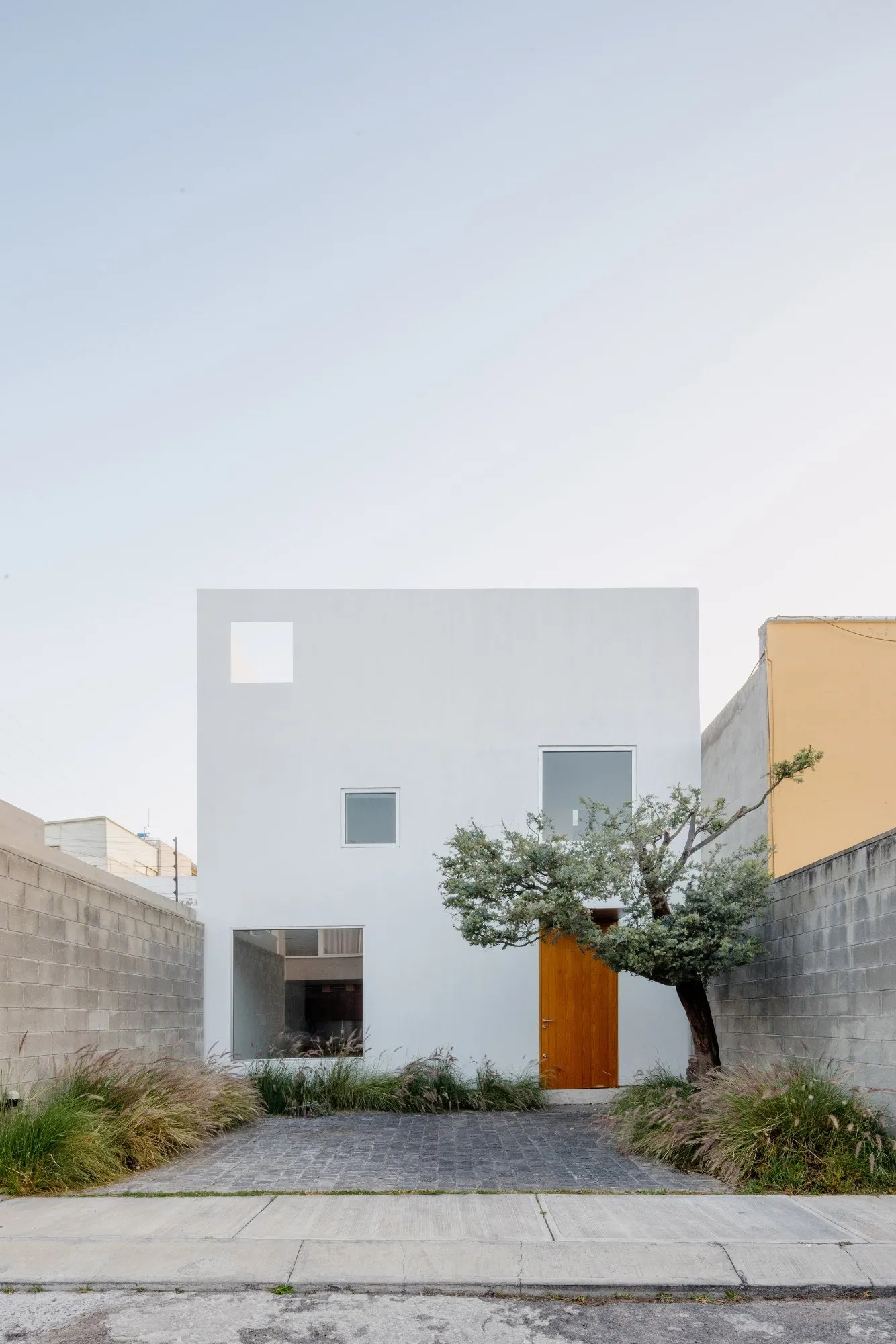
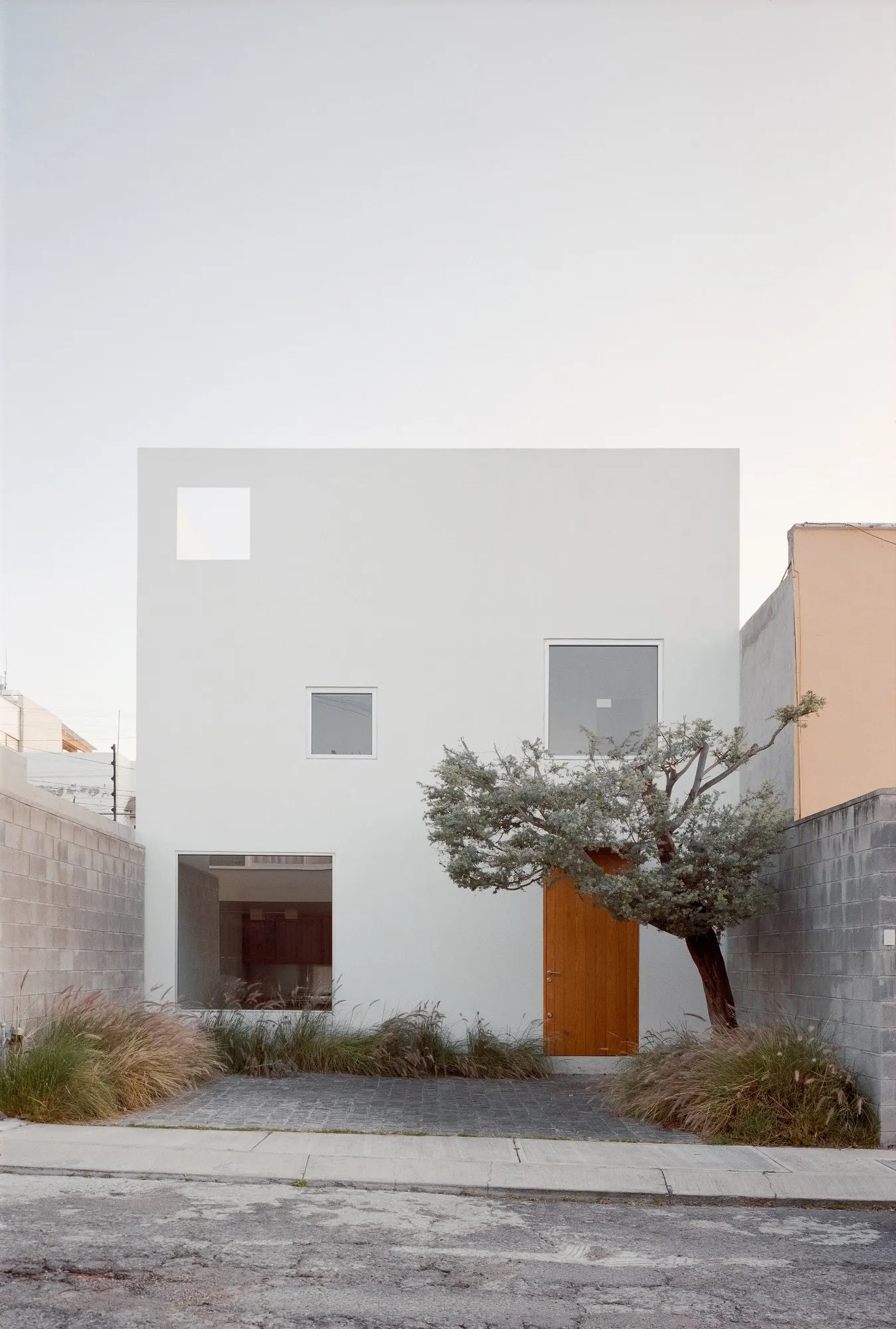
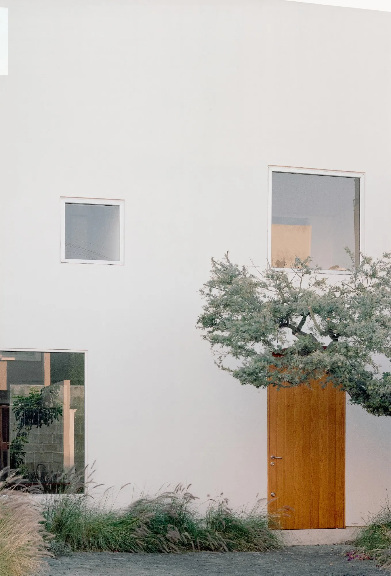
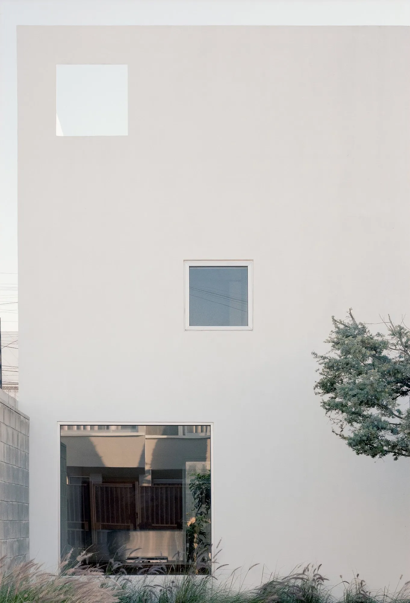
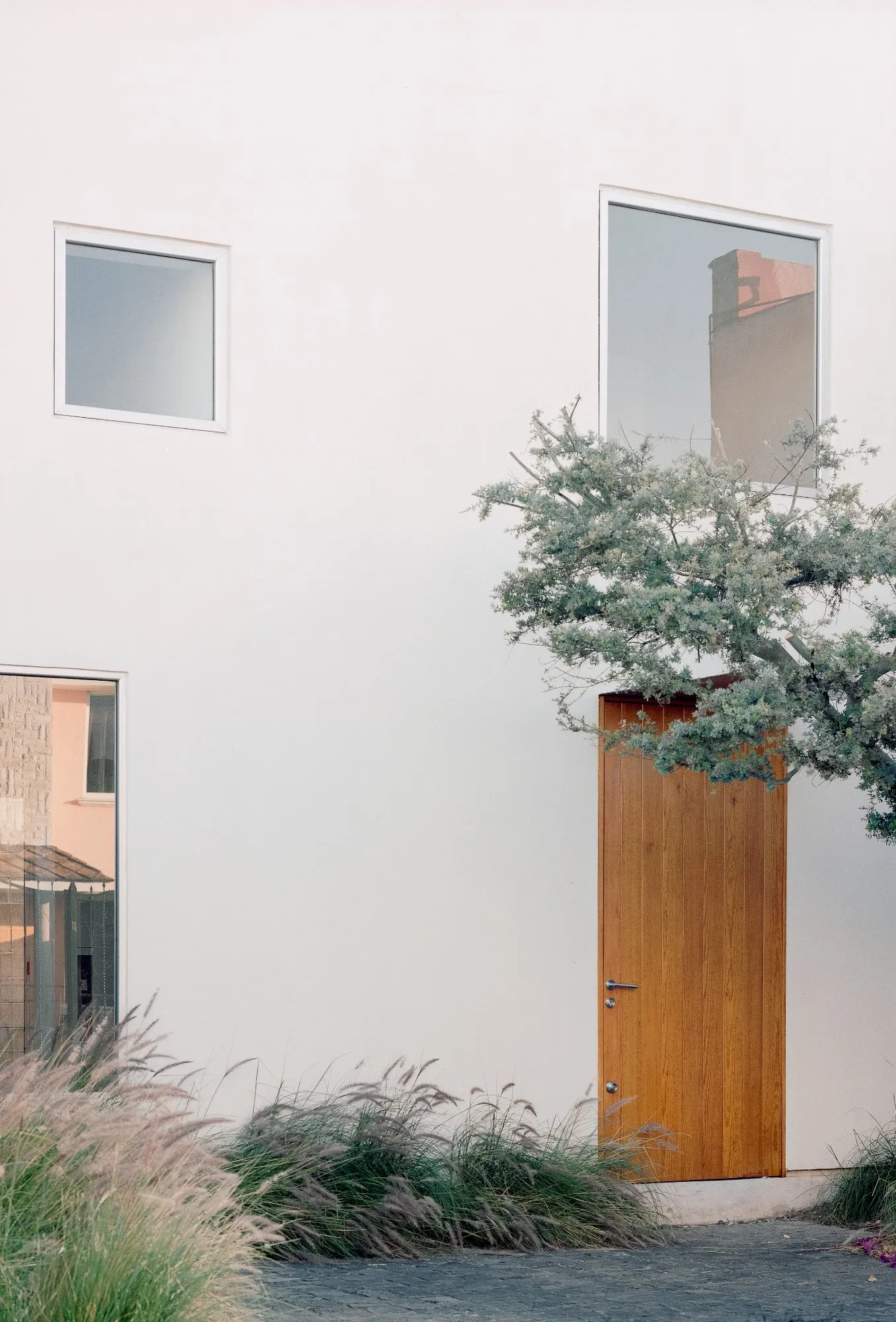
  • House Within a Cube I

    House Within a Cube I

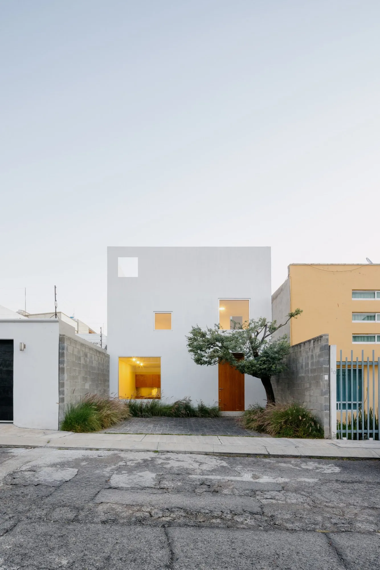
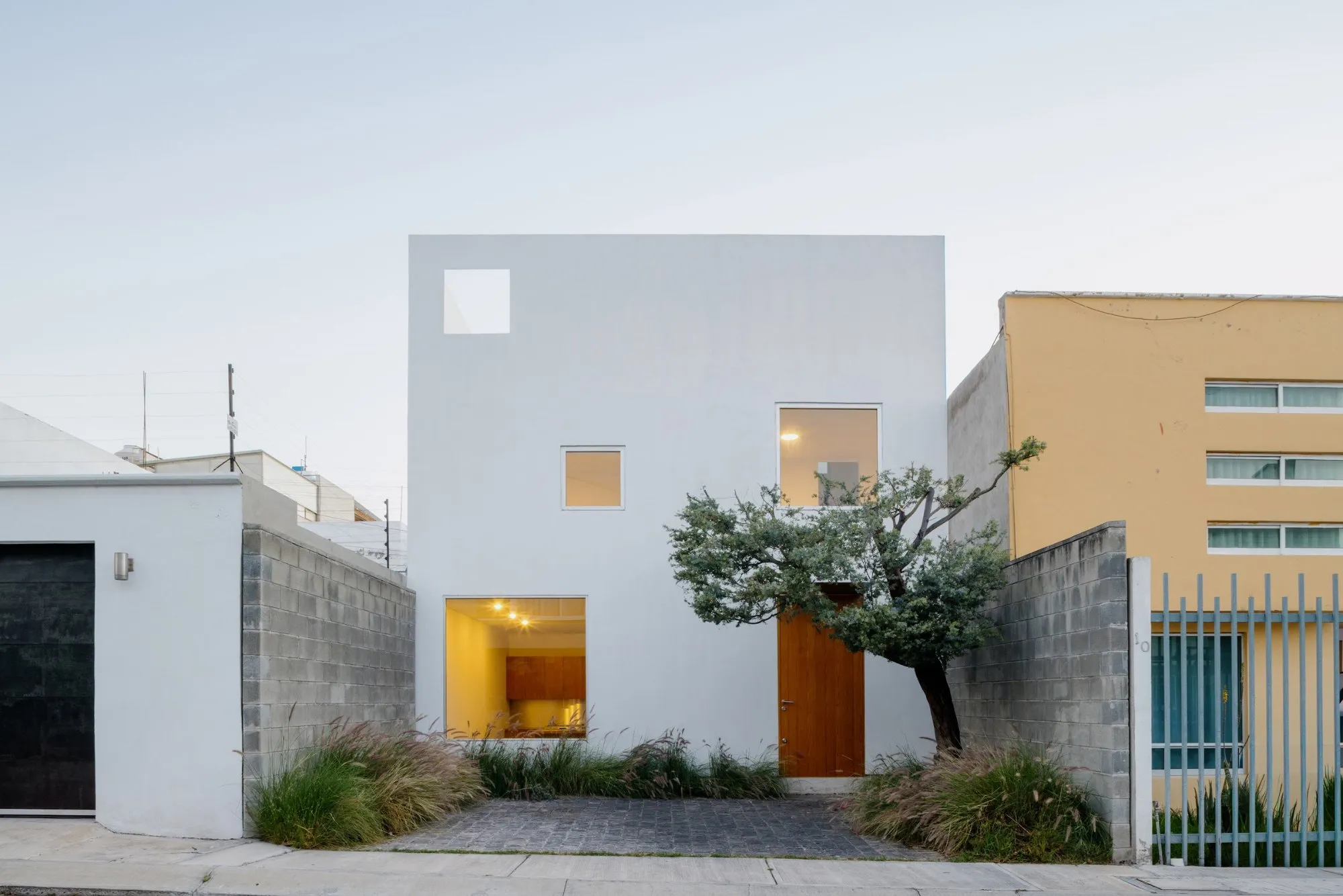
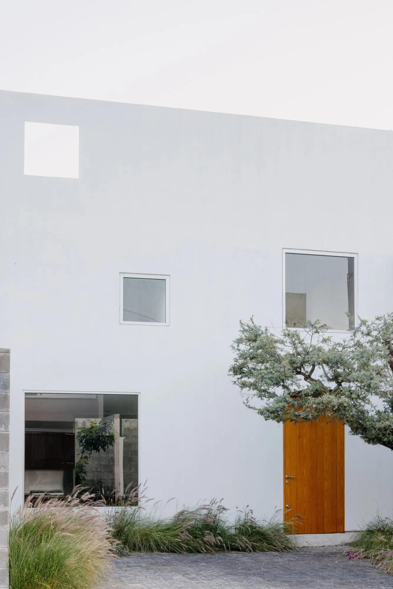
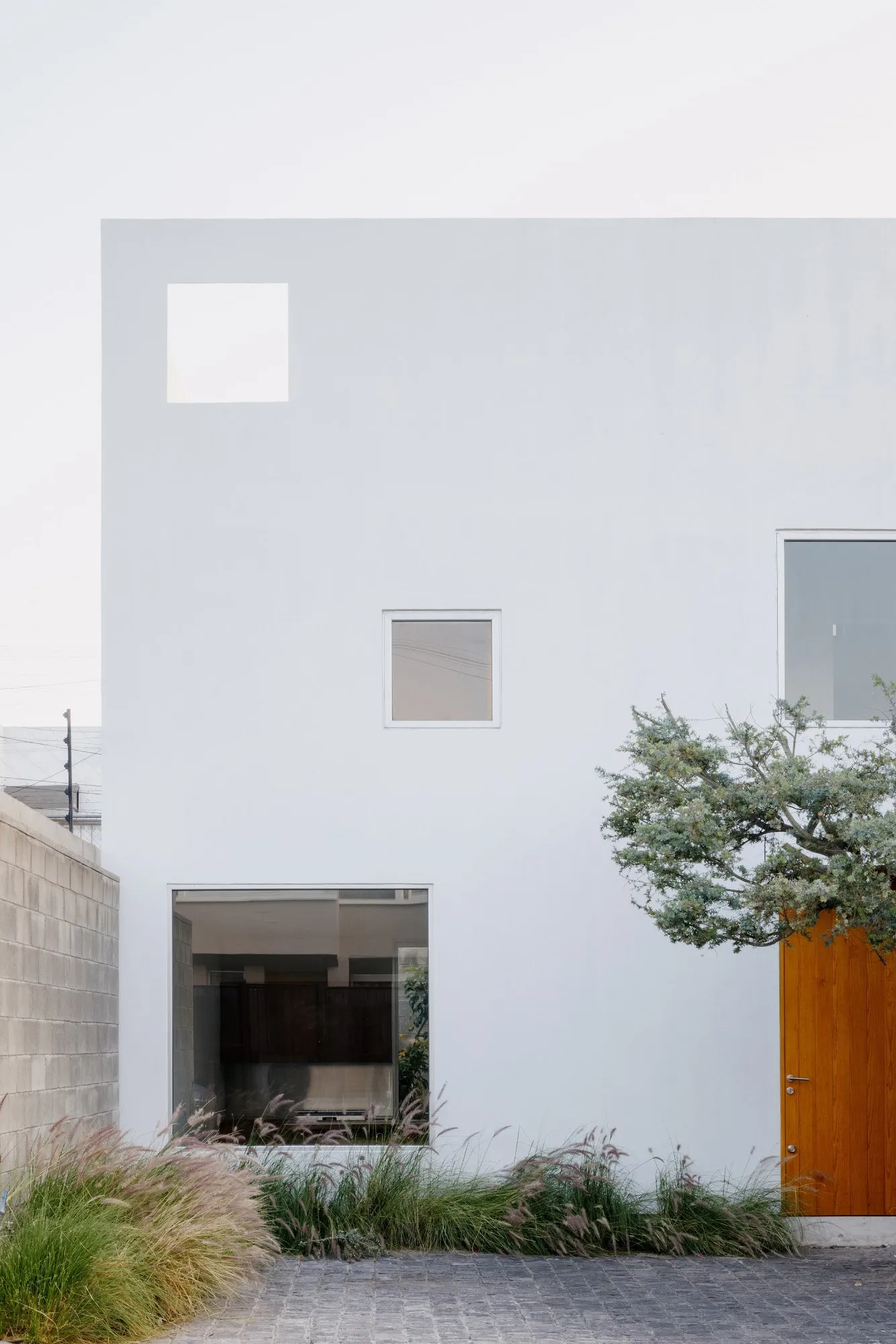
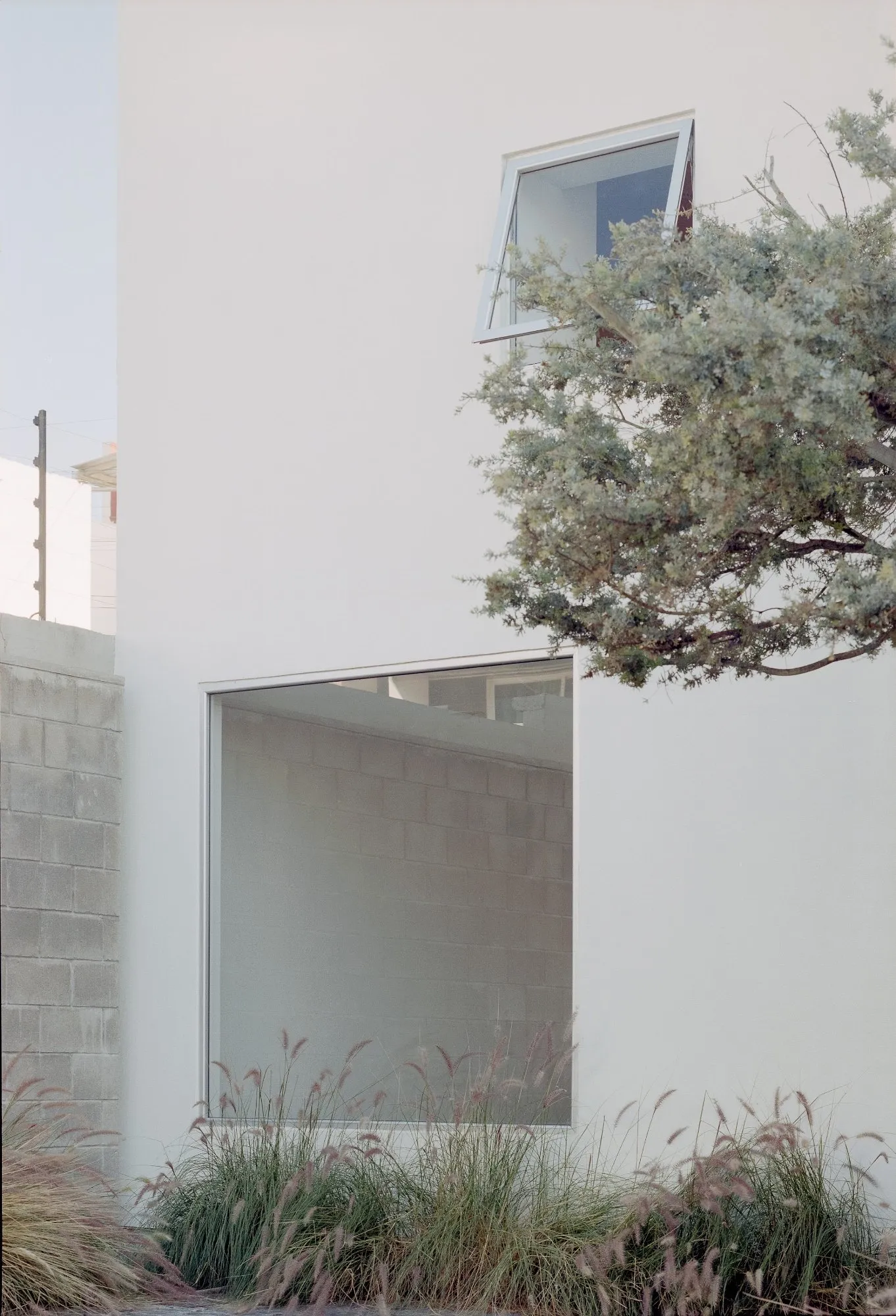
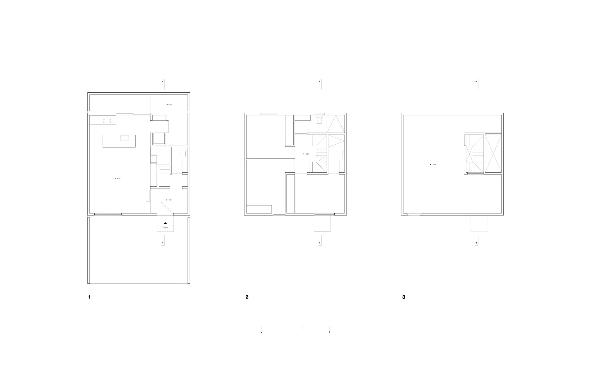
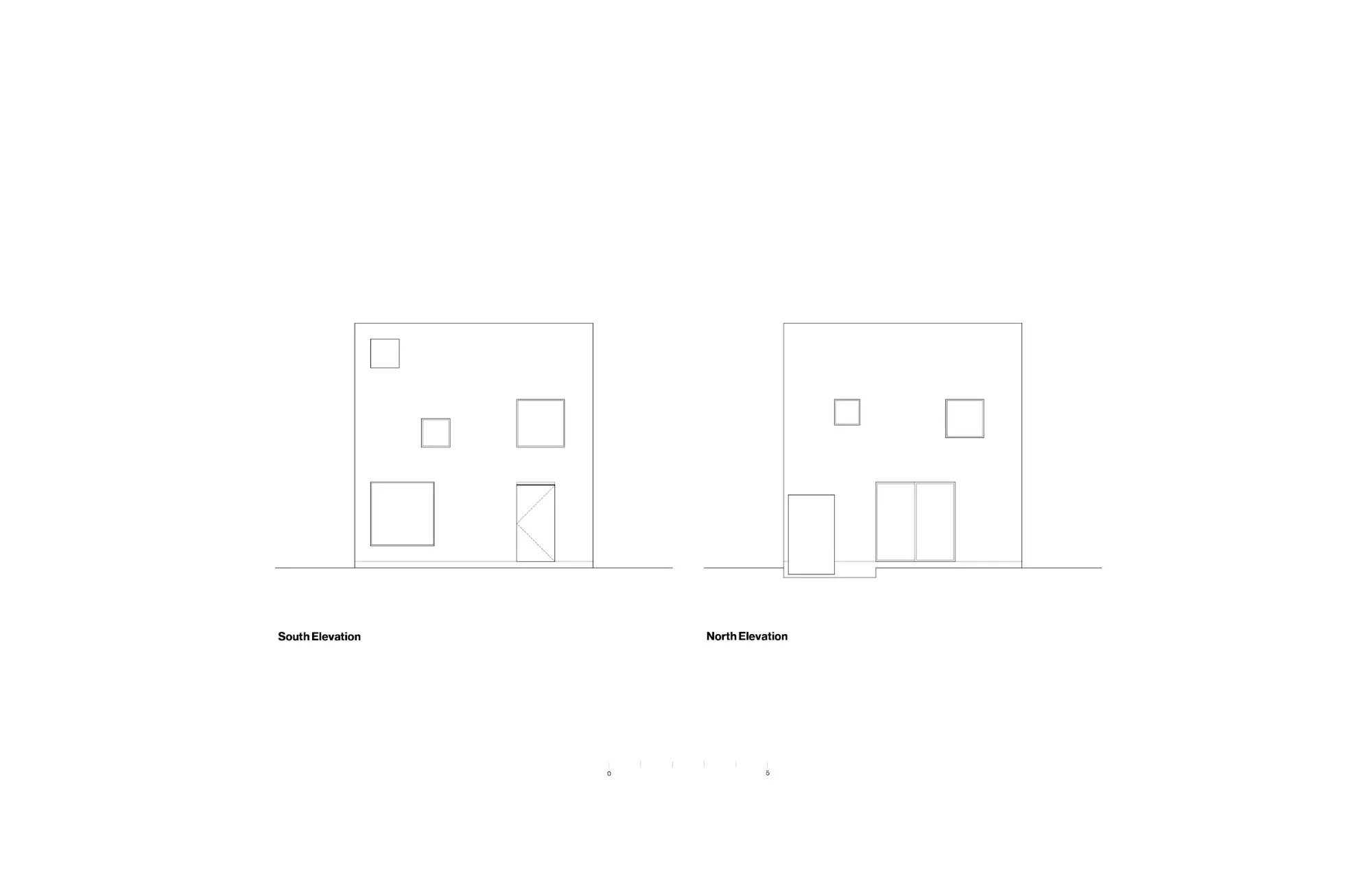
    A single-family house is contained within a cube of 7.5 metres on each side. The compact volume holds the whole programme across three levels, and from outside it reads as one solid, abstract mass.

    The ground floor gathers the shared rooms and the kitchen. Bedrooms and bathrooms occupy the second level, and the top opens to a roof terrace beside service spaces.

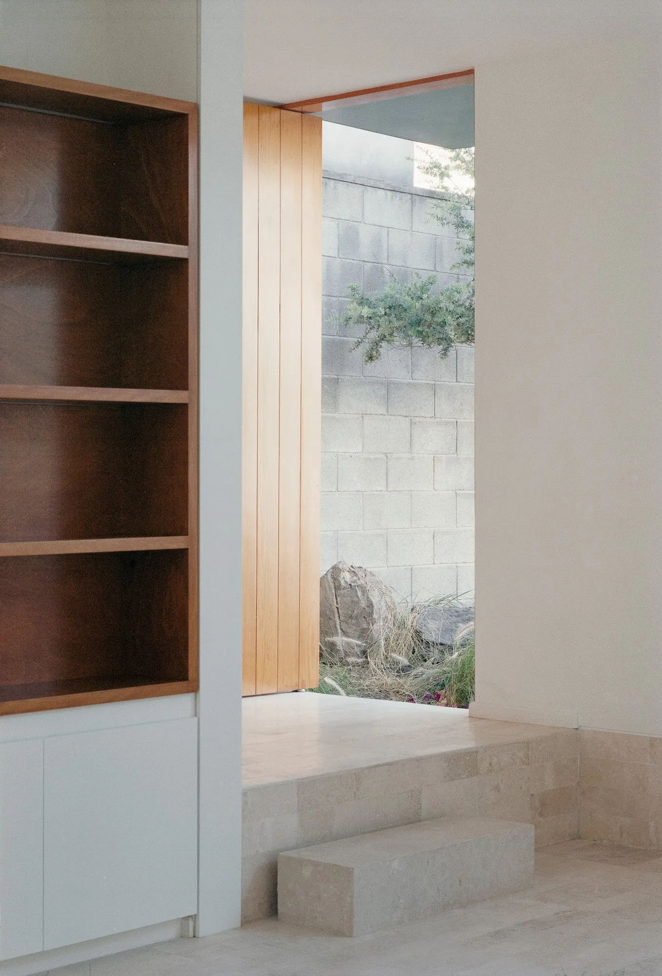
    Inside, small changes of level run through the plan. They separate areas without walls and make the modest floor area feel larger than its dimensions.

    The structure is load-bearing brick, with floors of beams and infill blocks. The outer walls are finished in a fine cement render that covers the brick and gives the cube its monolithic presence.

    House Within a Cube I, view 1
    House Within a Cube I, view 2
    House Within a Cube I, view 3
    House Within a Cube I, view 4
    House Within a Cube I, view 5
    House Within a Cube I, view 6
    House Within a Cube I, view 7
    House Within a Cube I, view 8
    House Within a Cube I, view 9
    House Within a Cube I, view 10
    House Within a Cube I, view 11
    House Within a Cube I, view 12
    House Within a Cube I, view 13
    House Within a Cube I, view 14
    House Within a Cube I, view 15
    House Within a Cube I, view 16
    House Within a Cube I, view 17
    House Within a Cube I, view 18
    House Within a Cube I, view 19
    House Within a Cube I, view 20
    House Within a Cube I, view 21
    House Within a Cube I, view 22
    House Within a Cube I, view 23
    House Within a Cube I, view 24
    Plans
    Elevations
    Sections
  • Tathasthu

    Tathasthu

    Design began before the clients had even bought the land. Asked to advise on a plot in a residential development, the studio studied the layout, the sun, the prevailing winds and the balance of built and open space, and proposed combining three adjoining plots. The result is a site open on all four sides, with roads on three edges and a banana farm on the fourth.

    The house, for a family of five, combines traditional values and Vastu principles with natural climatic comfort and a contemporary domestic life. The studio designed both architecture and interiors, so the house developed as one continuous system.

    A courtyard in the northeast organises the plan. Its position follows Vastu, and it also works environmentally, letting in soft morning light, driving cross ventilation and keeping visual links between family members in different rooms. The plan moves gradually from public to private: a foyer leads to the formal living room, while the family room, dining area and kitchen gather around the courtyard.

    The hot climate calls for light to be tempered rather than maximised. Deep overhangs, proportioned openings and the arrangement of the plan limit heat gain, and passive cooling reduces reliance on machines. Upstairs, a contemporary jharokha keeps the traditional bay window’s roles of framing landscape, filtering light and offering a place to pause, without its ornament.

    Kota stone, natural slate, timber and metal were chosen to last and to age well. CNC-cut Kota stone floors bring new fabrication to a familiar local material, and a slender metal stair with open timber treads lets light from the courtyard cast moving shadows. The name, a Sanskrit blessing meaning so be it, reflects a process in which the family’s hopes, the land and the architecture developed together.

    Tathasthu, view 1
    Tathasthu, view 2
    Tathasthu, view 3
    Tathasthu, view 4
    Tathasthu, view 5
    Tathasthu, view 6
    Tathasthu, view 7
    Tathasthu, view 8
    Tathasthu, view 9
  • Water Stories

    Water Stories

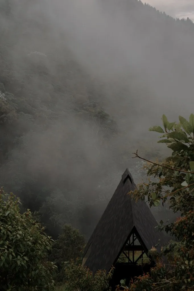
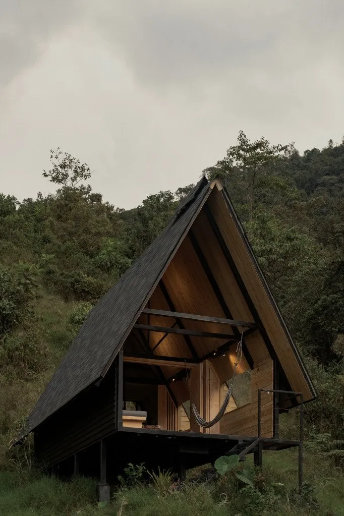
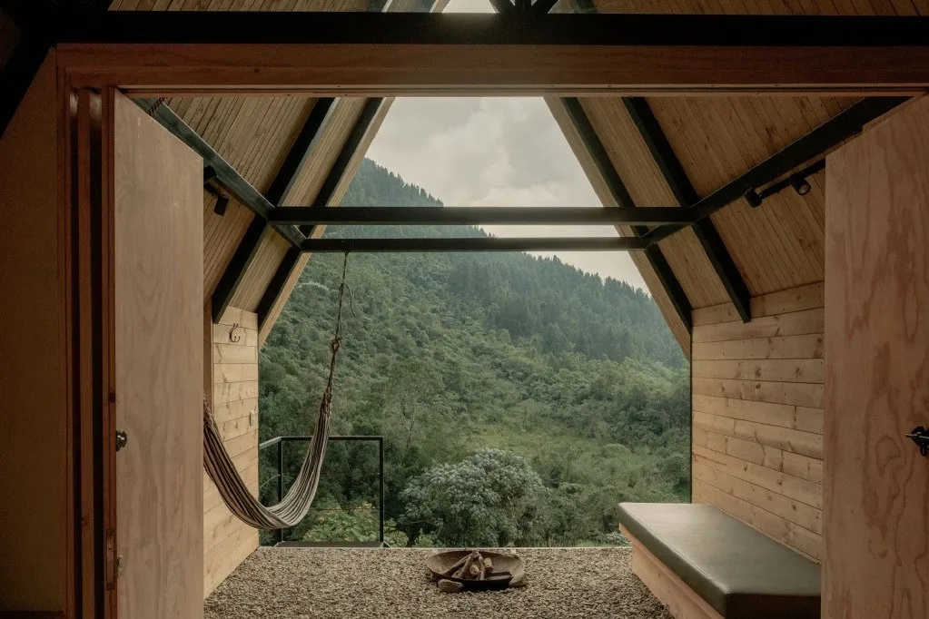
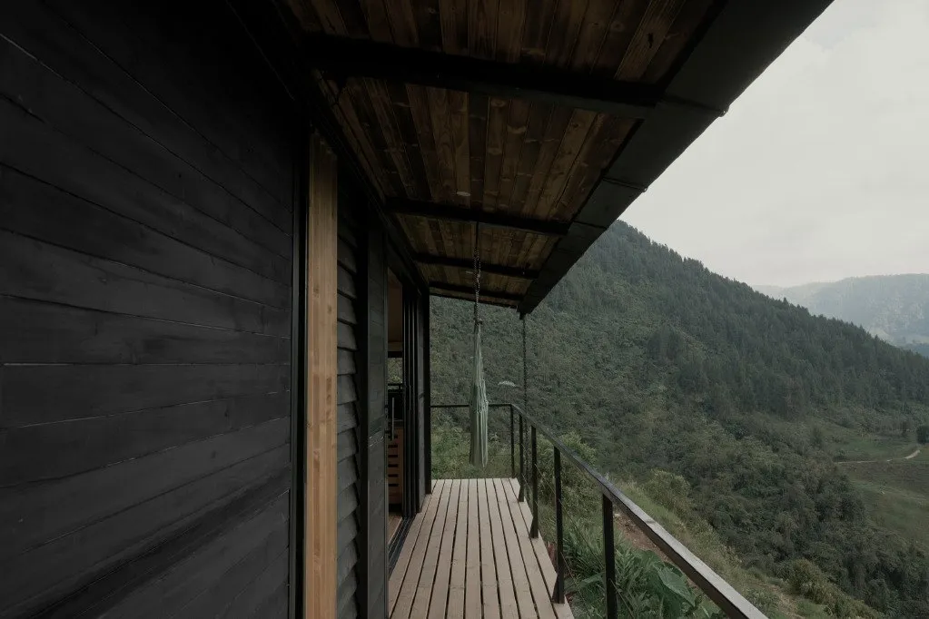
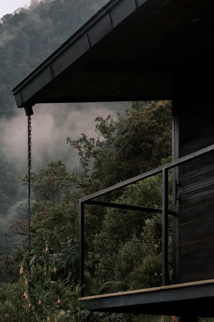
    The project starts with water as an ecological system rather than a surface. In the high Andean forest, moisture in the air is caught by ferns, epiphytes and mosses before moving slowly through canopy, soil and watershed. That cycle shapes a project that combines forest restoration with a few small shelters for short stays and contemplation.

    The land, once logged and grazed by cattle, is being reforested in three zones that respond to altitude, slope, vegetation and soil. In the upper west, where grazing exhausted the soil, pioneer species begin to rebuild fertility. On the east, a cooler creek forest benefits from denser canopy and a stream. The lower bird forest holds the most established native vegetation, where watercourses used by local and migrating birds meet.

    Architecture is part of the restoration rather than a separate destination. The shelters offer temporary accommodation and places for reflection and environmental learning, so visitors experience the processes being restored around them.

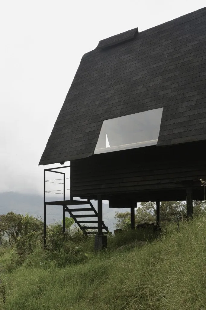
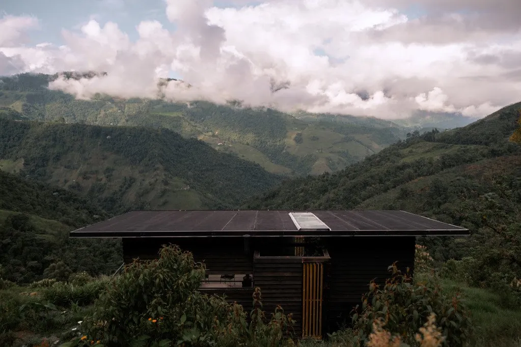
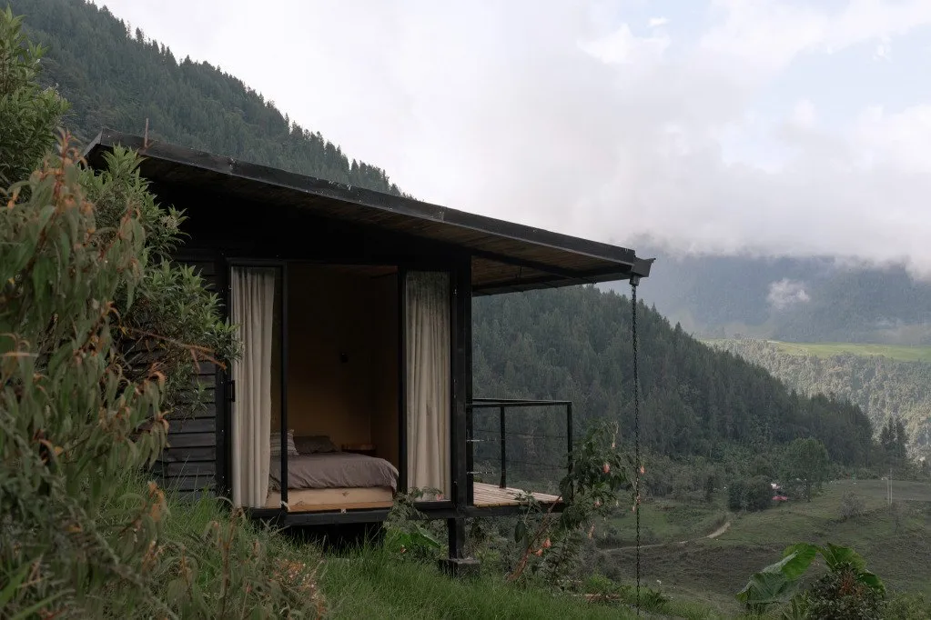
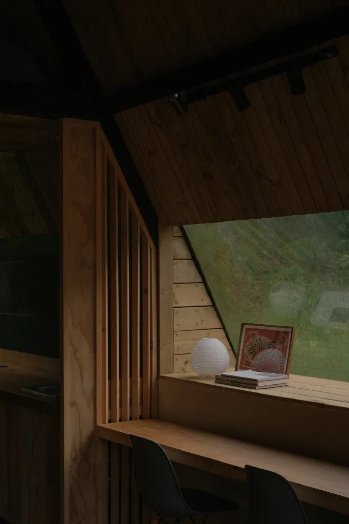
    The steep ground was studied through repeated physical models. Instead of flattening the mountain for platforms, the team set the shelters into the existing slope, each one a lookout tied closely to the vegetation. The two cabins built so far are compact and sit lightly, sharpening awareness of mist, plants, terrain and changing light. Short stays help pay for the long work of bringing the cloud forest back.

    Water Stories, view 1
    Water Stories, view 2
    Water Stories, view 3
    Water Stories, view 4
    Water Stories, view 5
    Water Stories, view 6
    Water Stories, view 7
    Water Stories, view 8
    Water Stories, view 9
  • NORM Residence

    NORM Residence

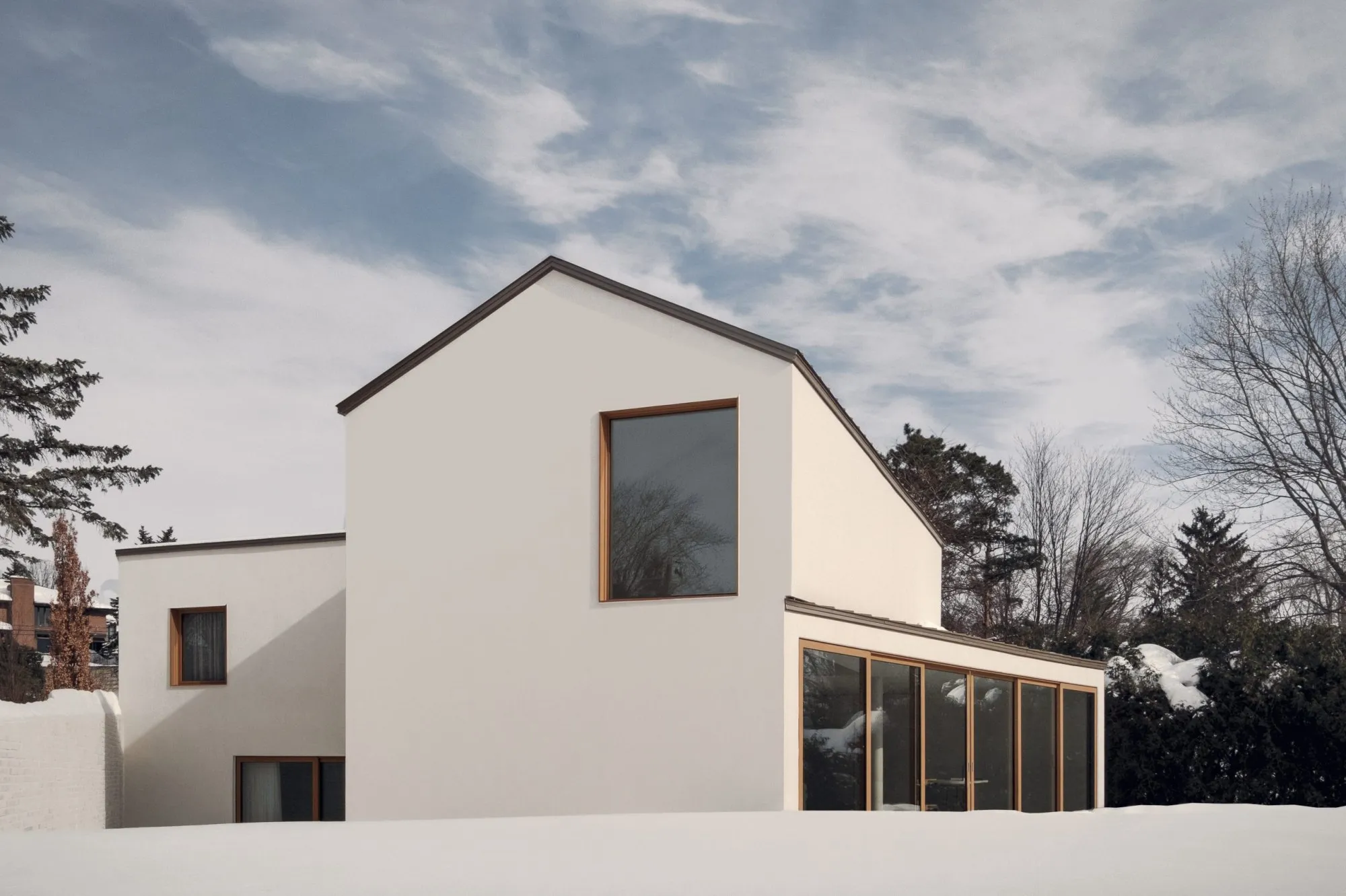
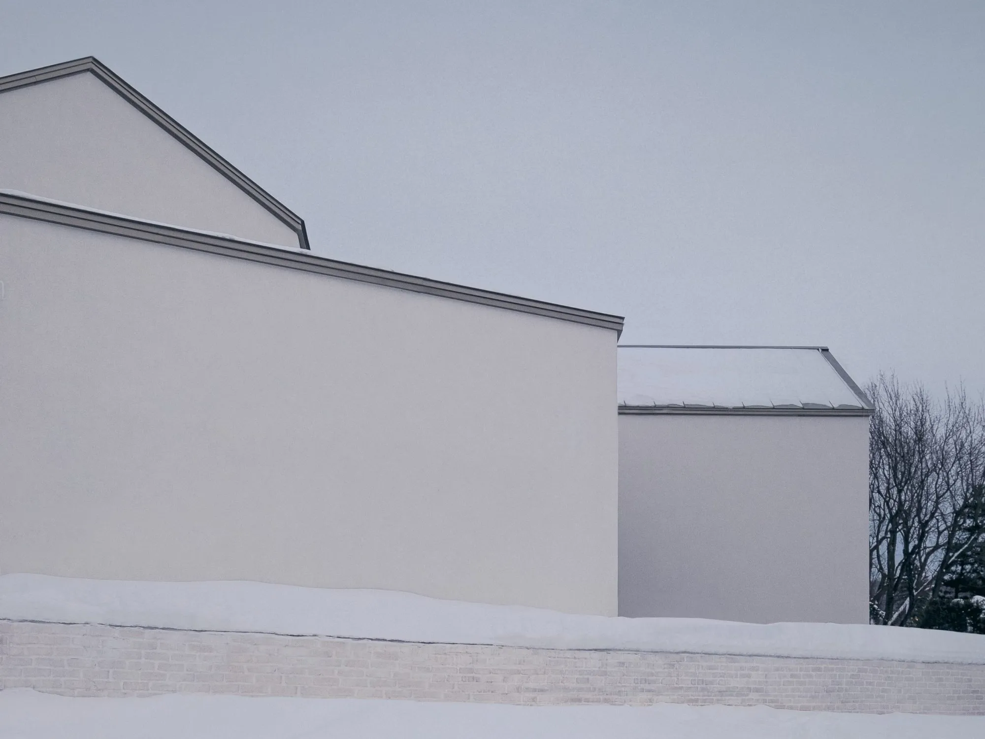
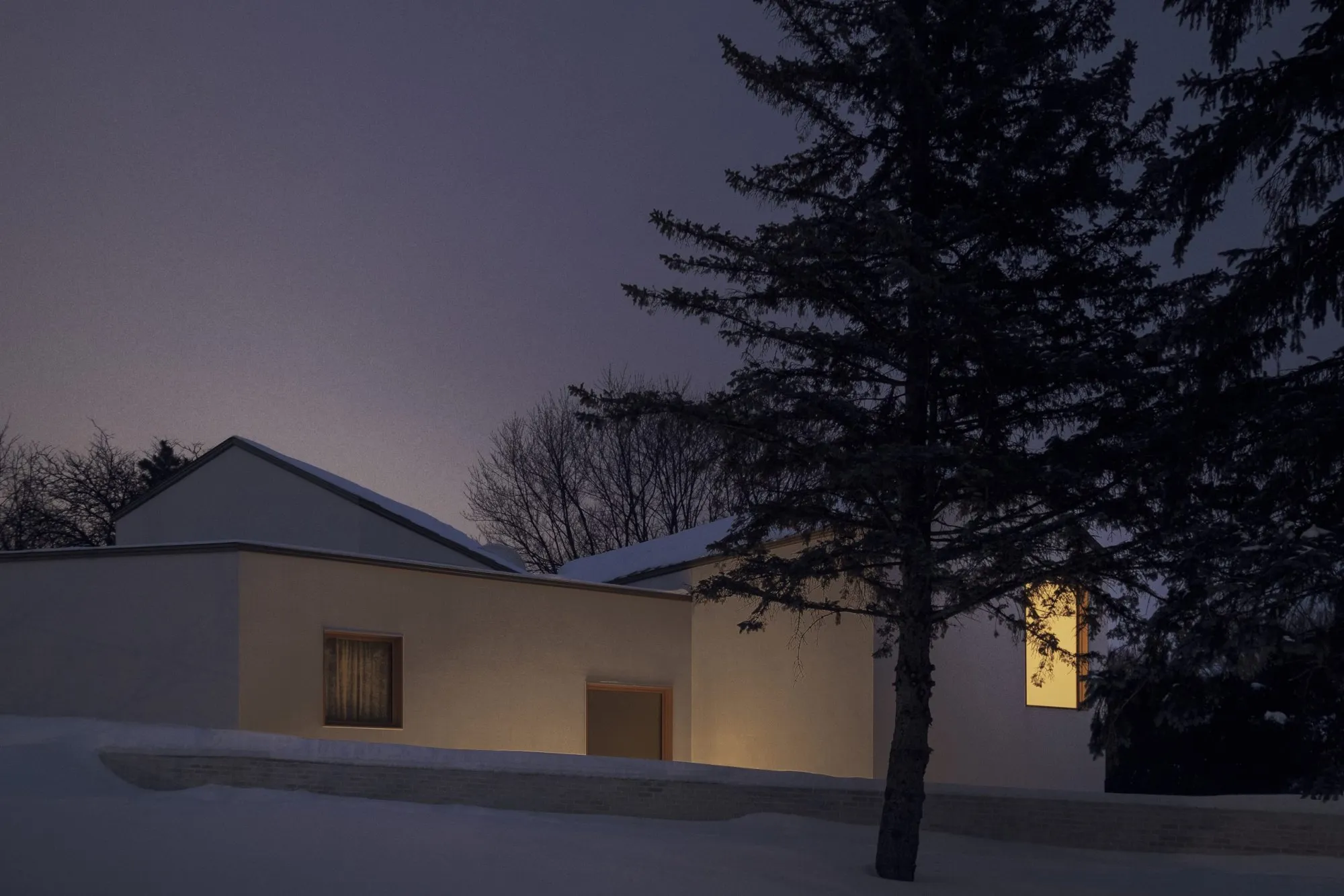
    The project transforms a conventional suburban house by reversing its programme, turning its rooms towards the landscape and reducing material expression for a quieter, more contemplative way of living. The area mixes an orthogonal street grid with roads that bend around uneven ground, and mature trees give it a wooded character, while the winding streets expose several sides of each house to view. These conditions became the starting point for questioning the generic suburban house.

    Before the work, the garage took the sunniest southern part of the gently sloping site, the main living spaces faced north, and the street front was dominated by the garage door, leaving the entrance almost hidden.

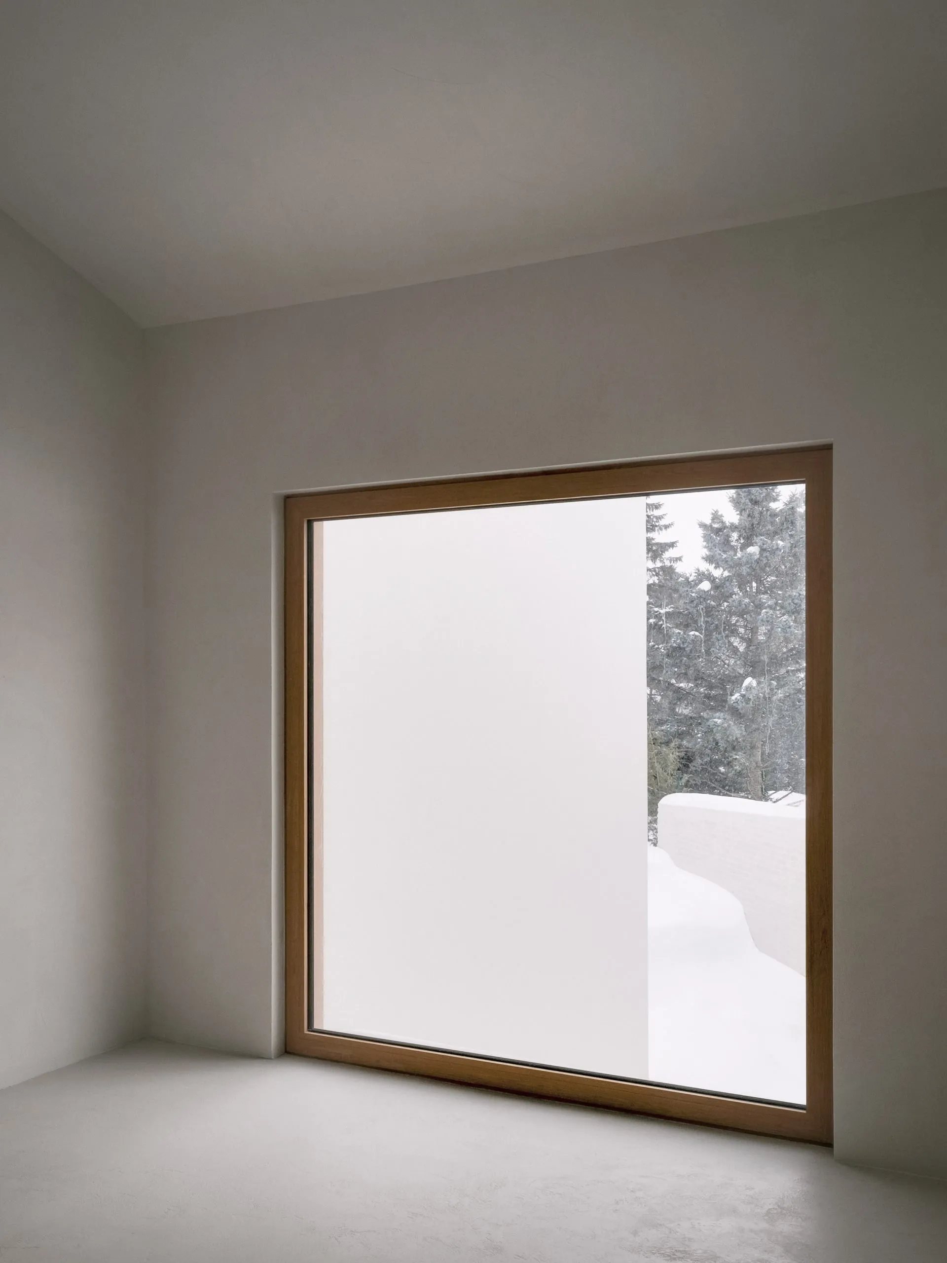
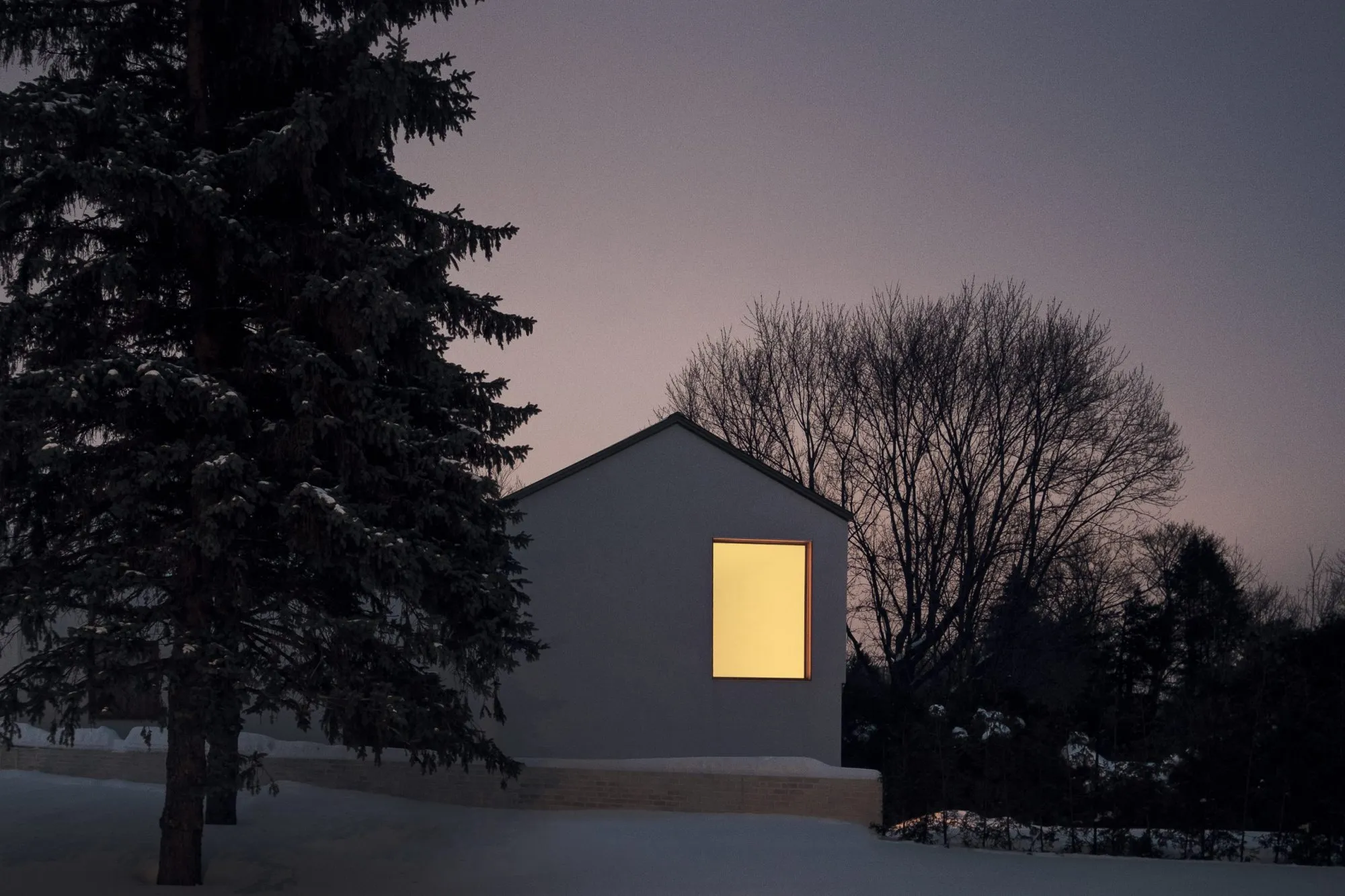
    The renovation and extension reverse the whole arrangement. Rather than treating each volume on its own, the new plan sets up continuous relationships between rooms and particular parts of the site. Glazed openings are aimed at single trees, patches of planting, the sky or the ground, filtering out the suburb around. The interior feels secluded despite close neighbours, and light, foliage and the seasons shape the character of each room.

    Inside, material variation is kept low. A uniform palette supports the abstract, multidirectional quality of the space, letting the function of each room recede into what the architect calls a fluid landscaped interior. Lime plaster, micro-cement and pale surfaces carry from inside to out, and the emphasis moves to nature, light and season rather than finishes.

    NORM Residence, view 1
    NORM Residence, view 2
    NORM Residence, view 3
    NORM Residence, view 4
    NORM Residence, view 5
    NORM Residence, view 6
    NORM Residence, view 7
    NORM Residence, view 8
    NORM Residence, view 9
    NORM Residence, view 10
    NORM Residence, view 11
    NORM Residence, view 12
    NORM Residence, view 13
    NORM Residence, view 14
    NORM Residence, view 15
    NORM Residence, view 16
    NORM Residence, view 17
    NORM Residence, view 18
    NORM Residence, view 19
    NORM Residence, view 20
    NORM Residence, view 21
    NORM Residence, view 22
    NORM Residence, view 23
    NORM Residence, view 24
    NORM Residence, view 25
    NORM Residence, view 26
    NORM Residence, view 27
    NORM Residence, view 28
    NORM Residence, view 29
  • Biot Town Hall Extension

    Biot Town Hall Extension

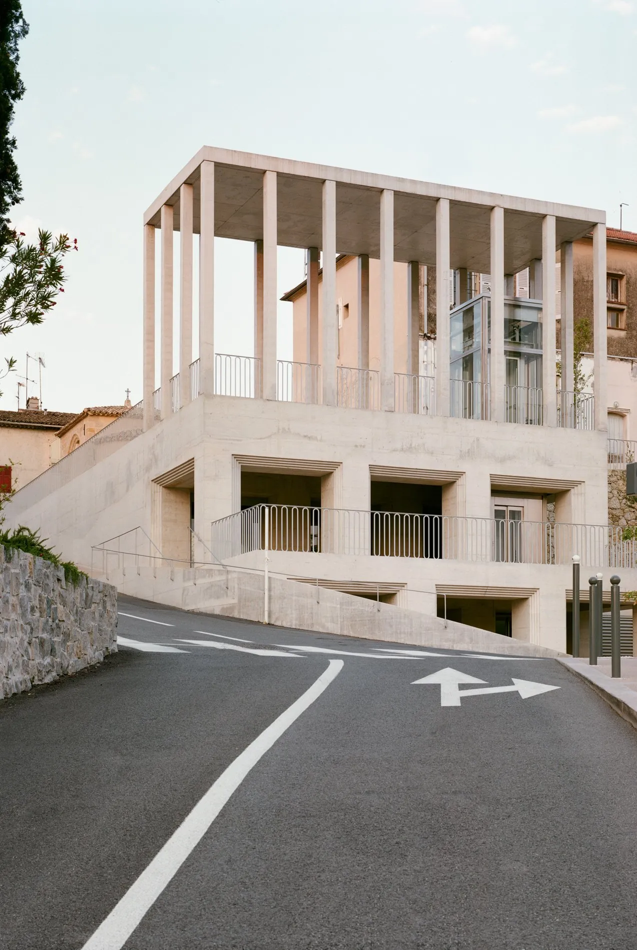
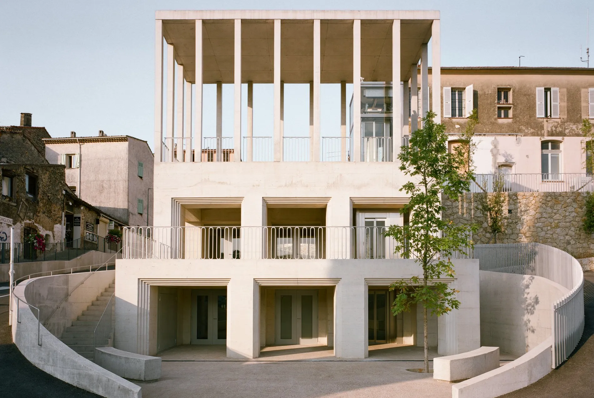
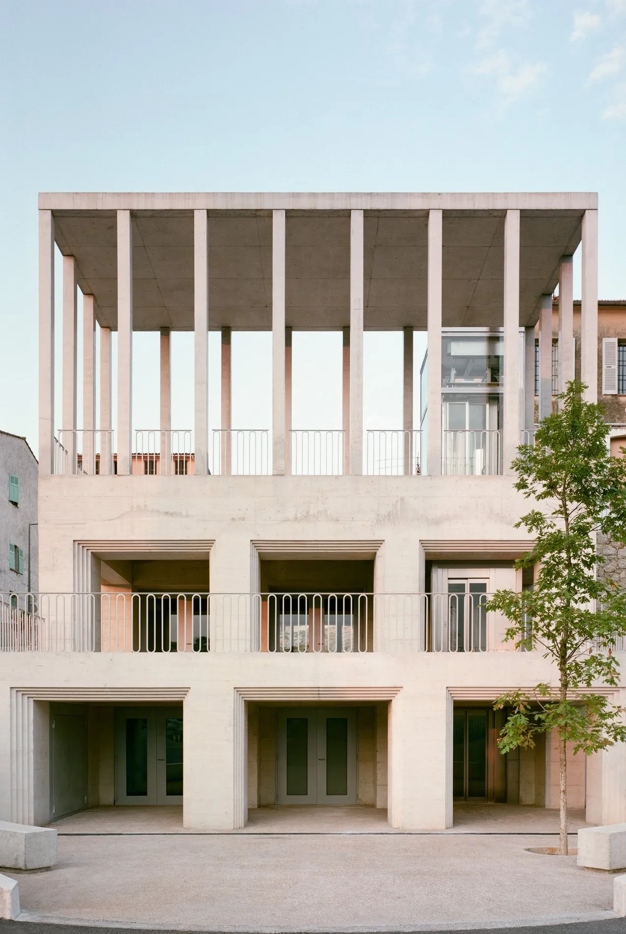
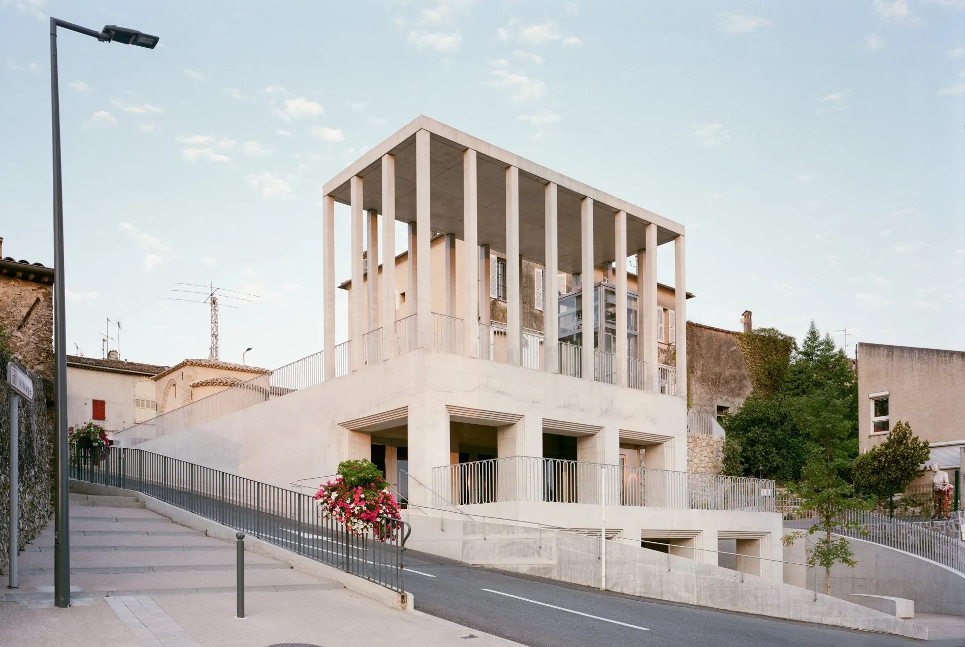
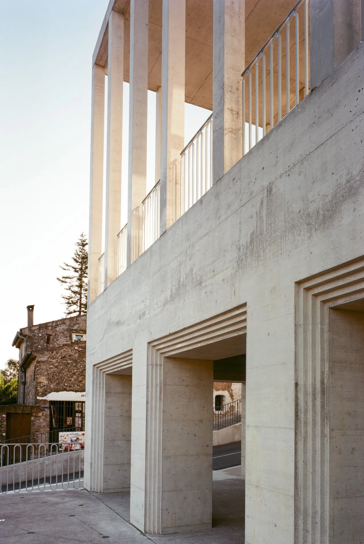
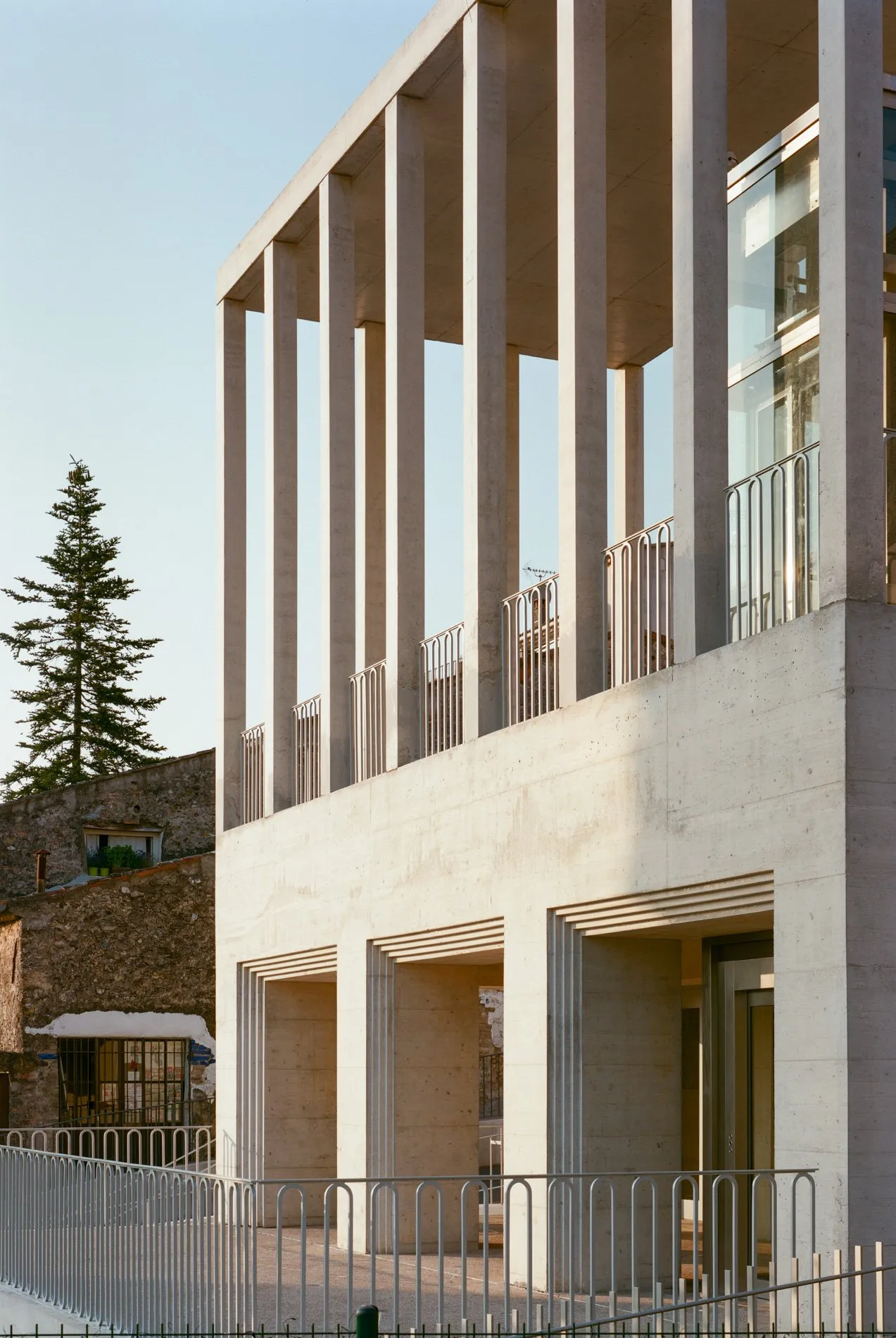
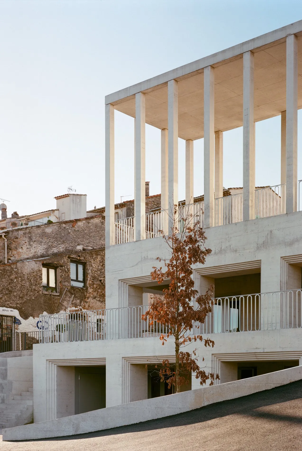
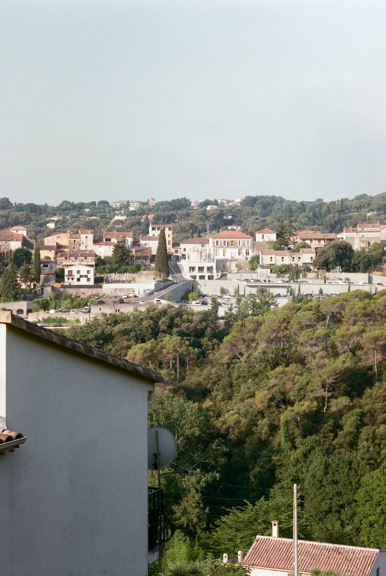
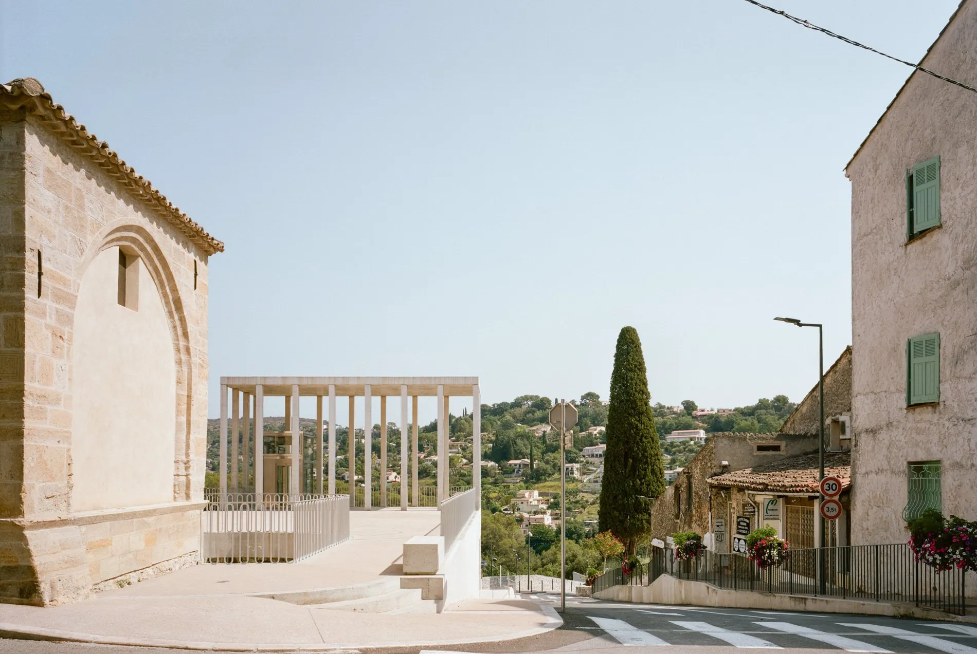
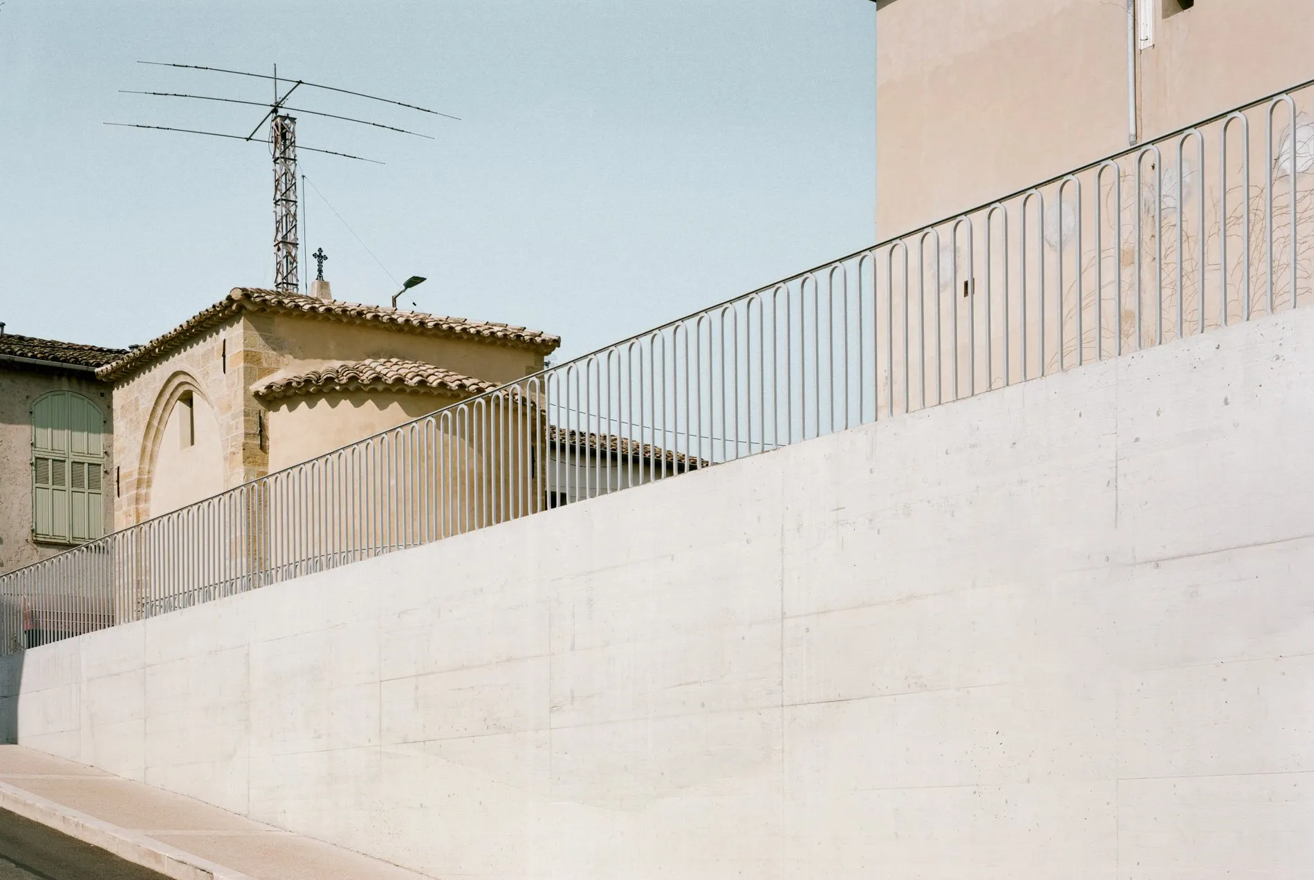
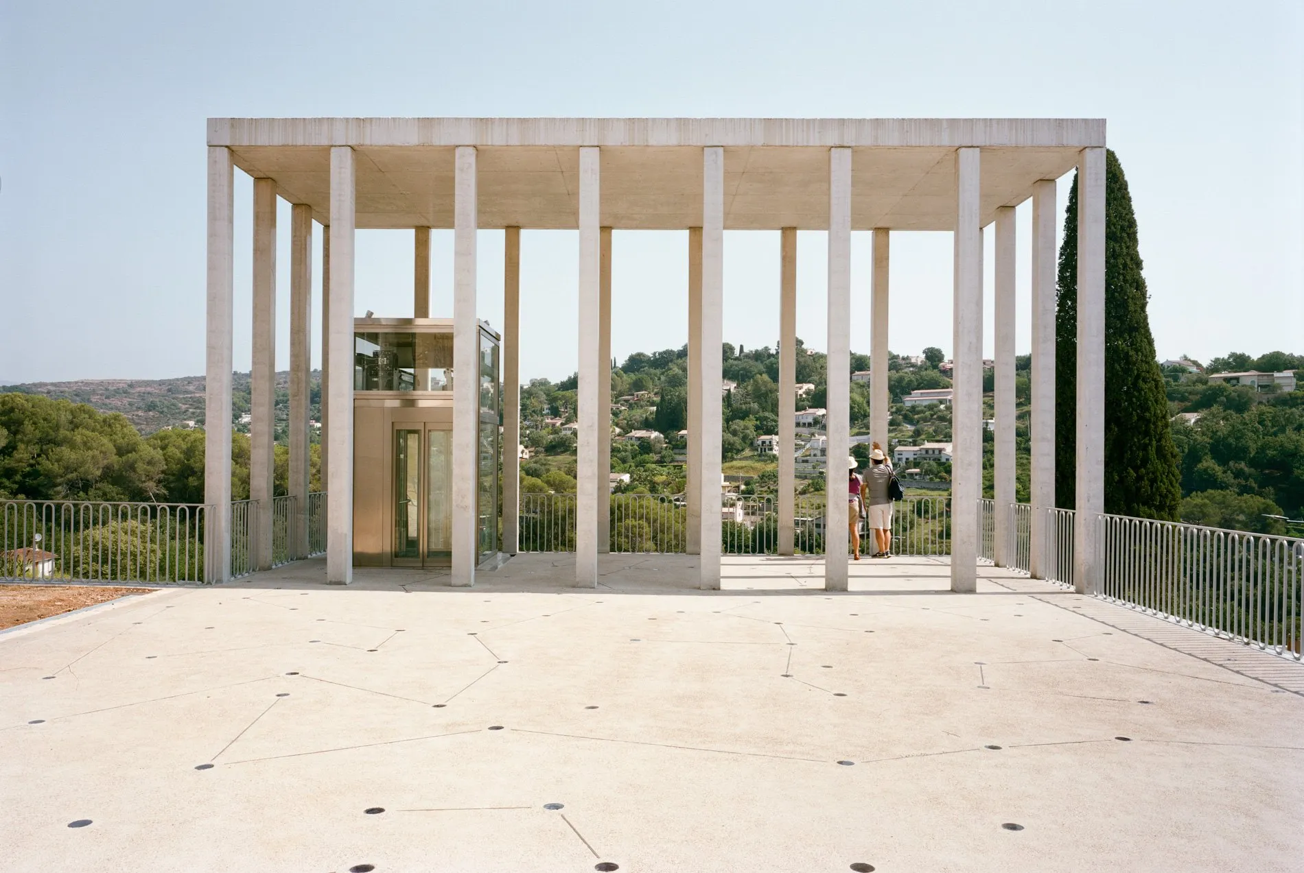
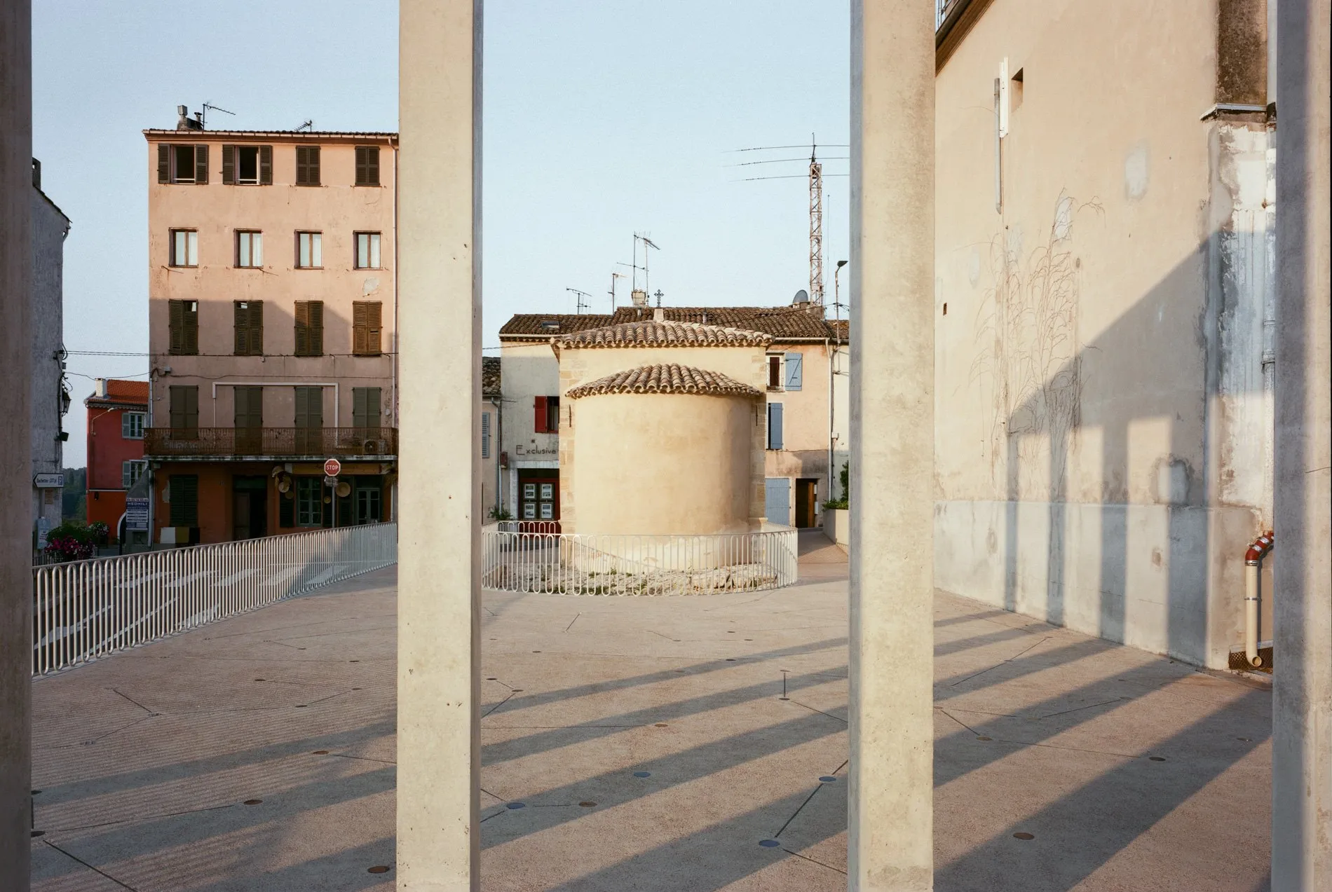
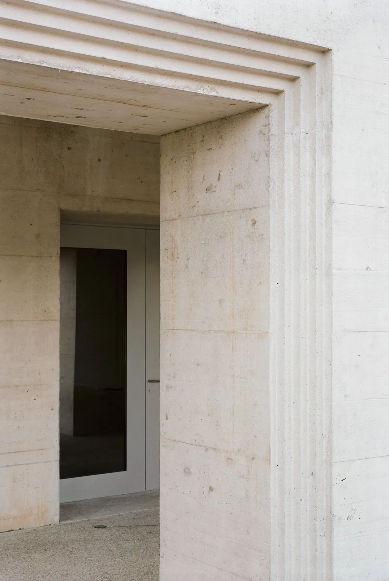
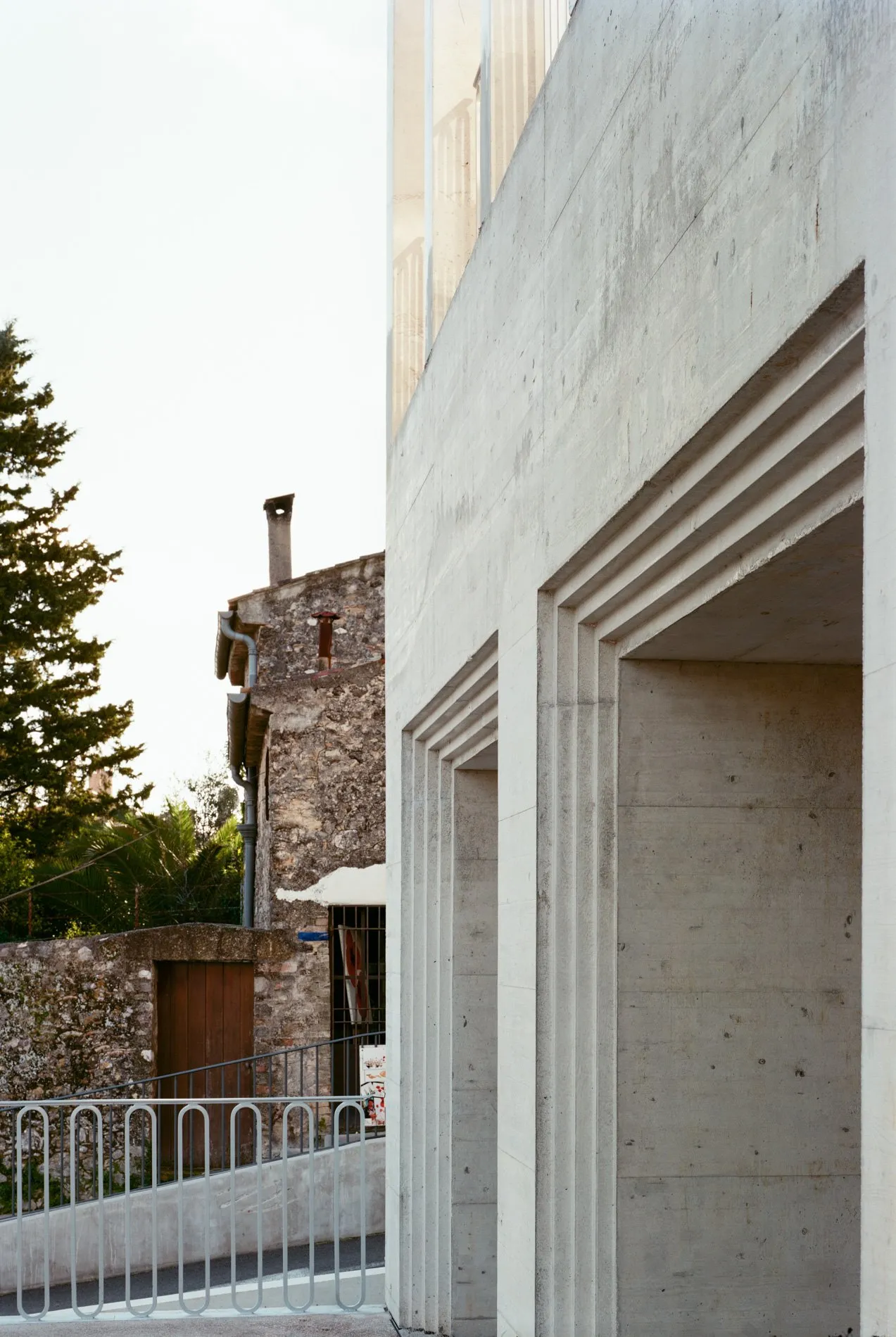
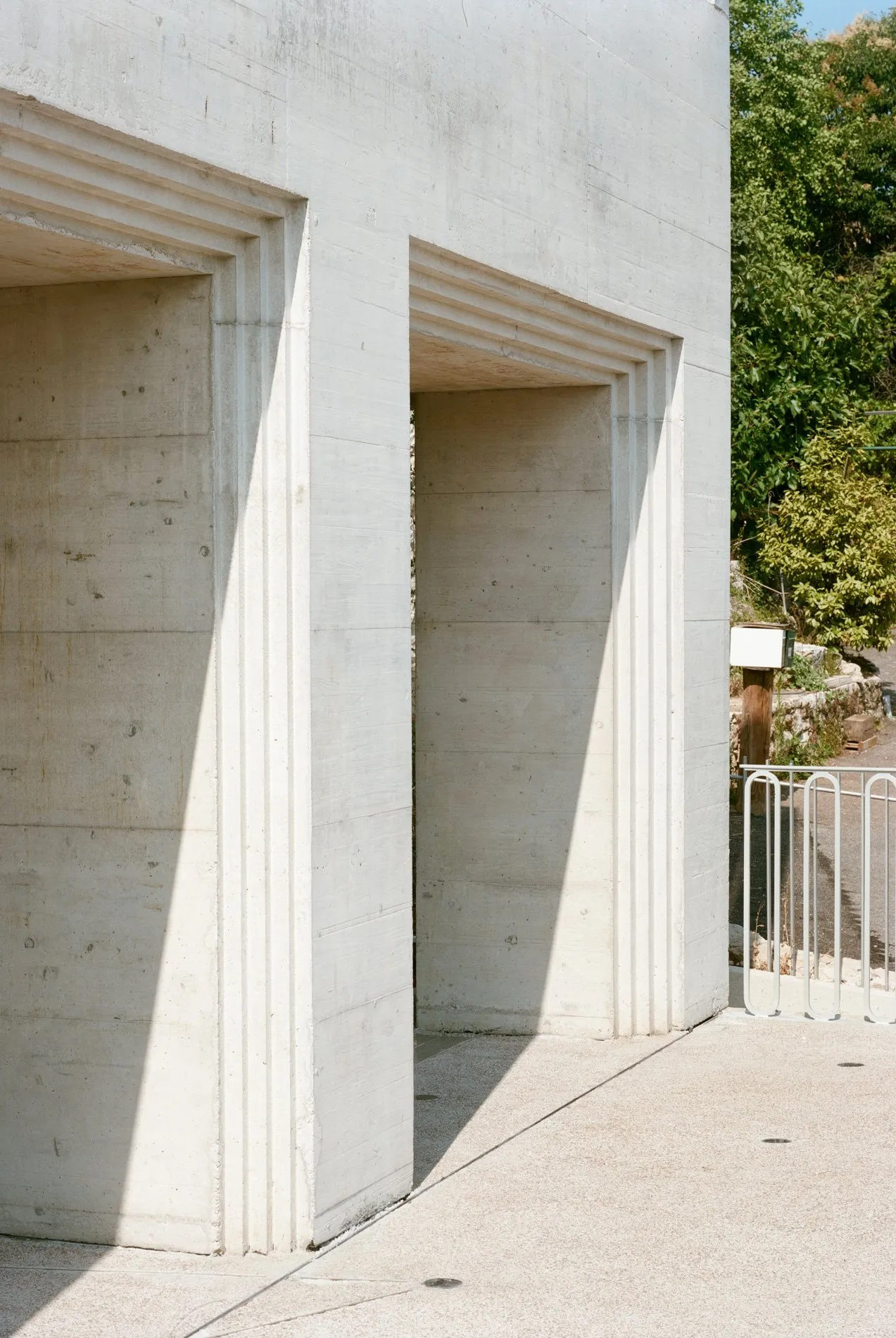
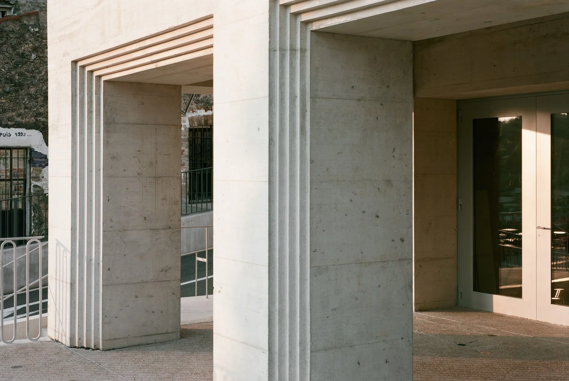
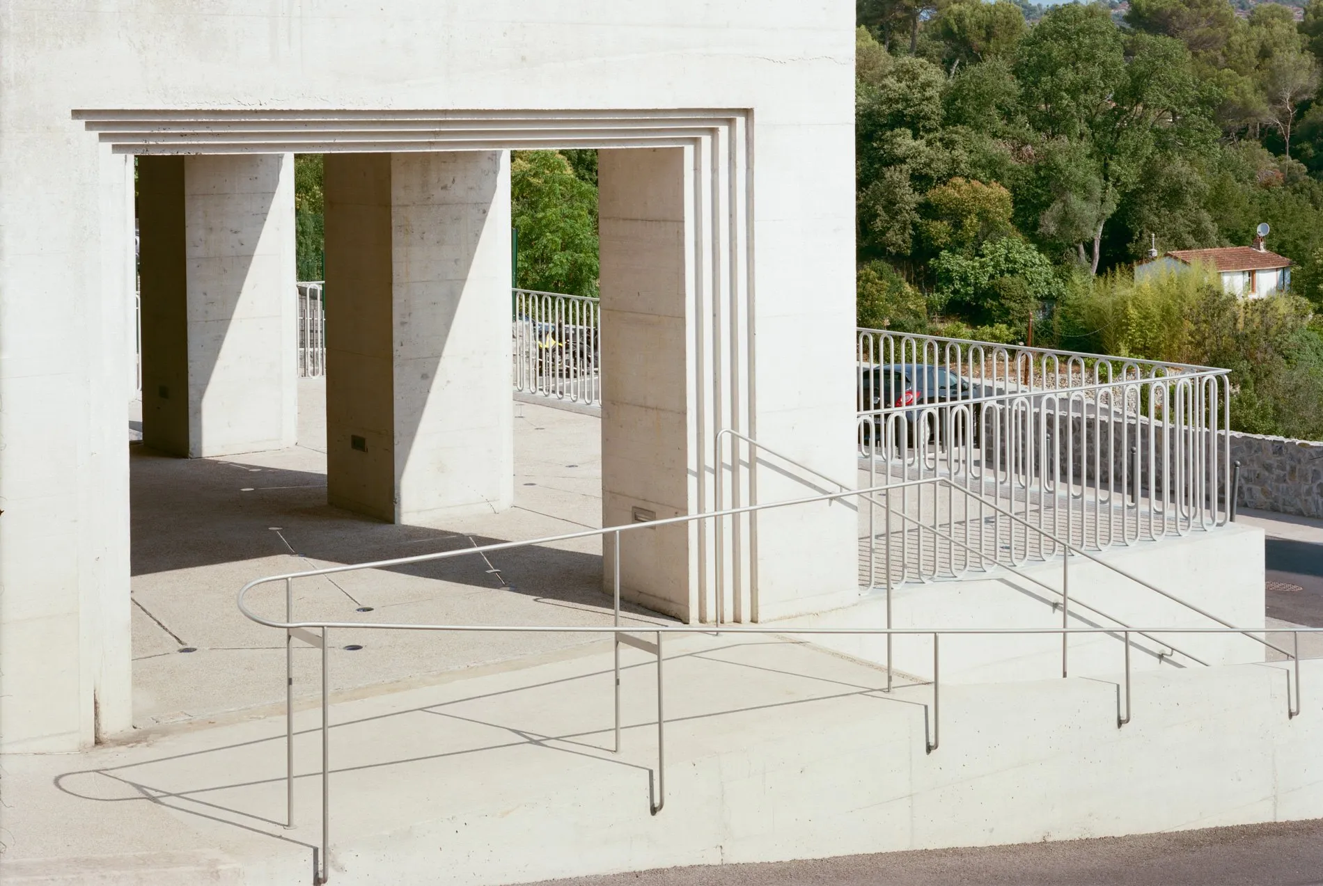
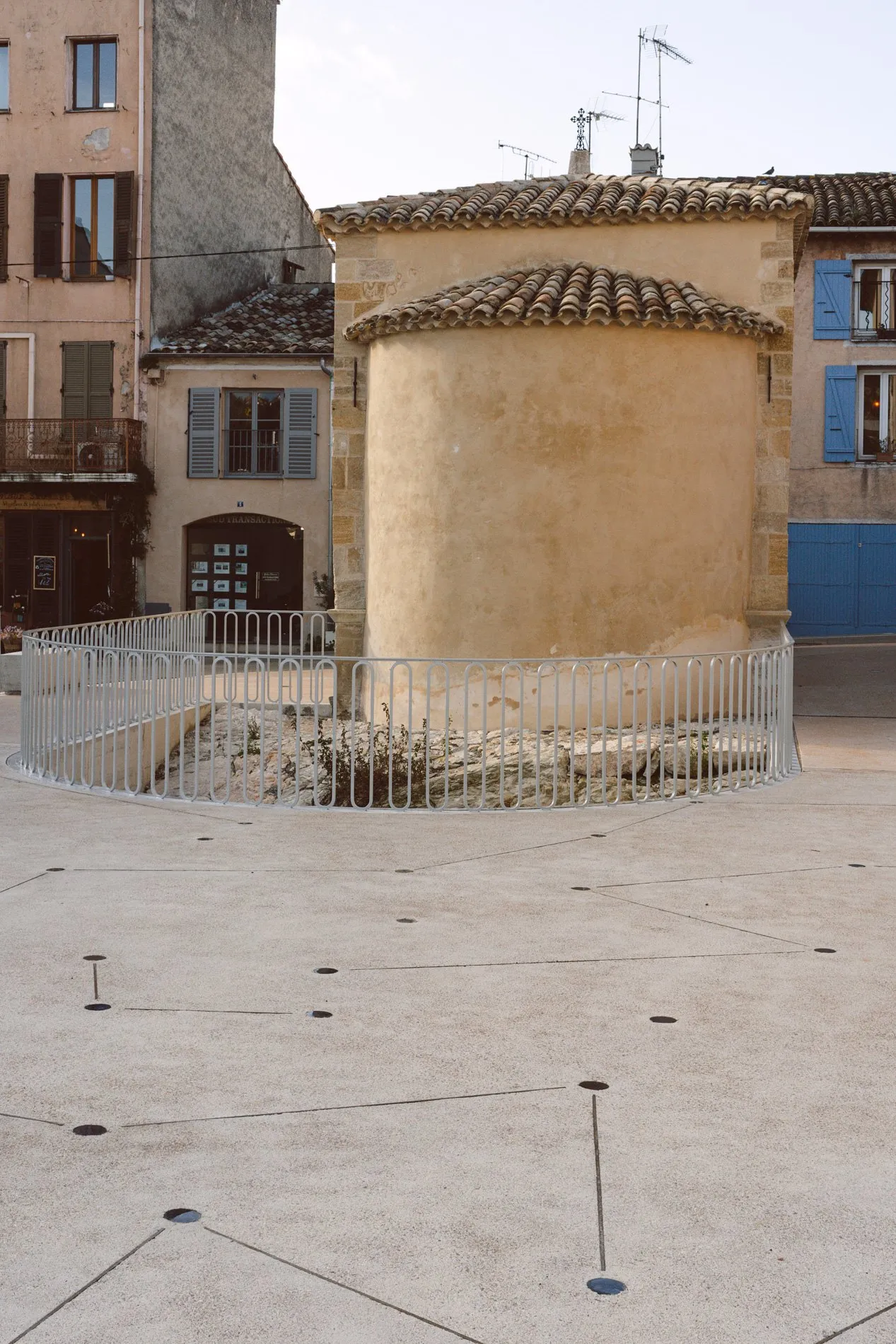
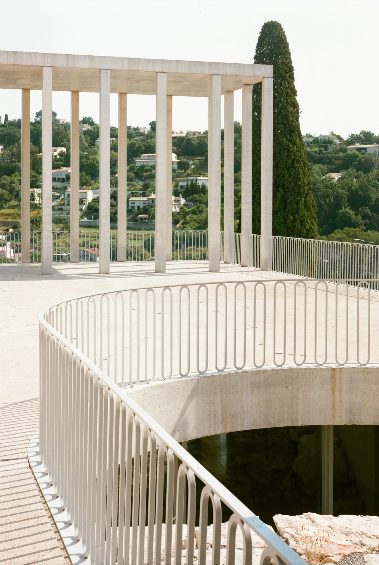
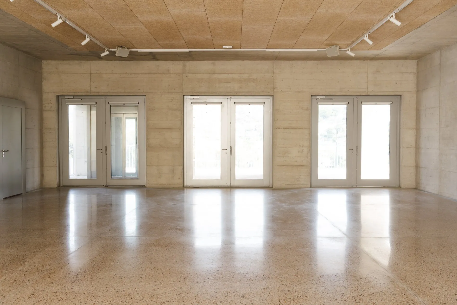
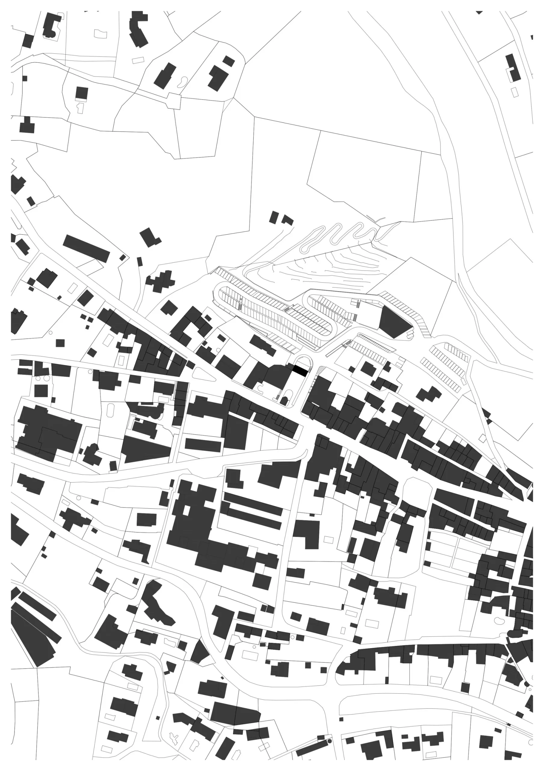
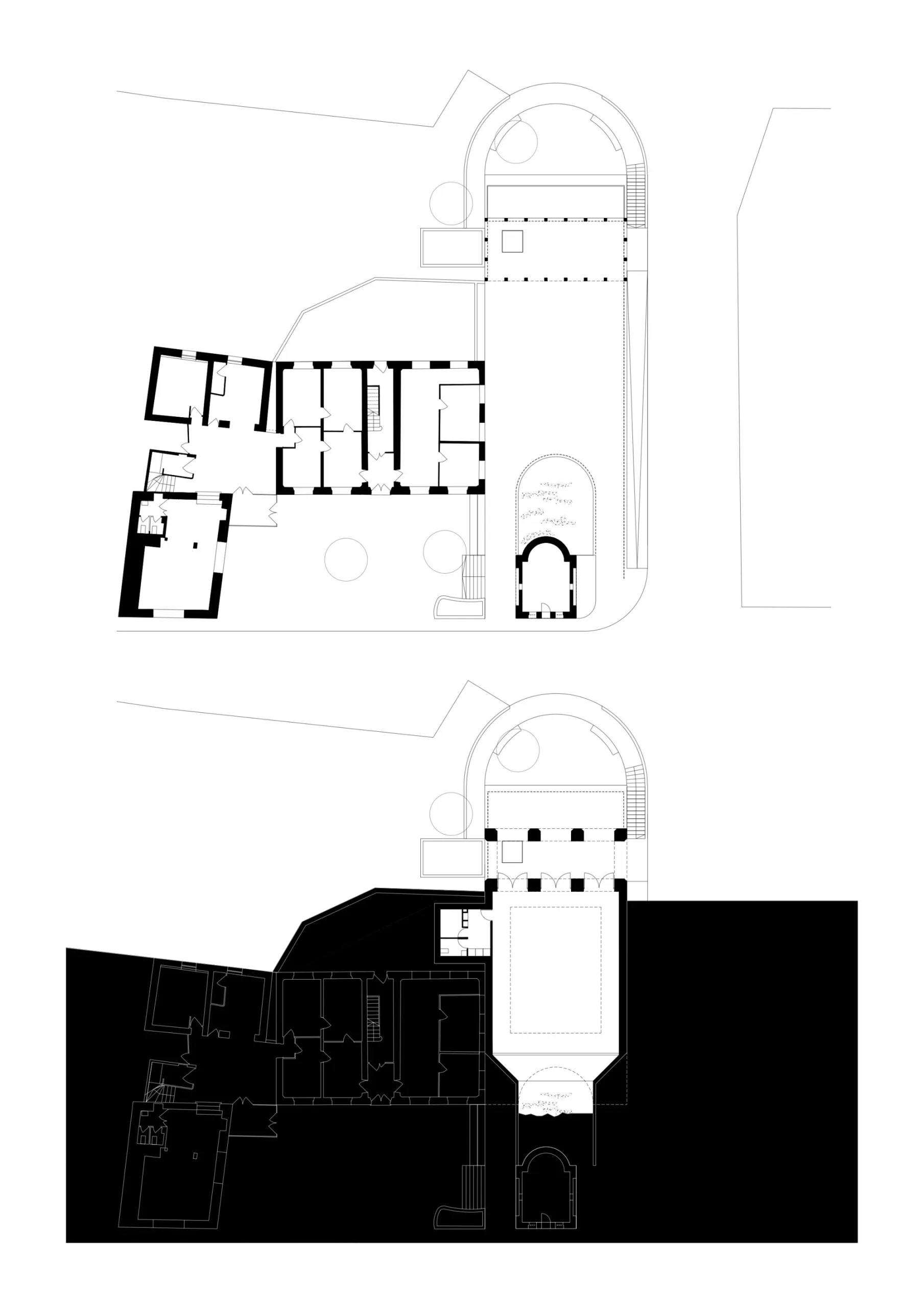
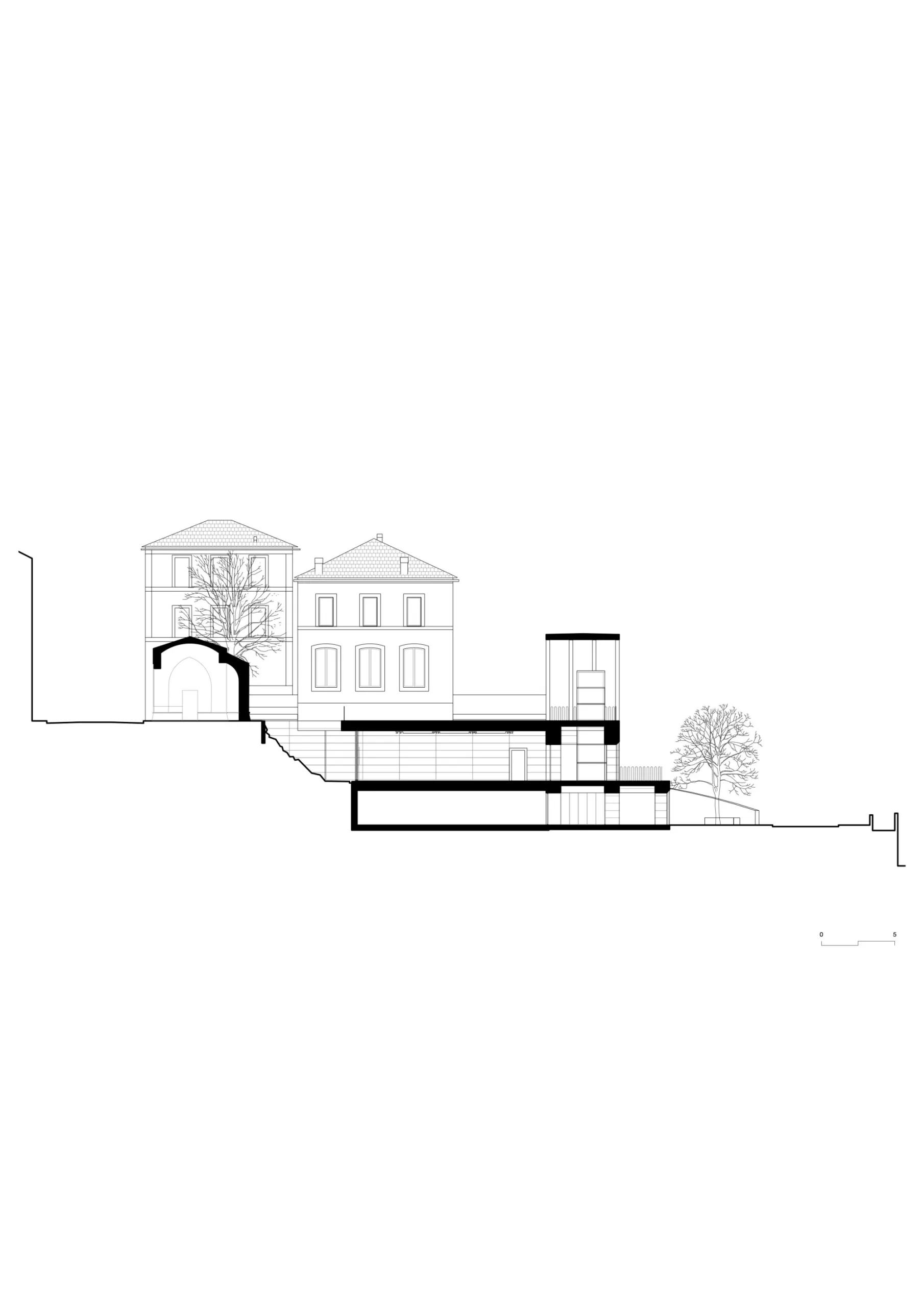
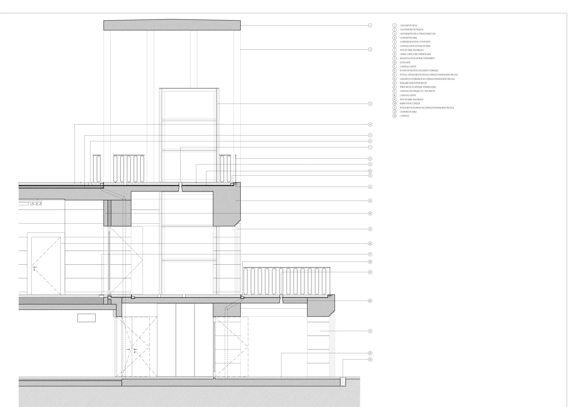
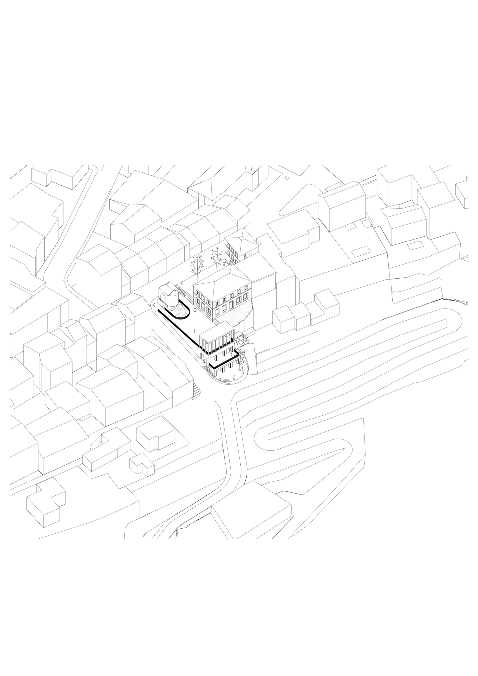
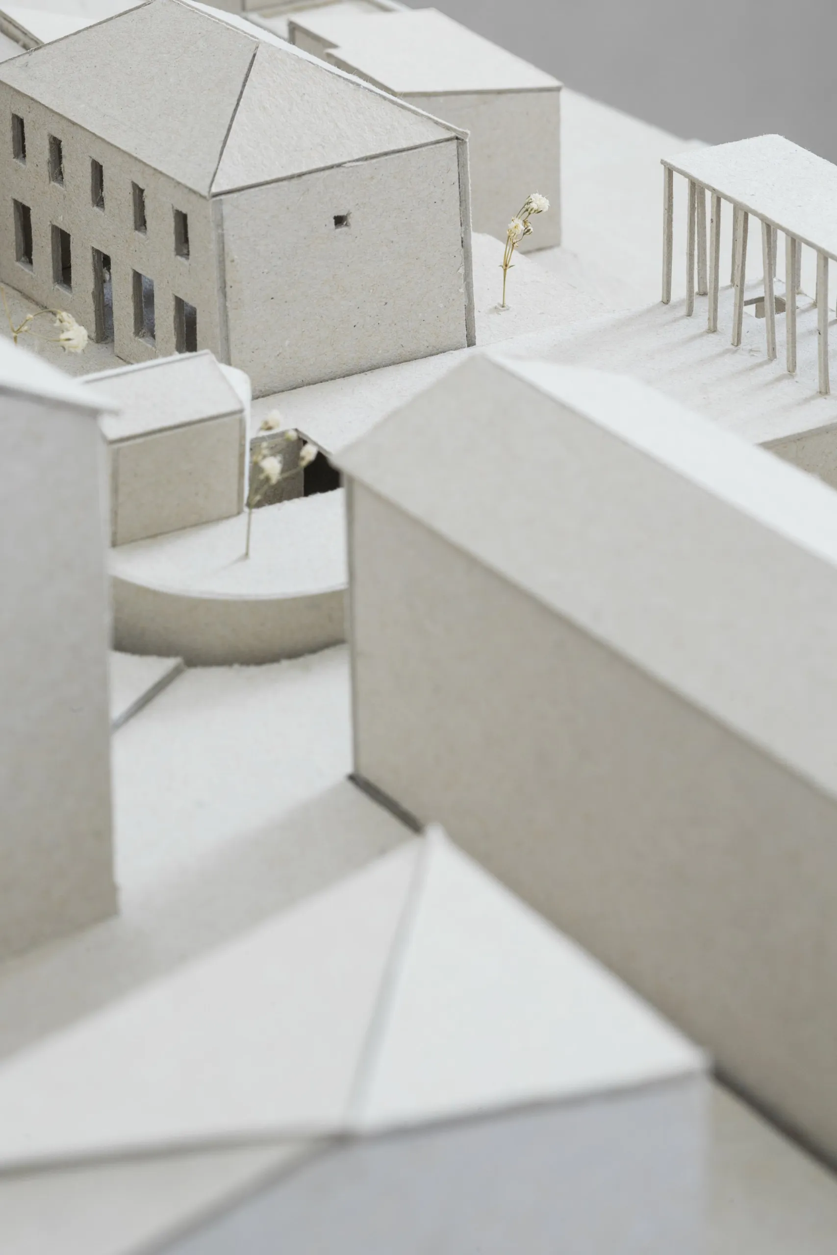
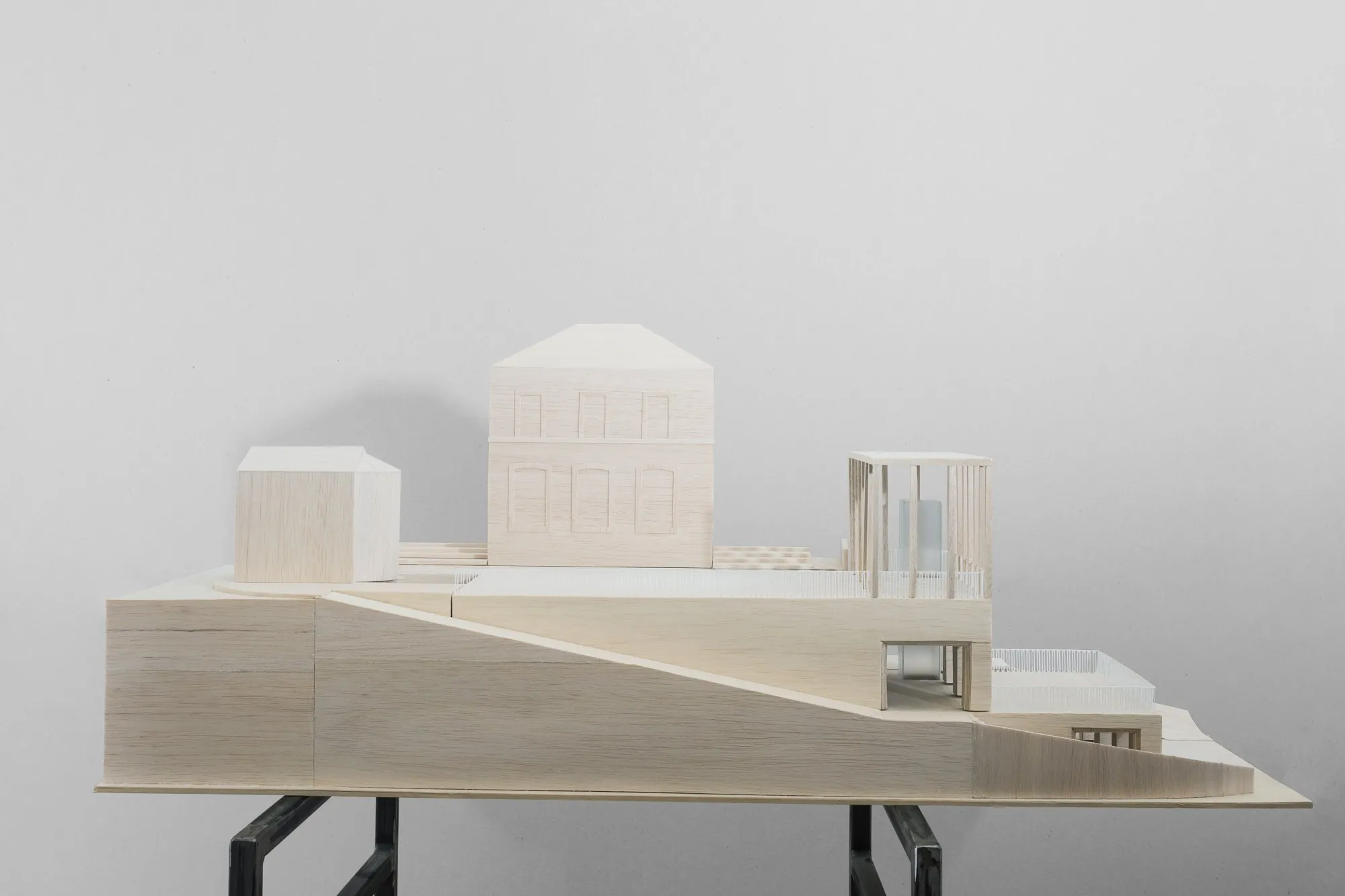
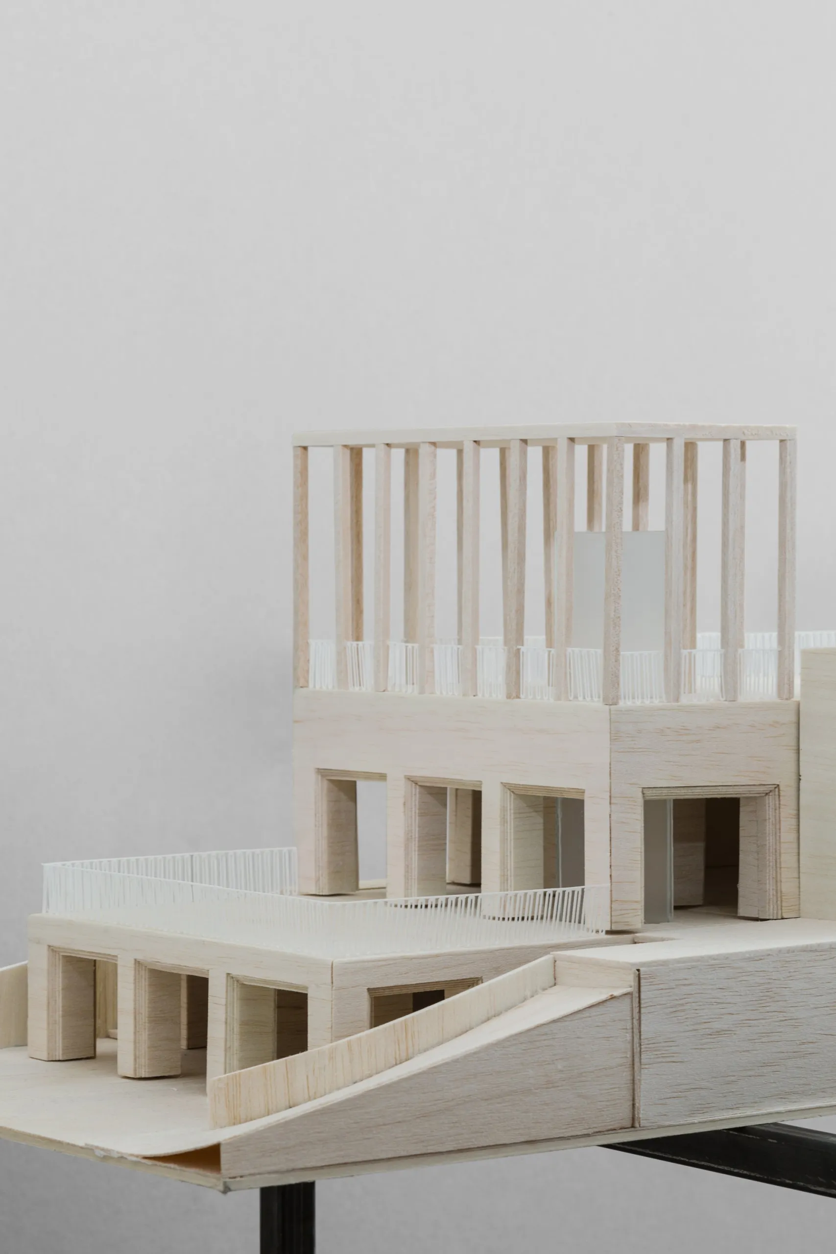
    The extension of the town hall is placed below the public square, turning its roof into civic ground and leaving the old chapel as the dominant presence in the historic centre. It is treated less as a new object than as a reworking of the ground: the new rooms sit beneath the forecourt, and the roof carries the existing public space out towards the landscape.

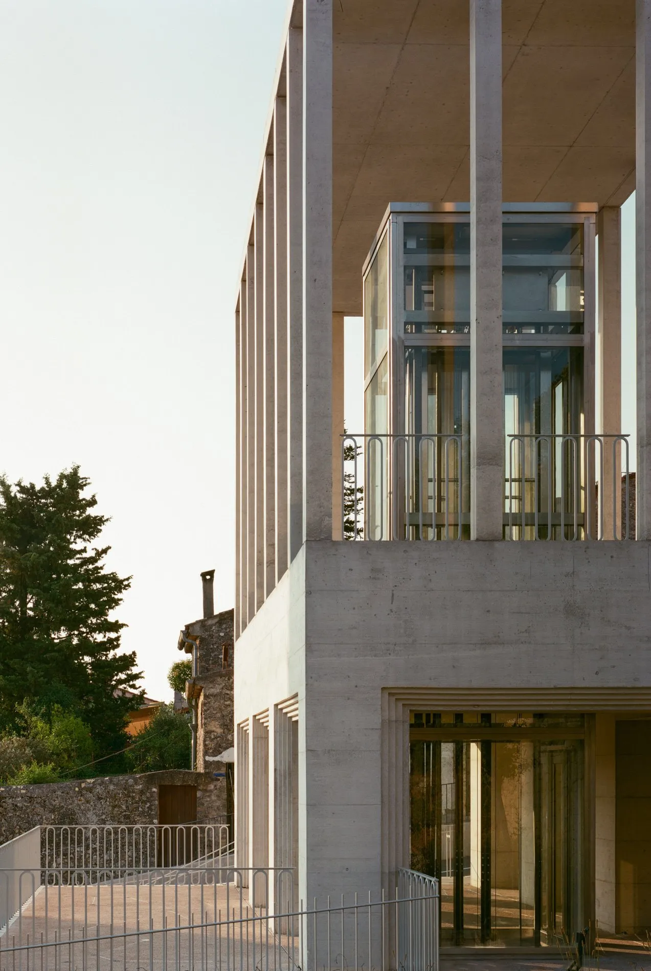
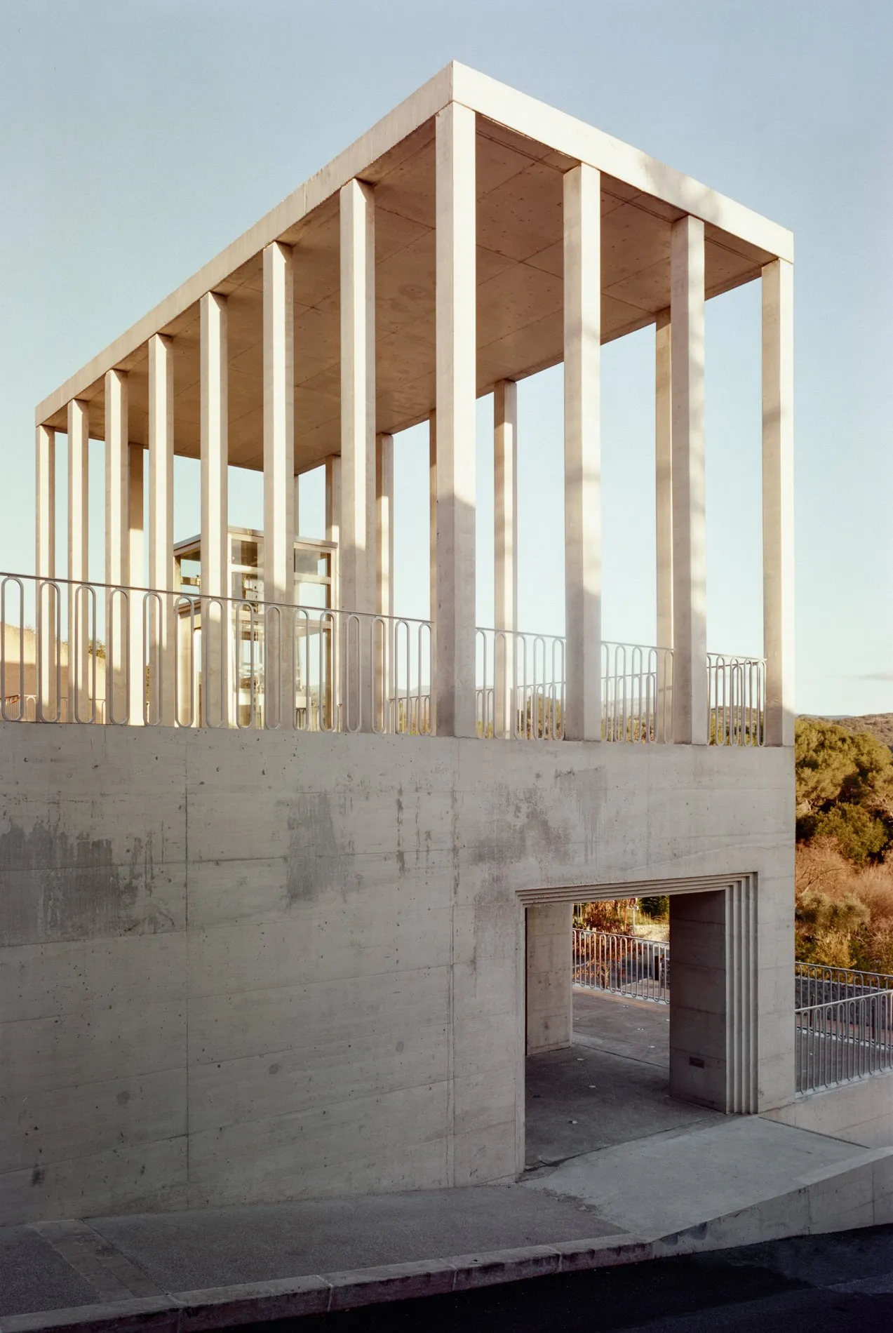
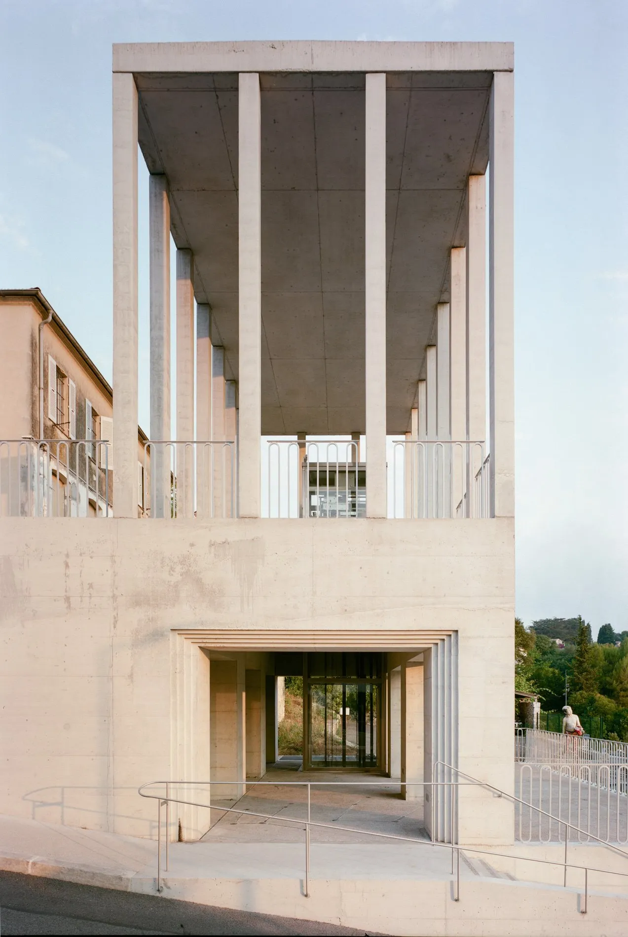
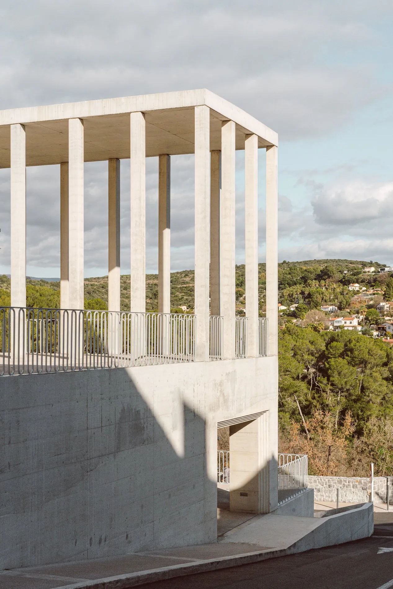
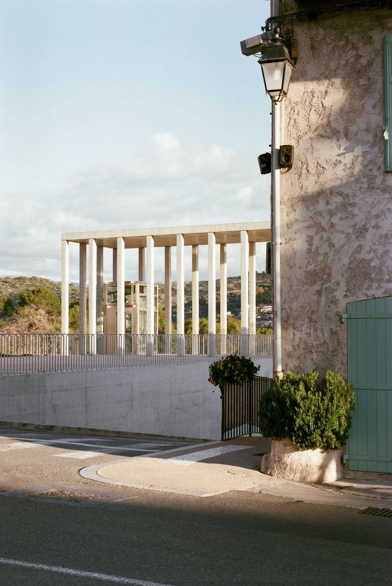
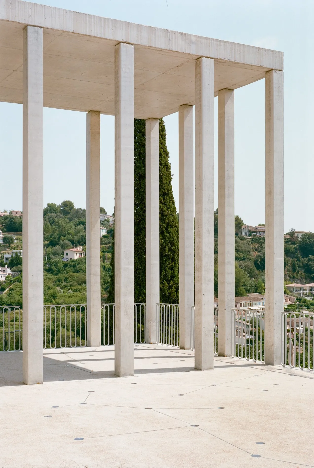
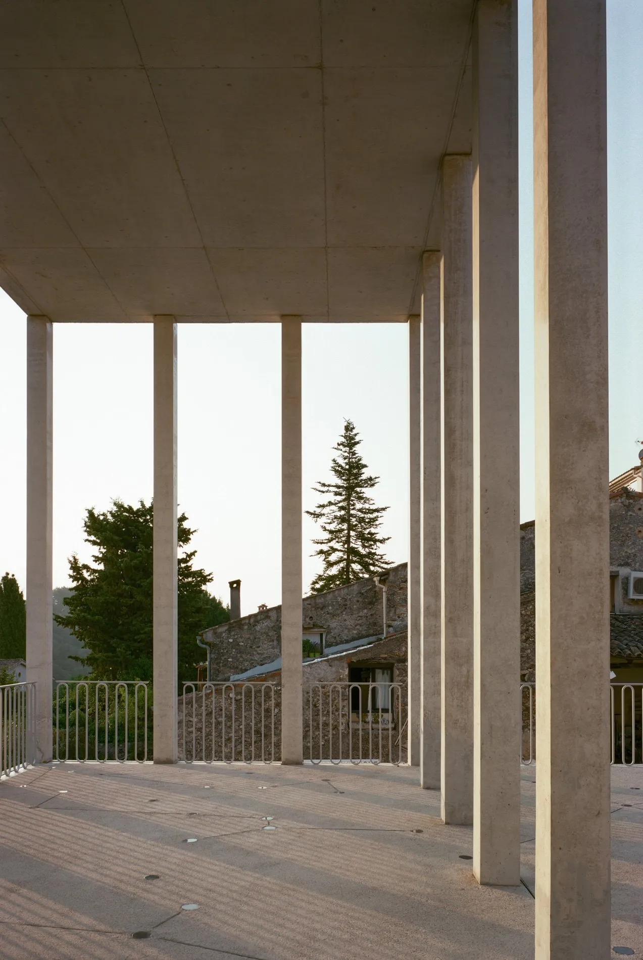
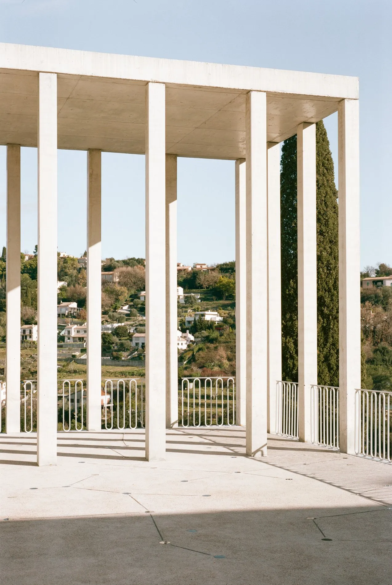
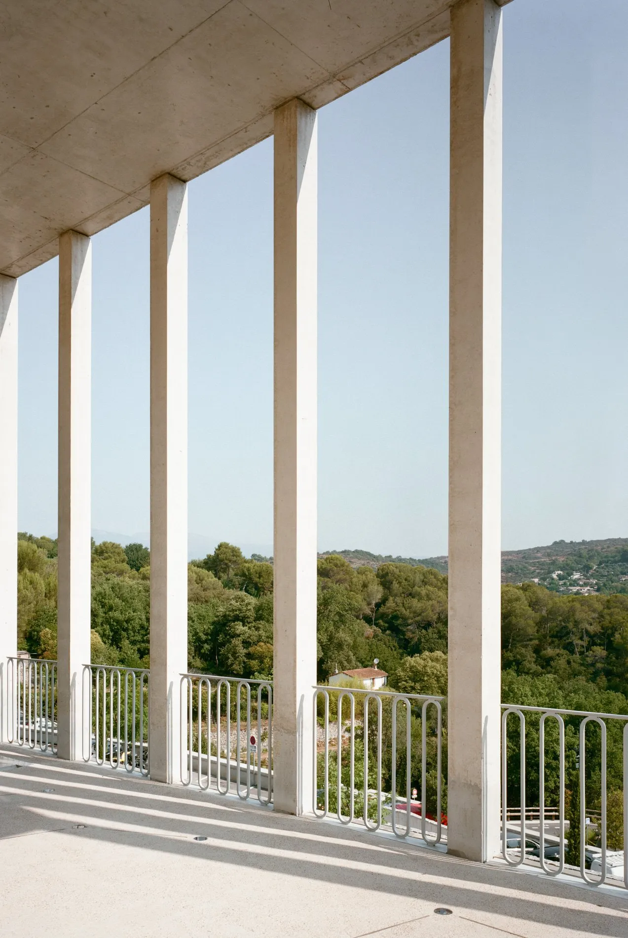
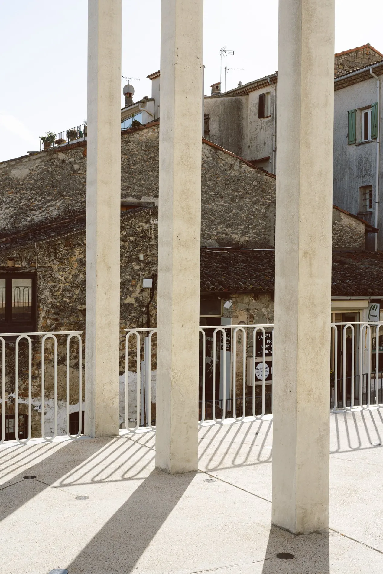
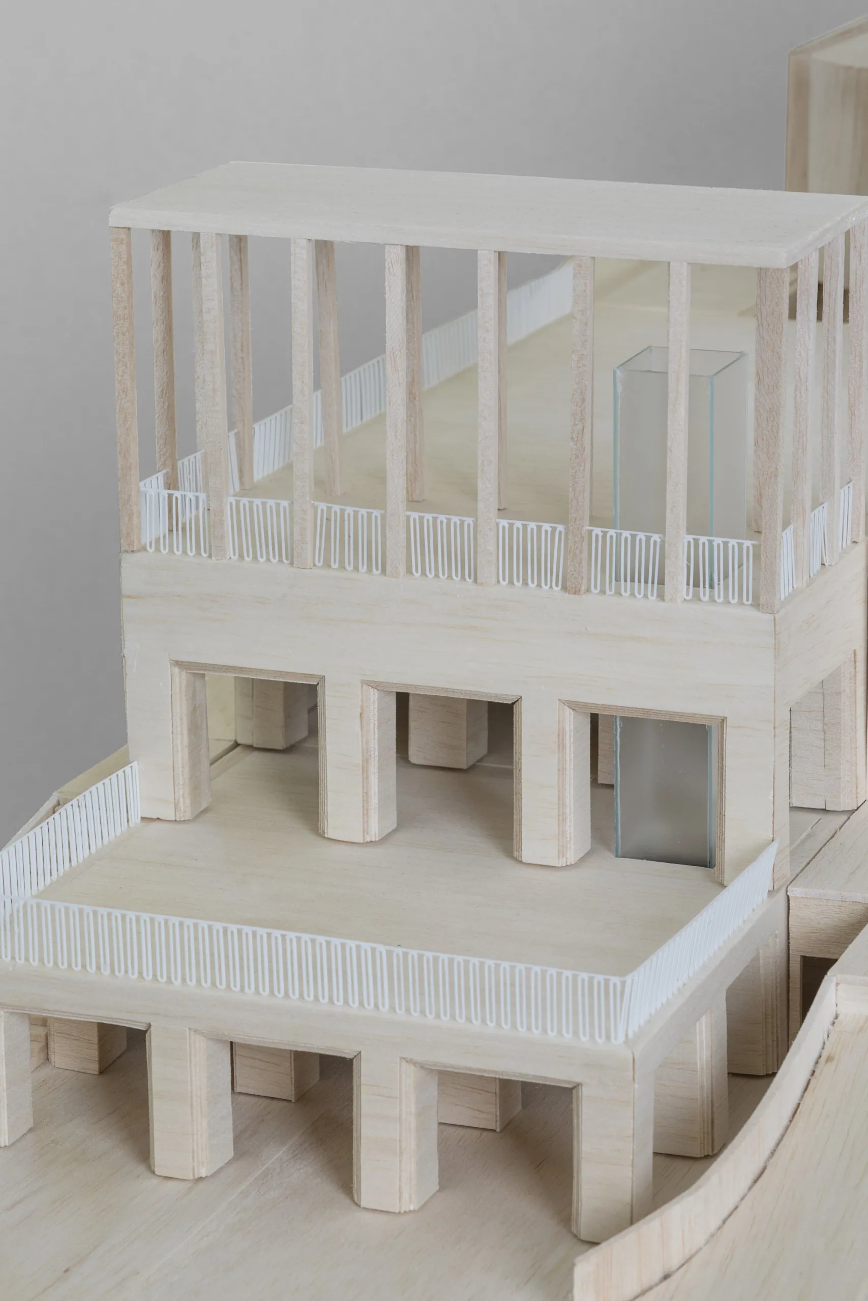
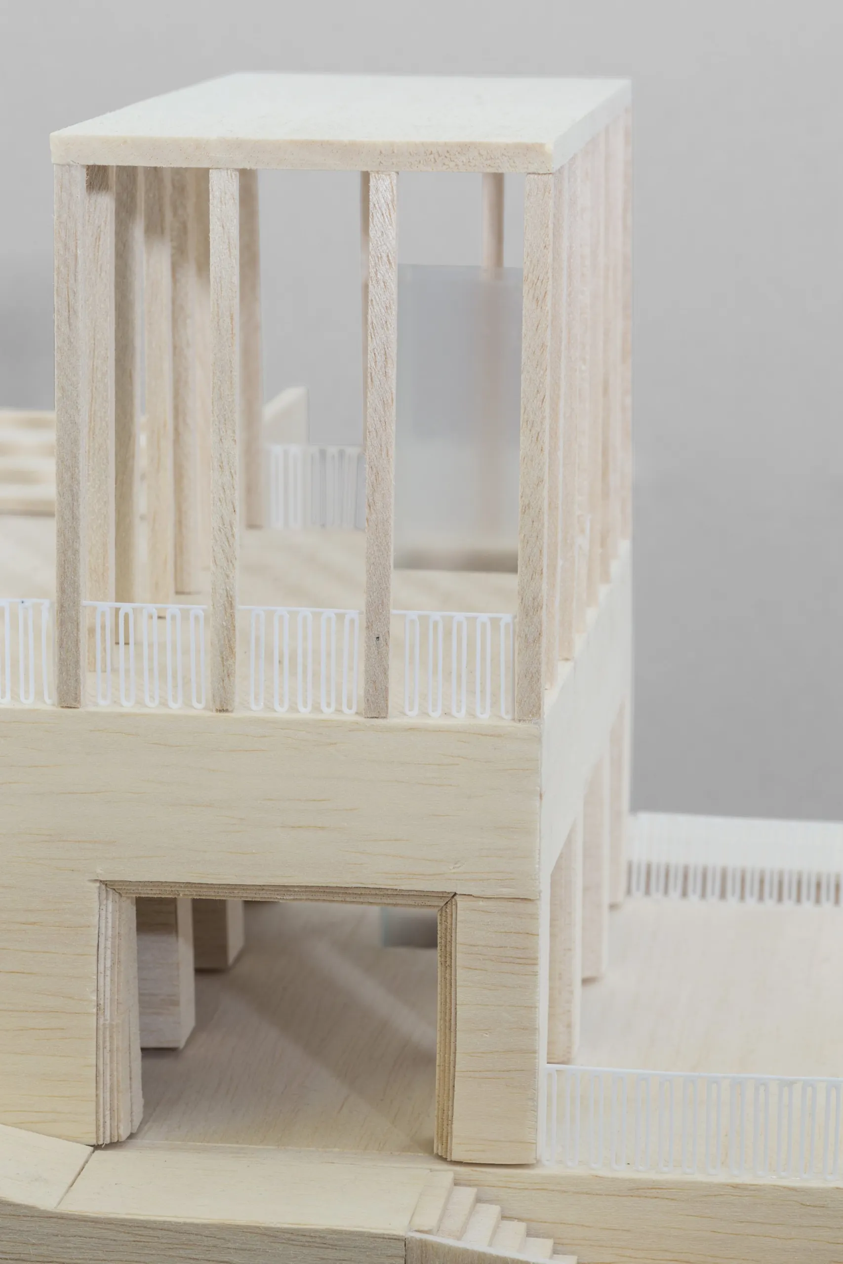
    From the square the architecture is deliberately quiet. The chapel stays clear against the horizon, and the new building largely disappears into the topography. The continuous surface becomes a belvedere looking to the valleys, and at its far edge a lift pavilion rises as the one visible element, linking the square with the car park below, a kind of light contemporary campanile beside the chapel.

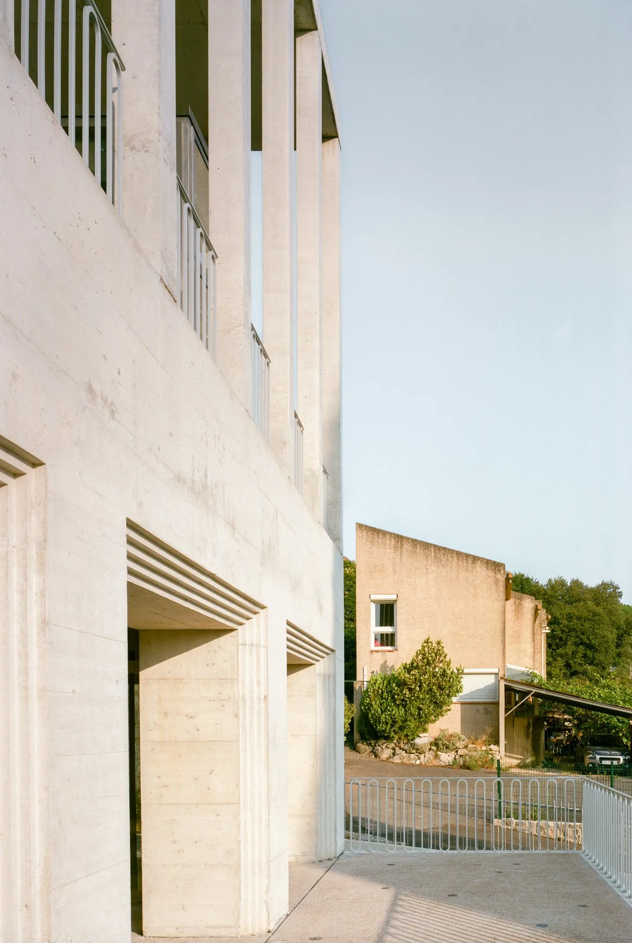
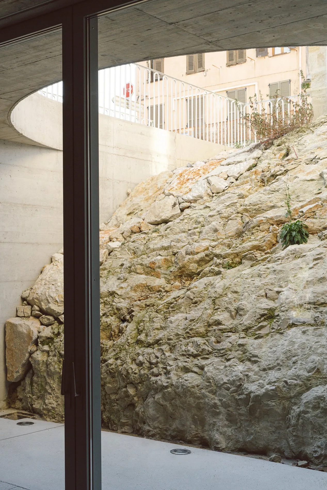
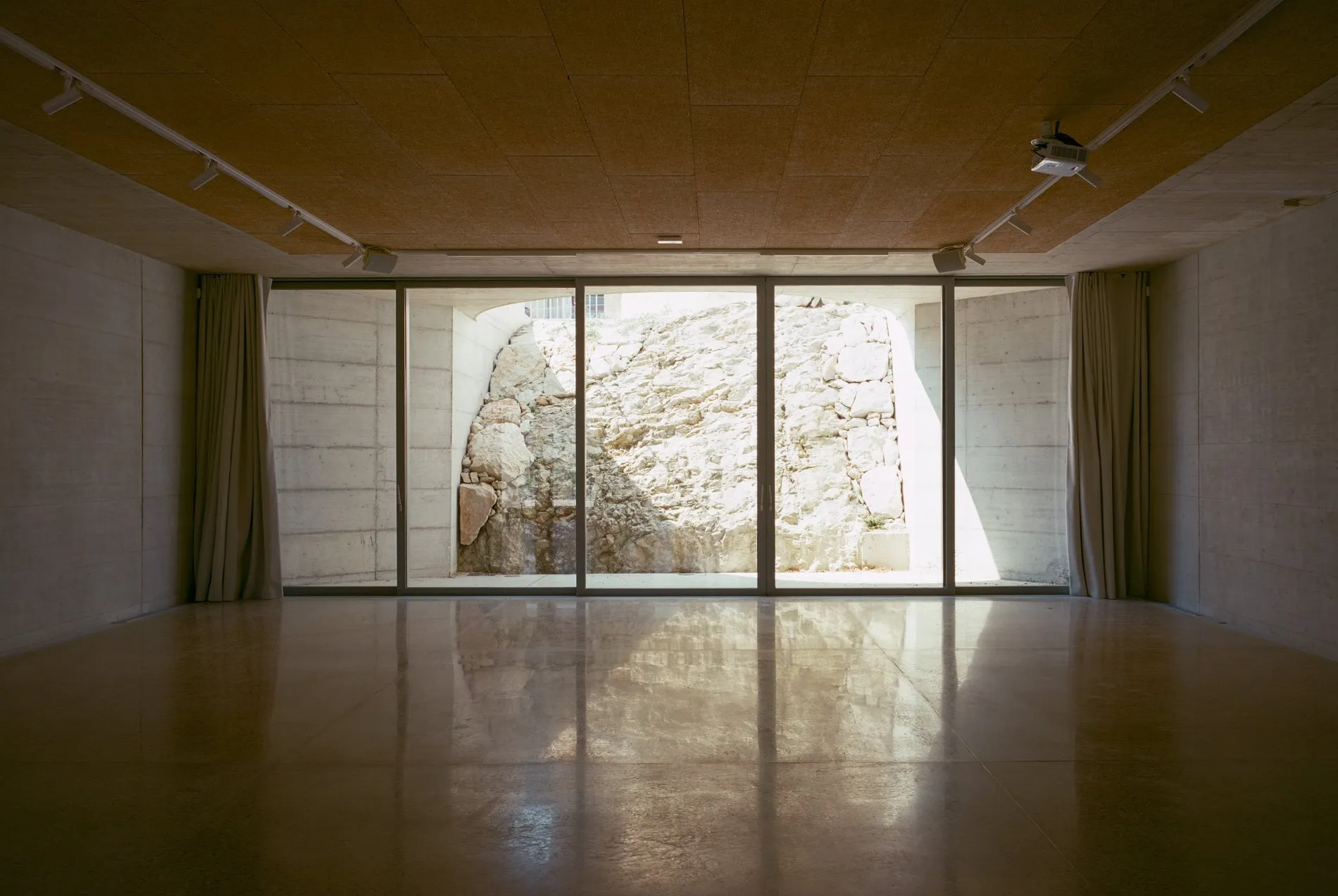
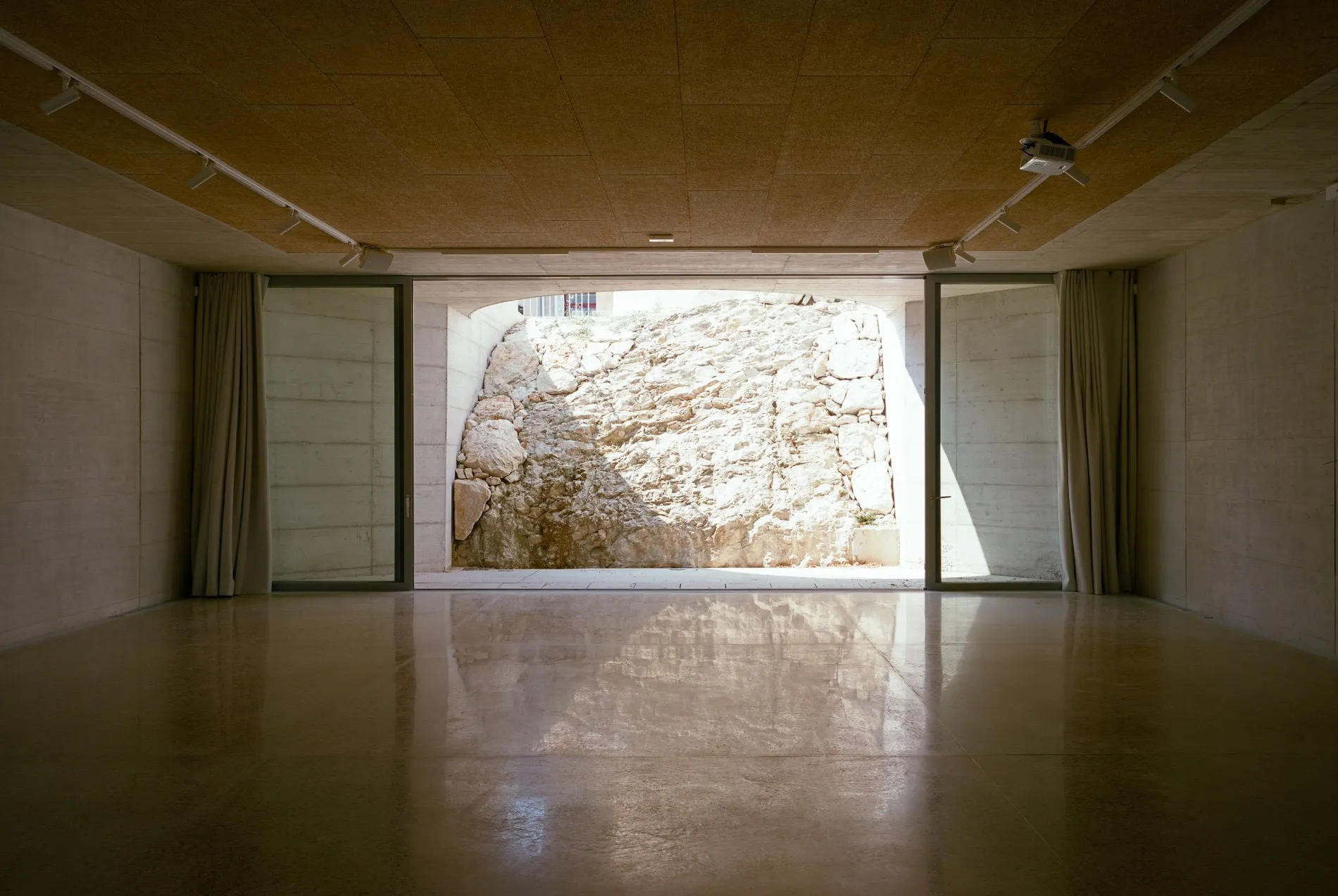
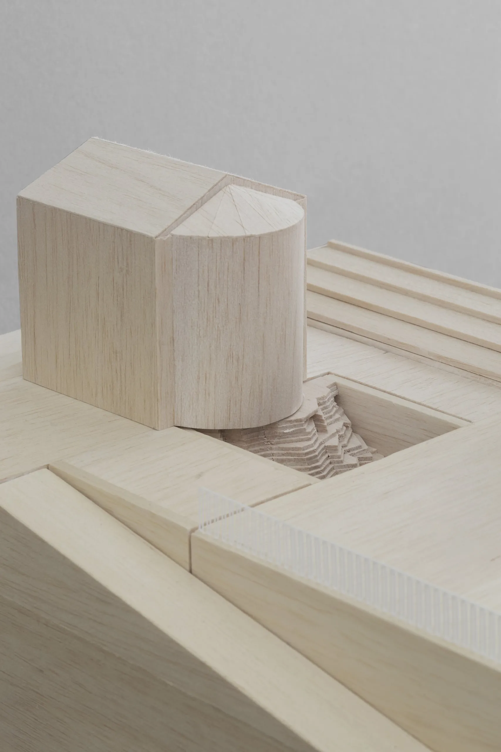
    Below, the relation to the ground becomes direct. A rear patio exposes the rock at the foot of the chapel and brings daylight into the meeting and association rooms, so the base of the monument becomes part of the interior.

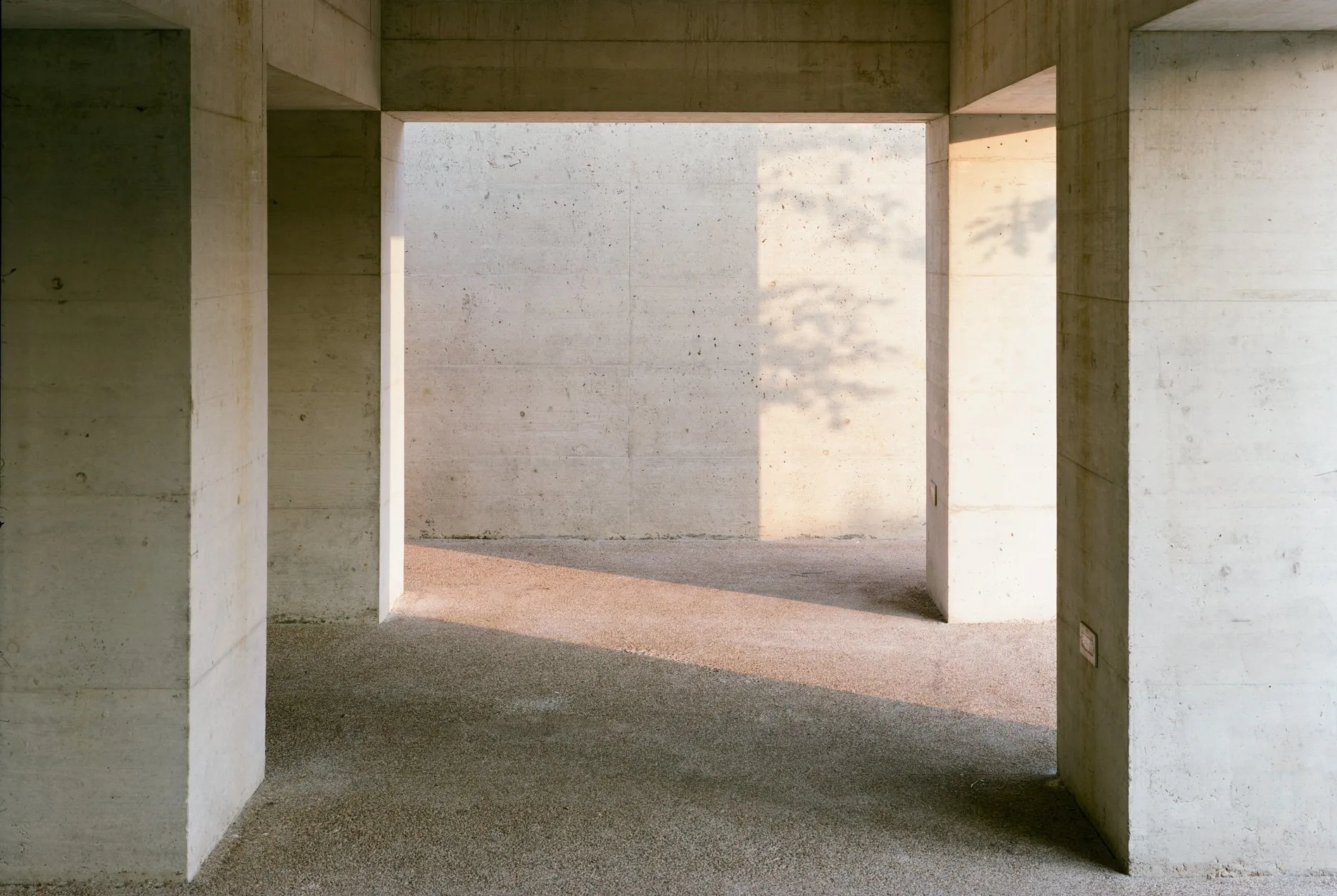
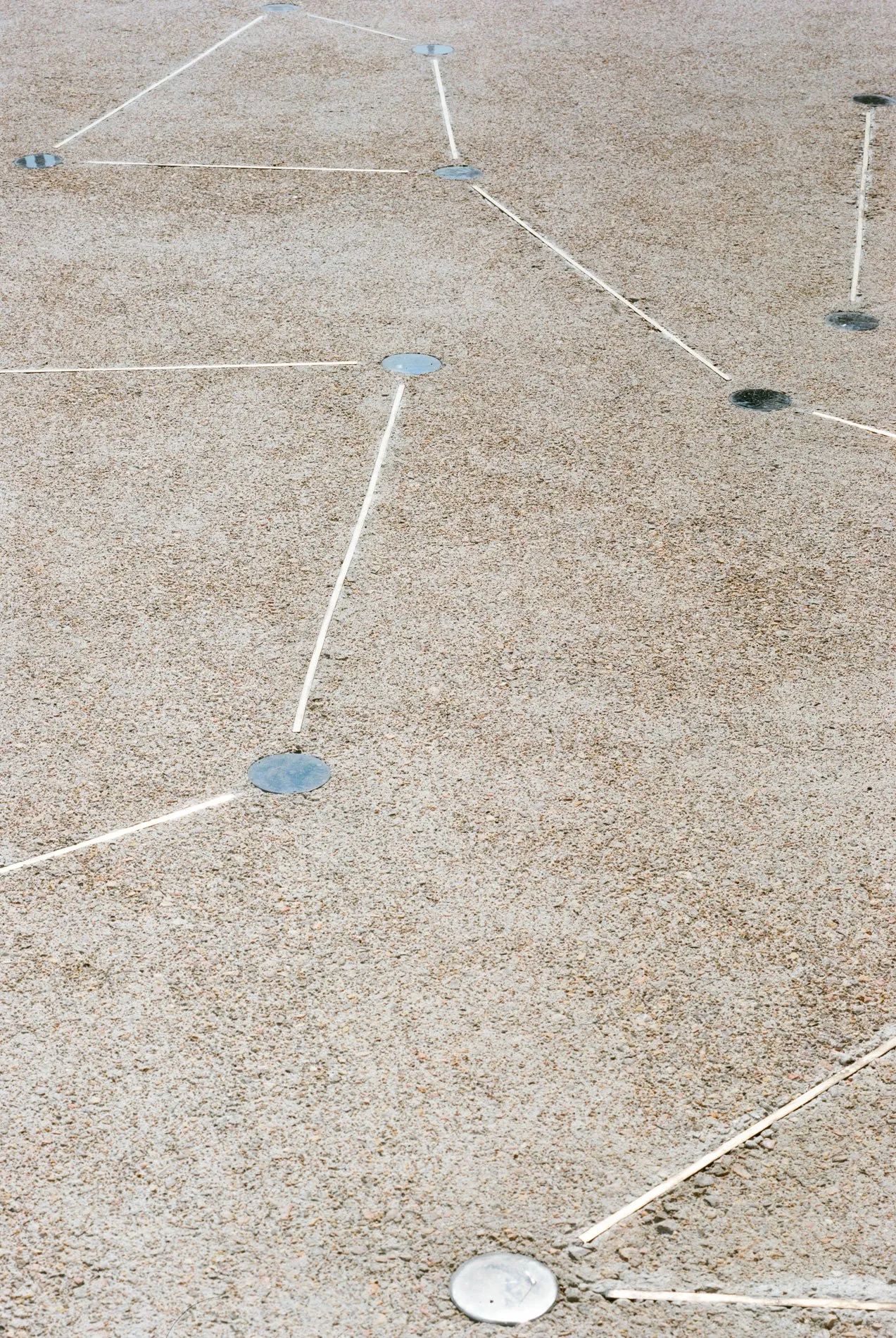
    Concrete gives building and landscape one language, cast against timber boards, polished, sanded or ground, so changes of texture rather than material mark different conditions. On the square, an artist added glass pavers made by local glassmakers, with blue and phosphorescent powders that store daylight and glow at night, and brass strips running through the paving as joints.

    Chapel, town hall and lift pavilion form a civic triptych, held together by the rebuilt public ground. The extension’s strongest gesture is its near absence, using section, material and topography to give the historic site more definition.
    Biot Town Hall Extension, view 1
    Biot Town Hall Extension, view 2
    Biot Town Hall Extension, view 3
    Biot Town Hall Extension, view 4
    Biot Town Hall Extension, view 5
    Biot Town Hall Extension, view 6
    Biot Town Hall Extension, view 7
    Biot Town Hall Extension, view 8
    Biot Town Hall Extension, view 9
    Biot Town Hall Extension, view 10
    Biot Town Hall Extension, view 11
    Biot Town Hall Extension, view 12
    Biot Town Hall Extension, view 13
    Biot Town Hall Extension, view 14
    Biot Town Hall Extension, view 15
    Biot Town Hall Extension, view 16
    Biot Town Hall Extension, view 17
    Biot Town Hall Extension, view 18
    Biot Town Hall Extension, view 19
    Biot Town Hall Extension, view 20
    Biot Town Hall Extension, view 21
    Biot Town Hall Extension, view 22
    Biot Town Hall Extension, view 23
    Biot Town Hall Extension, view 24
    Biot Town Hall Extension, view 25
    Biot Town Hall Extension, view 26
    Biot Town Hall Extension, view 27
    Biot Town Hall Extension, view 28
    Biot Town Hall Extension, view 29
    Biot Town Hall Extension, view 30
    Biot Town Hall Extension, view 31
    Biot Town Hall Extension, view 32
    Biot Town Hall Extension, view 33
    Biot Town Hall Extension, view 34
    Biot Town Hall Extension, view 35
    Biot Town Hall Extension, view 36
    Biot Town Hall Extension, view 37
    Site plan
    Plan
    Section
    Detail section
    Axonometric drawing
    Model
    Model
    Model
    Model
    Model
    Model
    Model
    Model
    Model
    Model
  • Surrey Docks Farm

    Surrey Docks Farm

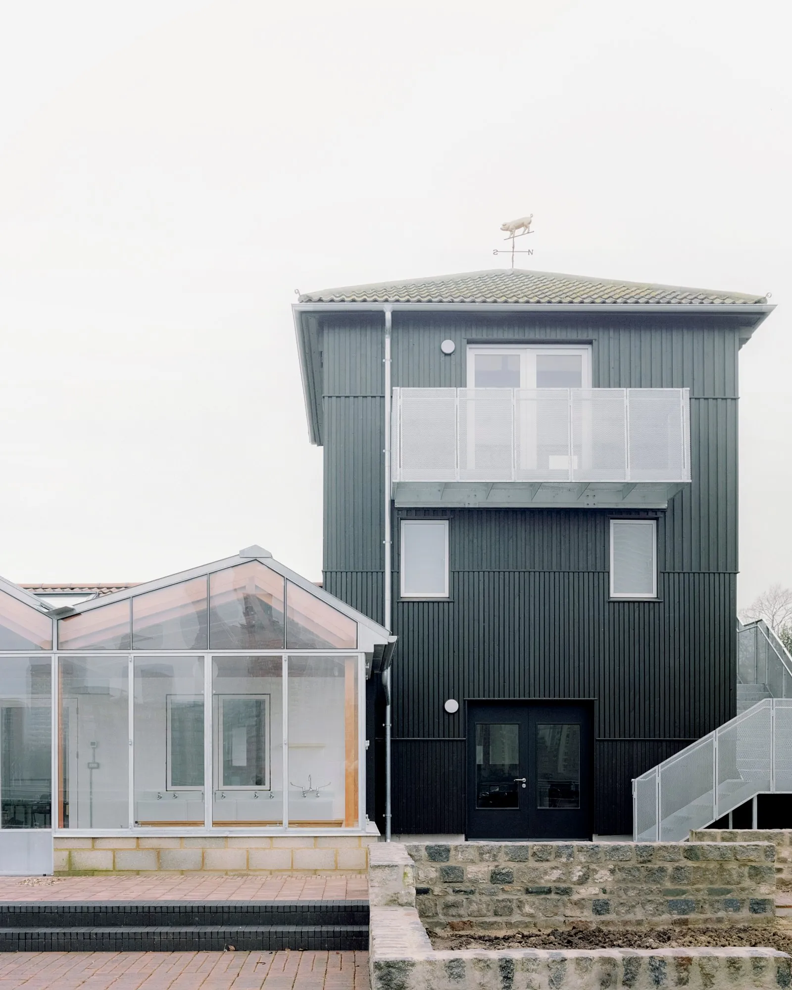
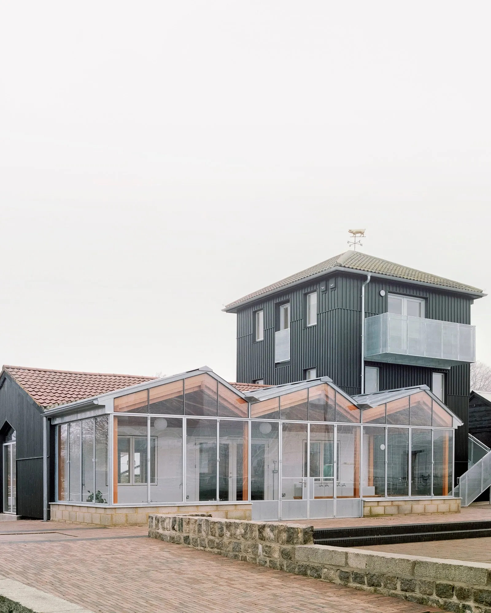
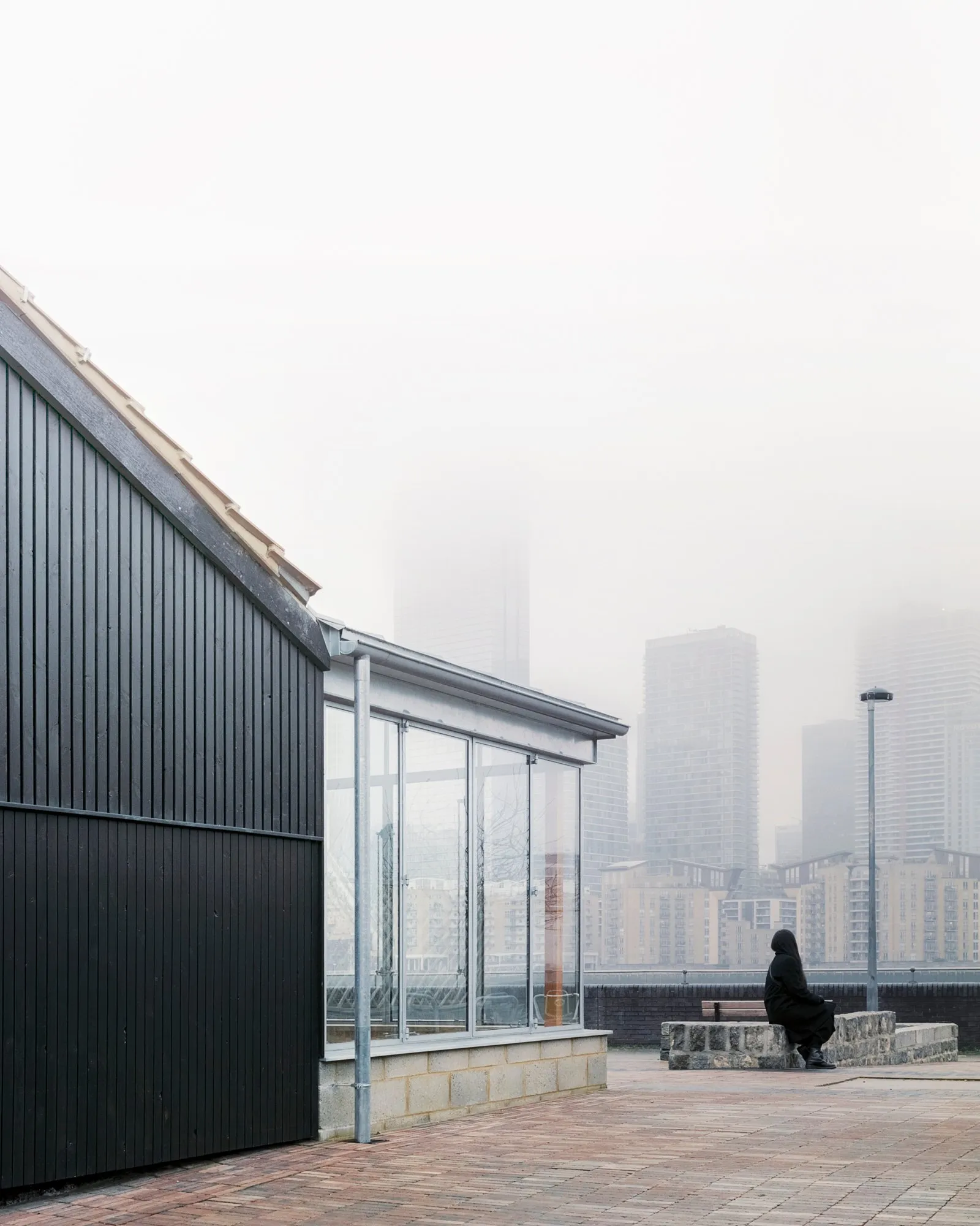
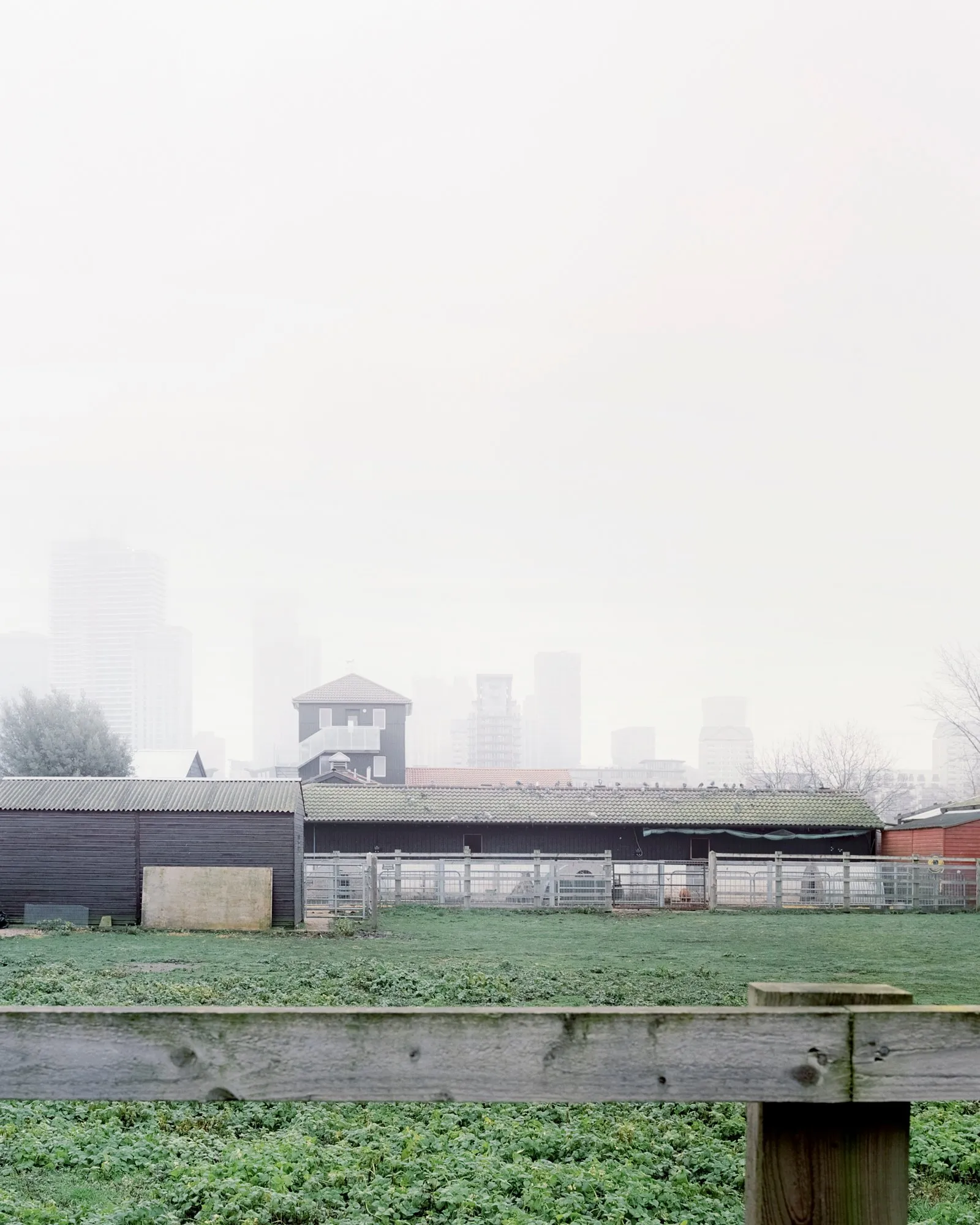
    The refurbishment treats a working city farm as a piece of civic infrastructure, opening it towards the river, extending its educational spaces and restoring a fire-damaged tower as a local landmark. It upgrades and extends 250 square metres of existing buildings and adds 320 square metres of public space along the riverfront.

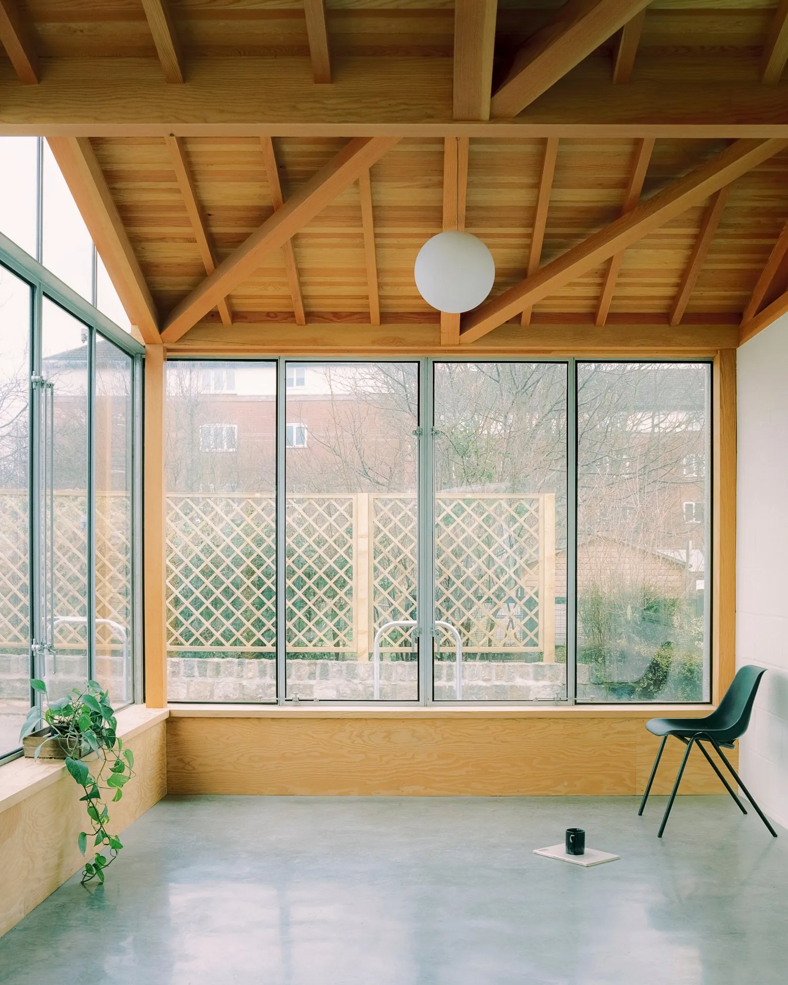
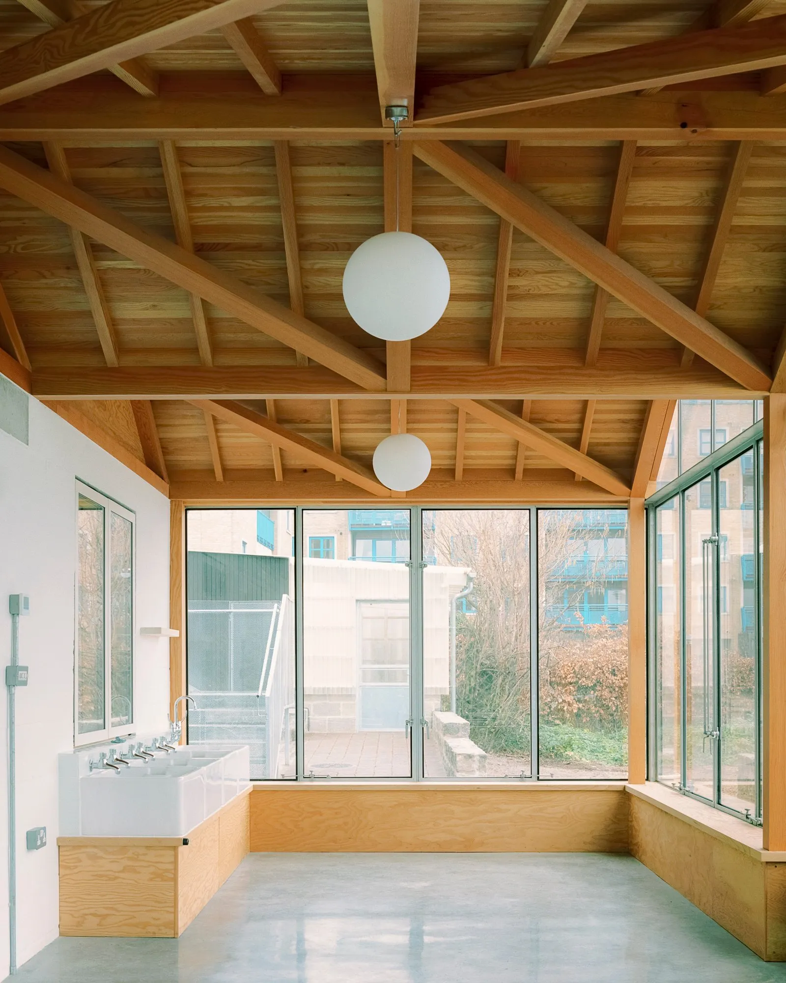
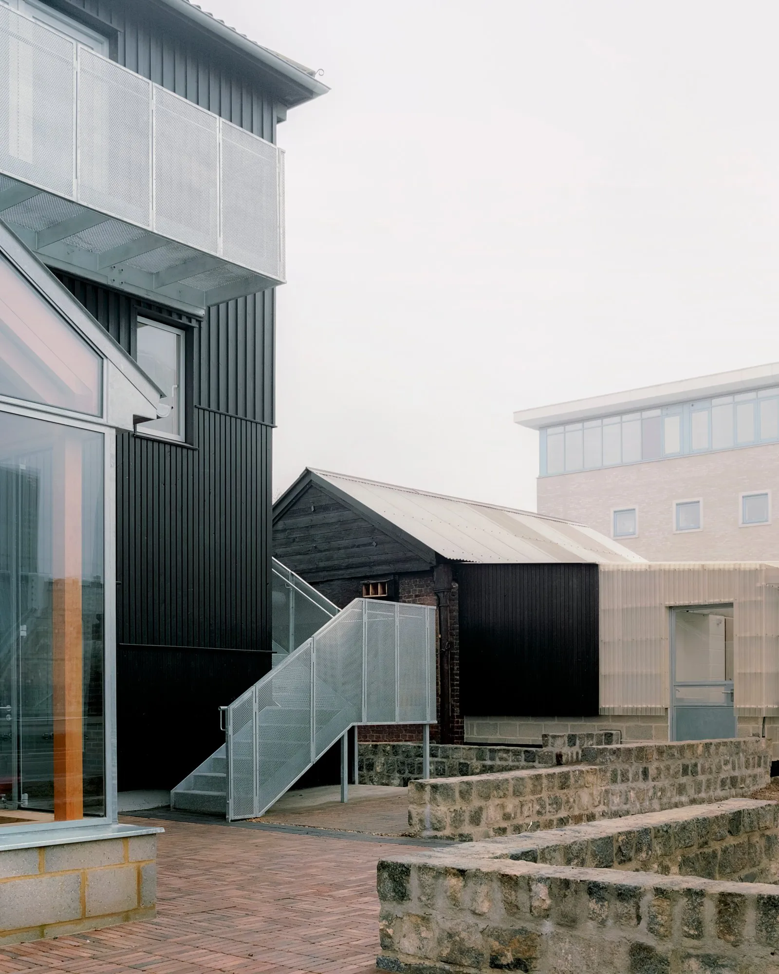
    Rather than clearing the site, the design team made a series of additions and adjustments that make the farm more visible from the riverside path and give it a clear public entrance. A glazed orangery attached to the main hall works as a foyer or as a classroom in its own right, almost doubling the teaching space at ground level and opening views to the river. Its Douglas fir frame is braced in the roof and rests on four slender columns, leaving the edges open.

    The three-storey tower, empty since a major fire more than a decade earlier, is back in use and visible across the neighbourhood and the river. Black rough-sawn timber cladding recalls agricultural buildings in the region and the site’s past as a timber wharf and shipyard. The boards widen towards the top, opening the facade and casting shifting bands of shadow, and a golden pig weathervane, modelled on the farm’s own breed, crowns the tower.

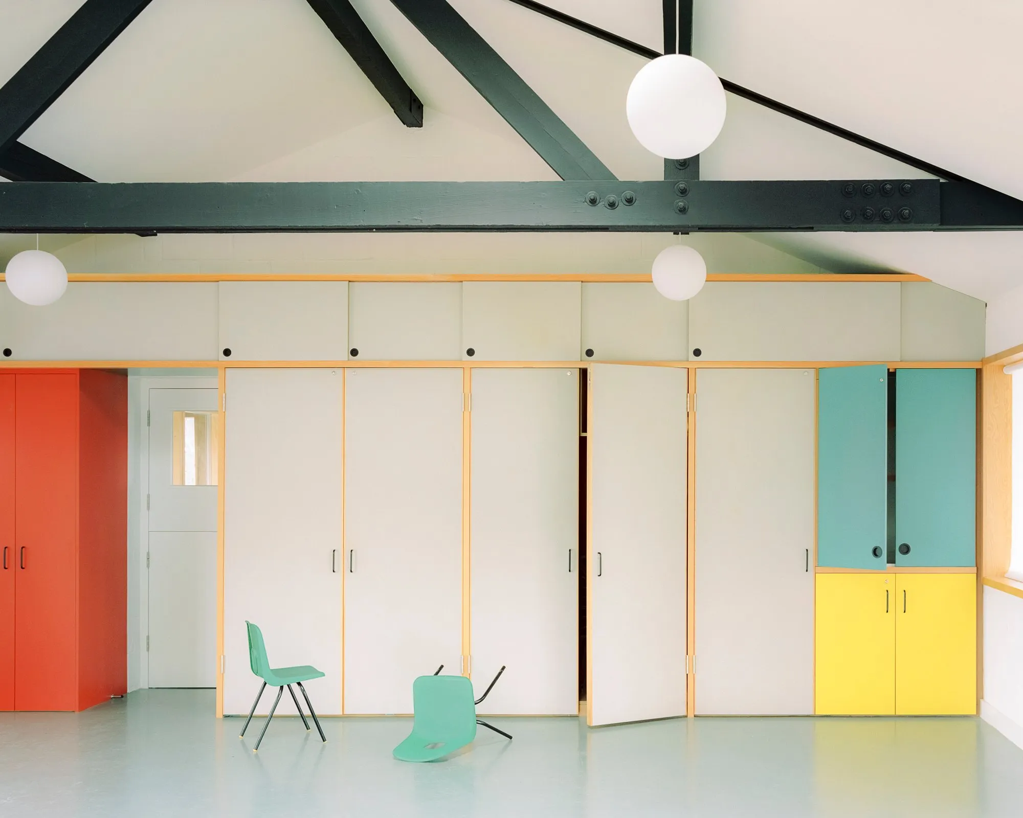
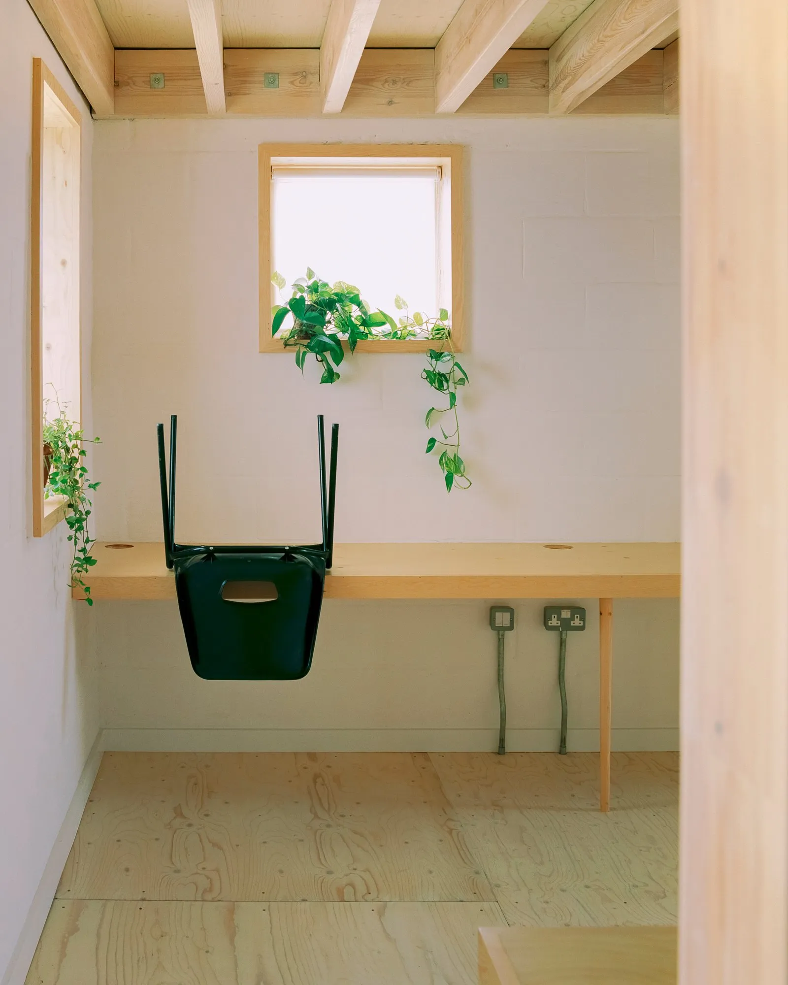
    Inside are a teaching kitchen, meeting rooms, offices, toilets and the multi-use hall. Galvanised steel, zinc, aluminium, concrete, pine and Douglas fir are mostly left exposed. Existing buildings were insulated from outside and given better windows and doors, brick and granite from the landscape were reused, foundations were designed to use less concrete, and a rainwater tank in the landscape supplies toilets and irrigation.
    Surrey Docks Farm, view 1
    Surrey Docks Farm, view 2
    Surrey Docks Farm, view 3
    Surrey Docks Farm, view 4
    Surrey Docks Farm, view 5
    Surrey Docks Farm, view 6
    Surrey Docks Farm, view 7
    Surrey Docks Farm, view 8
    Surrey Docks Farm, view 9
  • Suzhou Museum of Contemporary Art

    Suzhou Museum of Contemporary Art

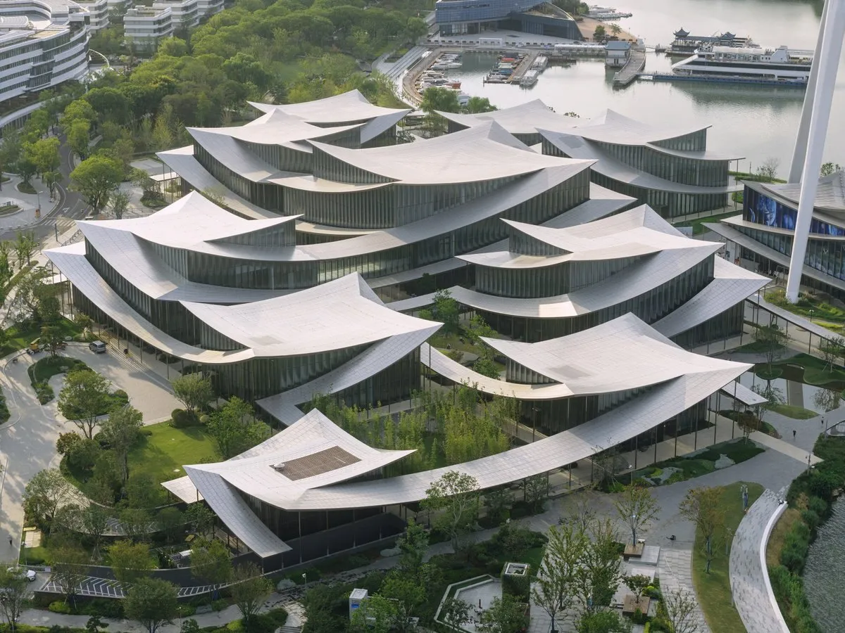
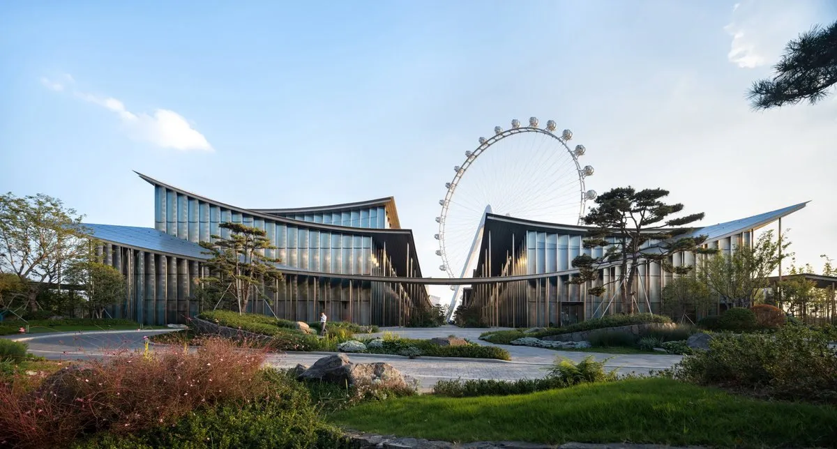
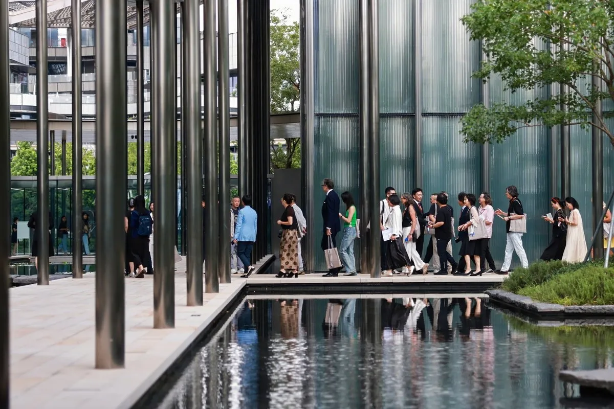
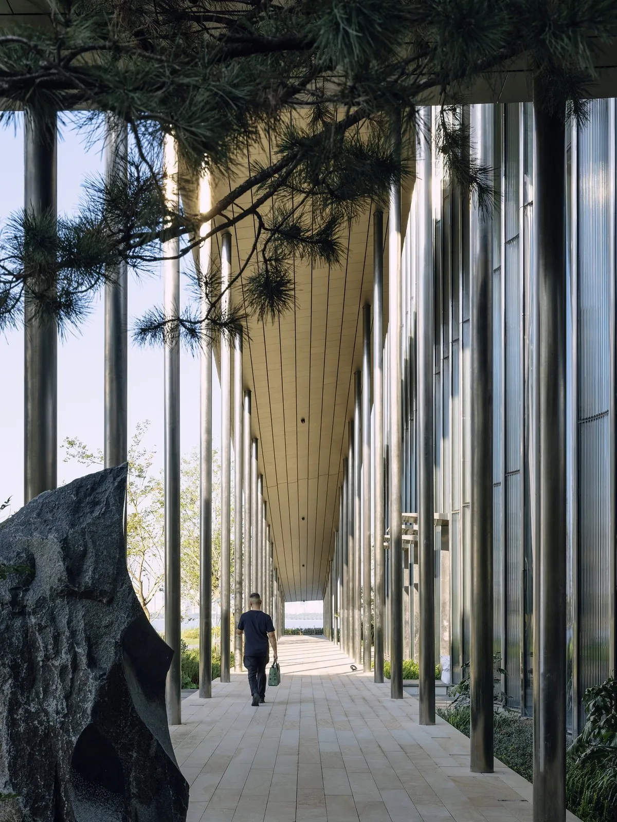
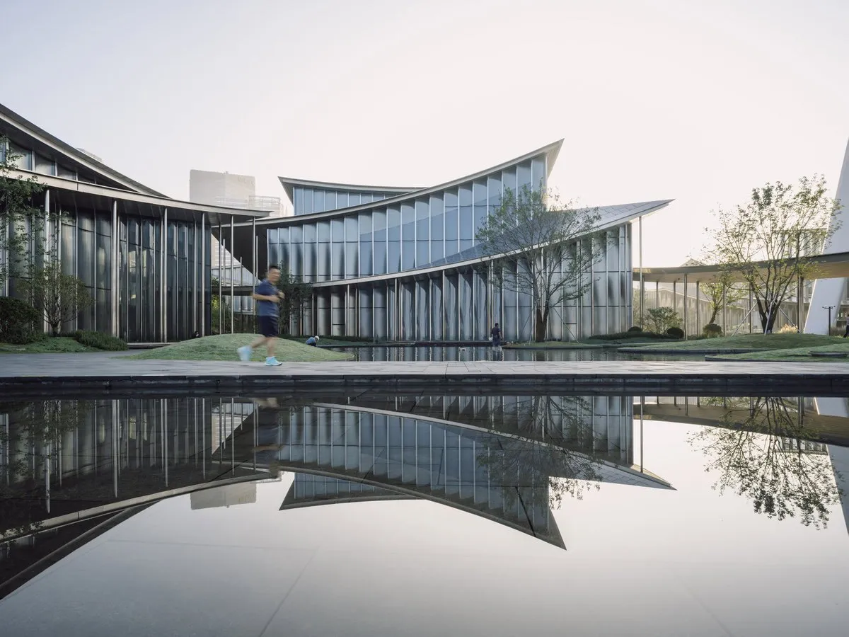
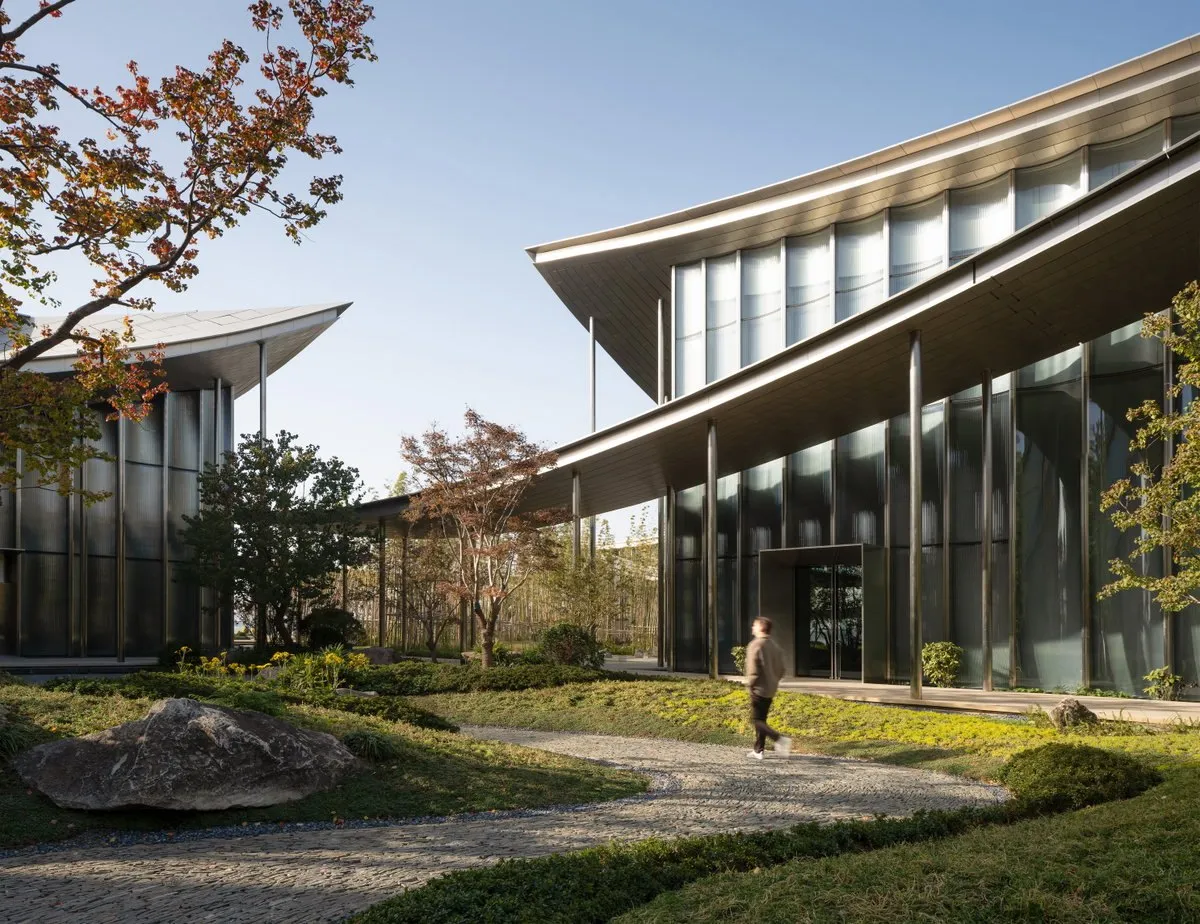
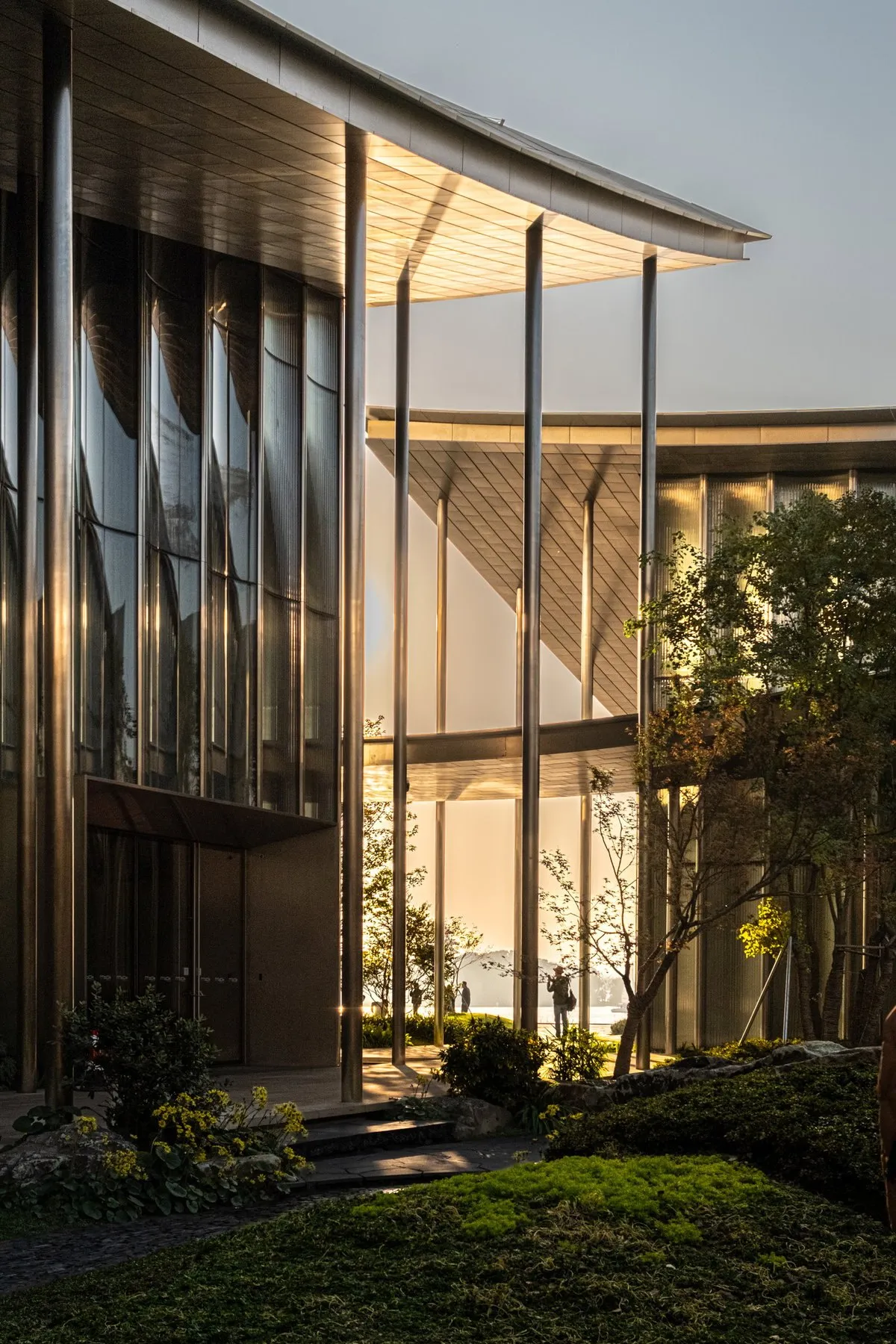
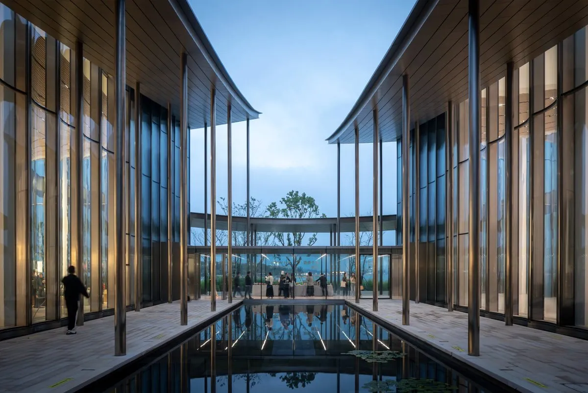
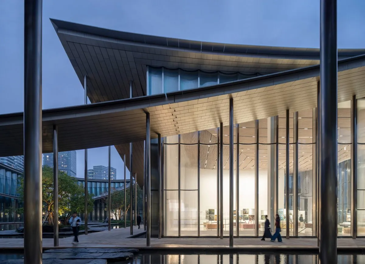
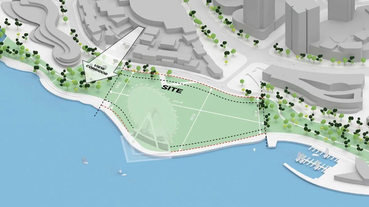
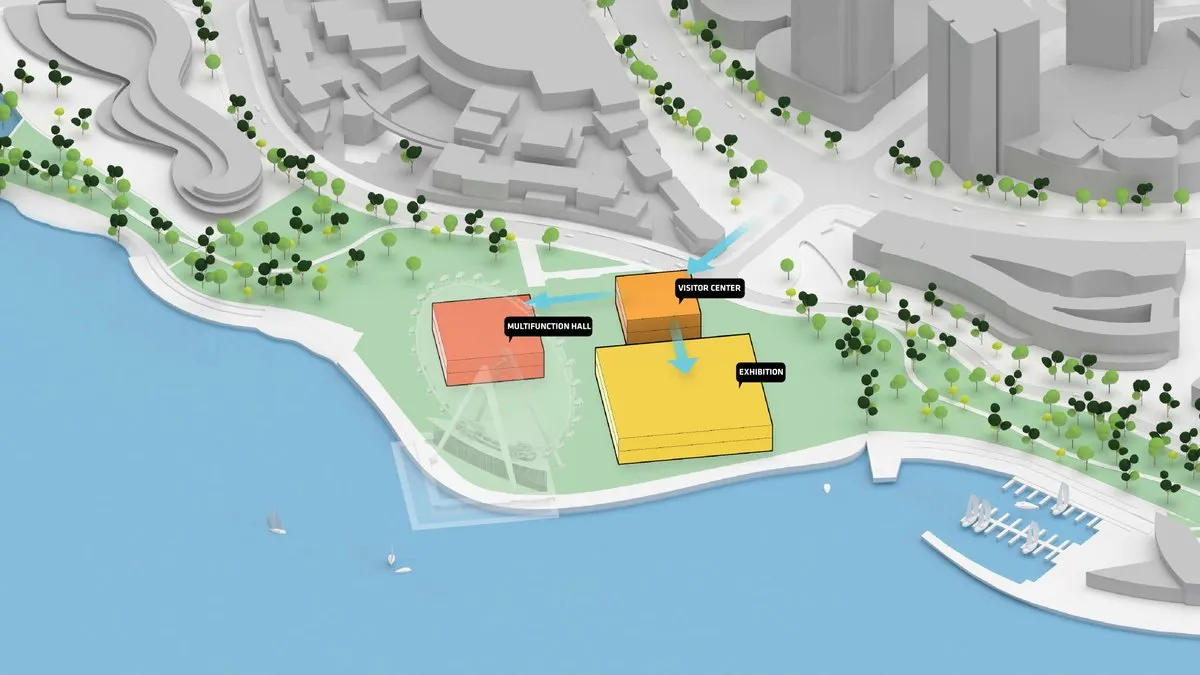
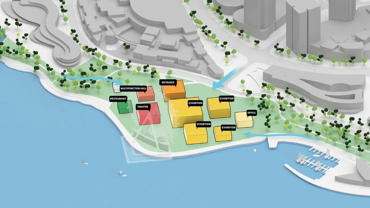
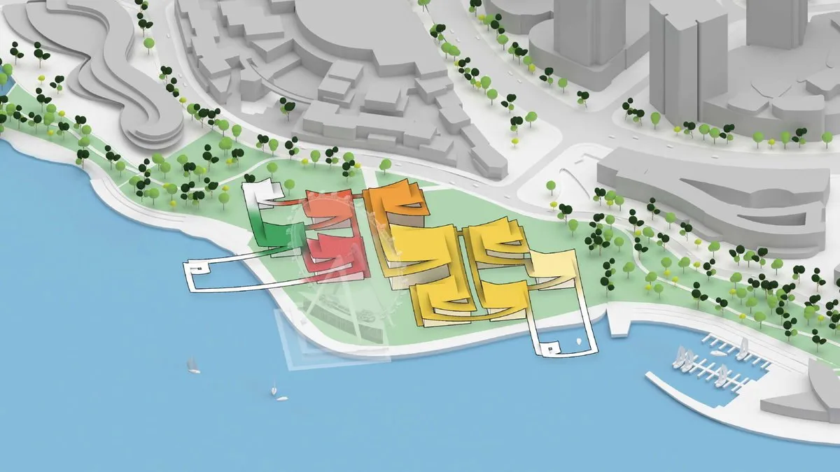
    On the edge of a lake, the museum is arranged as a sequence of linked pavilions that reinterprets the spatial logic of a traditional Chinese garden. Instead of one monumental volume, the programme is spread across nine separate buildings, with galleries, public spaces and gardens tied together by a continuous covered route between the city and the waterfront.
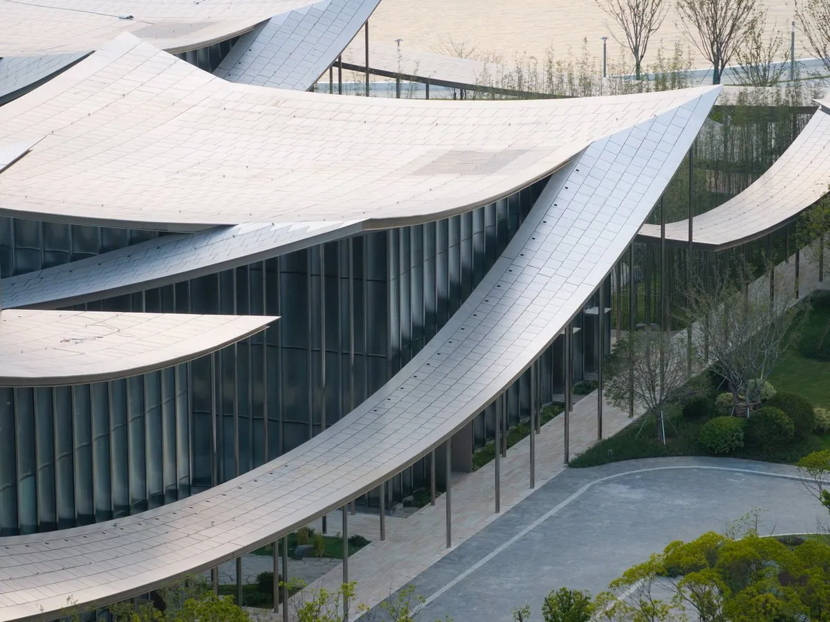
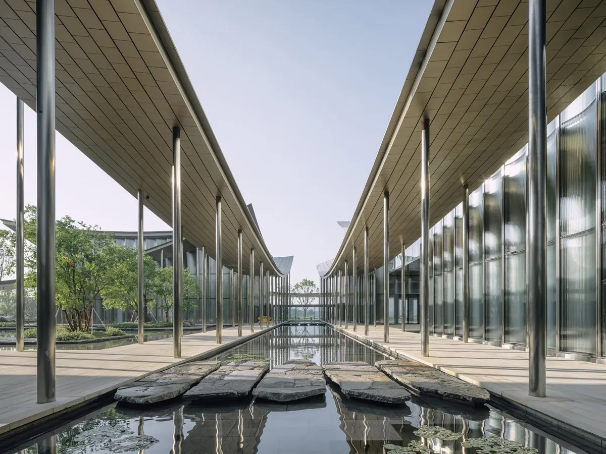
    The central reference is the lang, the covered corridor of the classical garden, enlarged and turned into a contemporary circulation system. Its curved edges frame courtyards, guide visitors between the halls and make sheltered places to watch the gardens and the water change.
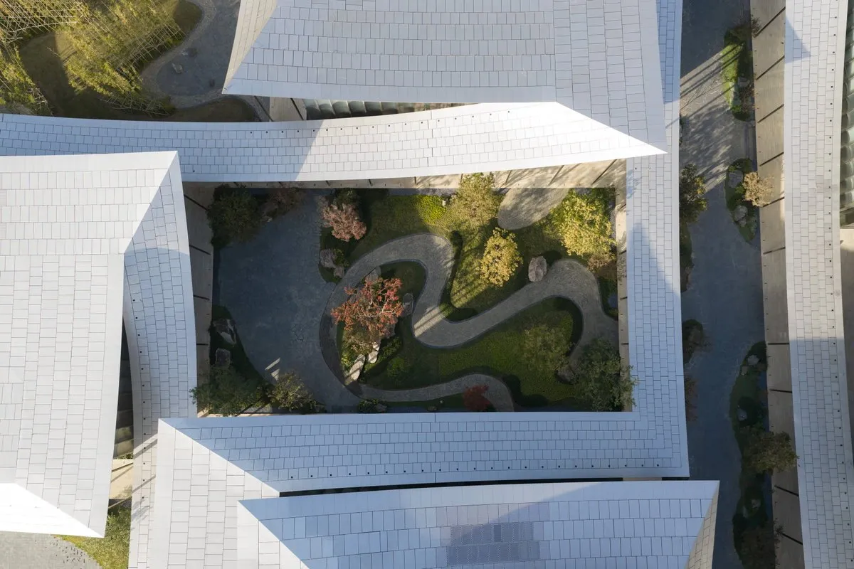
    Seen from above, the roof becomes a fifth facade. The looping plan recalls an endless knot, and the continuous geometry gives the scattered pavilions one identity. At ground level the same form makes a more intimate run of thresholds, framed views and pauses.

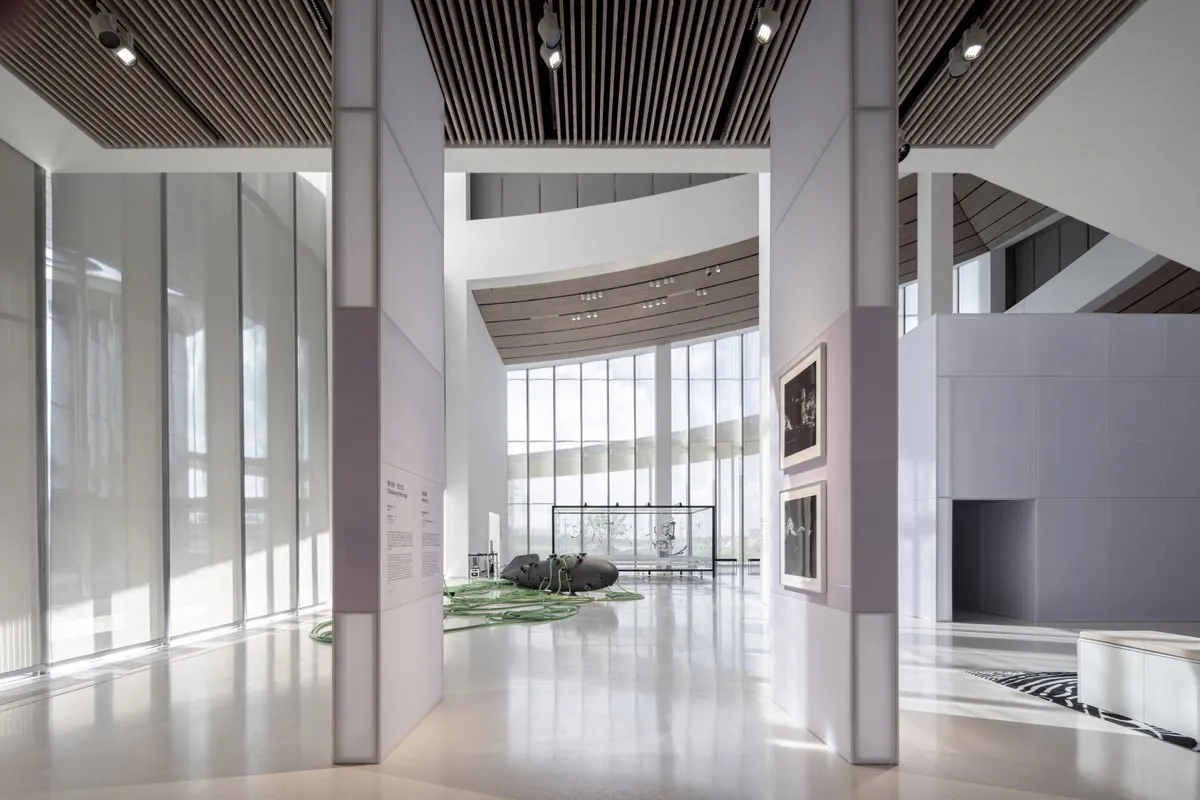
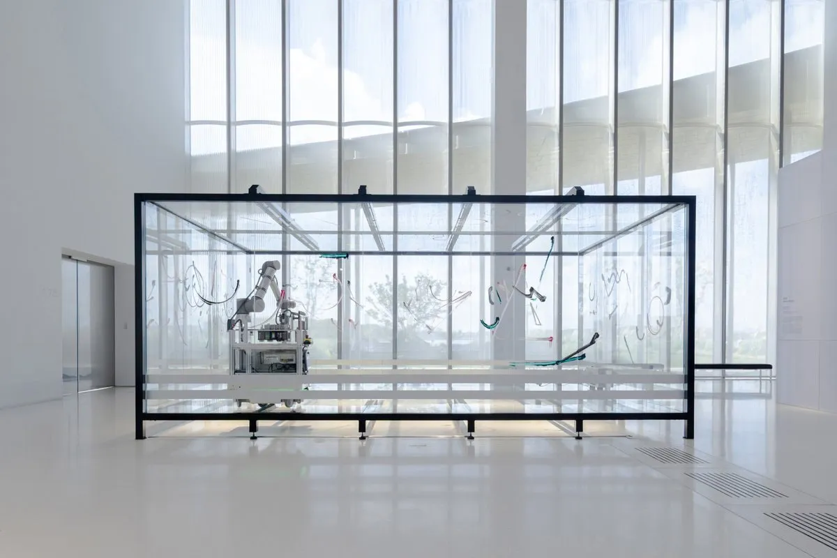
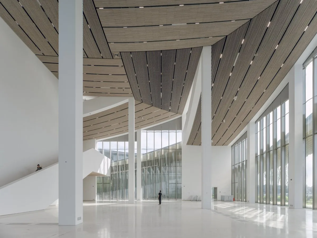
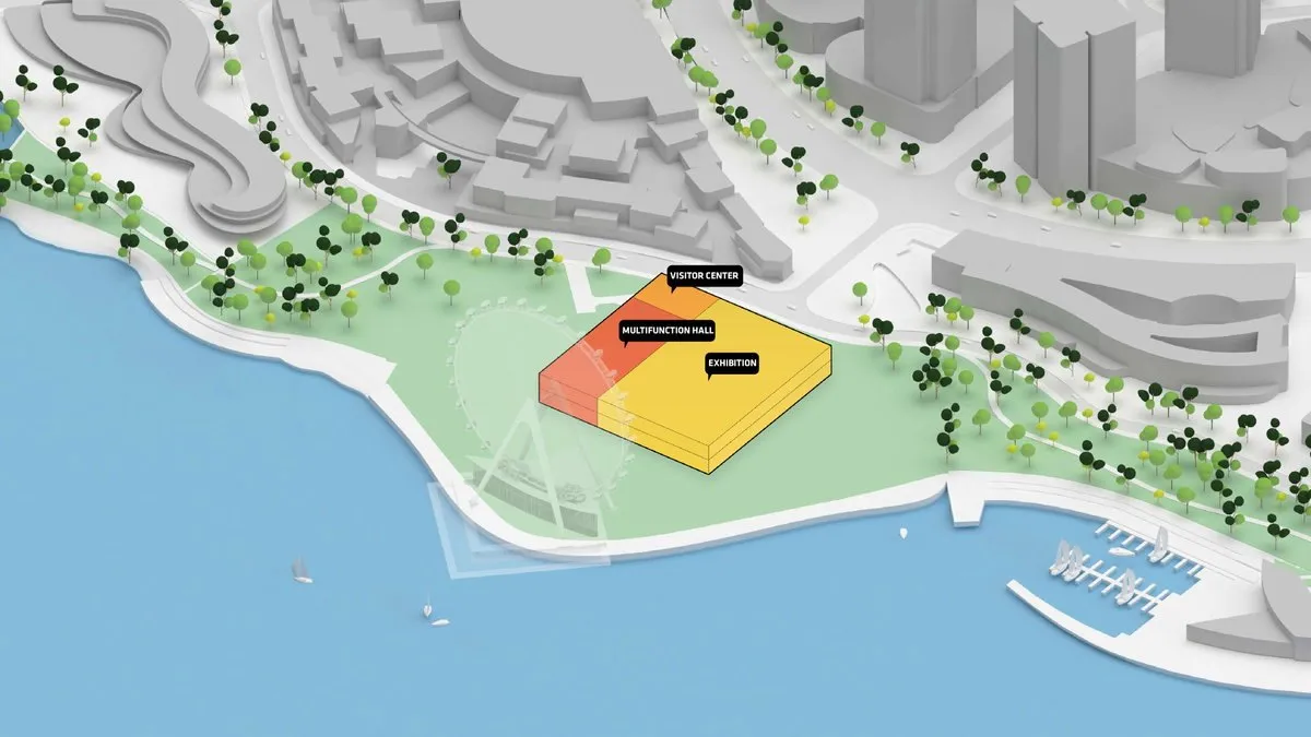
    Four main exhibition halls rise up to 18 metres, within 11,300 square metres of exhibition space, alongside areas for education, cultural exchange, commerce and a black-box venue for performance and experimental work.

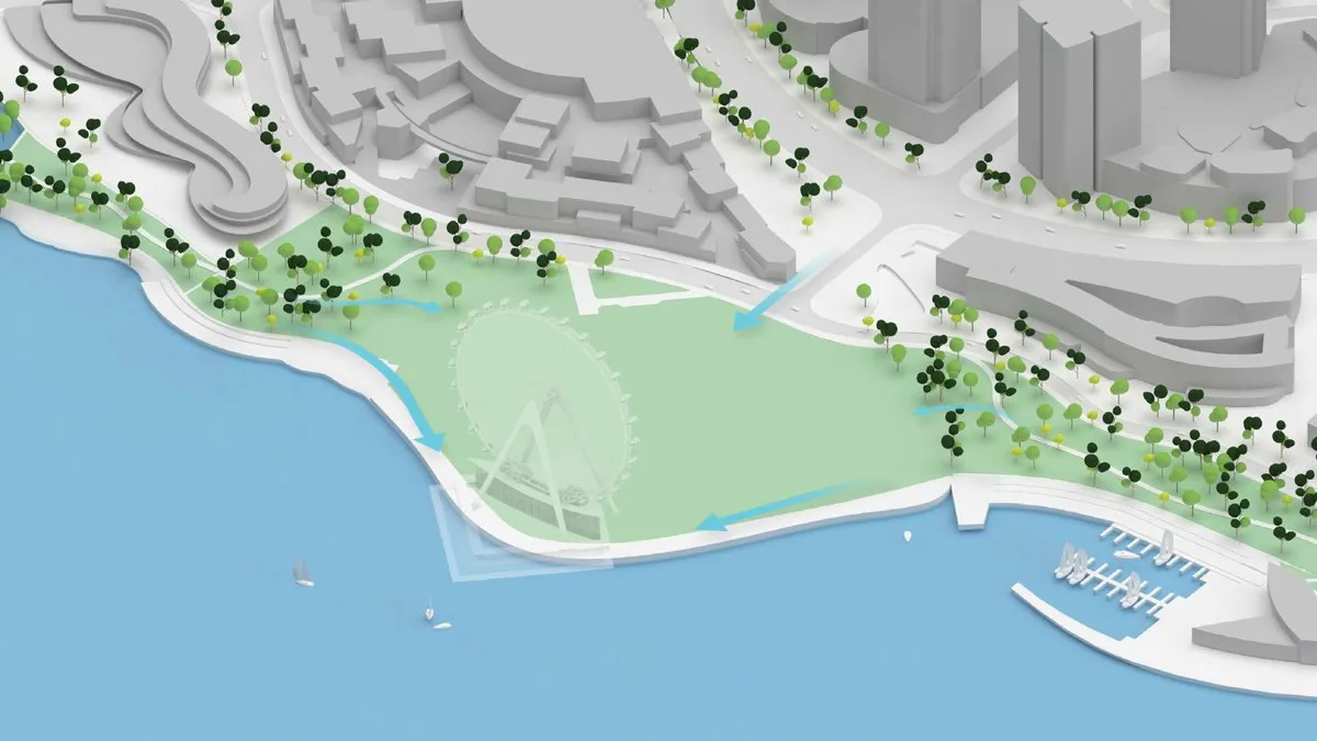
    Visitors move again and again from galleries into planted courtyards and covered passages, so the landscape becomes part of the museum. The route also carries on beyond the institution, linking the surrounding urban district with the public lakeside.

    Suzhou Museum of Contemporary Art, view 1
    Suzhou Museum of Contemporary Art, view 2
    Suzhou Museum of Contemporary Art, view 3
    Suzhou Museum of Contemporary Art, view 4
    Suzhou Museum of Contemporary Art, view 5
    Suzhou Museum of Contemporary Art, view 6
    Suzhou Museum of Contemporary Art, view 7
    Suzhou Museum of Contemporary Art, view 8
    Suzhou Museum of Contemporary Art, view 9
    Suzhou Museum of Contemporary Art, view 10
    Suzhou Museum of Contemporary Art, view 11
    Suzhou Museum of Contemporary Art, view 12
    Suzhou Museum of Contemporary Art, view 13
    Suzhou Museum of Contemporary Art, view 14
    Suzhou Museum of Contemporary Art, view 15
    Suzhou Museum of Contemporary Art, view 16
    Suzhou Museum of Contemporary Art, view 17
    Suzhou Museum of Contemporary Art, view 18
    Suzhou Museum of Contemporary Art, view 19
    Site diagram
    Site diagram
    Site diagram
    Site diagram
    Site diagram
    Site diagram
  • Gabonsa Pavilion

    Gabonsa Pavilion

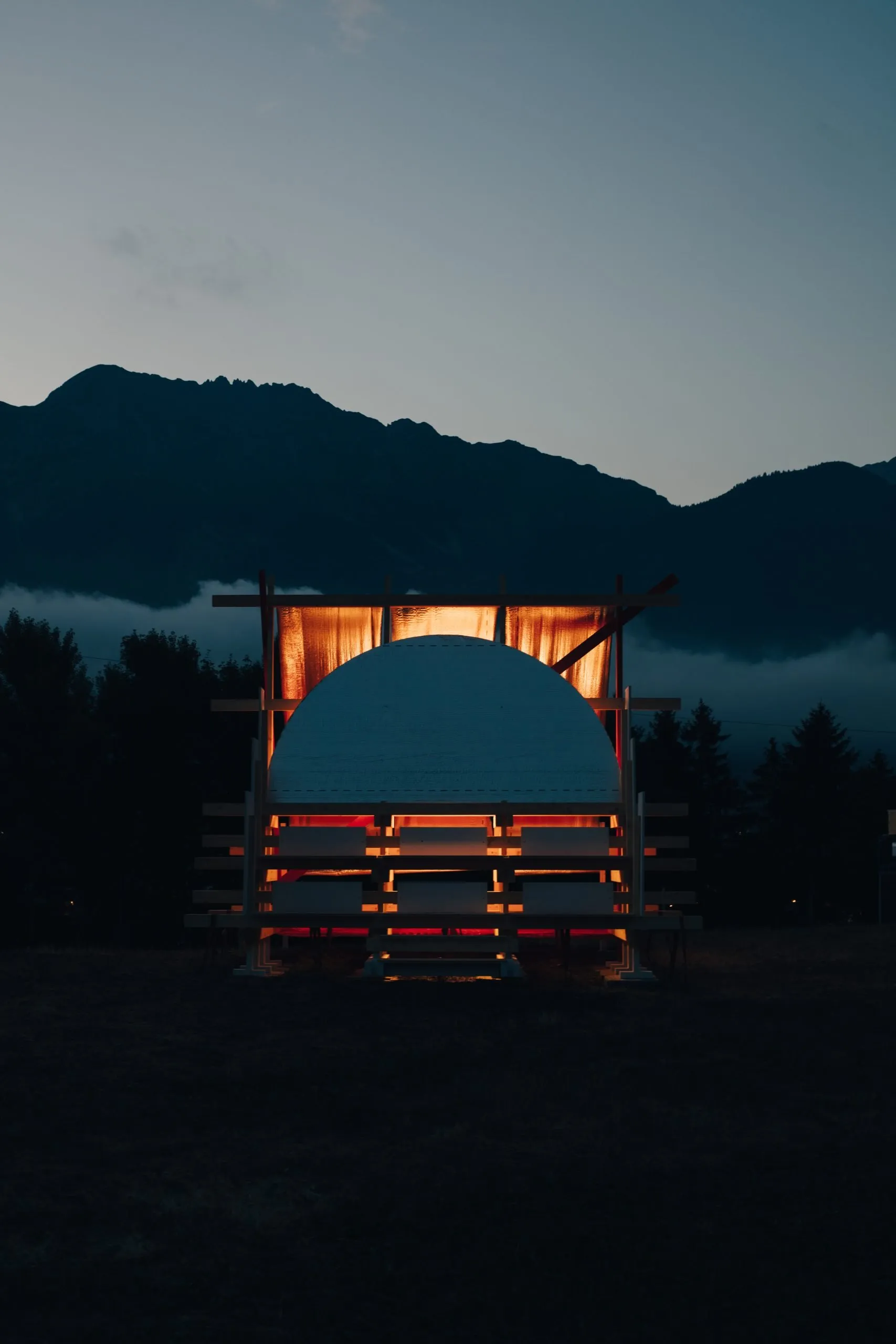
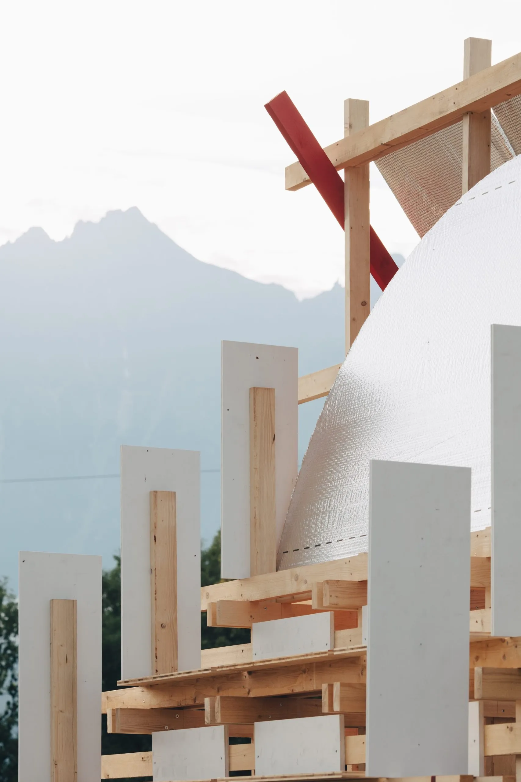
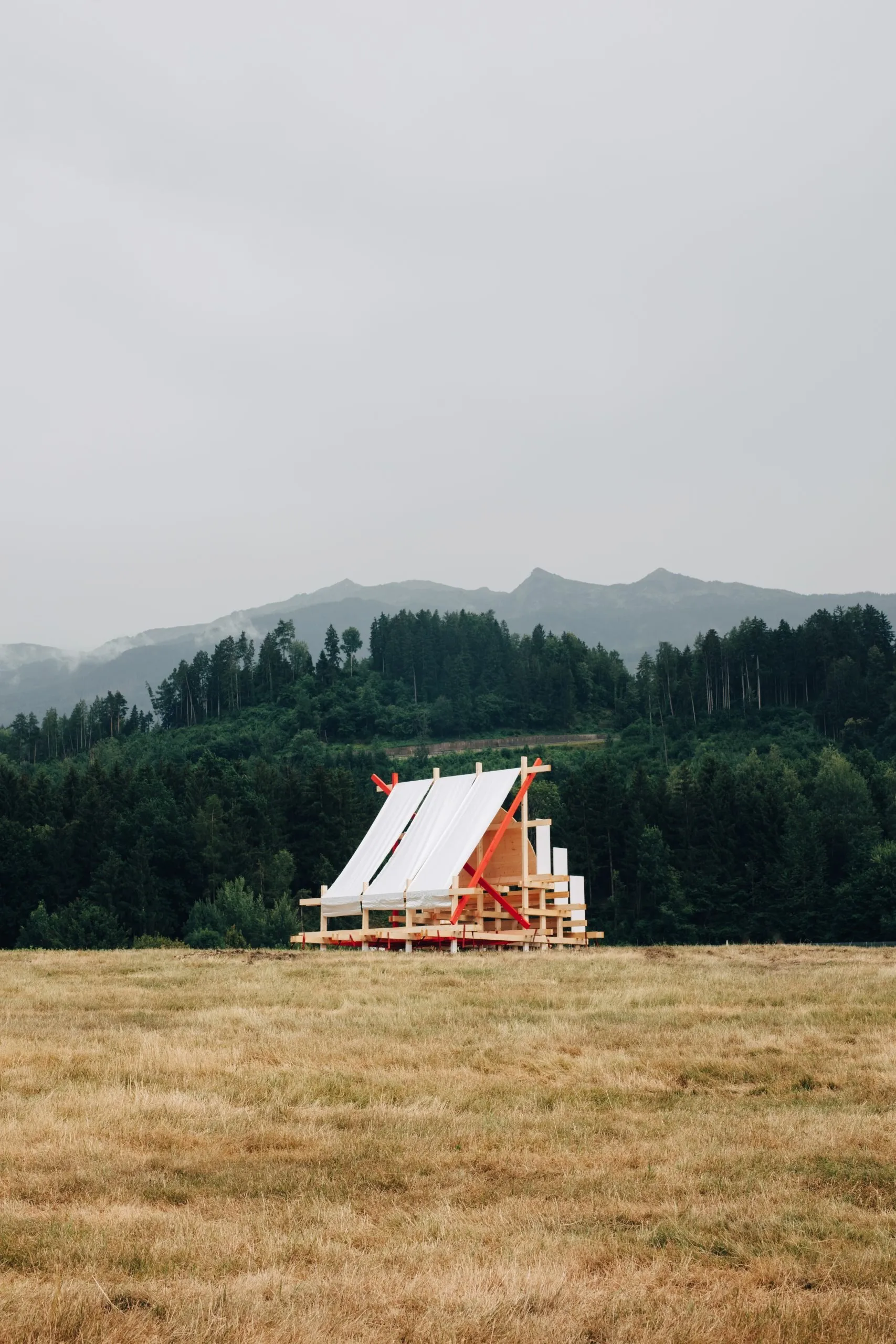
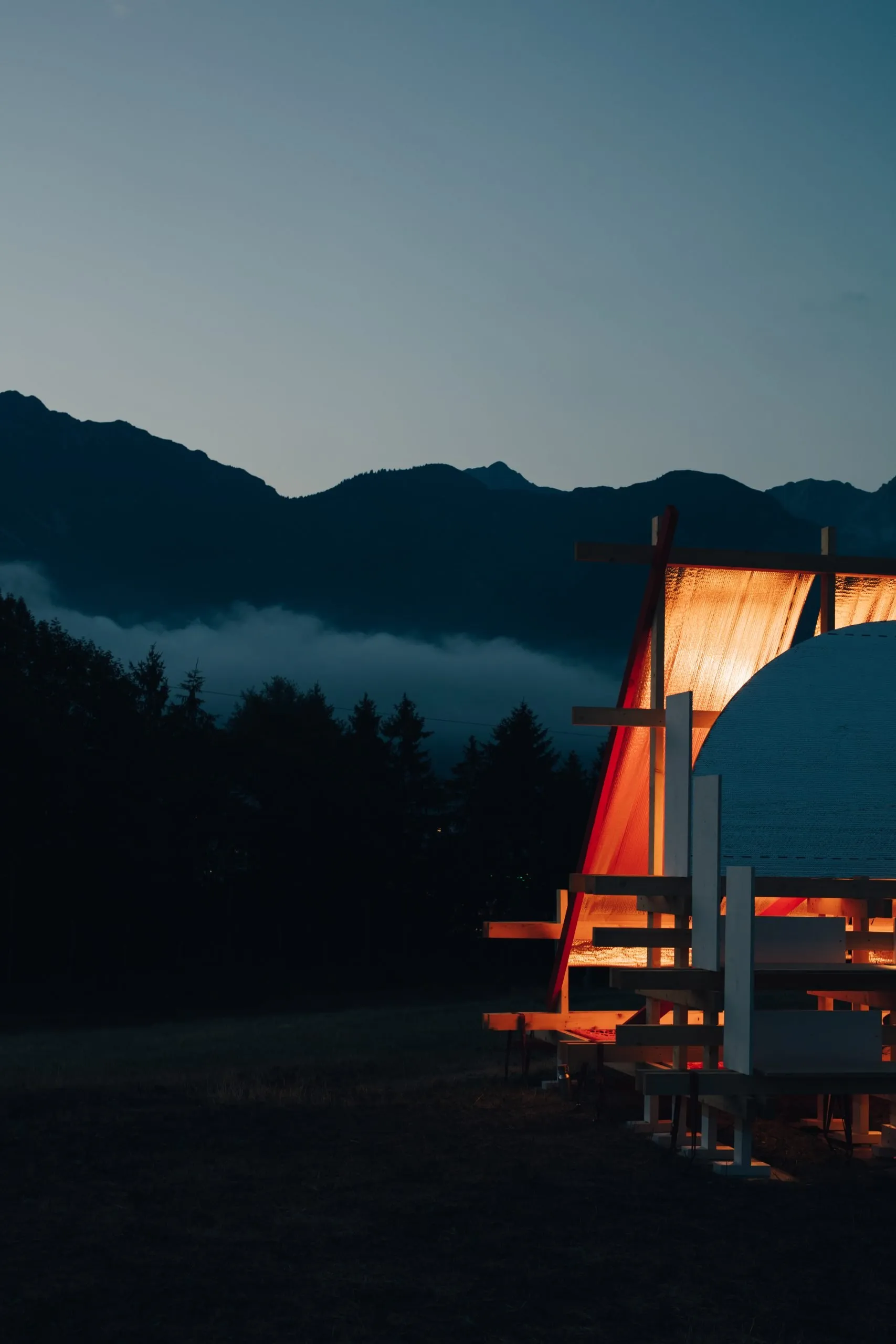
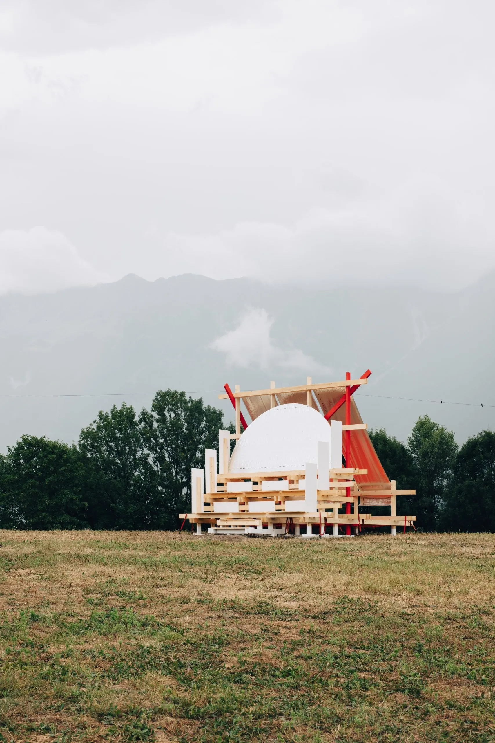
    Designed and built by architecture students, the pavilion turns a small hill on a former municipal landfill into a temporary seating landscape, meeting point and landmark for a music festival. It was developed with two local collectives that use cultural events to bring the old landfill back into public use.

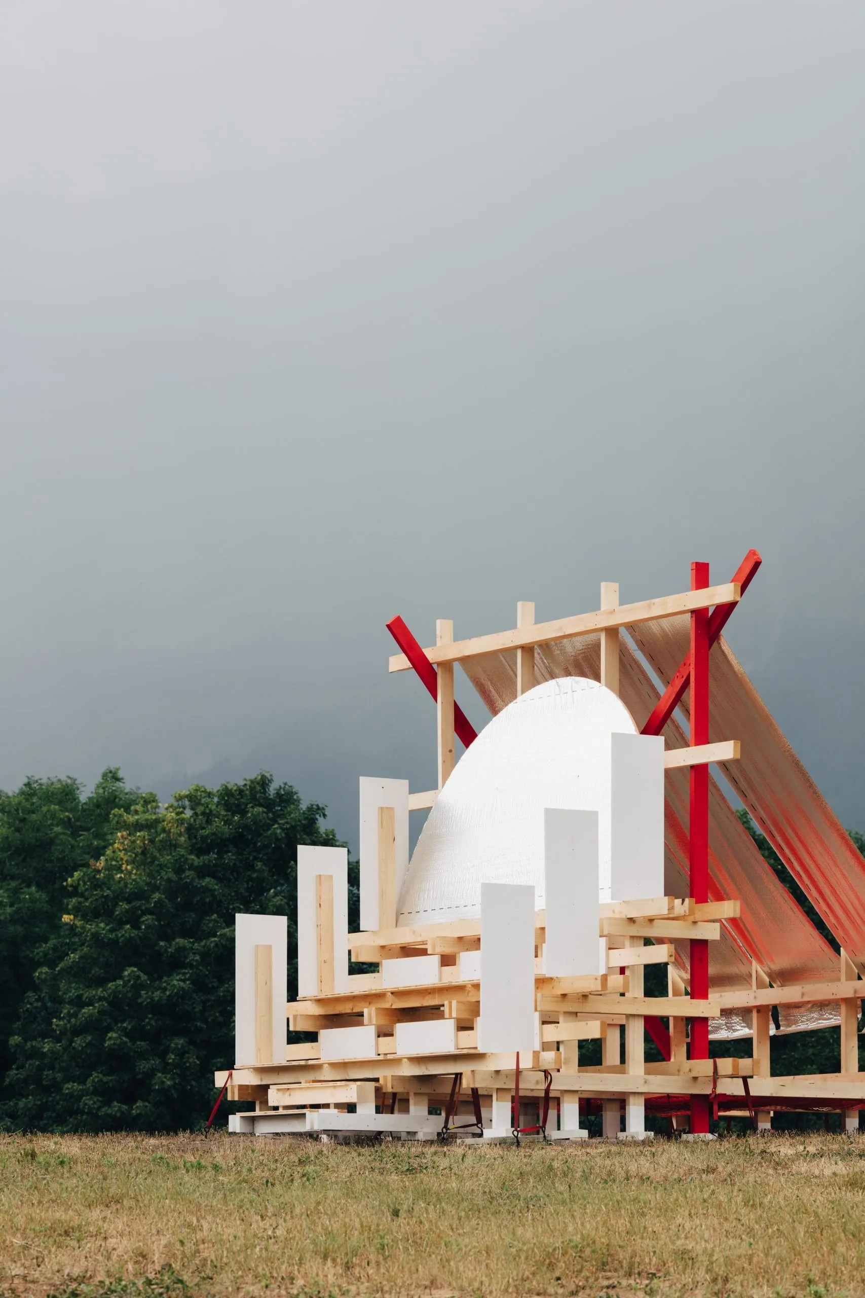
    Set between the festival’s main stage and its workshop area, the 16-square-metre structure works at the scale of furniture, installation and architecture at once. Its terraced form follows movement across the site: facing the stage it becomes a compact grandstand, and towards the workshops it turns into a more sheltered place to sit, recline and withdraw. Openings and changing levels frame the surrounding mountains.

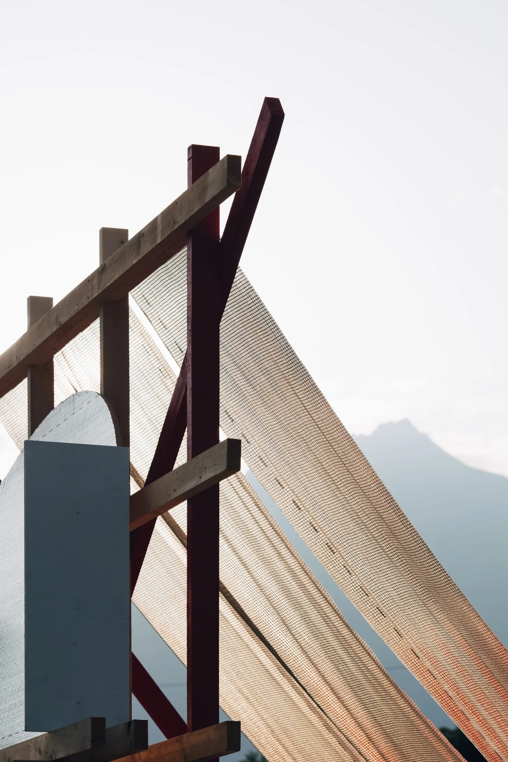
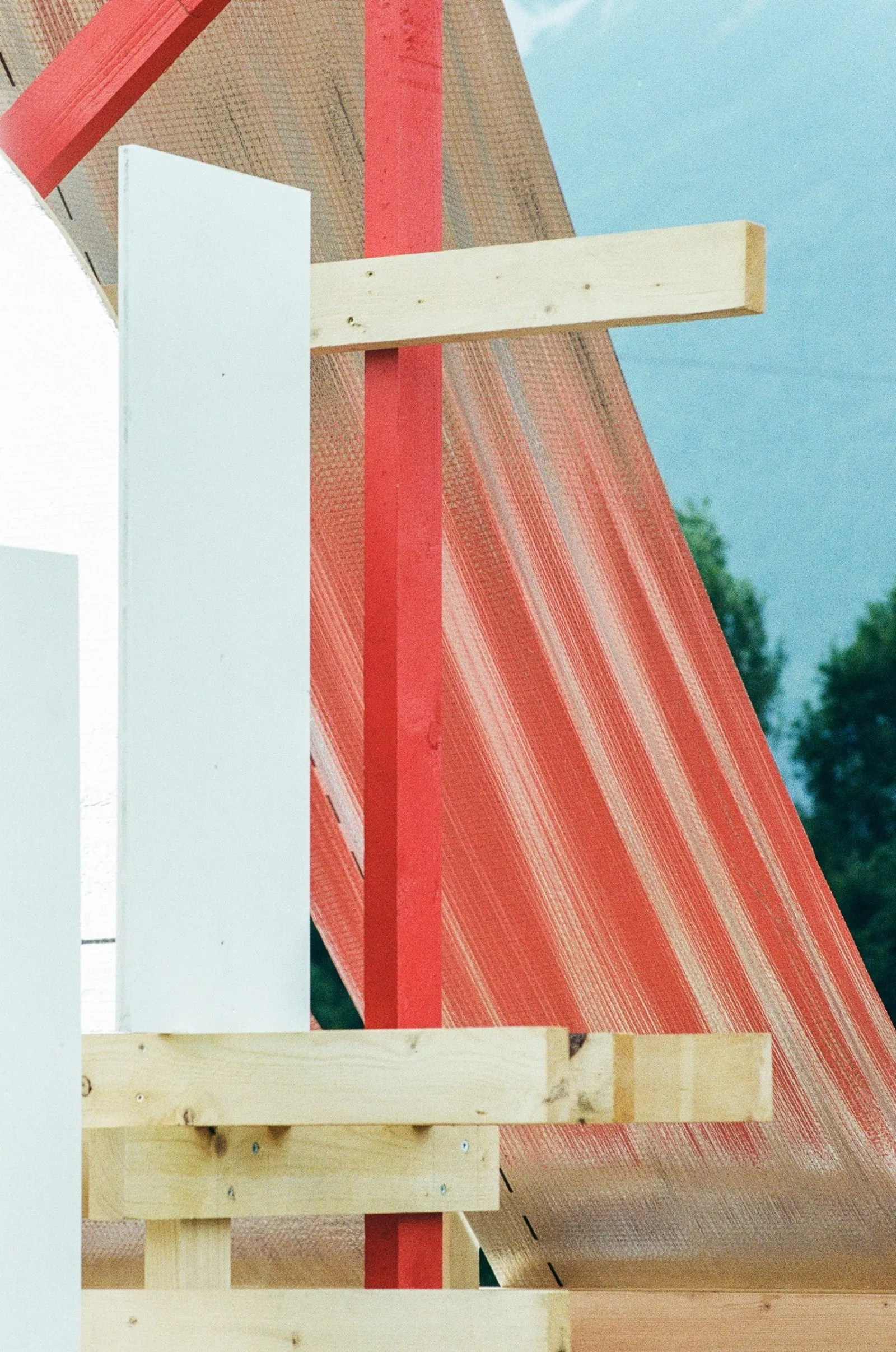
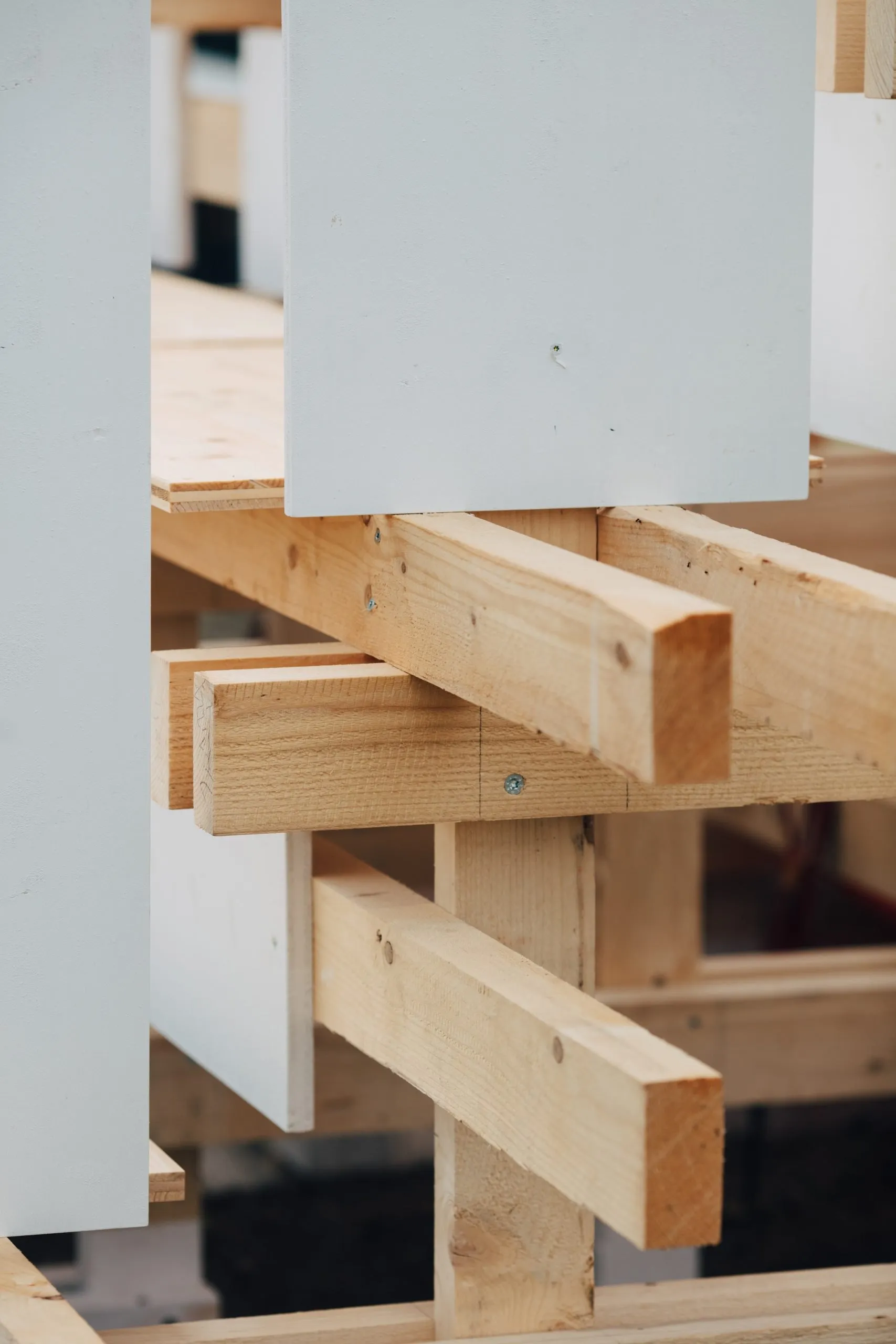
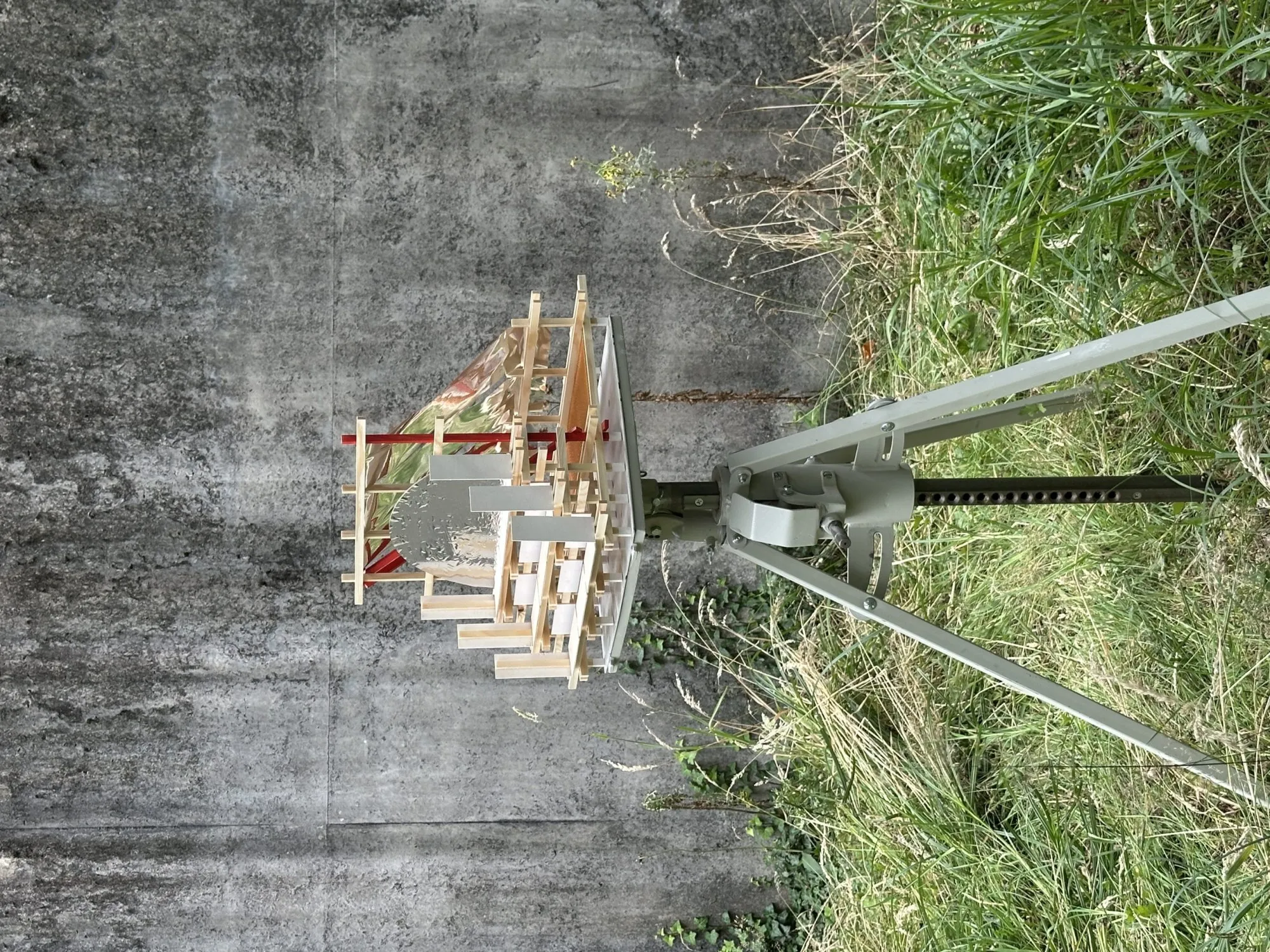
    A small budget, a short build and a temporary programme led to a deliberately simple system. The pavilion is assembled entirely from four-metre timber beams with plain screw connections. No glue or cast joints were used, and beams were cut only where the structure required it, so that most can be reused at full length after the festival.

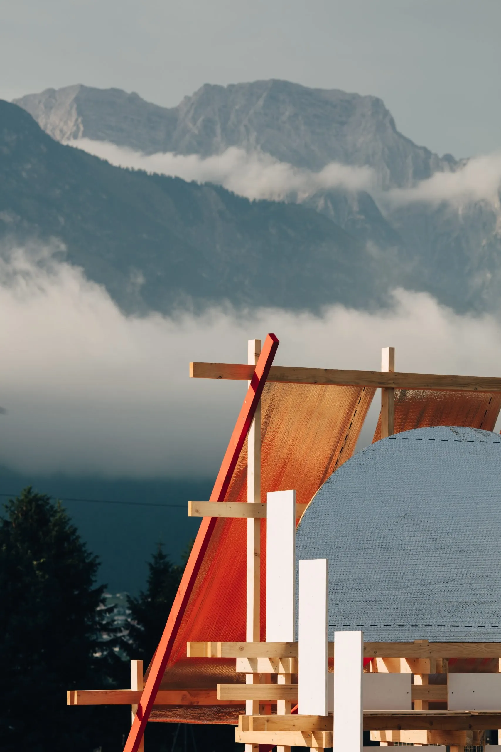
    Ordinary construction products take on new roles. A semicircle wrapped in reflective building foil mirrors the sky and mountains and makes the pavilion visible across the grounds. An aluminium vapour-barrier canopy gives shade, and an orange safety net slung beneath it becomes a hammock. Red-painted bracing shows the structure rather than hiding it, and ground screws and red straps anchor the pavilion lightly so that it can be fully dismantled.

    Gabonsa Pavilion, view 1
    Gabonsa Pavilion, view 2
    Gabonsa Pavilion, view 3
    Gabonsa Pavilion, view 4
    Gabonsa Pavilion, view 5
    Gabonsa Pavilion, view 6
    Gabonsa Pavilion, view 7
    Gabonsa Pavilion, view 8
    Gabonsa Pavilion, view 9
    Gabonsa Pavilion, view 10
    Model

Newsletter

A monthly letter from NOTES with new projects, dialogues and essays.