Author: pluto

  • Blue Bottle Coffee Kiyosumi-Shirakawa Roastery & Cafe

    Blue Bottle Coffee Kiyosumi-Shirakawa Roastery & Cafe

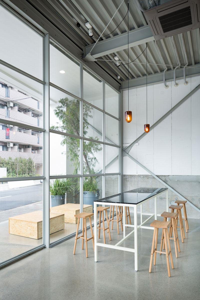
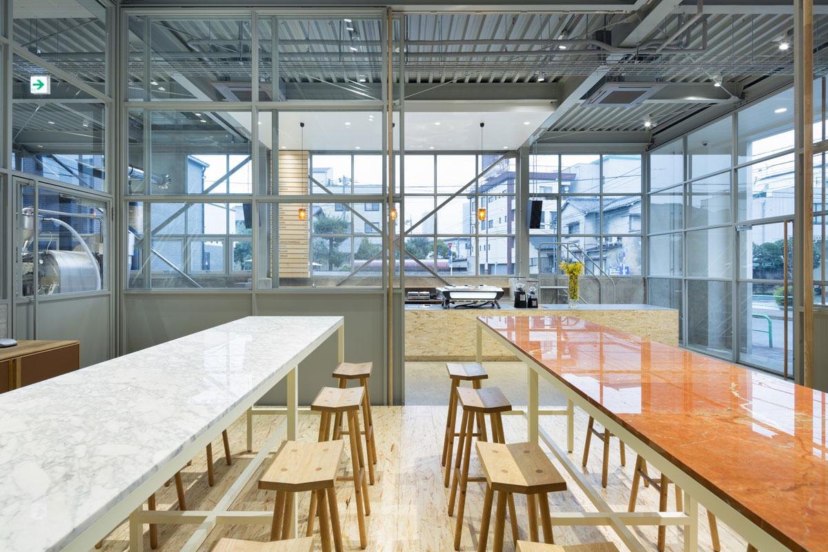
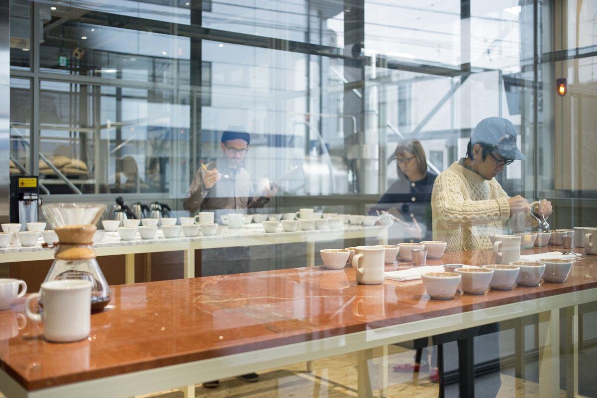
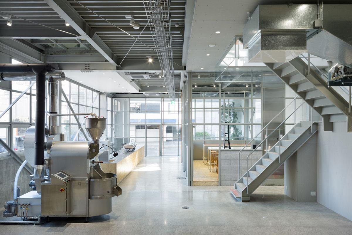
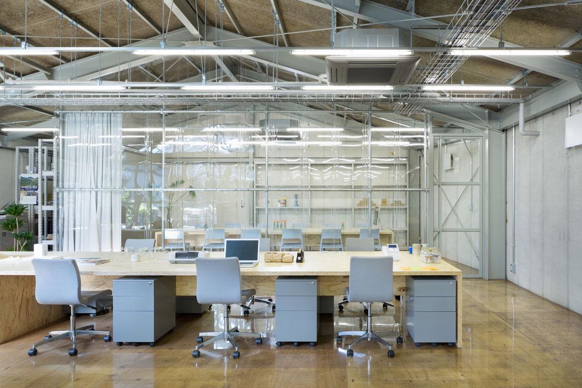
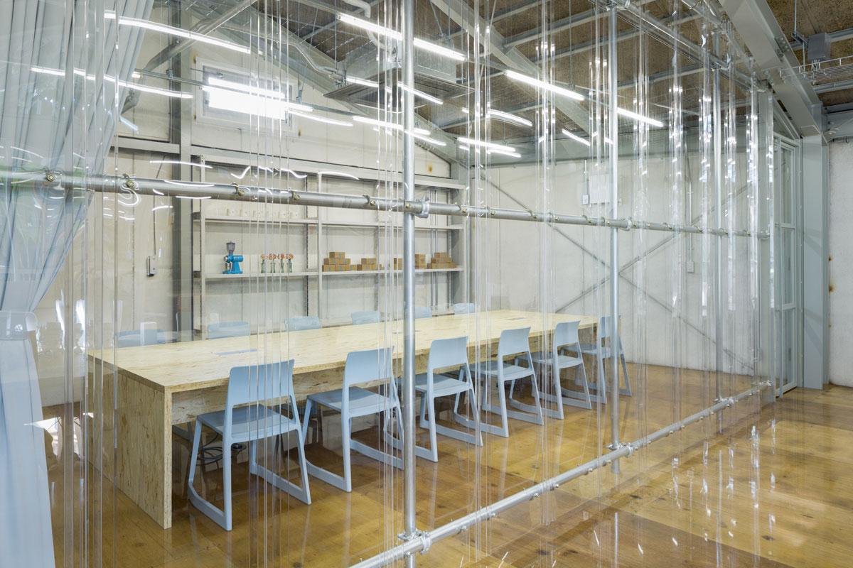
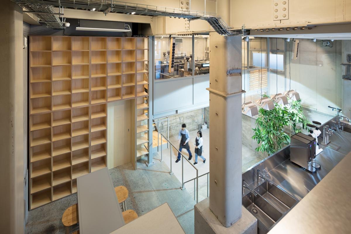
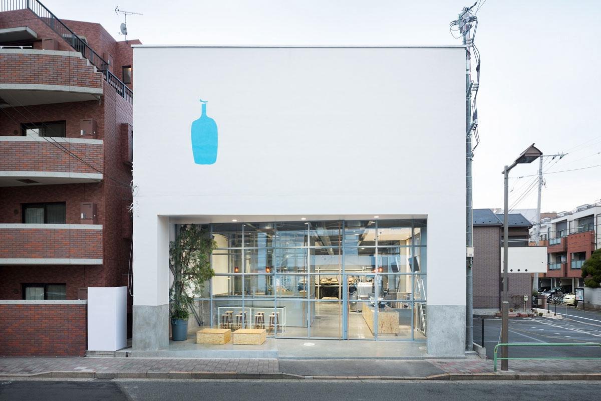
    This was the company’s first roastery and café in the country, built as the production base for its local operations. The design team renovated a former storage building to hold a roastery, a café, offices, a barista training room and a pastry kitchen.

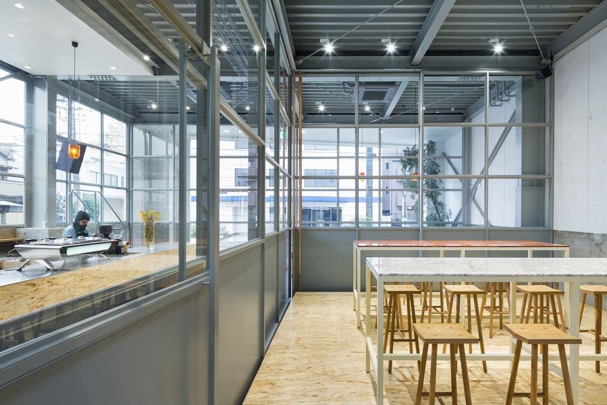
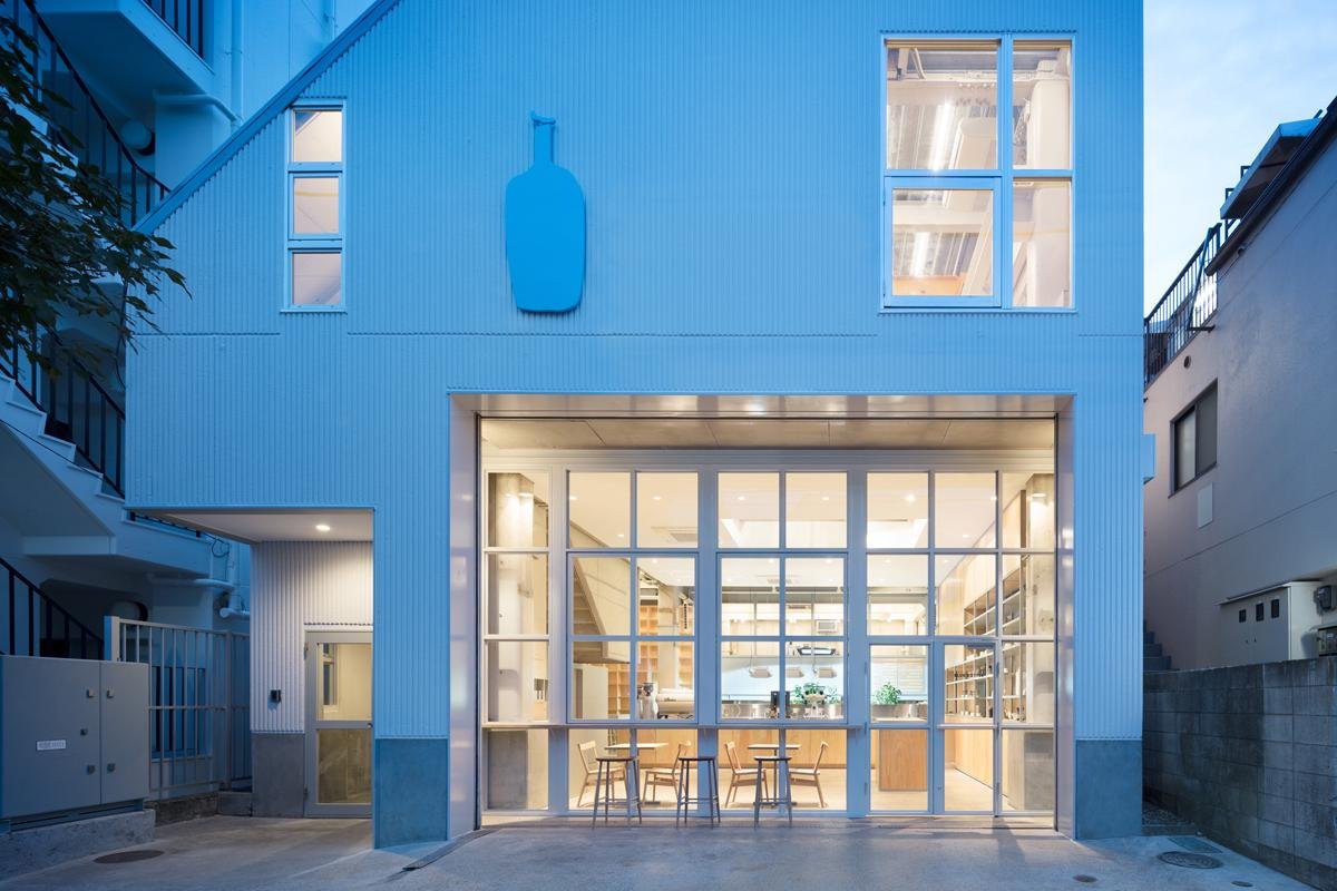
    The brand works for the best flavour and aroma while promoting fair trade and better conditions on coffee farms, and wants baristas and customers to learn and grow together. The architects supported that by opening the building to the street and making one continuous space, where everyone can see what the others are doing.

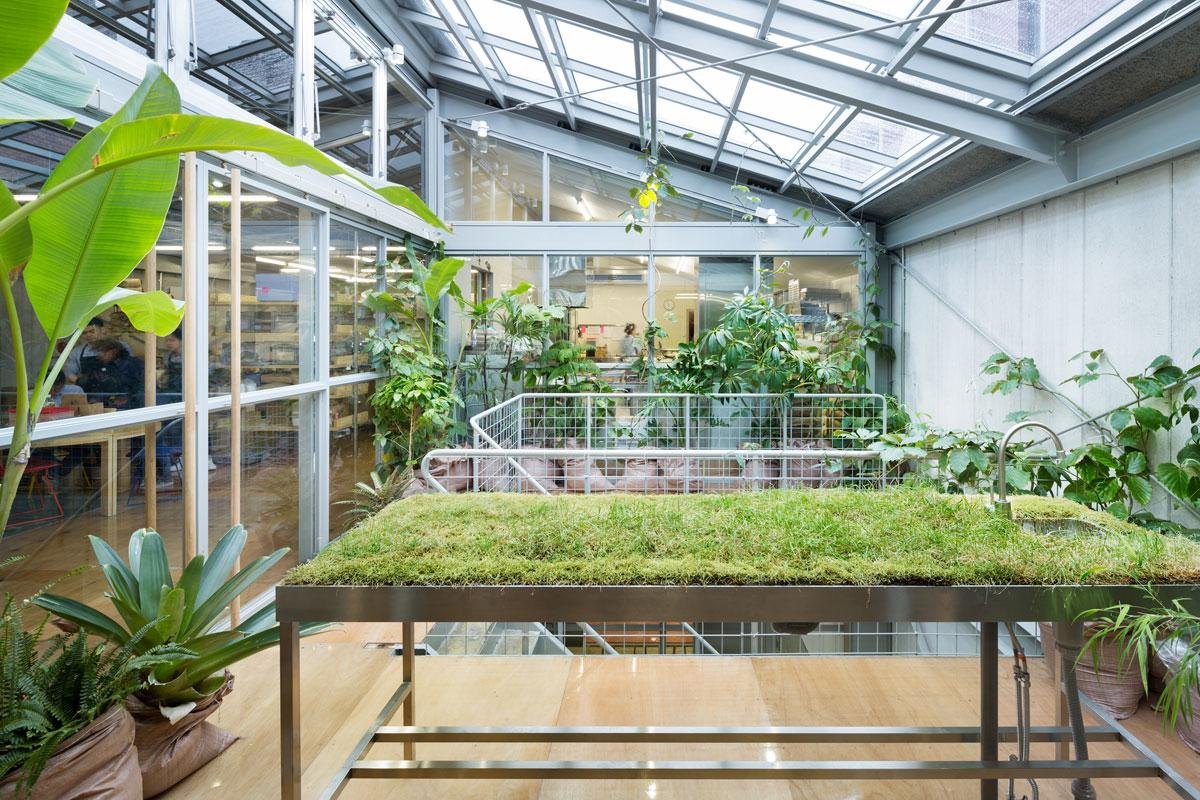
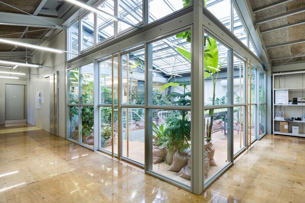
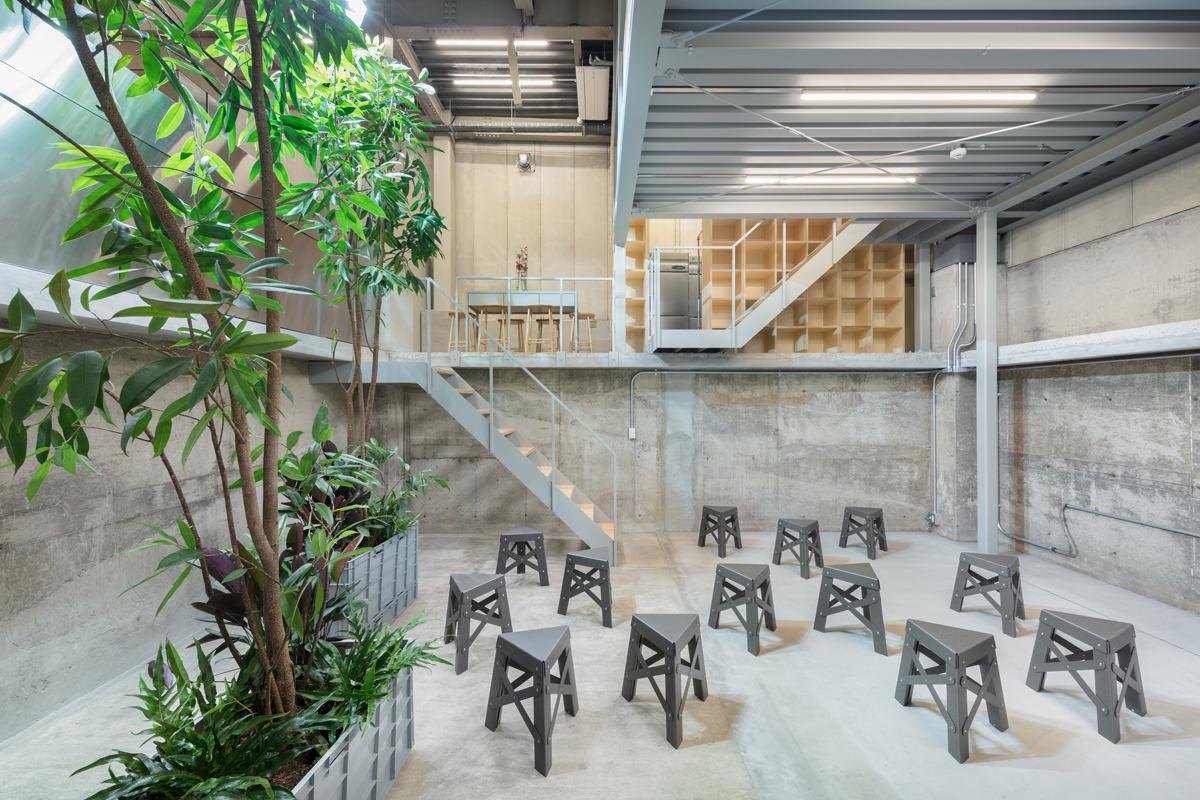
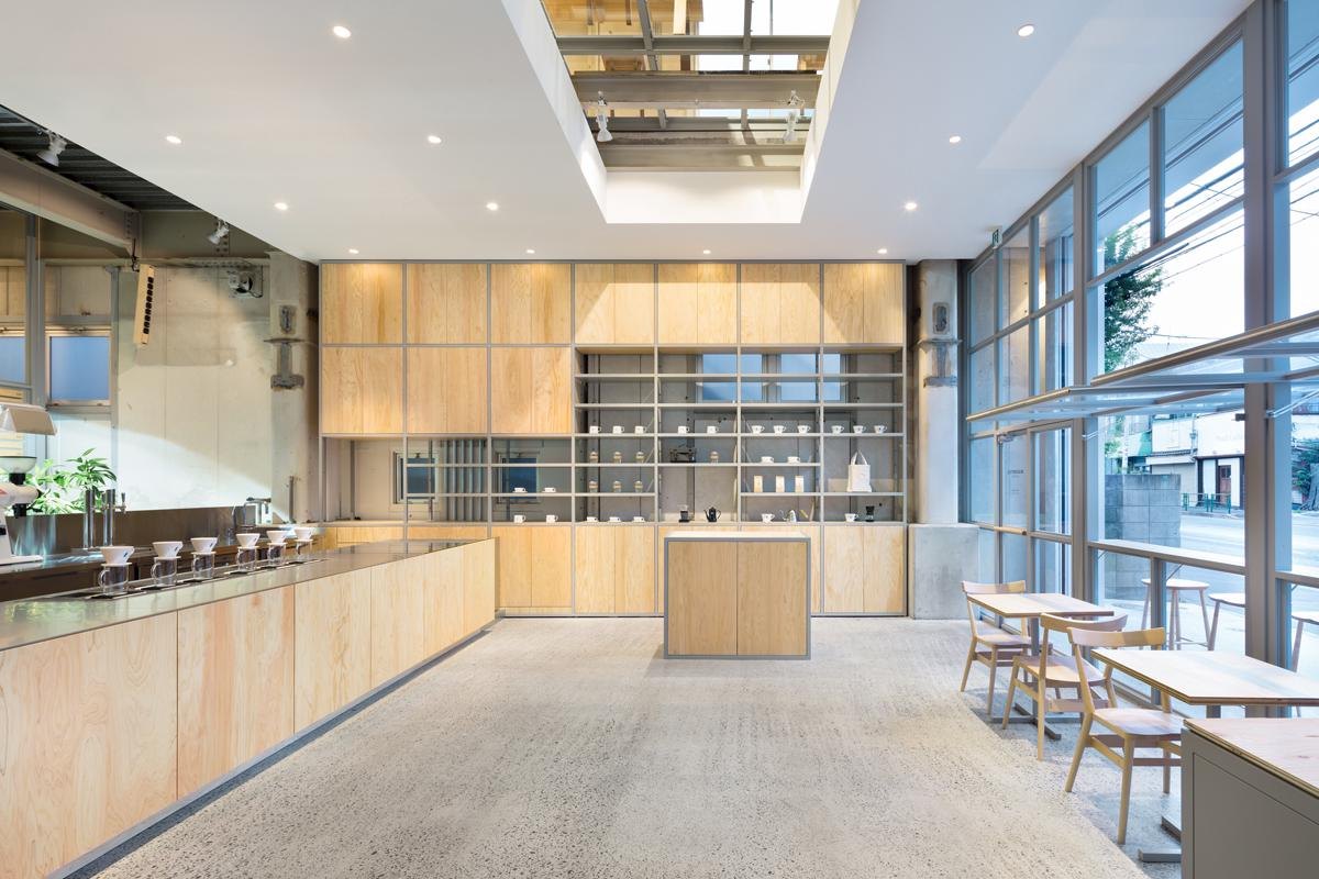
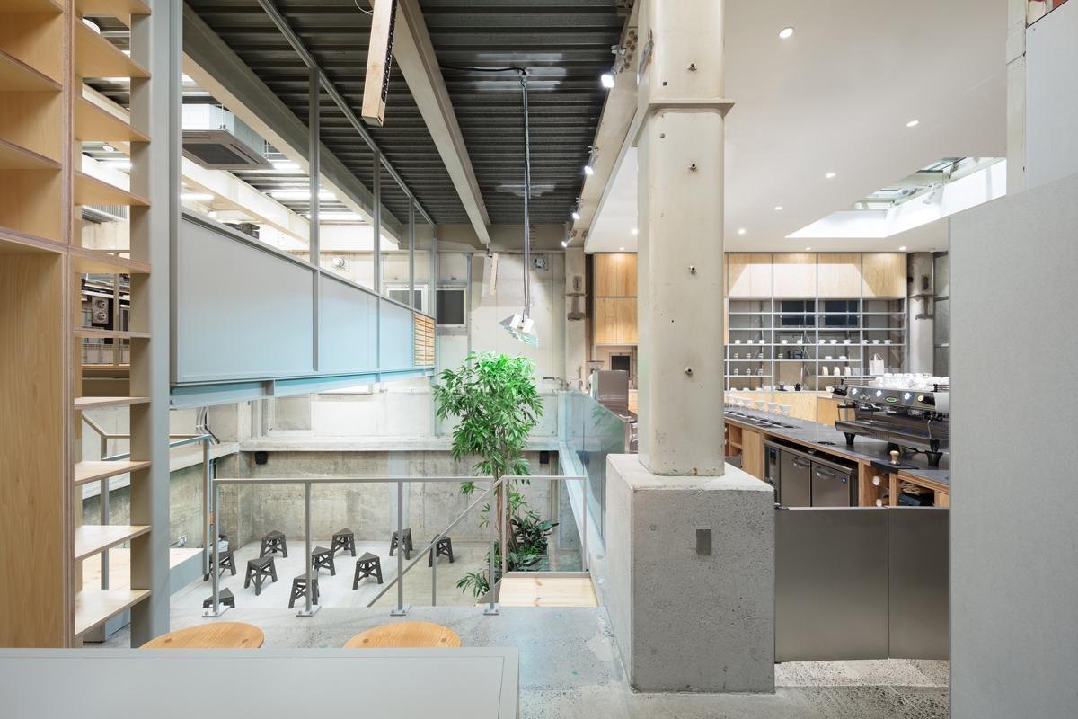
    Very large glass doors and screens on each floor keep neighbouring spaces in view of each other, inside and out, lower and upper floors. The old warehouse had no windows, so a large skylight was cut into the middle. It sits right above the void between the two floors, where indoor planting upstairs catches the light and sends a forest-like play of light and shade down below.

    Customers get more than an ordinary café visit. They can watch the production in the roastery, drink their coffee in the café and look up through the planted void to the floor above.

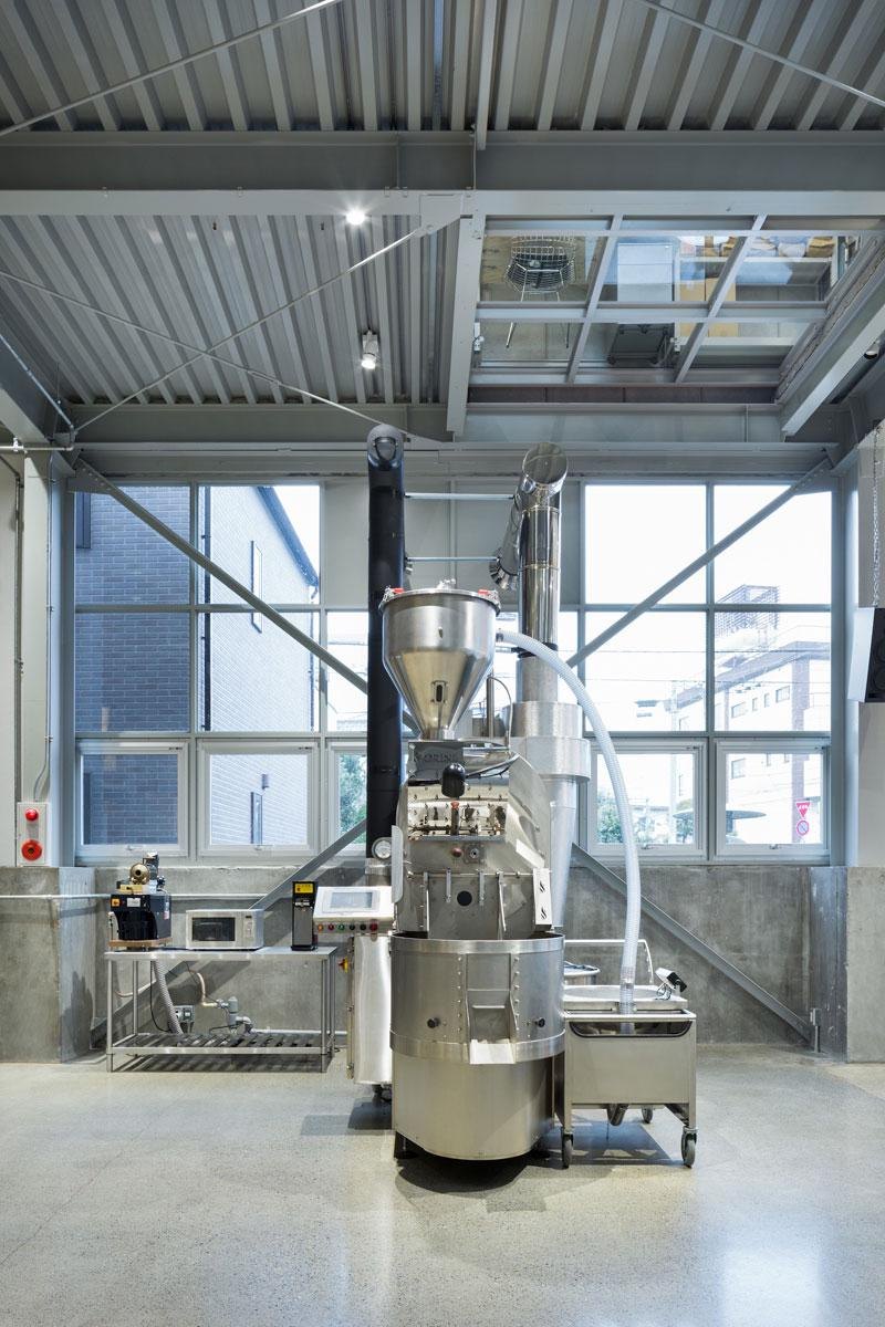
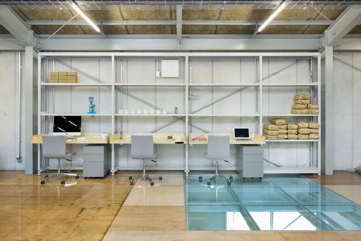
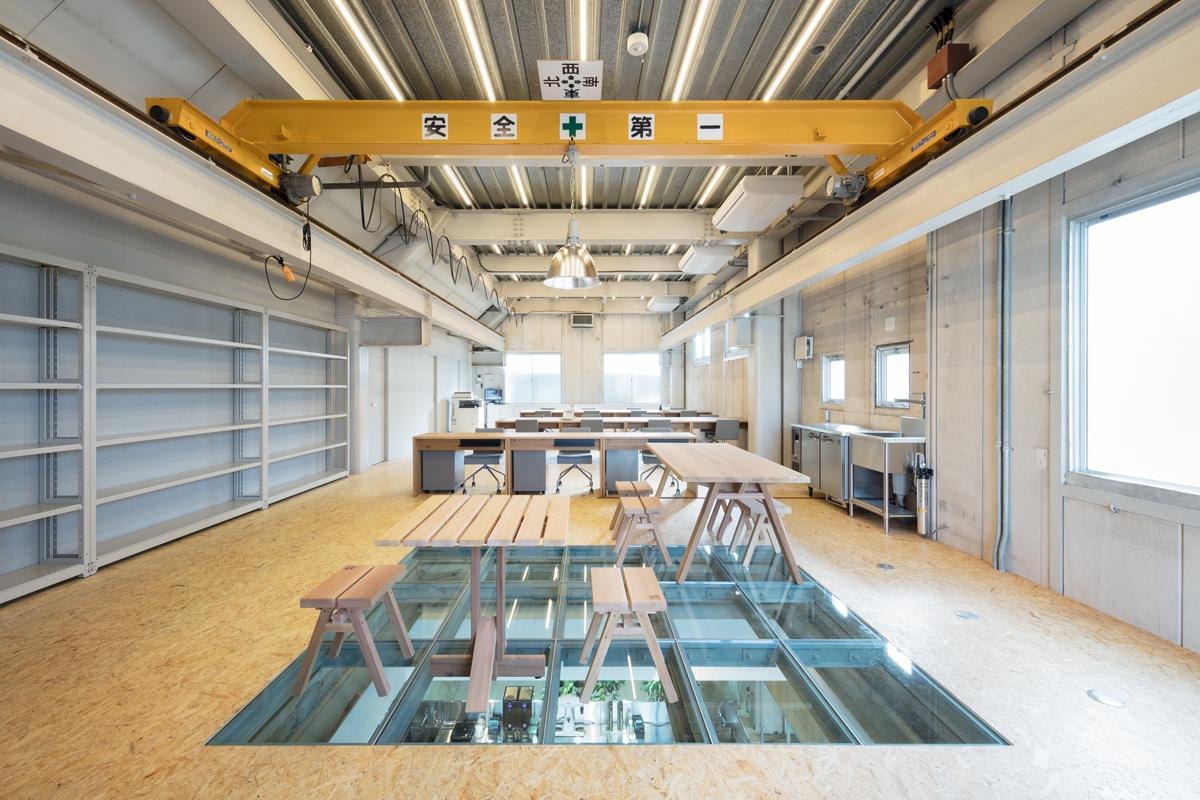
    Part of the upper floor is glass, set directly over the main roasting machine. Staff upstairs can see customers enjoying their coffee, which keeps them motivated, and they can watch production below and respond at once to any problem. These visual links tie staff and customers together.
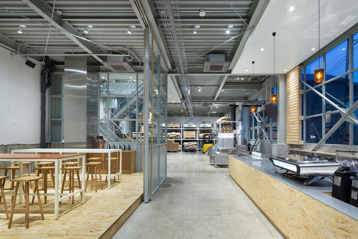
    Former warehouse with a glazed shopfront
    Blue Bottle Coffee Kiyosumi-Shirakawa Roastery & Cafe, view 2
    Blue Bottle Coffee Kiyosumi-Shirakawa Roastery & Cafe, view 3
    Blue Bottle Coffee Kiyosumi-Shirakawa Roastery & Cafe, view 4
    Blue Bottle Coffee Kiyosumi-Shirakawa Roastery & Cafe, view 5
    Blue Bottle Coffee Kiyosumi-Shirakawa Roastery & Cafe, view 6
    Blue Bottle Coffee Kiyosumi-Shirakawa Roastery & Cafe, view 7
    Roasting machine under the glass floor
    Planted void beneath the skylight
    Blue Bottle Coffee Kiyosumi-Shirakawa Roastery & Cafe, view 10
    Blue Bottle Coffee Kiyosumi-Shirakawa Roastery & Cafe, view 11
    Blue Bottle Coffee Kiyosumi-Shirakawa Roastery & Cafe, view 12
    Blue Bottle Coffee Kiyosumi-Shirakawa Roastery & Cafe, view 13
  • PACO

    PACO

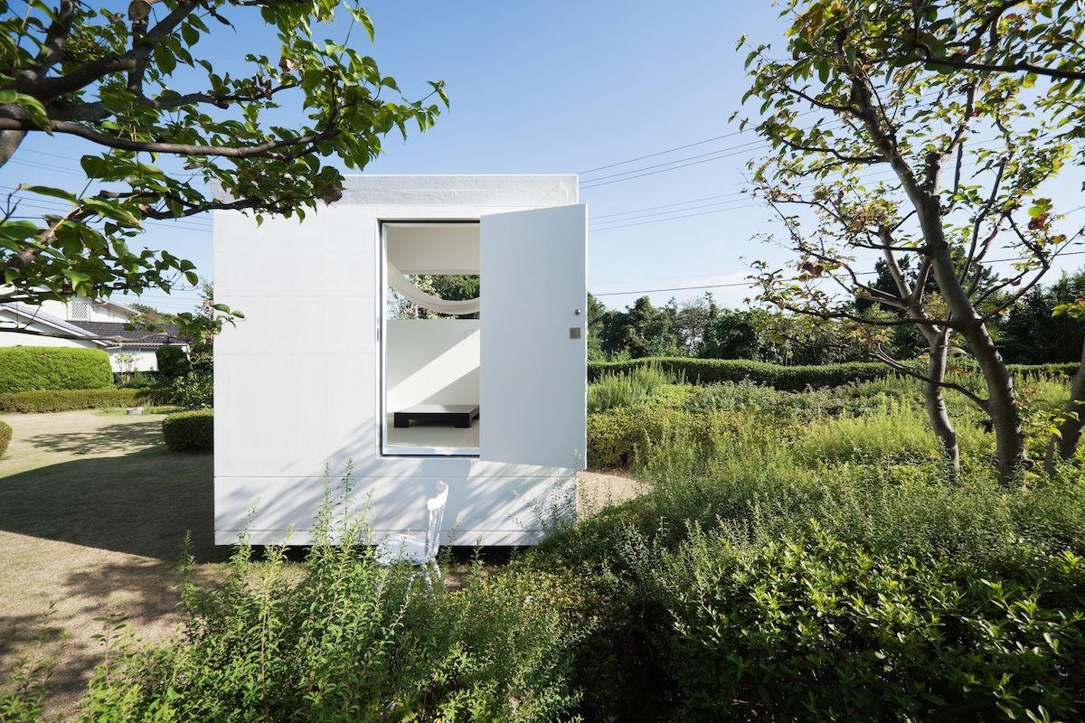
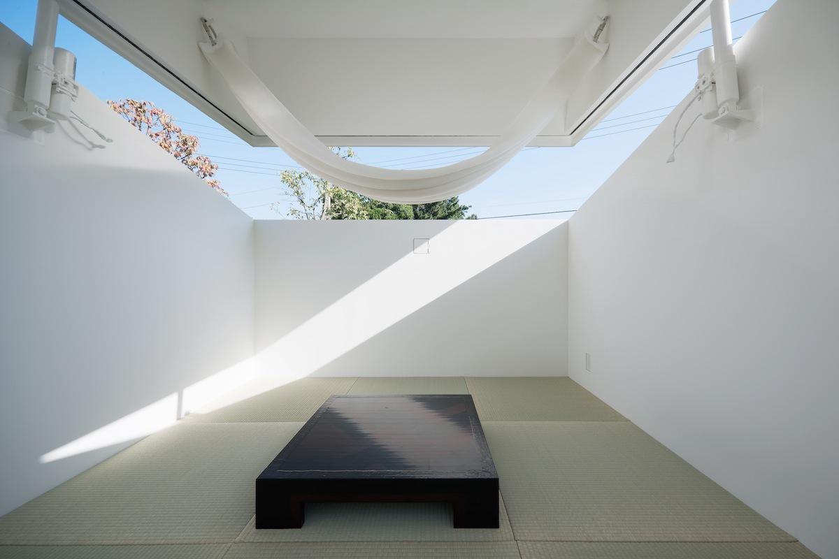
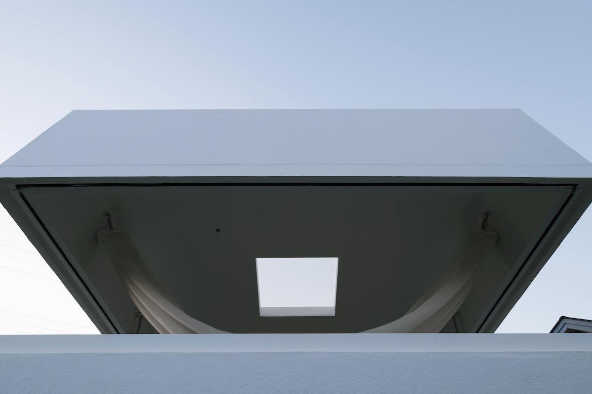
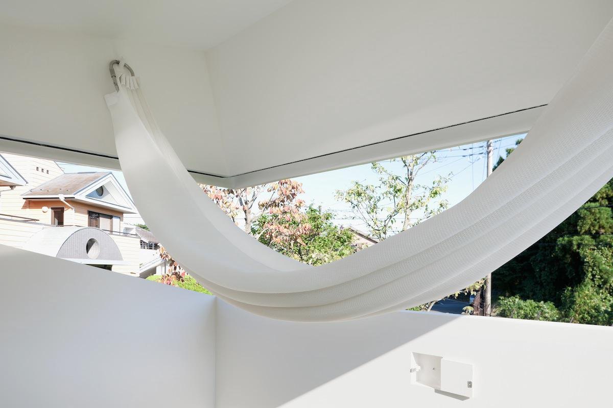
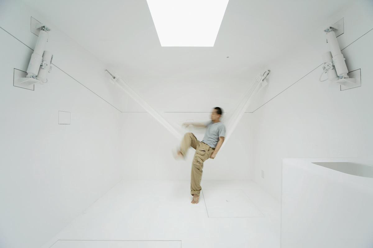
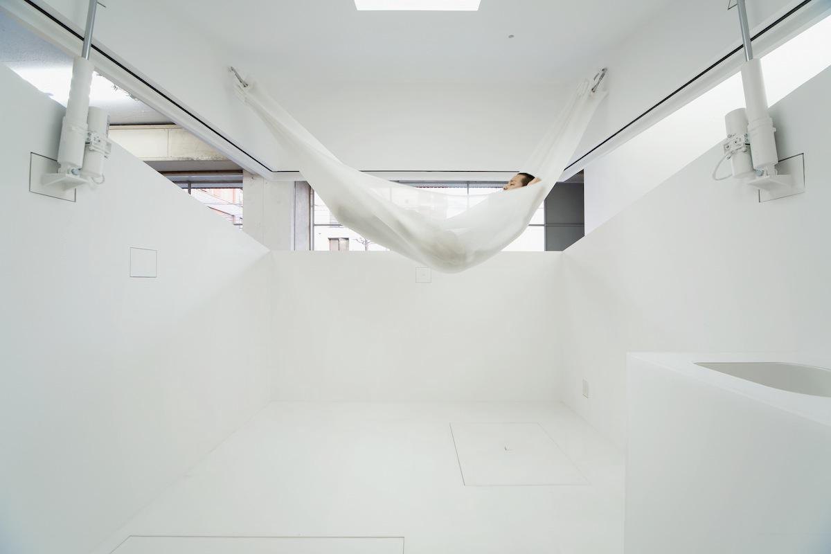
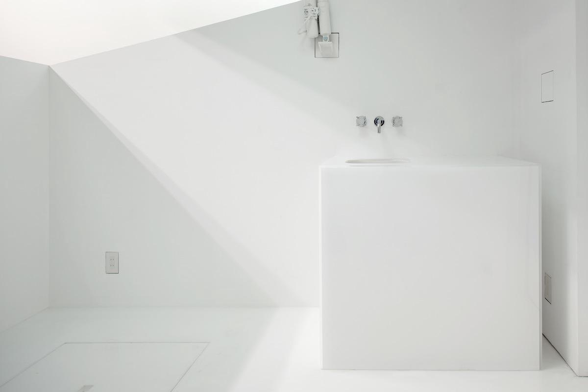
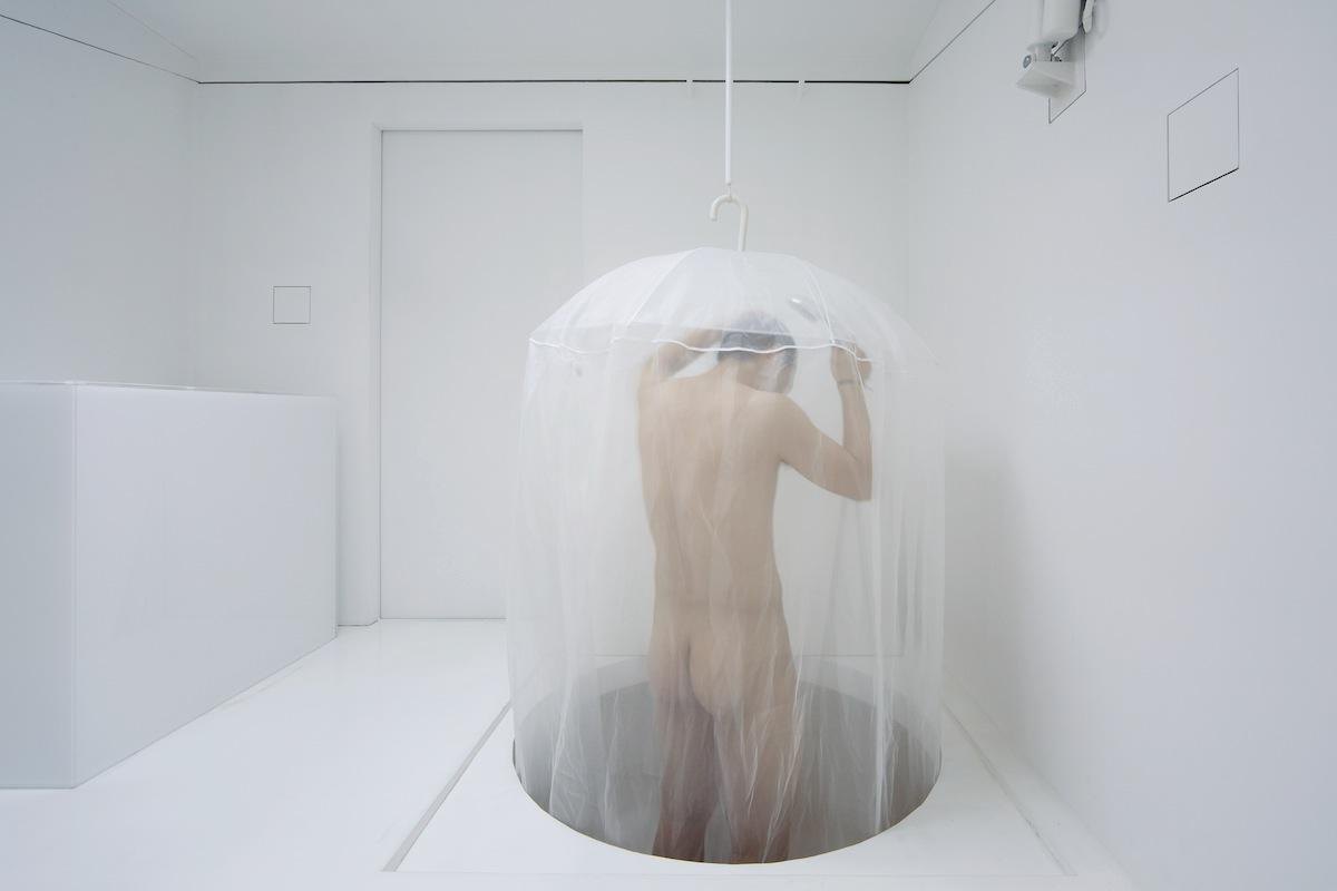
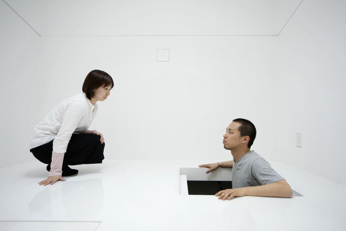
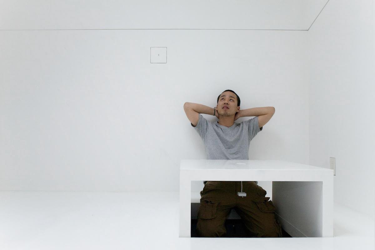
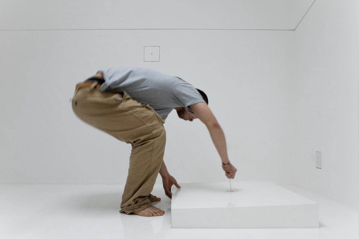
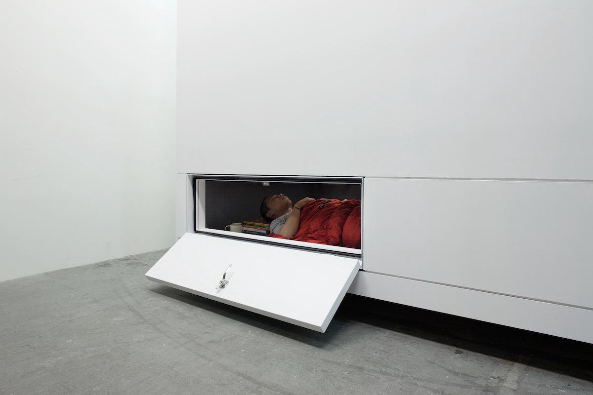
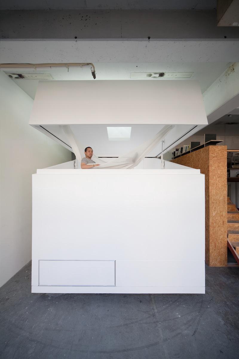
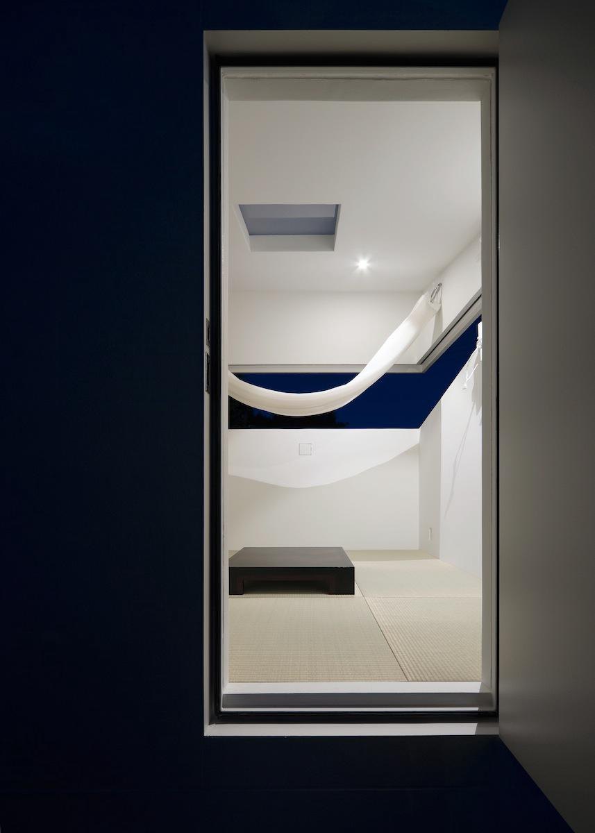
    PACO is a box, a cube 3 metres on each side, with a roof that opens. Despite its size it holds all the basic equipment needed to live.

    The design team made it as a conceptual model for imagining a new way of life. Set beside a house, inside a factory, by the sea or in the mountains, it suggests a different way of living in each landscape.

    The aim was to make it independent, a stand-alone object free of infrastructure. That is technically possible but not yet practical in today’s society, and the team presents it as a first step toward closing the gap.

    The white cube in a meadow
    PACO, view 2
    The cube with its roof opened
    PACO, view 4
    PACO, view 5
    PACO, view 6
    PACO, view 7
    PACO, view 8
    PACO, view 9
    PACO, view 10
    PACO, view 11
    PACO, view 12
    PACO, view 13
    PACO, view 14
  • Blue Bottle Coffee Nakameguro

    Blue Bottle Coffee Nakameguro

    For the design team, this was a building they already knew well. Years earlier they had set up a shared office across the street and spent long days looking out at it through the glass. Of all the buildings on that street, it was the one they liked most.

    When the coffee company chose it for a new cafe, the brief was to renovate the whole building for a cafe and office, with room for barista training and workshops. The structure is a three-storey steel frame that once housed an electrical factory. As in the team’s other work for the brand, the aim was a fair relationship between everyone present, staff and customers alike.

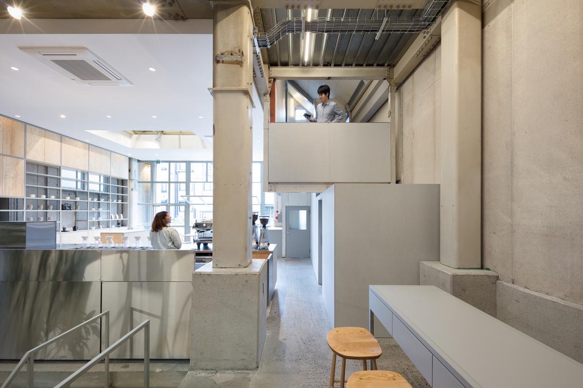
    The neighbourhood lies far from the station, and its streets are lined with small independent shops. To carry that small scale indoors, the floors were split into stepped levels, and the old openings once used for loading and storage were put back to work.

    Horizontal pivot windows across the glazed front mark the line between inside and street while keeping the two in view of each other. Wherever people are in the building, they can see and be seen, and stay aware of one another.

    Blue facade with the glazed front
    Stepped floors and greenery inside the former factory
    Coffee counter in pale plywood
    Bar seating along the glazed front
    Upper floor with glass floor panels and a gantry beam
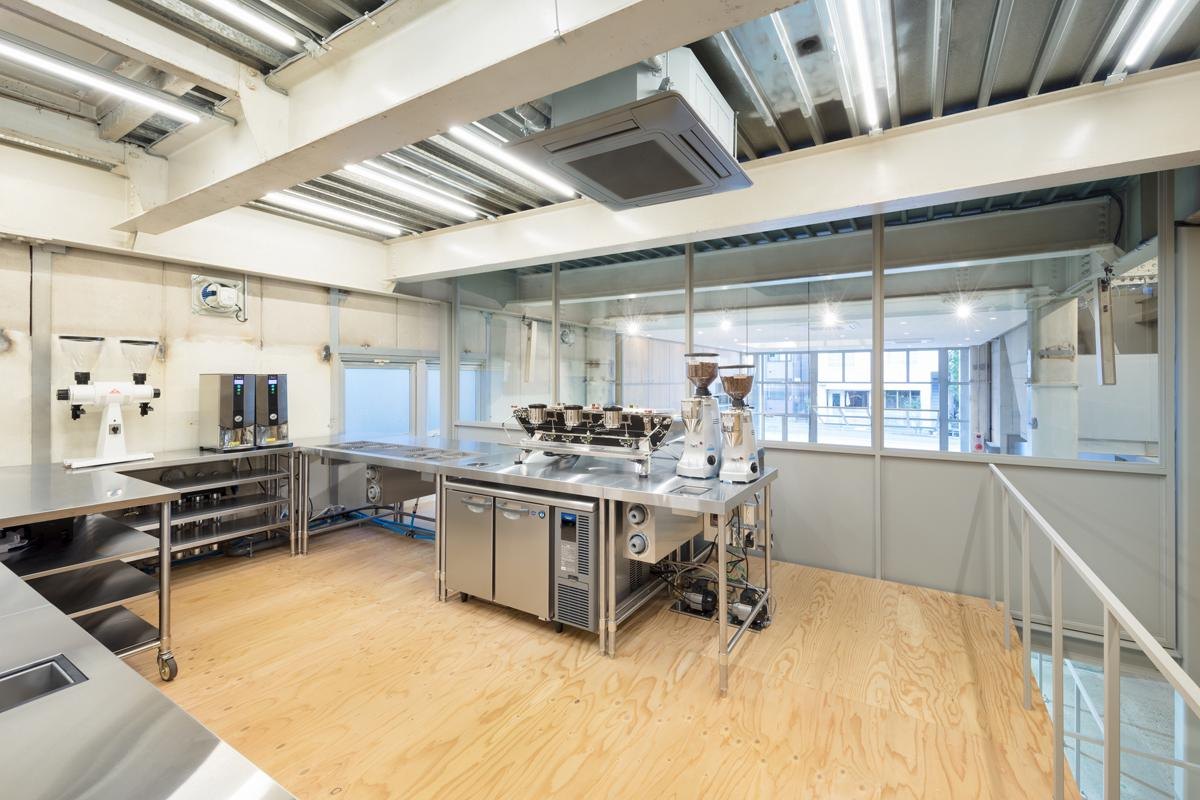
    Training kitchen on the upper floor
    Looking down into the stepped interior
    Pale seating platforms around a steel column
    Shelving and stair between levels
    Long table under a steel stair
    The street with the building in view
    Blue facade at dusk
  • Hue 5F

    Hue 5F

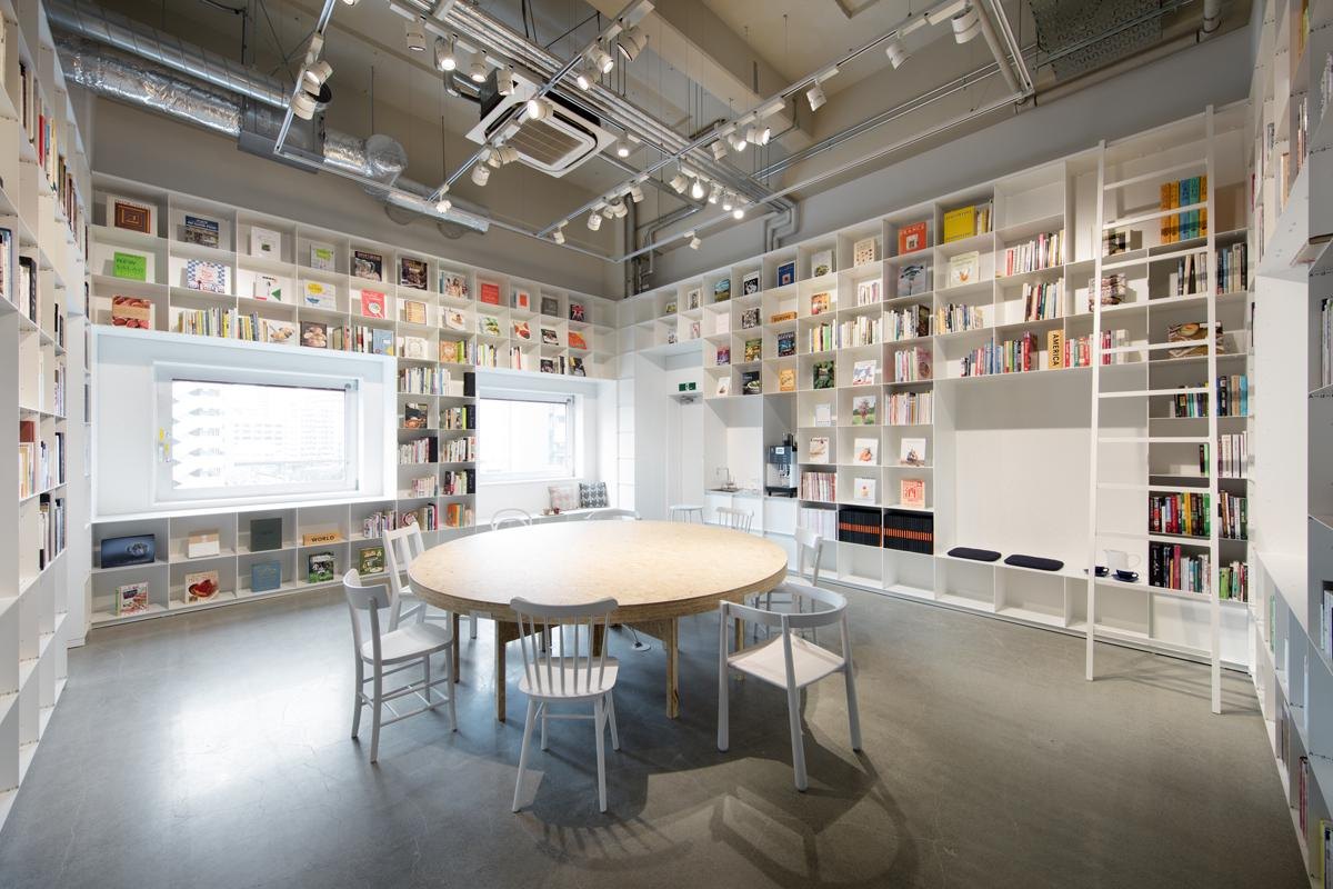
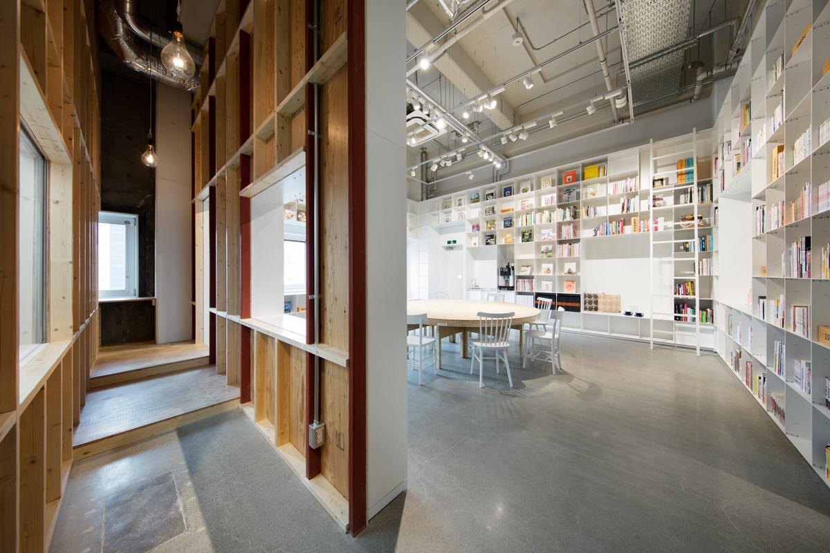
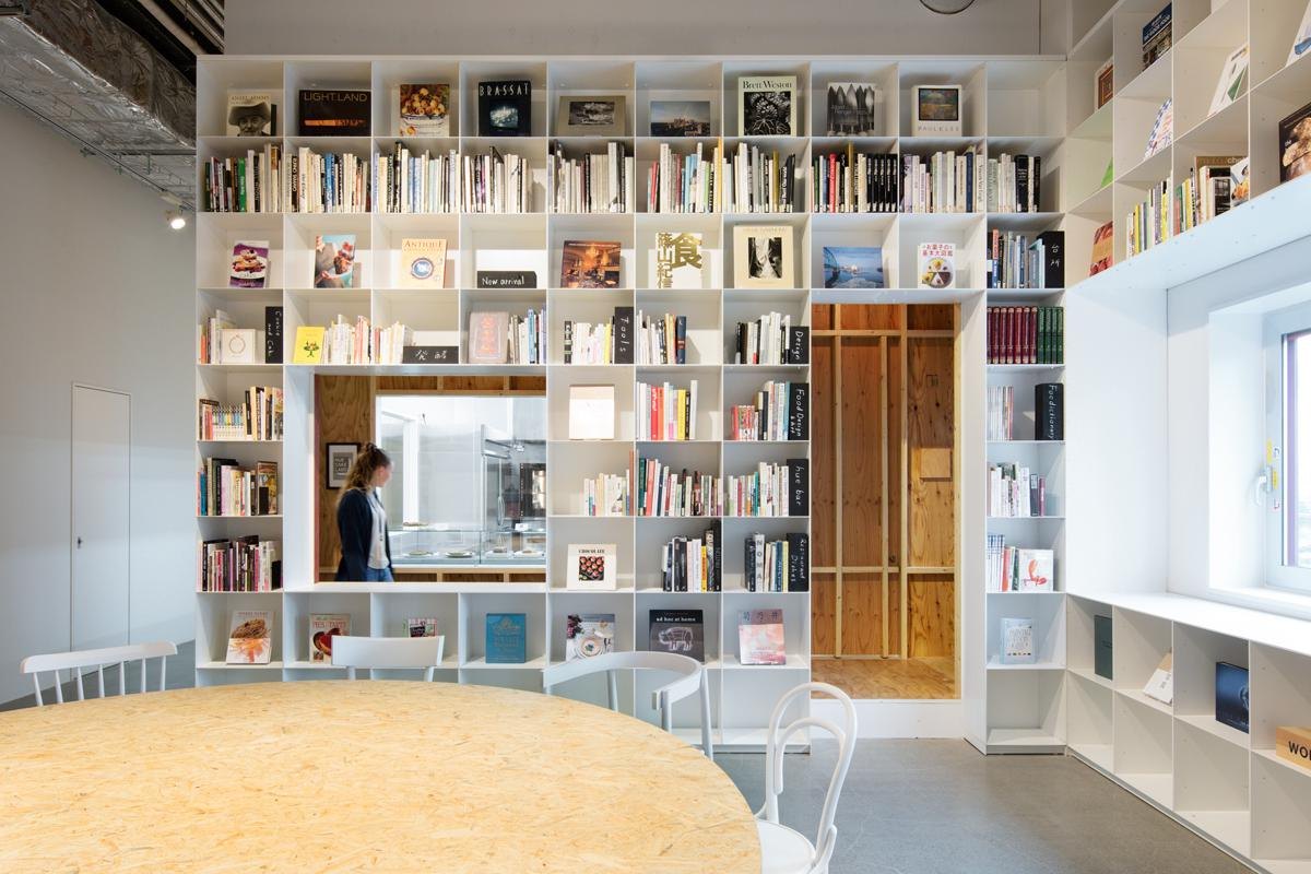
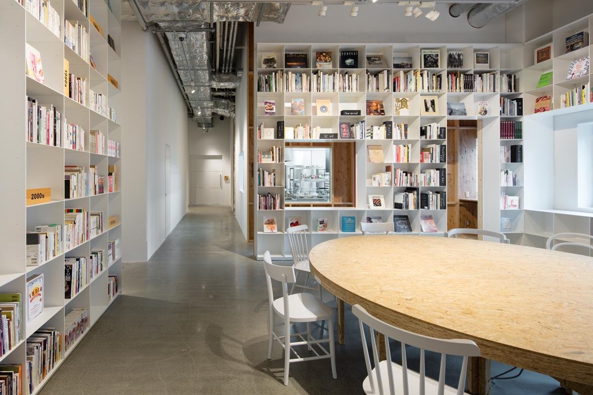
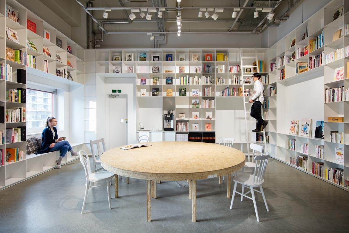
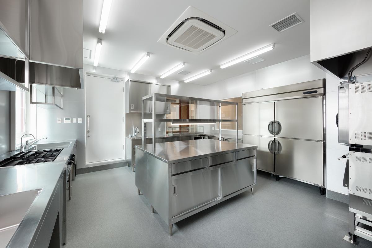
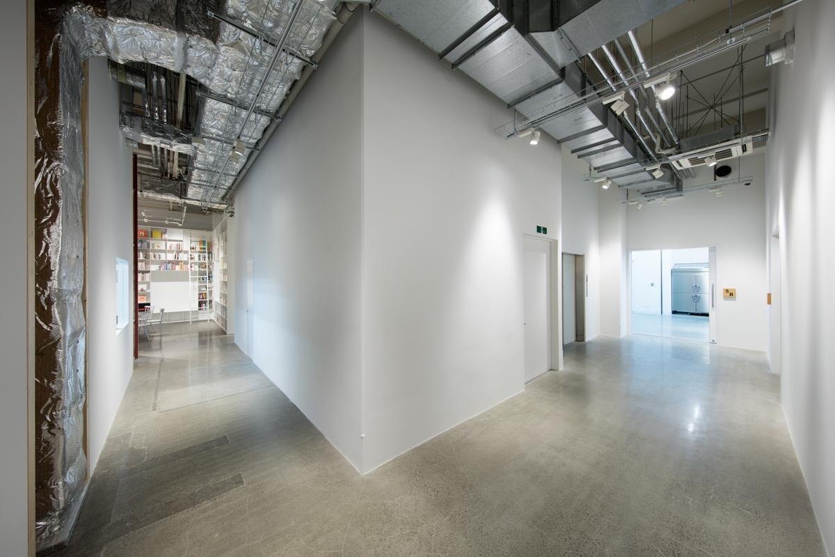
    This renovation covers one floor of a kitchen studio, following earlier work on the floors above. The floor above had served as both tableware storage and library. The client now wanted it for storage alone, with the library moved down to this floor along with a new cake shop.

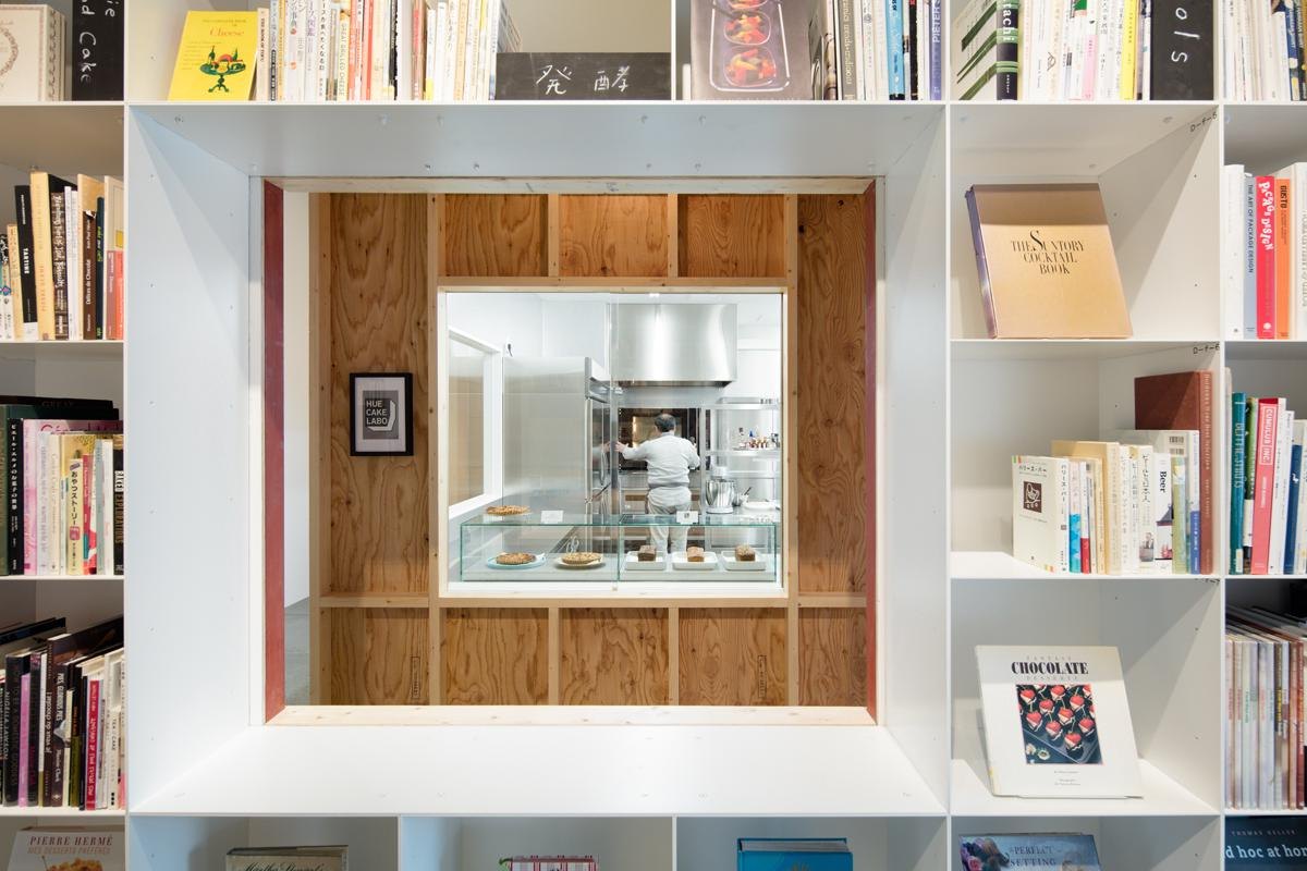
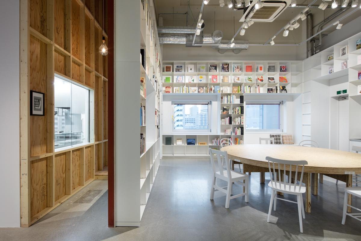
    A library and a cake shop make an unlikely pair. Between them the design team placed a kind of backstage, a timber-lined buffer that lets each side see the other while keeping some distance.

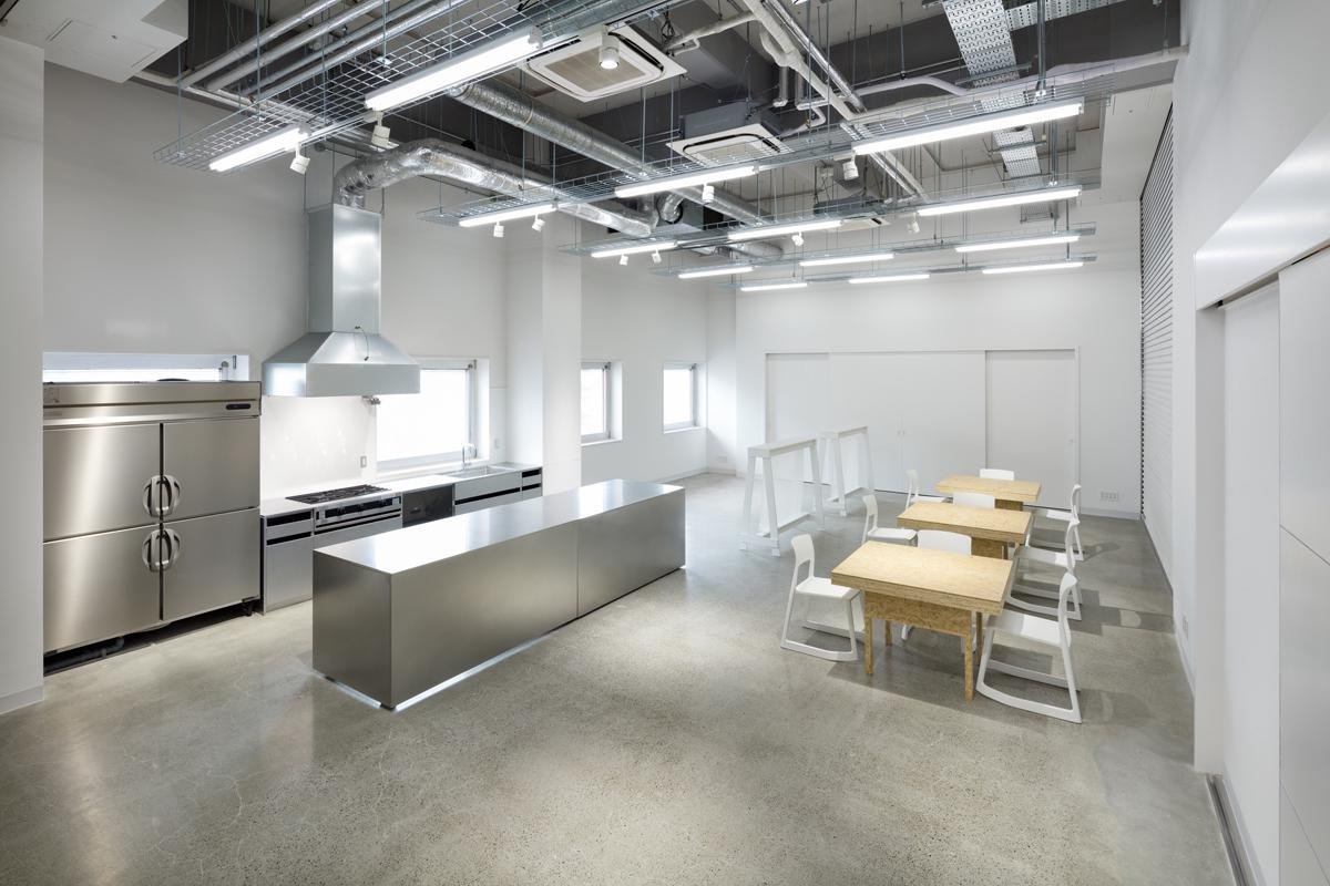
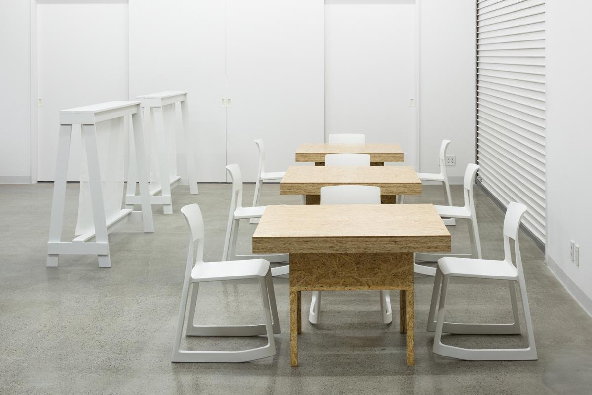
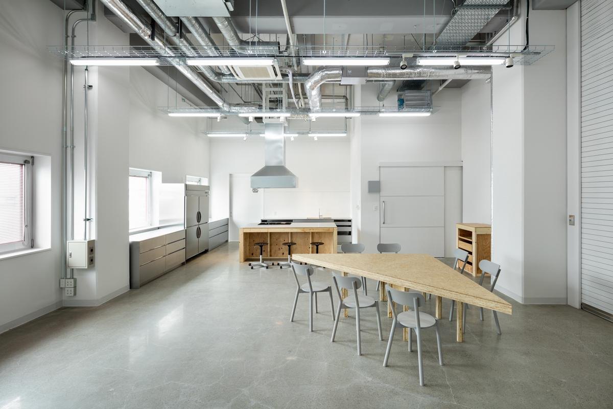
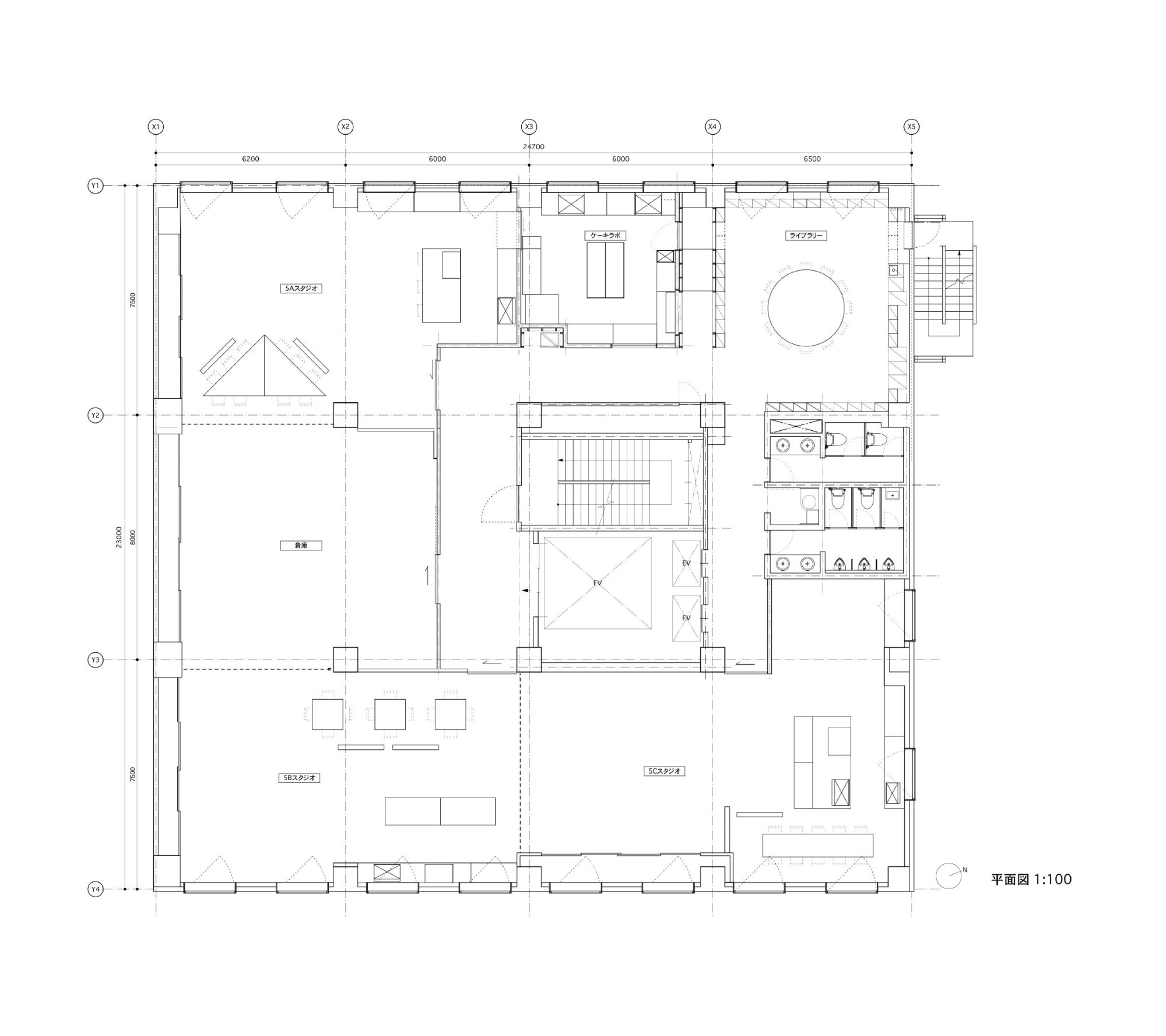
    The plan also draws spaces that seem unrelated, the library and three kitchen studios, into one place to gather. Three tables, one round, one triangular and one square, sit across these rooms like siblings and give people reasons to meet.

    Opening in the bookshelves framing the backstage space
    Timber-lined backstage beside the library
    Narrow timber passage between library and cake shop
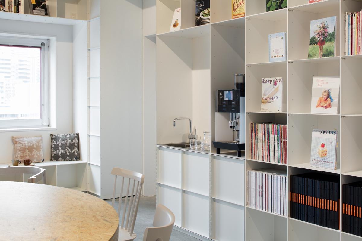
    Library walls of white shelving around the round table
    Round table in front of floor-to-ceiling shelves
    The library with its round table
    Reading by the window in the library
    White shelving with cookbooks and tableware
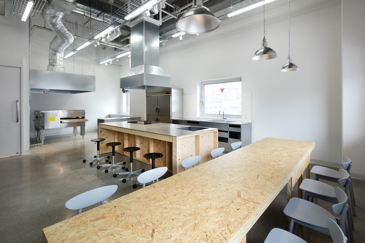
    Kitchen studio with a long particleboard table
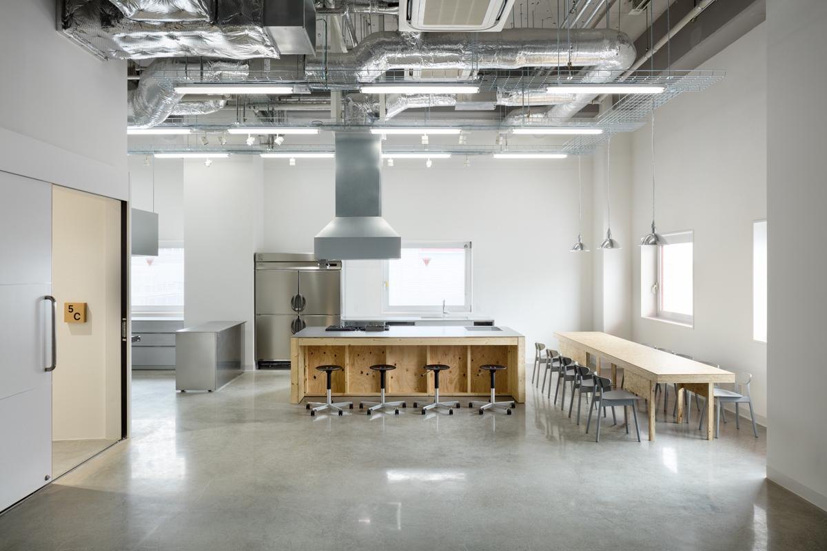
    Kitchen studio with an island and hood
    View through the kitchen studios
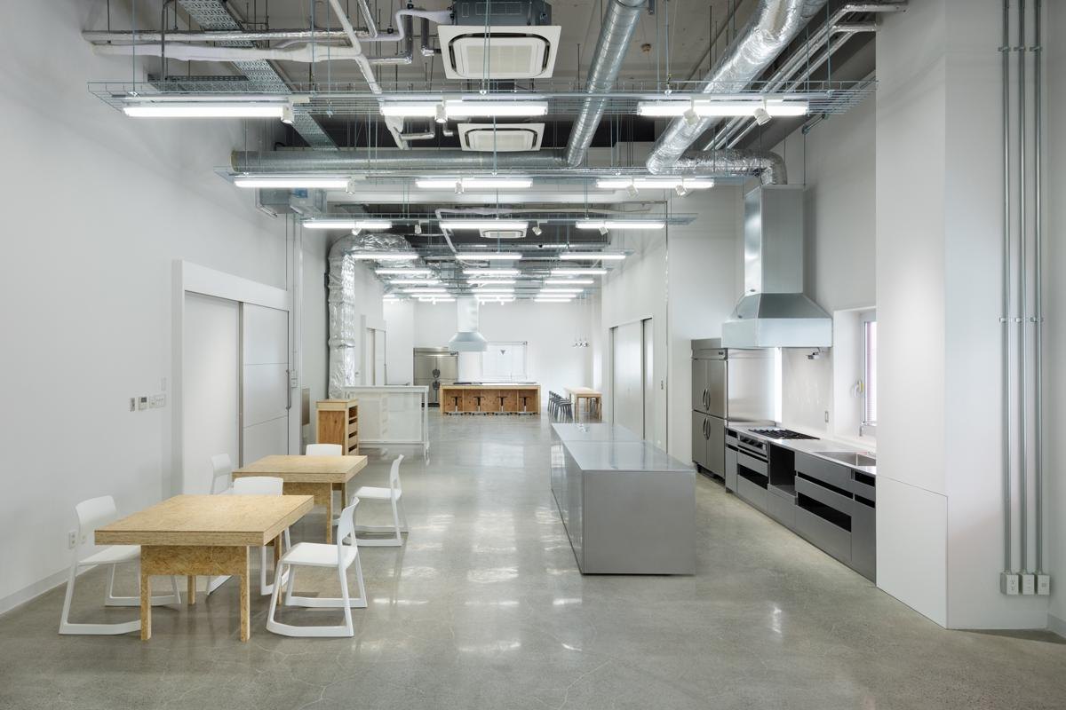
    Stainless steel kitchen and triangular table
    Square table and white chairs
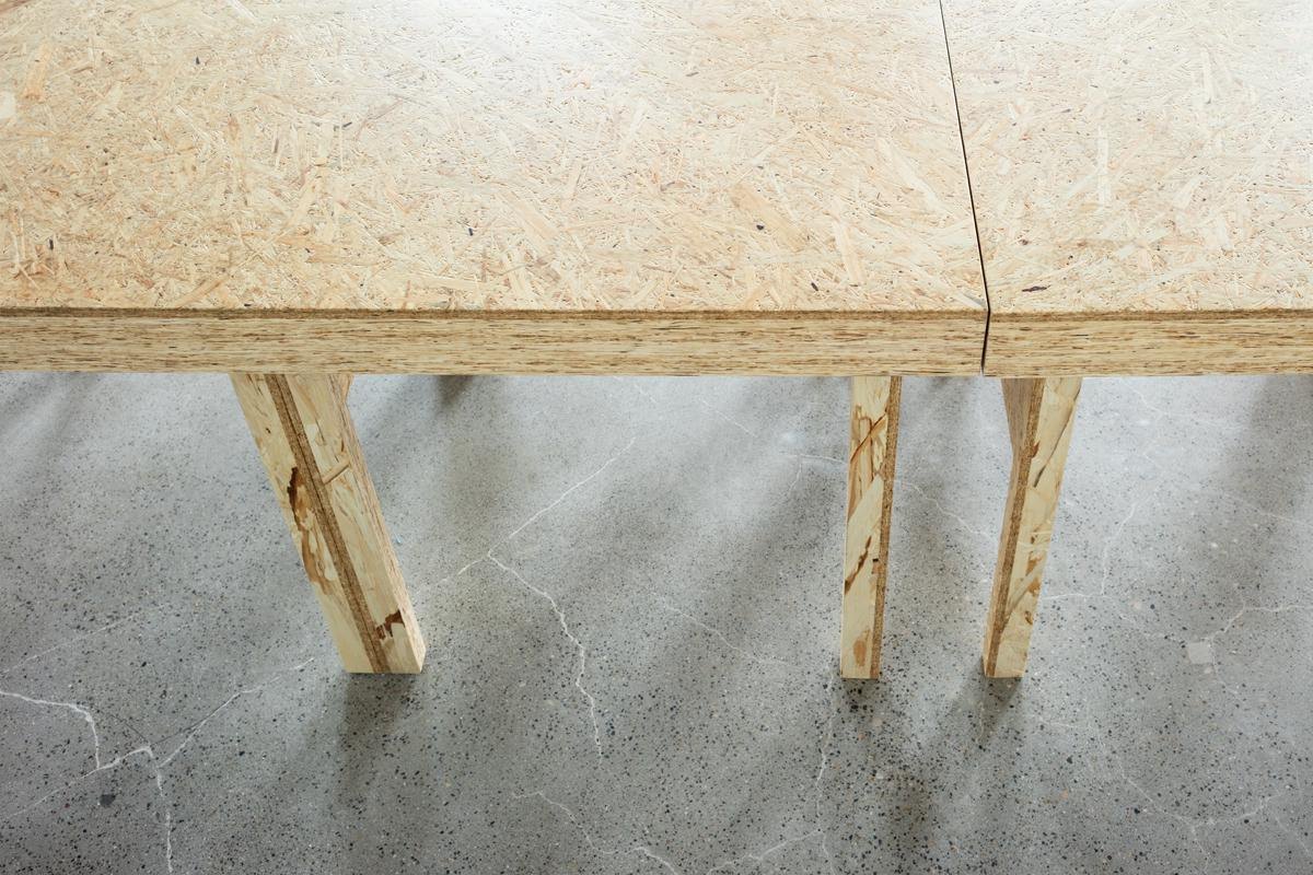
    Particleboard tabletop on timber legs
    Kitchen studio with a long table
    Stainless steel kitchen counters
    Corridor with exposed services
    Floor plan
  • mintdesigns Aoyama

    mintdesigns Aoyama

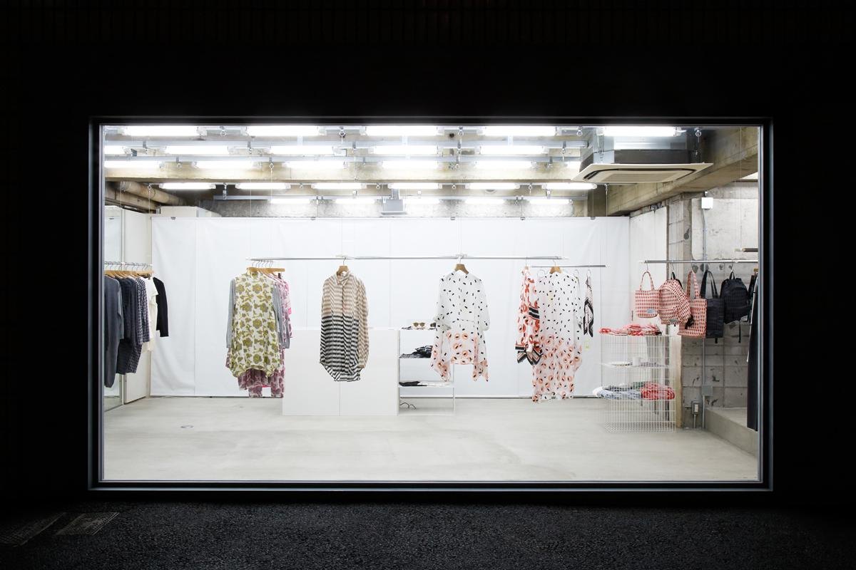
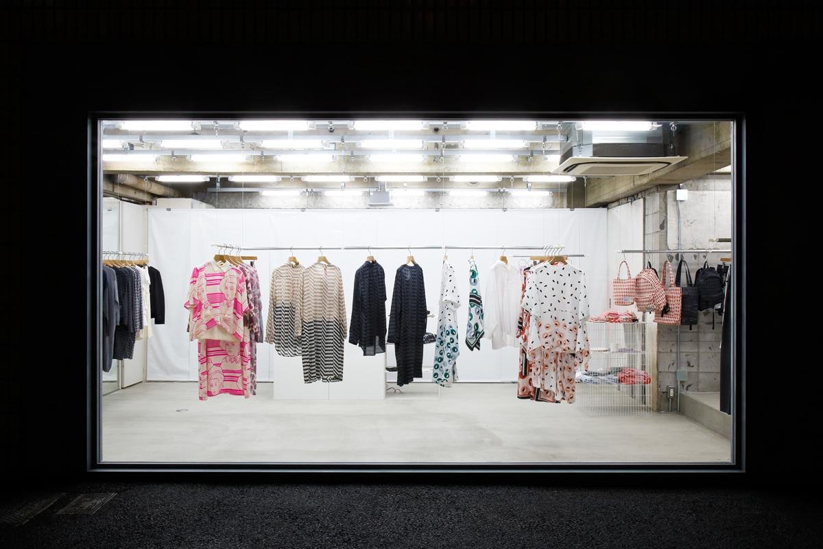
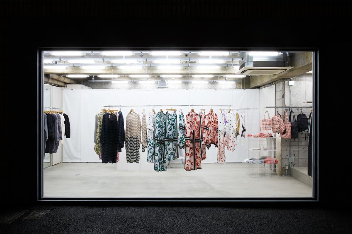
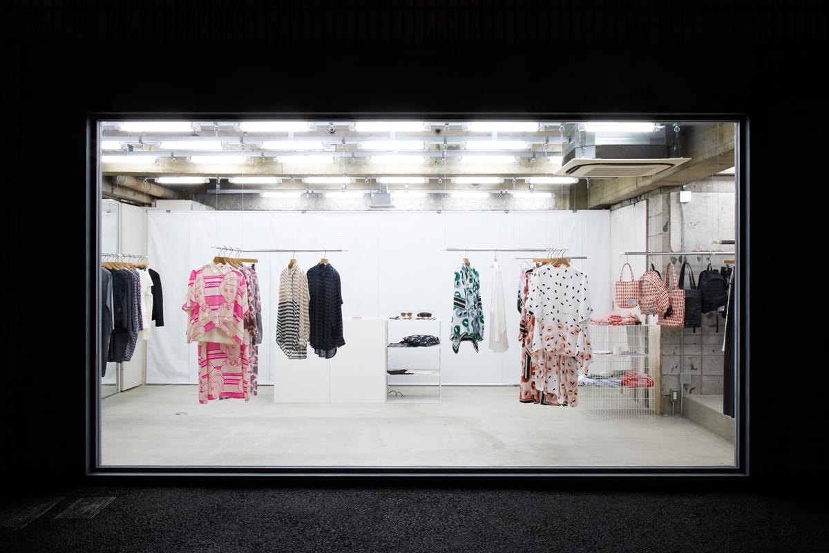
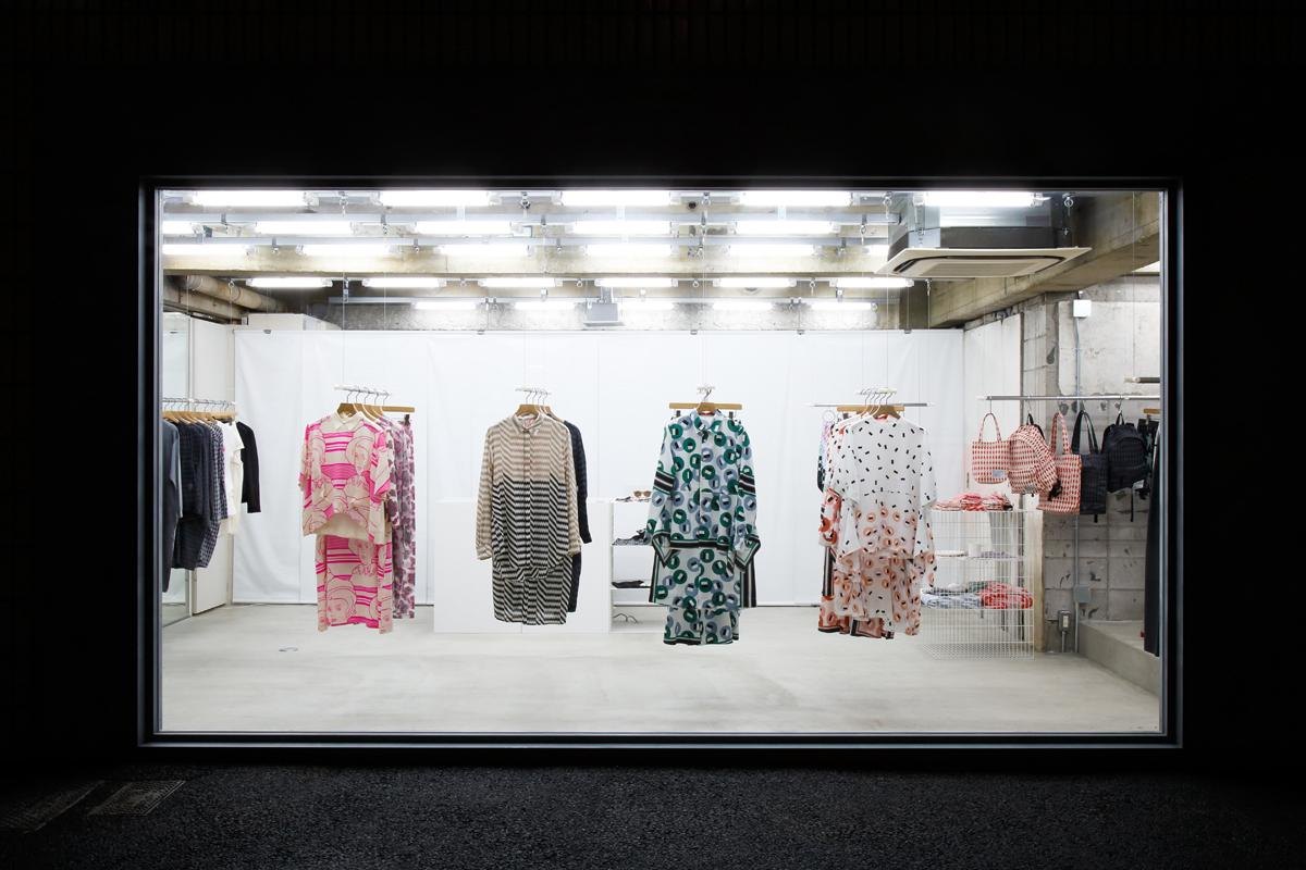
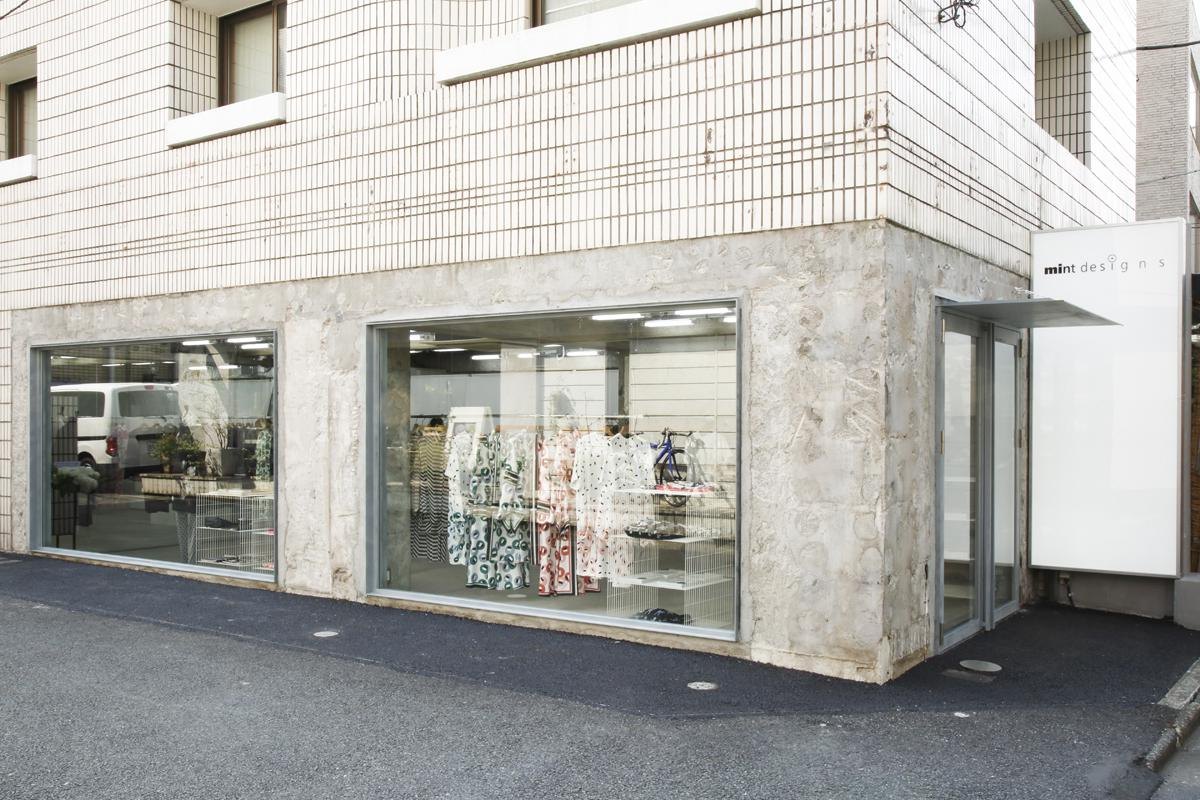
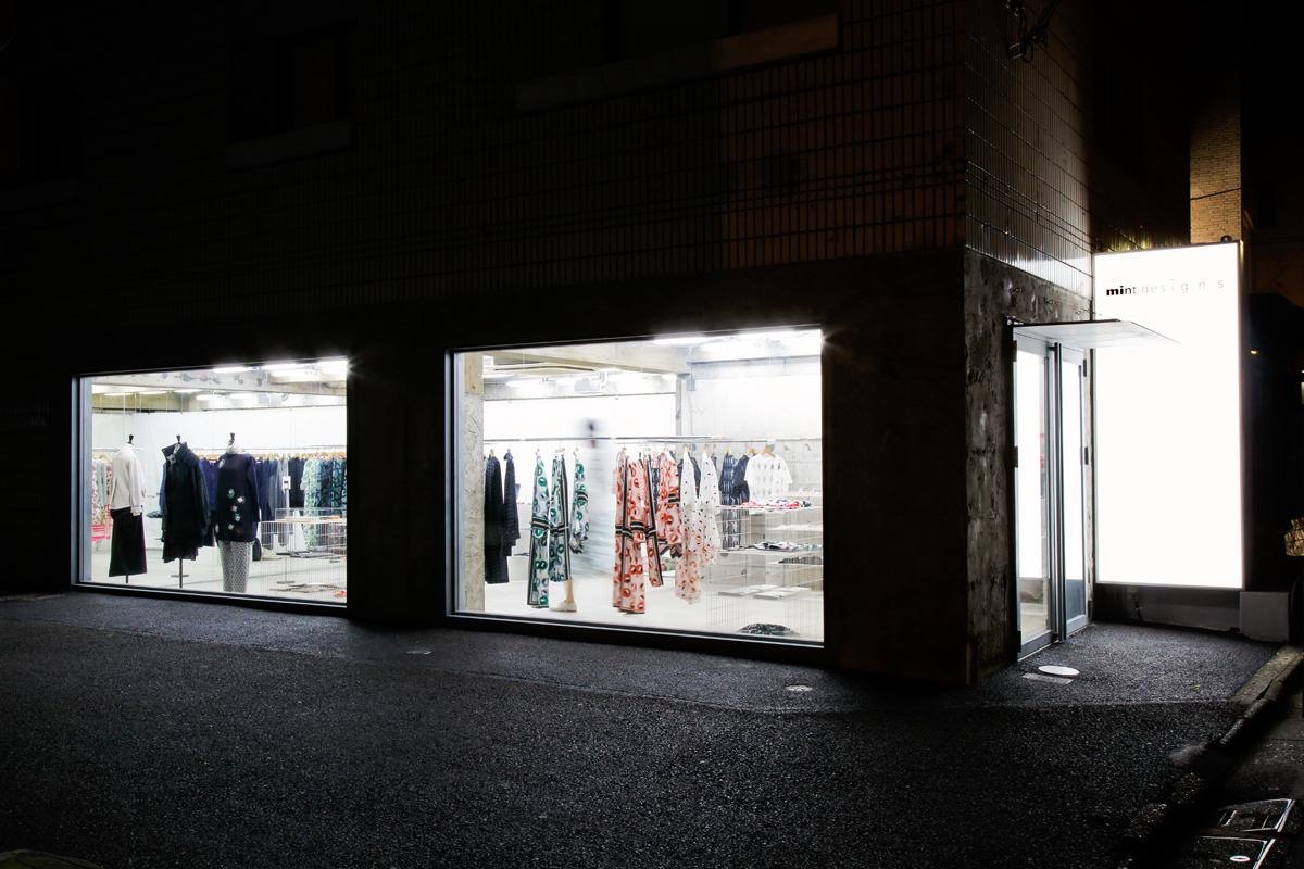
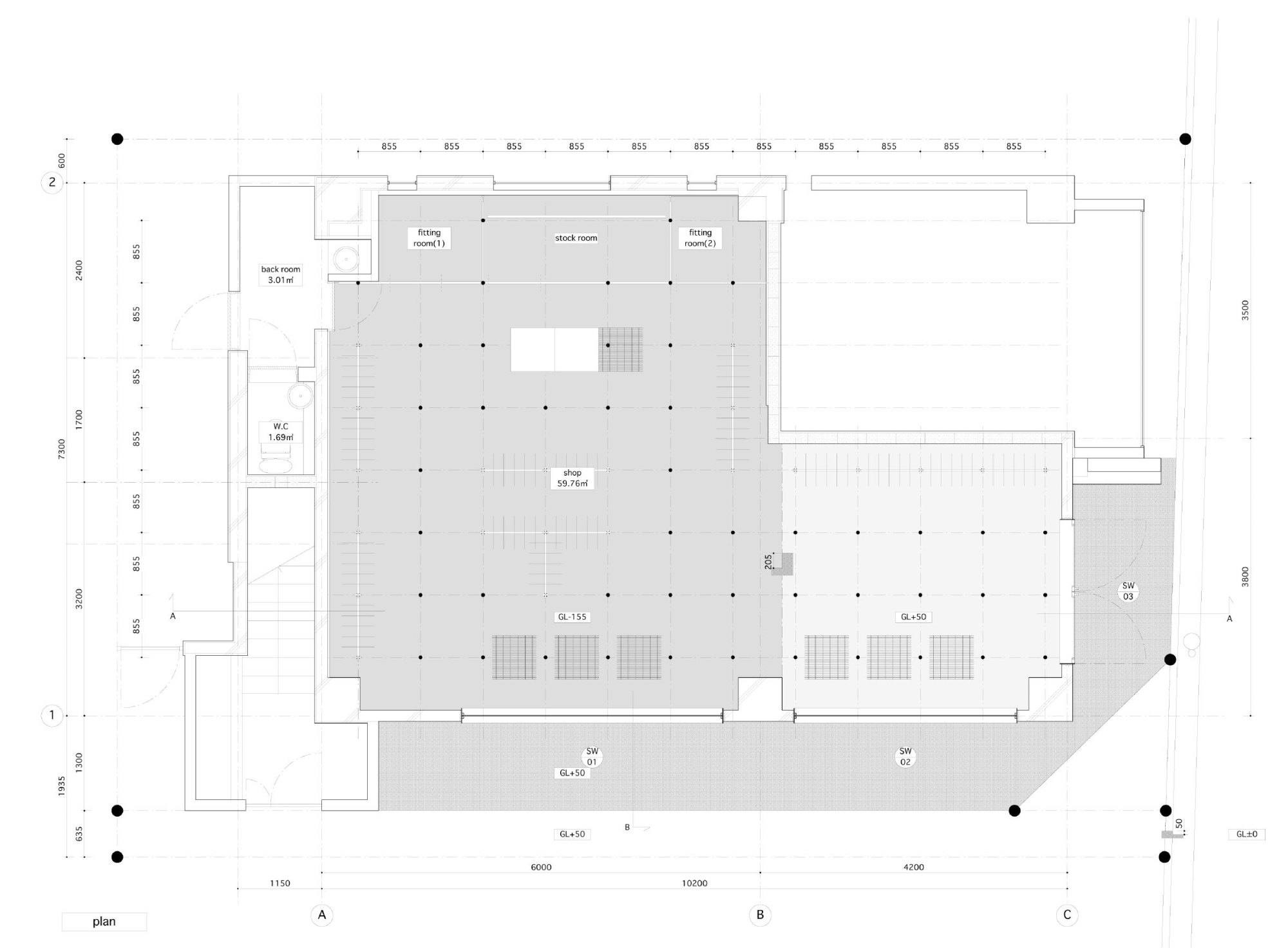
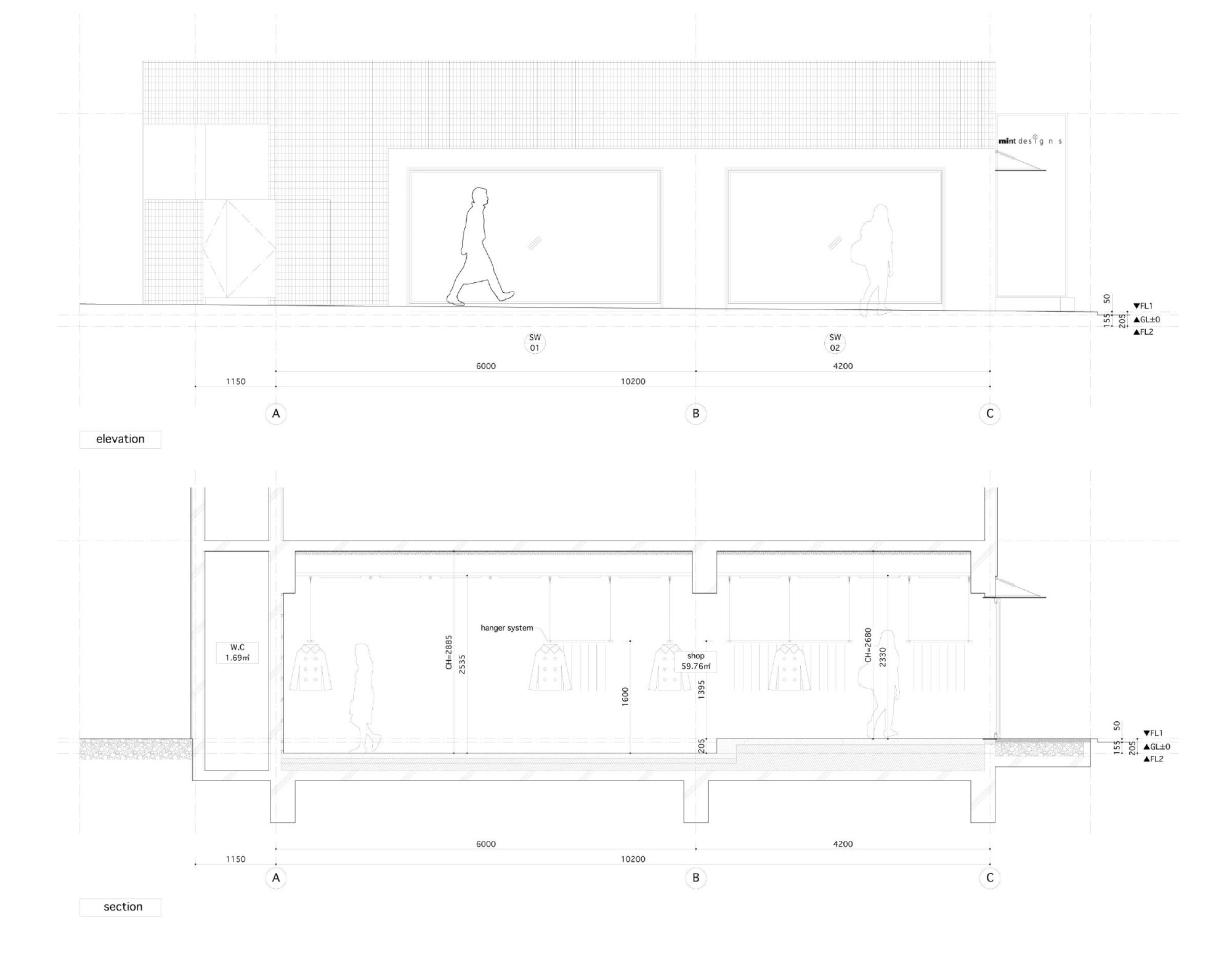
    This is the first standalone shop for an apparel brand. For such a small floor area, the shop has unusually large openings.

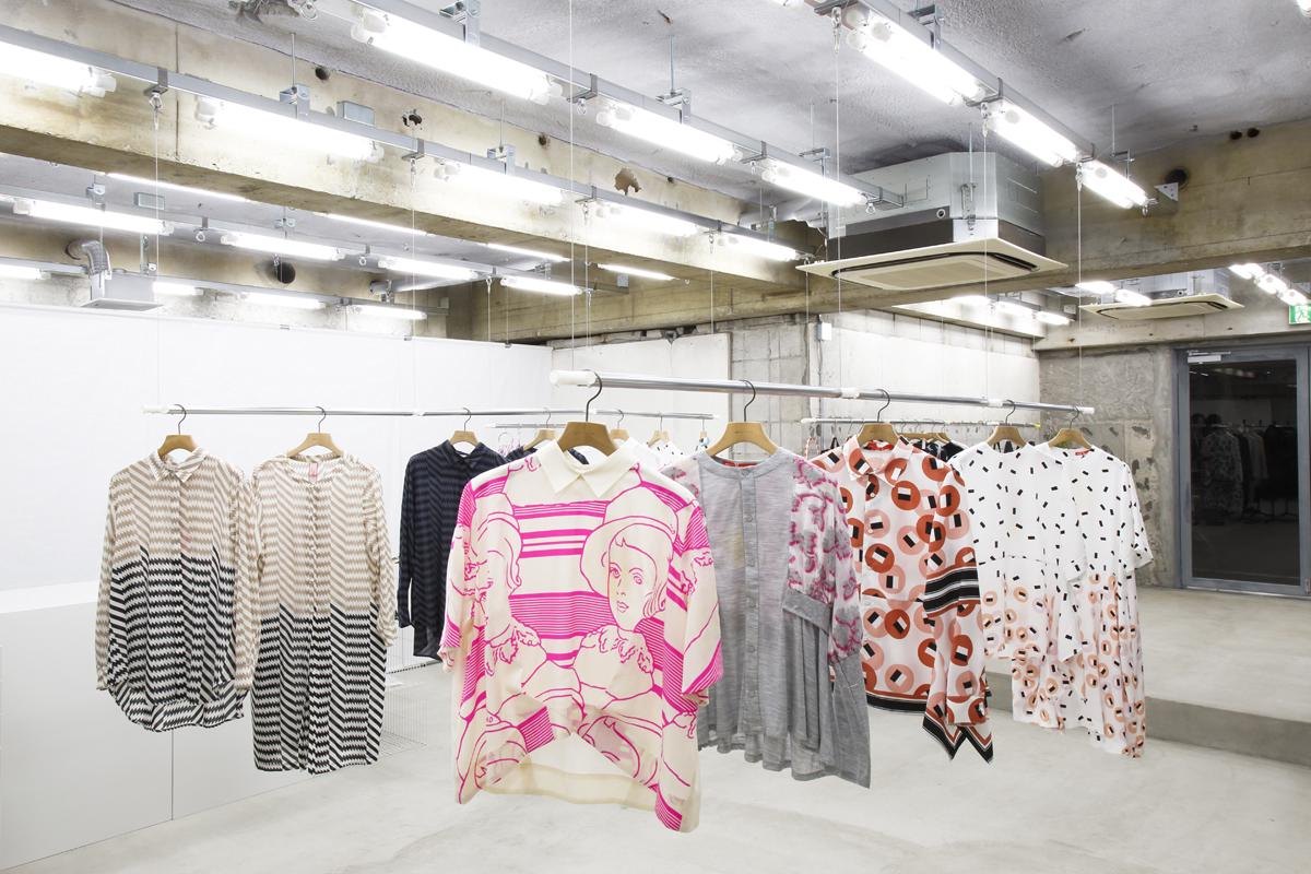
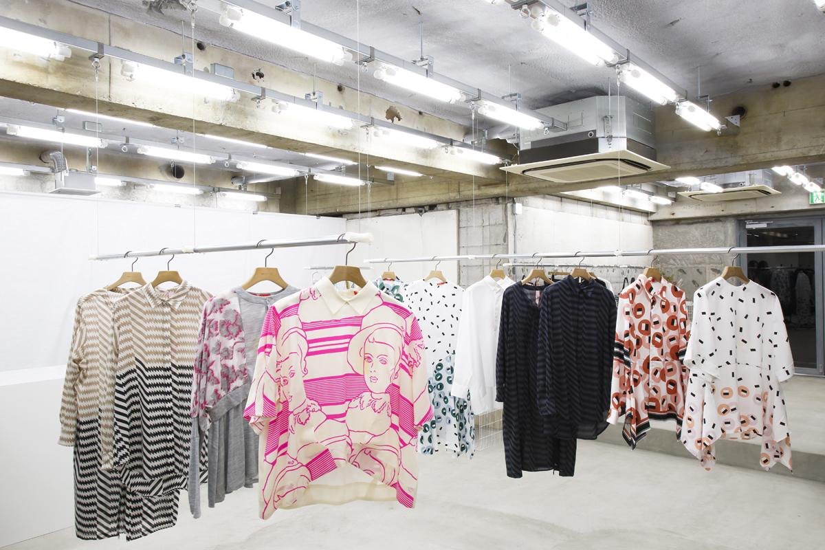
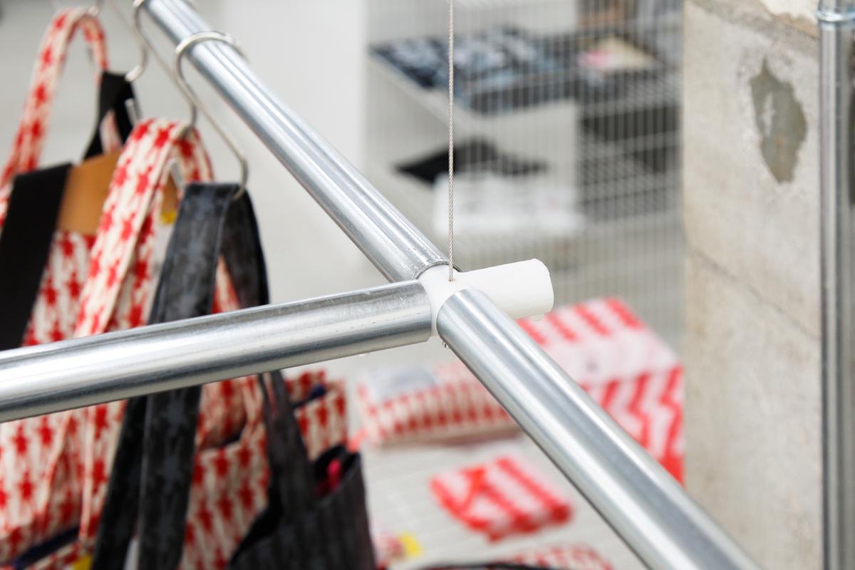
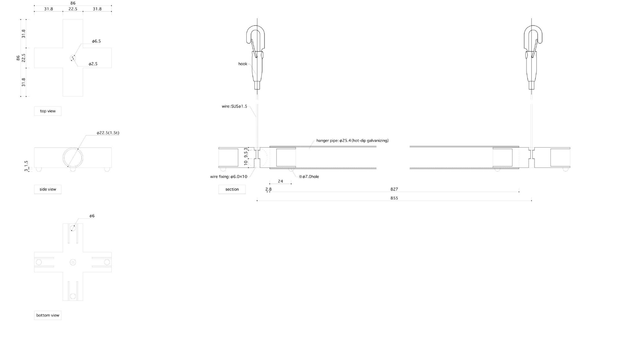
    The design team leaned into that visibility and treated the whole shop as an oversized display window. Adjustable hanger racks fitted with 3D-printed joints, which connect in four directions, let the display be rearranged from one day to the next.

    Everything else stays spare, with an exposed ceiling and a bare floor, so what passers-by see through the glass, especially at night, is the clothing and the changing arrangement of racks.

    Shop window at night with garments on racks
    A second arrangement of the window display
    A denser display of garments
    Garments regrouped on the racks
    Another display arrangement seen from outside
    Hanger racks under the exposed ceiling
    Garments on adjustable racks inside the shop
    Rack joint detail
    The corner shop front by day
    The shop front at night
    Floor plan
    Section
    Rack joint drawing
  • JINS Ageo Shop

    JINS Ageo Shop

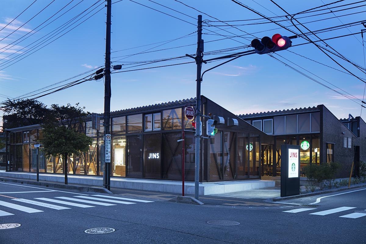
    An eyewear brand asked for the renewal of one of its suburban shops to mark the shop’s twelfth anniversary.

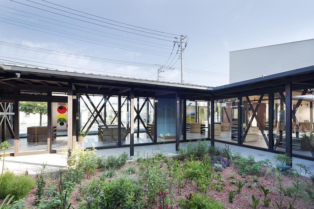
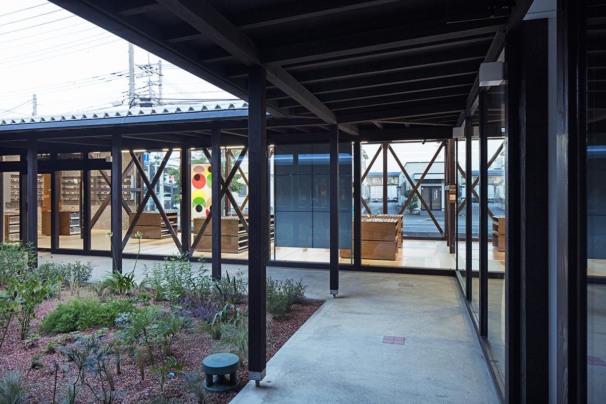
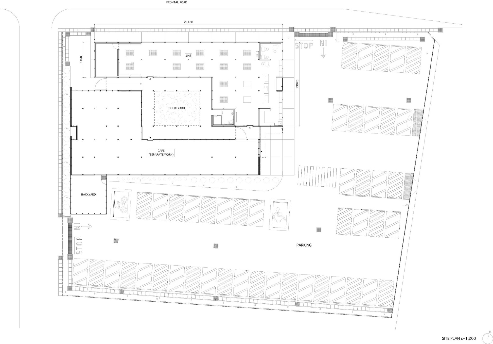
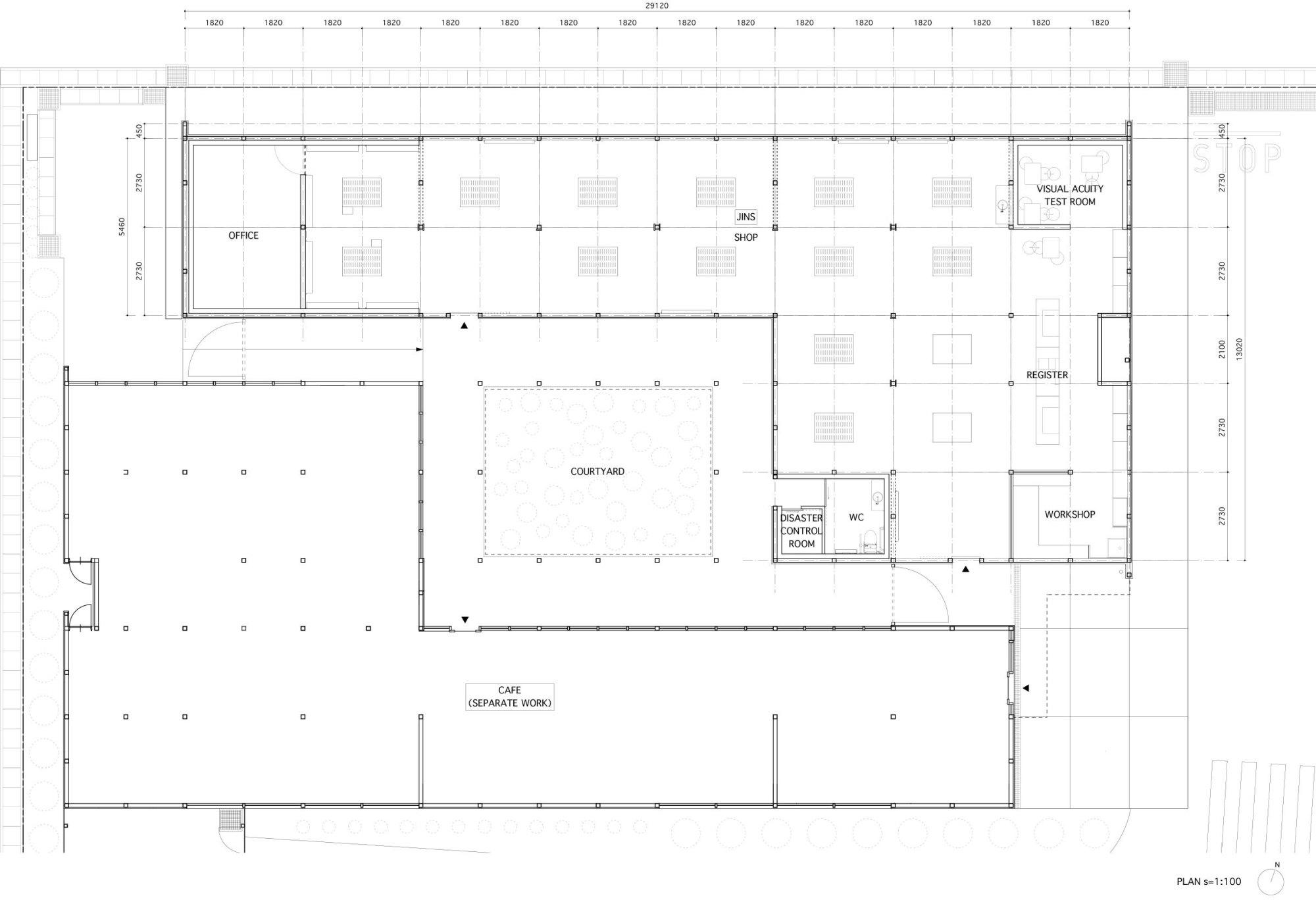
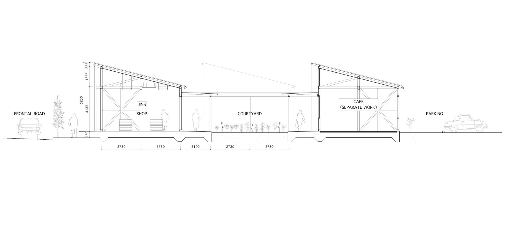
    The building was made of two L-shaped wings, an eyewear shop and a cafe, set around a square courtyard. An open corridor ran round the courtyard and served as an outdoor cafe. Yet the building was wrapped in timber panels, and the courtyard and cafe were hidden from the street.

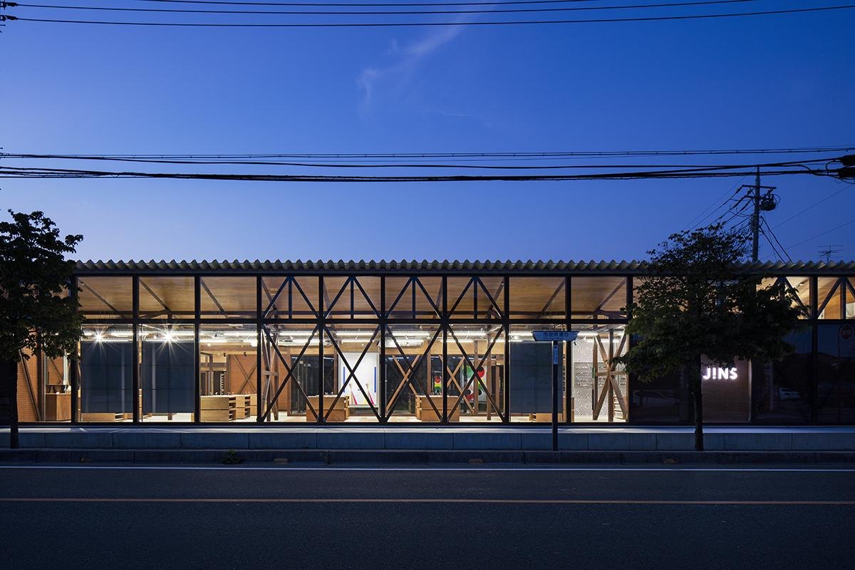
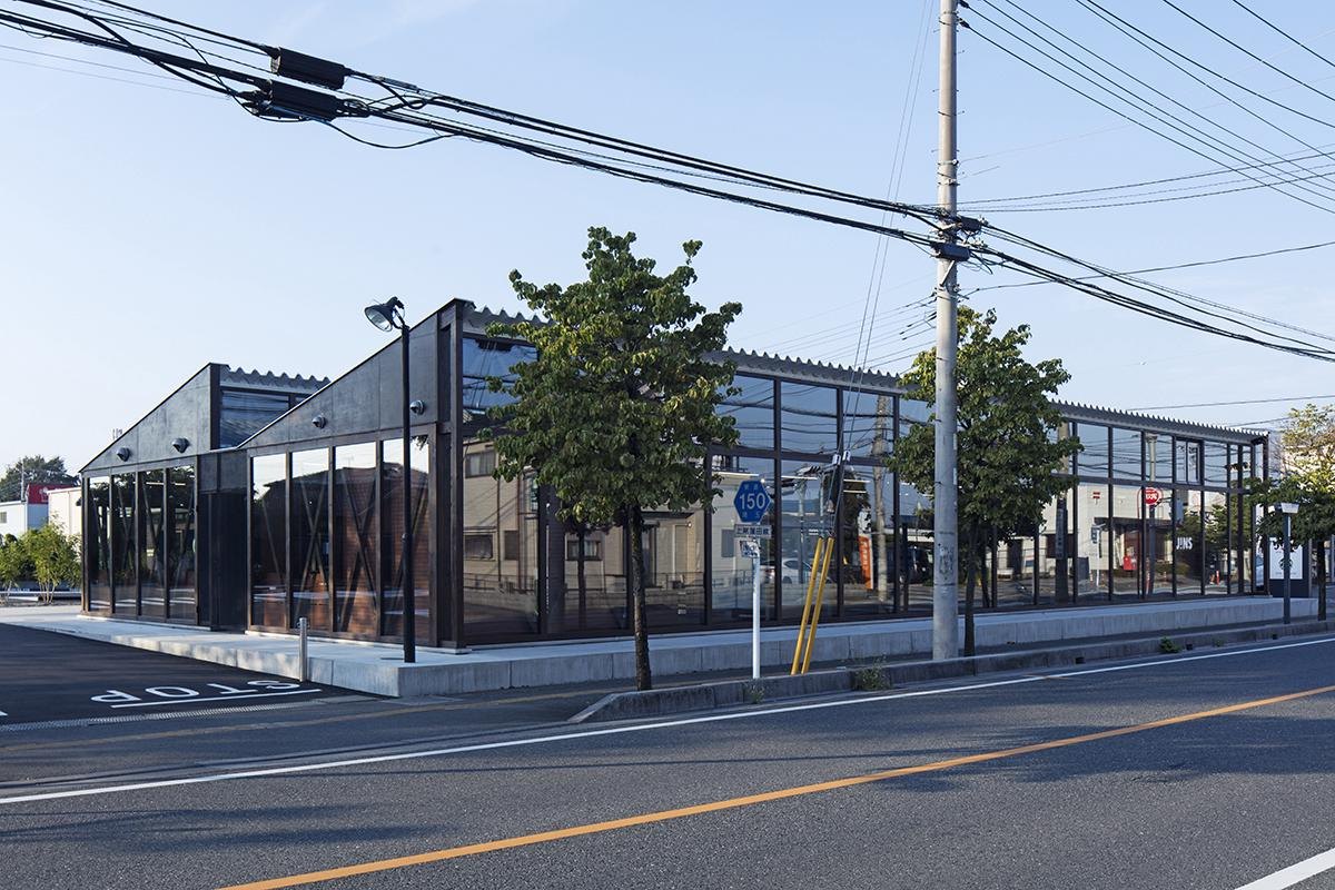
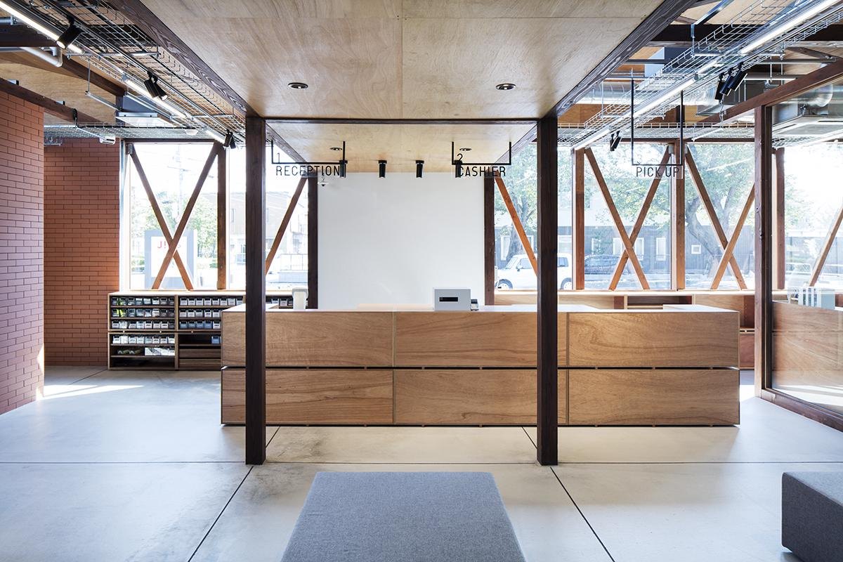
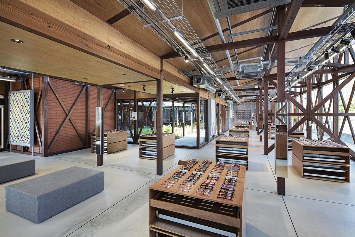
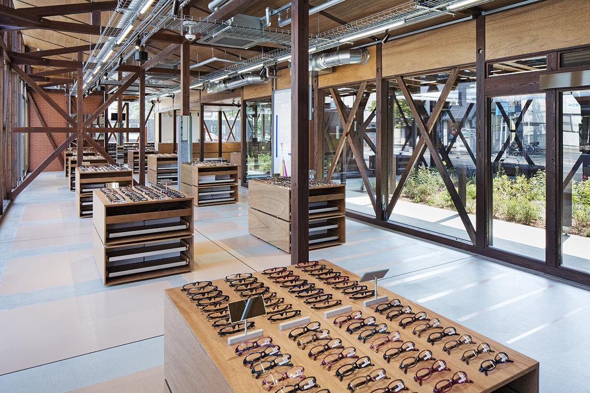
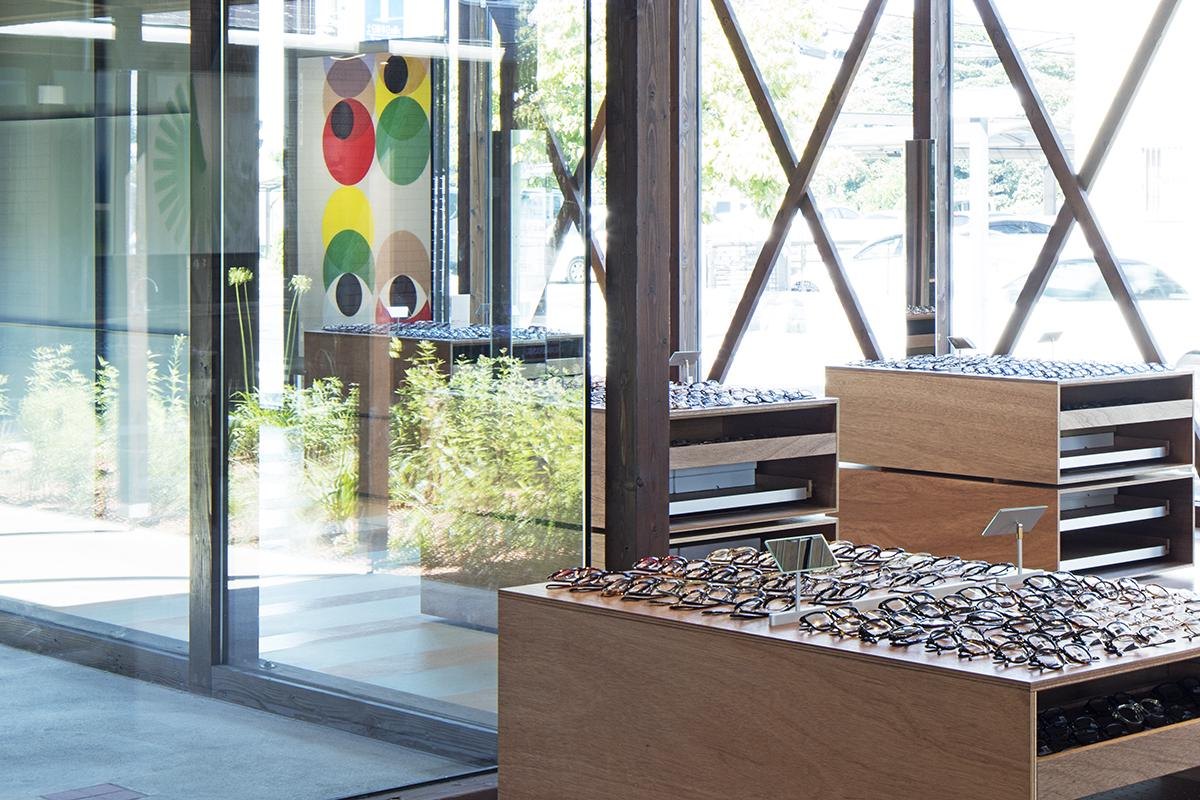
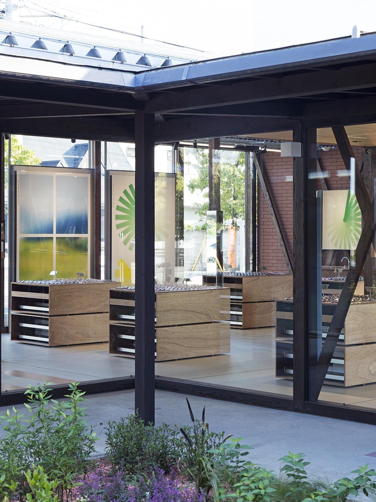
    The design team removed the outer walls and glazed the building with low-emissivity double glazing. The courtyard now comes into view from the street, and the wide range of frames becomes a display that passers-by can read from outside.

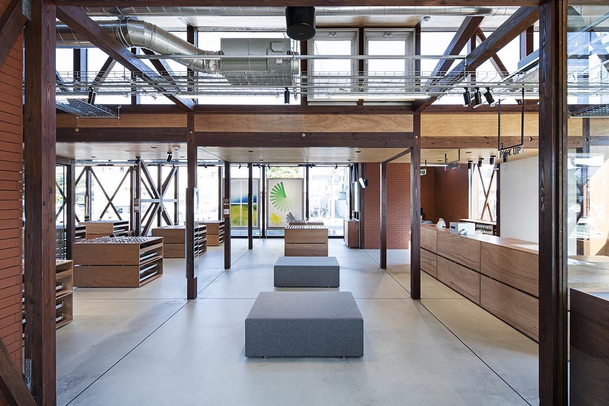
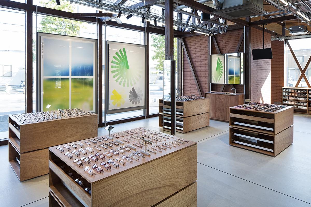
    Inside, the aim was to make the exposed structure count. New walls stand offset from the old wall lines and are finished in brick tiles usually meant for exteriors. Shelves and display furniture are treated as freestanding pieces, kept apart from the building itself.

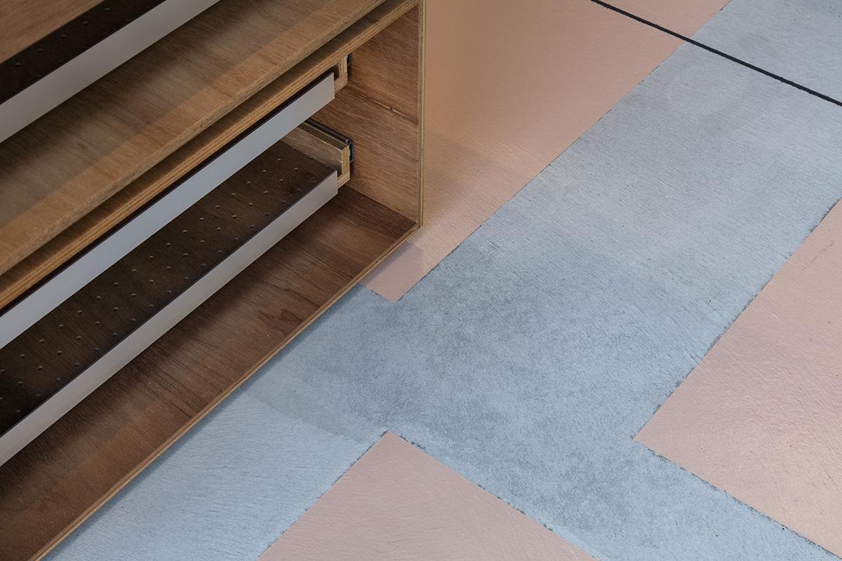
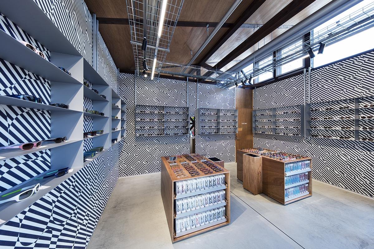
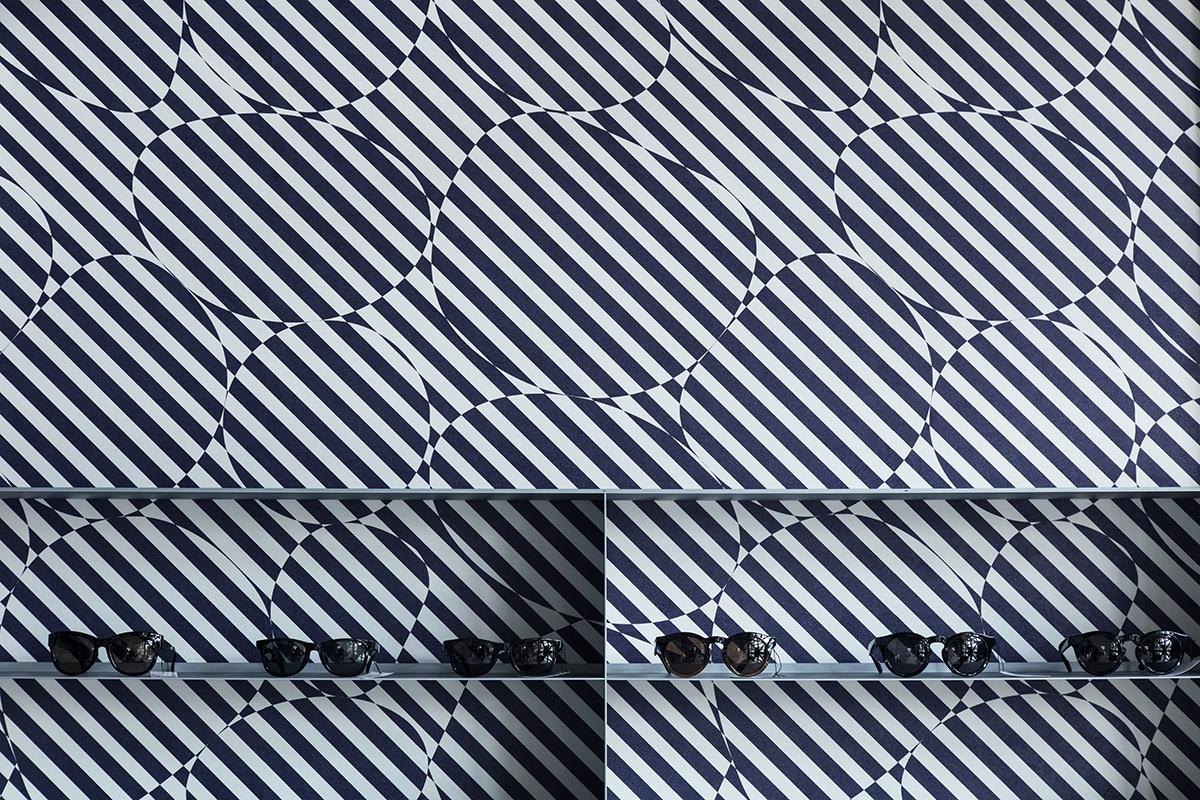
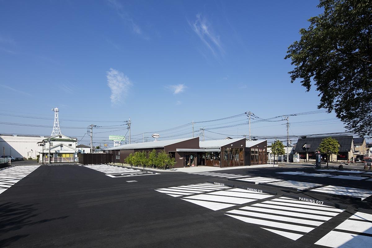
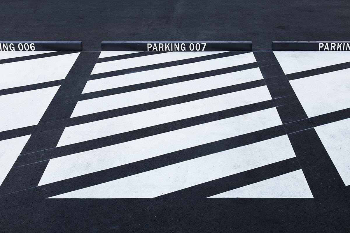
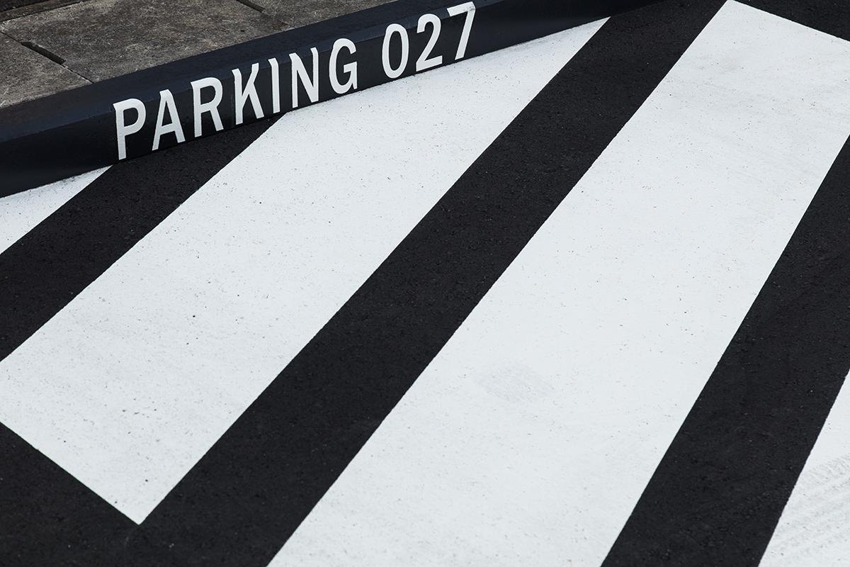
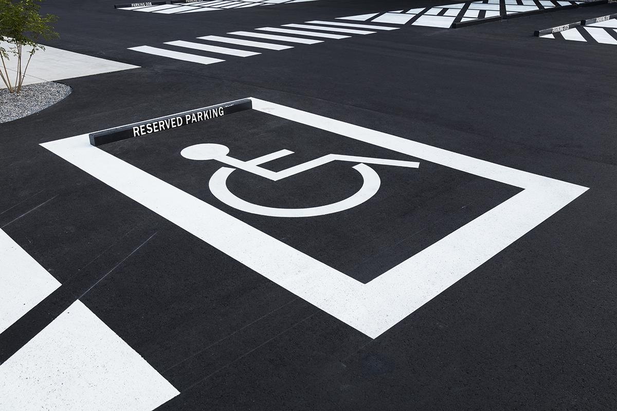
    Eyewear comes in countless shapes and colours. Working with a graphic design office, the team added visual elements, from striped wall panels to painted markings across the car park, so the products and the space can relate to each other freely.

    The glazed shop front at dusk
    The shop on the street corner by day
    Exposed timber frame above the sales floor
    Counter and display units under the bared structure
    Display tables and benches along the glazing
    Eyewear displays under timber cross bracing
    Display tables by the courtyard windows
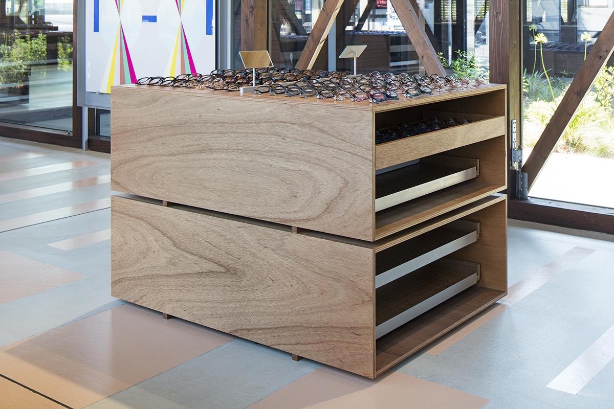
    Display boxes against the glass
    Timber display box with drawers
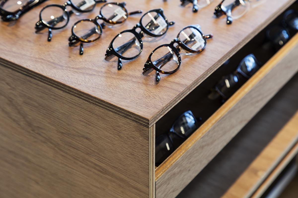
    Glasses on a display tray
    Drawer detail of a display box
    Striped graphic wall with eyewear shelves
    Close view of the striped graphic panels
    Courtyard garden framed by the corridor
    Open corridor around the courtyard
    View through the shop into the courtyard
    Car park with painted graphics
    Striped car park markings
    Parking bay number painted on the asphalt
    Accessible parking bay marking
    The shop at dusk from the crossing
    Site plan
    Floor plan
    Section
  • Blue Bottle Coffee Roppongi Cafe

    Blue Bottle Coffee Roppongi Cafe

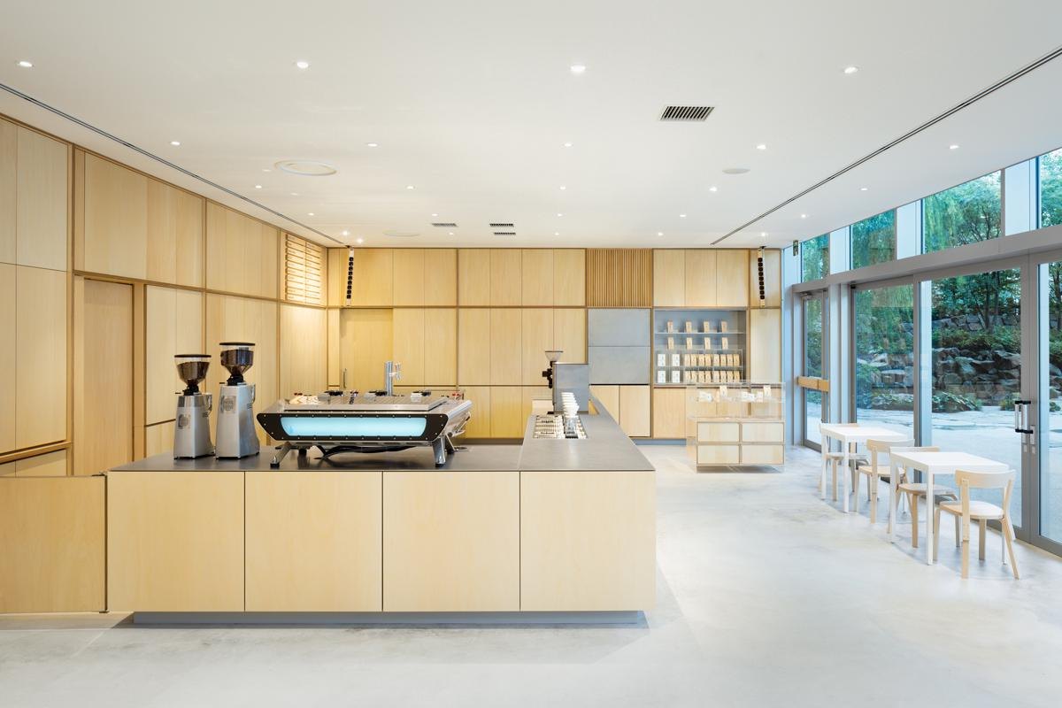
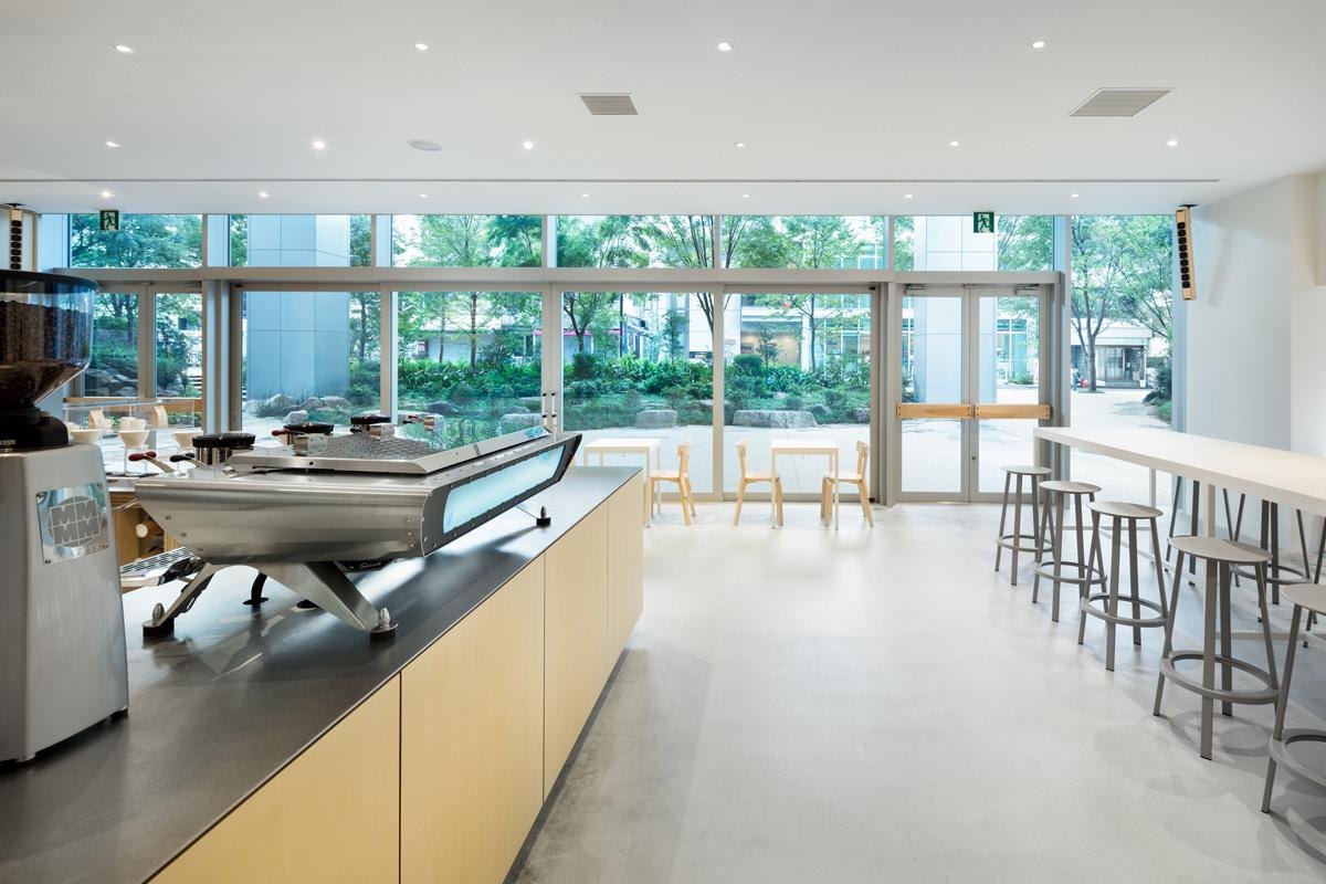
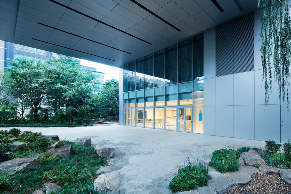
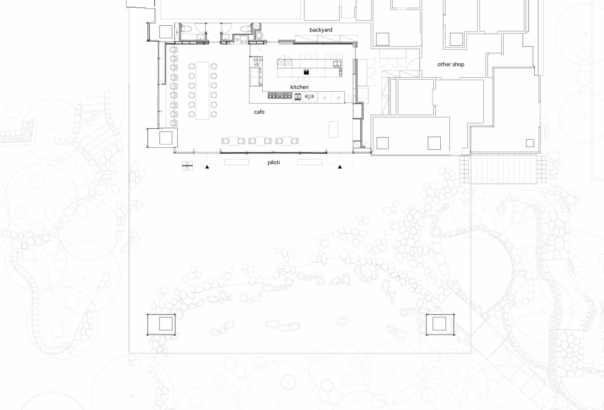
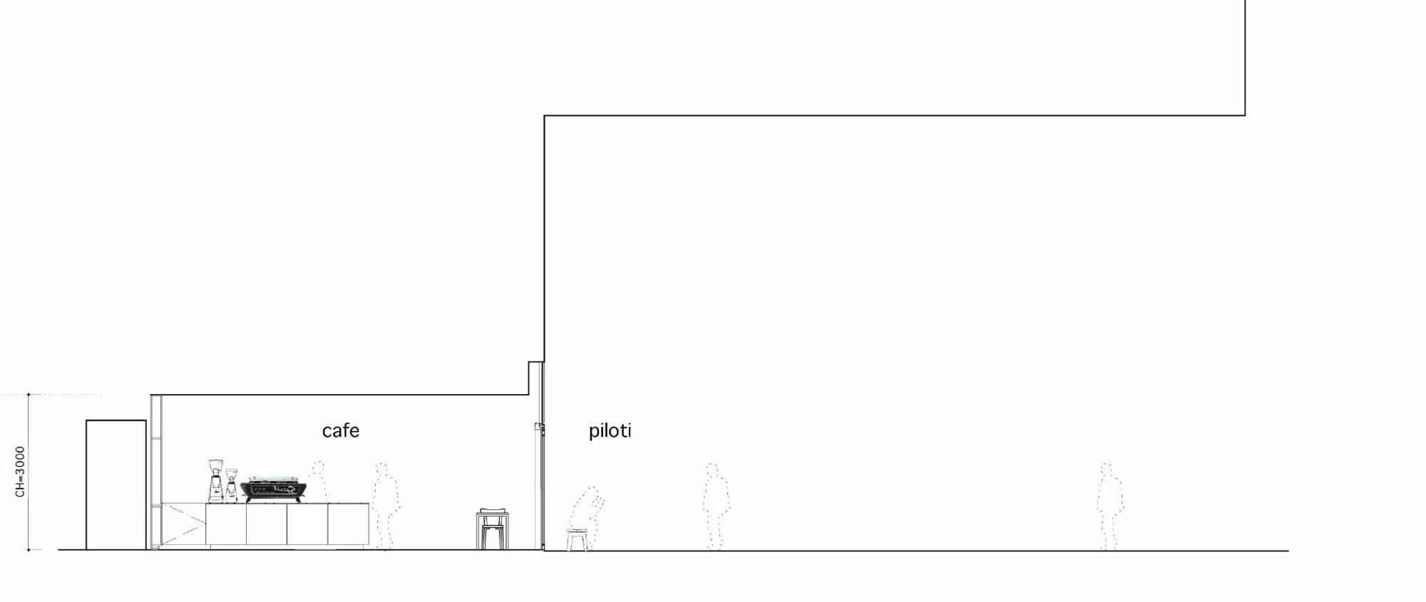
    The cafe sits on a back street away from a busy avenue, facing a small sunken public plaza that works like a park anyone can wander into.

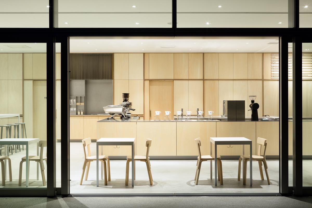
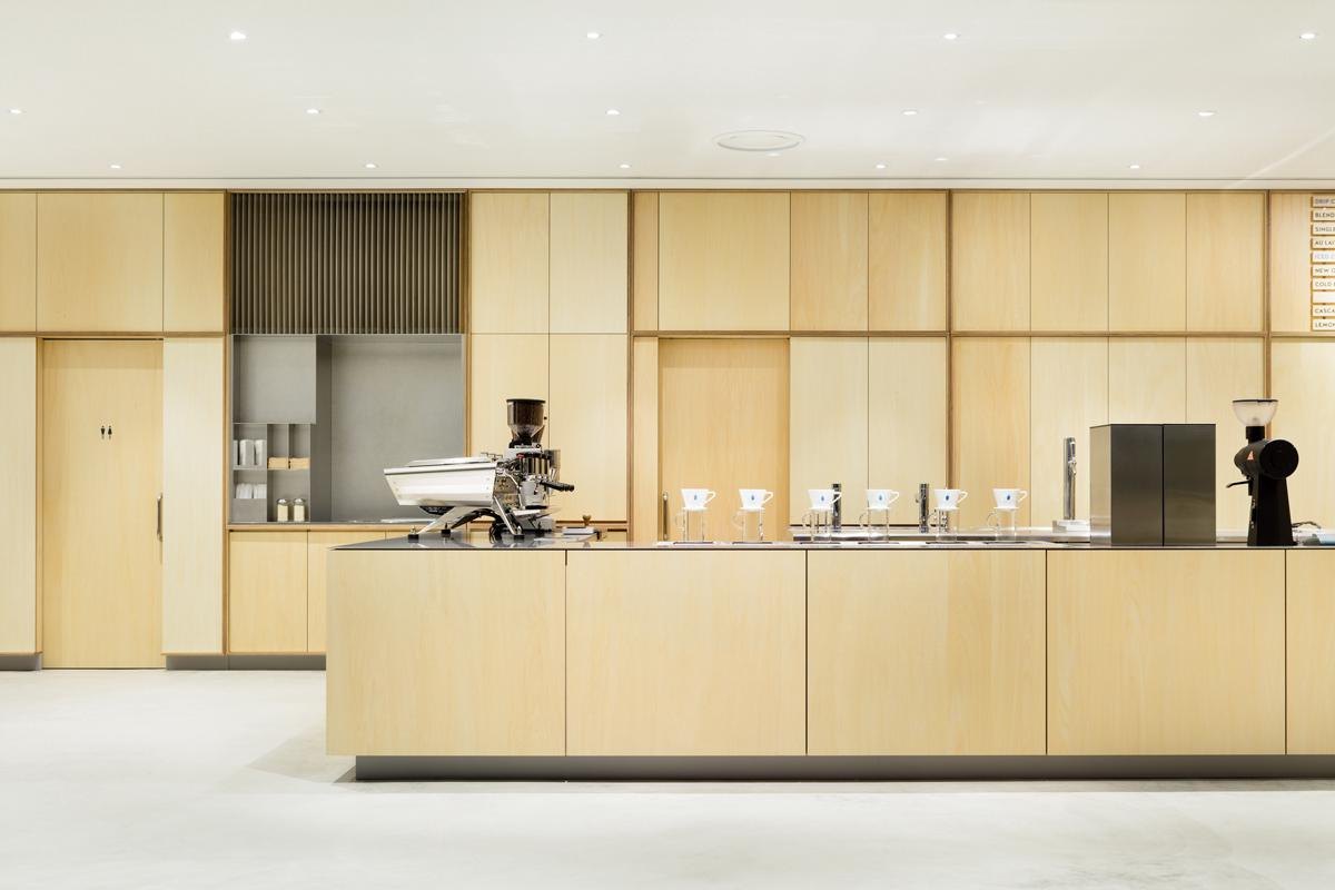
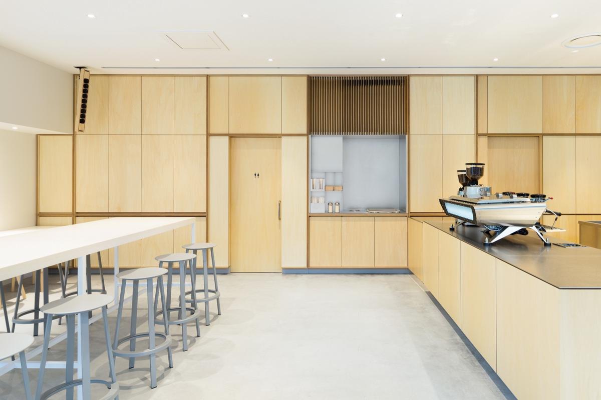
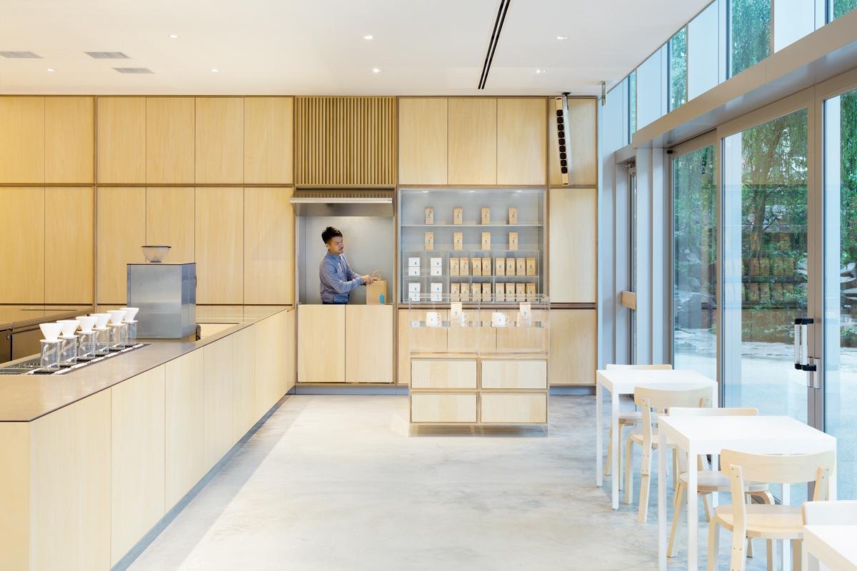
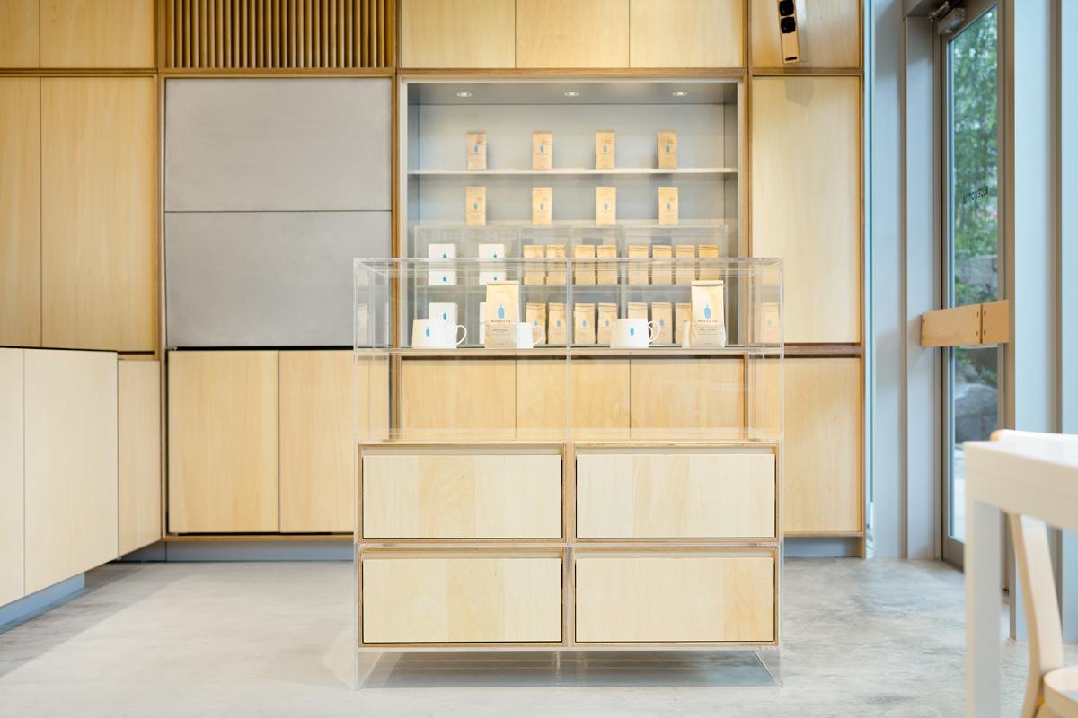
    The design team pictured a cafe that stays beside the plaza and quietly takes it in. The main finish is basswood plywood. Every wall is made of cabinets with doors set in a regular rhythm, and that strict order is loosened by irregular frames that gather several doors into one.

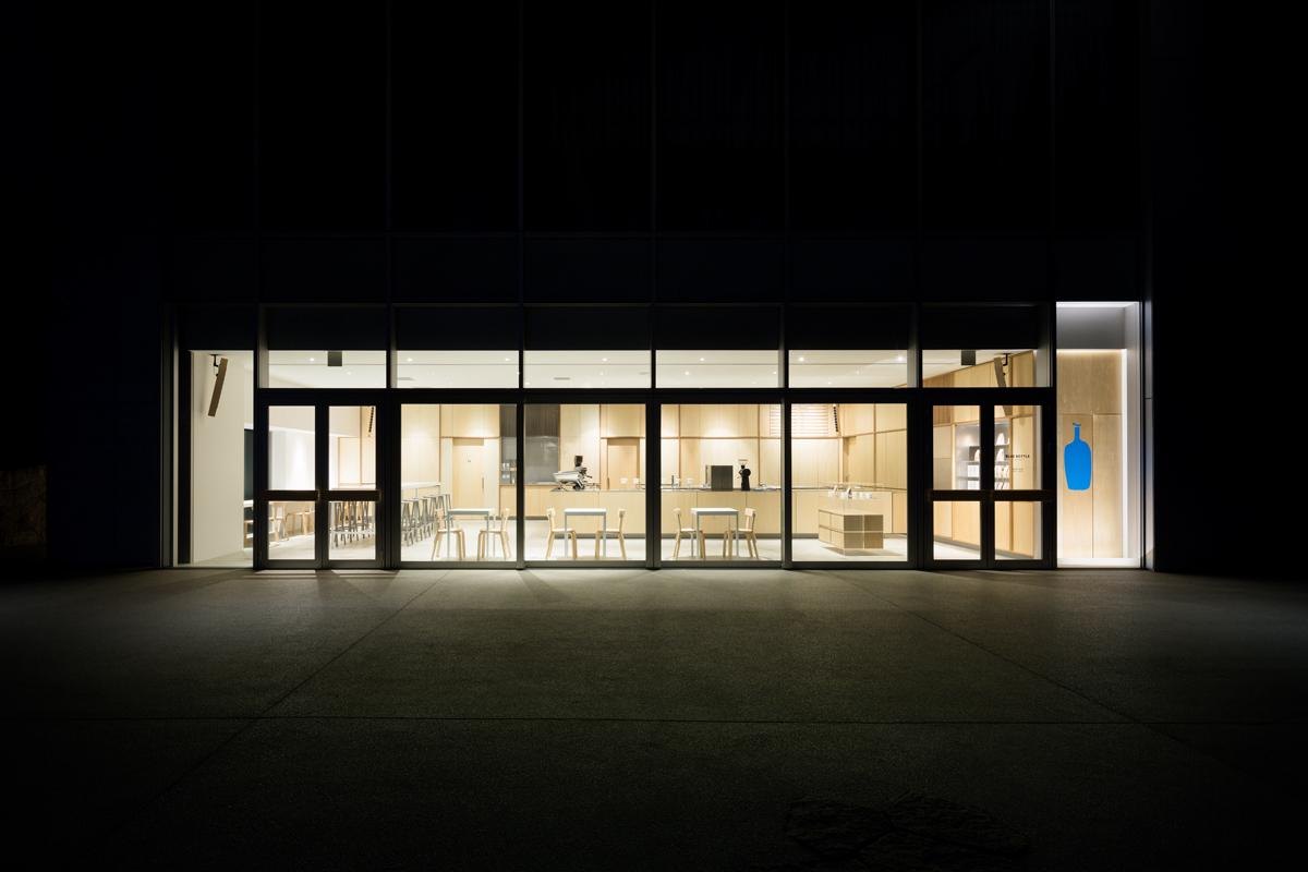
    The glazed front turns the counter toward the trees of the plaza, so the calm, even interior and the green outside are read together.
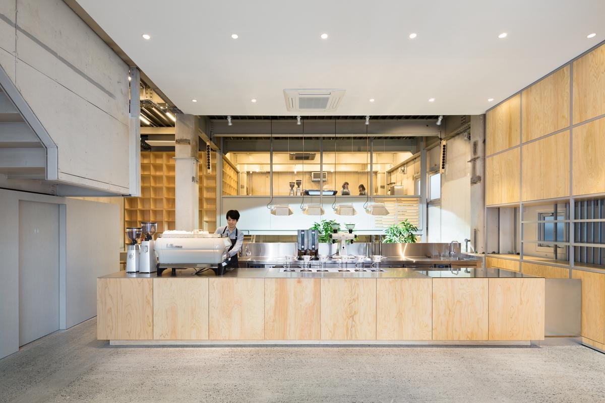
    Glazed front with the plywood interior beyond
    The cafe lit at night
    Espresso counter against cabinet walls
    Counter and plywood wall cabinets
    Espresso machine in front of the cabinet doors
    Bar seating facing the plaza
    High table and counter in plywood
    Service counter and a wall of cabinet doors
    Cabinet wall with framed groups of doors
    The cafe beside the sunken plaza
    Floor plan
    Section
  • DESCENTE BLANC Shop

    DESCENTE BLANC Shop

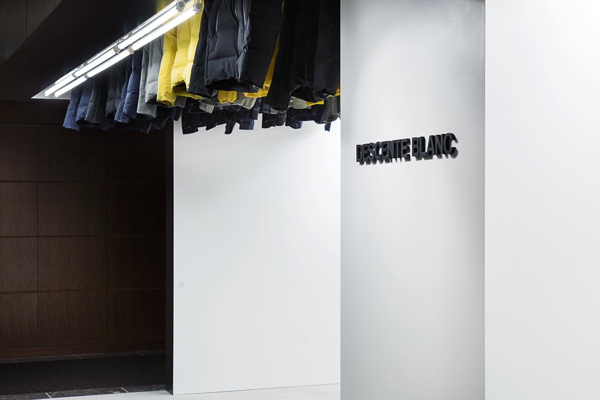
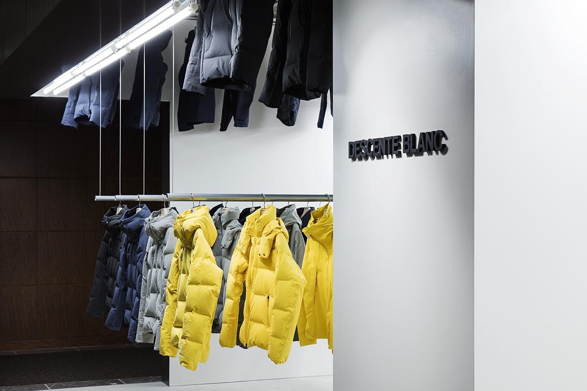
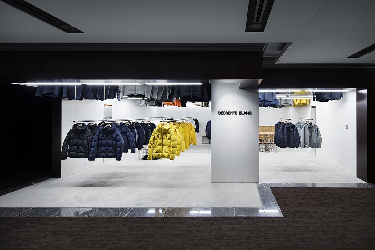
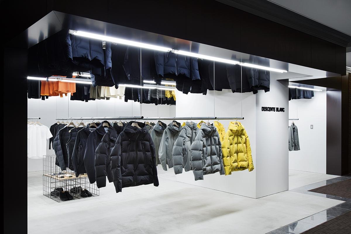
    This is the fourth shop for the apparel brand and its second set inside a larger building. Unlike its predecessor in a newer complex, the host building here has a polished, traditional interior.

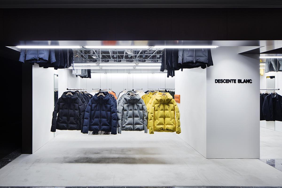
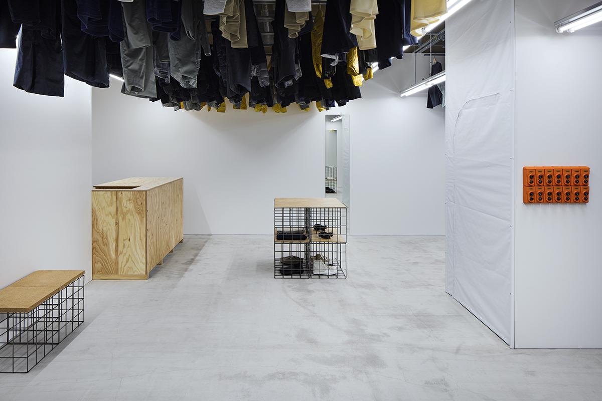
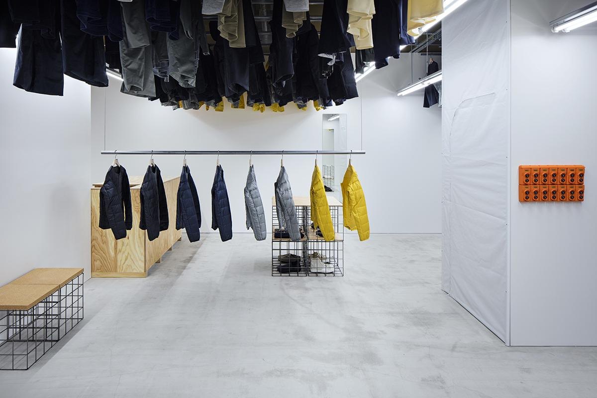
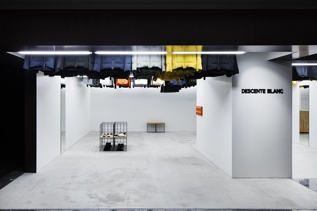
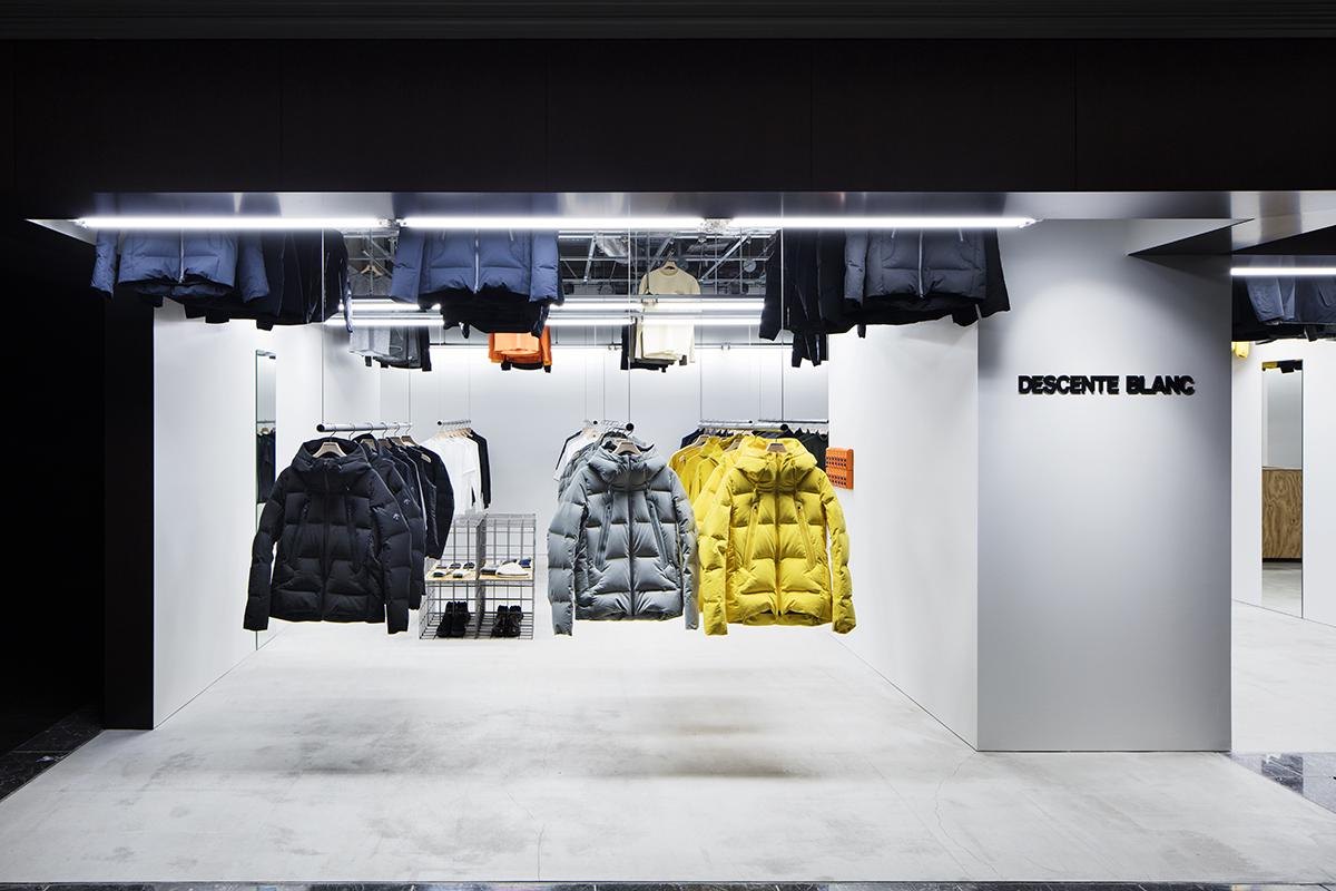
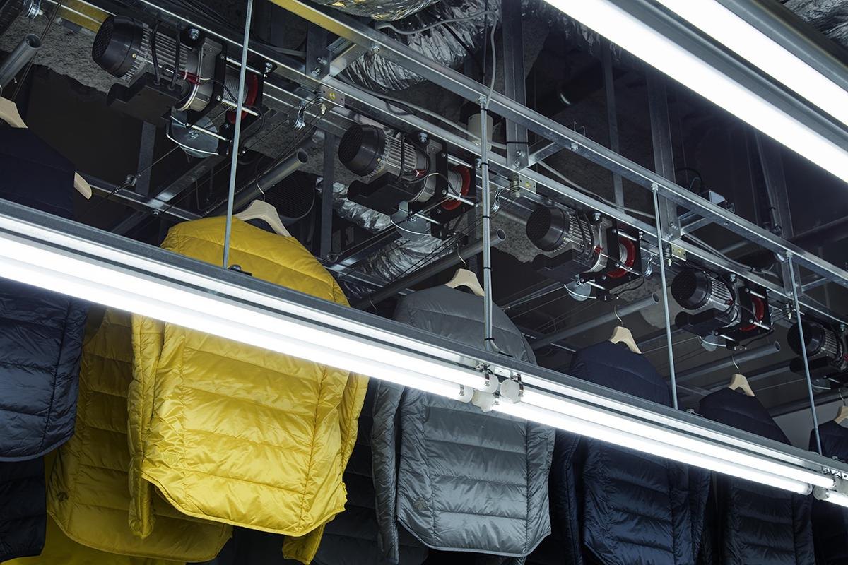
    Across the series, the design idea is to rethink how staff fetch stock, folding an automatic lifting display system into the ceiling. Taking out the existing ceiling exposed the plenum, and the old finishes above and below the missing ceiling met in a sharp line, as if an invisible ceiling plane were still in place.

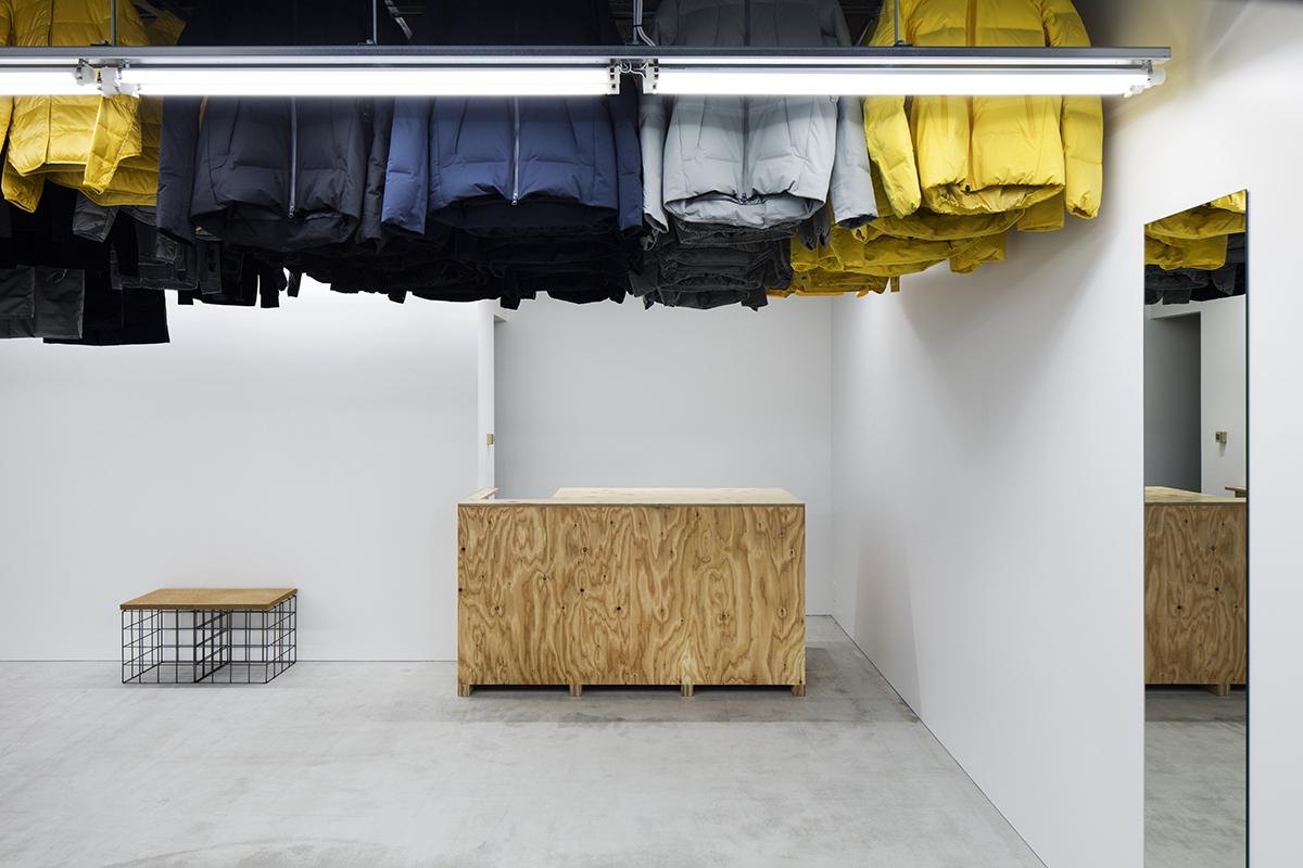
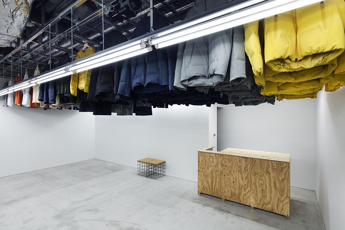
    The design team built on that effect. Stock is kept in the plenum, with clothes hung close under the soffit like aircraft in a hangar. The hanger pipes are set so the hems line up exactly with the imaginary ceiling plane, and the lights sit at the same height to sharpen the line.

    Jackets hanging below the overhead stock in the open ceiling
    Shop entrance with the brand name on a white wall
    Yellow down jackets lowered from the ceiling stock
    The shop seen from the corridor
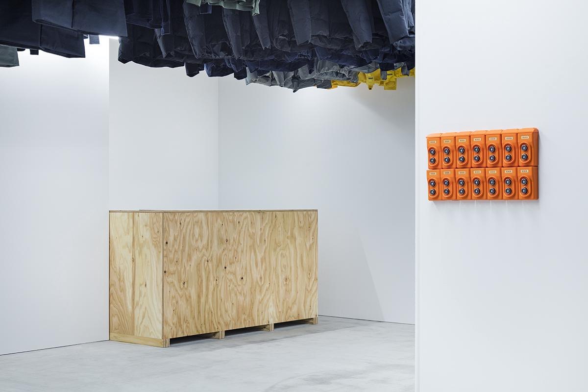
    OSB counter and orange shoe display
    Overhead stock above a pale floor
    Garment rail lowered under the ceiling stock
    Wide view with clothes stored overhead
    Jackets aligned below the line of the old ceiling
    The shop front at an angle
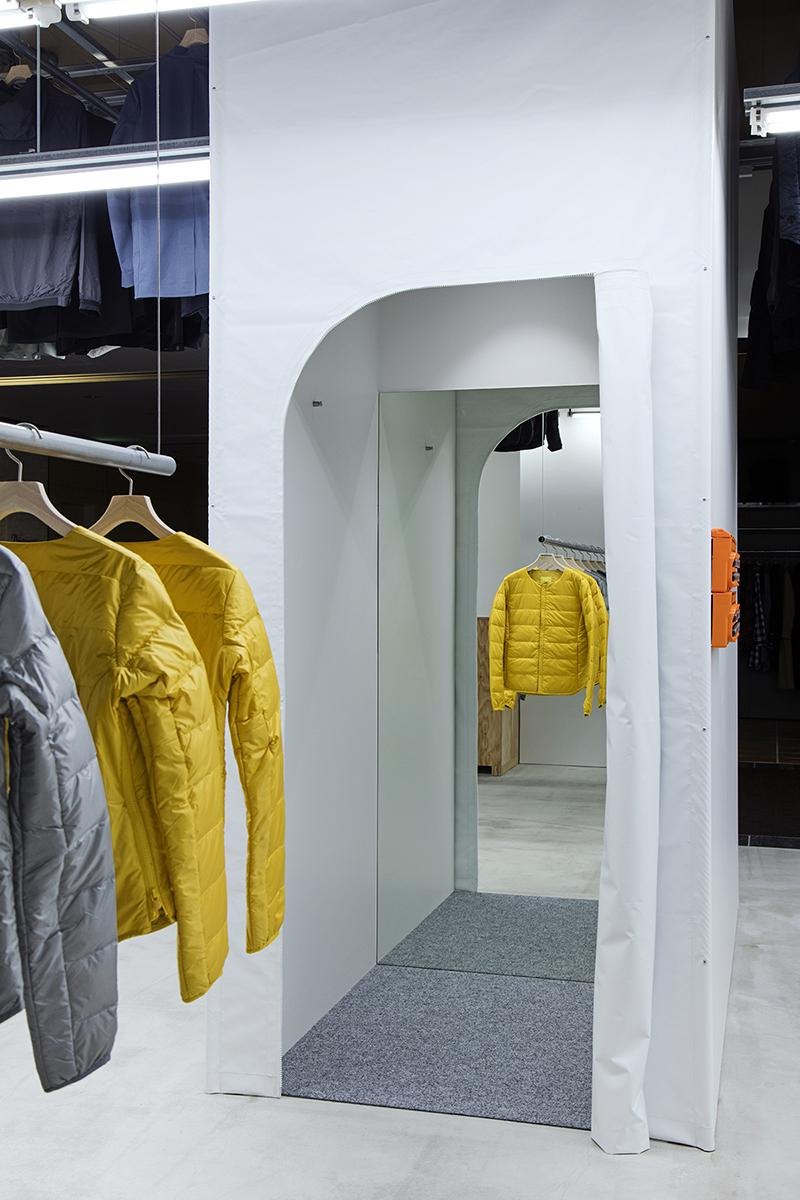
    Fitting room with an arched opening
    OSB counter under the hanging stock
    Counter and overhead rails
    Hanger pipes and lights in the ceiling void
    Floor plan
    Section
  • Camper Together Shop

    Camper Together Shop

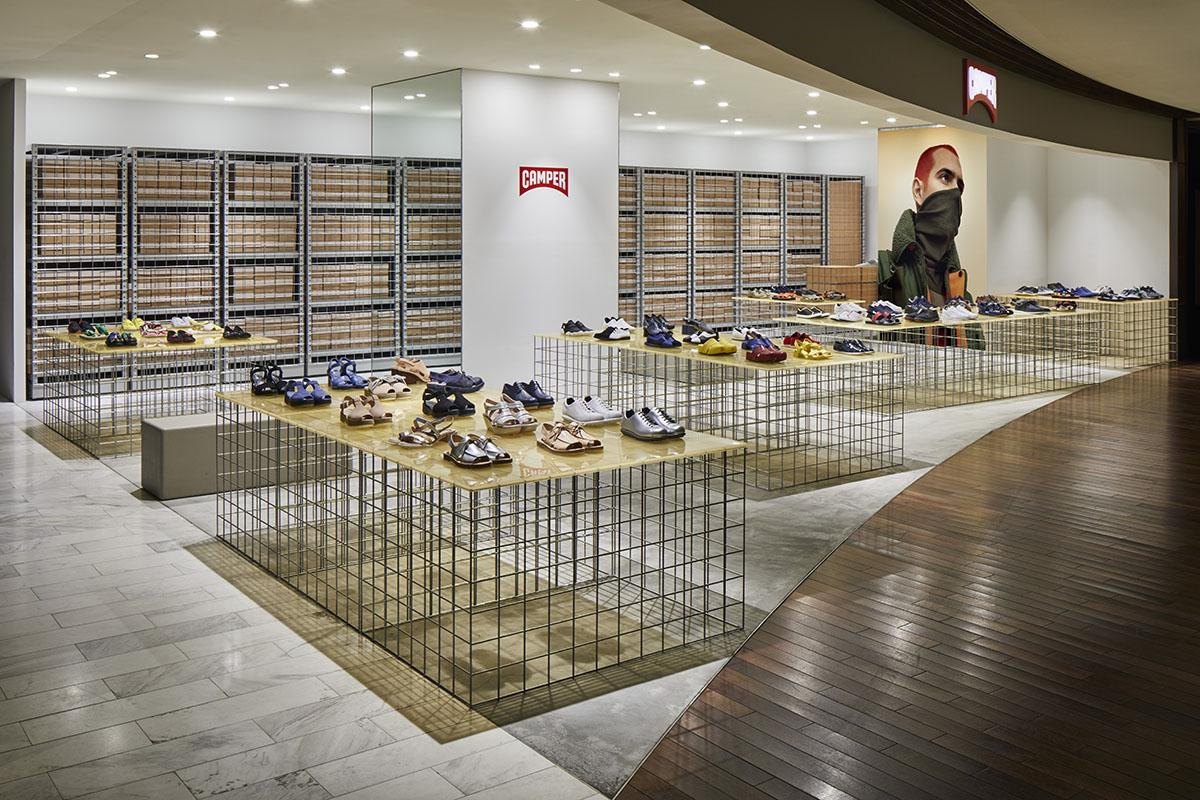
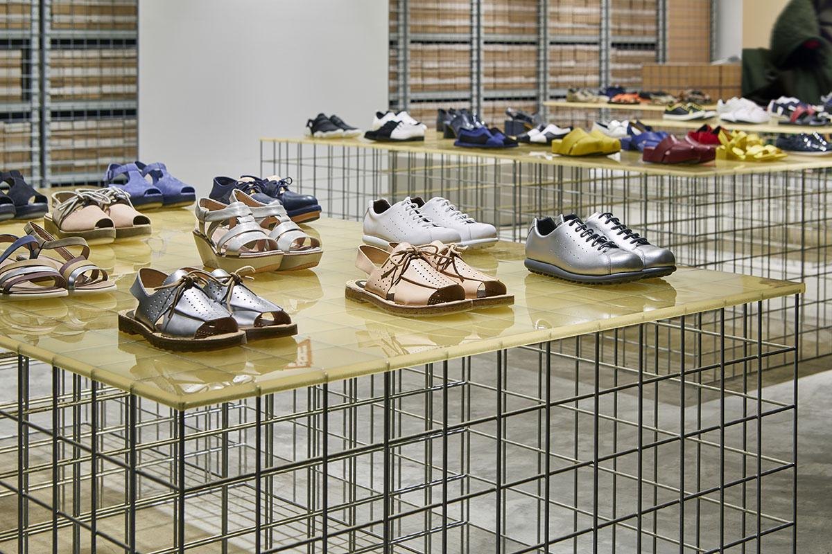
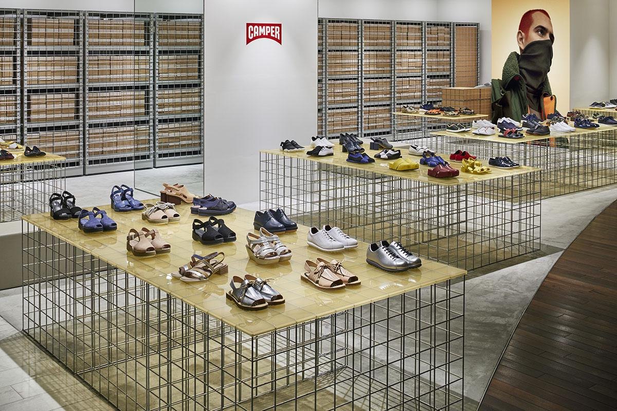
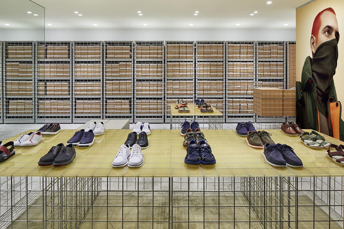
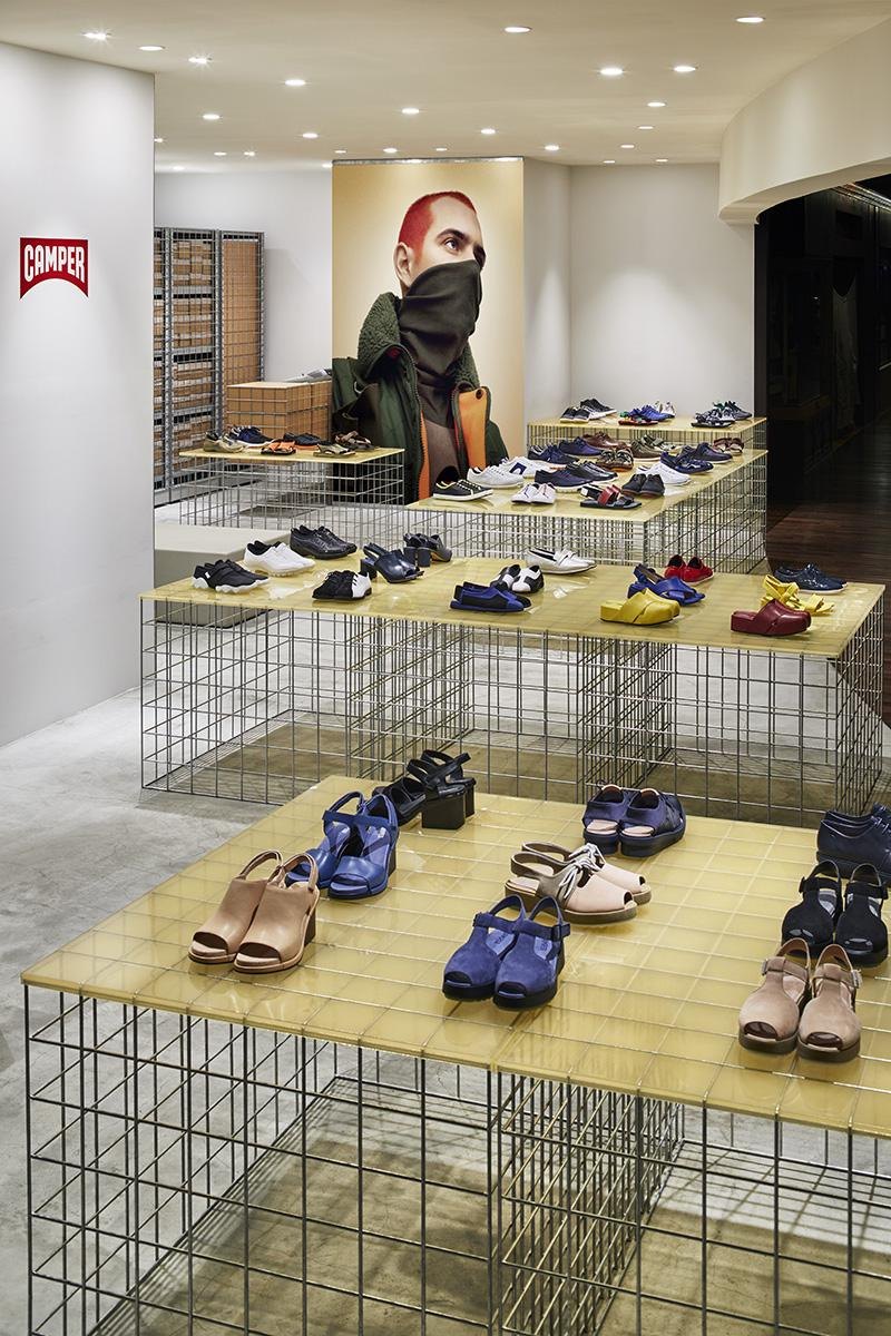
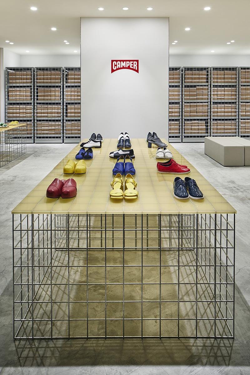
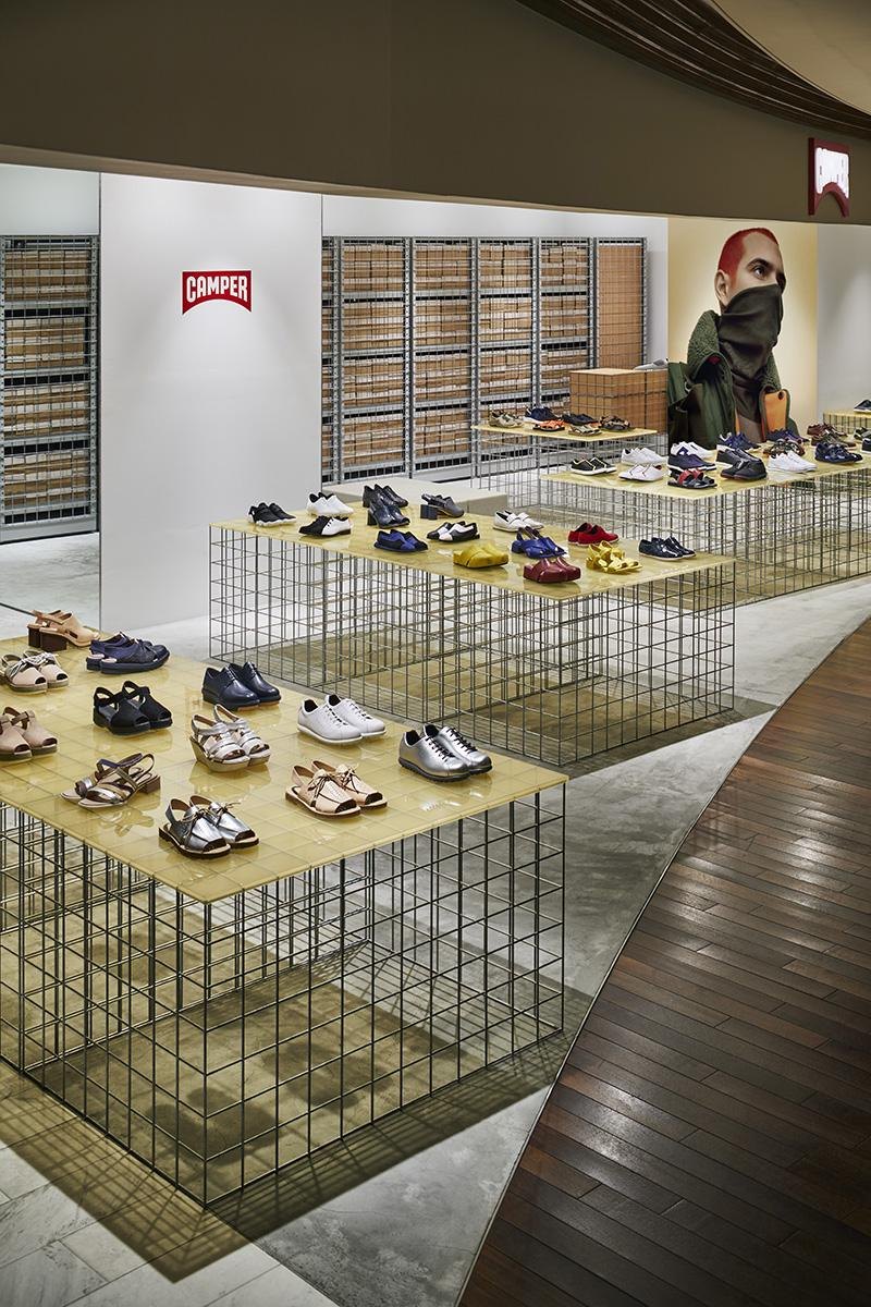
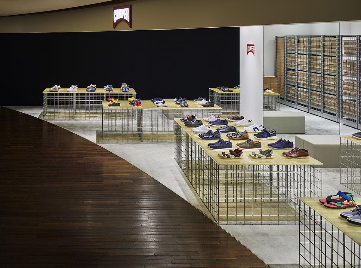
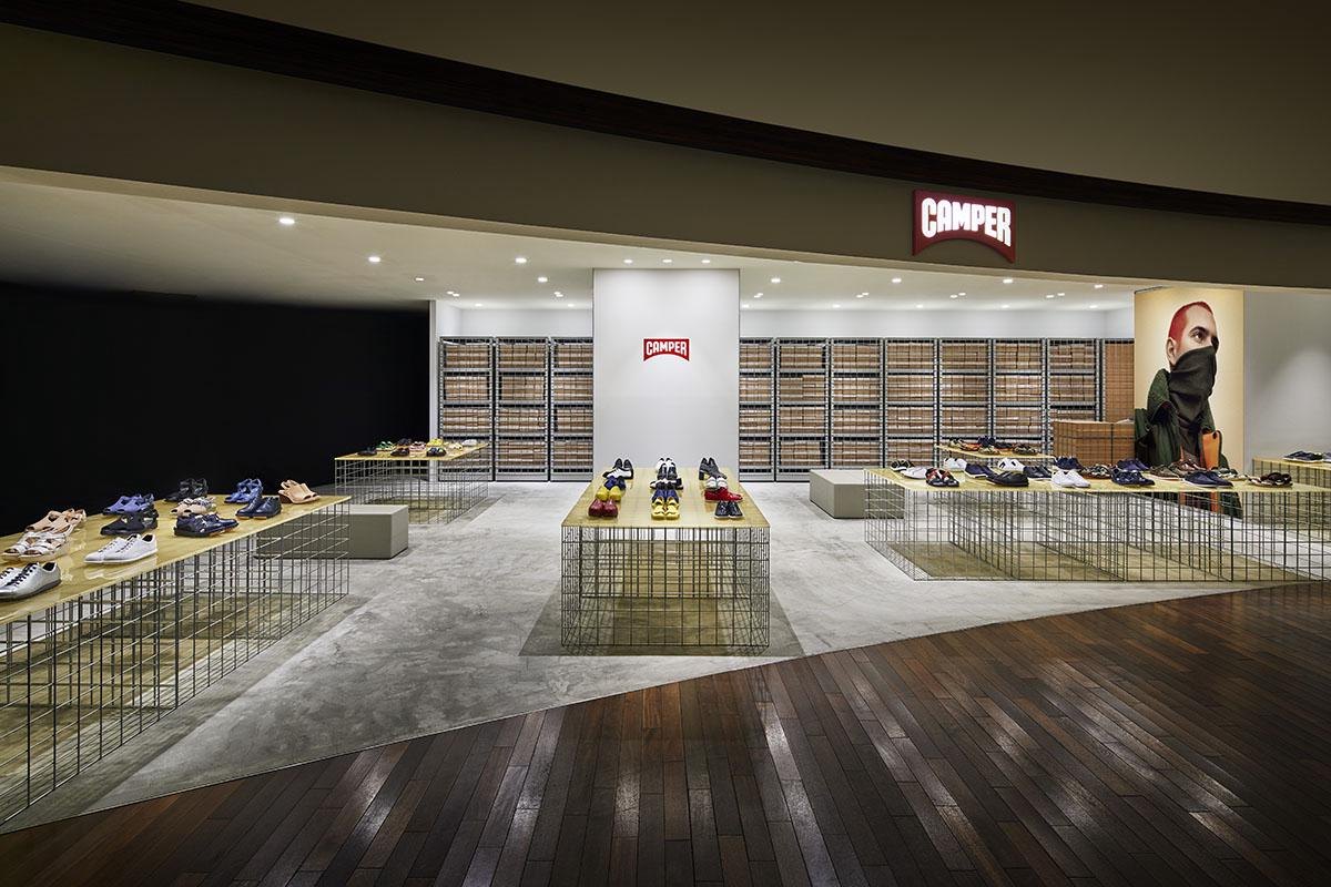
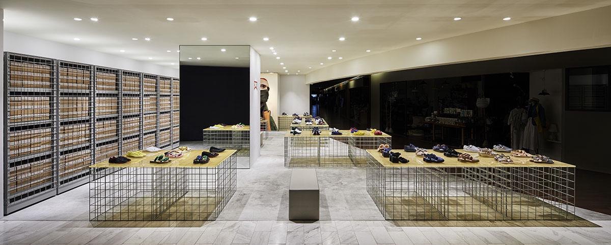
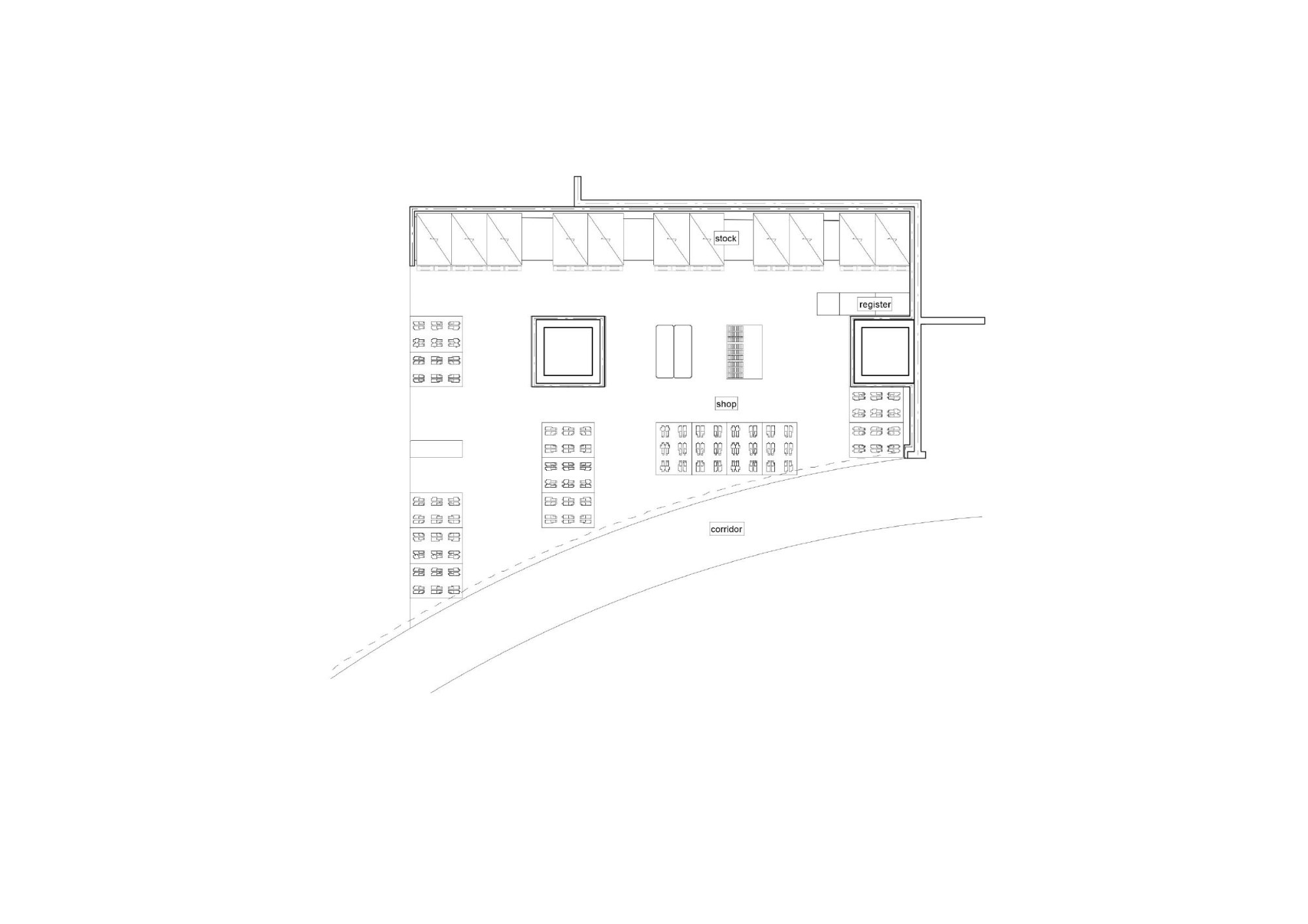
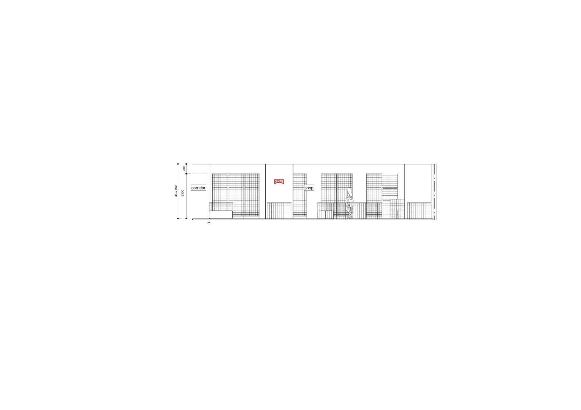
    A shoe store runs on the trip between shop floor and stockroom, since every pair a customer wants to try has to be fetched. Here the stockroom, built from movable racks, faces the sales area directly, keeping that trip as short as possible and cutting the wait for customers.

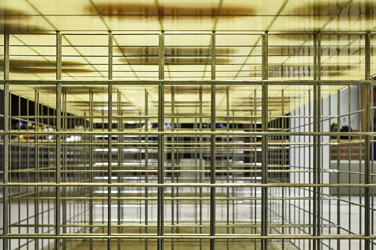
    The stockroom is enclosed in steel mesh. It becomes a see-through backdrop that puts the staff’s movements on show, and it adds a sense of depth that makes the small store feel larger than it is.

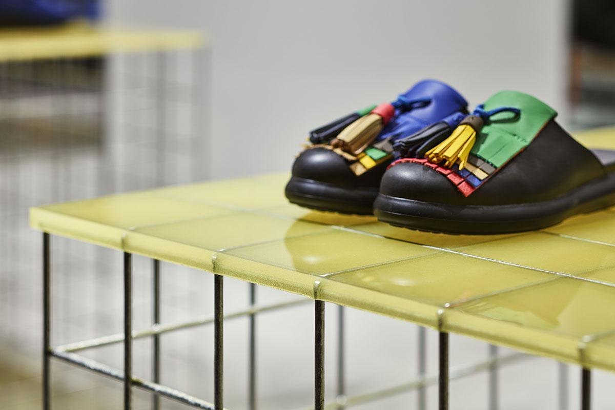
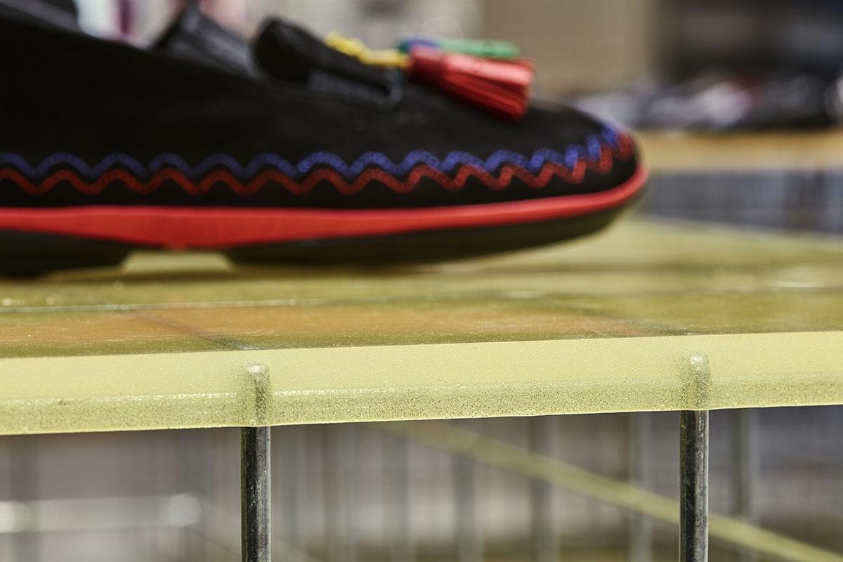
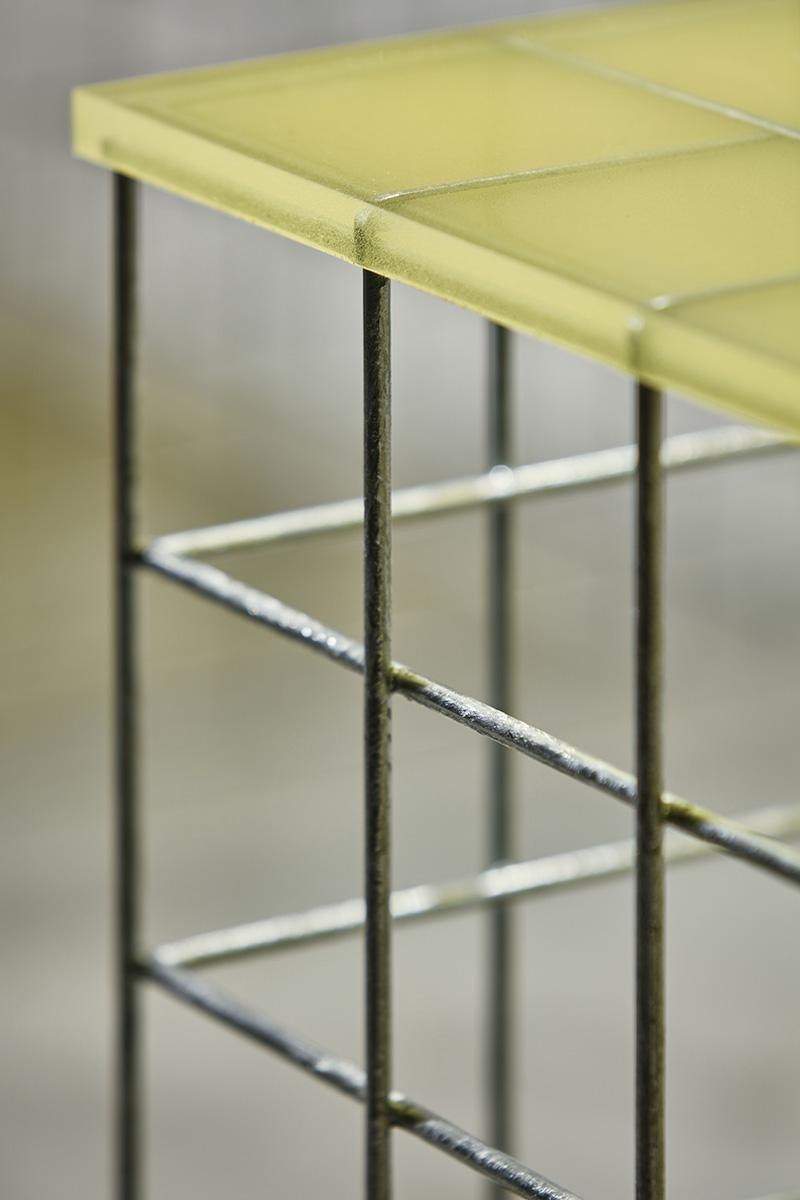
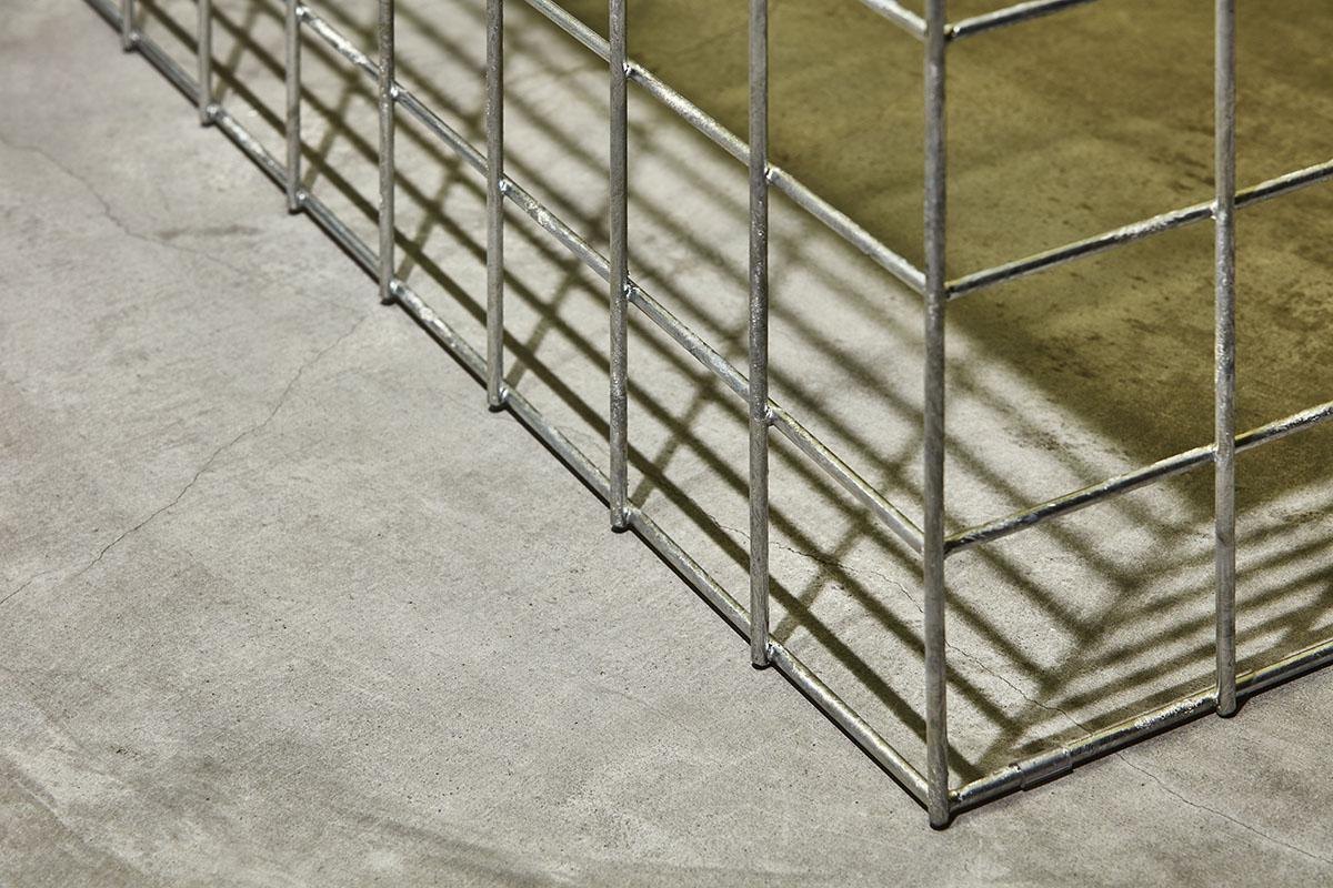
    The design team wanted the products set against materials of everyday life, so customers could picture the shoes in use while handling them. The palette is matte and industrial. Urethane rubber and MDF pick up the colour of the shoe boxes, while galvanised steel and dyed cork answer the grey of the concrete floor.

    Shoes on mesh tables with translucent rubber tops
    Display tables in front of the stock racks
    Shoe on a translucent rubber tabletop
    Close view of a shoe on the rubber top
    Corner of a steel mesh table
    Mesh frame on the concrete floor
    Rows of mesh tables seen from above
    Shoe boxes stacked on racks behind the tables
    Store front with the brand sign
    Mesh display table by a white column
    Display tables near the entrance
    The store from the mall walkway
    Stock racks forming the backdrop to the sales floor
    The open store front
    Wide view of the store
    Floor plan
    Elevation
  • House in Sangenjaya

    House in Sangenjaya

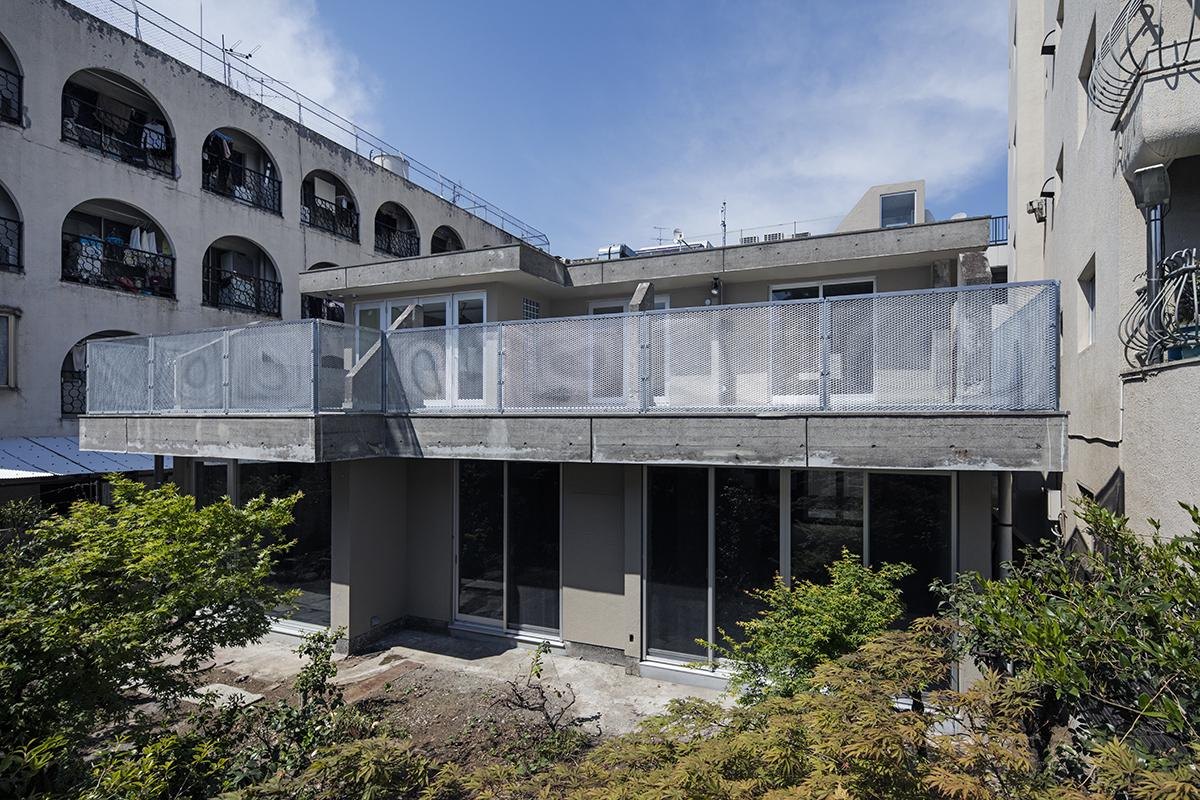
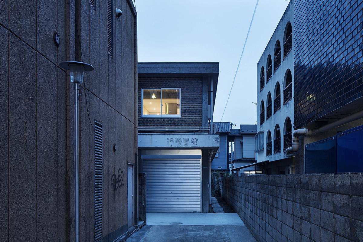
    A dead-end lane runs between two mid-rise buildings near a railway station. Look down it and the space suddenly opens to the sky, with a fifty-two-year-old building standing quietly at the end. It once held the client’s grandfather’s clinic and housed three generations of the family.

    In this location the obvious move would have been a new rental block with more floor area. The family preferred to keep the building, long familiar to the neighbourhood, over higher returns. The design team began by keeping the structure and planning for new activity that could, in time, make it a well-loved local place again.

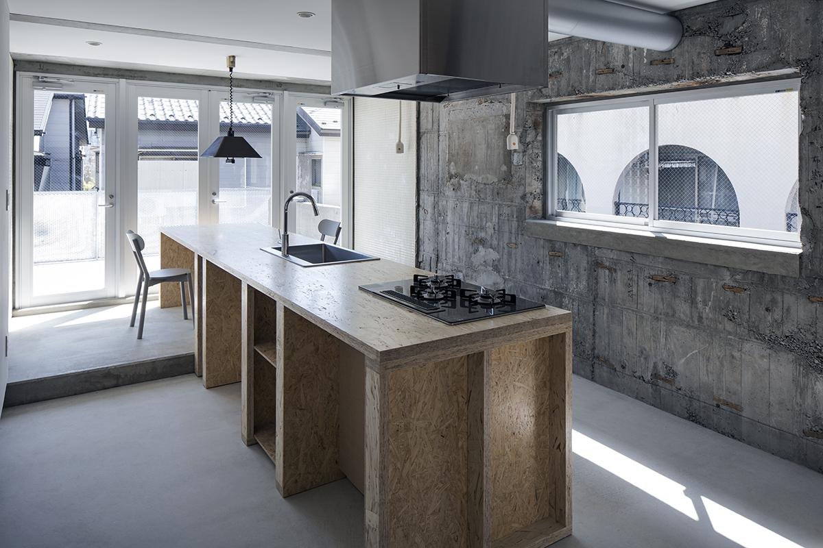
    The client wanted to have friends over often. A small gallery he runs himself sits at the southwest corner of the ground floor, with his home upstairs, and the two are linked. The rest of the ground floor was let to a tenant so that the life inside would reach out toward the lane and the city.

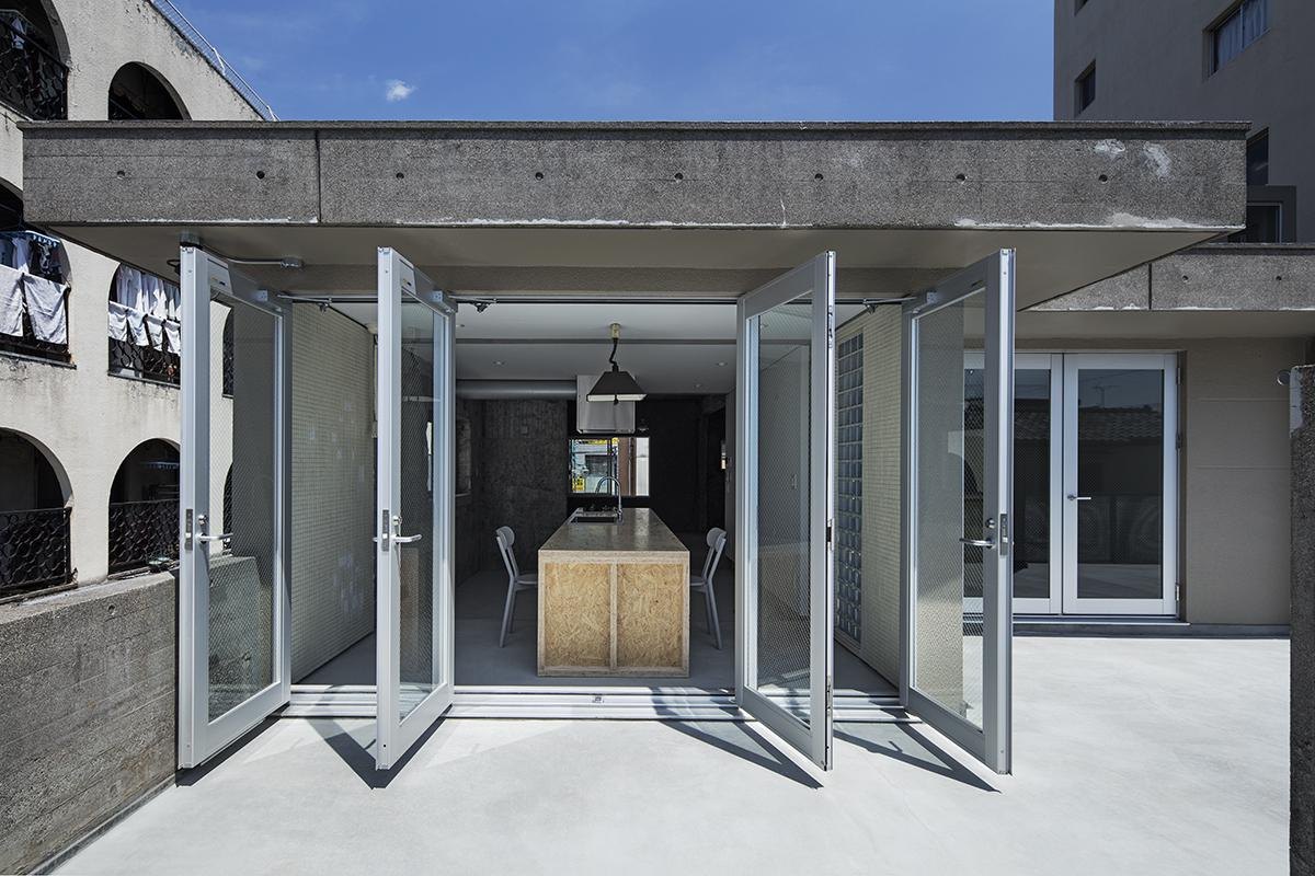
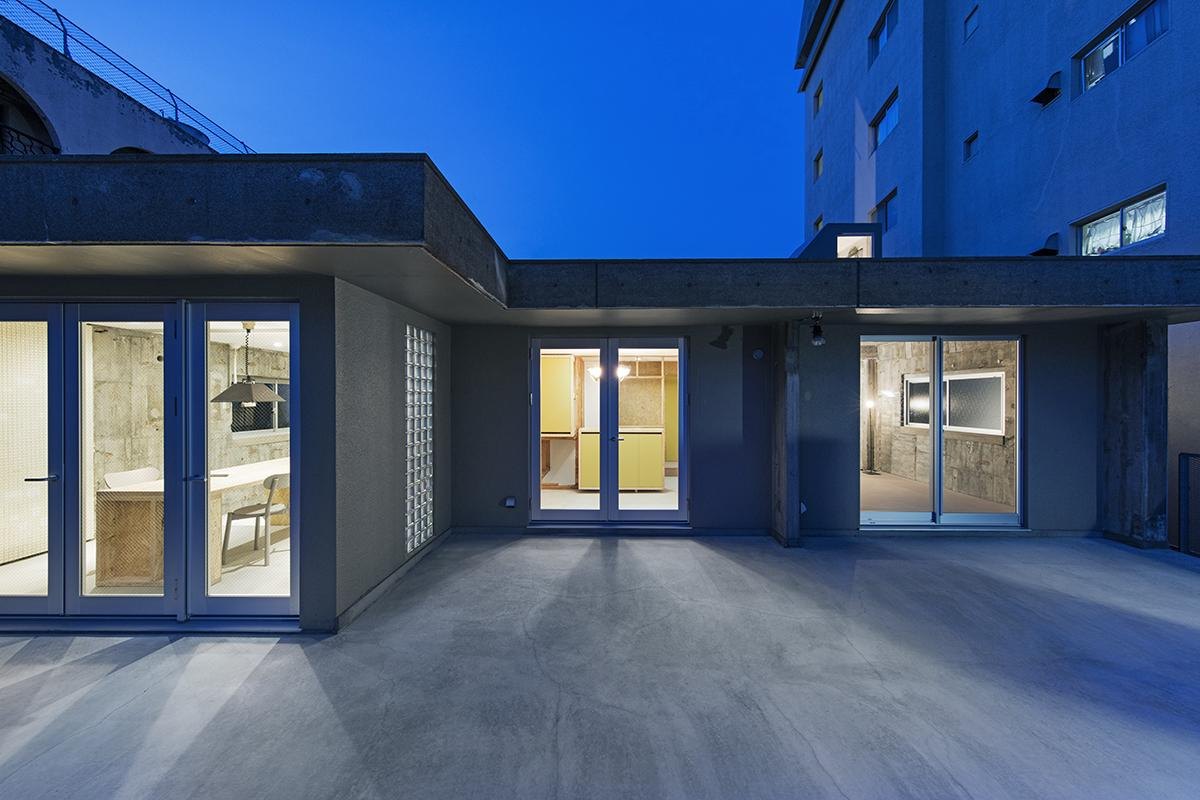
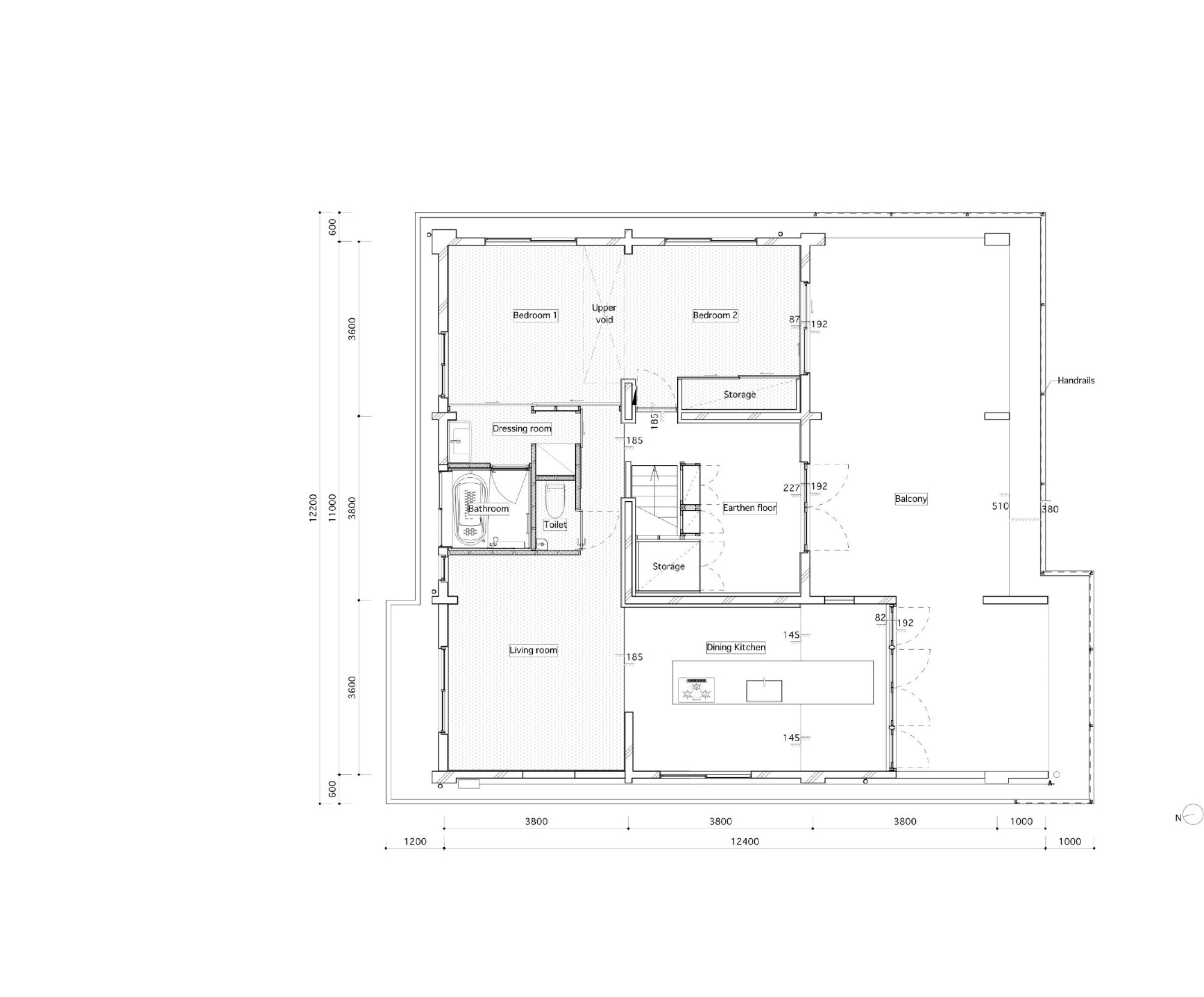
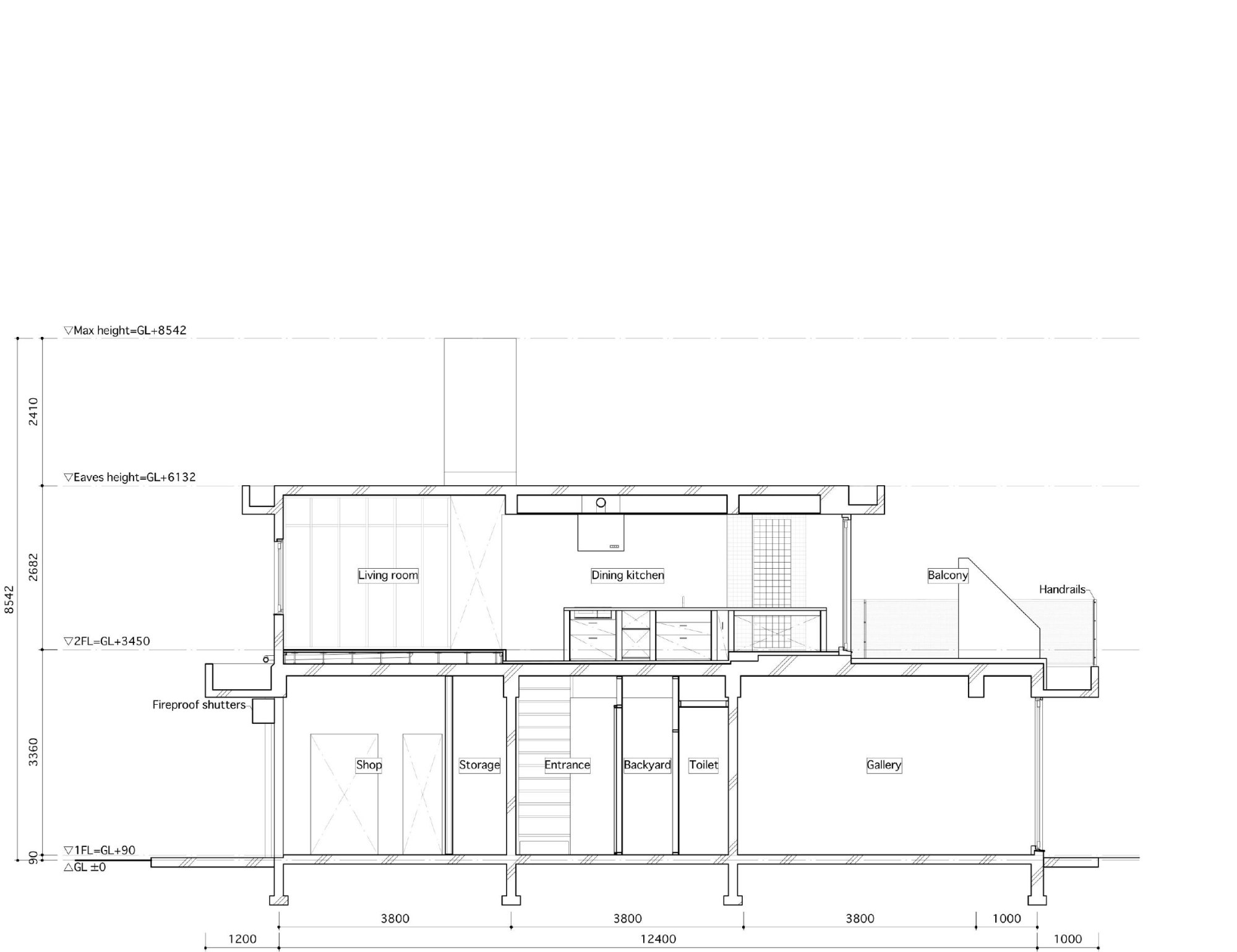
    Built when the city had more room to spare, the building is generous. Half of the upper floor is an open balcony under the sky. The balcony and a connecting doma, an earth-floored space, sit between the public ground floor and the private home above, linking everyday activity across both.

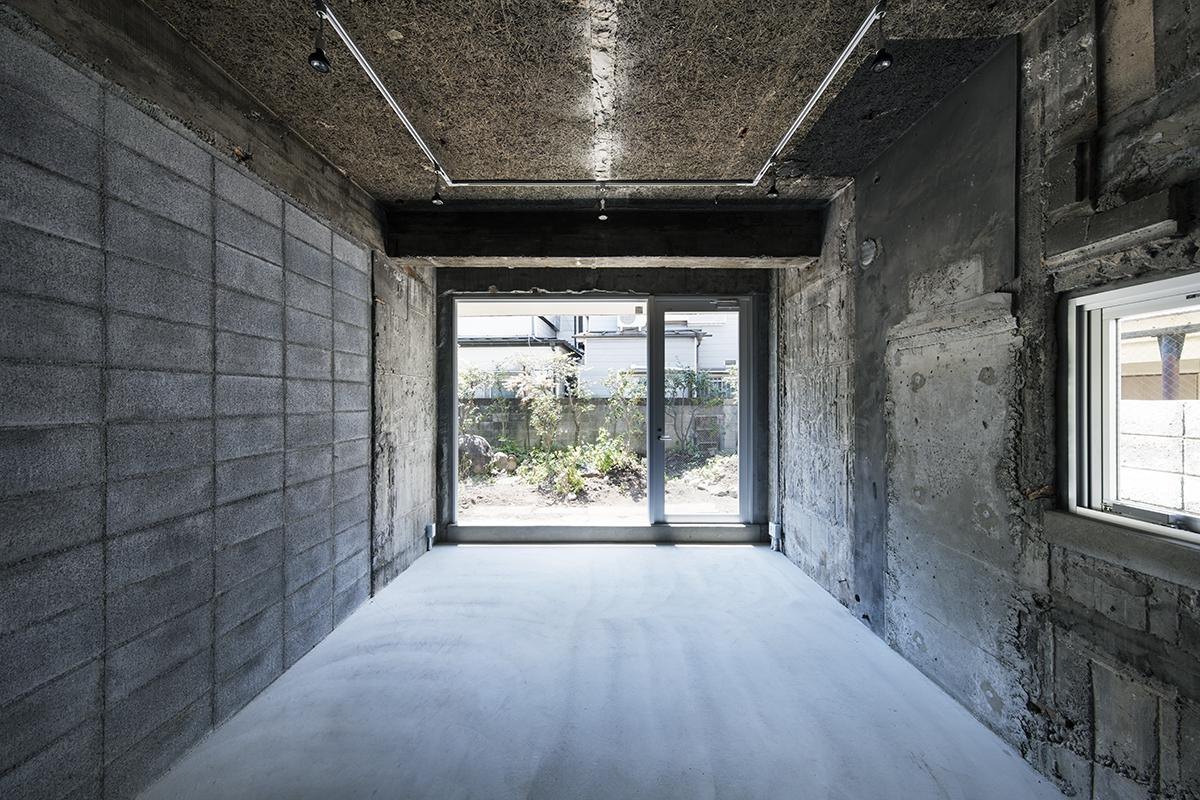
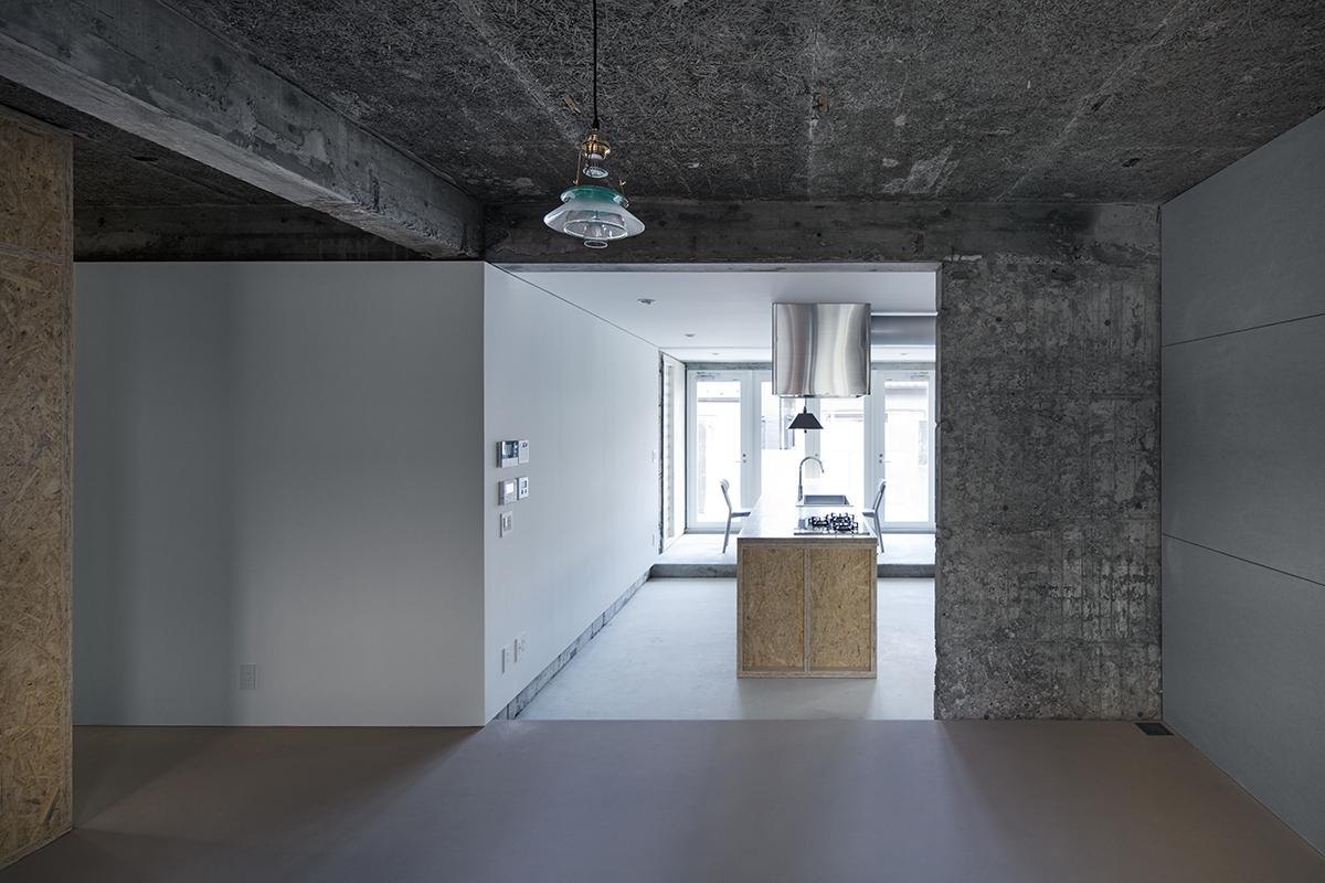
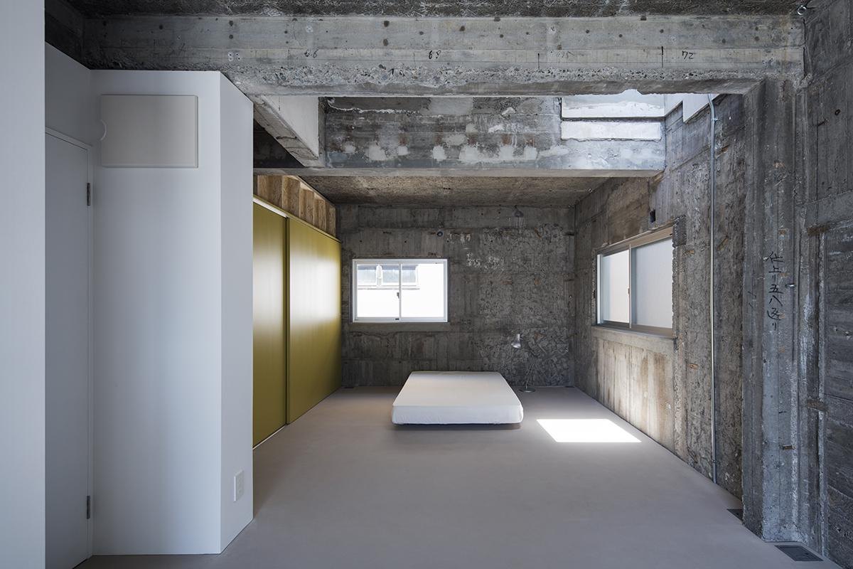
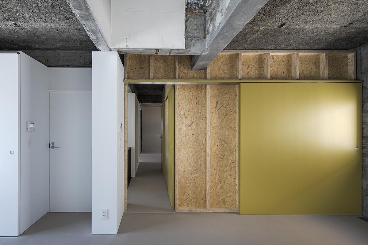
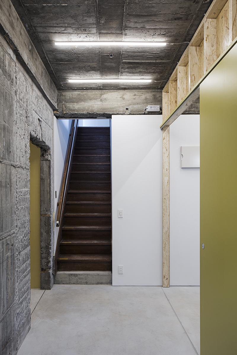
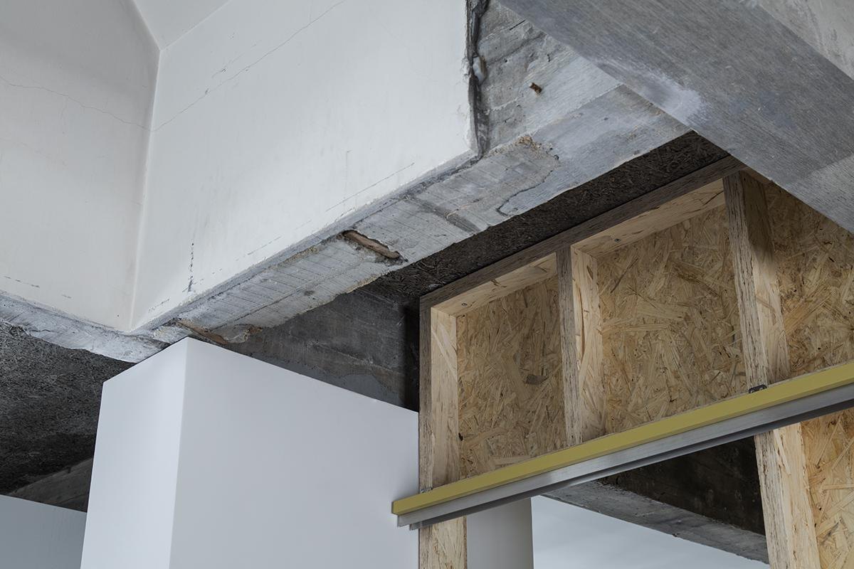
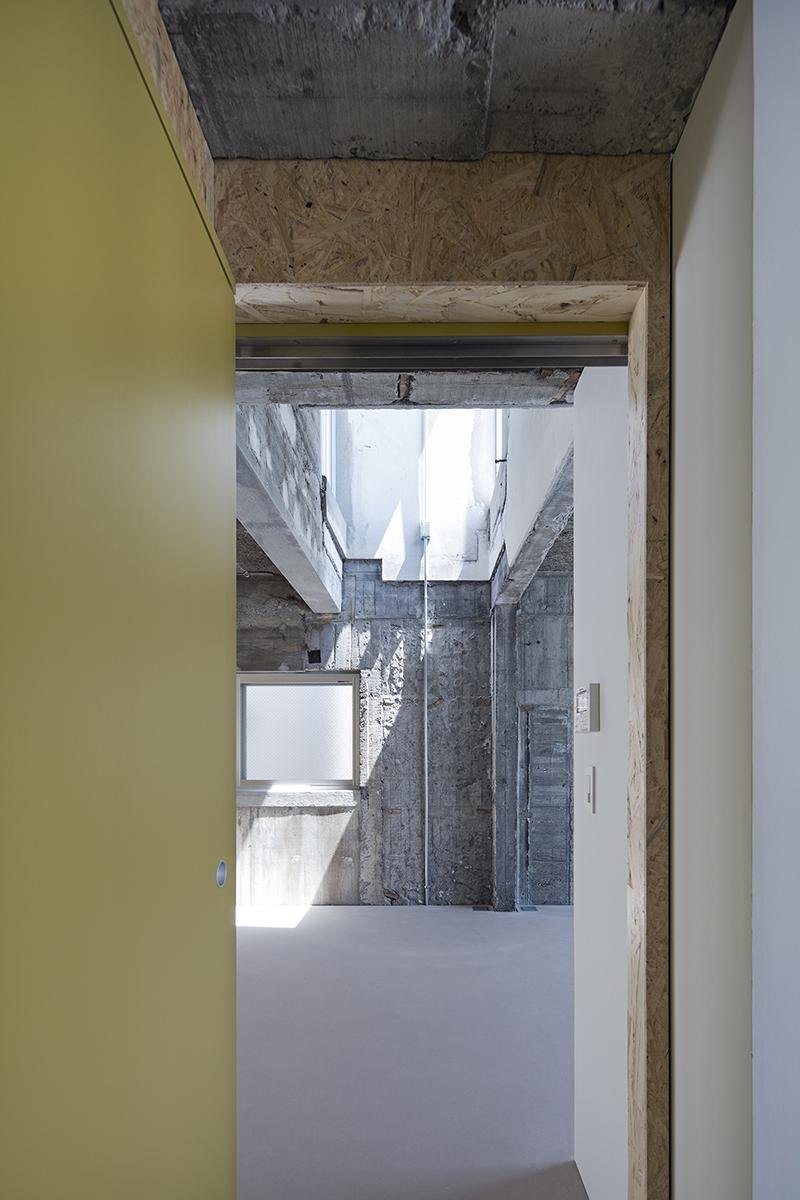
    The old structure was left as untouched as possible, with its exterior walls exposed as found. All services are gathered into a single core of painted plasterboard, then branch out through the ceiling void above the doma, under raised floors and behind painted walls to reach both zones.

    The building at the end of the narrow lane
    Stripped ground floor with board-marked concrete
    Kitchen island beyond the white service core
    Kitchen counter under the concrete ceiling
    Upper floor room with gold-painted panels
    Sliding panels beside the service core
    Stair rising between the core and a gold wall
    Exposed beam meeting the plasterboard core
    Opening between a gold wall and the white core
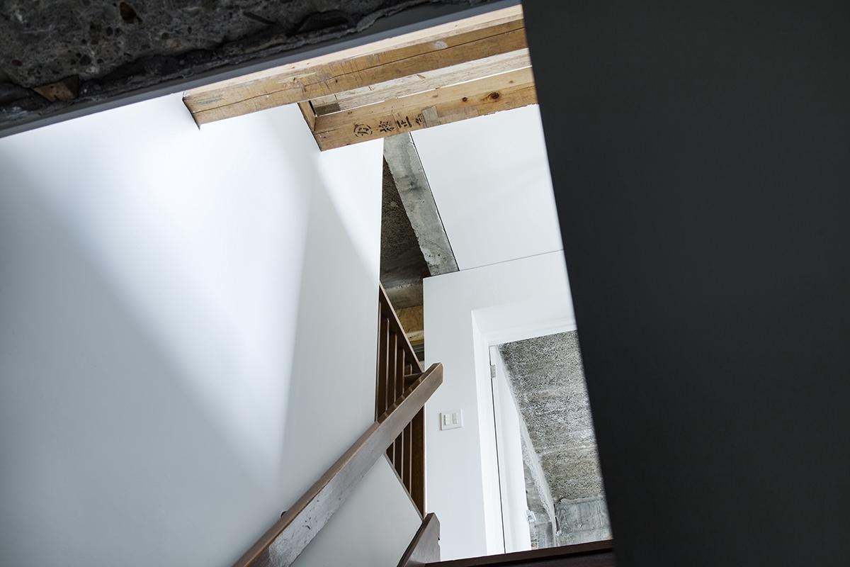
    Looking down the stairwell
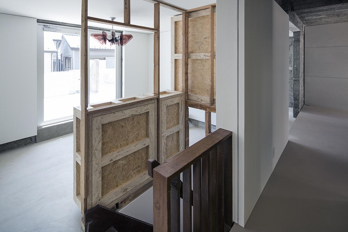
    Timber balustrade at the top of the stair
    Folding glass doors opening onto the balcony
    The balcony at dusk
    The building and balcony seen from the garden
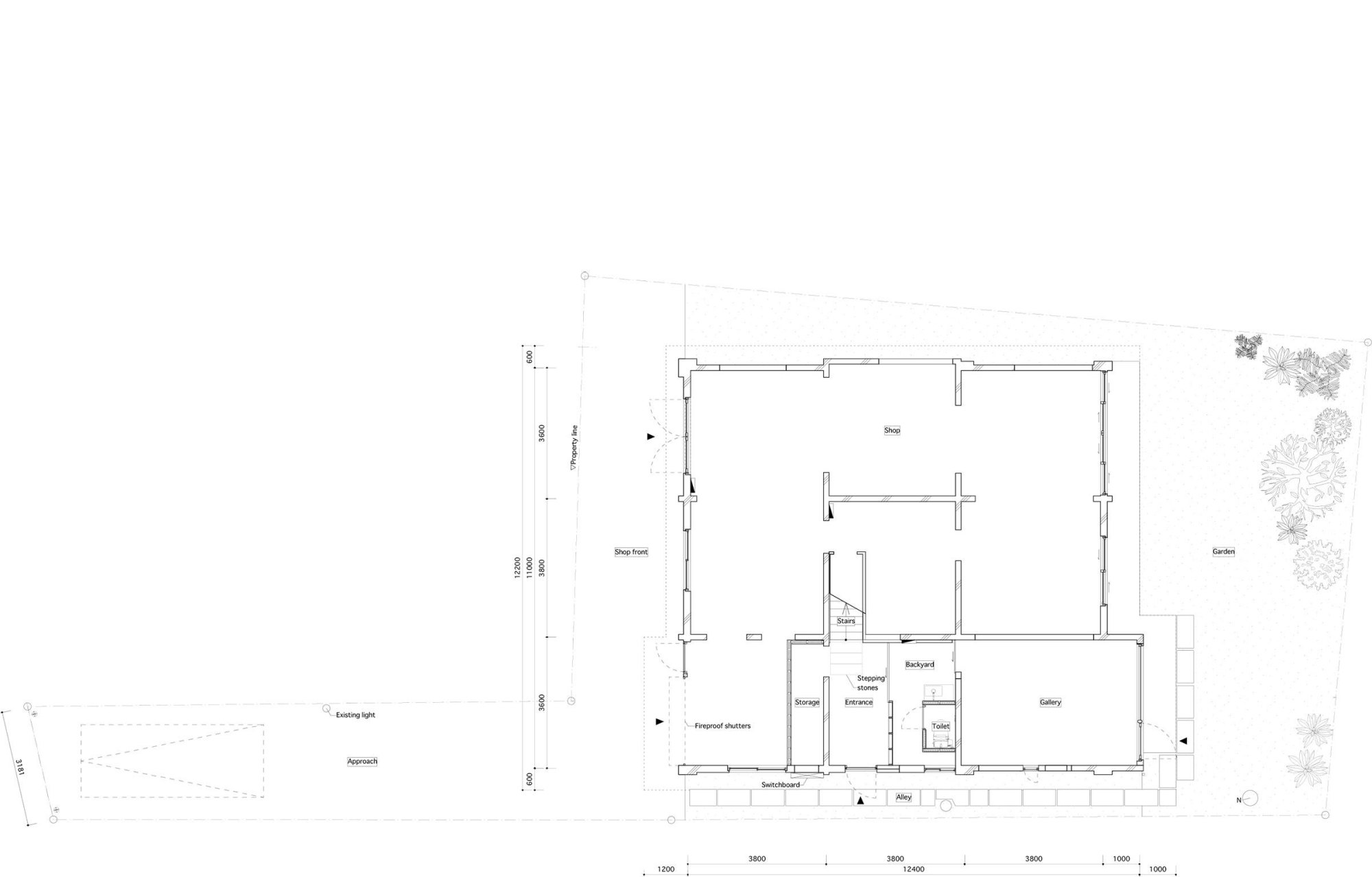
    Site plan
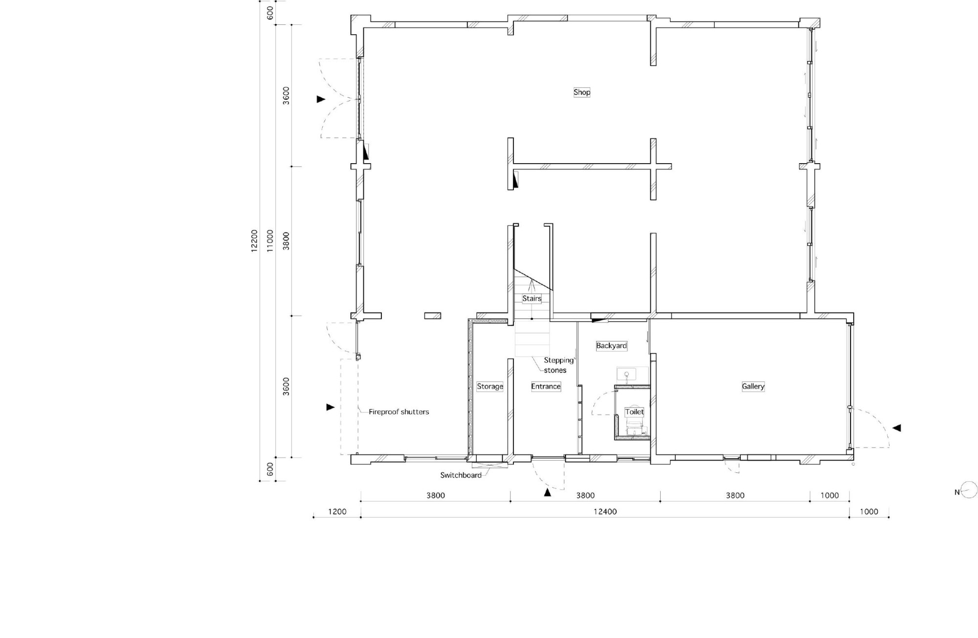
    Ground floor plan
    Upper floor plan
    Section
  • YAGICHO-HONTEN

    YAGICHO-HONTEN

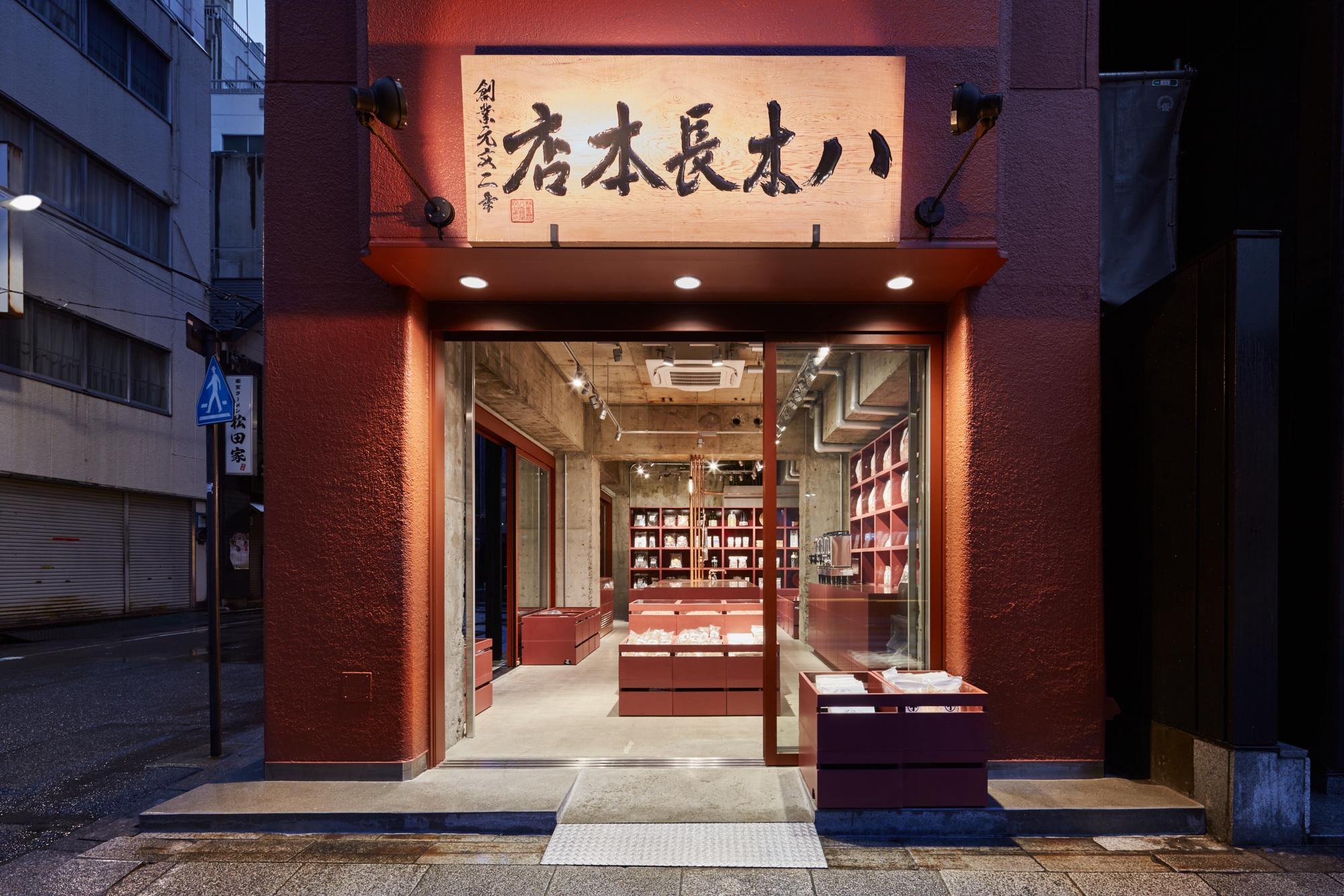
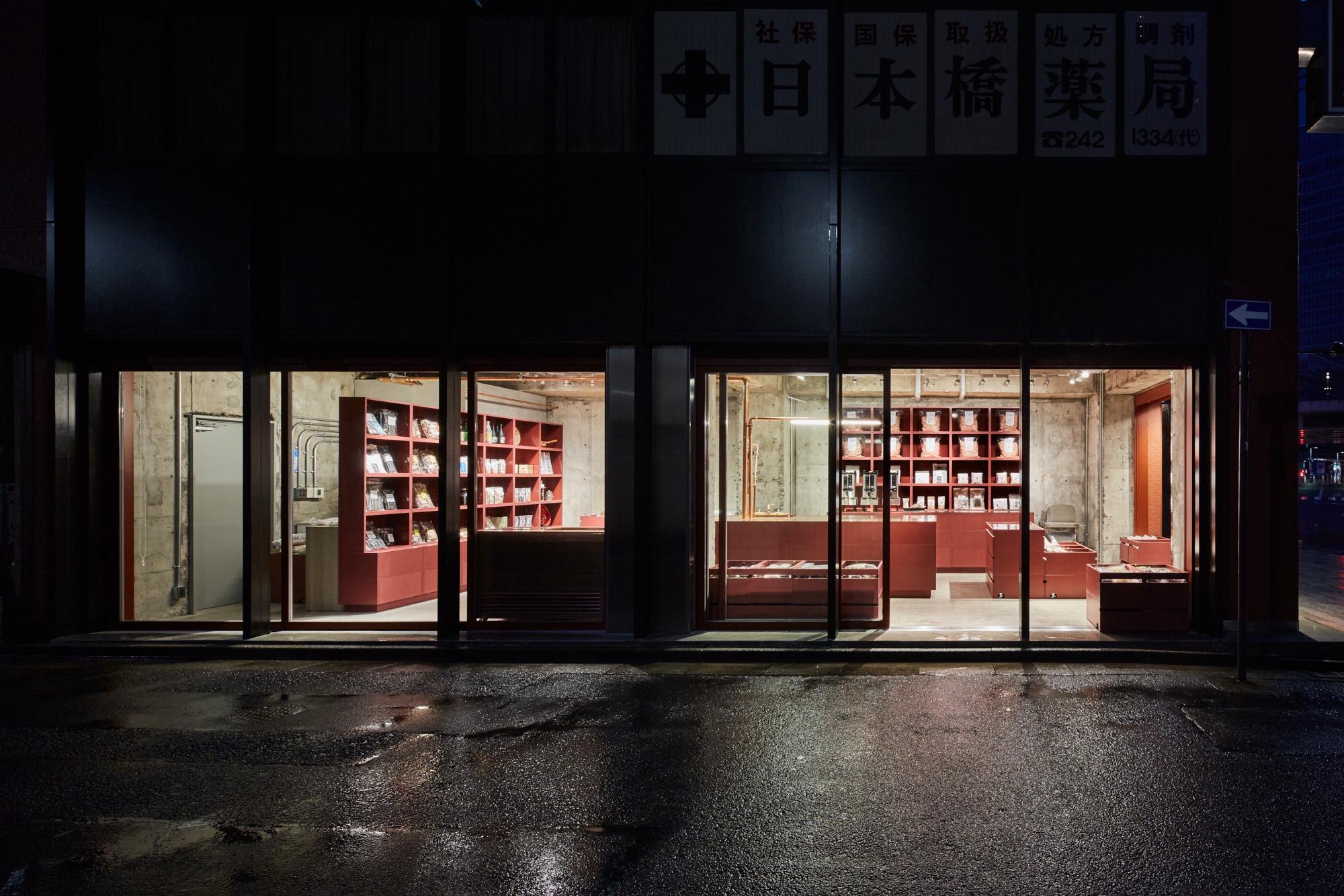
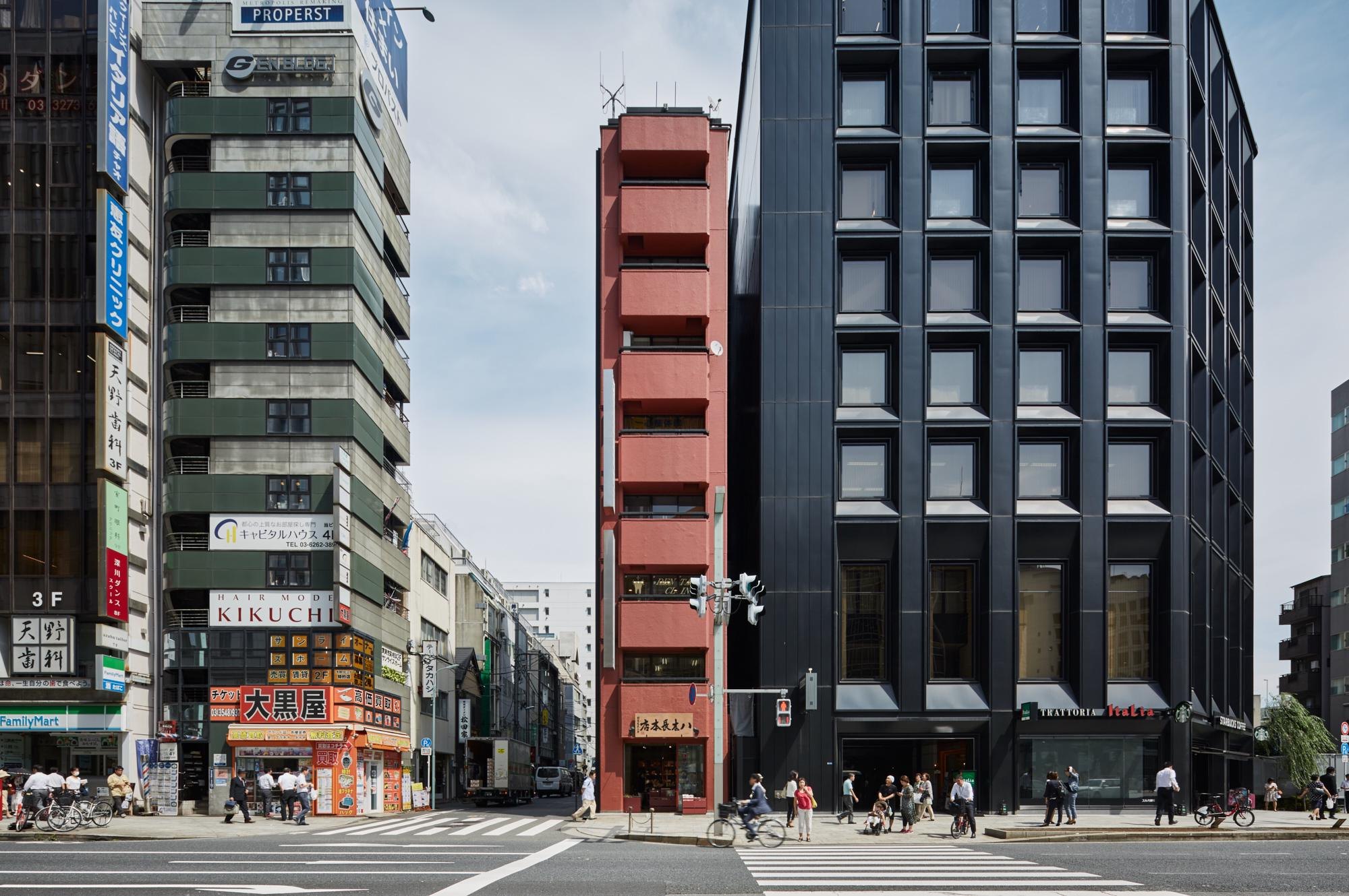
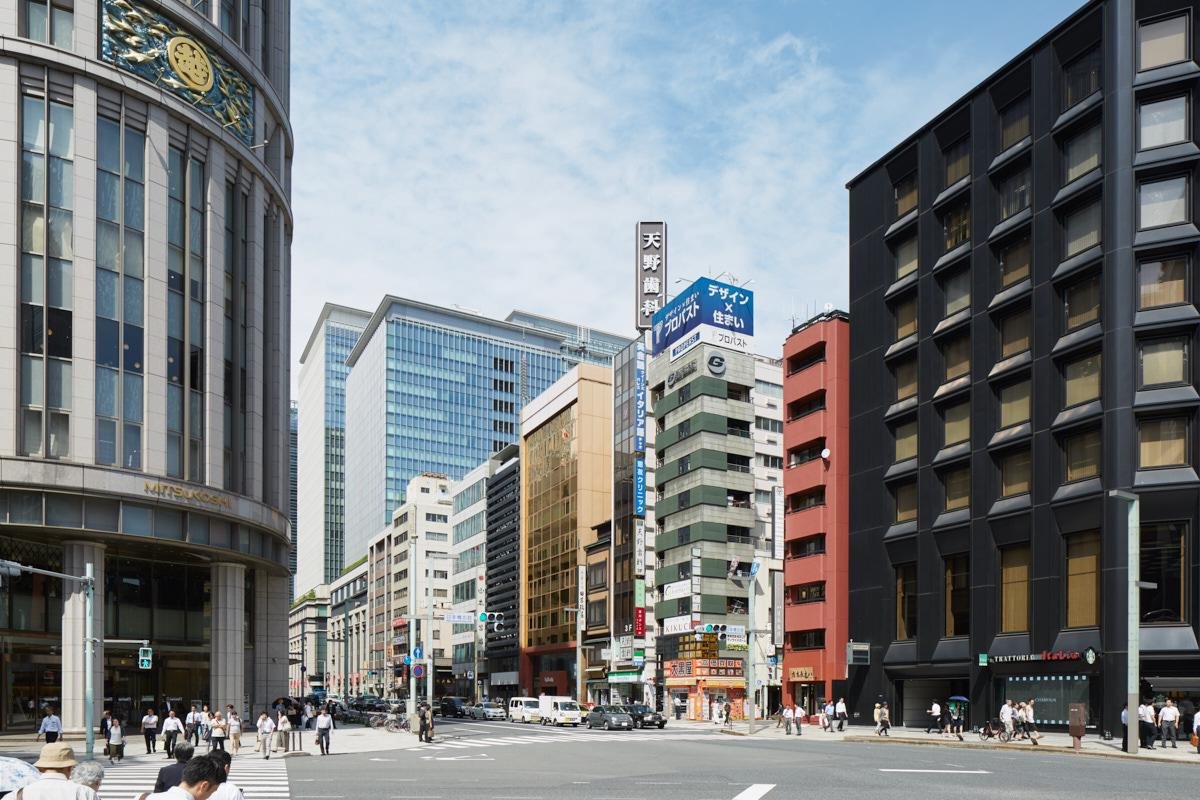
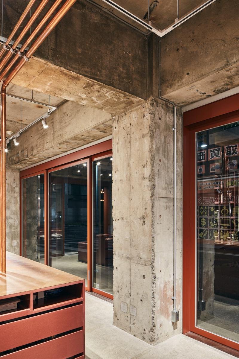
    The client is a dried food merchant with around 280 years of history, trading in the staples of dashi: dried bonito, kelp and shiitake. The project is a renovation of its main store.

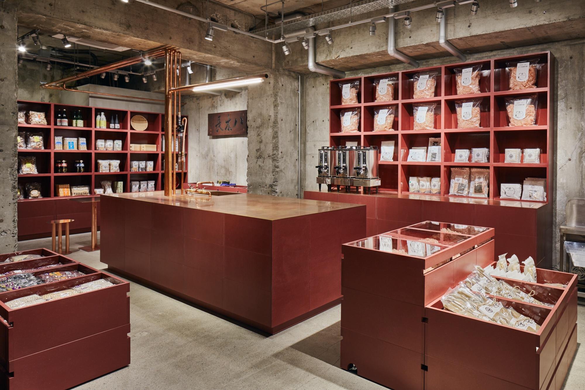
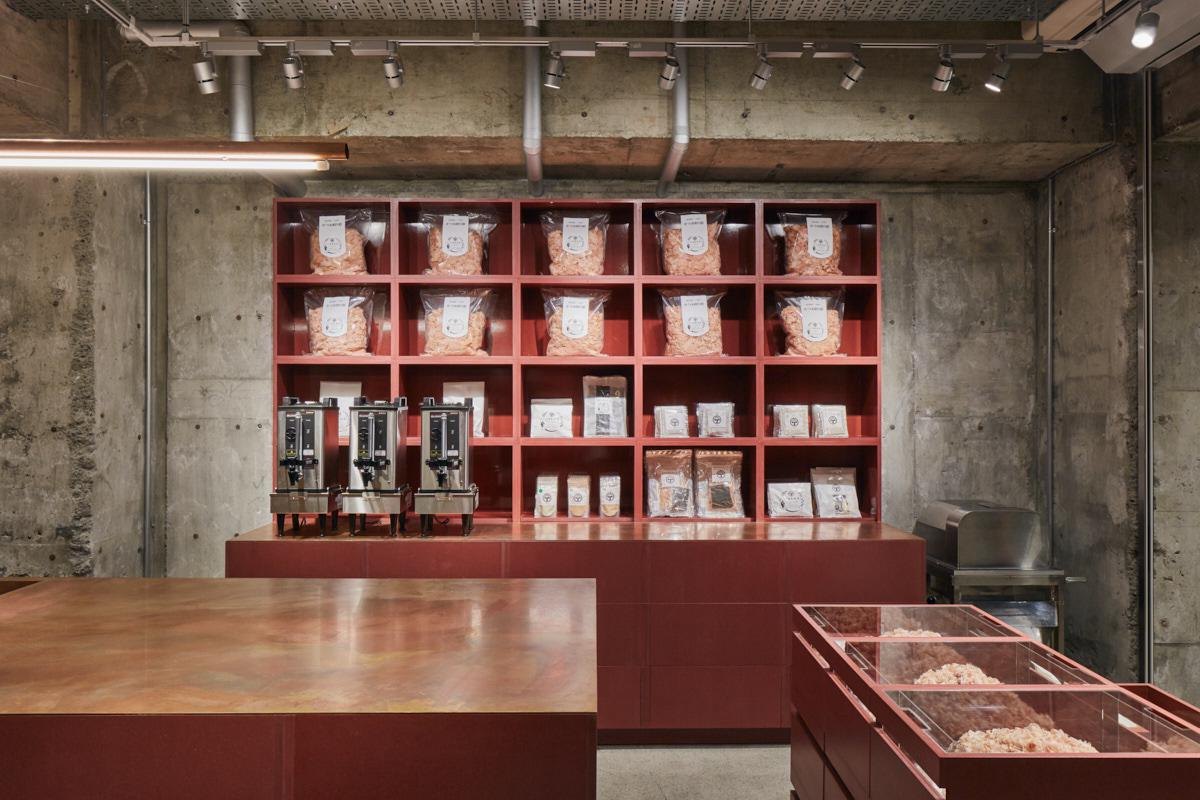
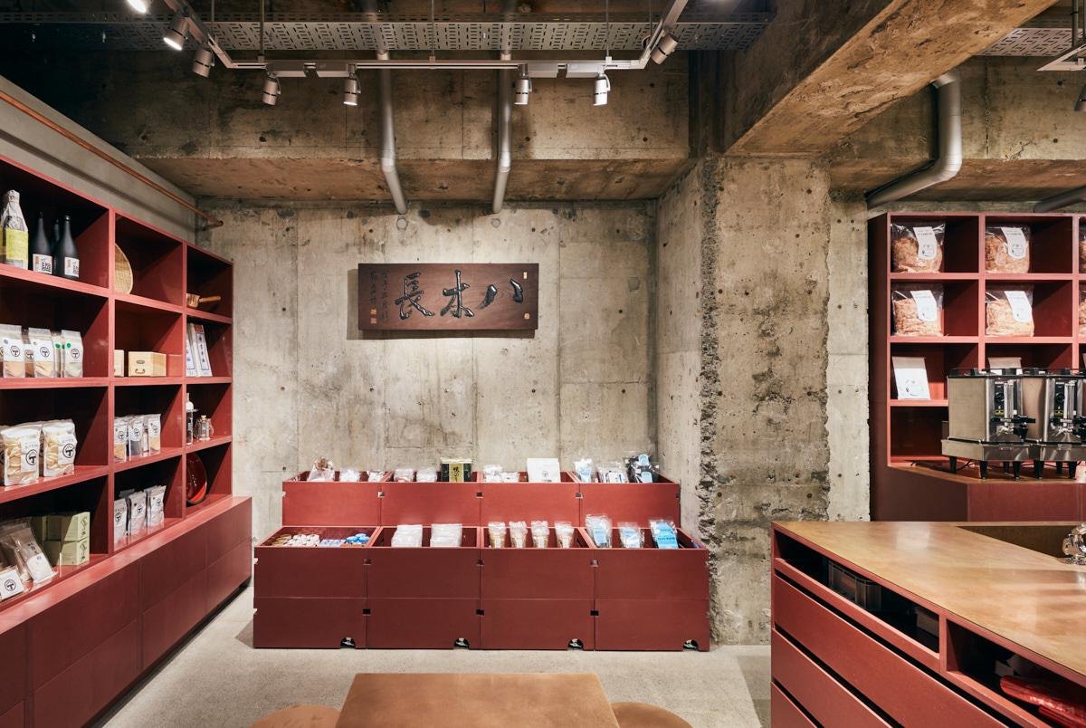
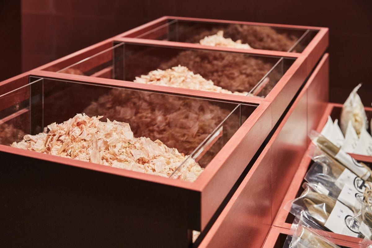
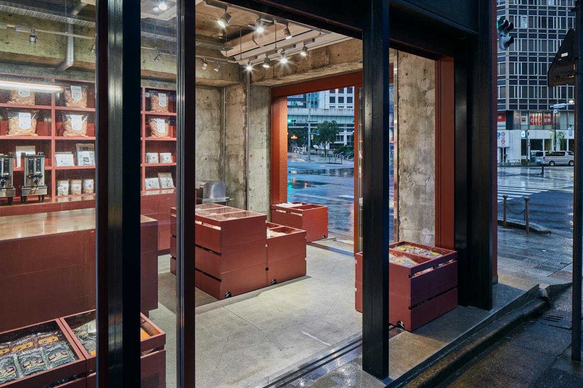
    The building looks as if it had been painted red inside and out in a single stroke, but the red was already there. The design team noticed that it matched the cut face of dried bonito and took it up as the colour of the brand.

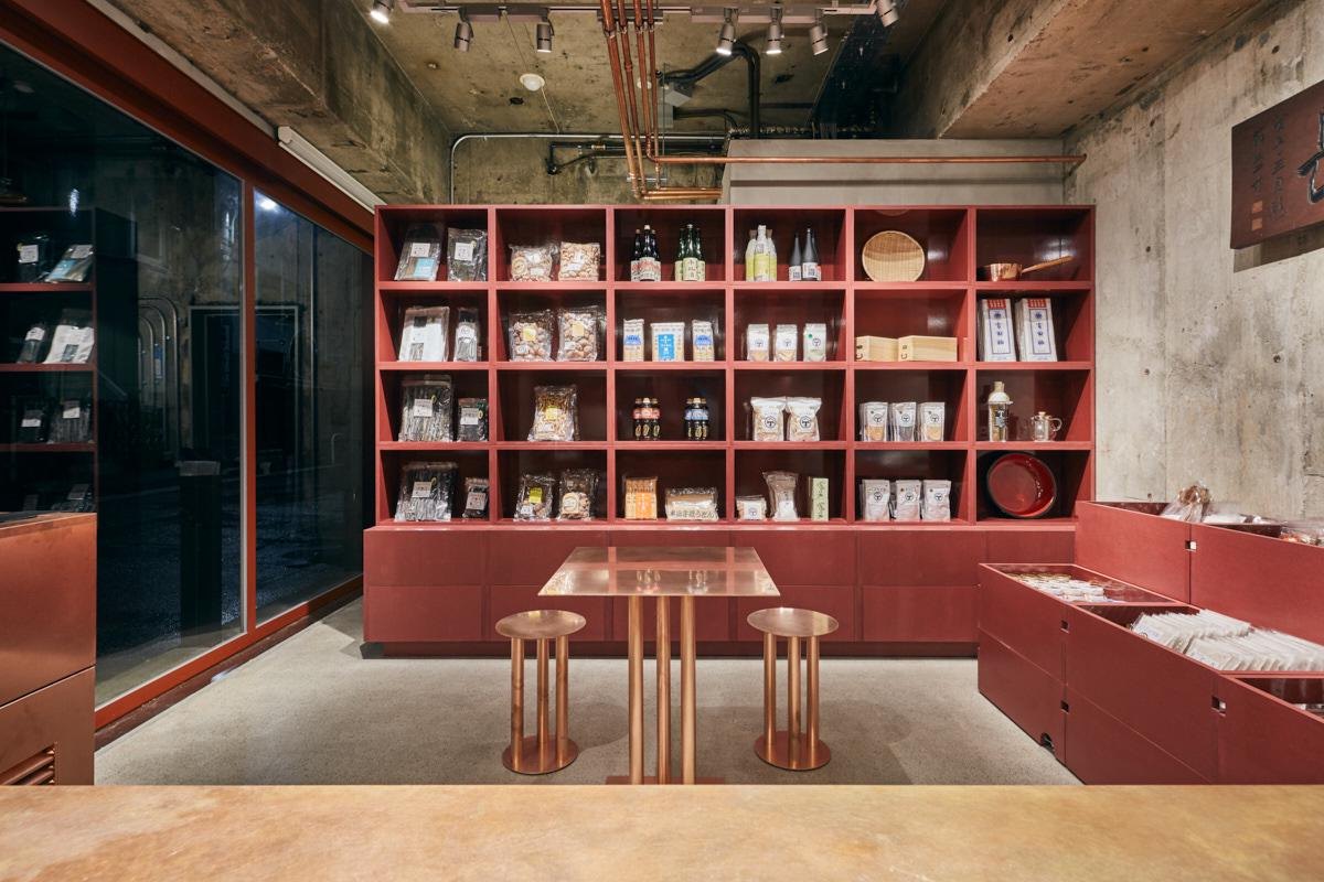
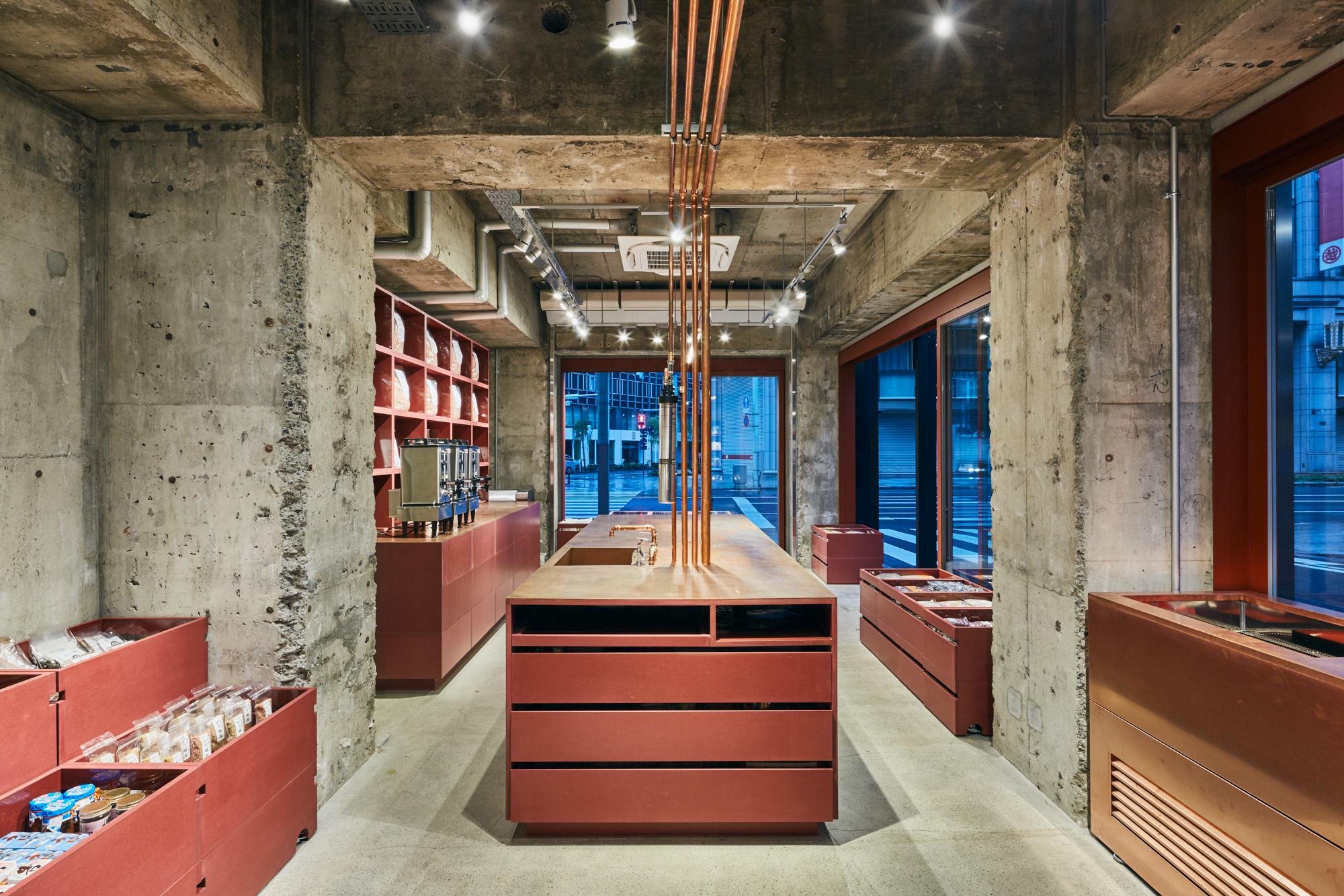
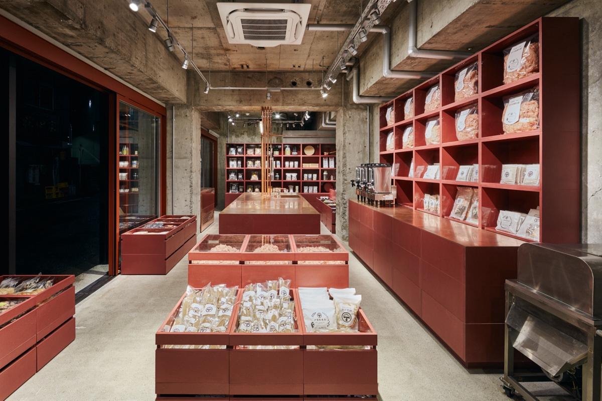
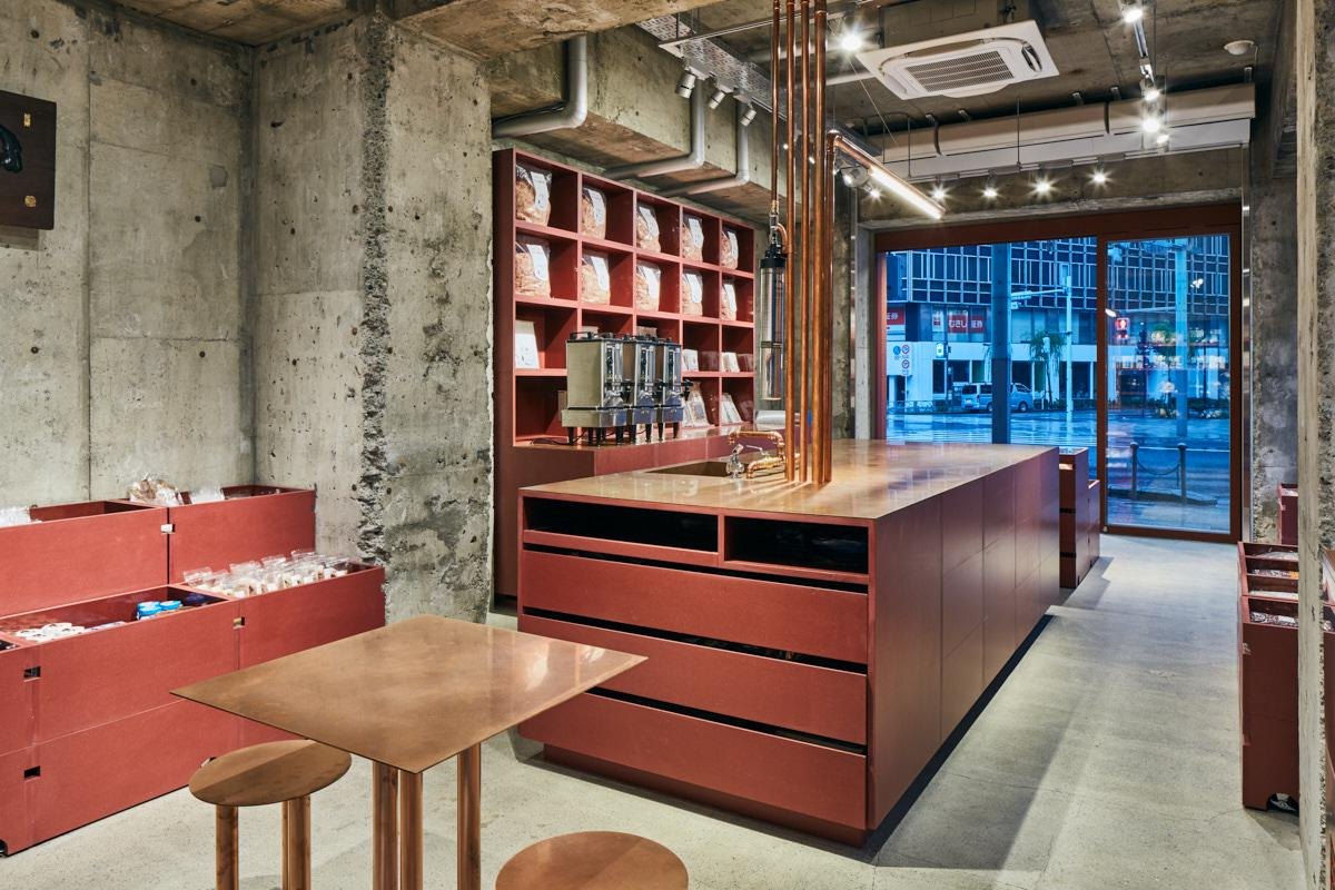
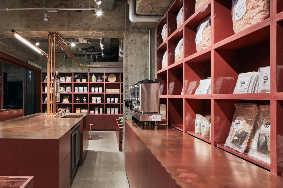
    Display boxes were made from MDF in the same red and stacked through the store, turning the sales floor into something closer to a market. Against bare concrete columns and ceilings, the boxes and shelving read as one continuous piece of furniture.

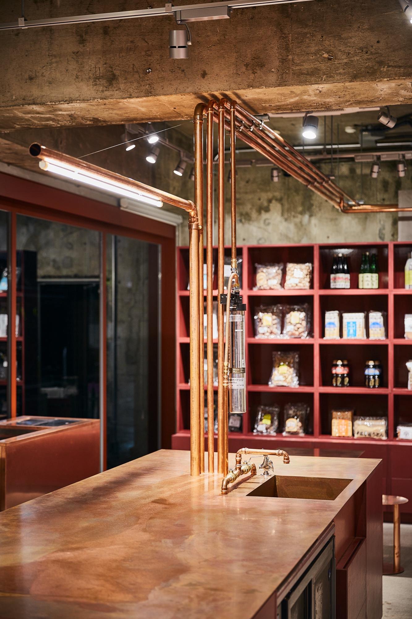
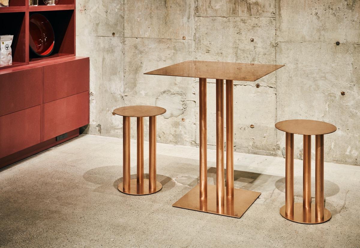
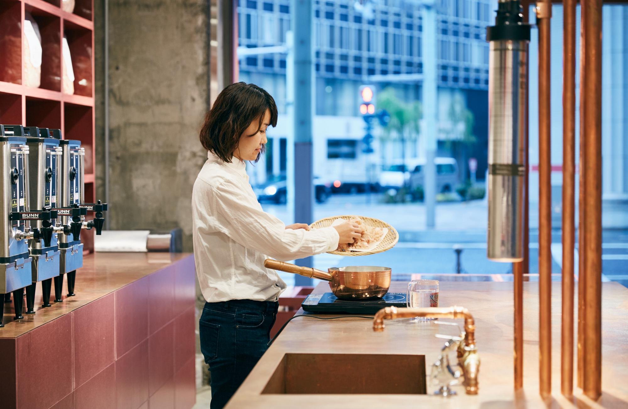
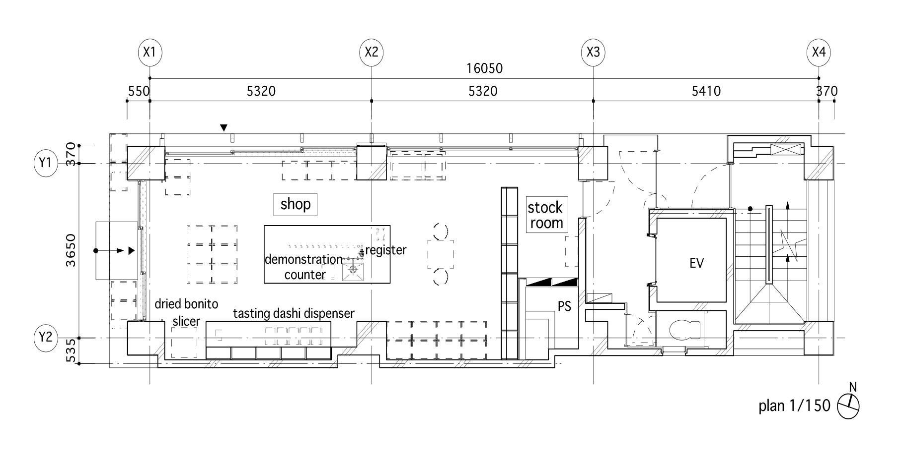
    At the centre stands a counter topped in copper. It serves as the till and as a kitchen where staff show how to make a first dashi. Set as an island, it puts staff and customers on an equal footing and invites conversation.
    On fine days every door is opened. The store spills toward the pavement, people drift in and out, and its activity becomes part of the street.

    Red shelving and display boxes inside the store
    Store front with the signboard at night
    Glazed frontage lit at night
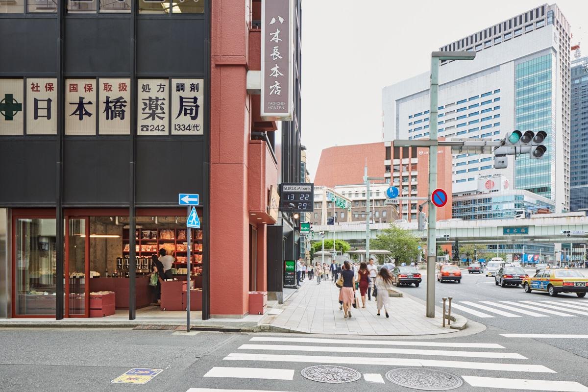
    The narrow red building between taller neighbours
    The store on a busy street corner
    Red shelves behind the copper-topped counter
    Stacked red boxes forming a market floor
    Island counter between exposed concrete columns
    View through rows of red display boxes
    Copper pipes framing the central counter
    Copper column by the window
    Red display boxes under the old signboard
    Island counter and stools near the street windows
    Copper stools and high table
    Dried bonito flakes in a glass-topped box
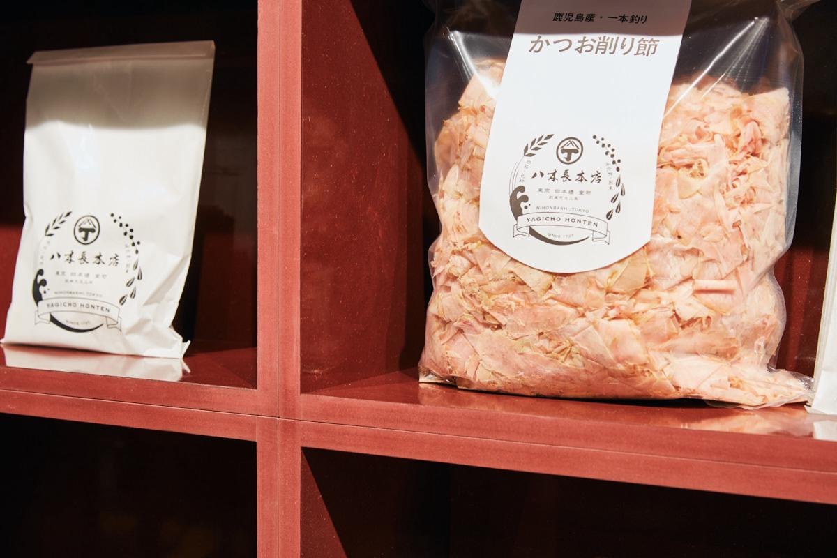
    Shelves of packaged dried foods
    Packaged products on red shelving
    Making dashi at the counter
    Interior seen through the open doors
    The store from the street crossing
    Floor plan
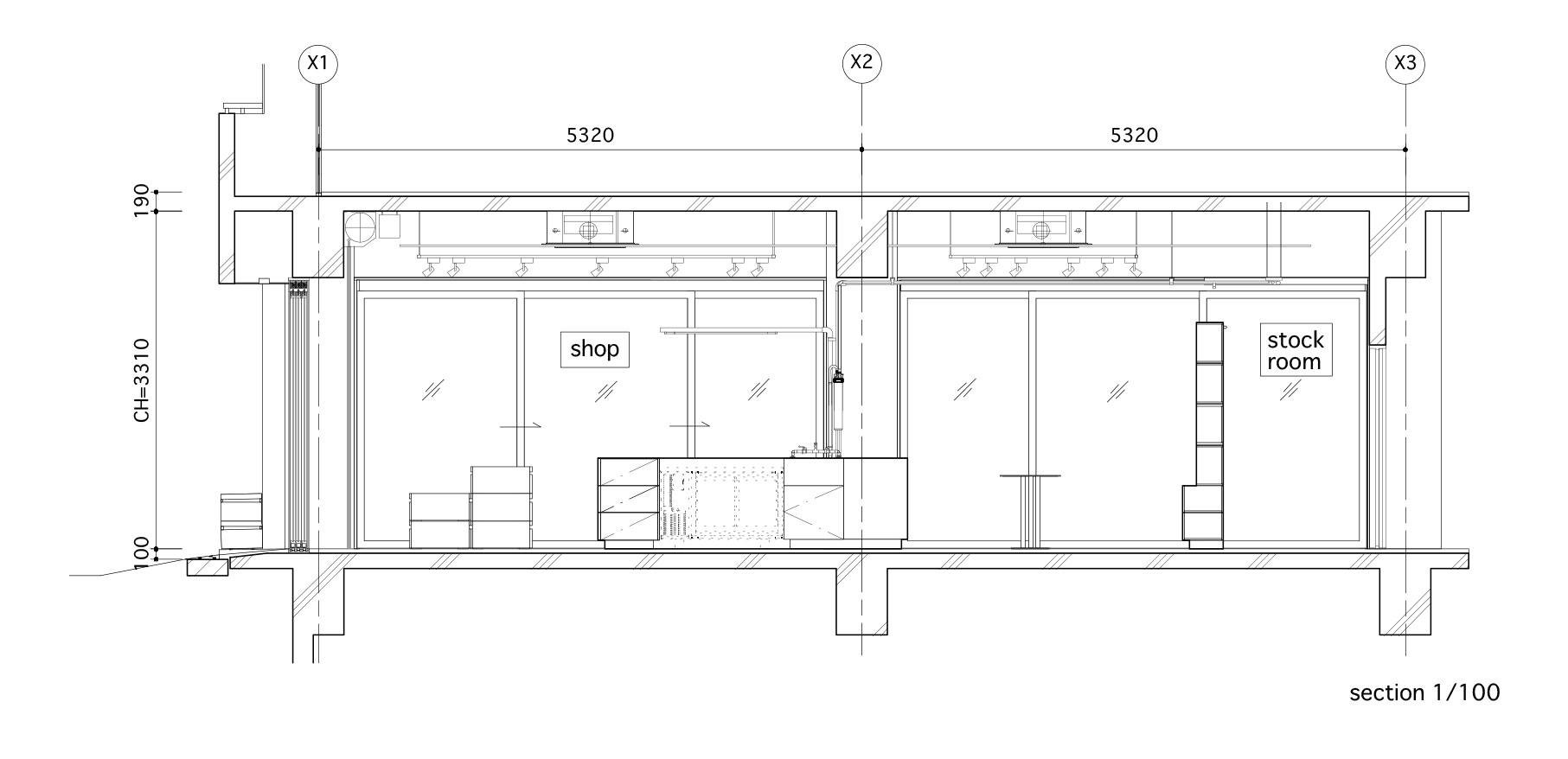
    Section
  • Blue Bottle Coffee Sangenjaya Cafe

    Blue Bottle Coffee Sangenjaya Cafe

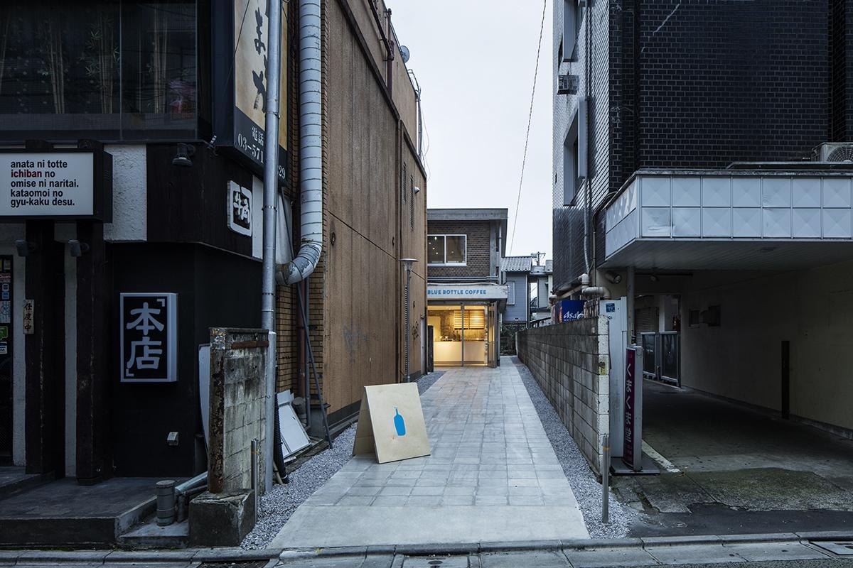
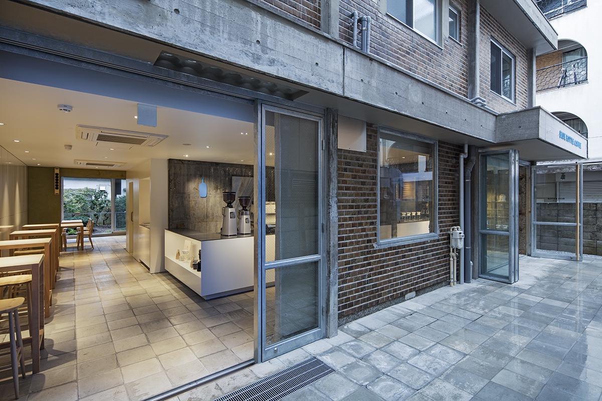
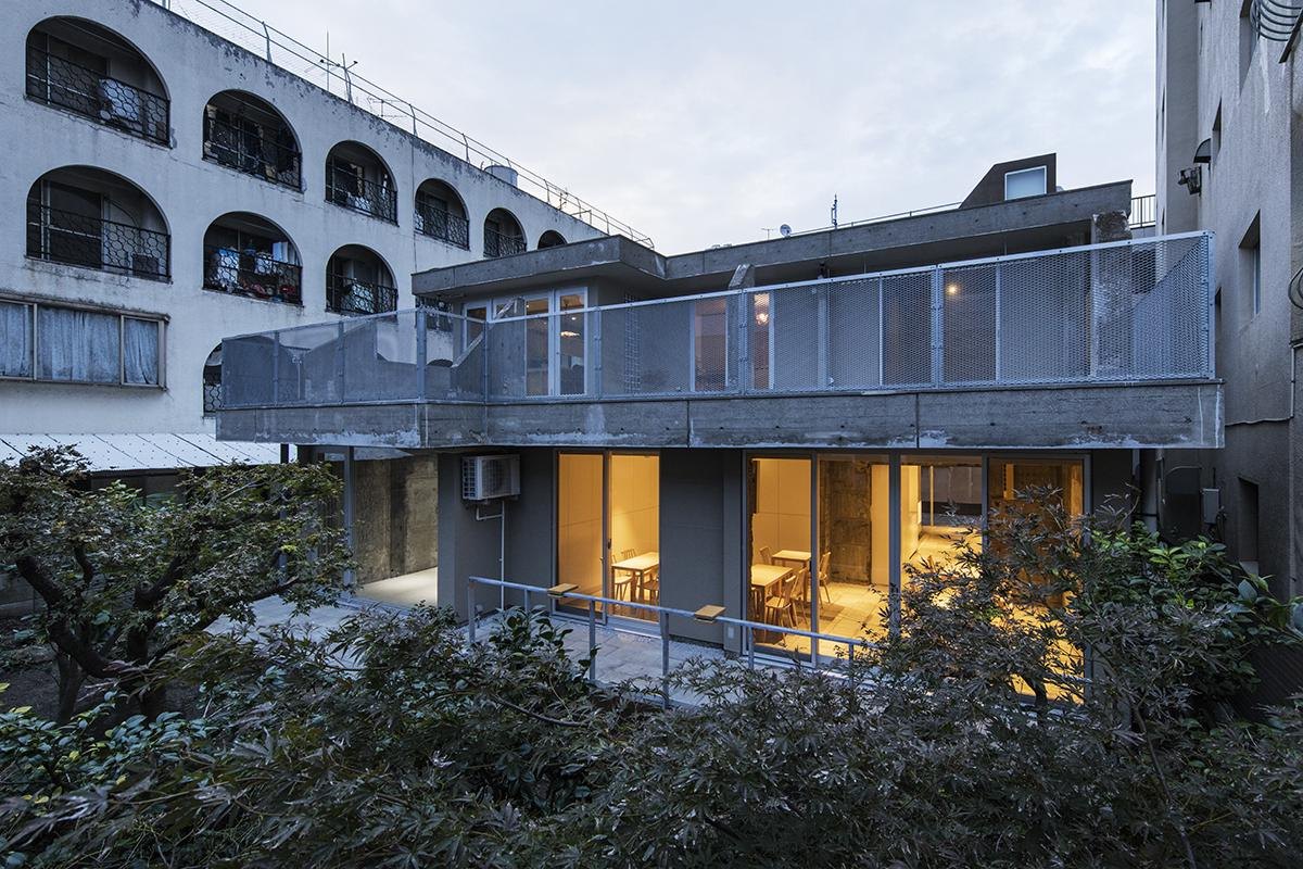
    A fifty-year-old low building stands at the end of a dead-end lane between two larger blocks, a short walk from a railway station. From its doorstep the sky opens wide overhead, a rare sense of emptiness in a dense city.

    It had been the home and clinic of the client’s grandfather, who also painted there in his later years. The site could easily have carried a new commercial or apartment building. Out of regard for him, the family chose to keep the house and make it a place for the neighbourhood rather than chase returns.

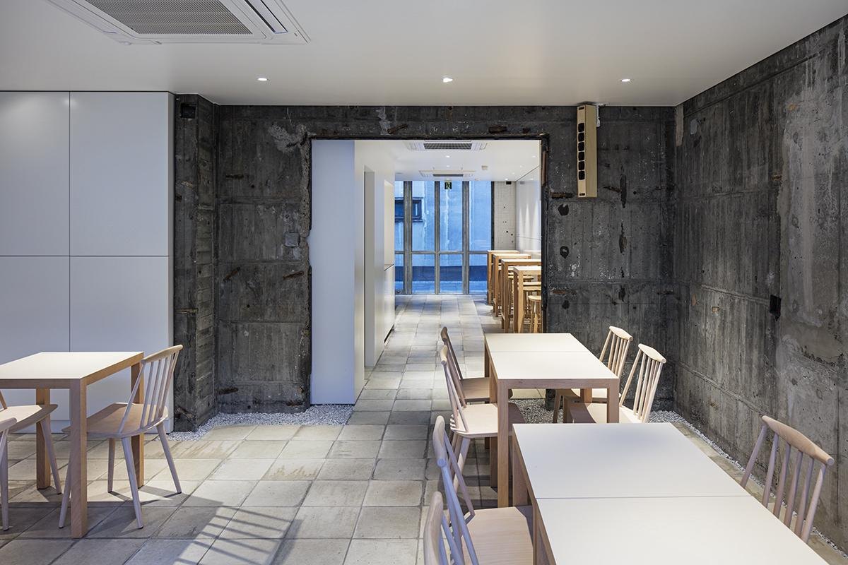
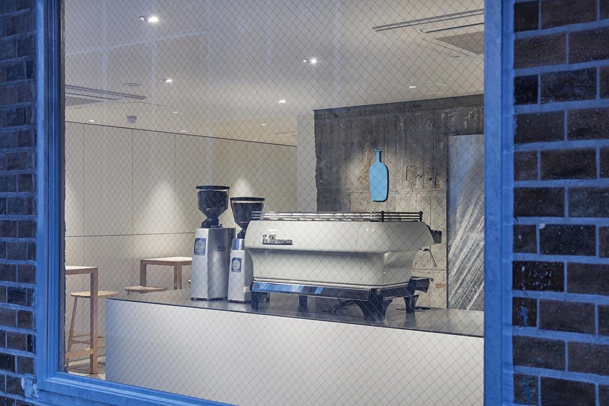
    A first renovation created a residence upstairs and a gallery on the ground floor. The family then looked for a tenant, and a coffee company that shared their outlook opened a cafe in the remaining space.
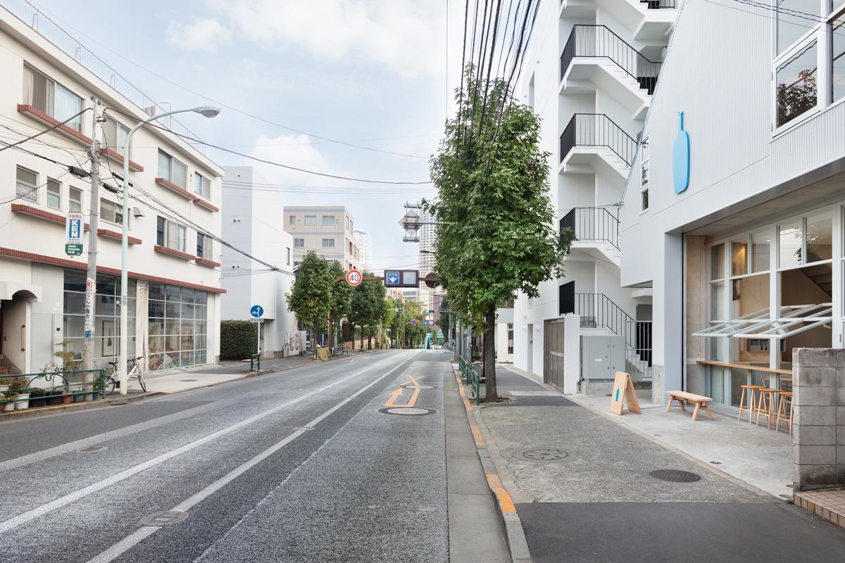
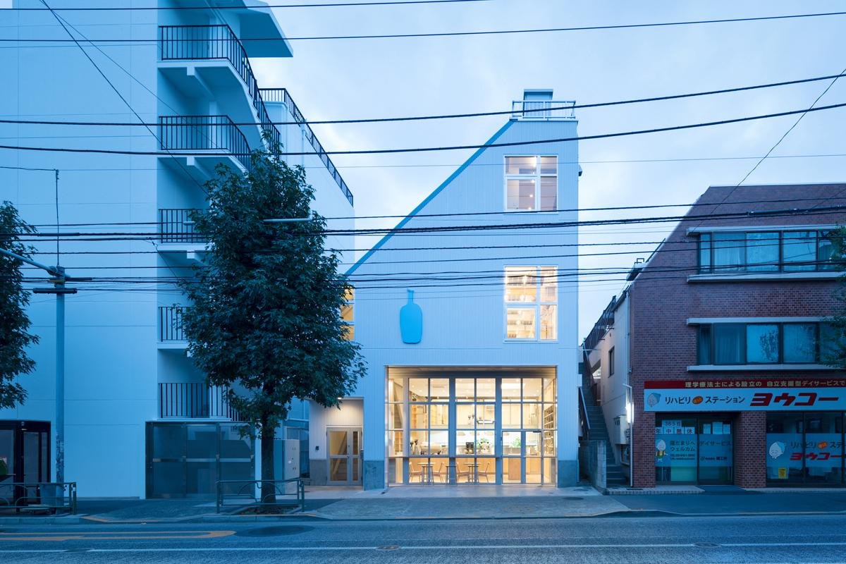
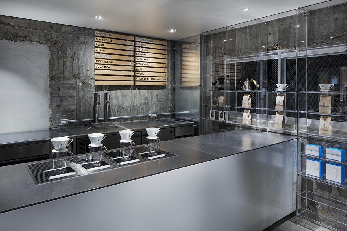
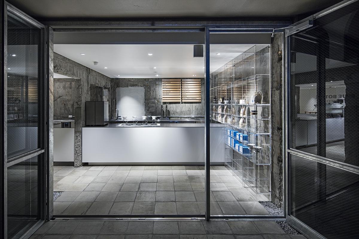
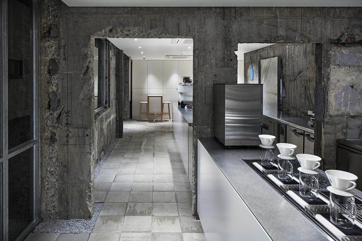
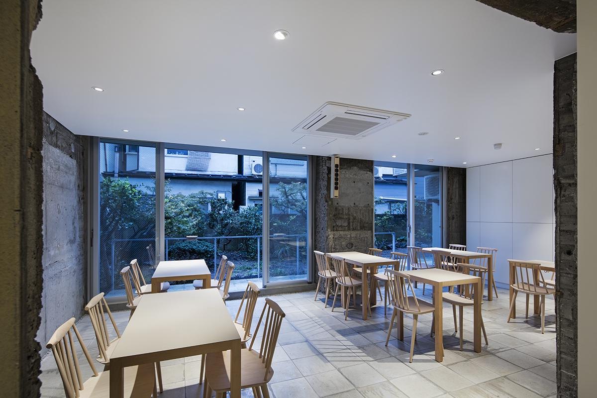
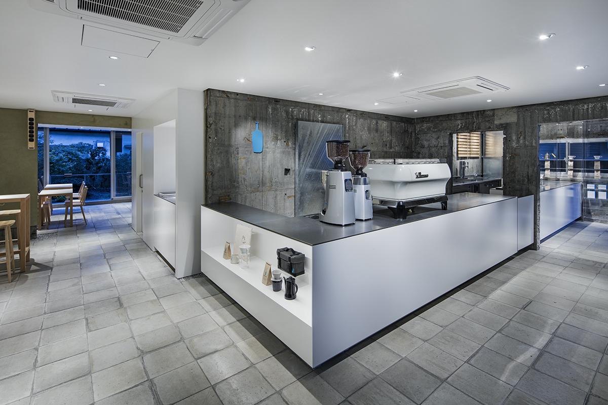
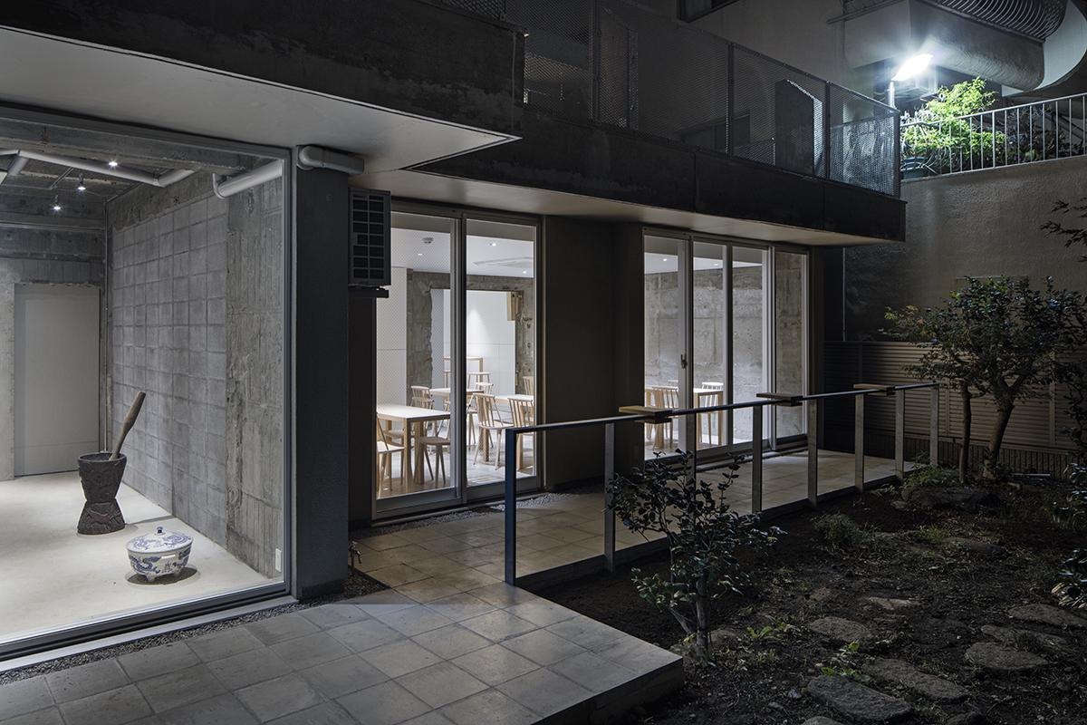
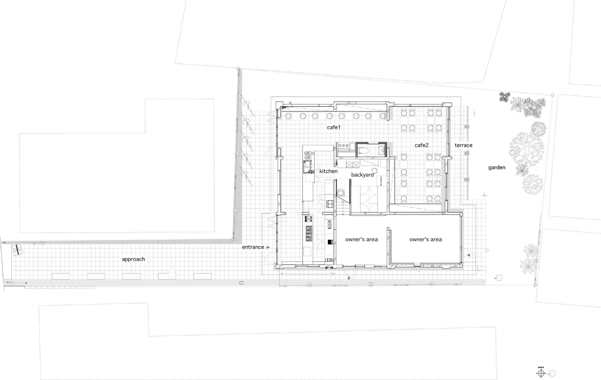
    The lane runs from a busy shopping street toward quiet houses and ends in a garden, an unexpected luxury so close to the centre. The cafe draws out that depth. Customers walk to the register at the far end, stop at the drip bar, pass through the seating, step out to the garden and then follow the building to the gallery entrance. Precast concrete paving traces the whole route, tying inside to outside and the building back to the street.
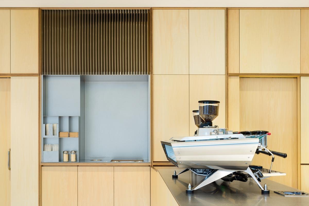
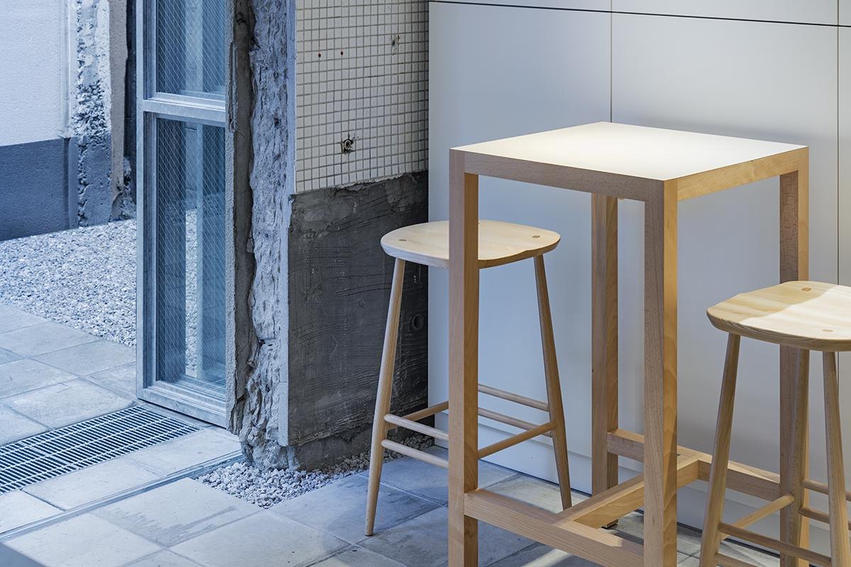
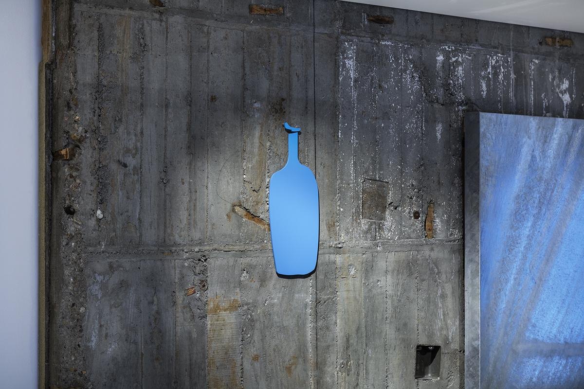
    The original concrete, cast against cedar formwork, still shows the grain of the boards. Its rough surface reminded the coffee company’s founder of a musician’s idea of balancing roughness and softness, and the interior grew from that pairing: raw walls against clean steel counters and pale timber furniture.

    The dead-end lane leading to the cafe
    Glazed entrance looking into the counter
    Precast concrete paving past the drip bar
    Drip bar against the board-marked concrete wall
    Seating room opening toward the garden
    Stools by the board-marked concrete wall
    Seating area facing the garden
    Espresso counter with seating beyond
    Logo on the existing concrete wall
    Counter seen through a brick-framed window
    Terrace along the building with precast slabs
    Gallery entrance at night
    The building and garden at dusk
    Site plan
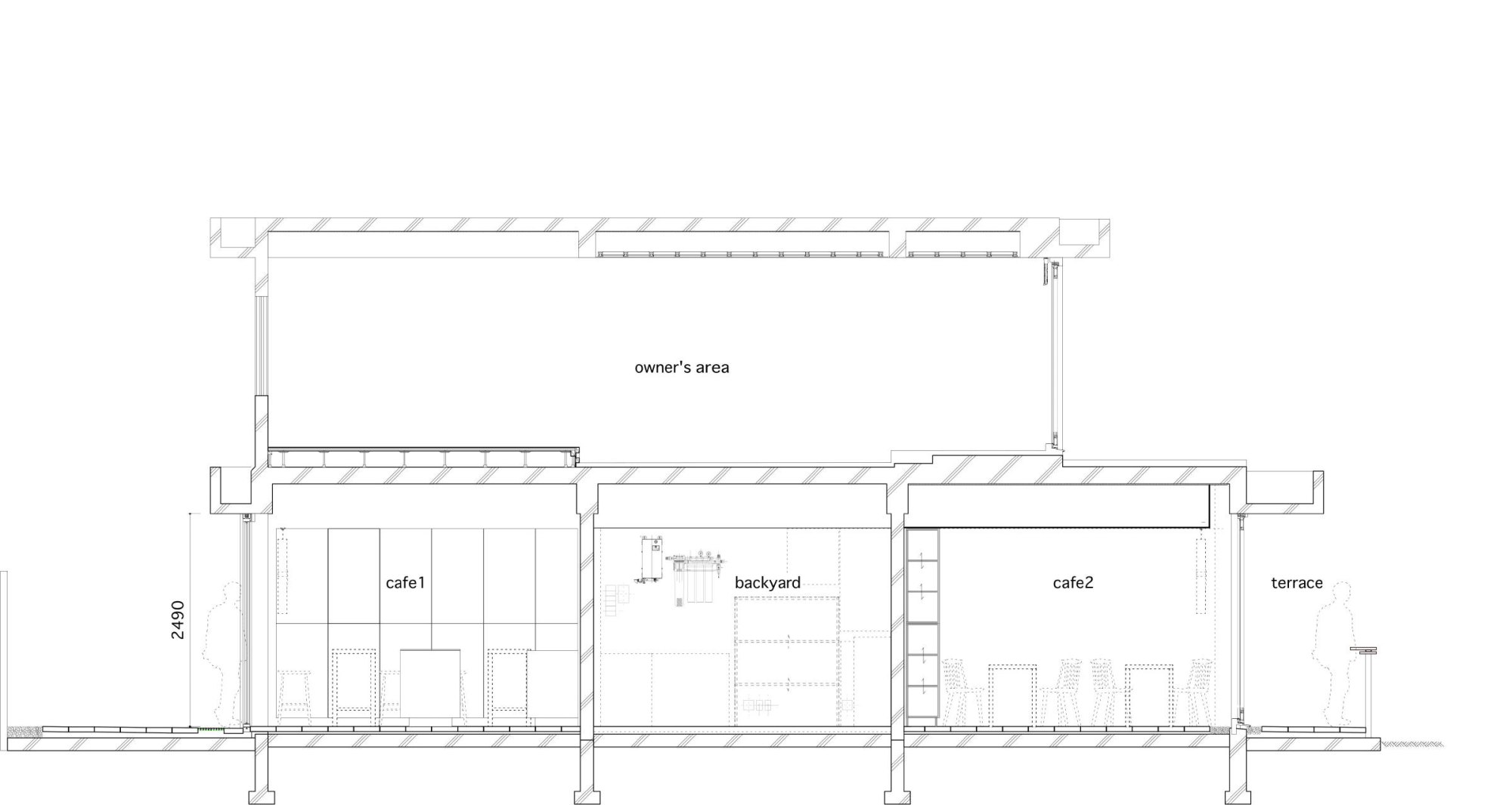
    Section

Newsletter

A monthly letter from NOTES with new projects, dialogues and essays.