Author: pluto

  • °C (Do-C) Gotanda

    °C (Do-C) Gotanda

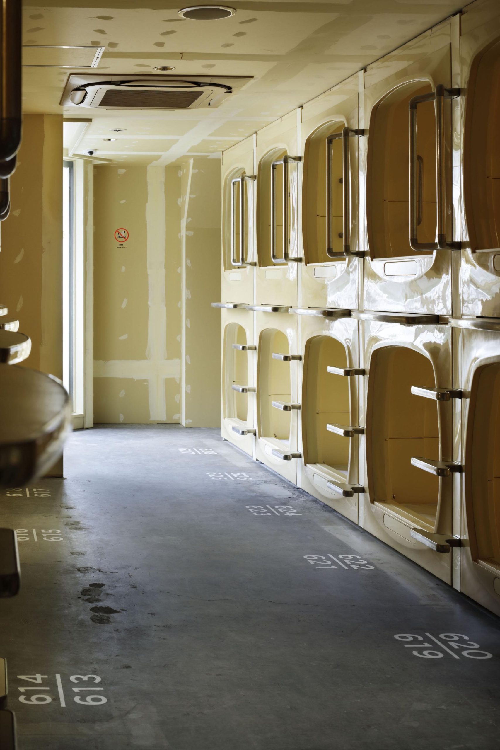
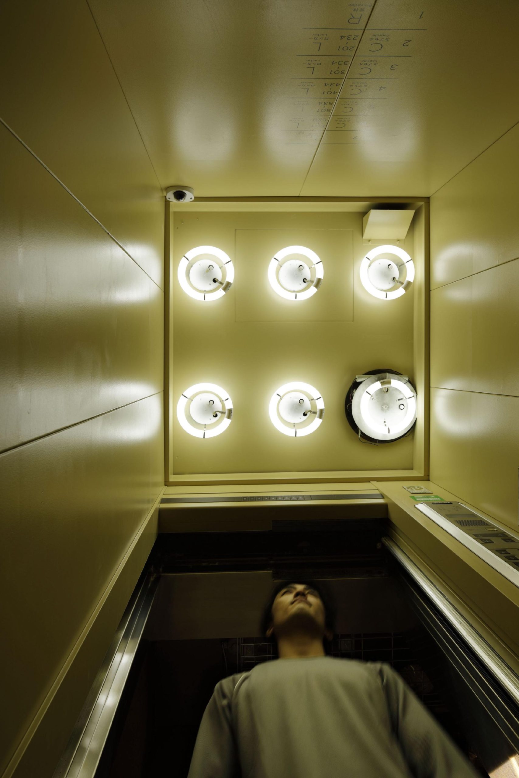
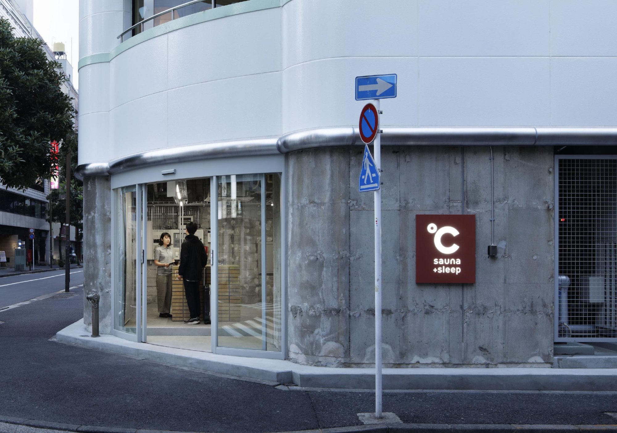
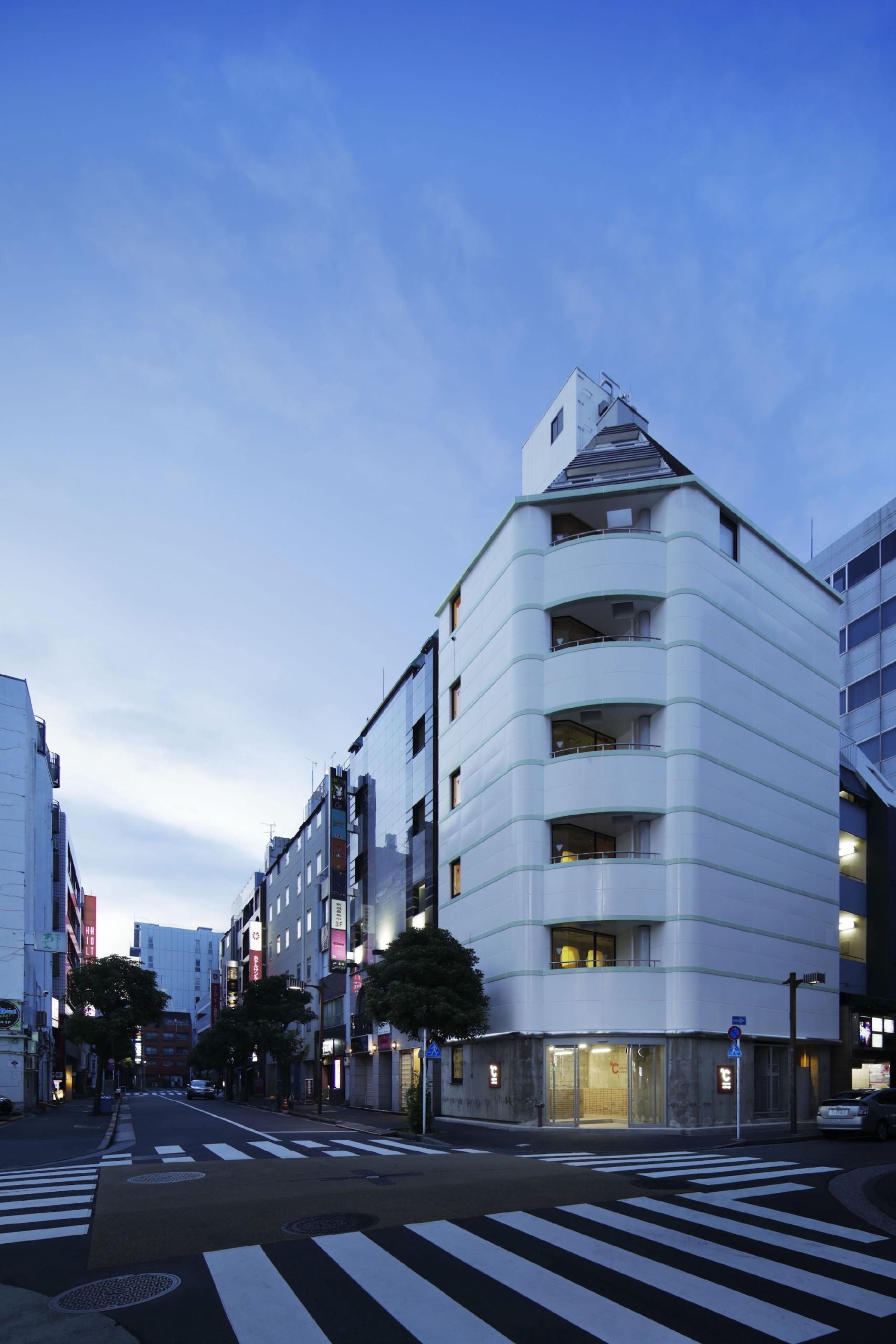
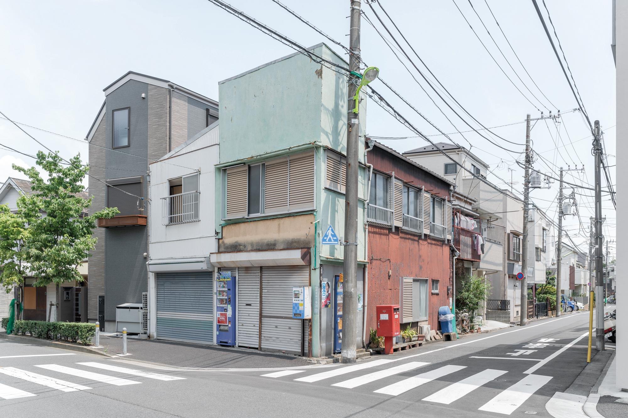
    The second branch of a capsule hotel chain sits on a street corner in a busy nightlife district next to a railway station. The building had already been a capsule hotel under another operator, and its capsule units were kept. Given the neighbourhood, the hotel takes male guests only.

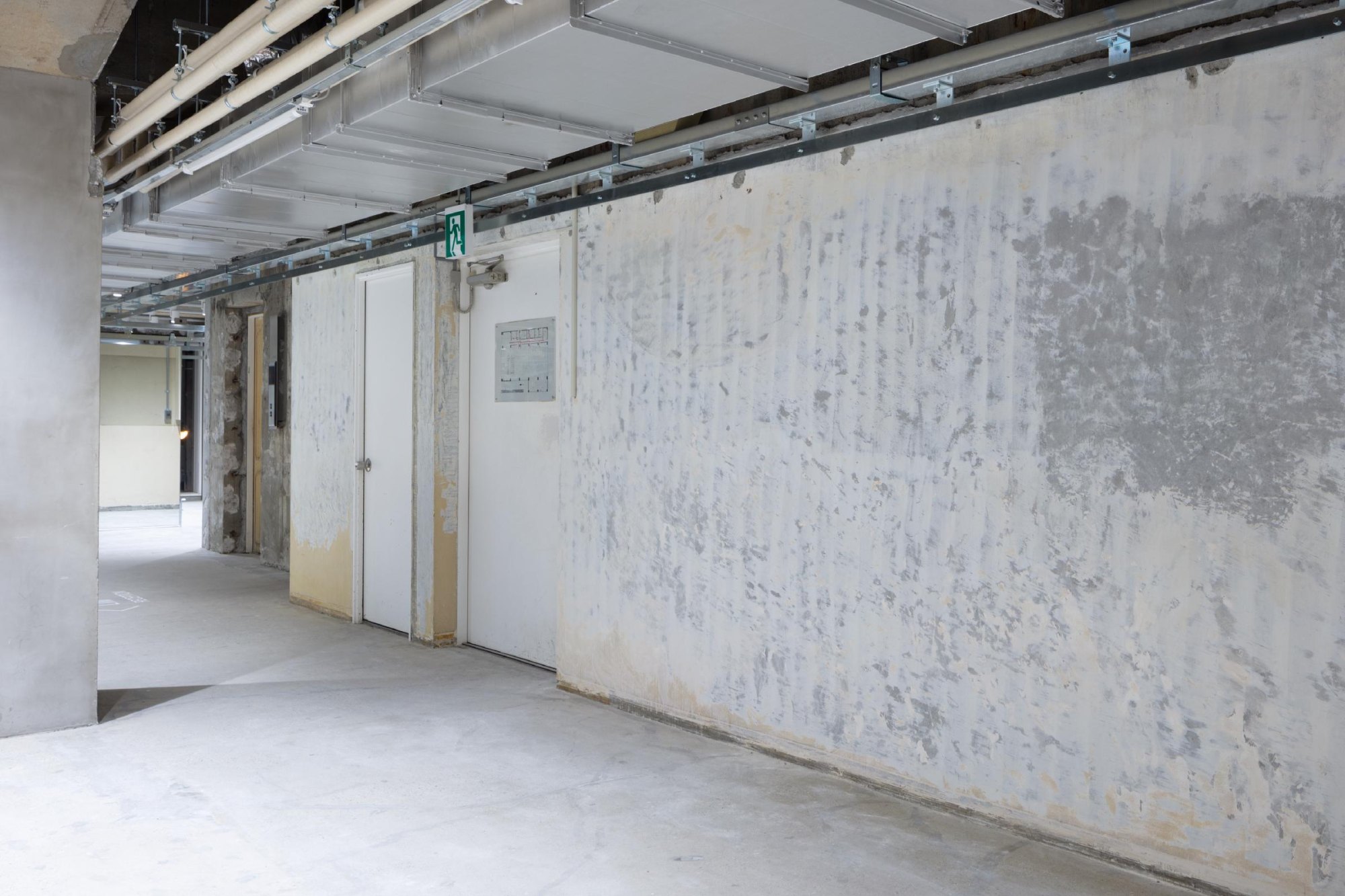
    A first-time guest walking through this rough part of town may be relieved to spot the hotel on its corner, then uneasy again on stepping inside and wondering whether the work is finished. That doubt is intended. The building was stripped back to the bare minimum, and the new spaces were made from what remained.

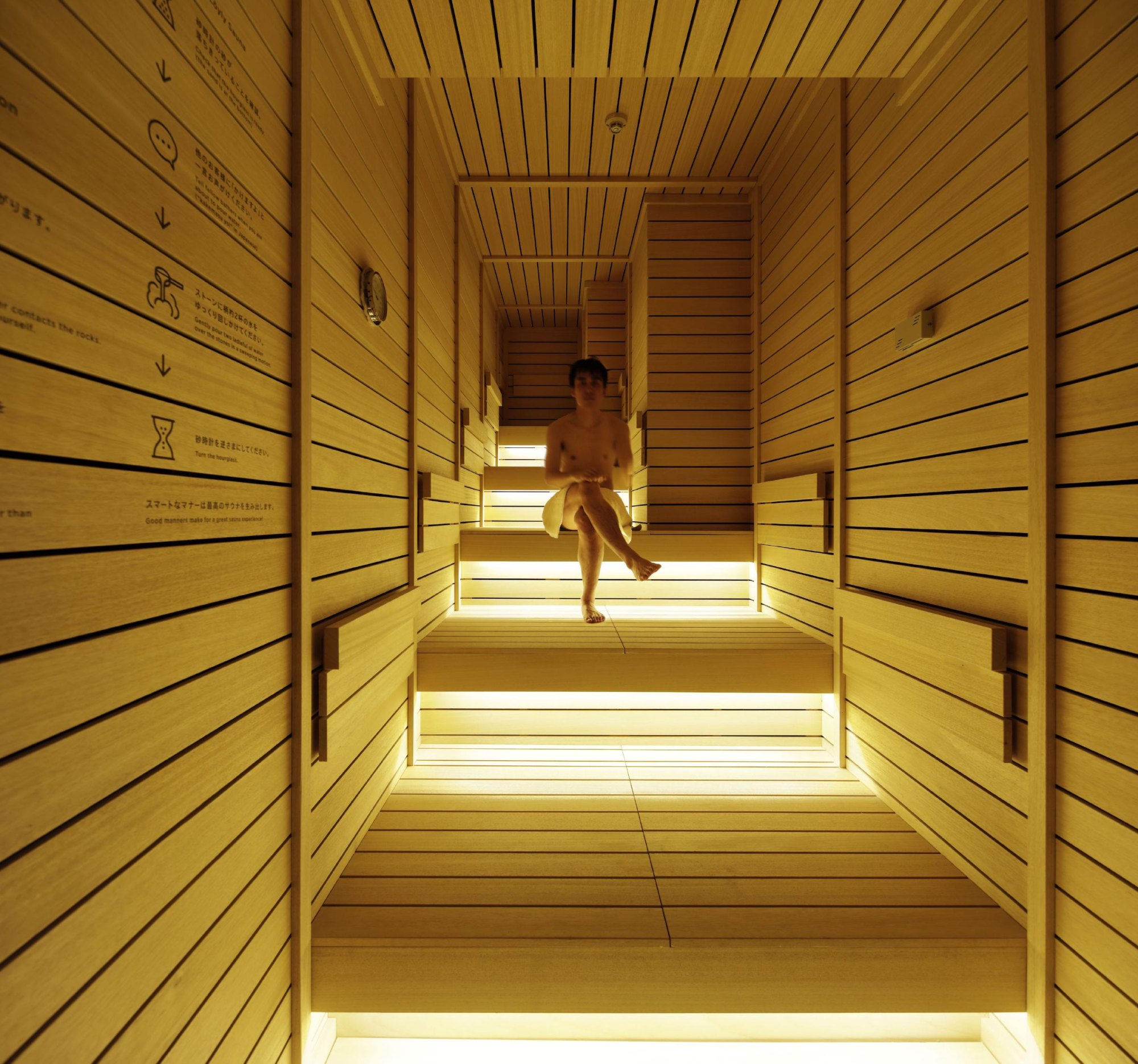
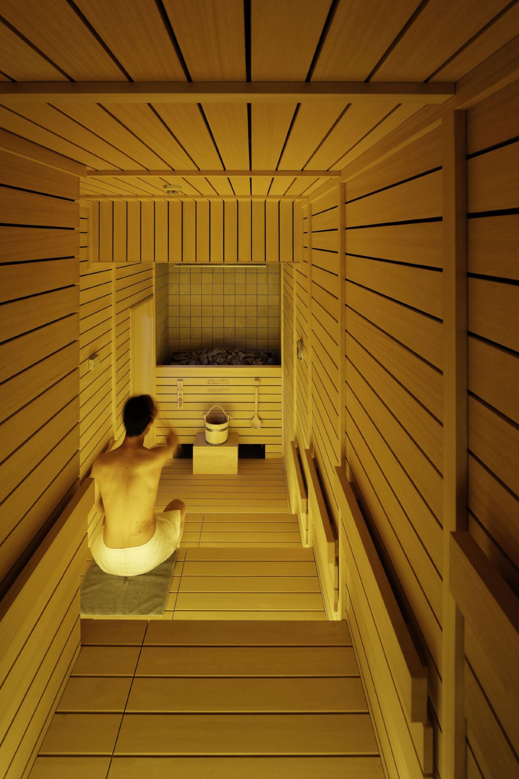
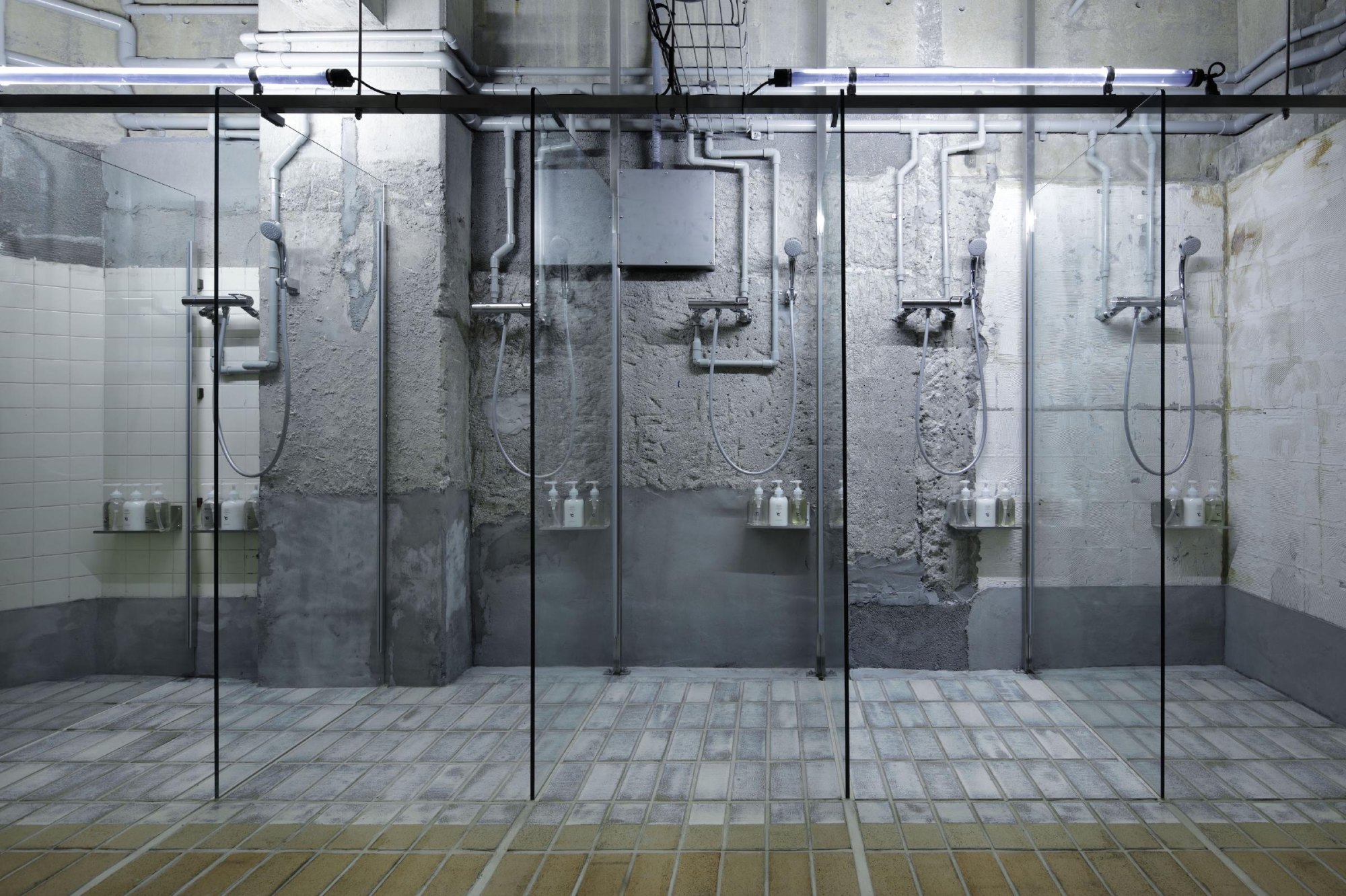
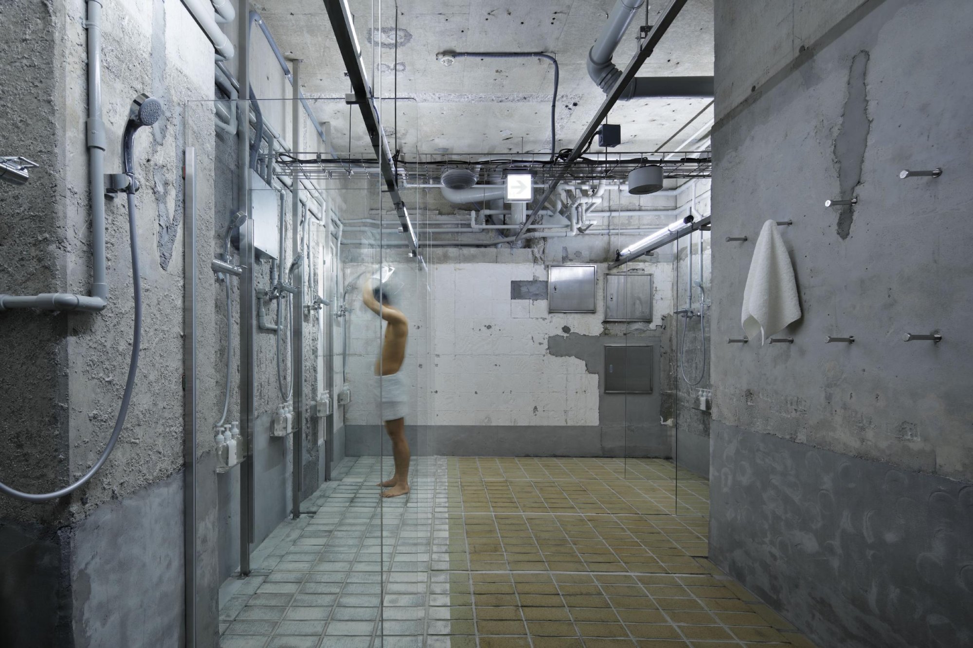
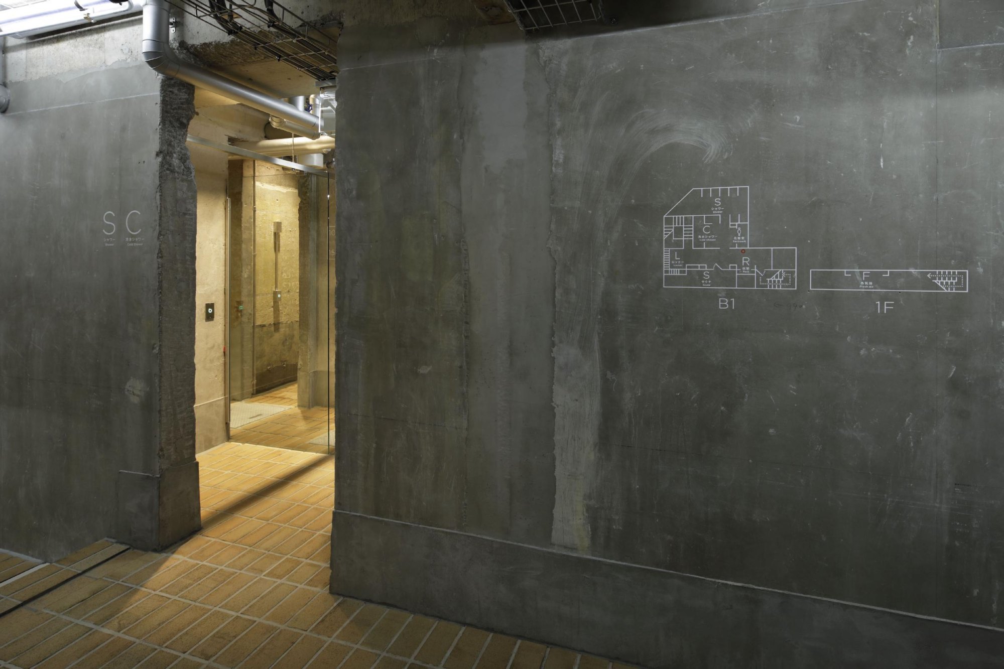
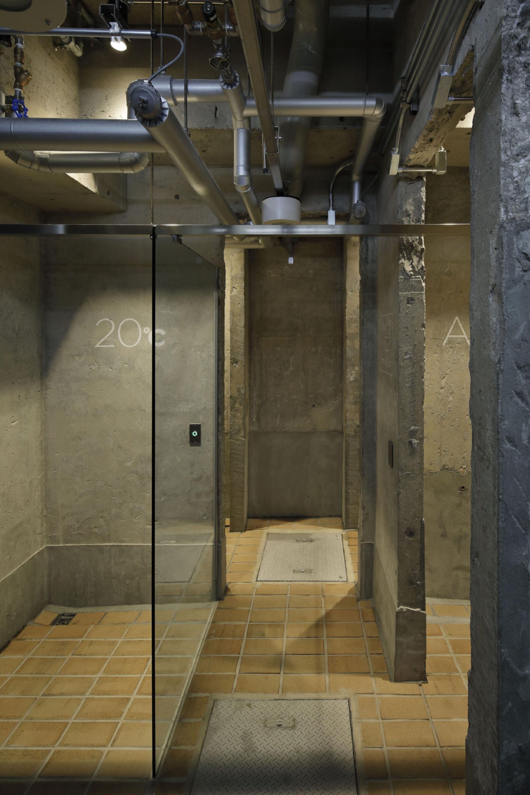
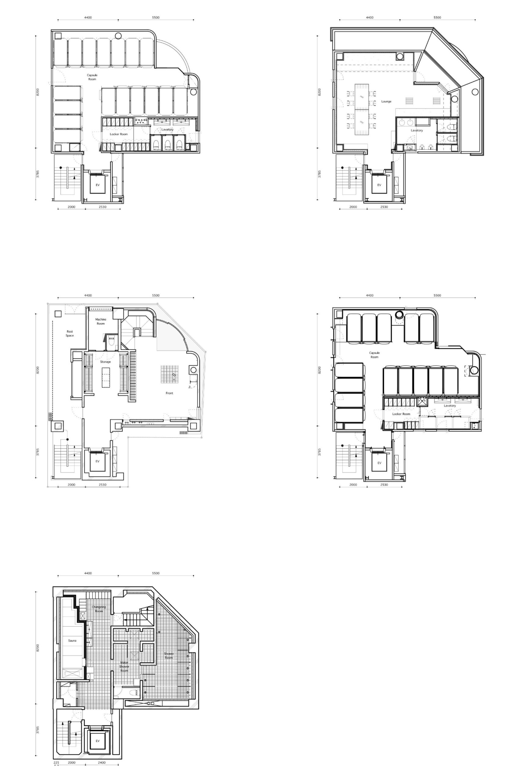
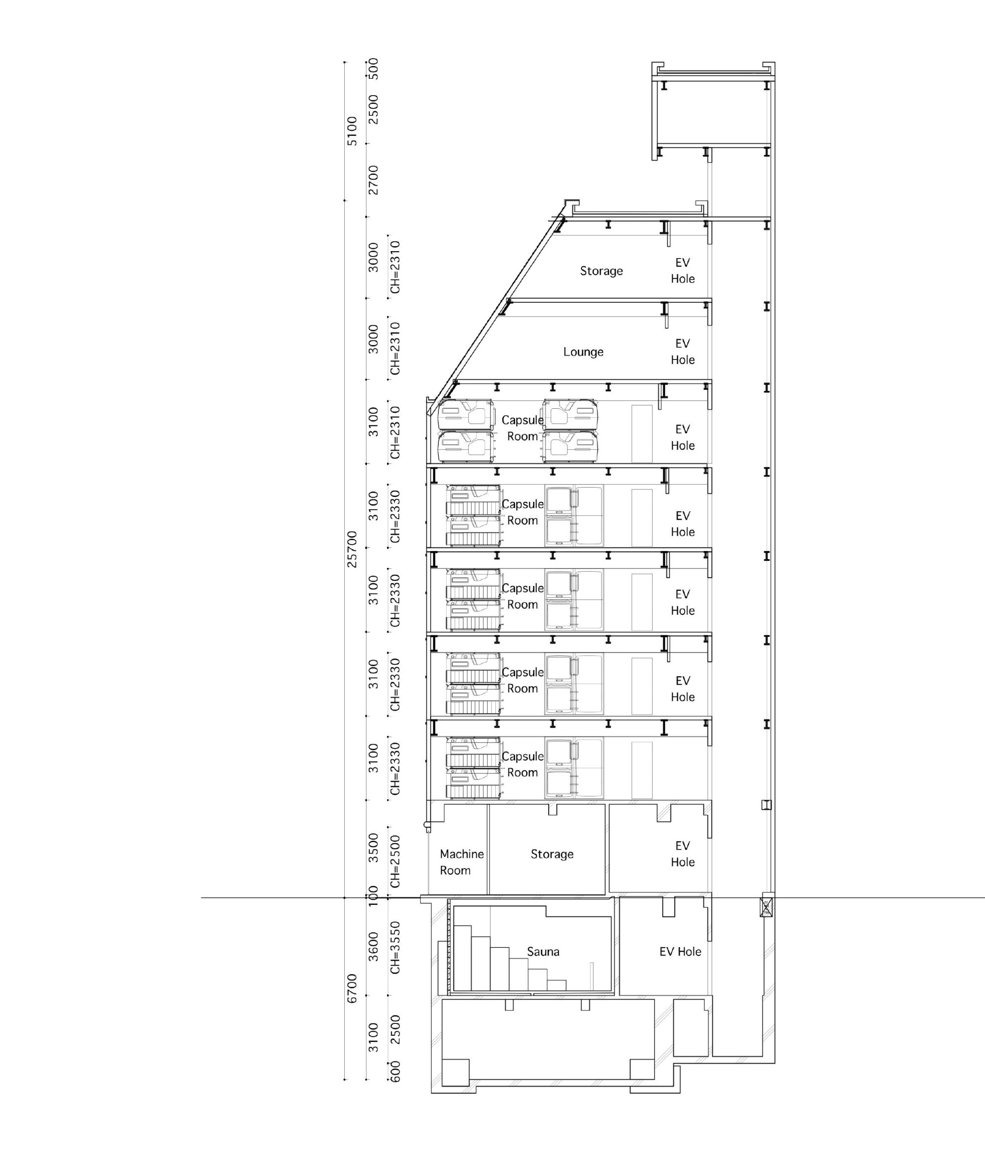
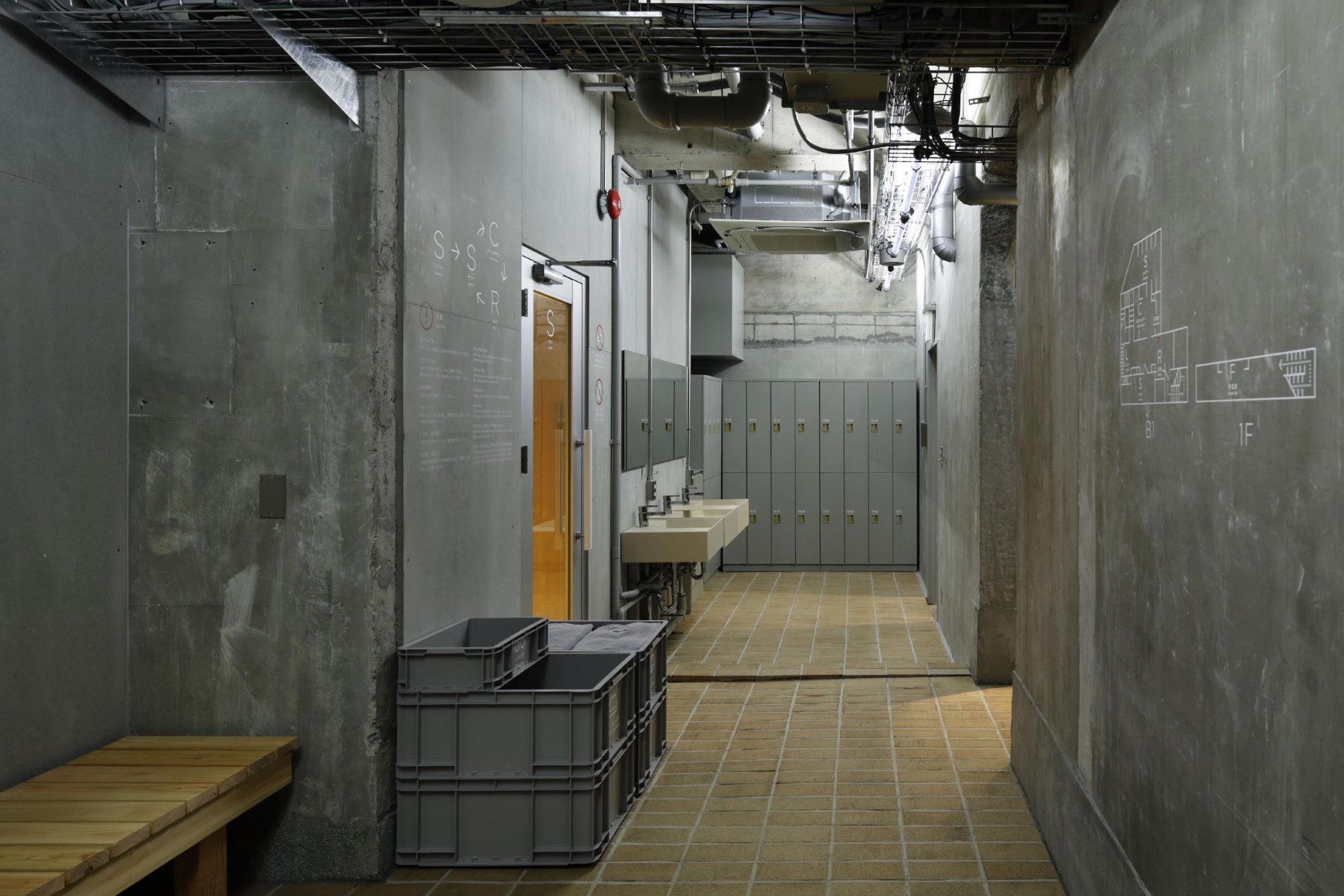
    Demolition left an odd interior of projections, recesses and dead ends, more like a cave than a building. The design team treated it as one, studying each leftover form to find what it could best hold. The old public bath in the basement became a sauna and shower room.

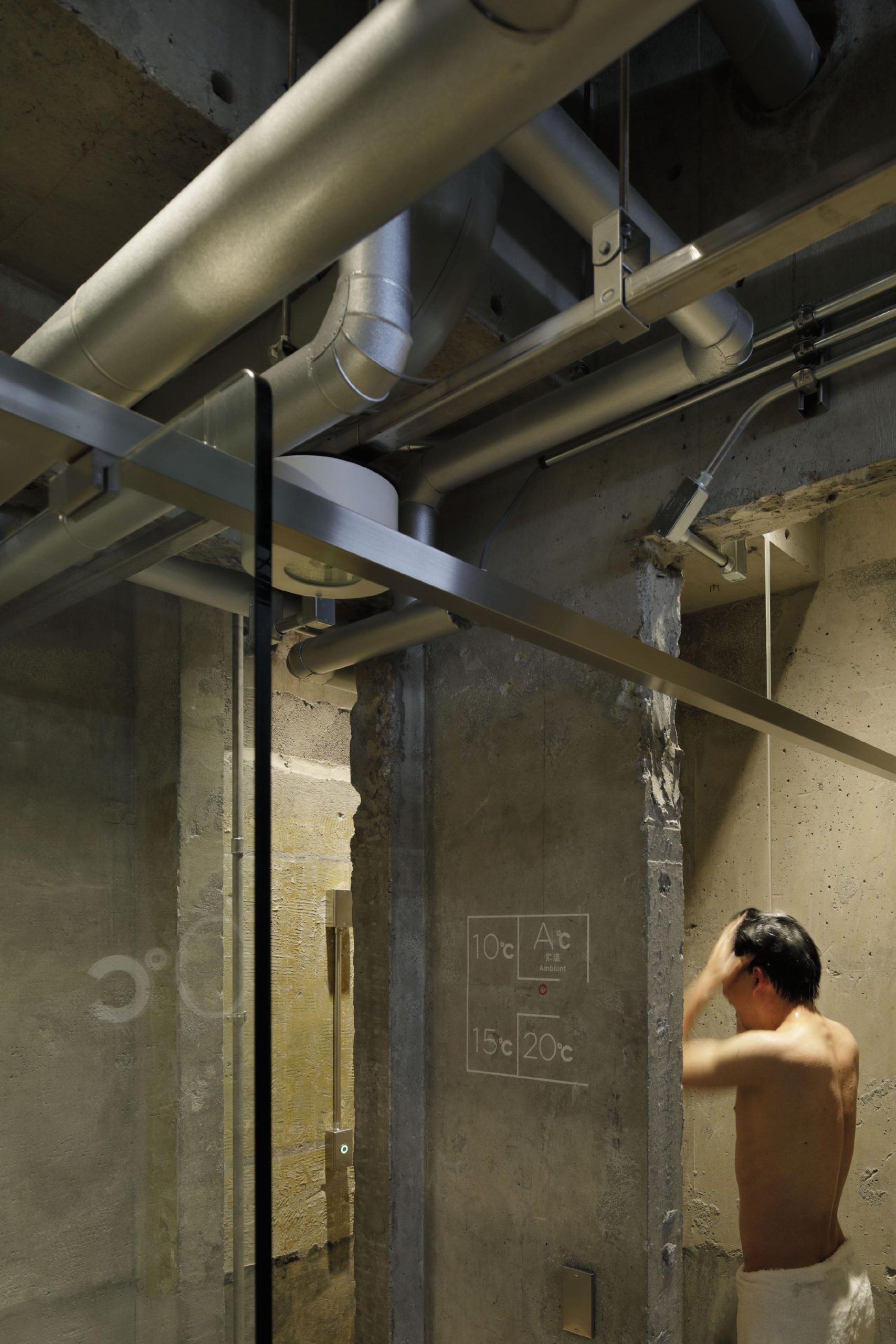
    A tall, narrow void was turned into a sauna with a stepped floor, so guests choose their heat by choosing their level. A small enclosed pocket, probably a former toilet, was lined with shower pillars that send strong jets of water from the walls.

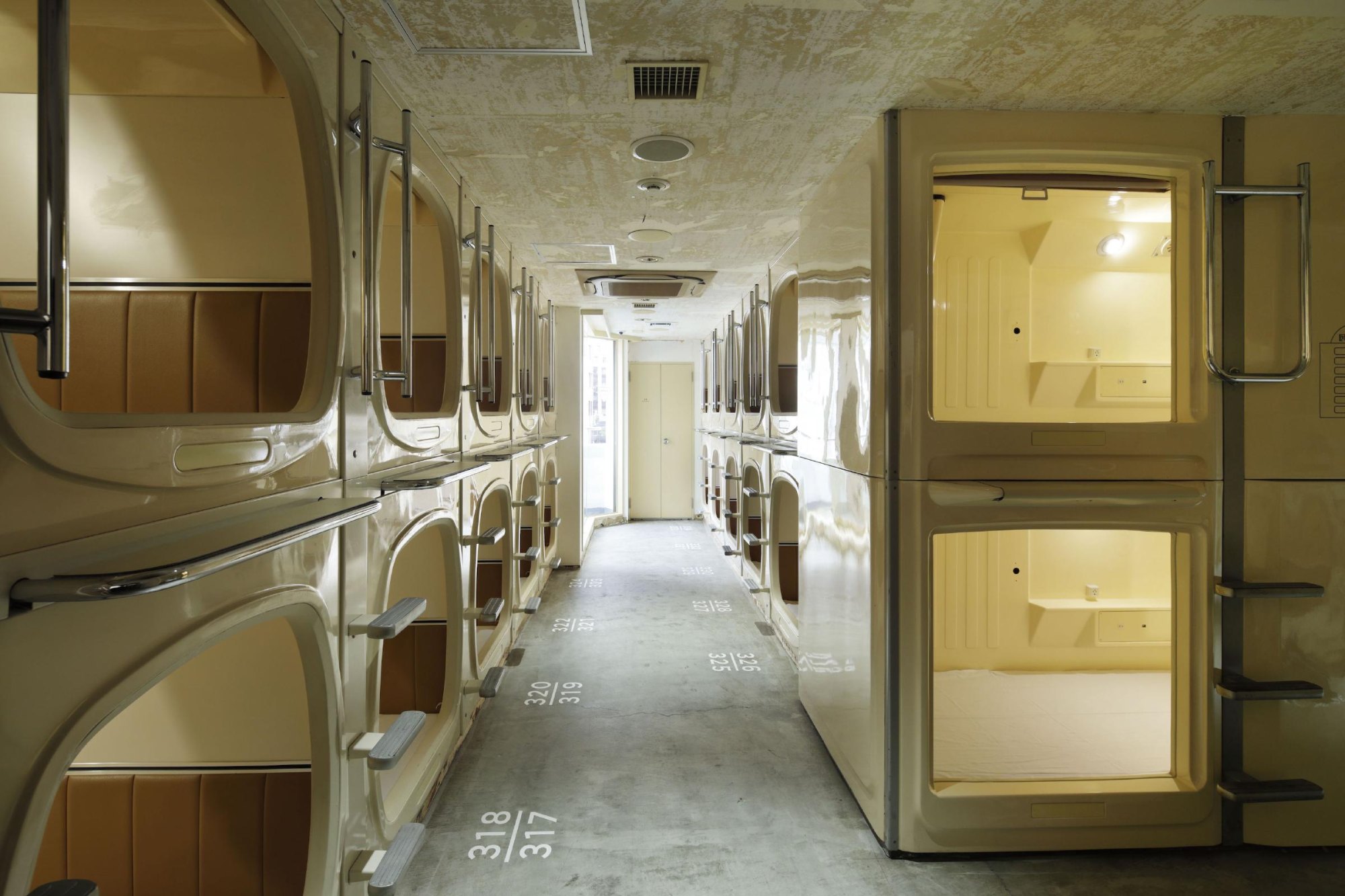
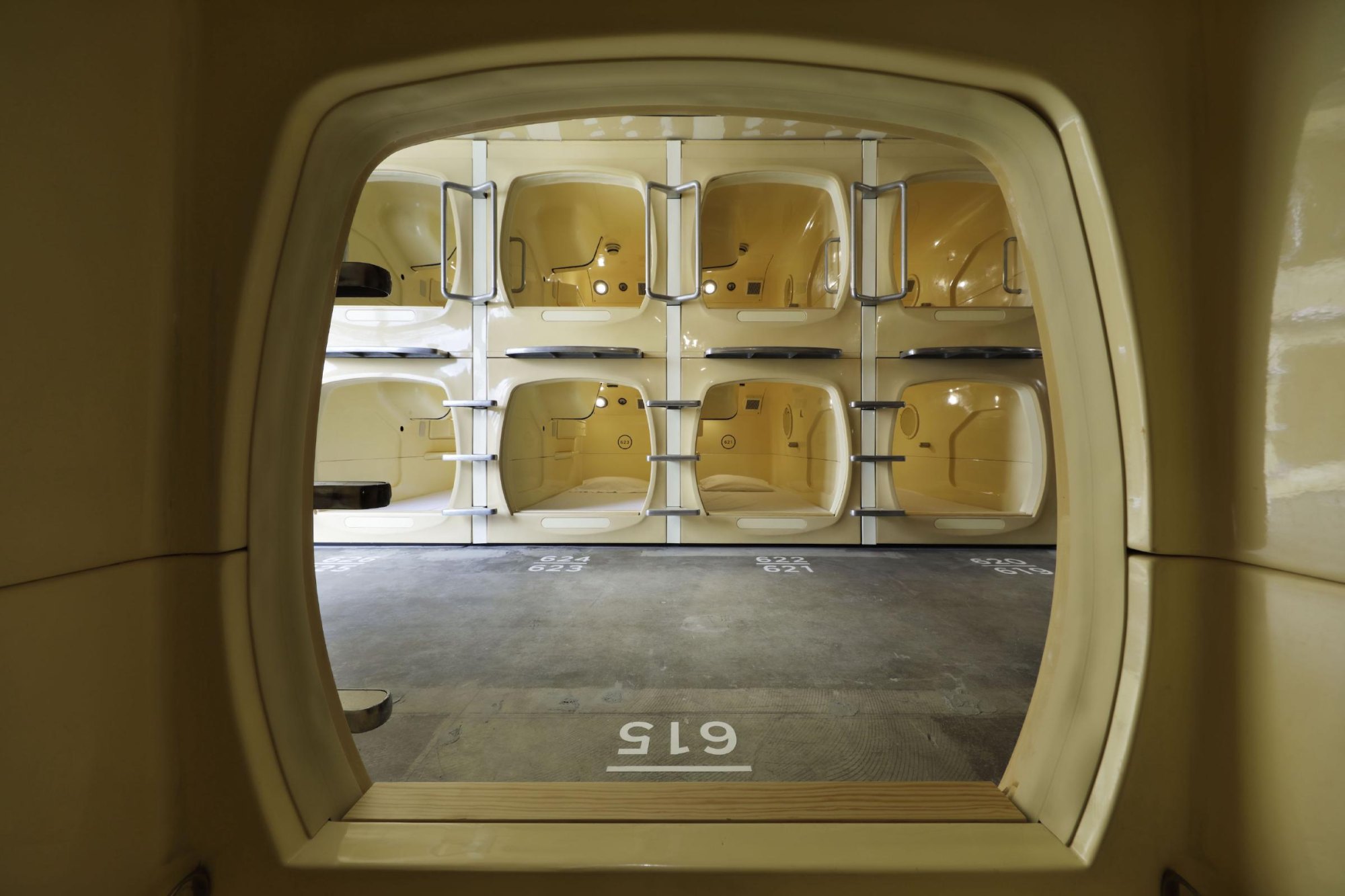
    On the guest floors the capsules stayed as they were. Old wallpaper was peeled away and new walls were left unfinished, so the dated capsules now sit against raw surfaces, and that contrast does most of the work of refreshing them.
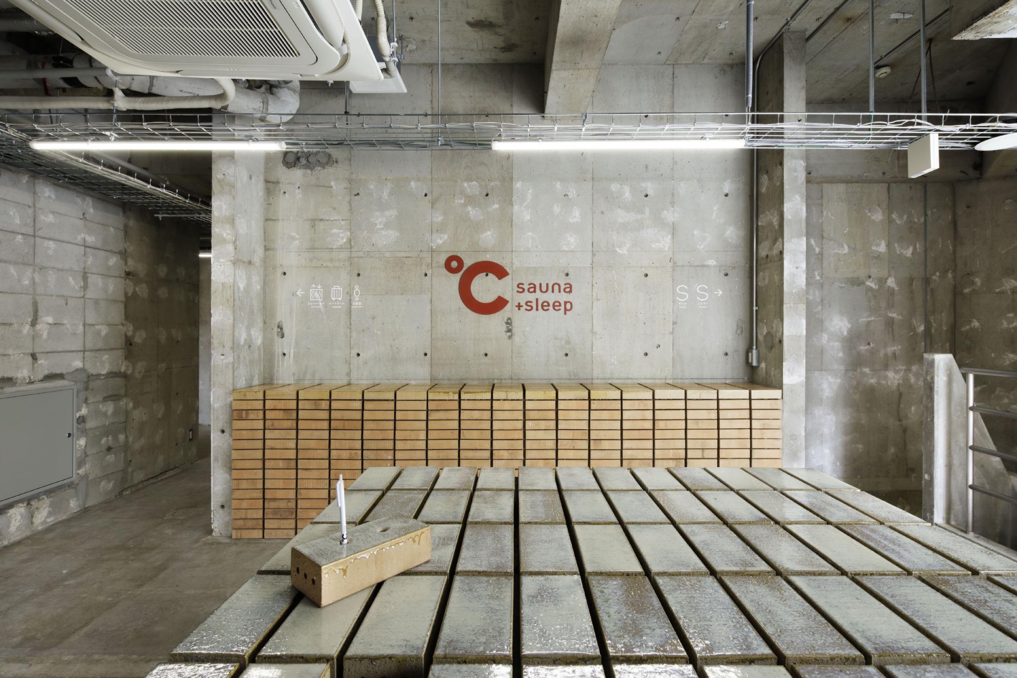
    Stripped basement with timber duckboards and the hotel logo
    Bare concrete corridor leading to the bath area
    Stepped timber sauna lit from below
    Guest on the upper tier of the sauna
    Shower stalls with exposed pipework
    Shower room stripped back to bare surfaces
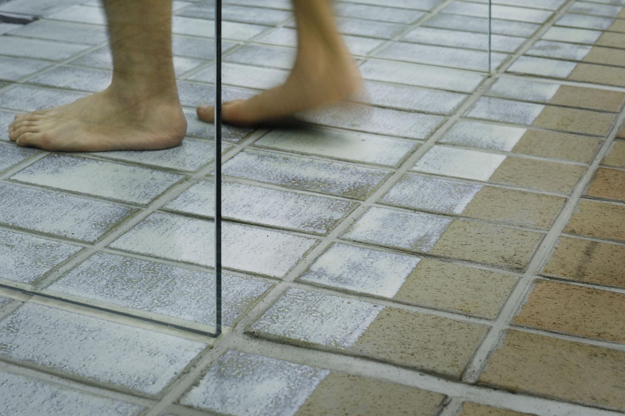
    Tiled floor in the wet area
    Glass partition and exposed ducts by the showers
    Existing capsule units along a corridor
    Capsules seen through a capsule opening
    Stacked capsules in a narrow aisle
    Unfinished walls with pencil markings
    Glass-enclosed shower in a bare concrete room
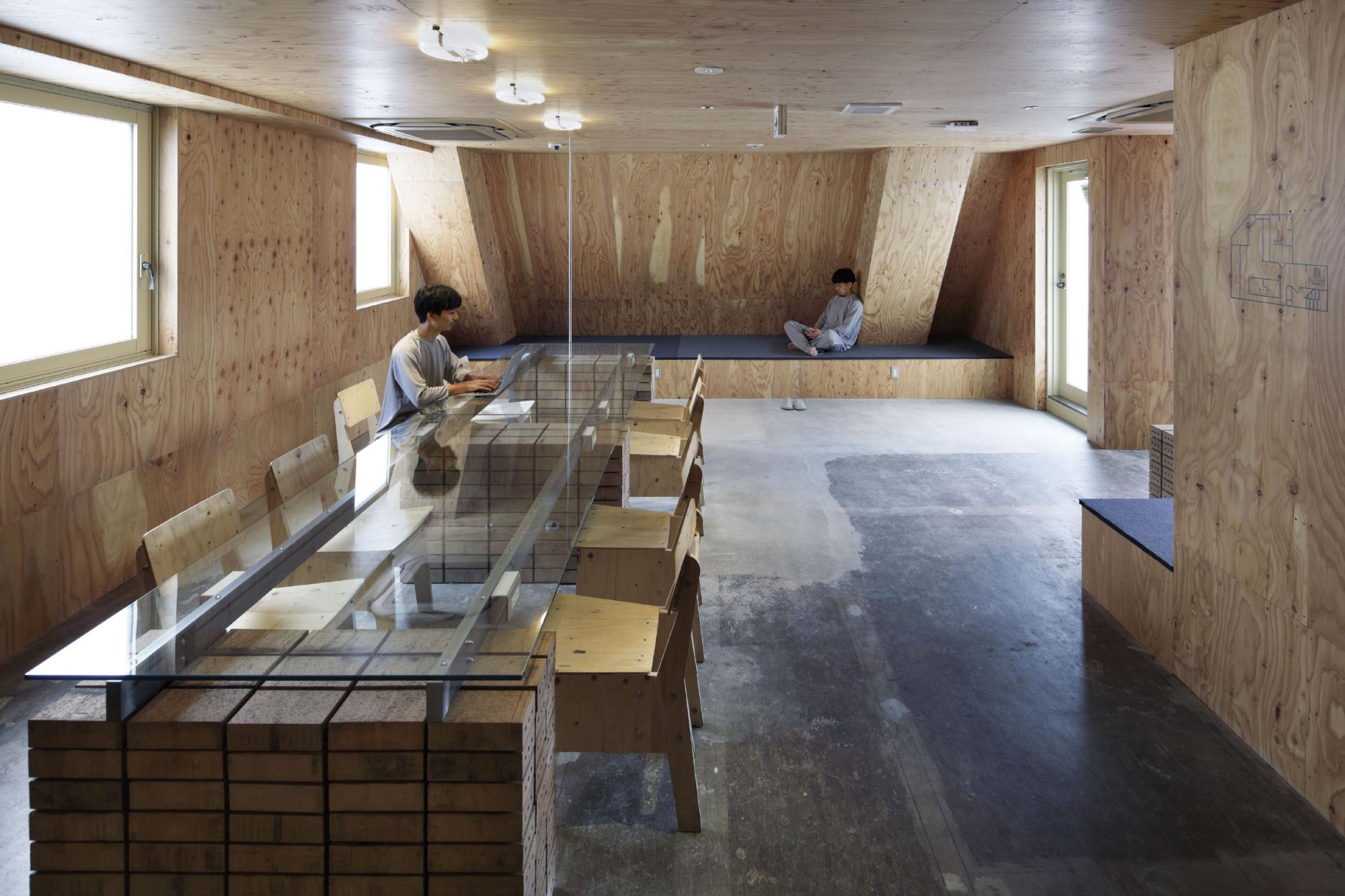
    Lounge with timber benches and a long table
    Enclosed shower cubicle with round water jets
    Corner entrance with the hotel sign
    The building on its street corner at dusk
    Floor plans
    Section
  • Blue Bottle Coffee Kobe Cafe

    Blue Bottle Coffee Kobe Cafe

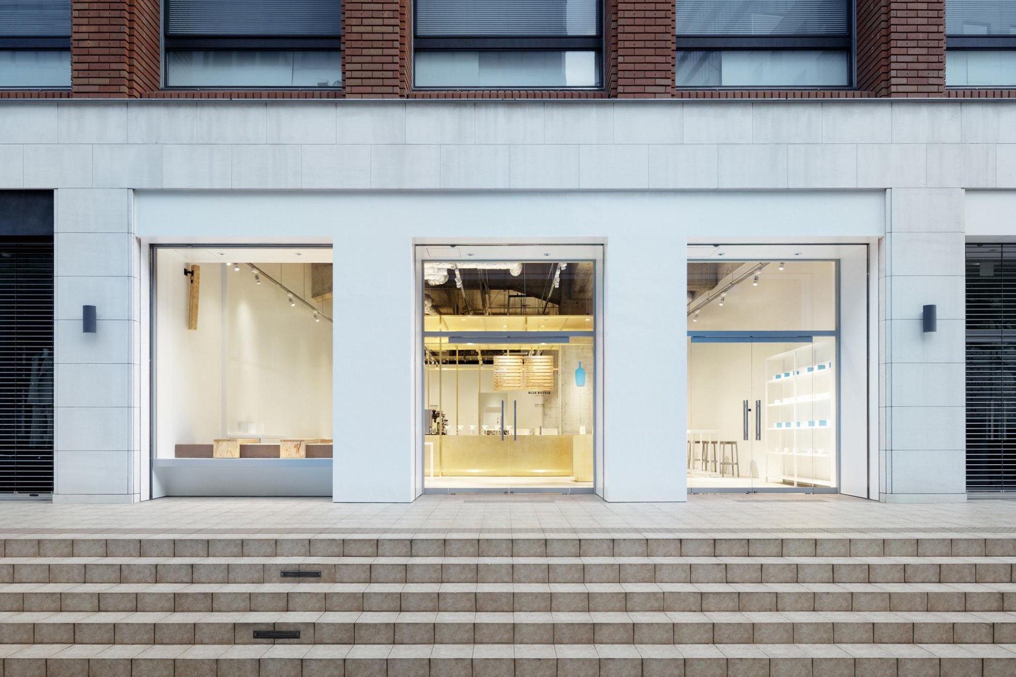
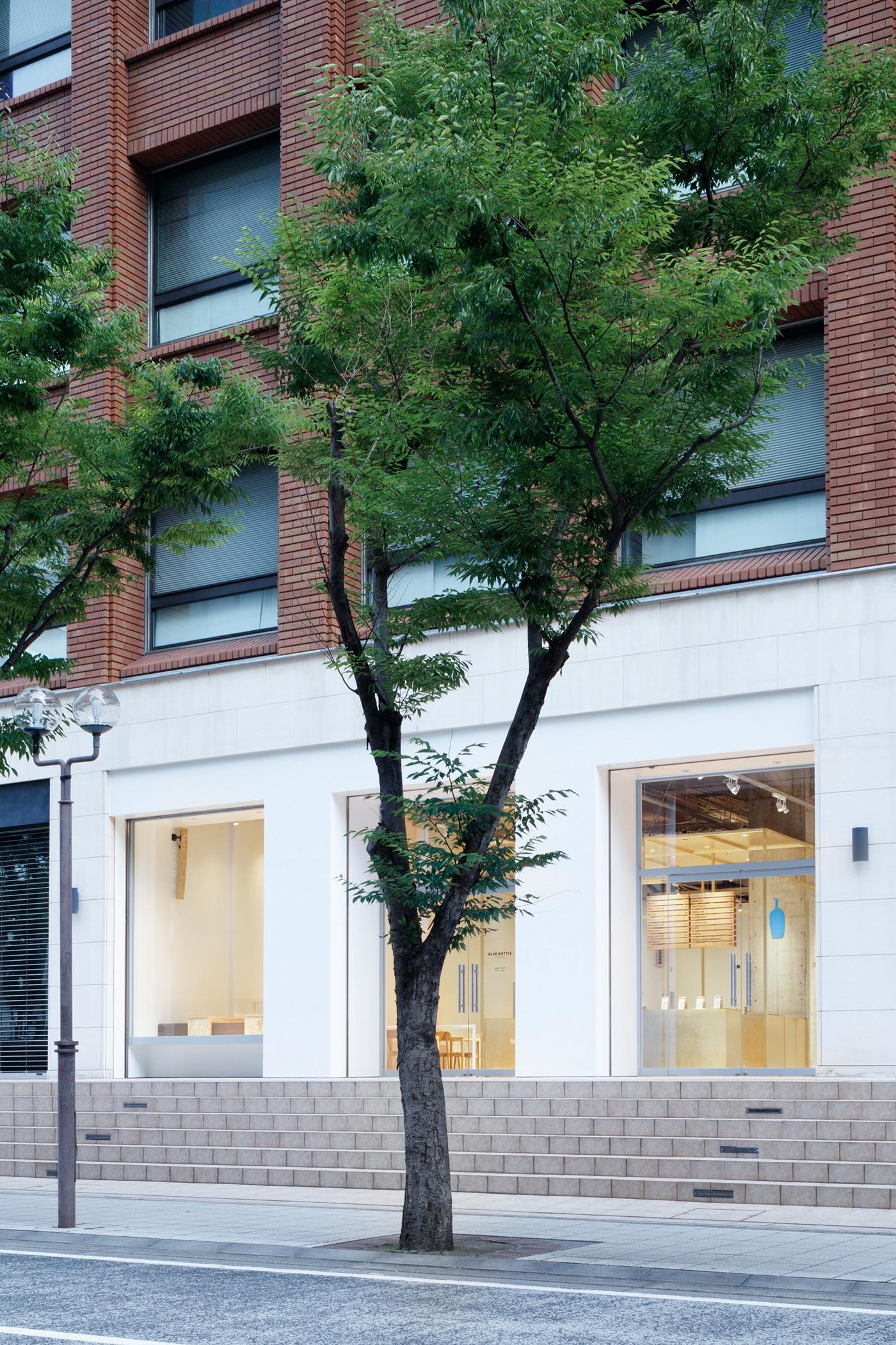
    The cafe occupies the ground floor of a department store building in an old port district once laid out for foreign merchants. Many of the district’s western-style buildings survive, and the area still carries a distinctly foreign air. The host building only imitates that style: it is a newer block dressed to look historic, with luxury fashion boutiques on either side of the cafe.

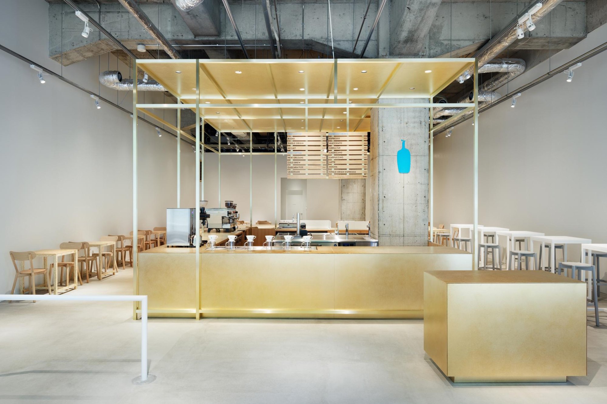
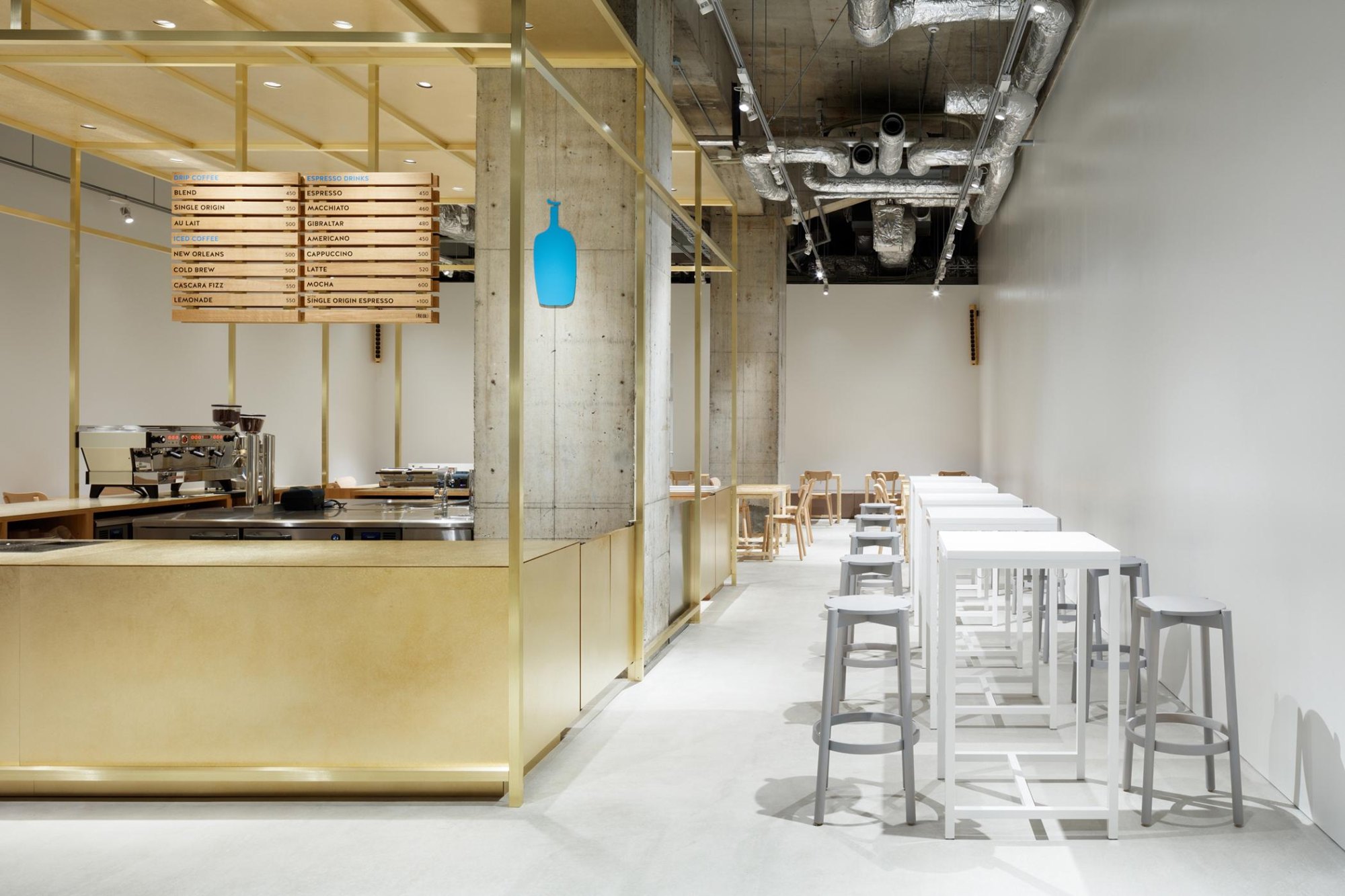
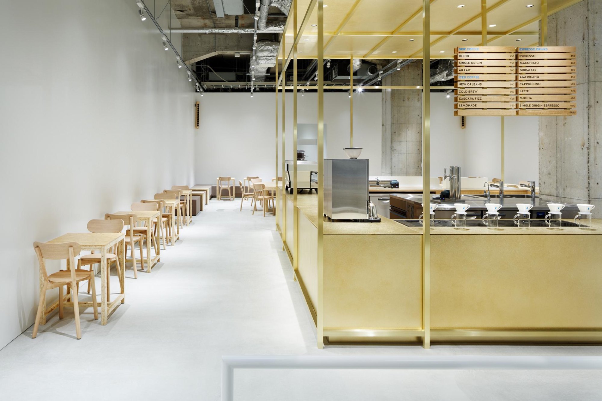
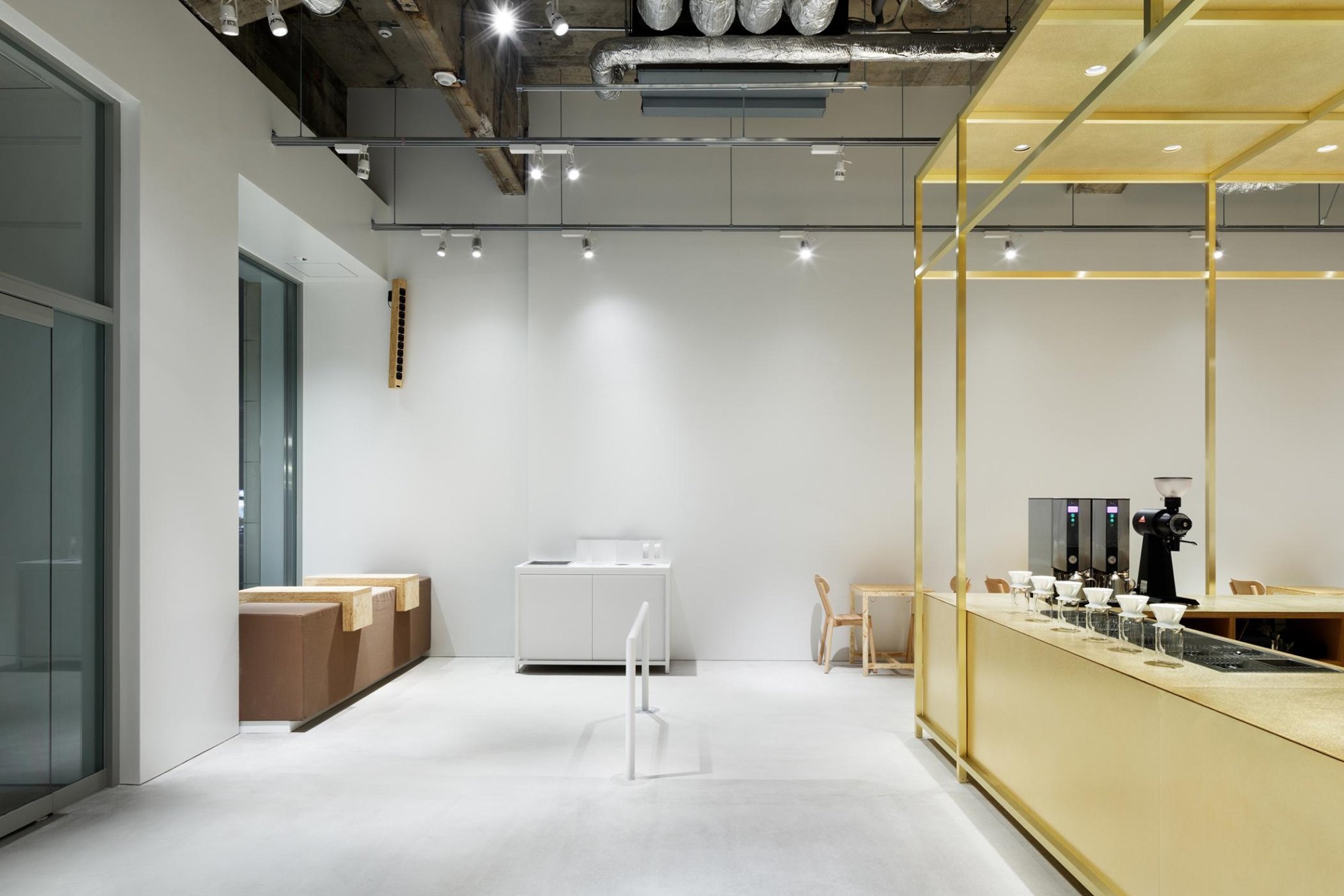
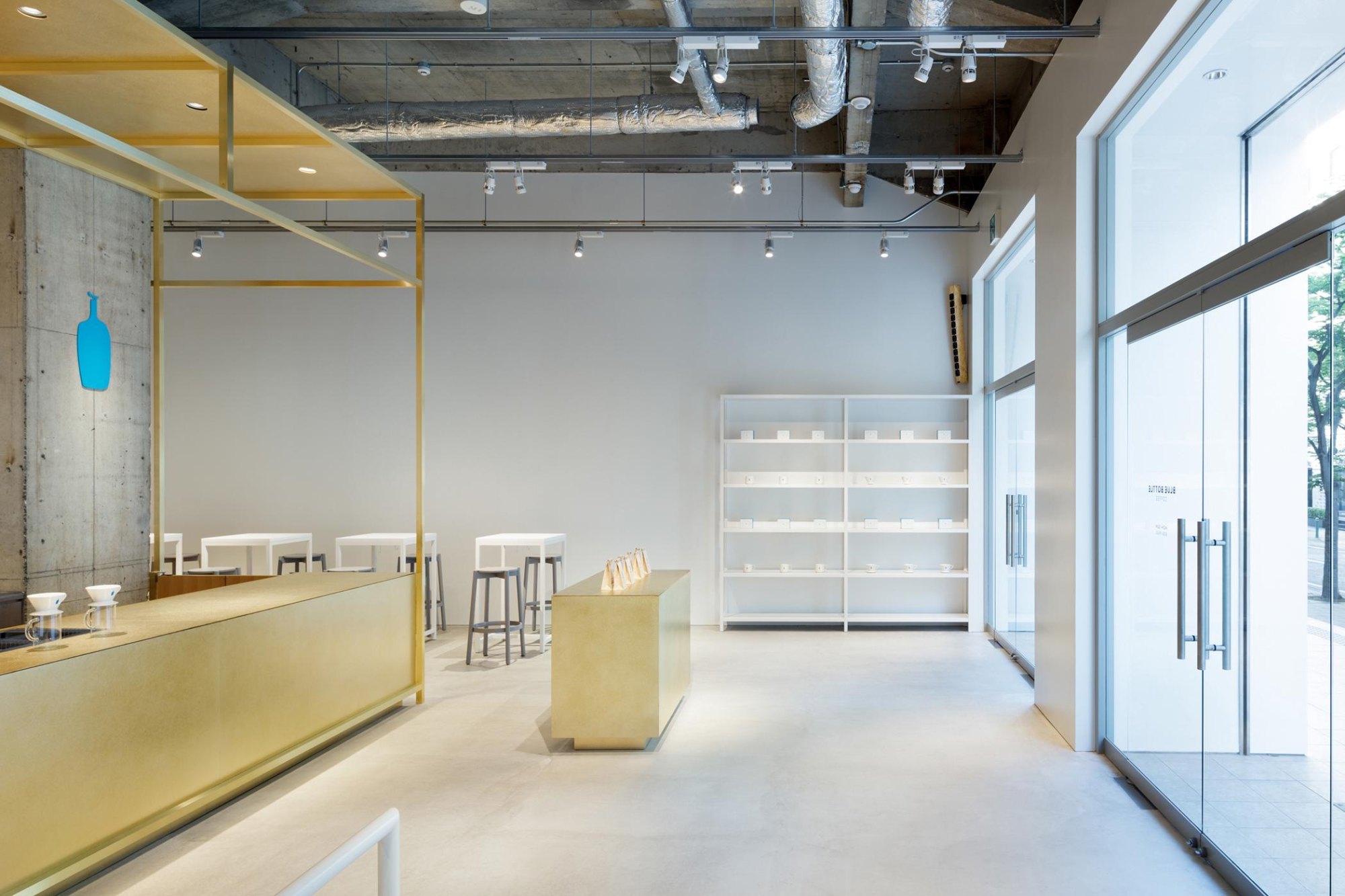
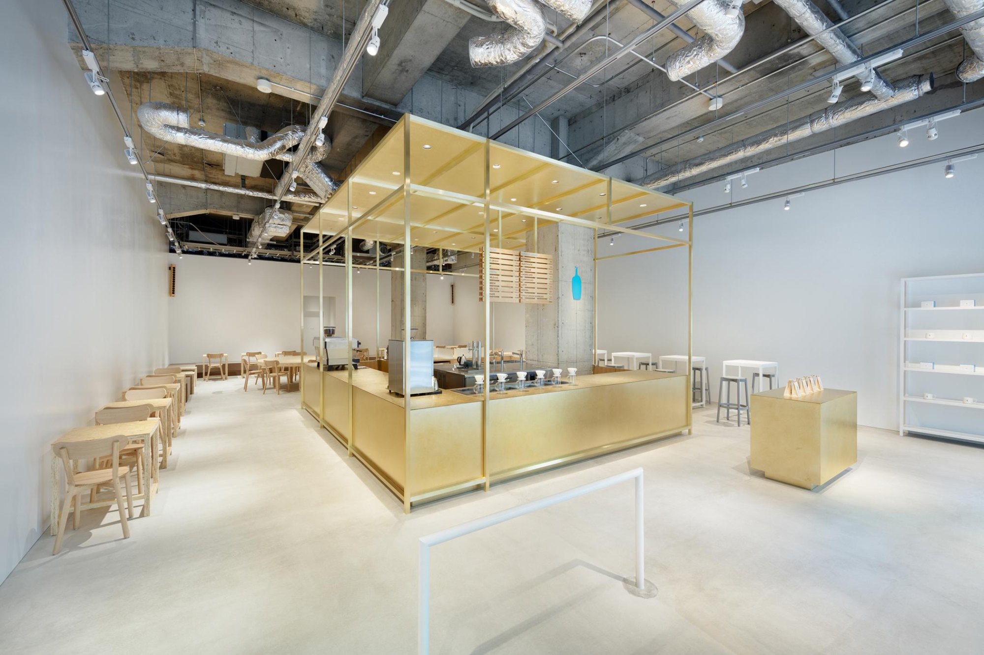
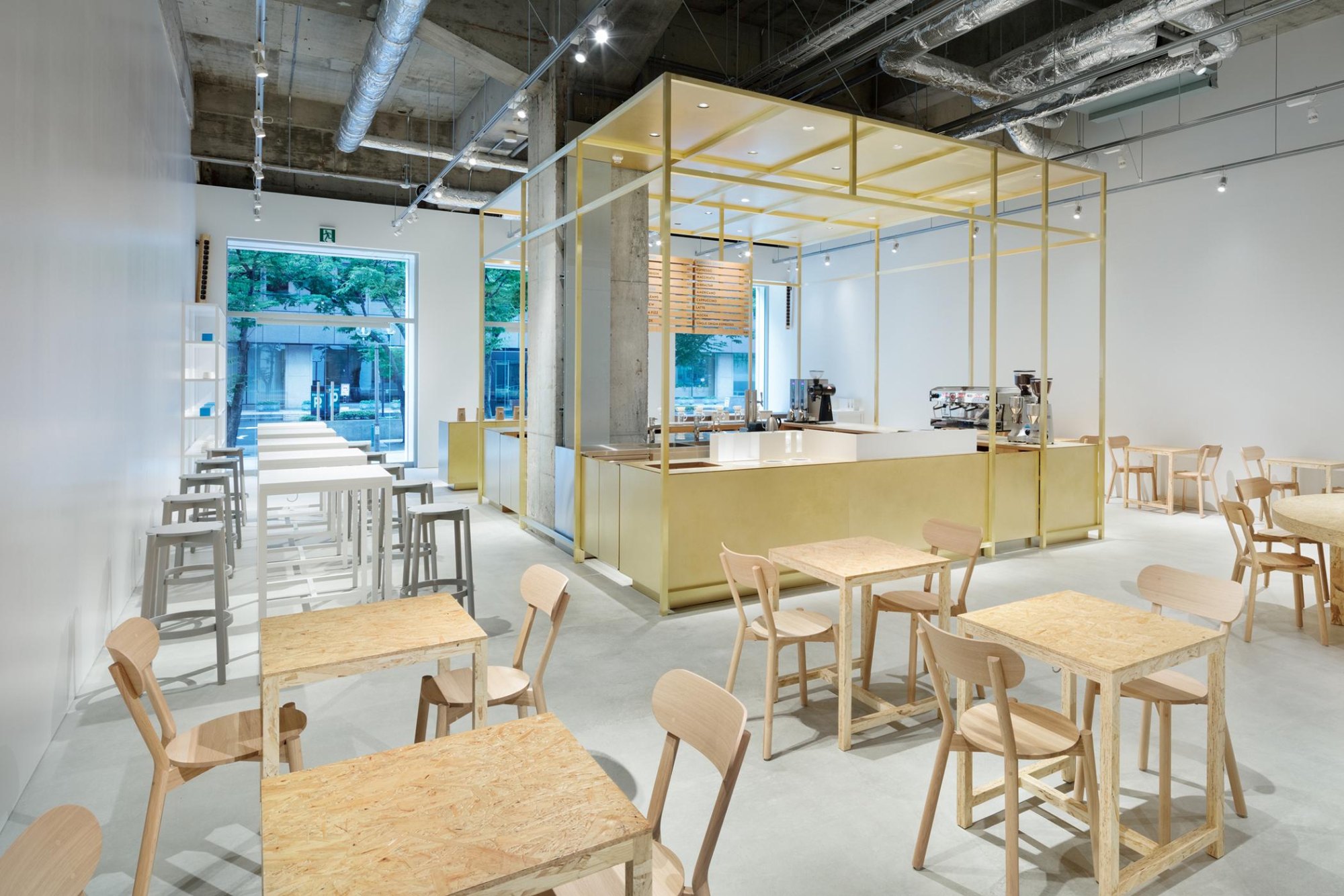
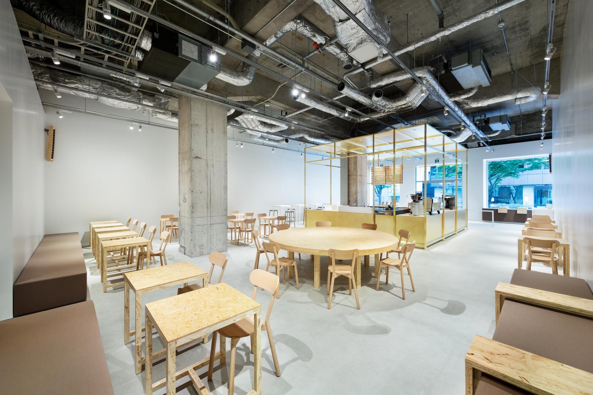
    The space handed to the design team was tall and generous. Rather than divide it, they gathered every cafe function into one freestanding island so the rest of the room could stay open and read as a single volume.

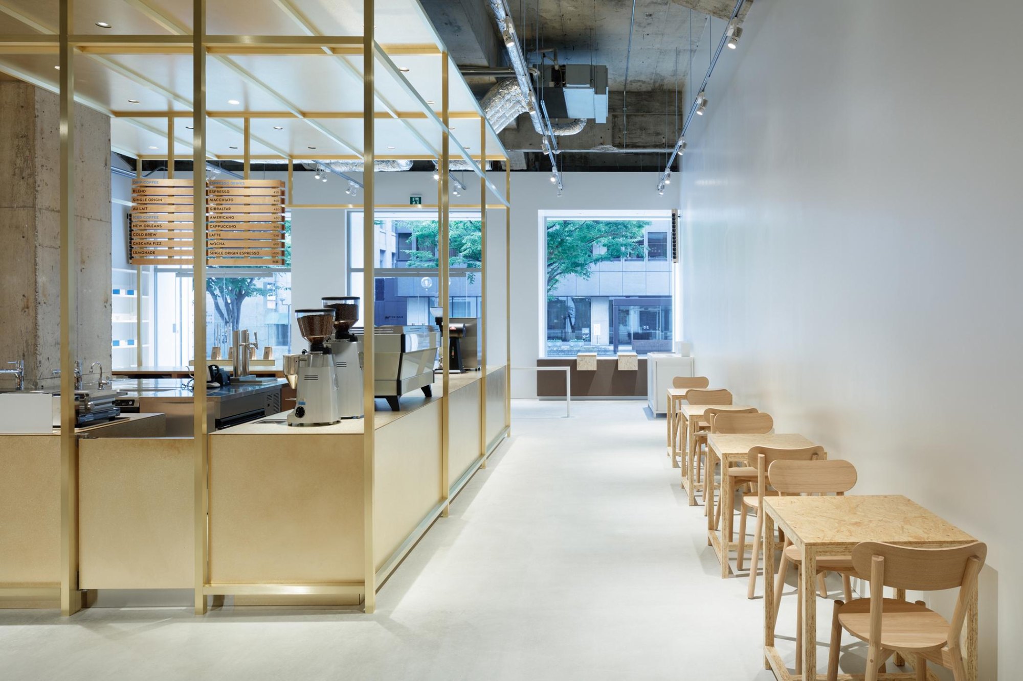
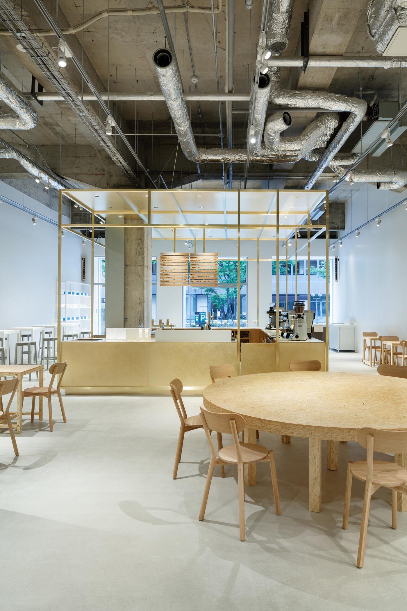
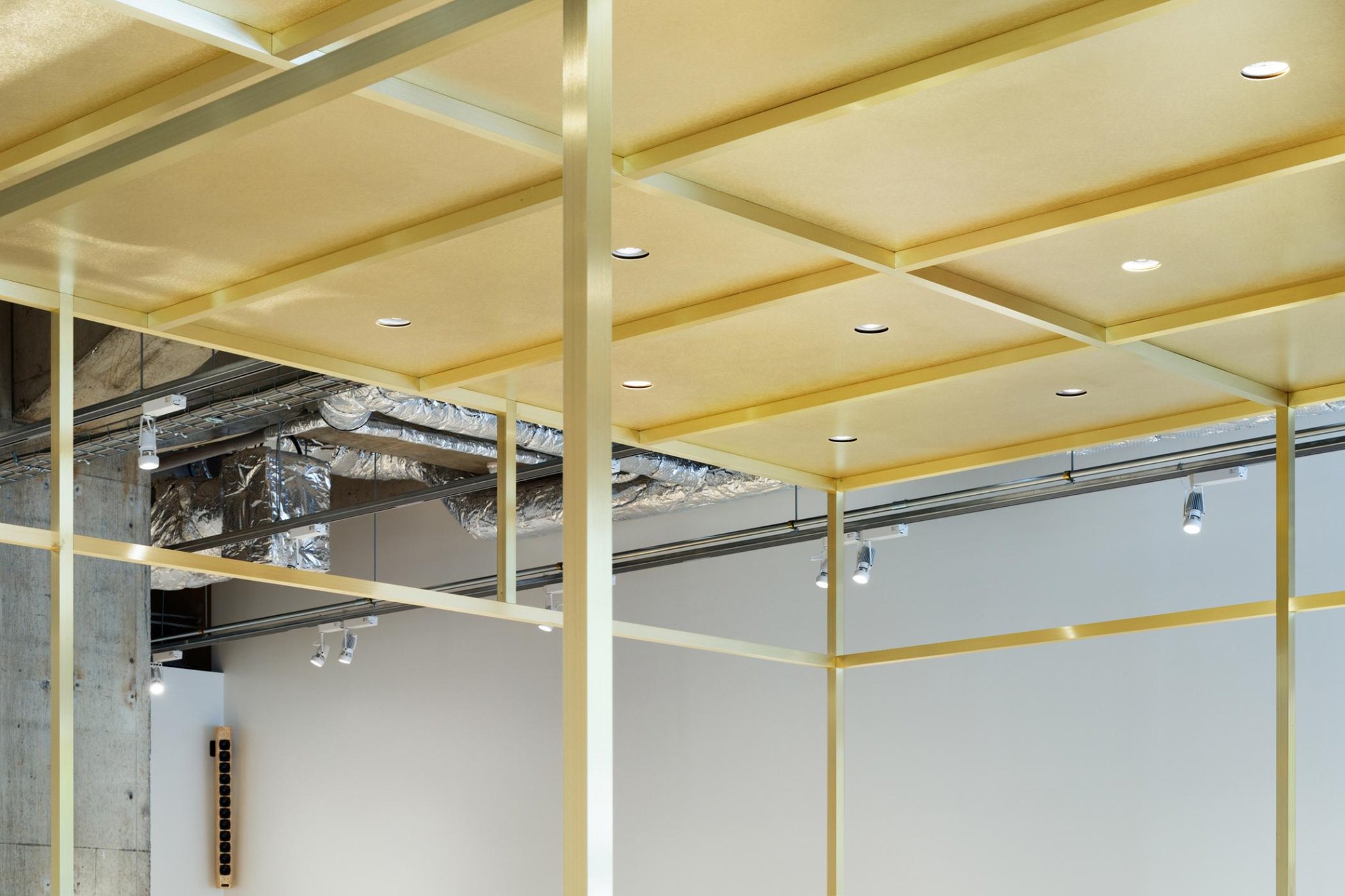
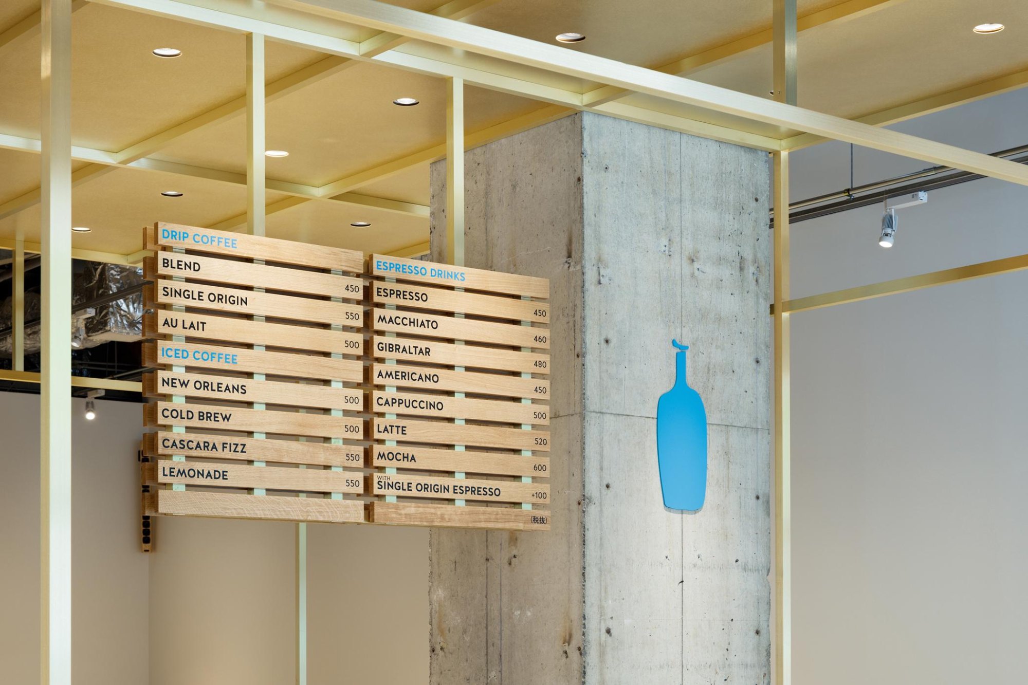
    The island is built around a slender brass frame that holds the counter, the drip bar and the hanging menu boards. Its shine works as a quiet counterweight to the ornamented setting outside, one simple and clearly new object set against a backdrop of borrowed history.

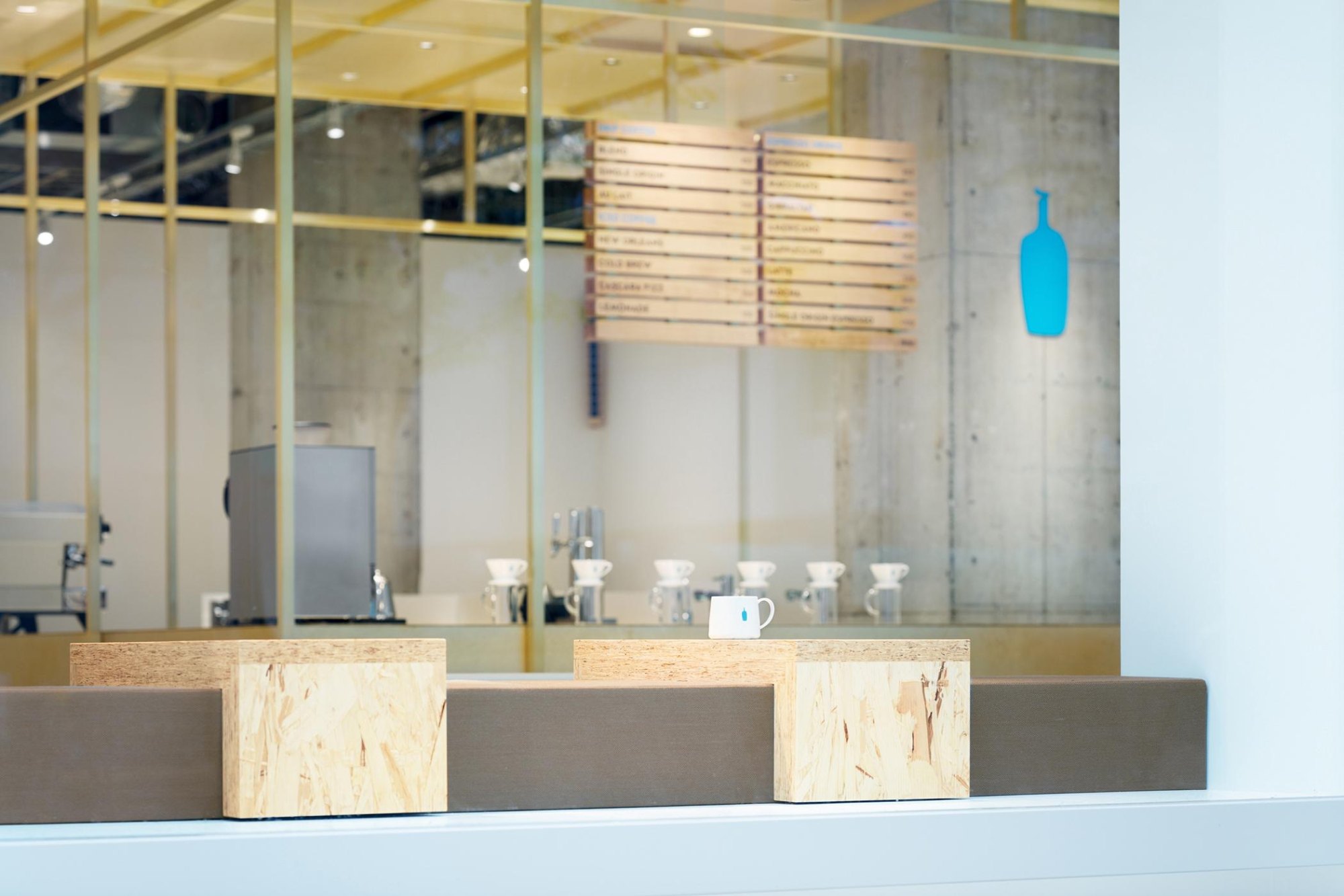
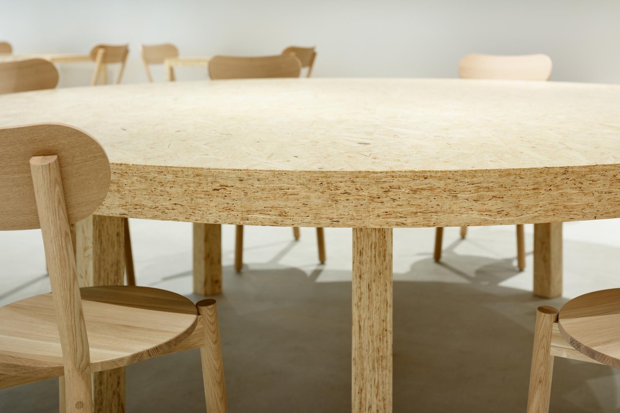
    Around it the finishes stay plain. White walls, an exposed ceiling and a pale concrete floor leave the brass to carry the room, while particleboard tabletops and light timber chairs keep the seating informal.

    Street front of the cafe above a stone base and steps
    The entrance seen from the tree-lined street
    Brass-framed counter island with the drip bar
    Long view along the island toward the seating
    Service side of the island and the open floor
    Counter with suspended timber menu boards
    The island seen from the entrance glazing
    The island standing free in the high-ceilinged hall
    Seating arranged around the island
    Coffee bar and tables by the street windows
    Round communal table under the exposed ceiling
    Tables and stools along the window
    Banquette seating against the wall
    Brass frame and ceiling panels from below
    Particleboard tabletop and timber chairs
    Timber menu boards hung from the brass frame
    Floor plan and section
  • Nakamata

    Nakamata

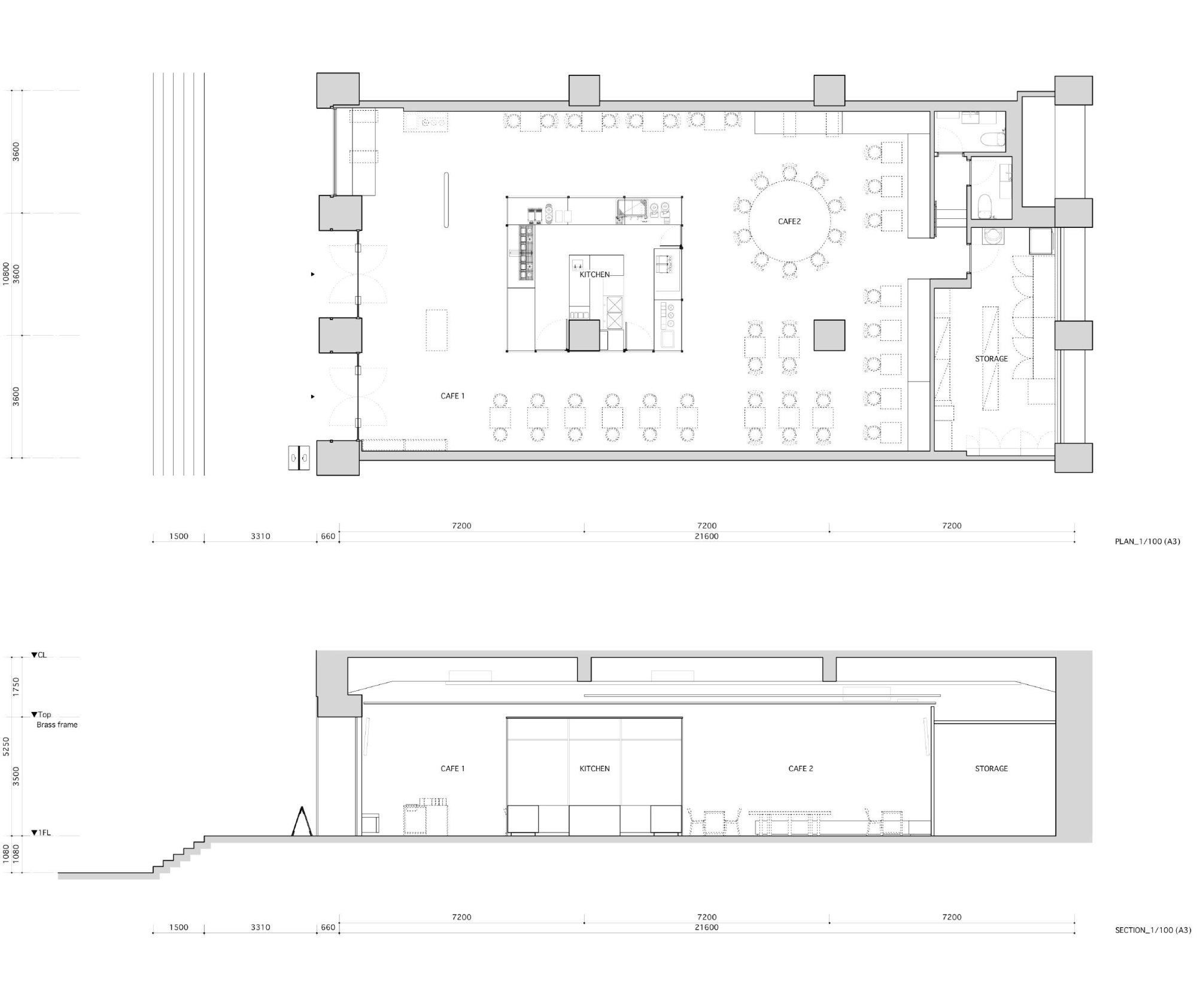
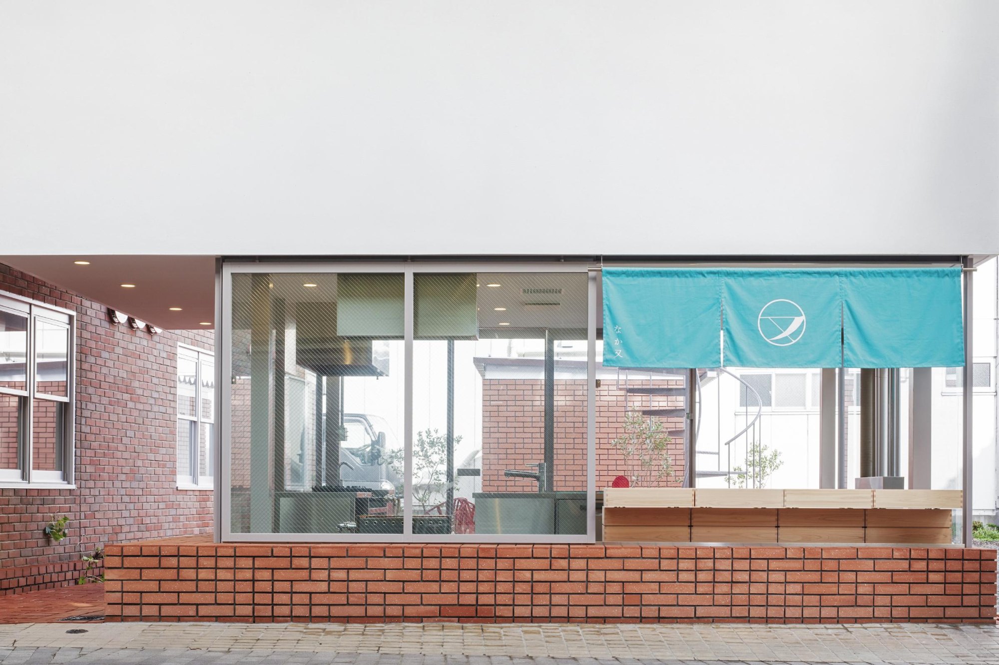
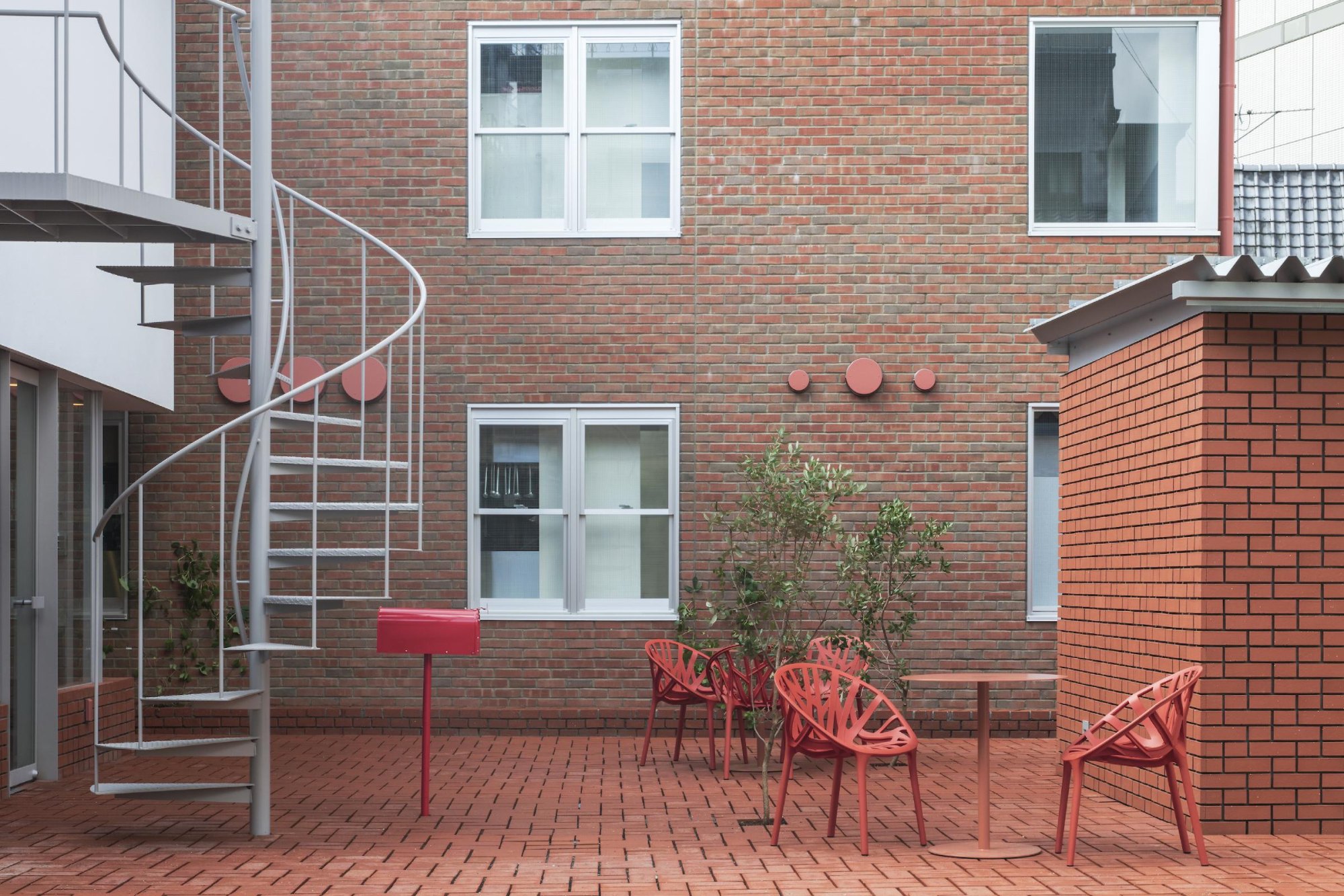
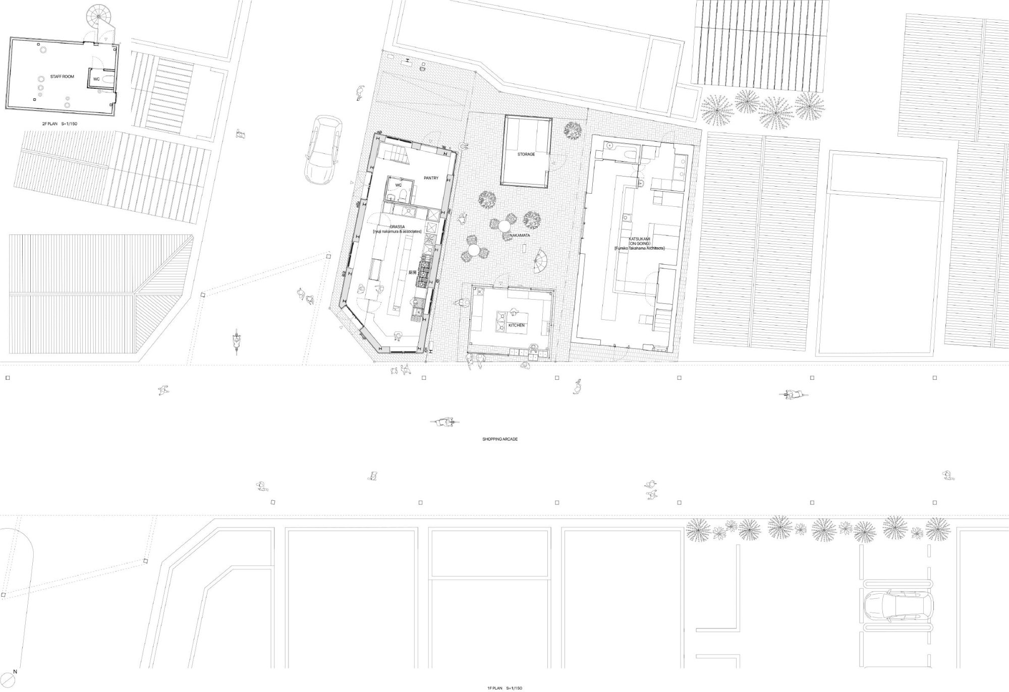
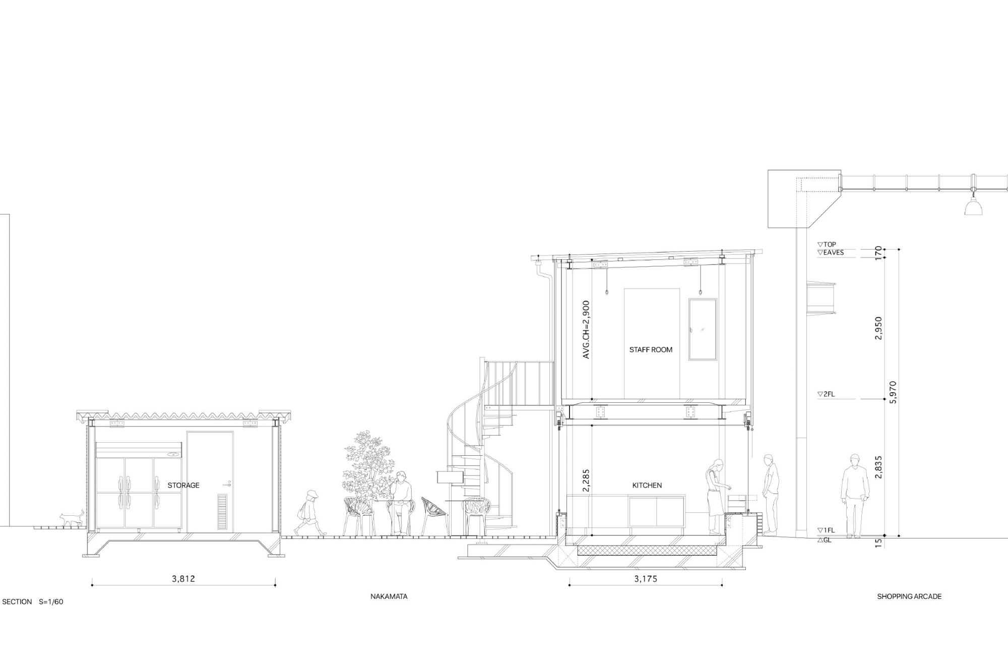
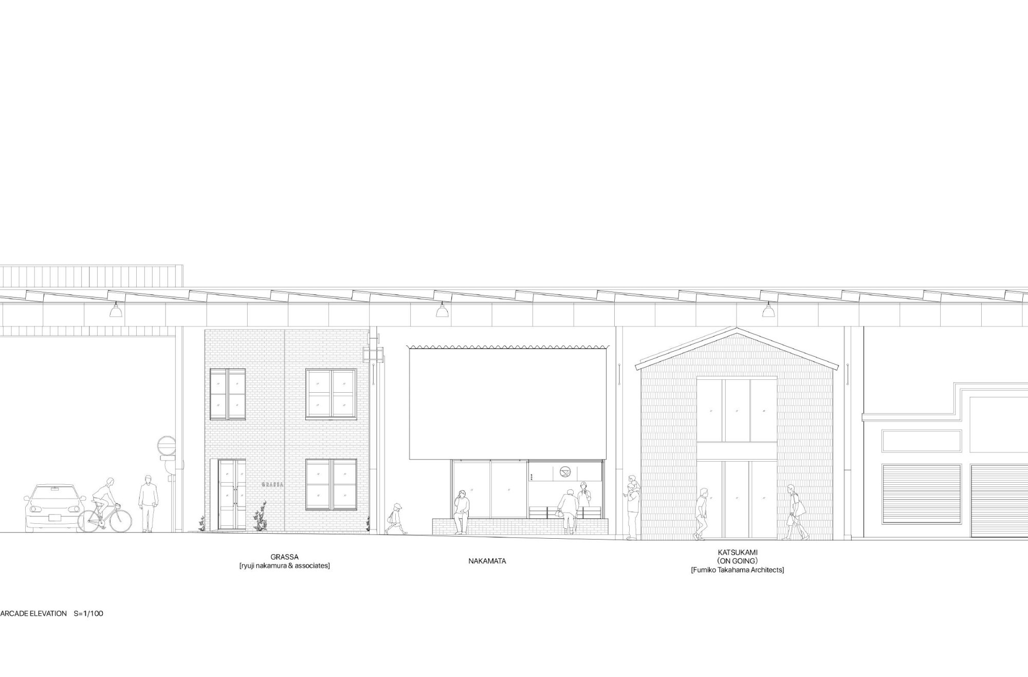
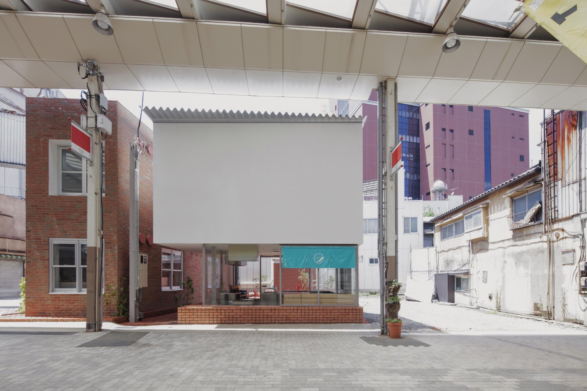
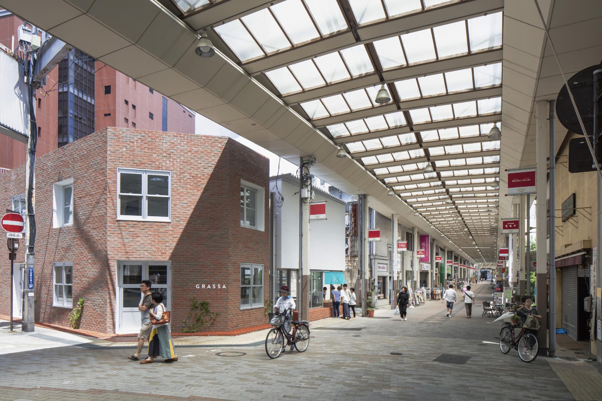
    Nakamata is a traditional sweet shop on a covered shopping street in a regional city. A two-storey shoe shop and home once filled the whole site, wedged between neighbours, with a single facade to the street. The old buildings were demolished to make way for the new shop.

    Like many shopping streets in smaller cities, this one was turning into a street of closed shutters, with few passers-by even by day and empty lots appearing here and there. A local entrepreneur set up an agency to reconnect people and places, and this shop was one of several projects it launched. Even so, shuttered shops kept increasing.

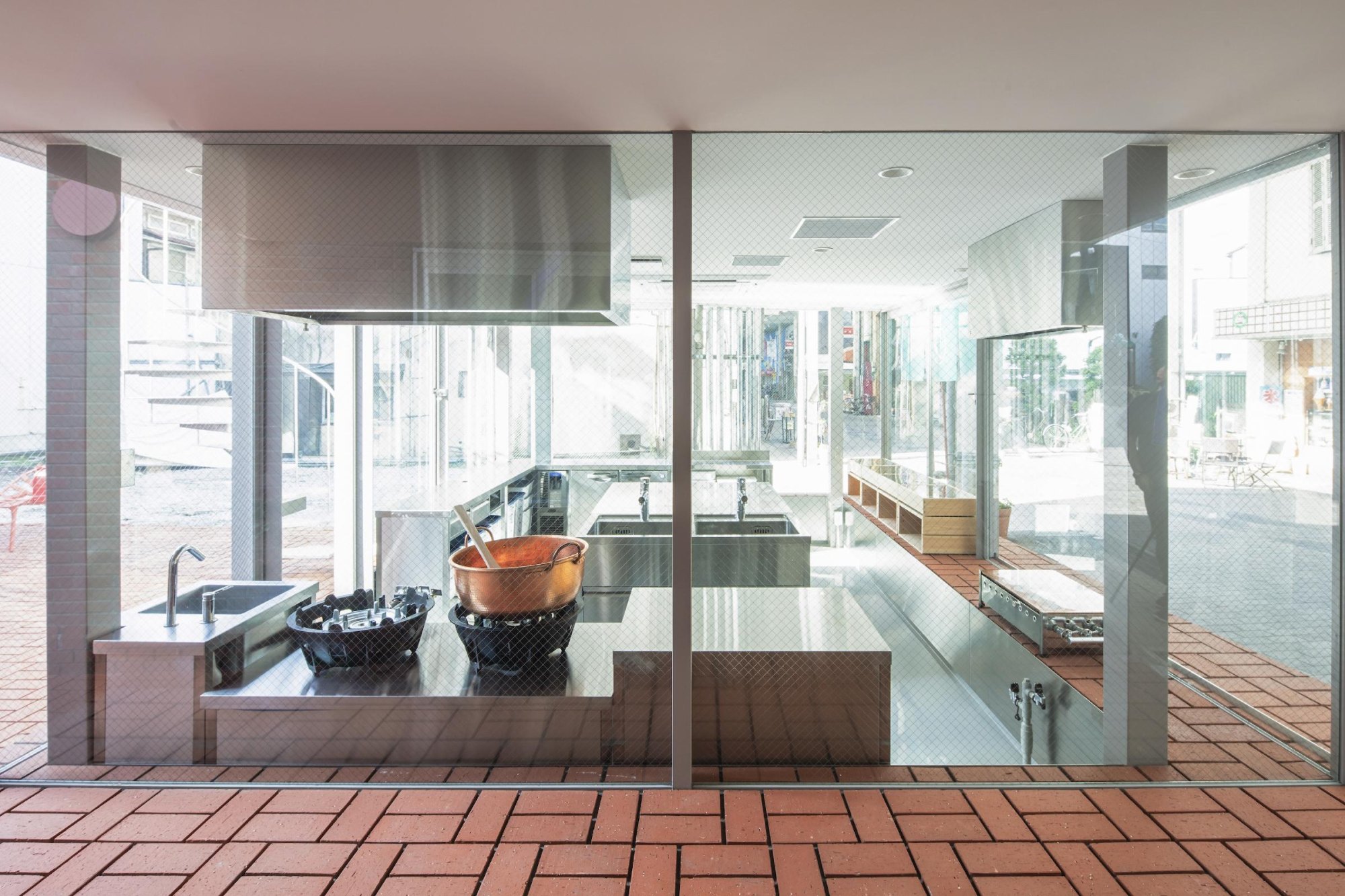
    A sweet shop needs no seating, so the floor area it required was small compared with the site, leaving a large excess volume. The design question became how to use that excess to give something back to the city. Rather than trying to revive the busy streets of the past, the team looked at suburban malls and online shopping, where everything expected is easy to find, and asked what a small building in the city could offer instead.

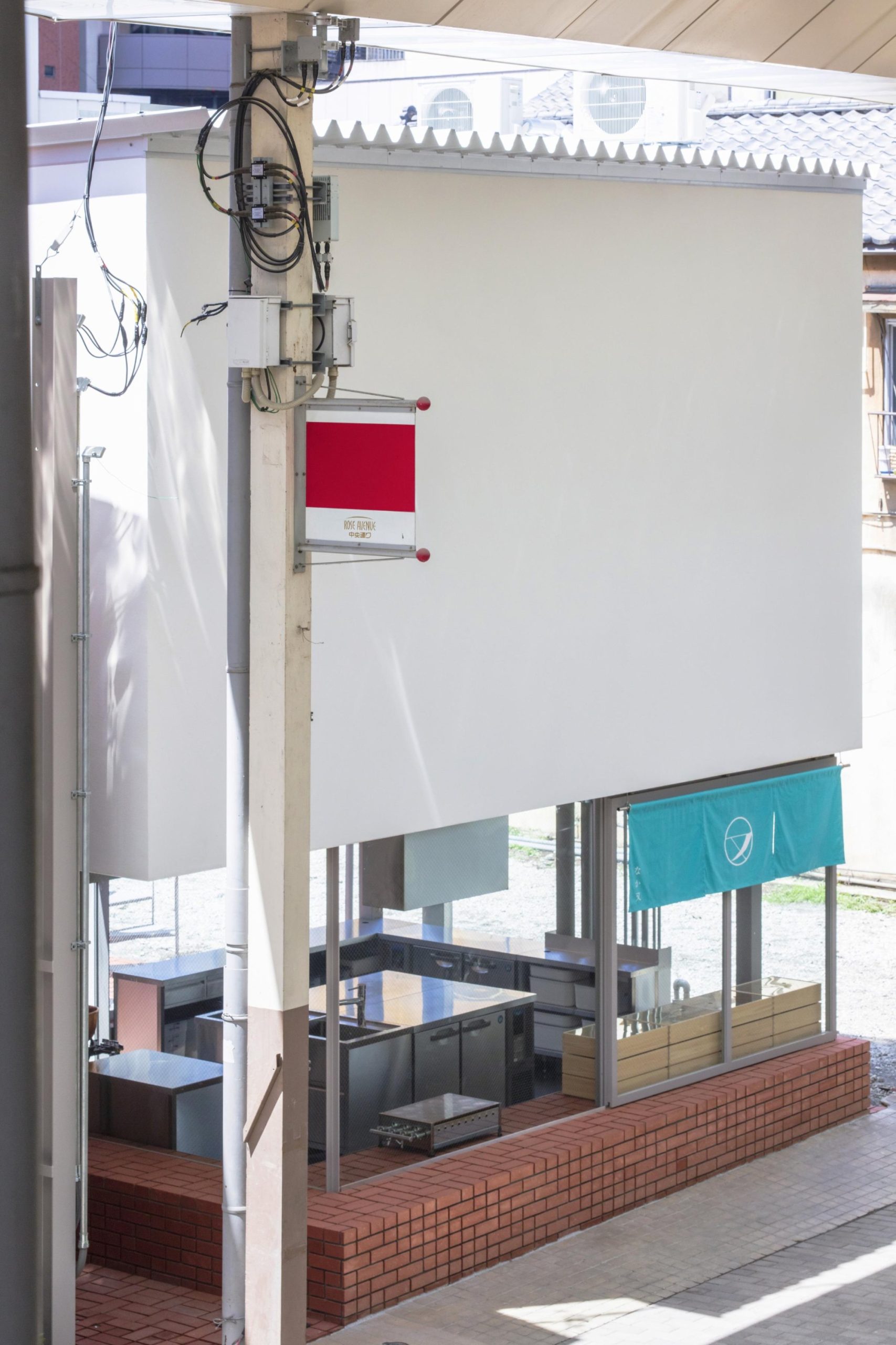
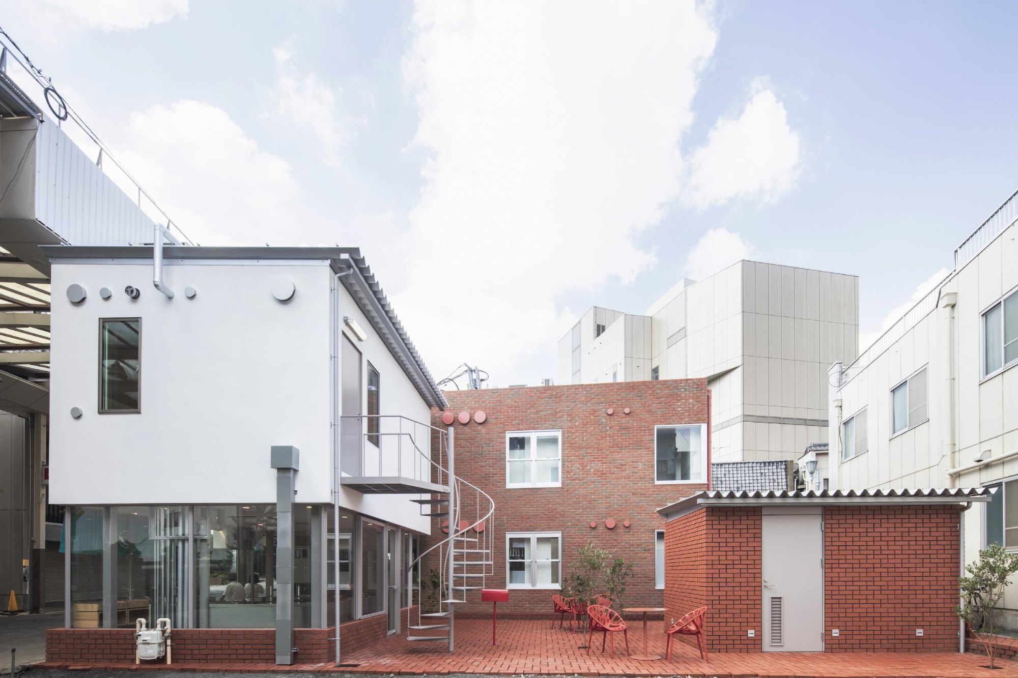
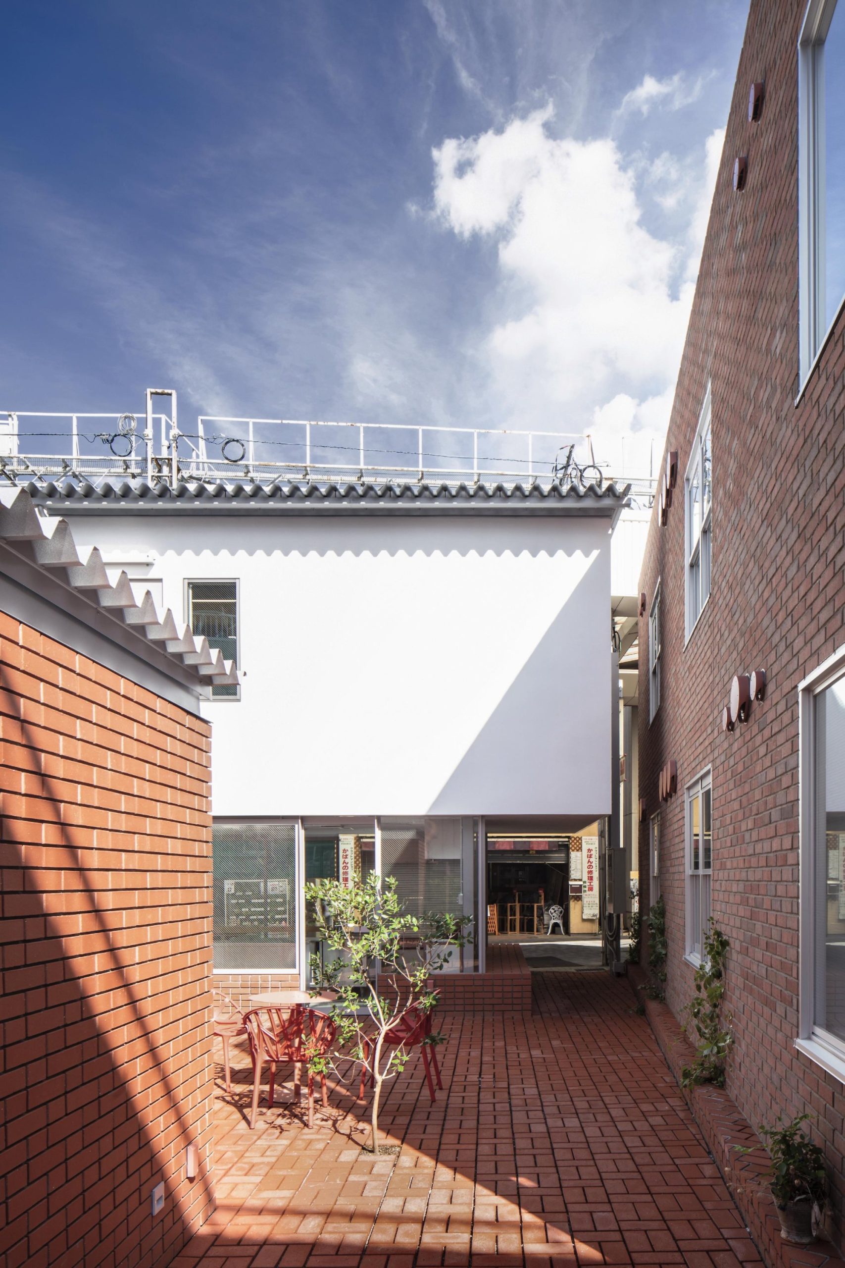
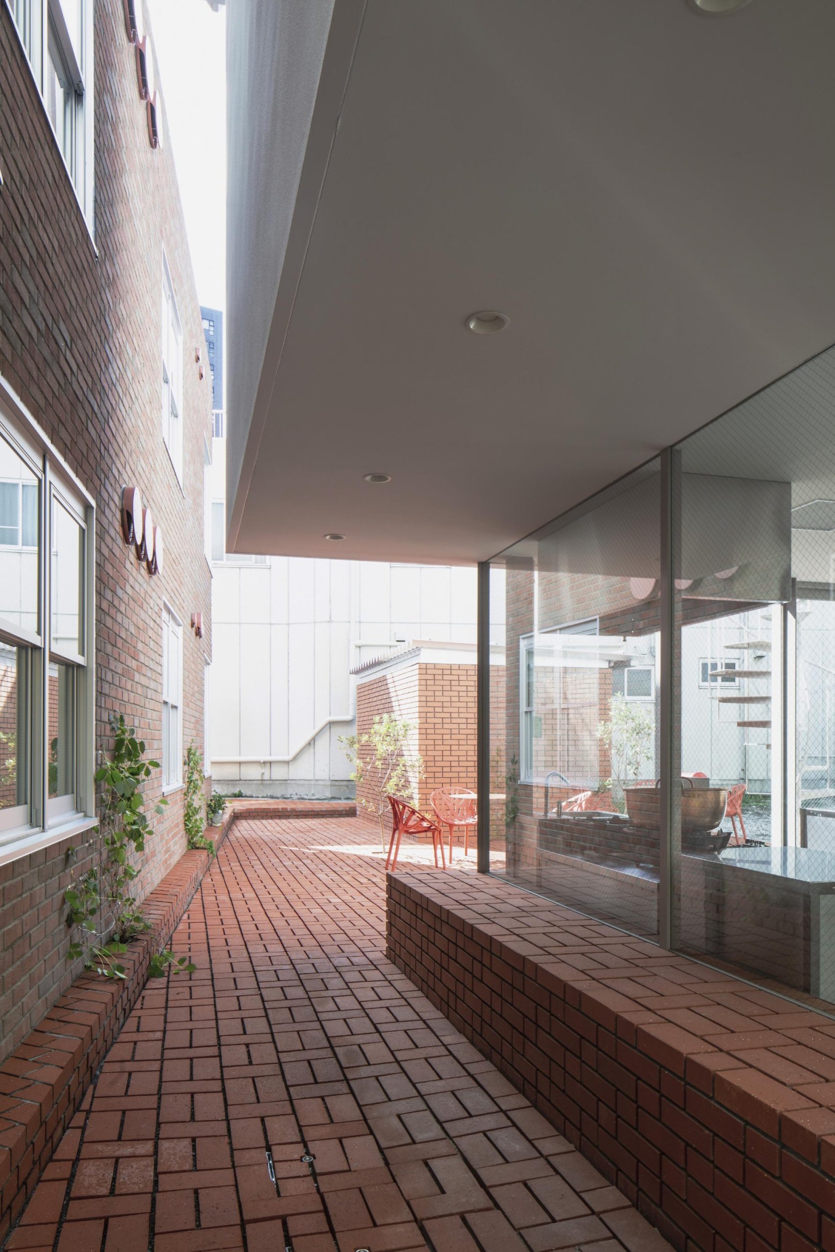
    The street is lined with layers from different periods. The team cut a path at right angles to them, adding depth and more building surface to raise curiosity. In effect they used reduced volume to make space, showing what a vacant lot on the street might become and offering hope to anyone thinking of opening a small shop here.

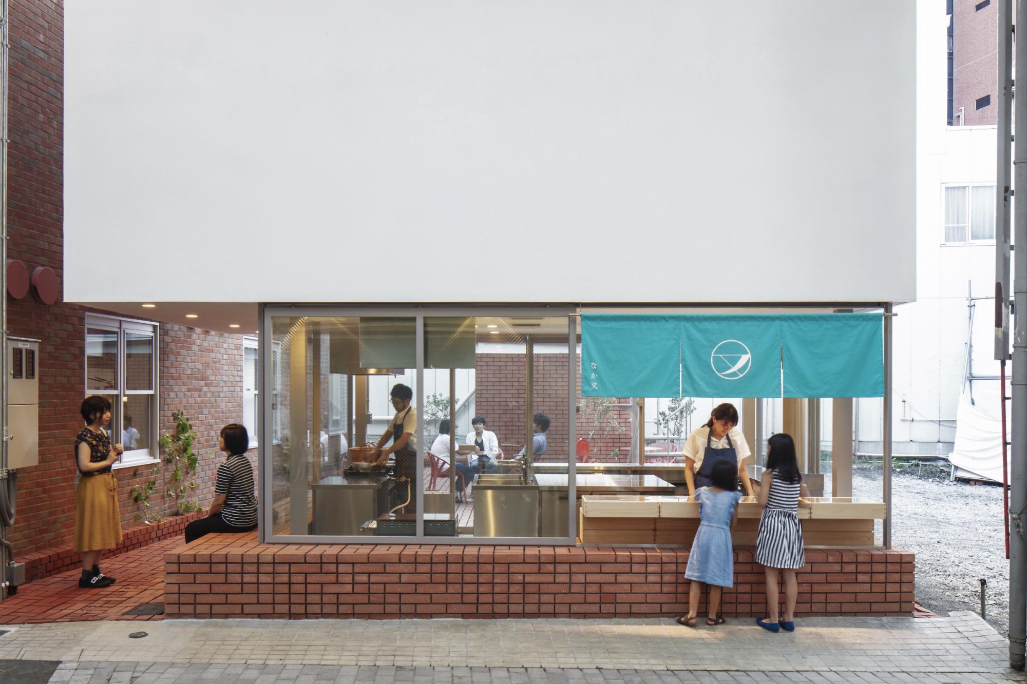
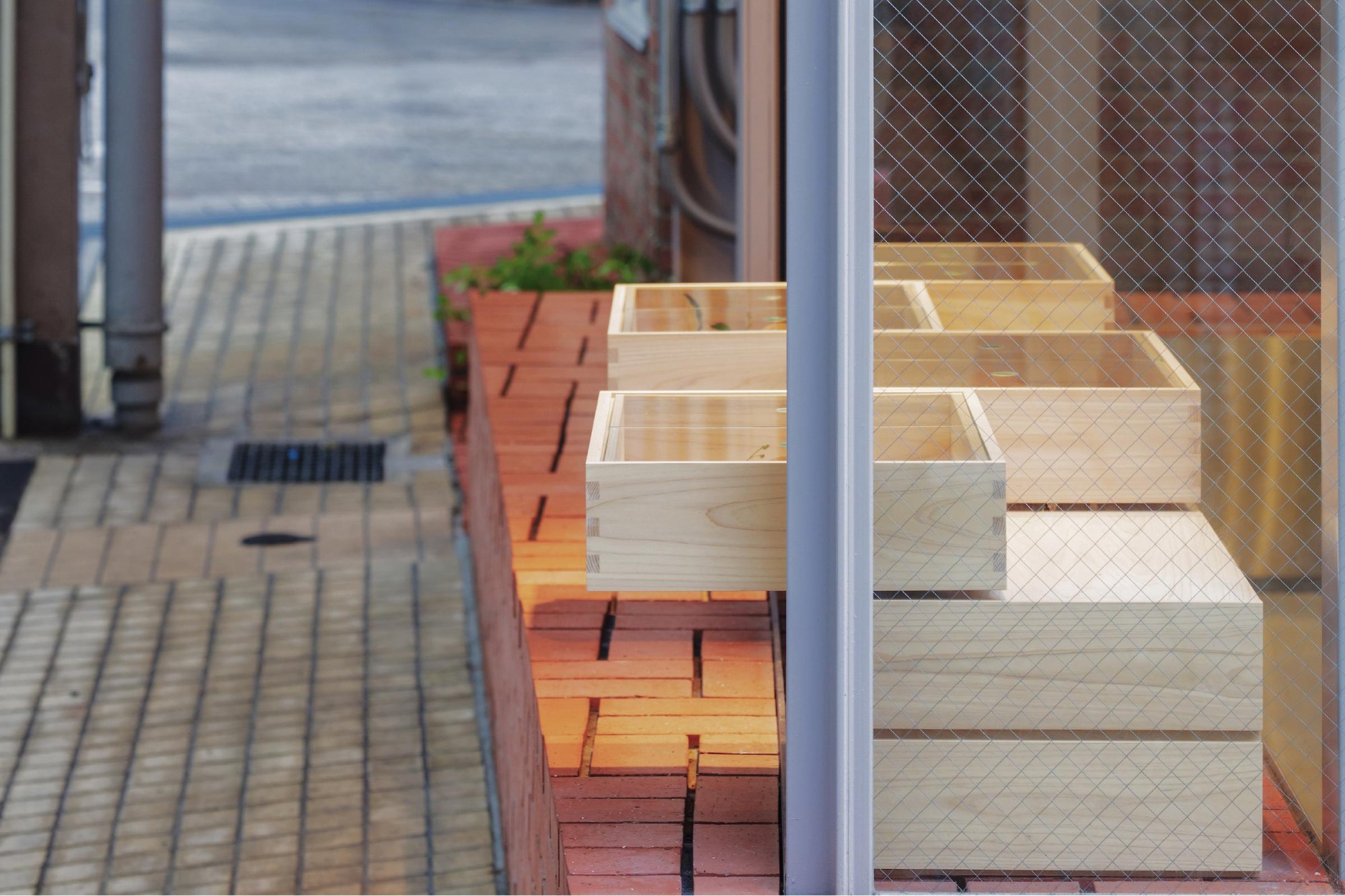
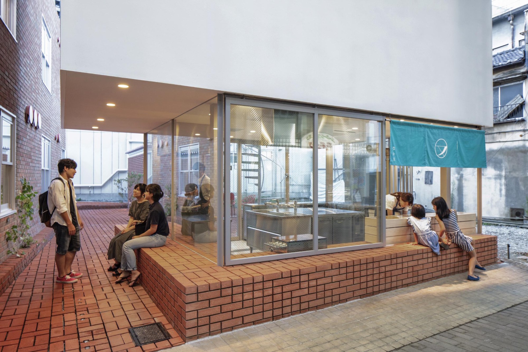
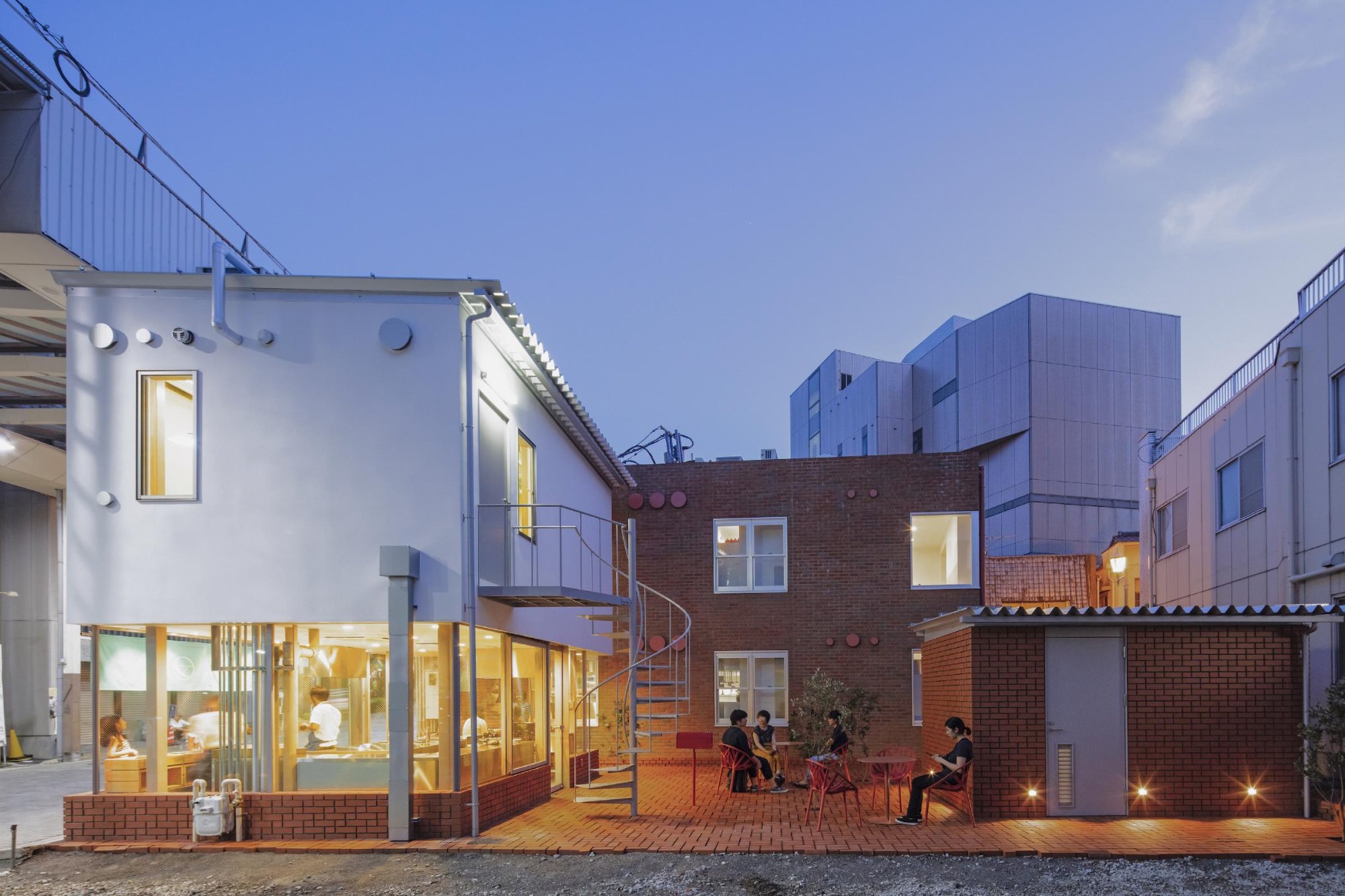
    The agency’s design code required brick on the exterior. The team could watch the neighbouring buildings going up on both sides as they designed, and tested how to stack their own bricks in relation to them: one large stack, then split in two and reduced, with care for the voids between. Three small trees were planted in those voids, and the bricks around them can be lifted as the trees grow. The joints were left unfilled as deep grooves, on the floor and the walls alike, to bring out the weight of the brick and the play of light and shadow.

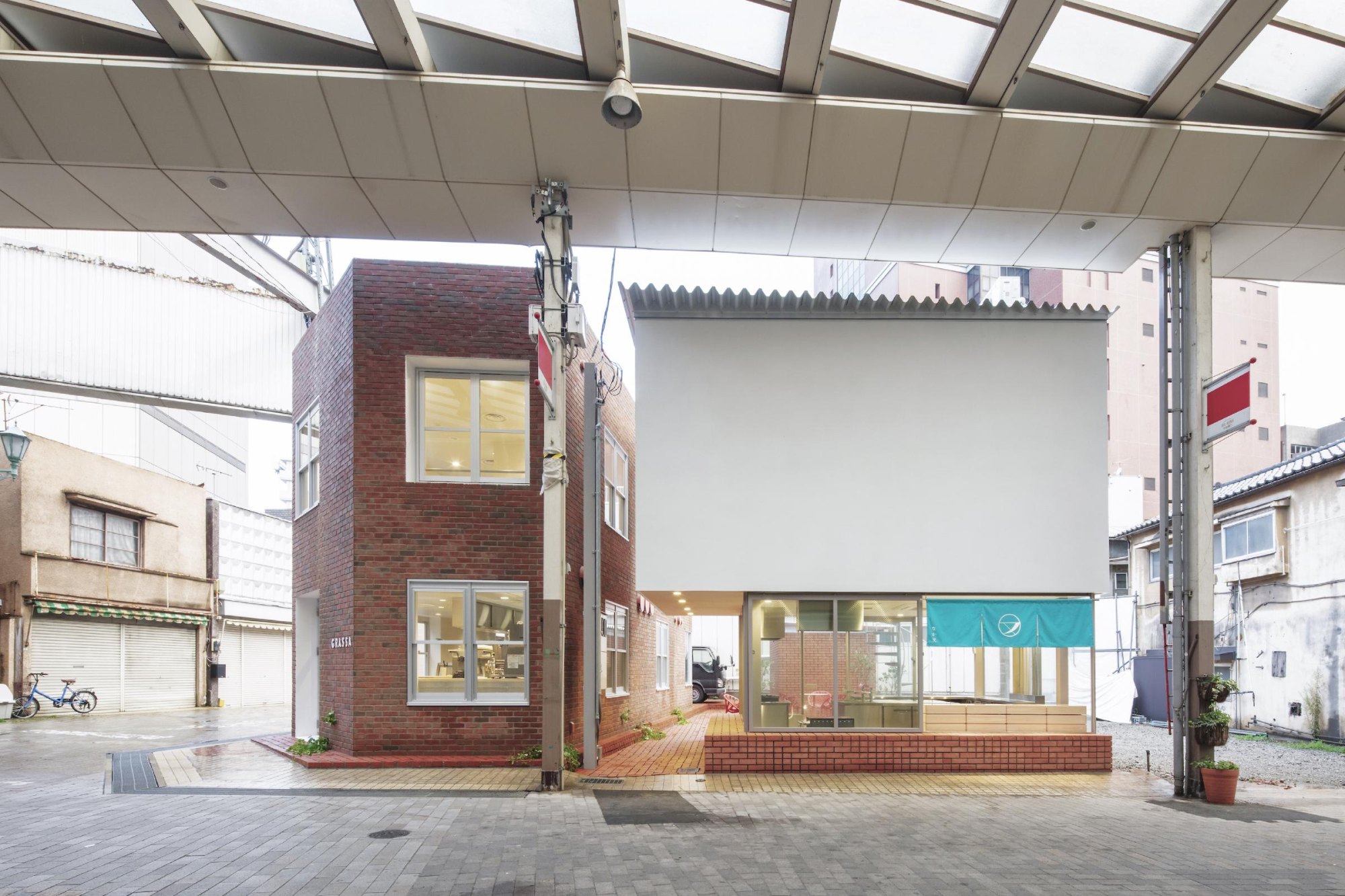
    Shop front under the arcade with a raised white screen
    The shop on the covered shopping street
    Nakamata, view 3
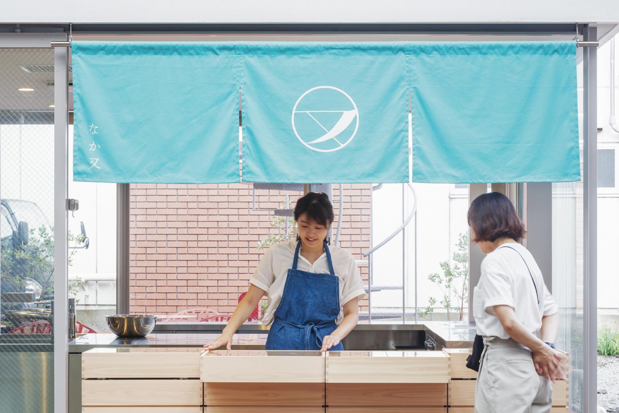
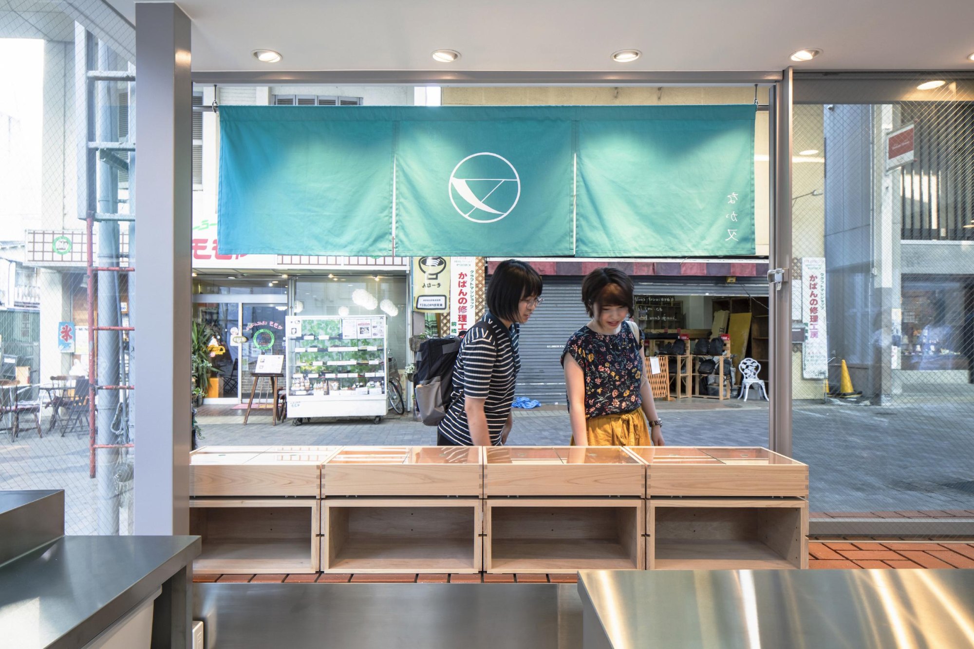
    Staff at the counter under a teal curtain
    Nakamata, view 5
    Nakamata, view 6
    Nakamata, view 7
    Nakamata, view 8
    Brick courtyard with a spiral stair and red chairs
    Narrow brick passage open to the sky
    Nakamata, view 11
    Nakamata, view 12
    Nakamata, view 13
    Nakamata, view 14
    Nakamata, view 15
    Brick stacks and the shop in the evening light
    The shop and courtyard at dusk
    Site plan
    Section
    Elevation
  • DESCENTE BLANC Sapporo

    DESCENTE BLANC Sapporo

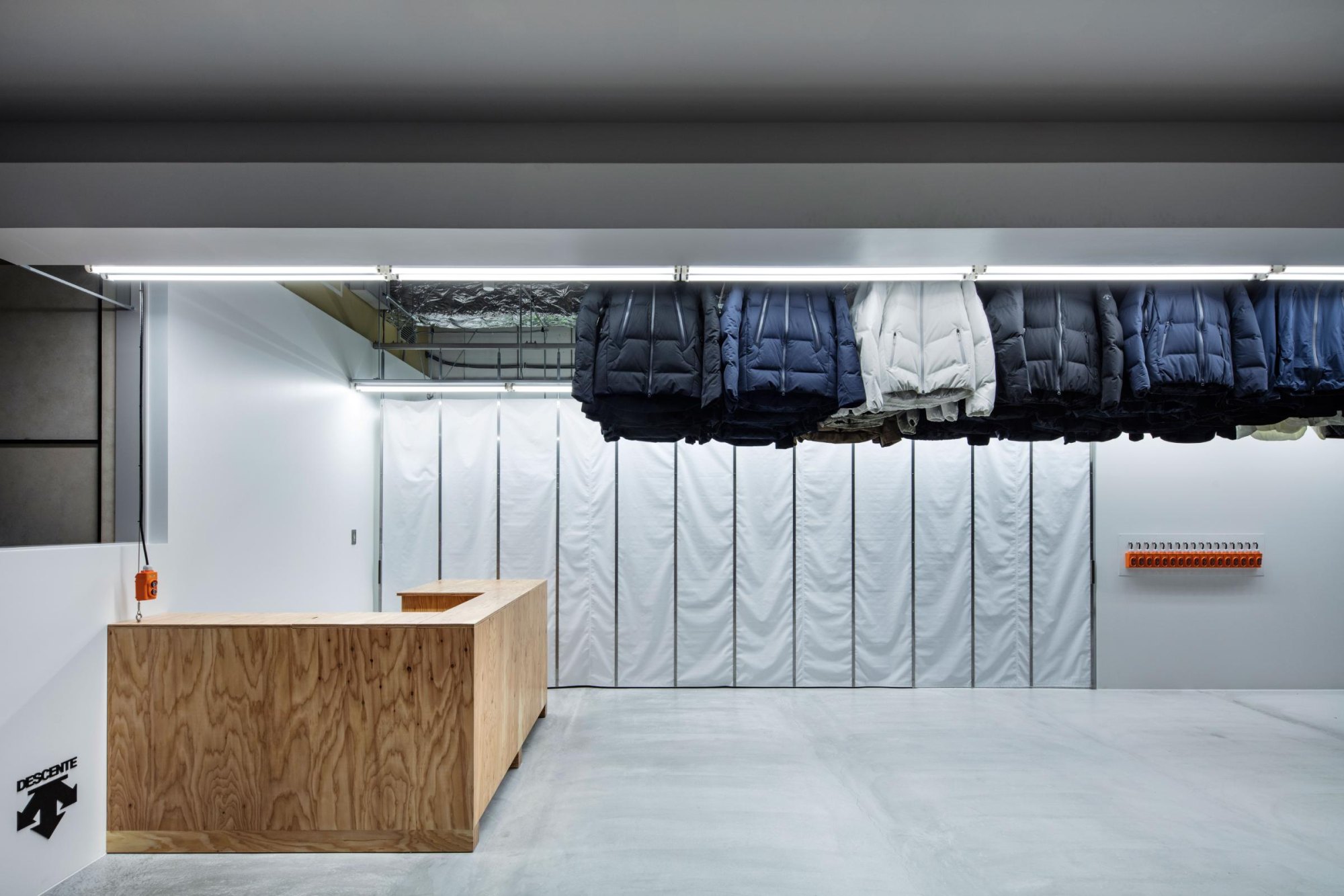
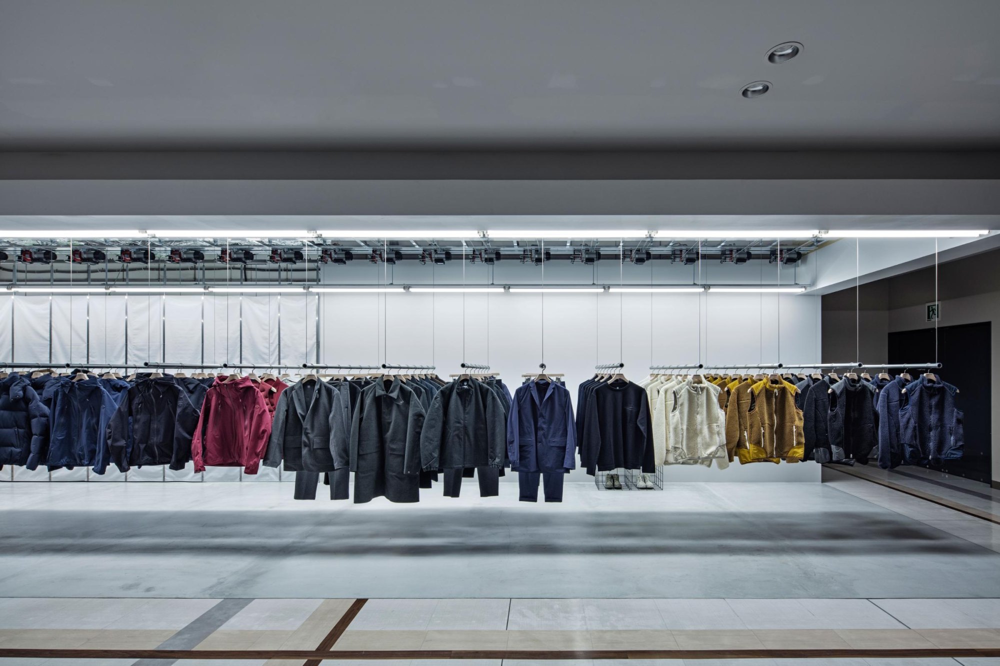
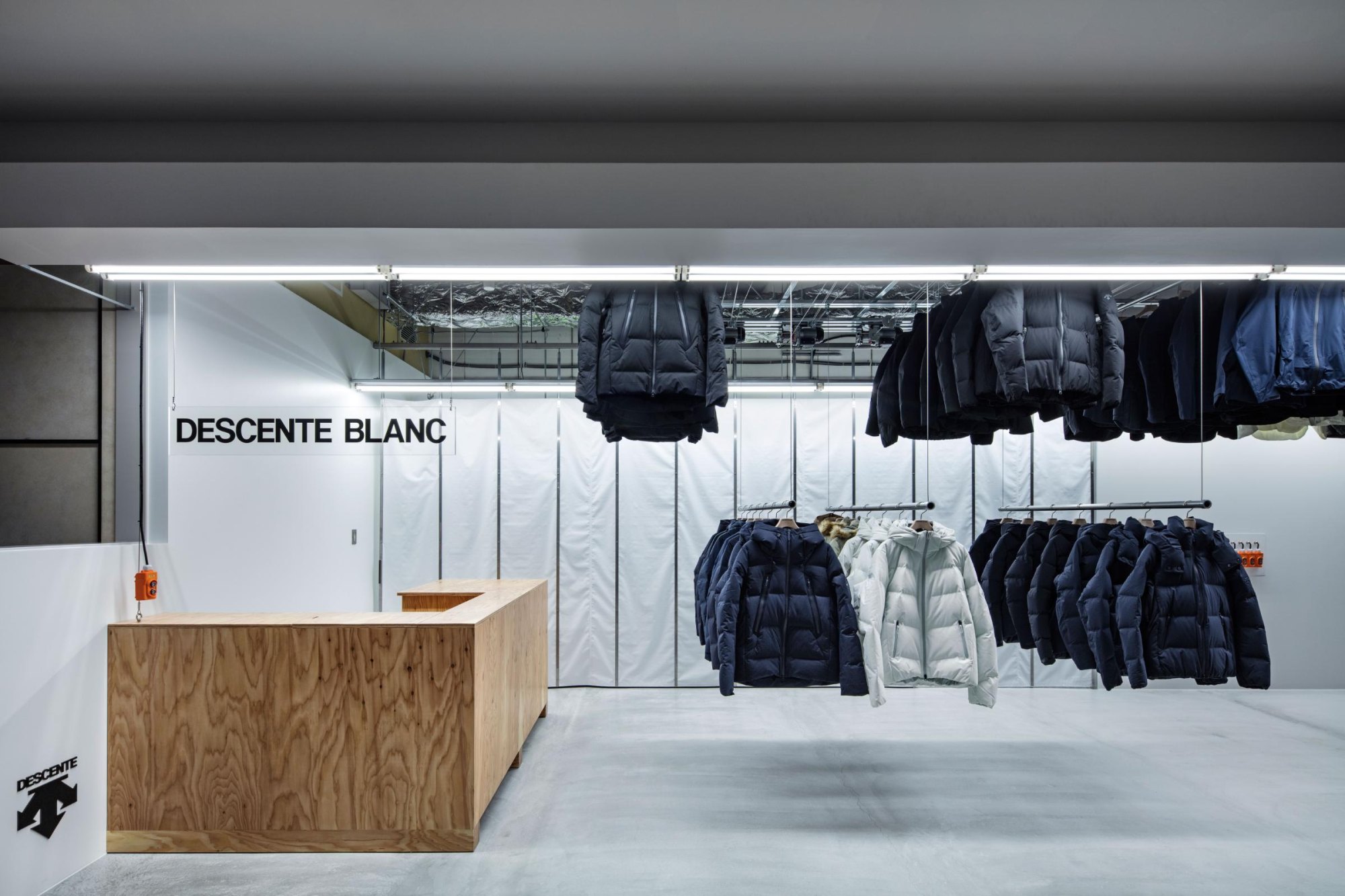
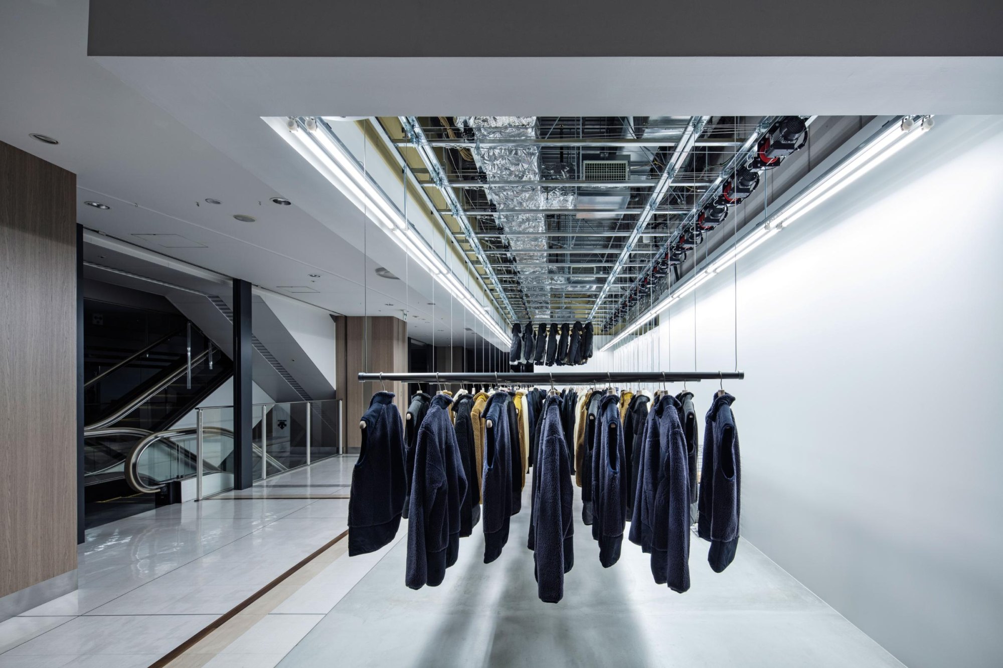
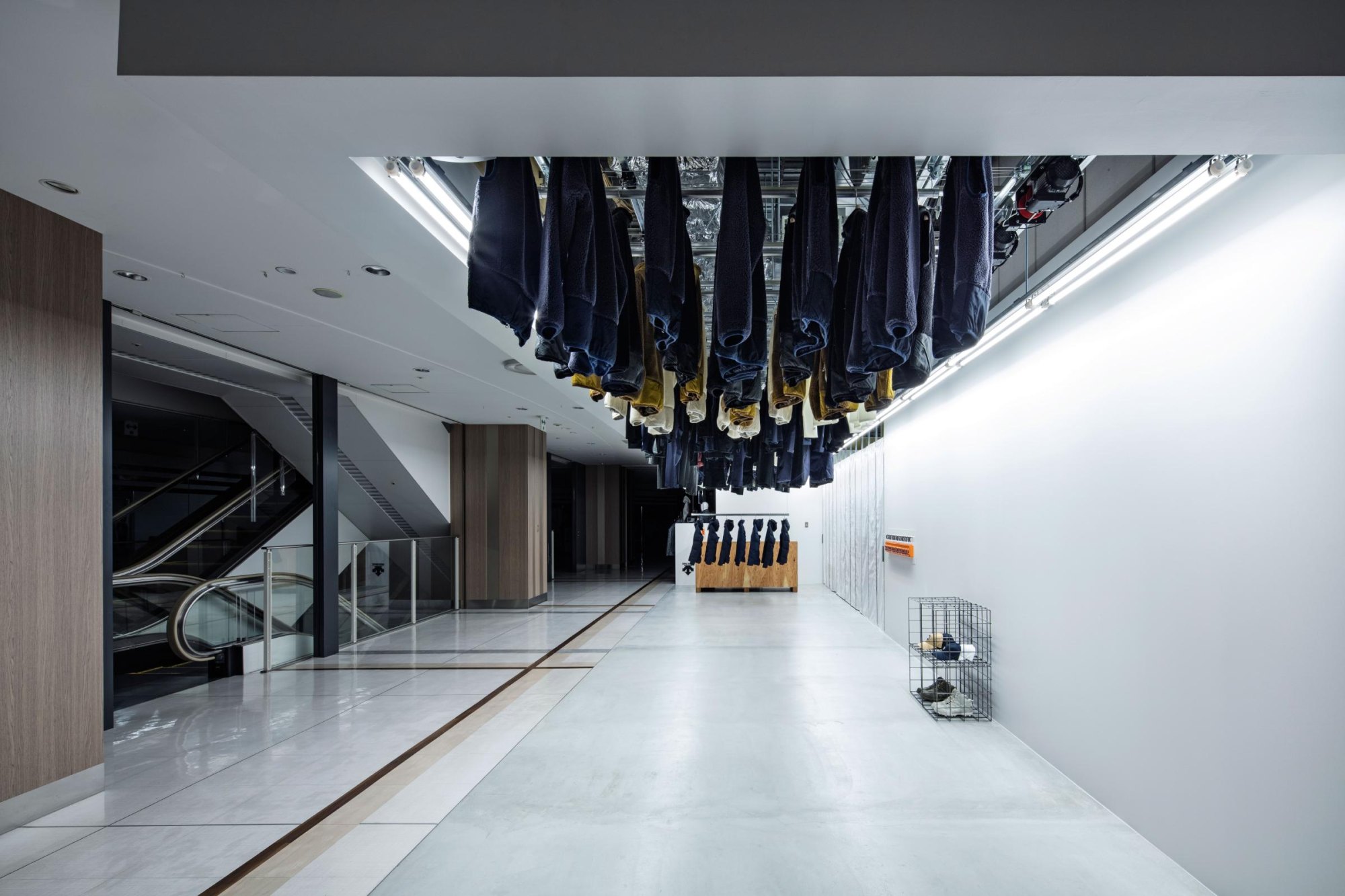
    This is a shop-in-shop for a sportswear brand inside a shopping mall. It is the smallest of the brand’s stores, but its storefront is relatively wide, and the design team used that width to show the clothes clearly.

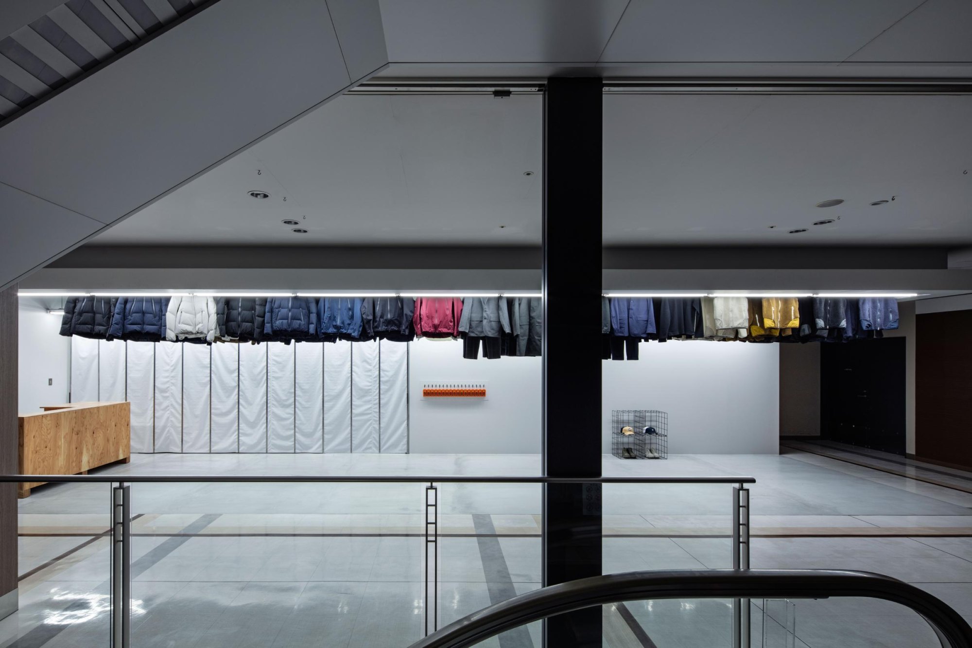
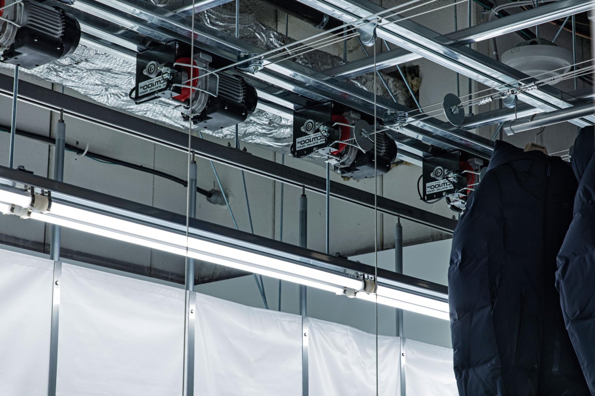
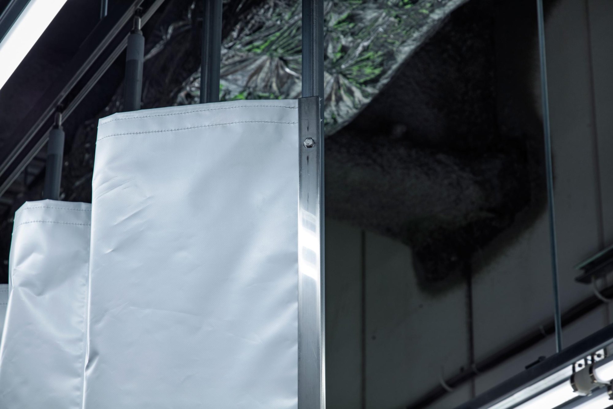
    A vertically movable hanger bar system runs perpendicular to the storefront, so garments can be raised, lowered and rearranged across the depth of the shop.

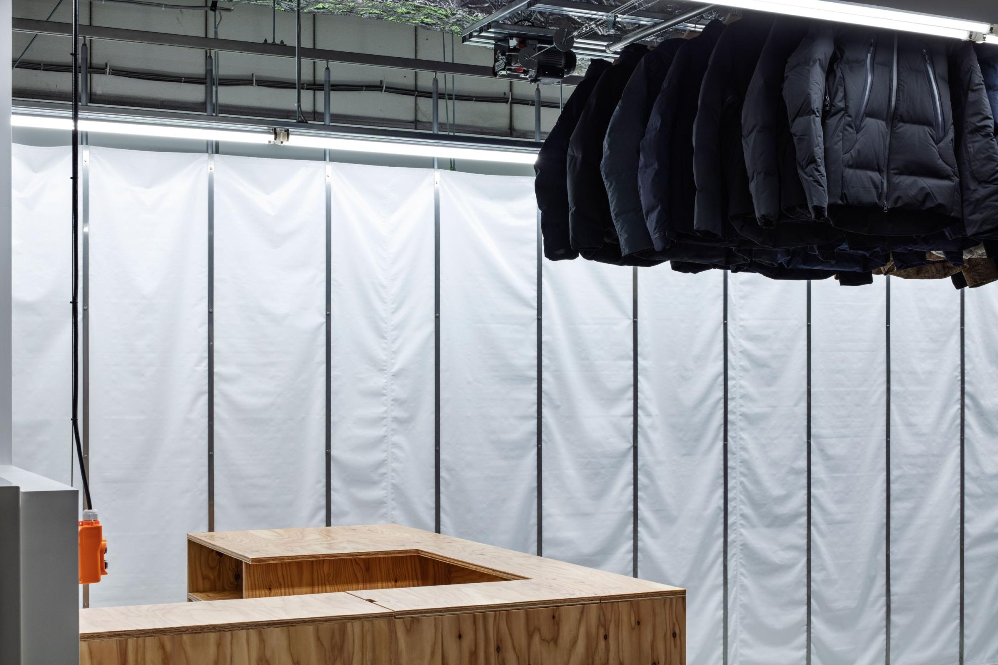
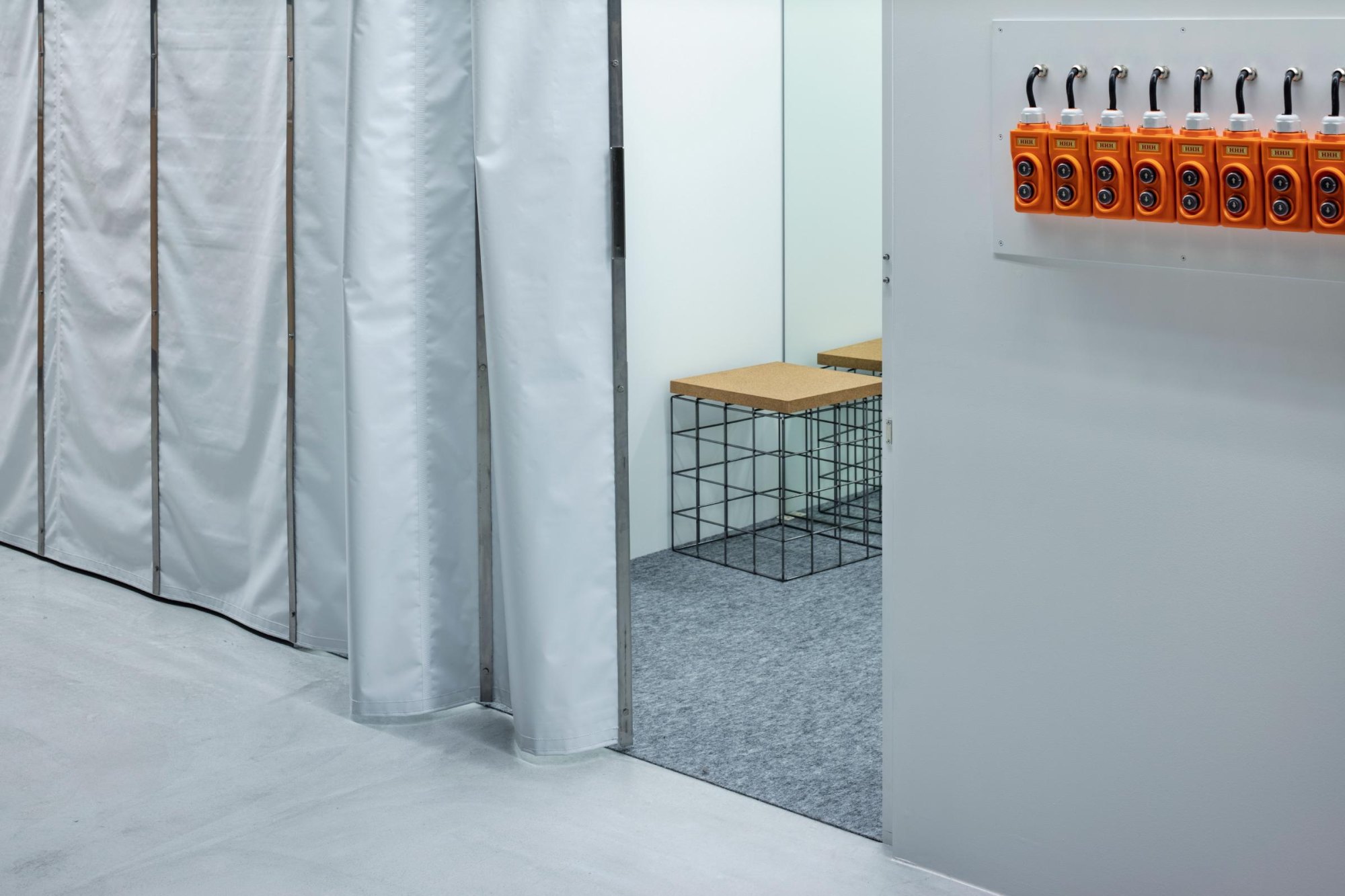
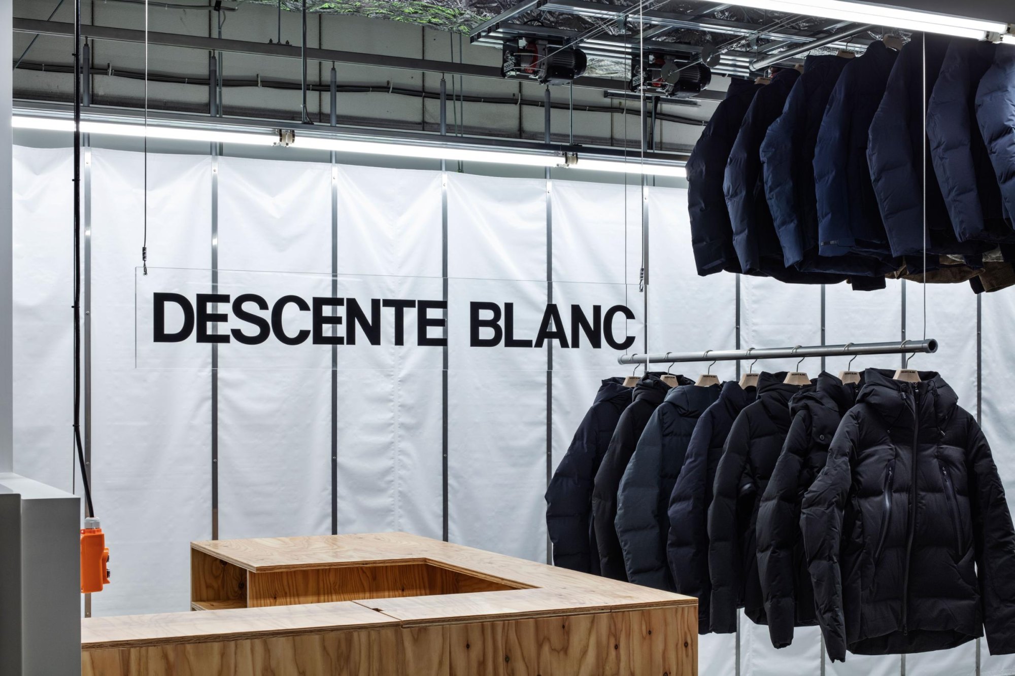
    A stockroom and fitting room take up one of the remaining spaces, hidden behind curtains modelled on construction-site gates of tarpaulin and steel frames. The cash counter sits in the other space, along with a store sign that also moves up and down, a first for the brand.

    Counter and jackets on the movable hanger bars
    DESCENTE BLANC Sapporo, view 2
    DESCENTE BLANC Sapporo, view 3
    Tarpaulin curtains hiding the fitting room
    Shop sign and jackets above the counter
    DESCENTE BLANC Sapporo, view 6
    DESCENTE BLANC Sapporo, view 7
    DESCENTE BLANC Sapporo, view 8
    DESCENTE BLANC Sapporo, view 9
    DESCENTE BLANC Sapporo, view 10
    DESCENTE BLANC Sapporo, view 11
  • Chalet on Powder Mountain

    Chalet on Powder Mountain

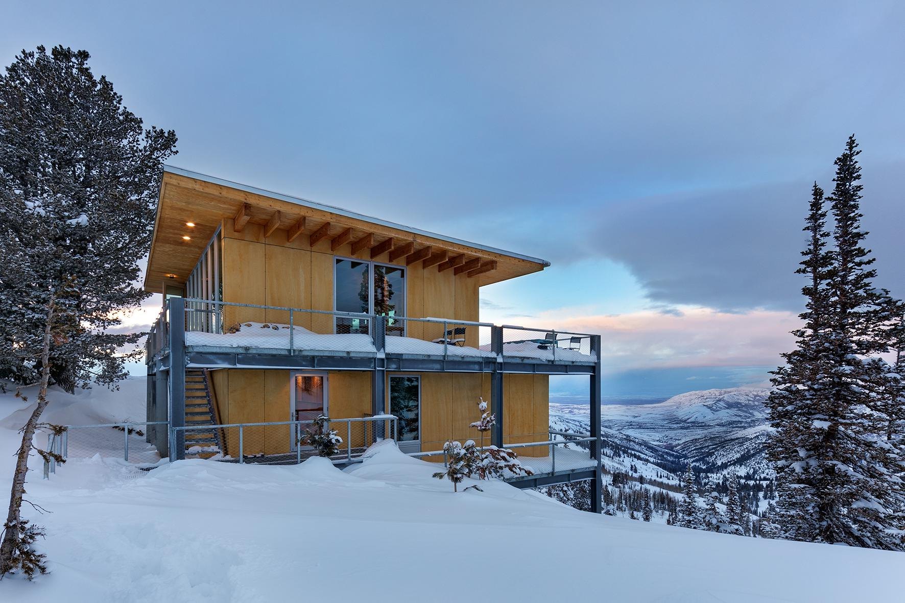
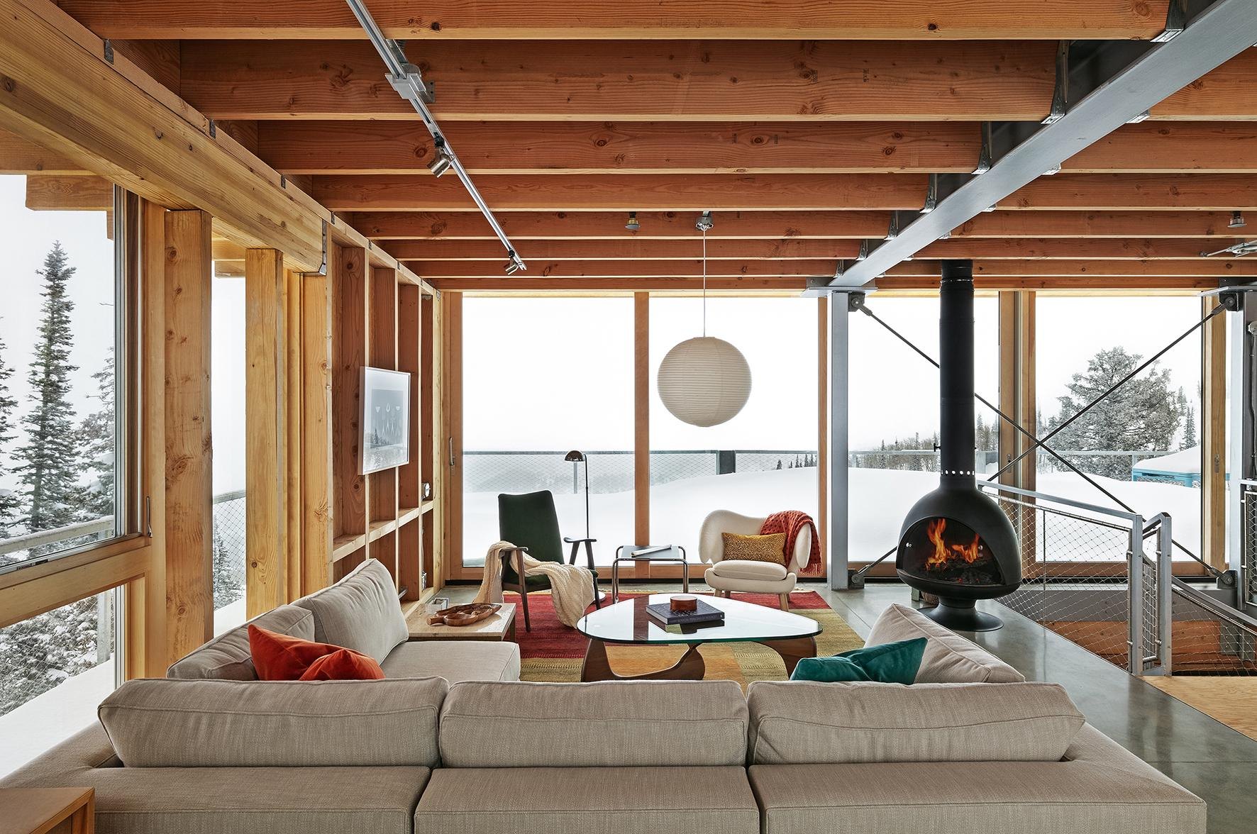
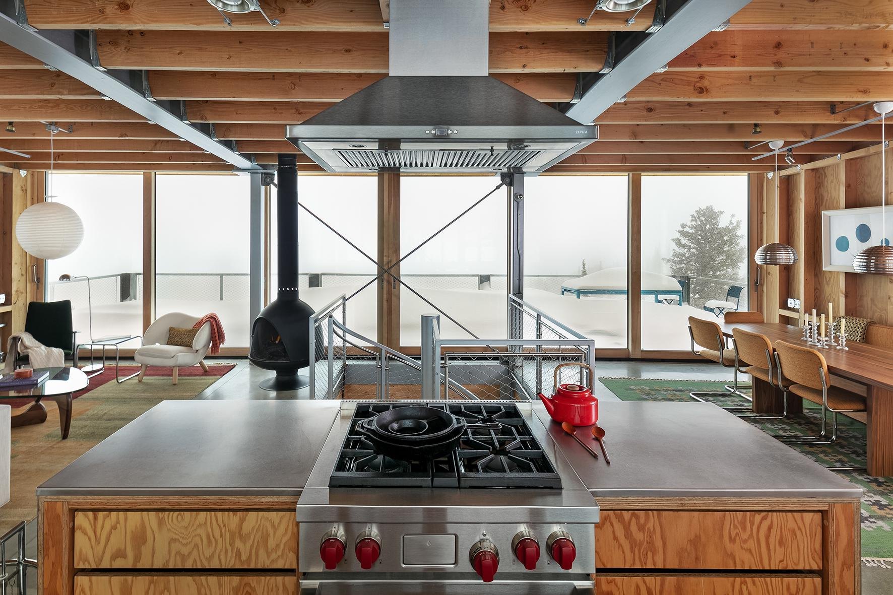
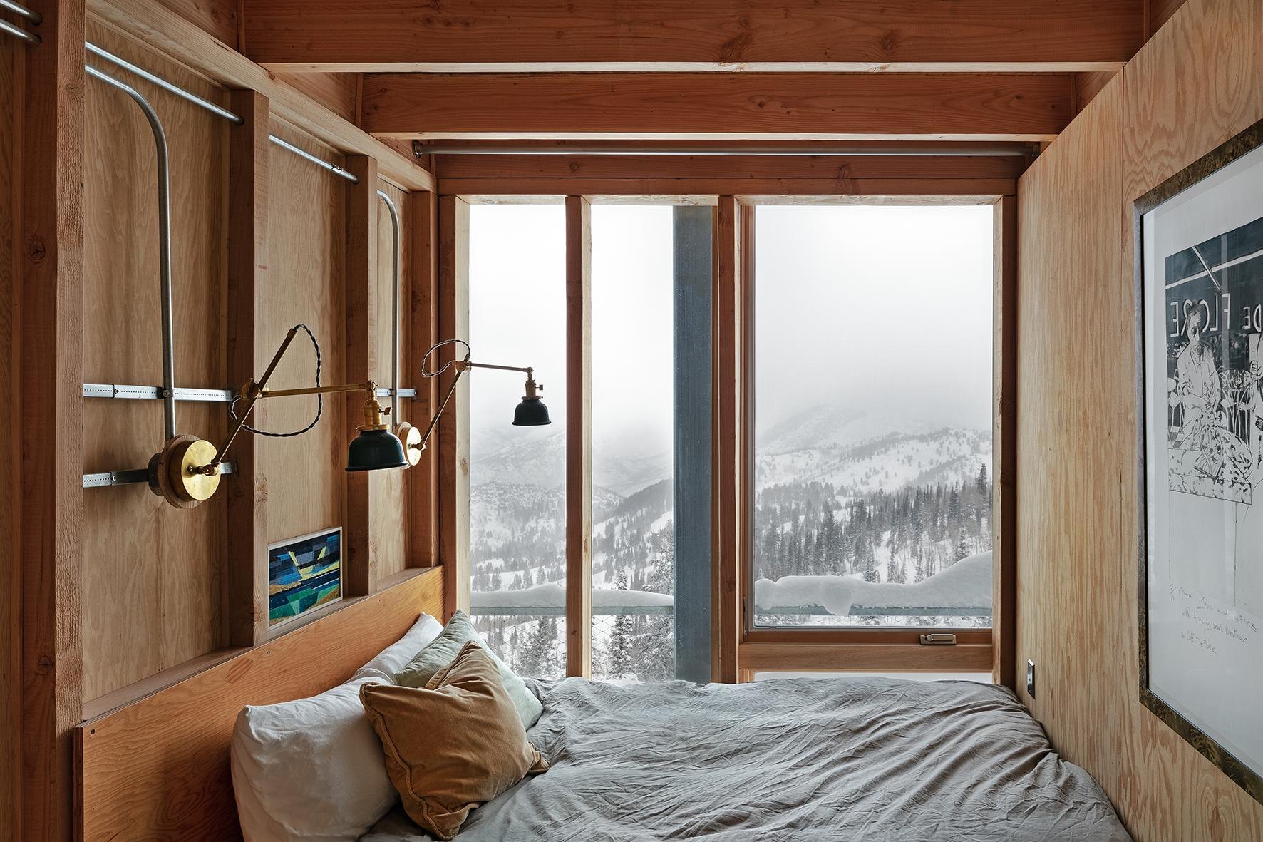
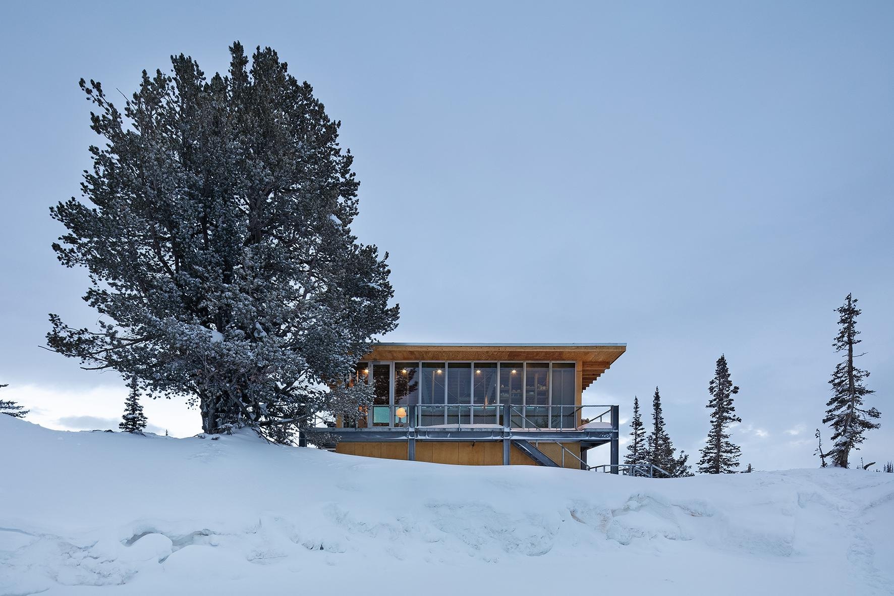
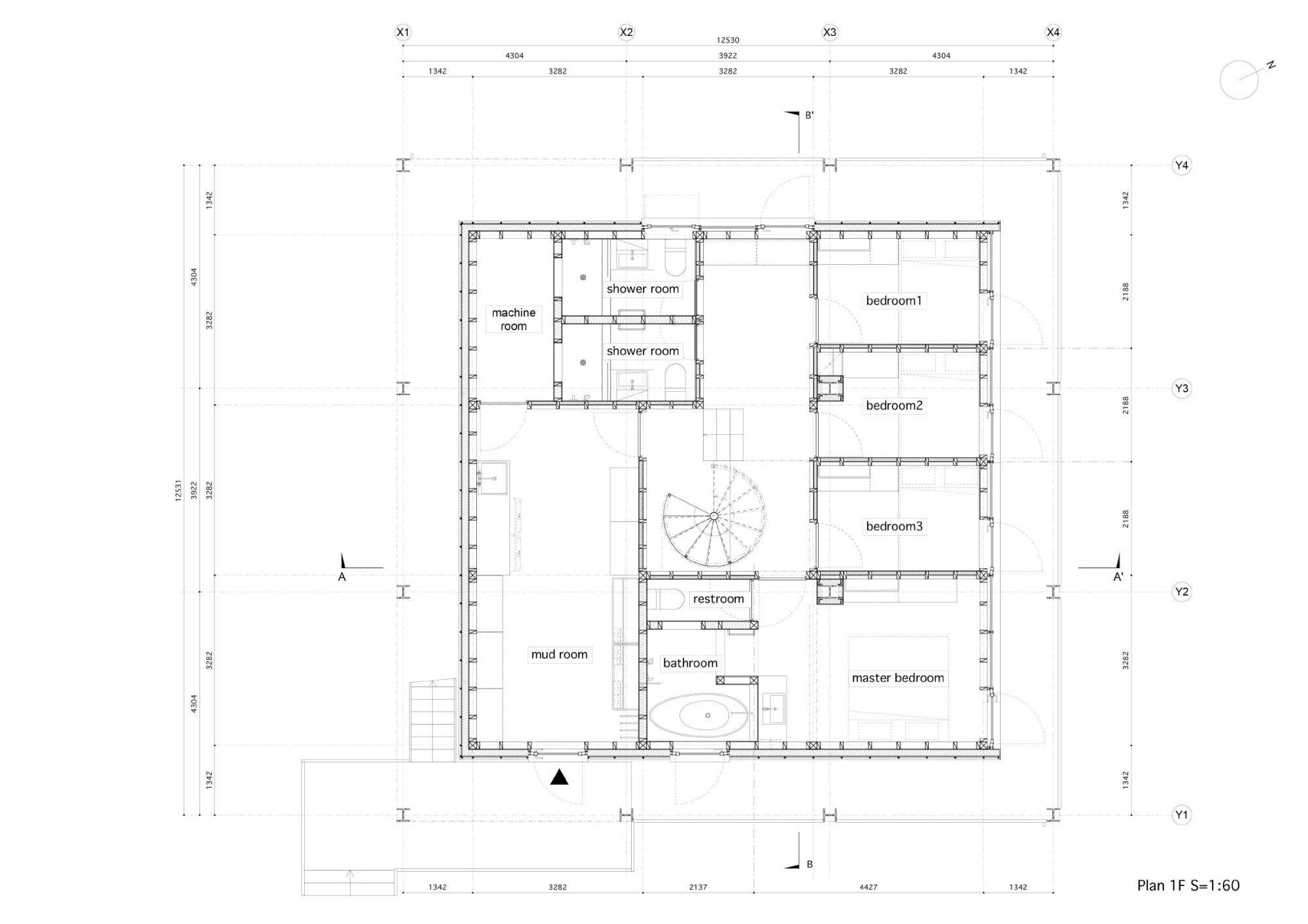
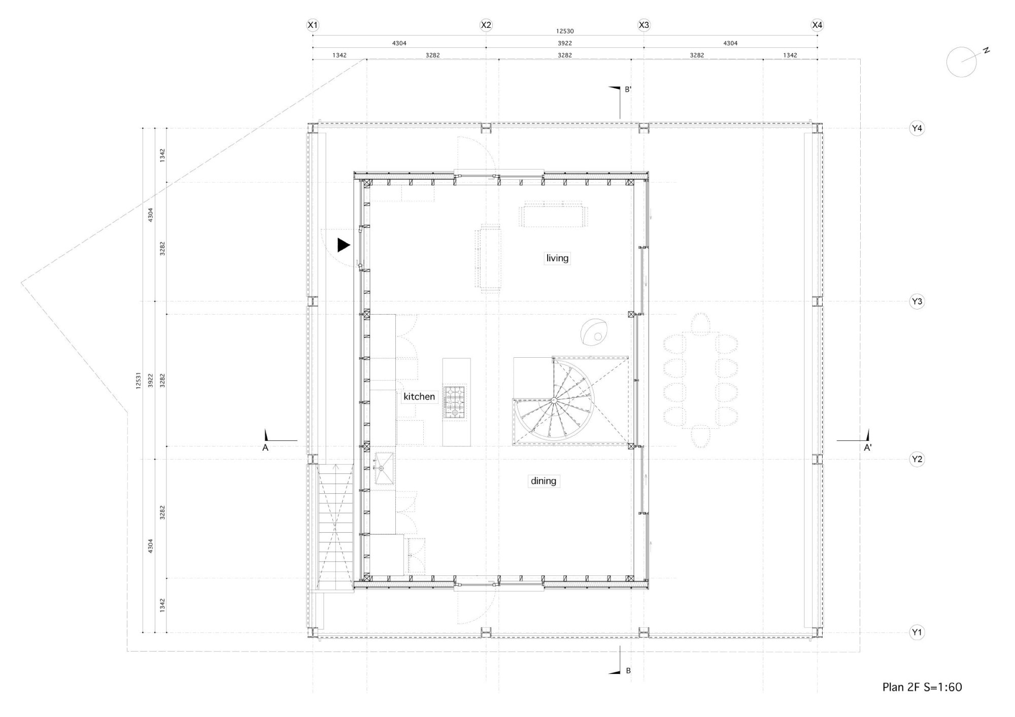
    This chalet stands just north of the top of a gentle slope that runs from north to south, at the northern end of a cluster of chalets inside a natural park. From the upper floor it looks south over the others, and it is well placed for both the town and the ski runs, with wide views to the north.

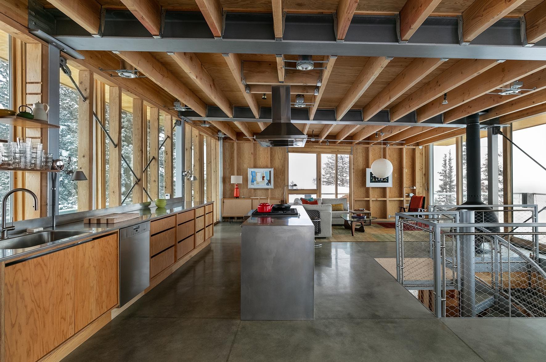
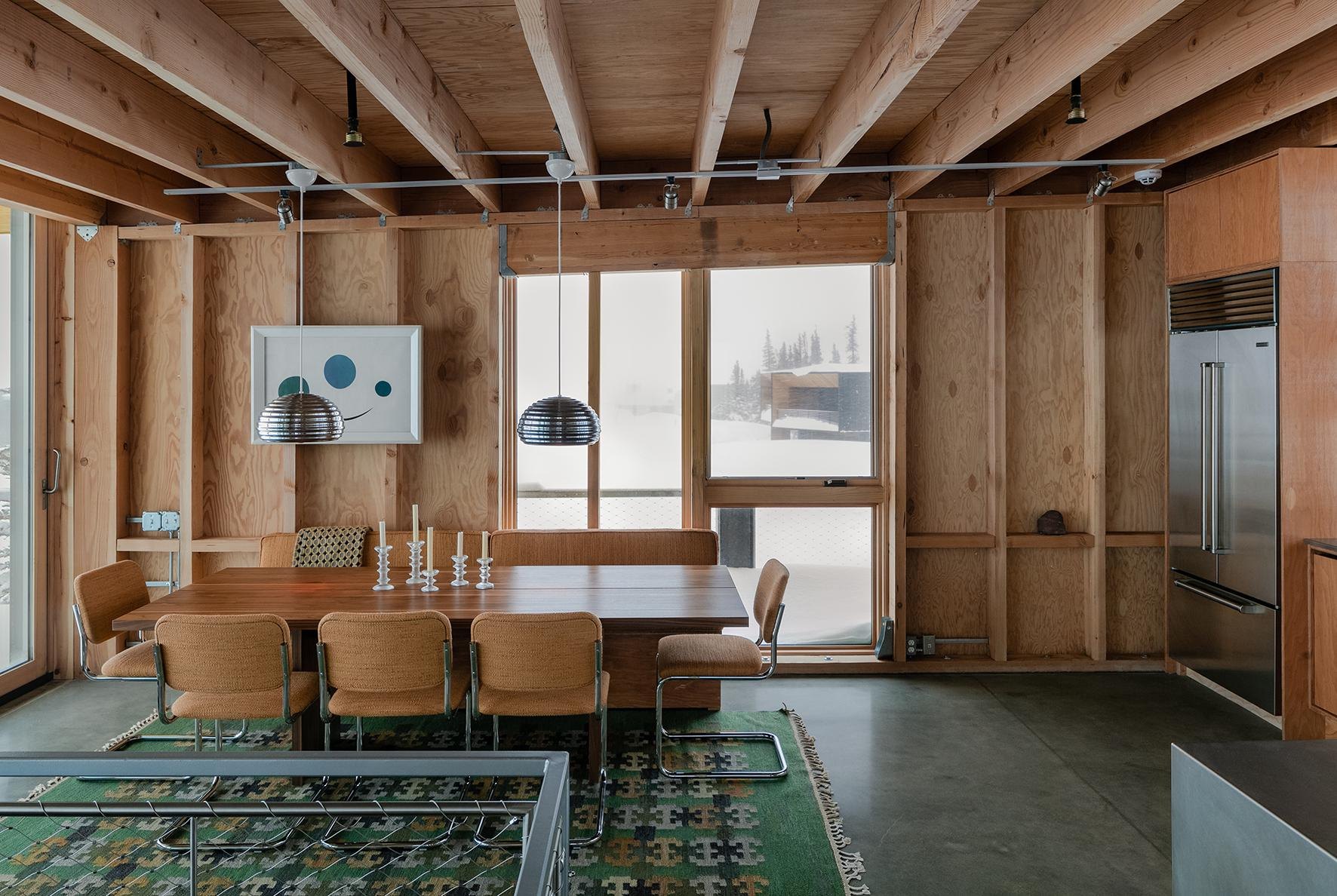
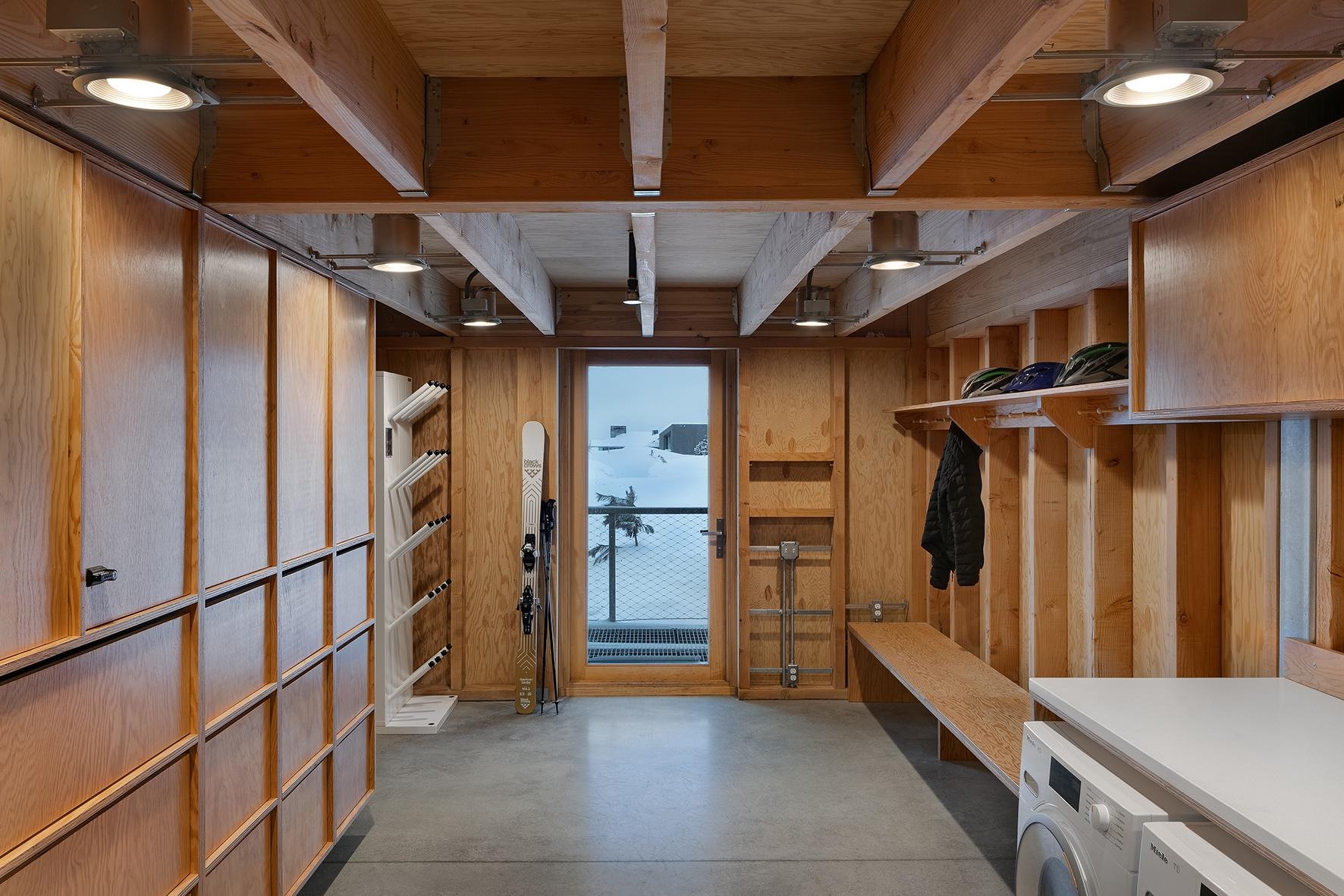
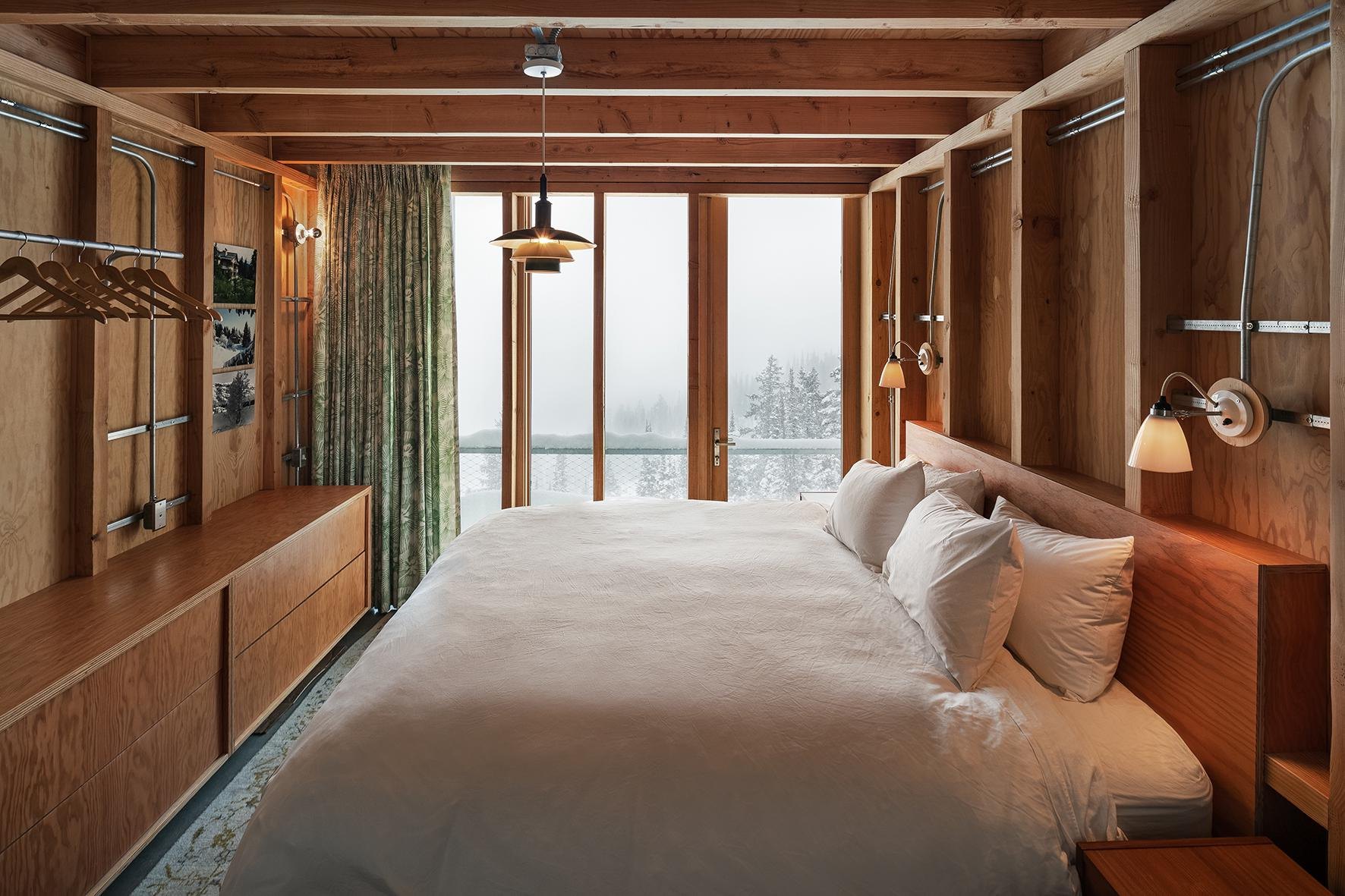
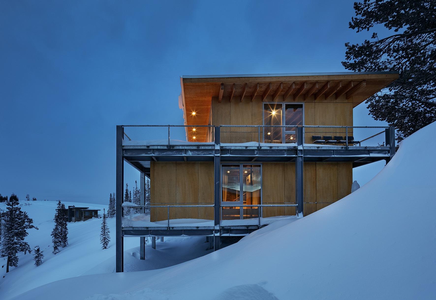
    After skiing, guests come off the slope from the south. On the lower floor they enter a mudroom, take off ski clothes and skis and hang them to dry, then shower and change in one of the bedrooms before going upstairs. The upper floor, open to the northern view, holds a generous balcony created by the setback rules, along with the kitchen, dining room and living room, where the day ends with food, drink and a fire.

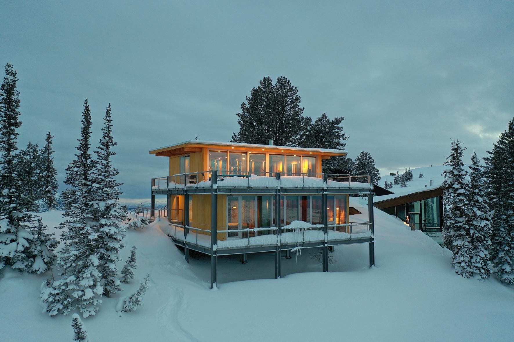
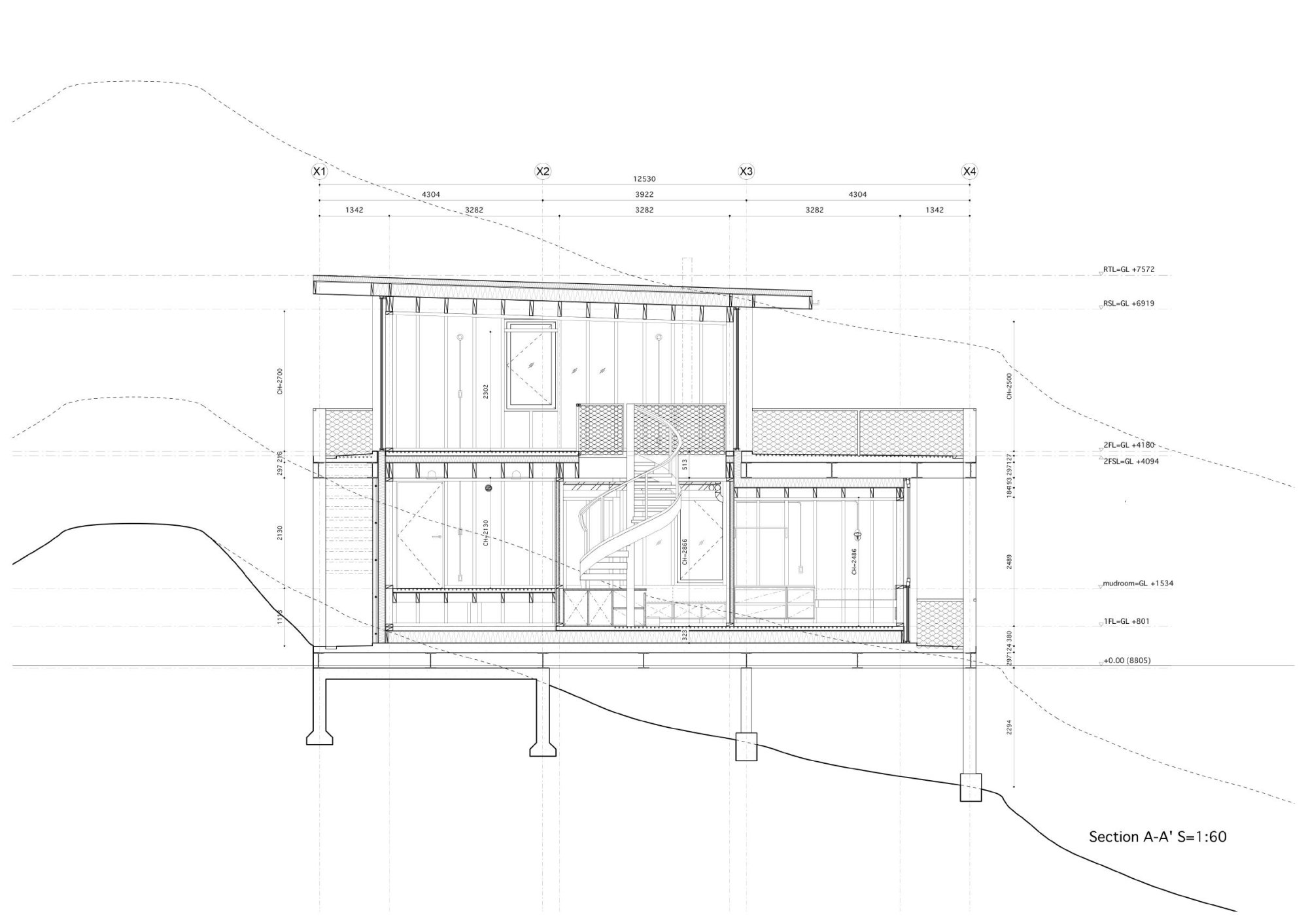
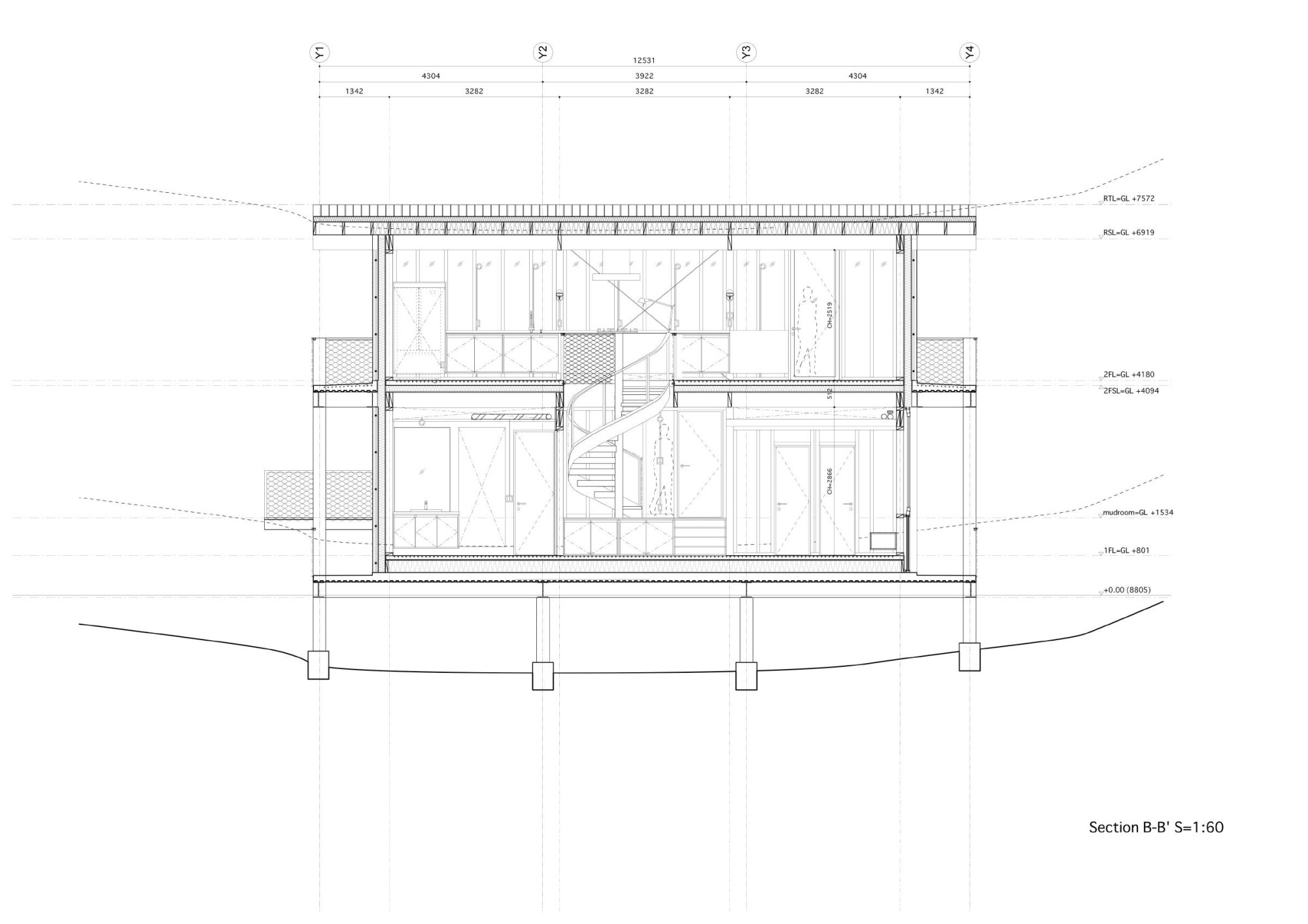
    Because the site lies in a natural park, building rules are strict and the buildable area is small, so the house fills exactly the maximum volume allowed. Its compact size suits the scale of the landscape and gives a sense of being tucked into it.

    The lower floor is a steel frame that keeps the building at a set distance from the slope, and a highly insulated timber structure sits on top to protect the interior. The timber blends with the ground and stones in summer and reads as warm against the snow in winter.

    The timber chalet on steel legs in the snow
    Chalet on Powder Mountain, view 2
    Chalet on Powder Mountain, view 3
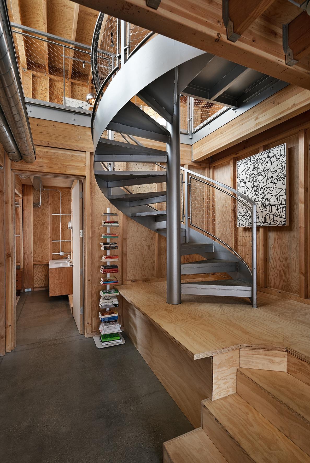
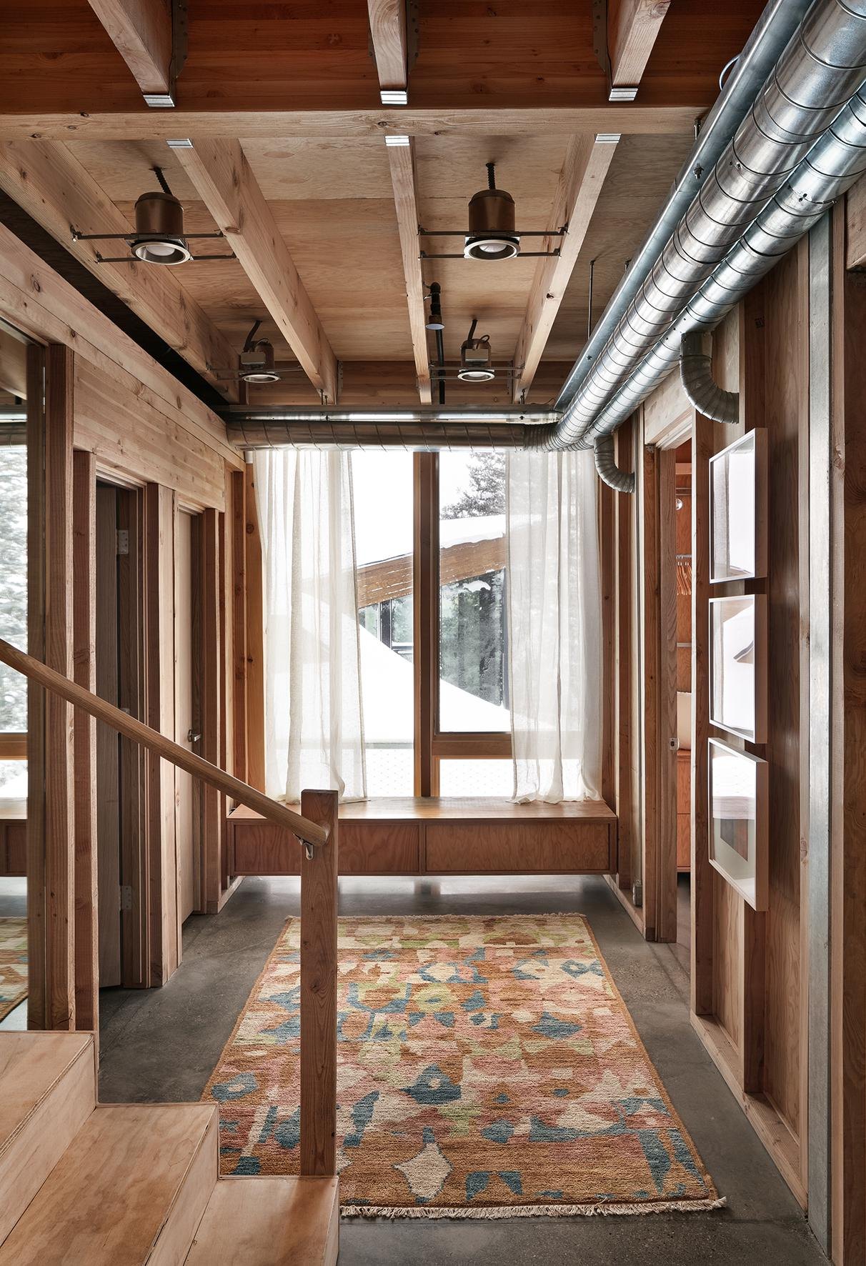
    Spiral stair between the floors
    Chalet on Powder Mountain, view 5
    Chalet on Powder Mountain, view 6
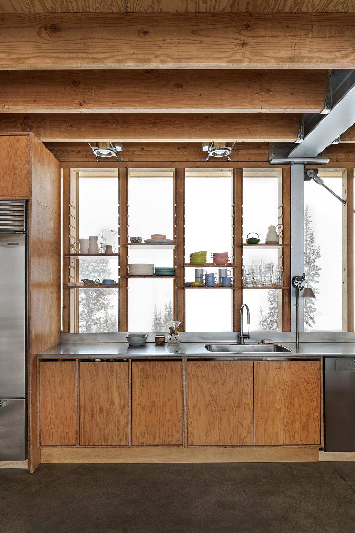
    Kitchen with a long cooking island
    Chalet on Powder Mountain, view 8
    Chalet on Powder Mountain, view 9
    Chalet on Powder Mountain, view 10
    Chalet on Powder Mountain, view 11
    The chalet among pine trees in winter
    The chalet raised above the snowy slope at dusk
    Balcony facing the northern view
    Lower floor plan
    Upper floor plan
    Section
    Section
  • Portable

    Portable

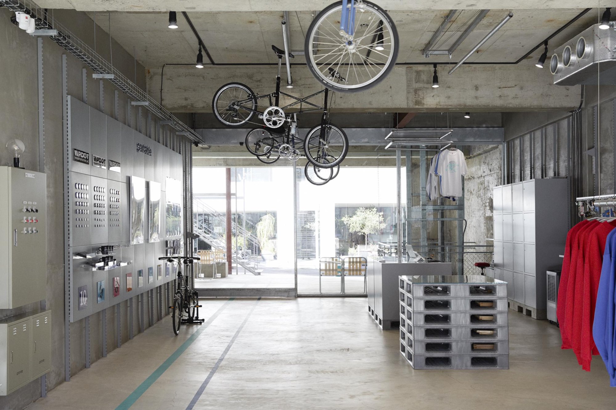
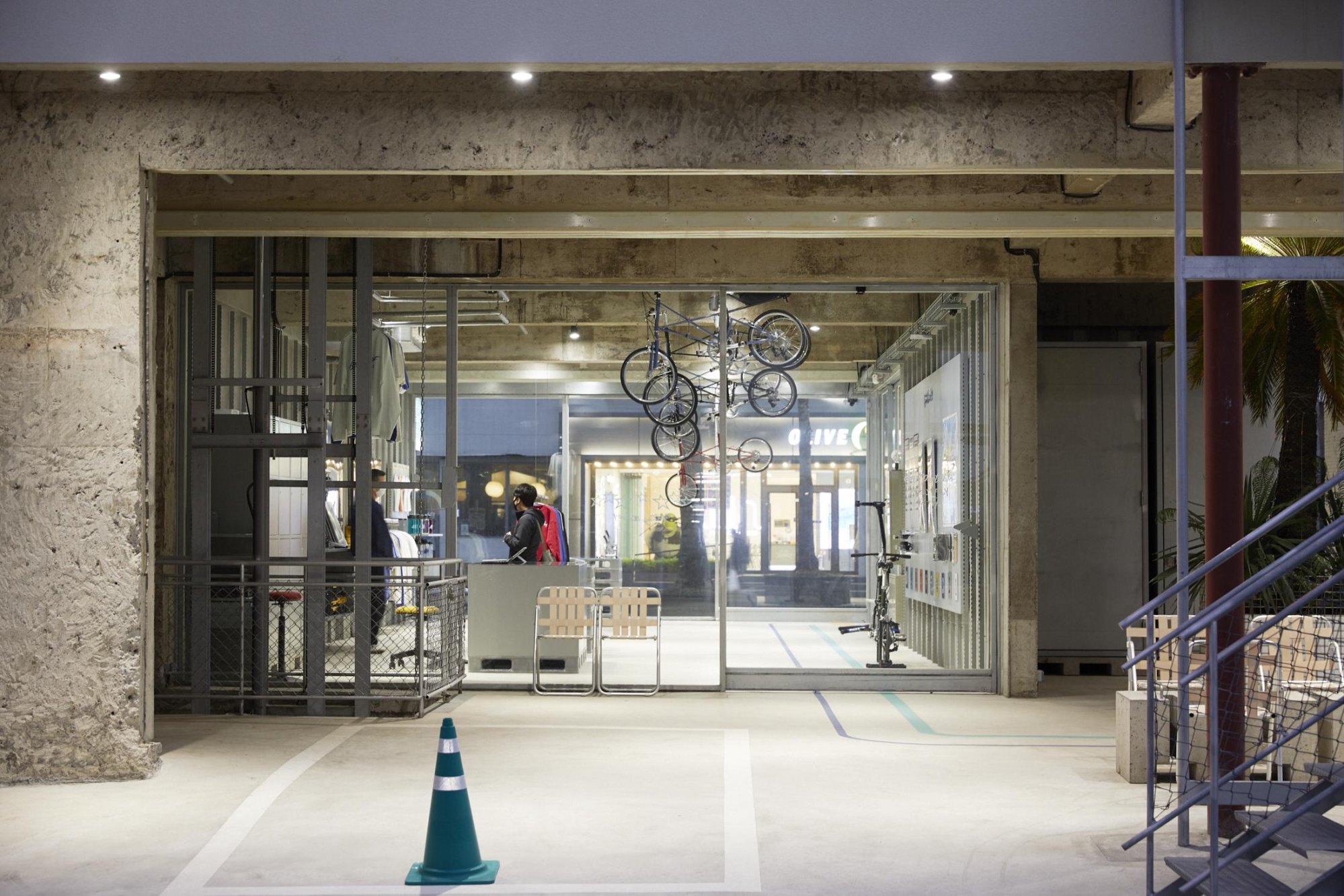
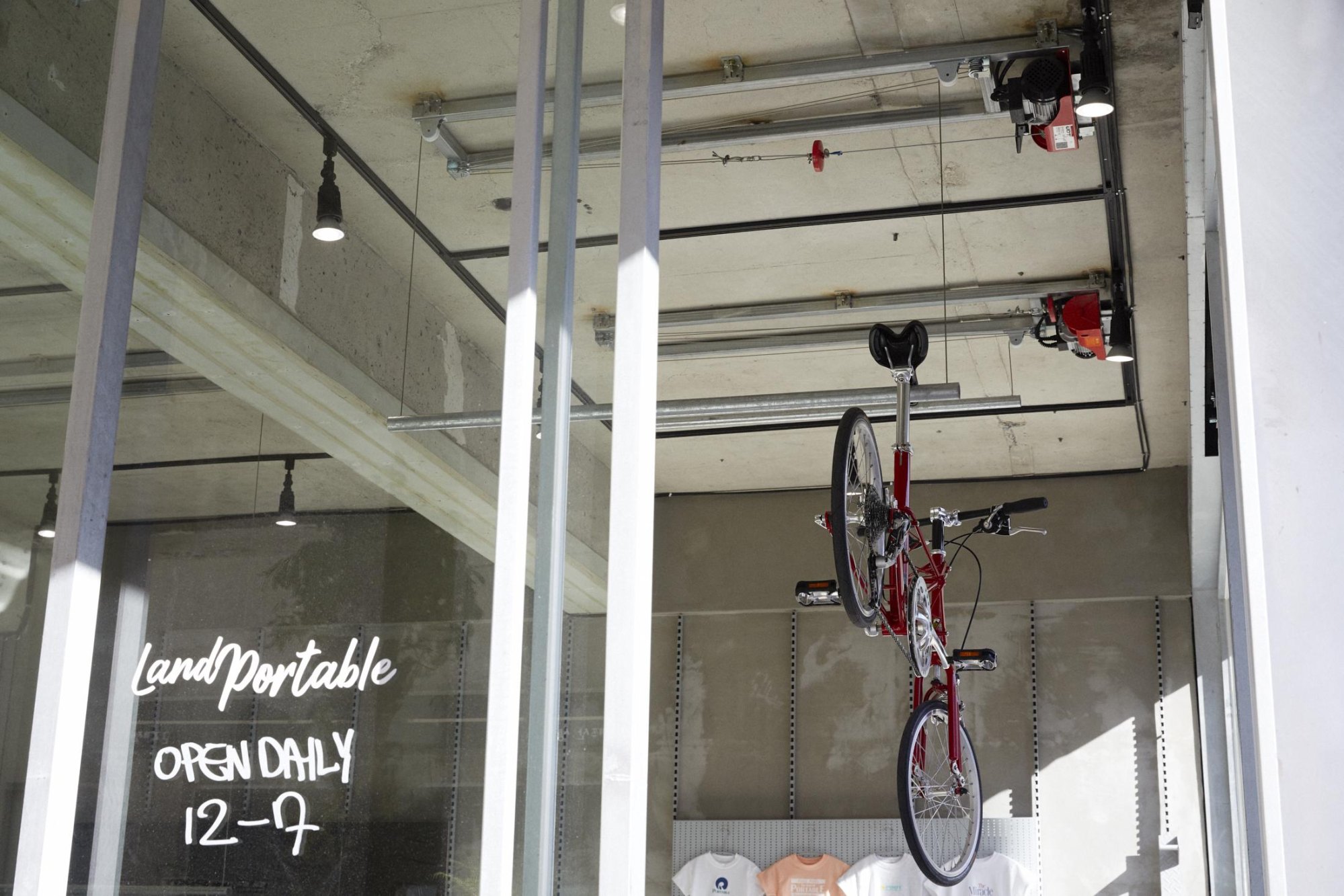
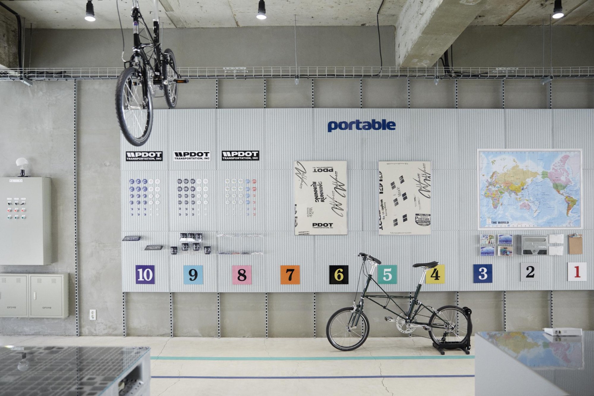
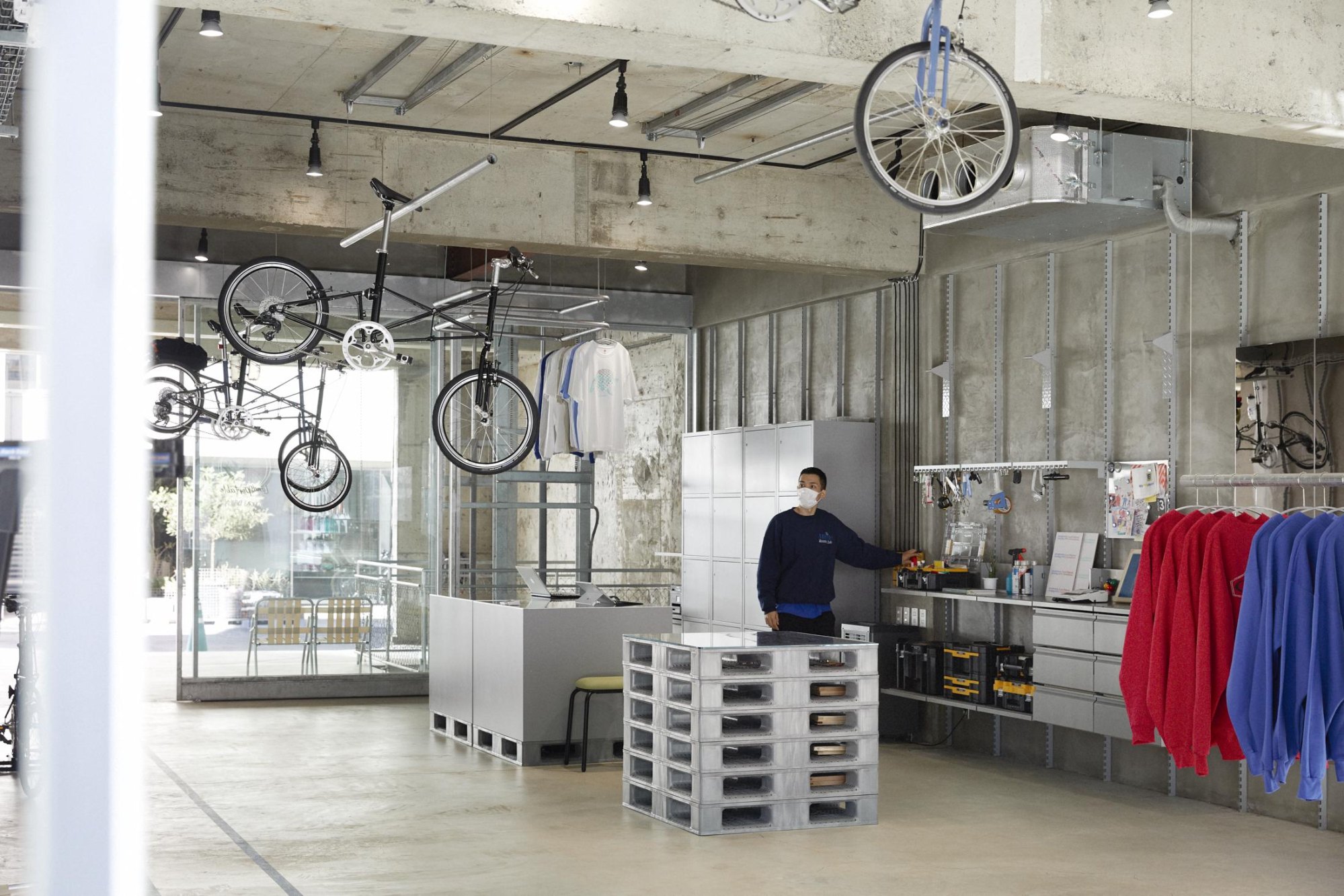
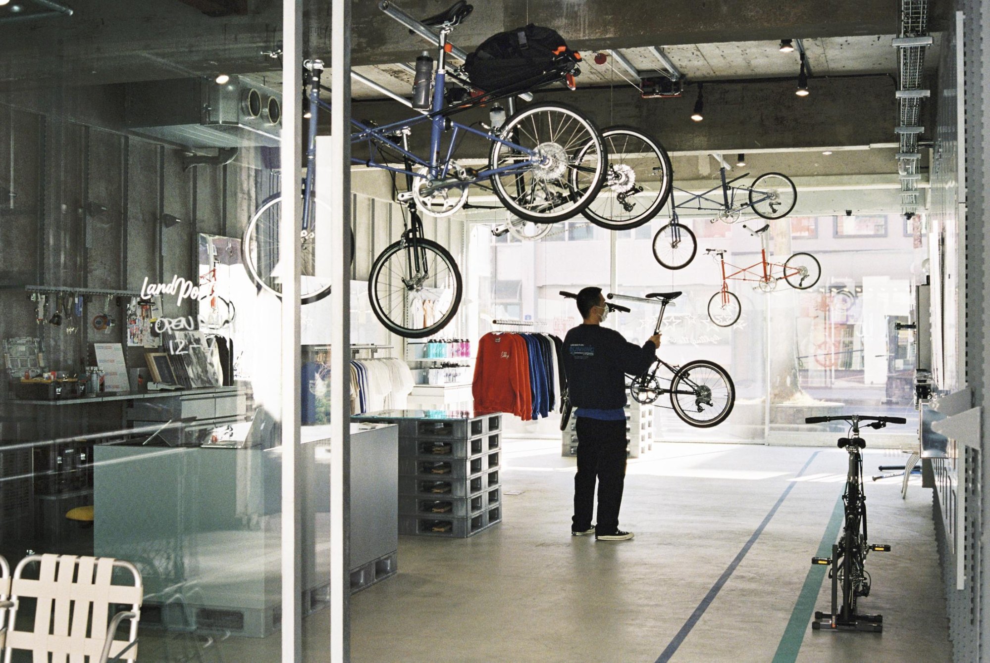
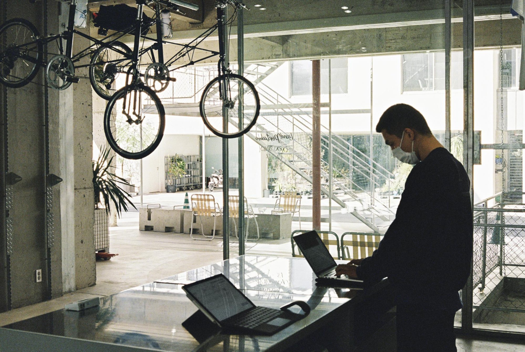
    Portable is a ground-floor shop for visitors exploring an island by bicycle as well as by car. It rents and sells only folding bikes, which suit the size of the island and fit easily in a car.

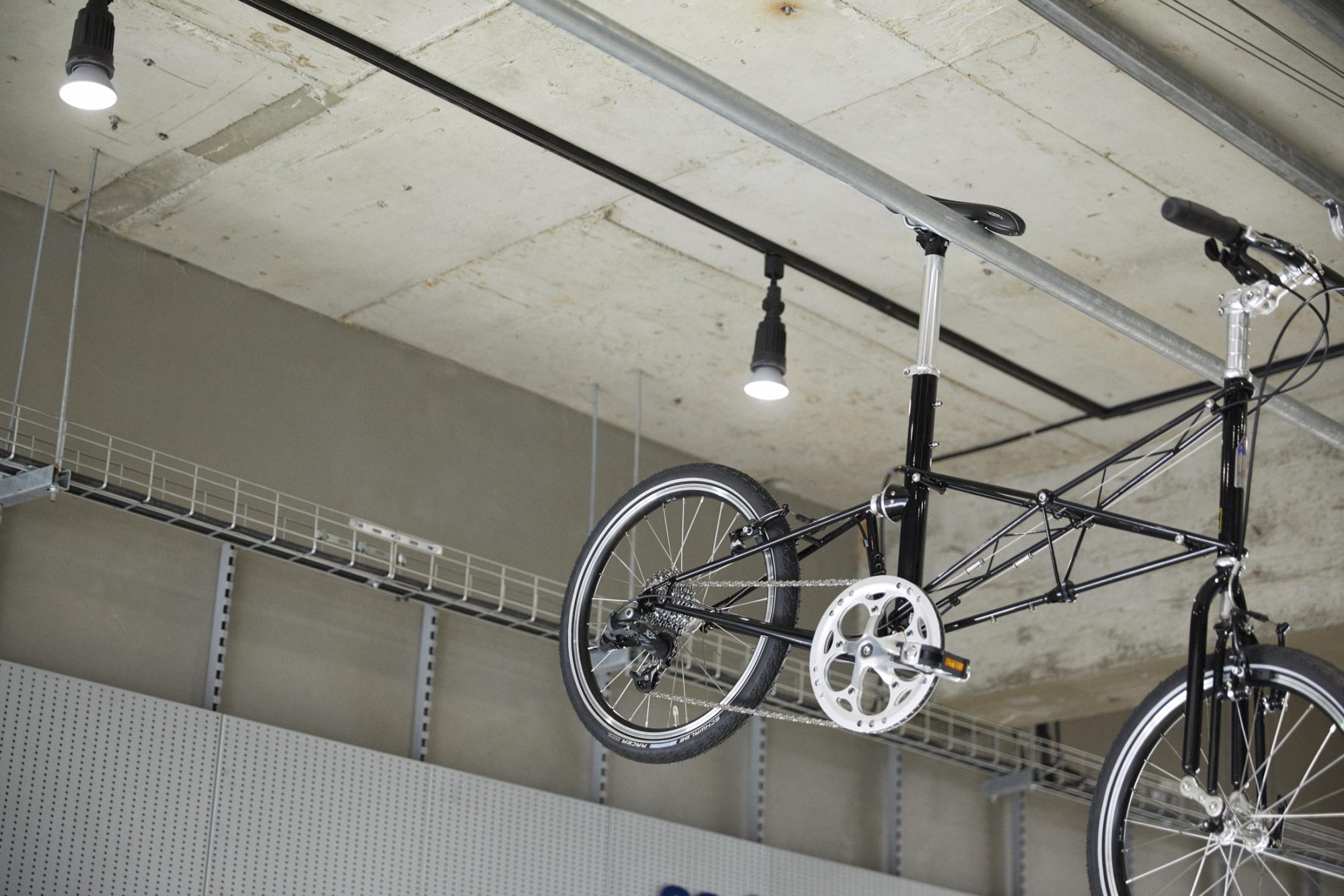
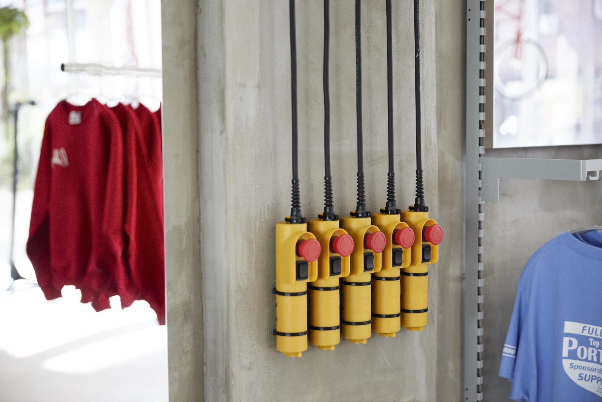
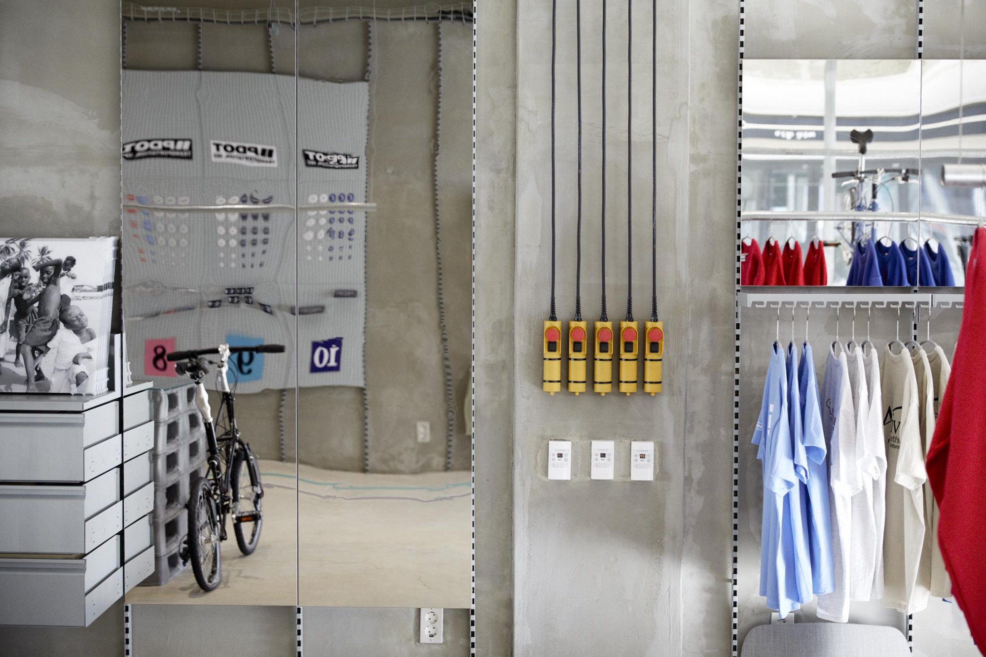
    Yoga and other sports workshops are held from time to time, so a vertically movable hanger rack system lets the bikes be lifted into the ceiling and frees the whole floor for other uses.

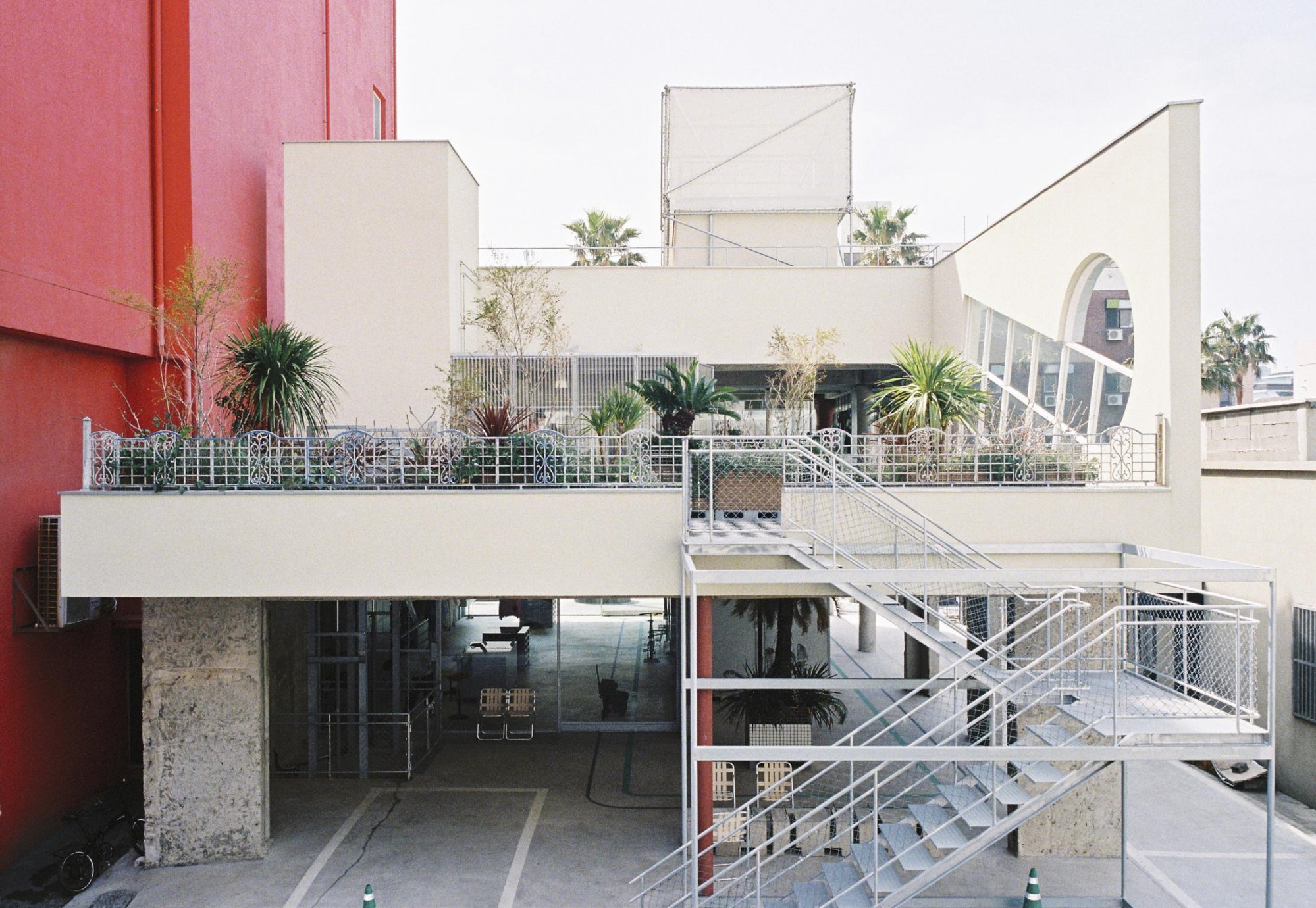
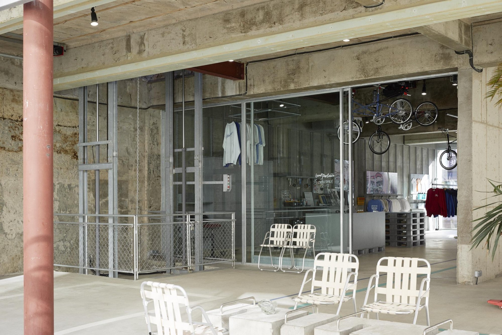
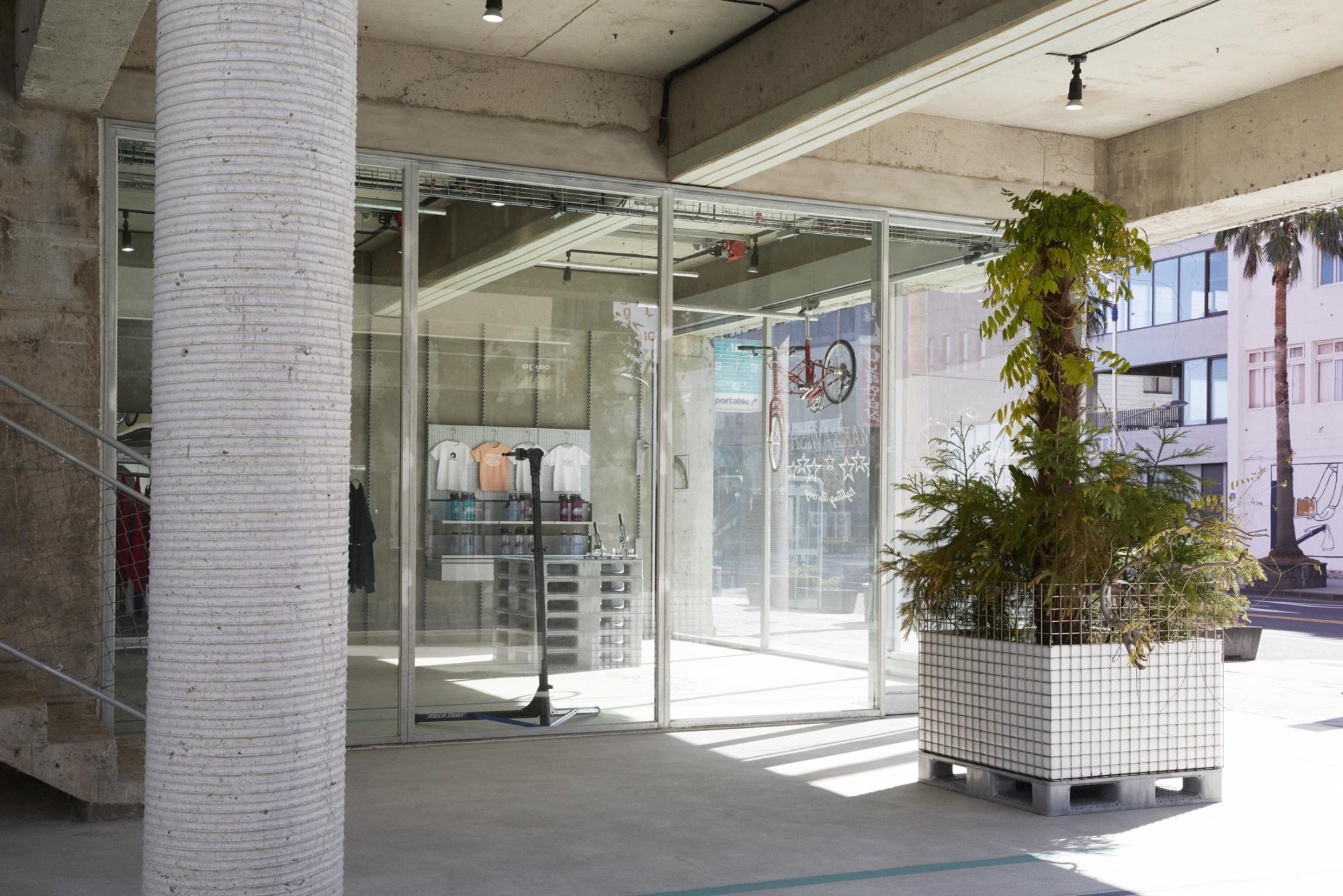
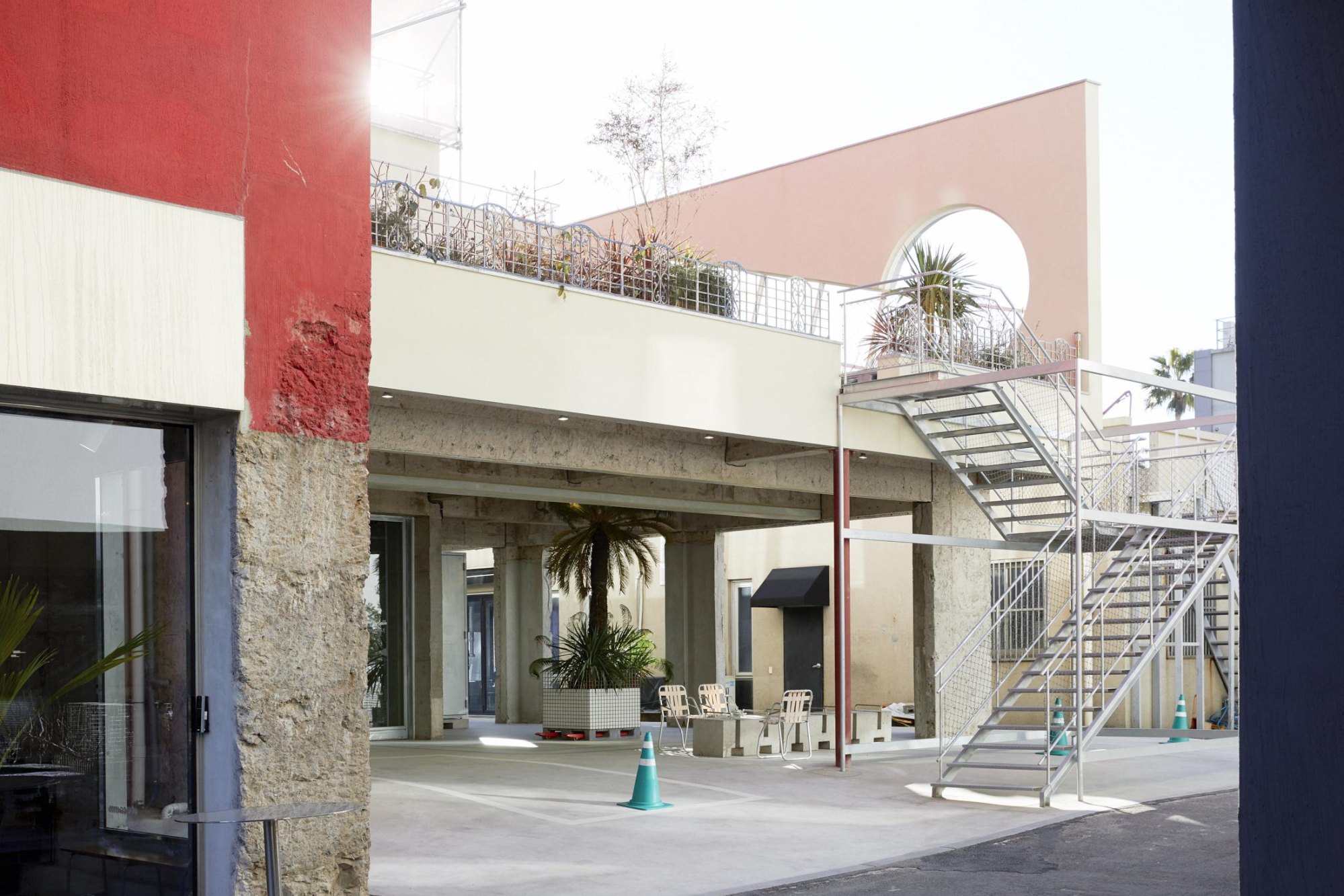
    The same racks carry clothes and other goods, and visitors can reach up, touch and look at whatever hangs from them. The shop opens through glass onto a covered forecourt, and its concrete shell and exposed services keep the interior plain.
    The building with a red wall and a planted terrace
    Portable, view 2
    Folding bikes hung from the ceiling racks
    Portable, view 4
    Portable, view 5
    Clothes and bright packaging on the hanger racks
    Portable, view 7
    Portable, view 8
    Portable, view 9
    Portable, view 10
    Portable, view 11
    Portable, view 12
    Portable, view 13
    Portable, view 14
    Portable, view 15
  • Co-ownership of Action: Trajectories of Elements

    Co-ownership of Action: Trajectories of Elements

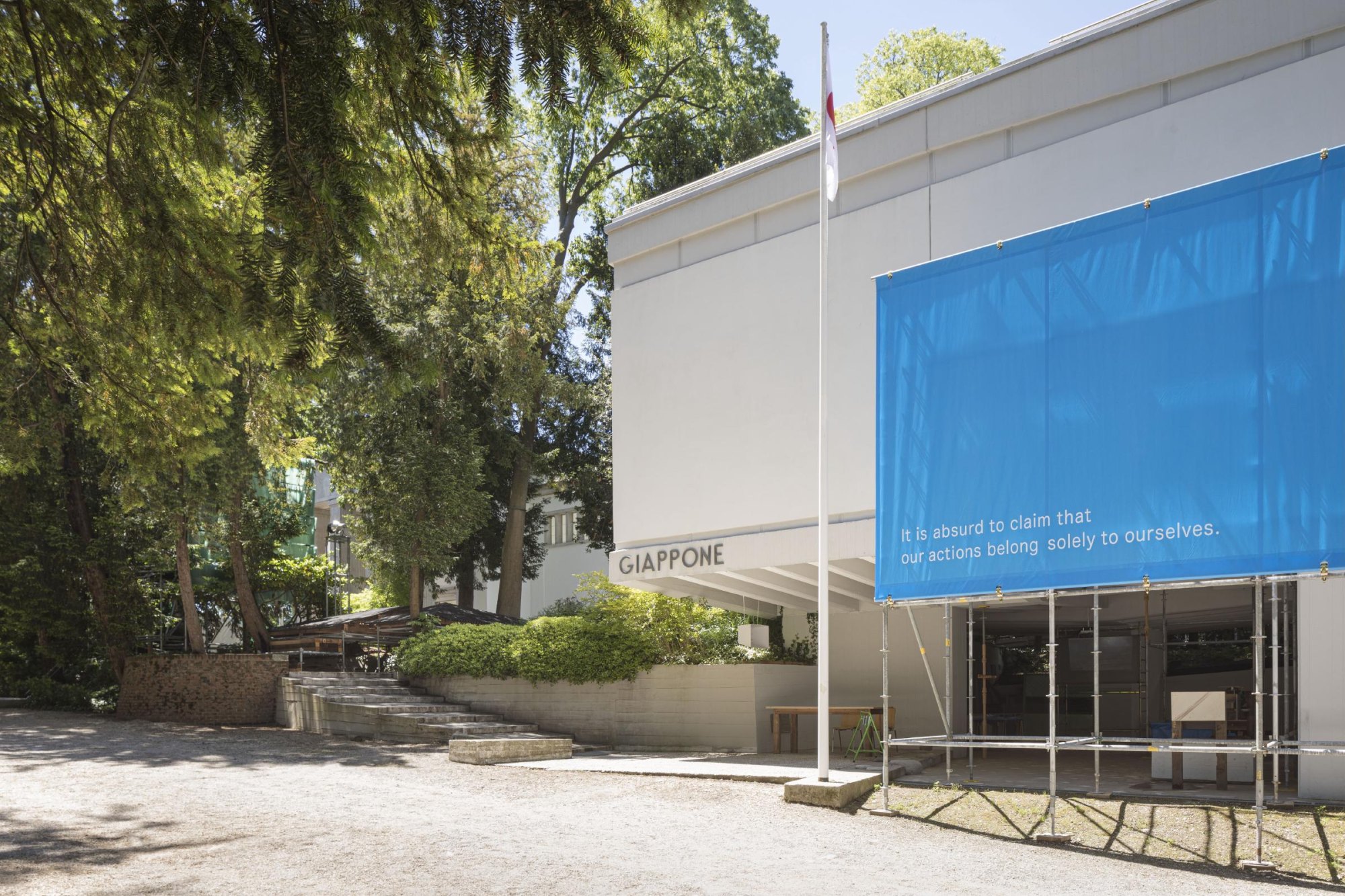
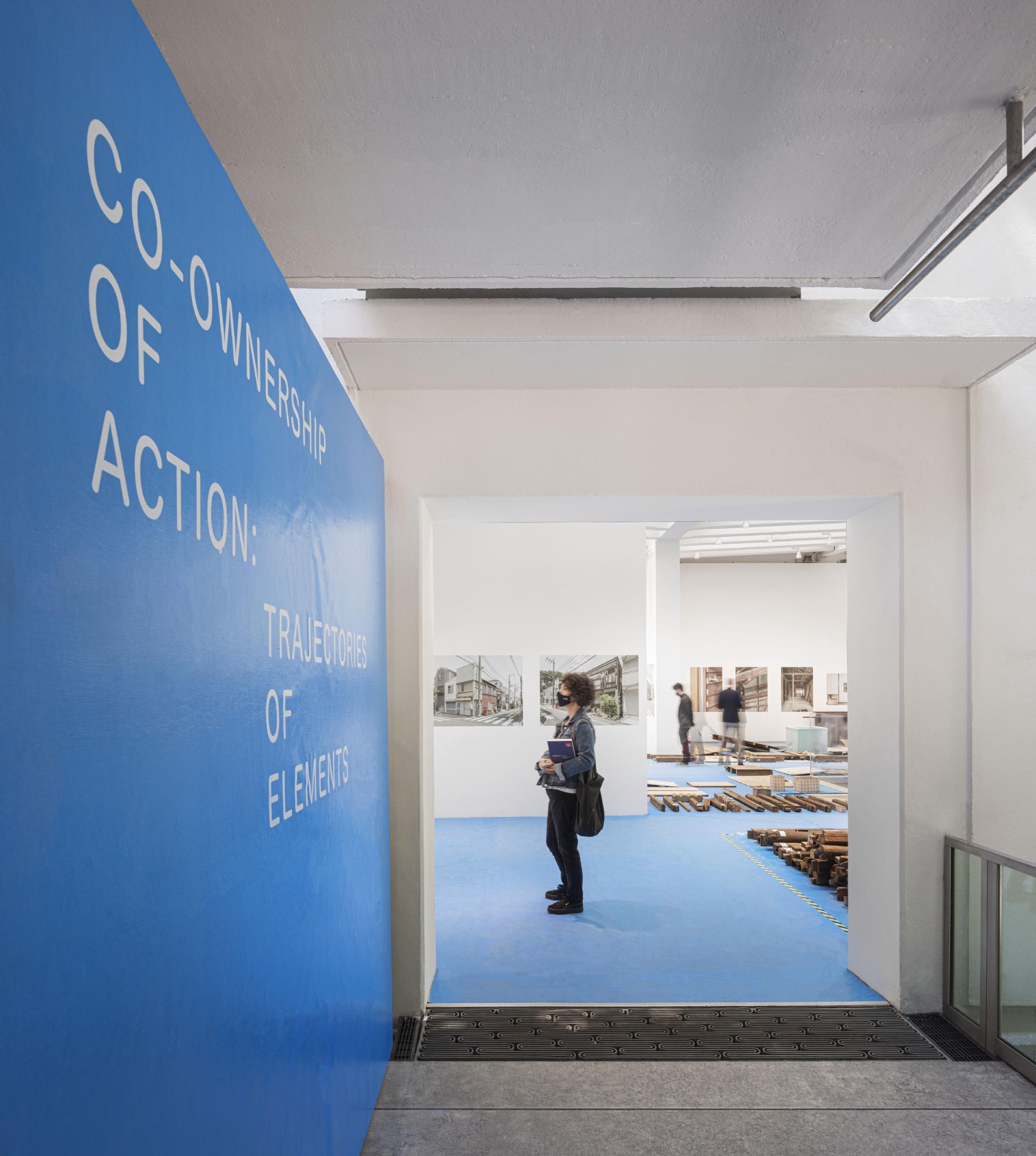
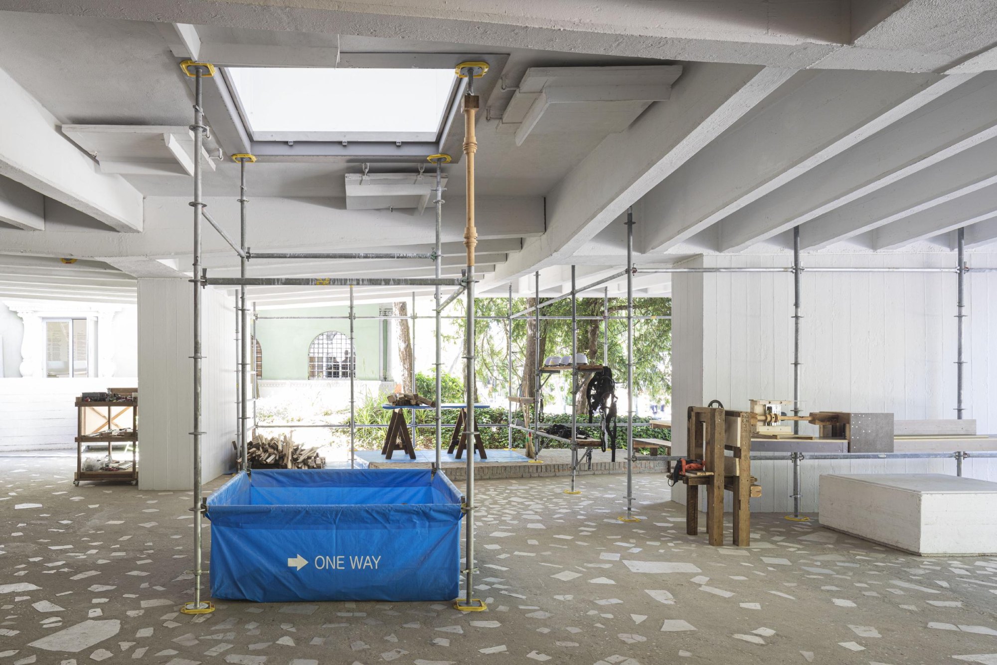
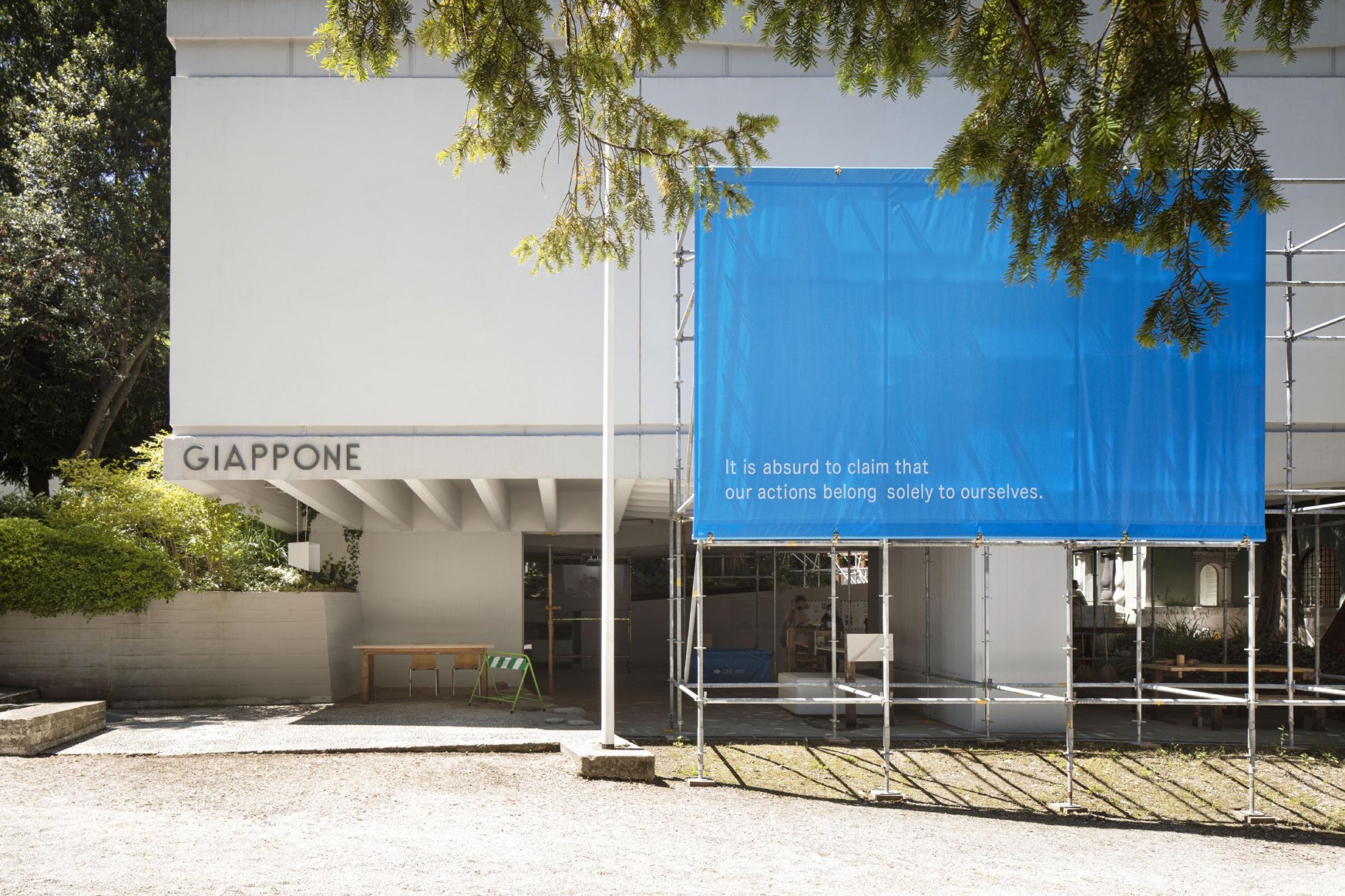
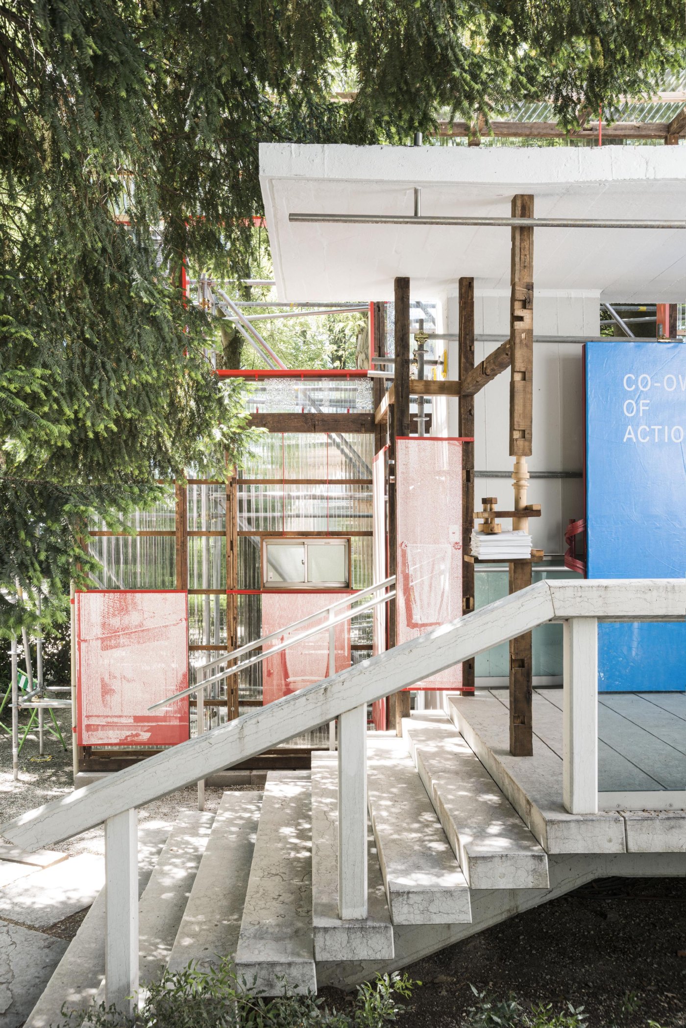
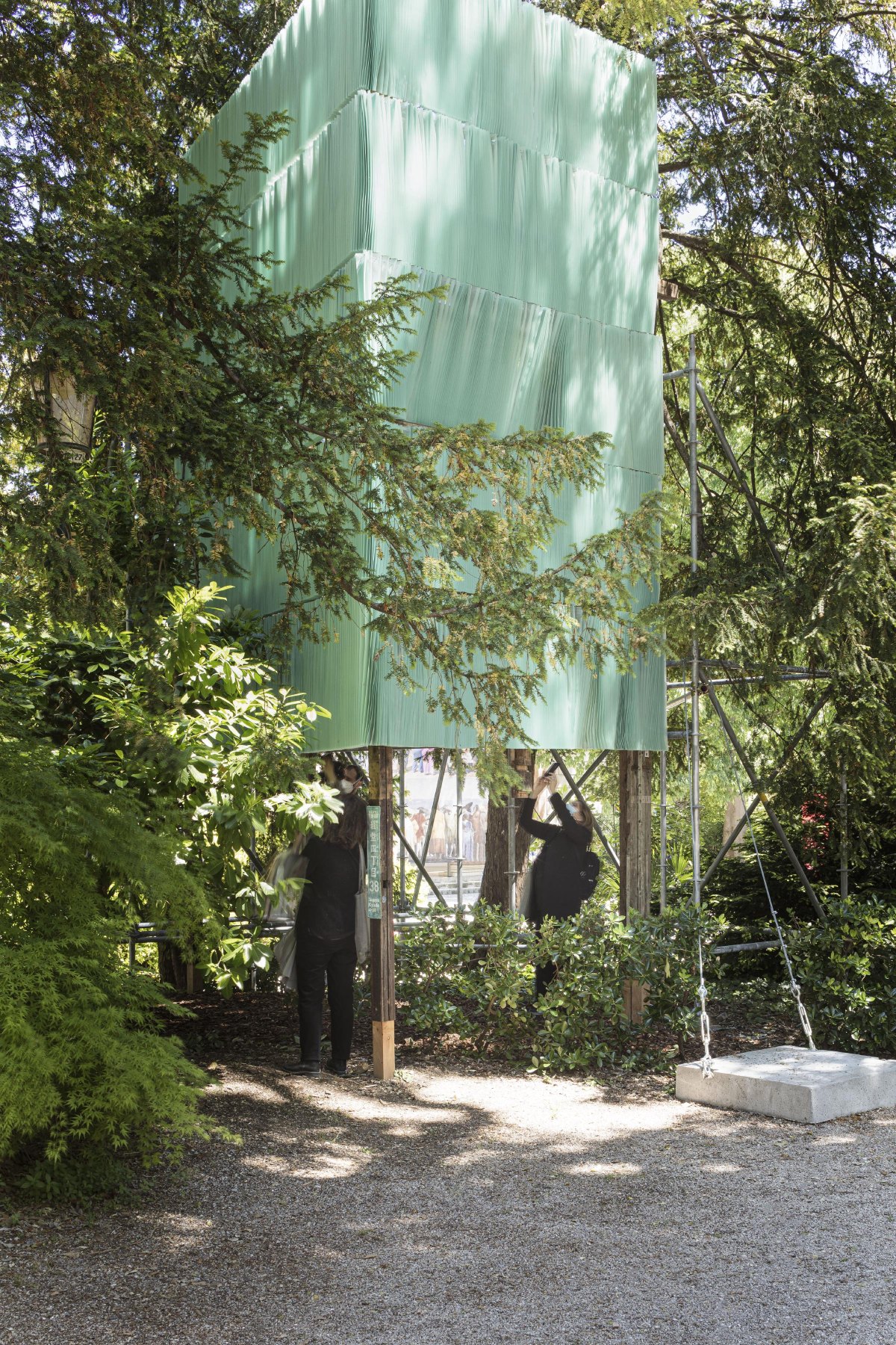
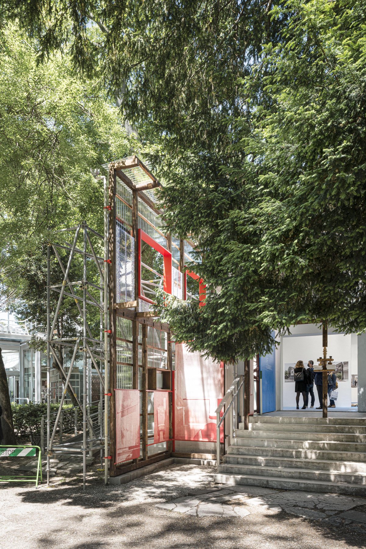
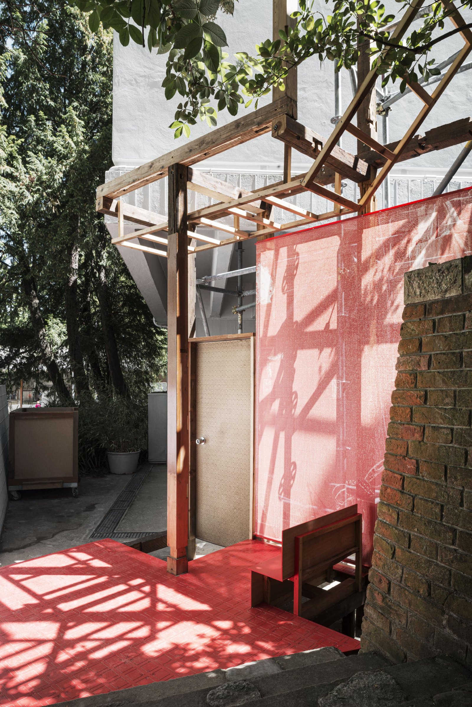
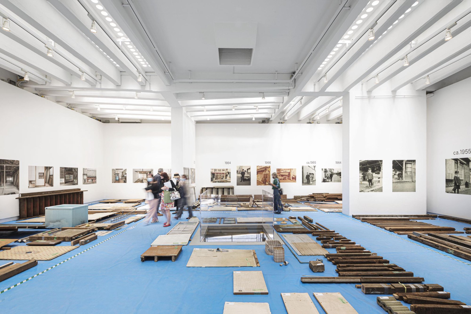
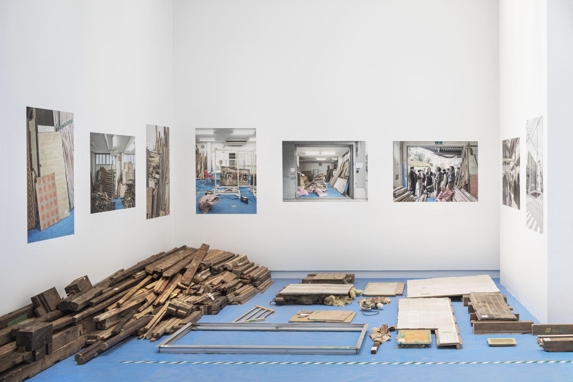
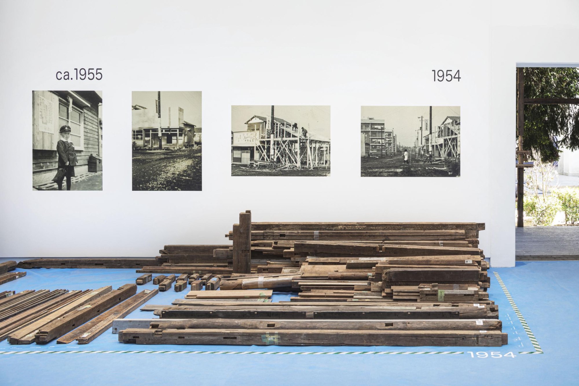
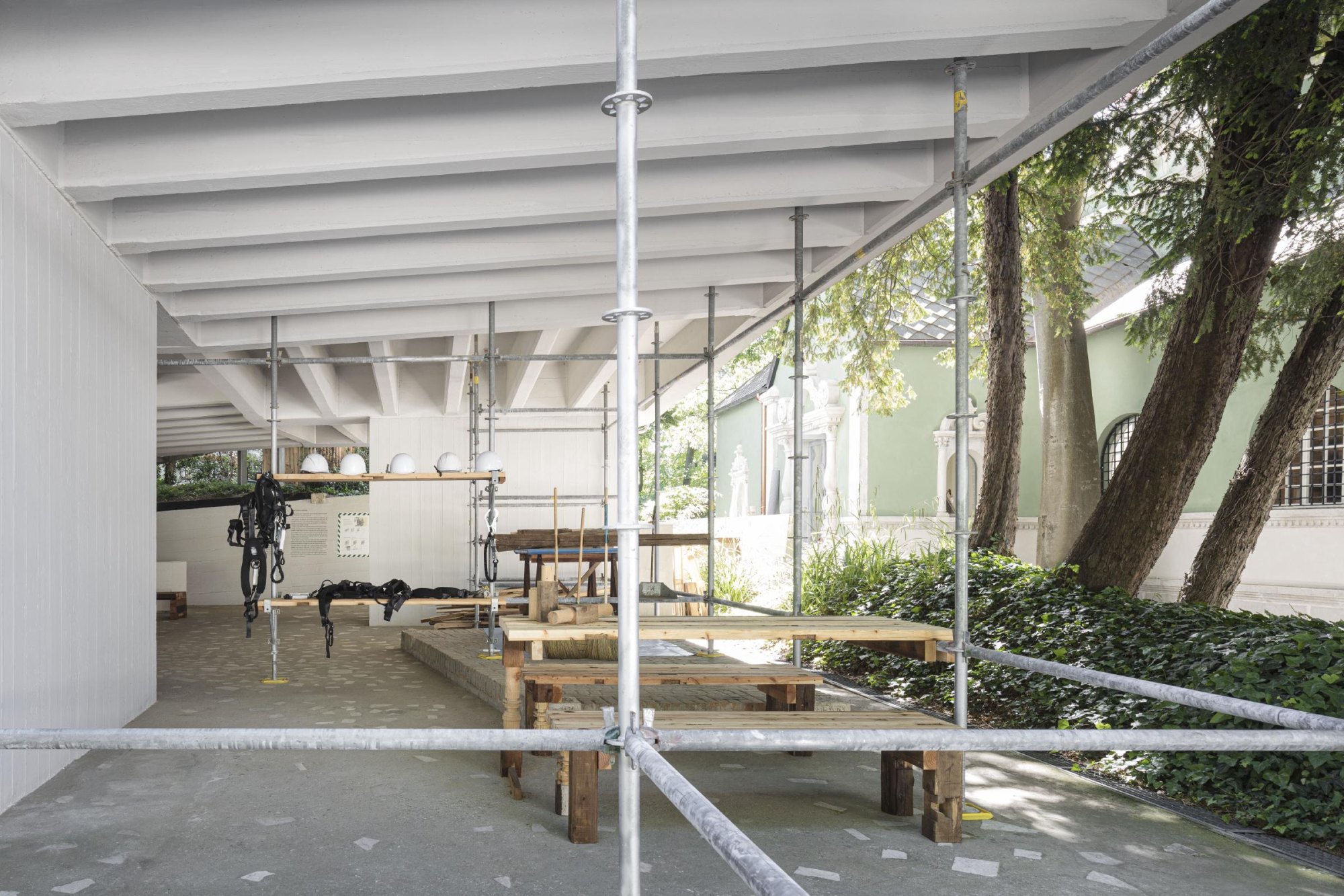
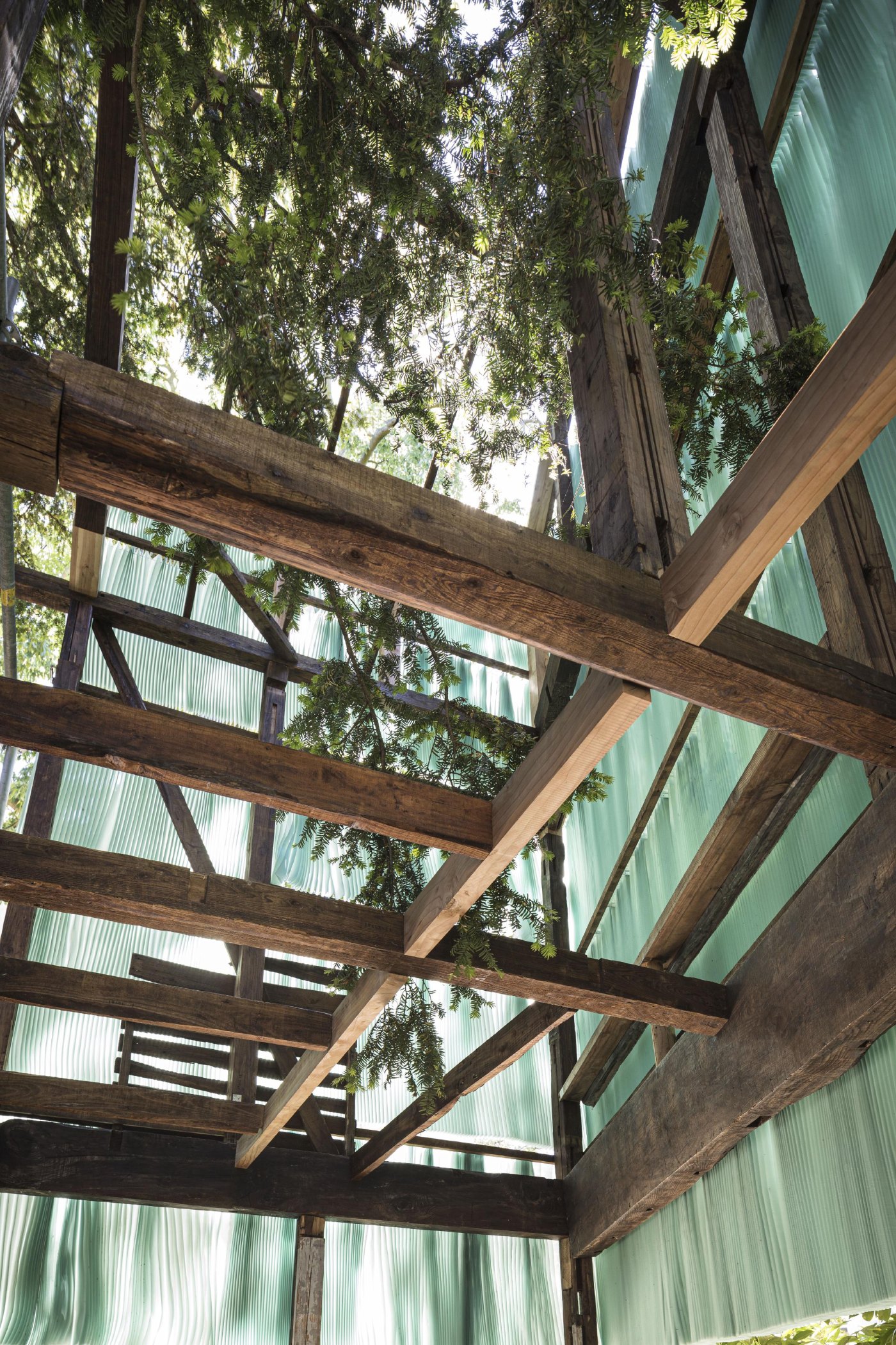
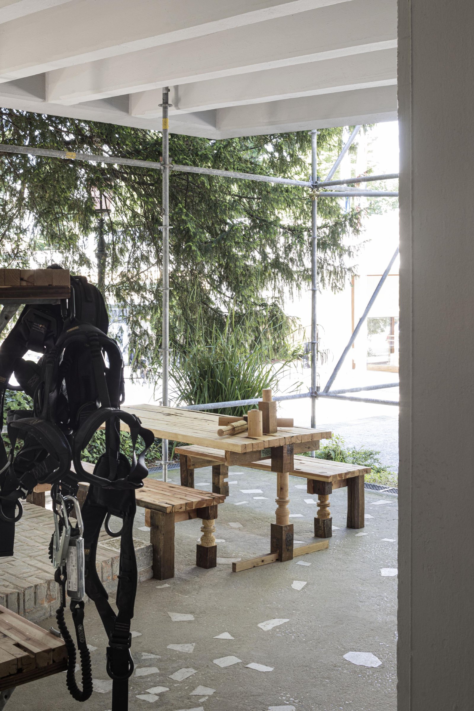
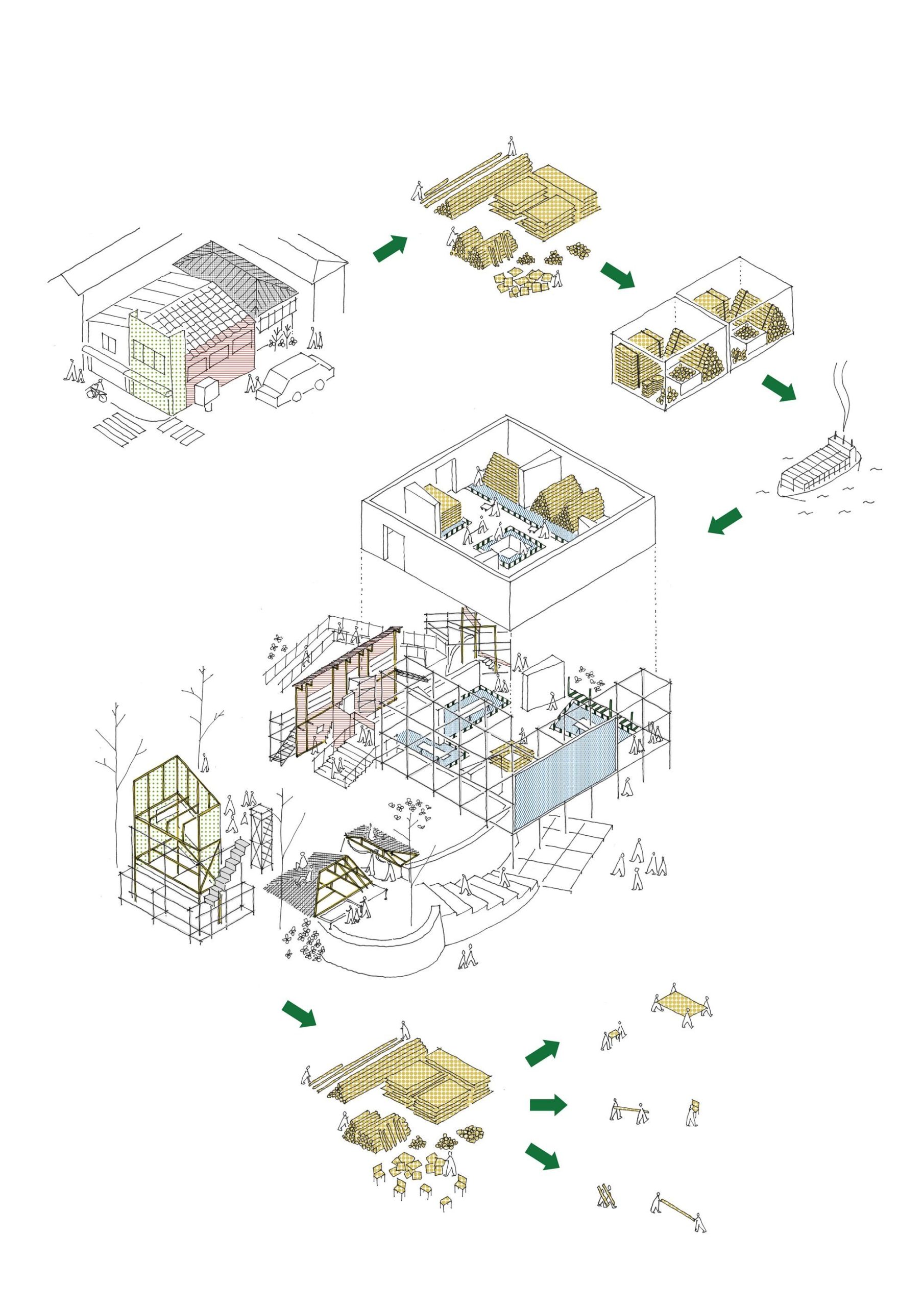
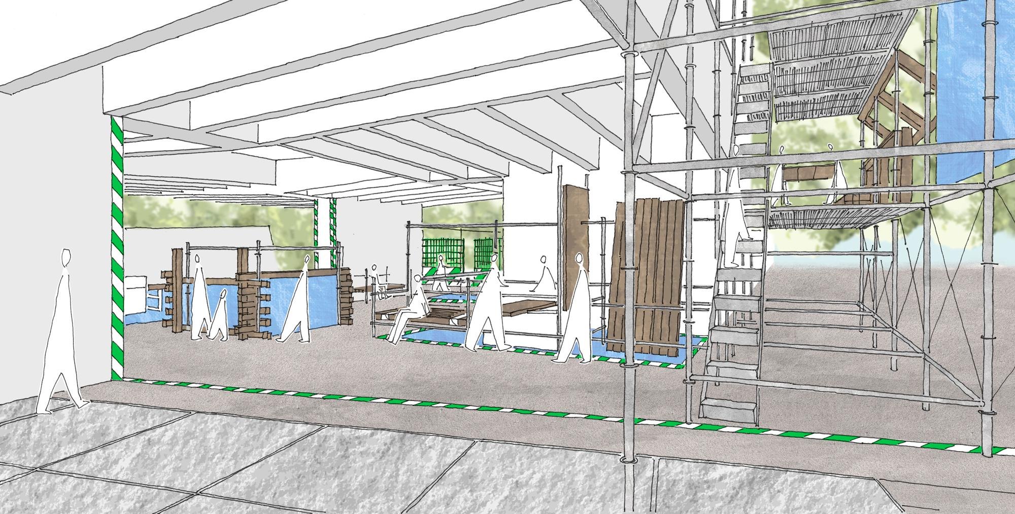
    Co-ownership of Action: Trajectories of Elements was a national pavilion exhibit at the 17th International Architecture Exhibition in 2021, curated by Kozo Kadowaki. An old wooden house was taken apart into its individual pieces, shipped abroad and rebuilt in a new configuration, with modern materials added: scaffolding pipe, mesh and blue tarpaulin.

    A team of five architects worked with artisans and researchers, and left room for improvisation on site as part of the exhibition.

    The project takes aim at mass consumption, made worse by how cheaply and quickly goods can now be moved. By shipping a post-war house that had outlived its use and showing its parts in a new setting, the exhibit gives ordinary old materials a second life. It turns movement for consumption into movement for reconstruction, and asks how architecture might be sustained and approached differently.

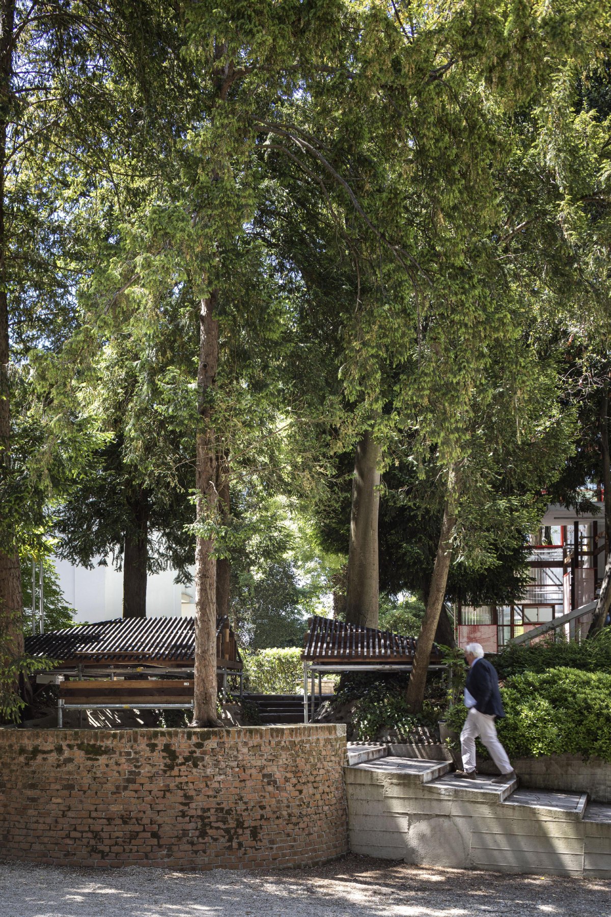
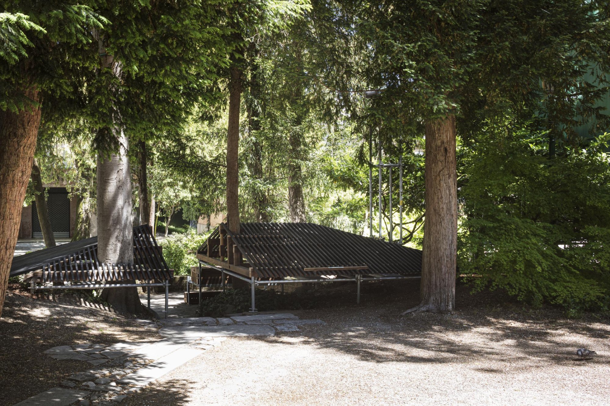
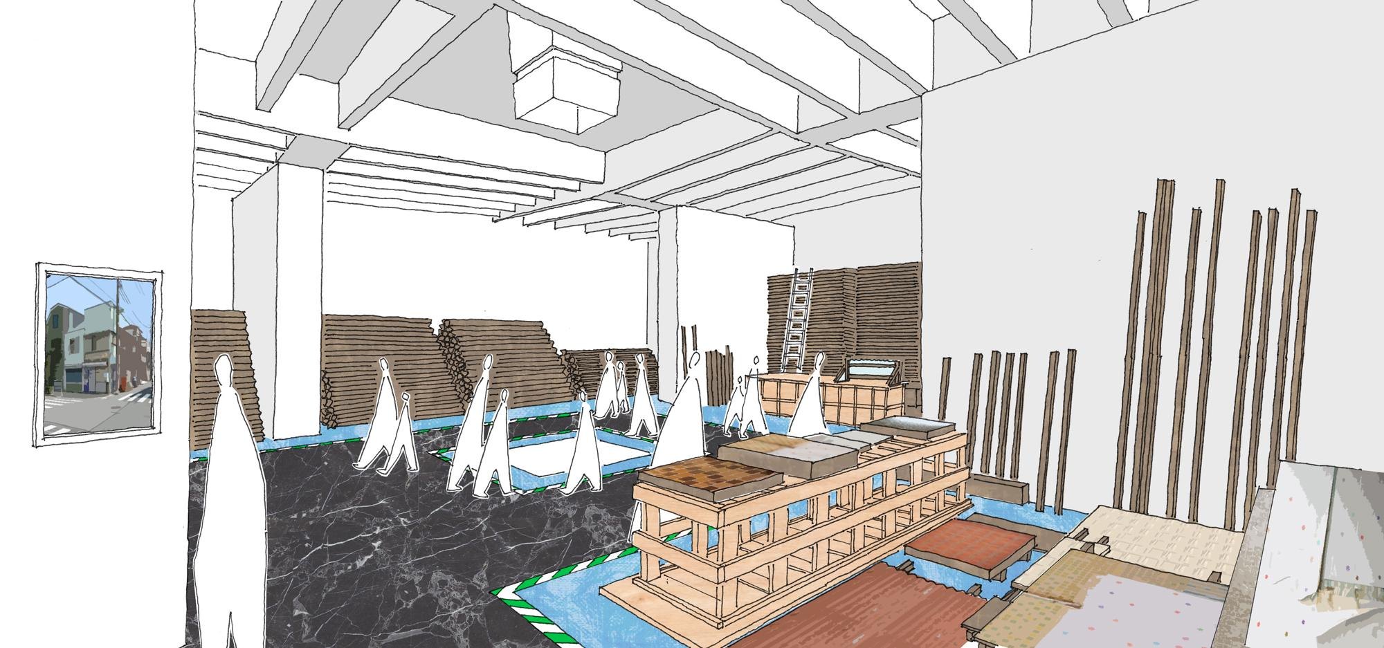
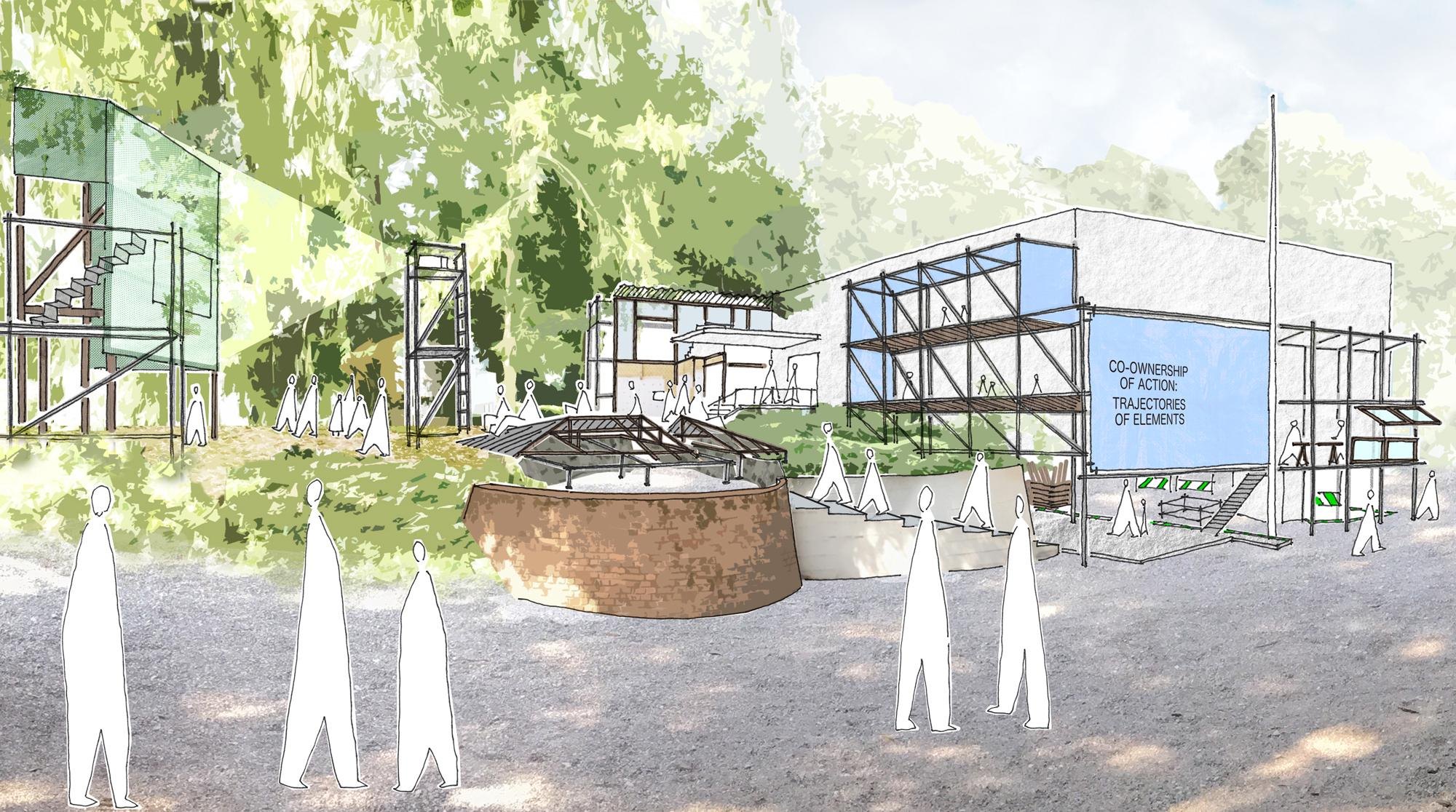
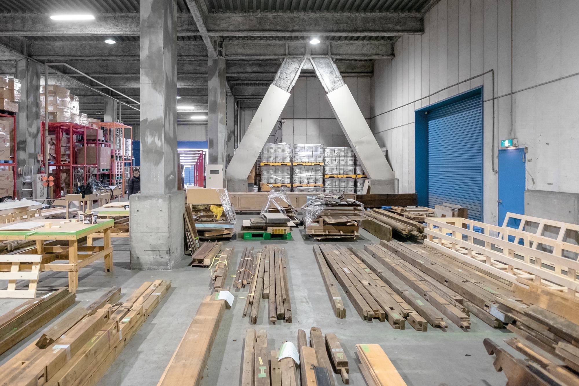
    Inside the pavilion, timbers, doors and fittings from the house were laid out like an inventory. Outside, in the garden beneath it, the pieces were put back together as new structures for sitting, gathering and shade.

    Entrance with the blue exhibition banner
    Co-ownership of Action: Trajectories of Elements, view 2
    The pavilion with blue tarpaulin among trees
    Co-ownership of Action: Trajectories of Elements, view 4
    Co-ownership of Action: Trajectories of Elements, view 5
    Co-ownership of Action: Trajectories of Elements, view 6
    Co-ownership of Action: Trajectories of Elements, view 7
    Co-ownership of Action: Trajectories of Elements, view 8
    House parts laid out on the blue floor
    Timbers and fittings arranged inside the pavilion
    Co-ownership of Action: Trajectories of Elements, view 11
    Co-ownership of Action: Trajectories of Elements, view 12
    Co-ownership of Action: Trajectories of Elements, view 13
    Co-ownership of Action: Trajectories of Elements, view 14
    Co-ownership of Action: Trajectories of Elements, view 15
    Co-ownership of Action: Trajectories of Elements, view 16
    Exploded axonometric diagram
    Perspective drawing of the interior
    Perspective drawing of the garden
    Perspective drawing of the structures
    The original house before it was dismantled
    Co-ownership of Action: Trajectories of Elements, view 22
  • LIM

    LIM

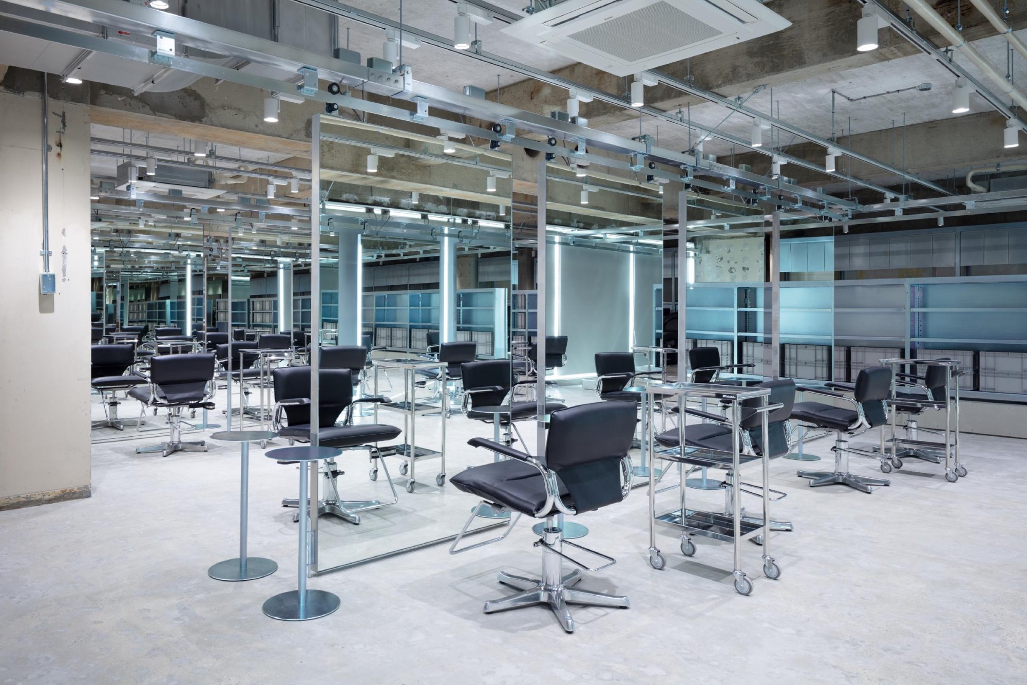
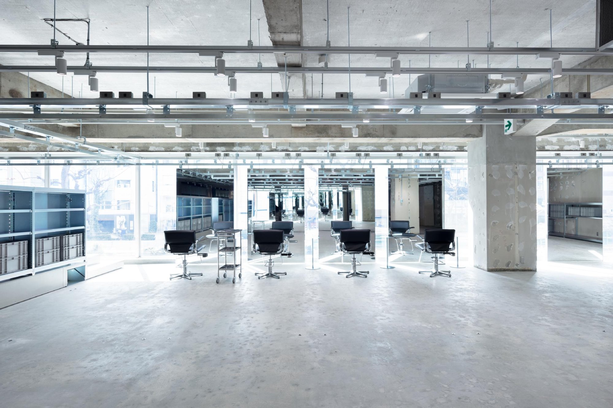
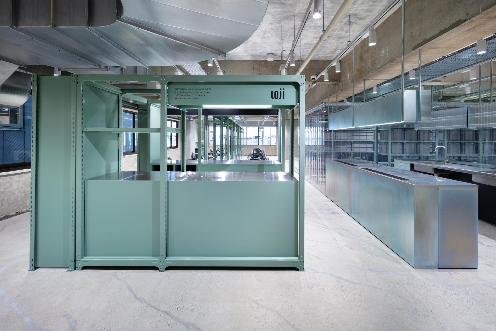
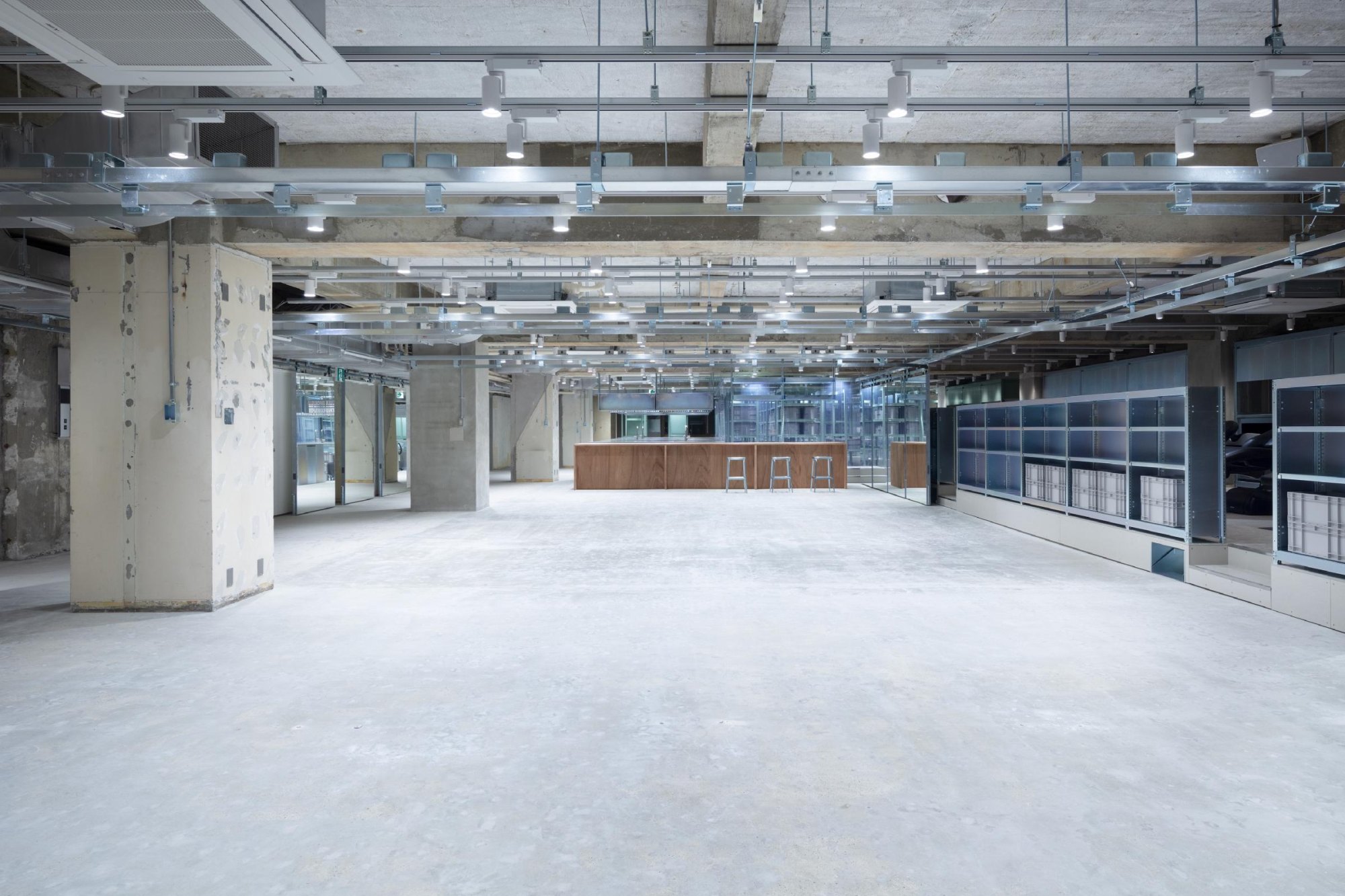
    LIM is the renovated flagship of a hair salon. The client explained that the name comes from Less Is More, Mies van der Rohe’s famous phrase, and asked the design team to build the salon around that idea, on a low budget.

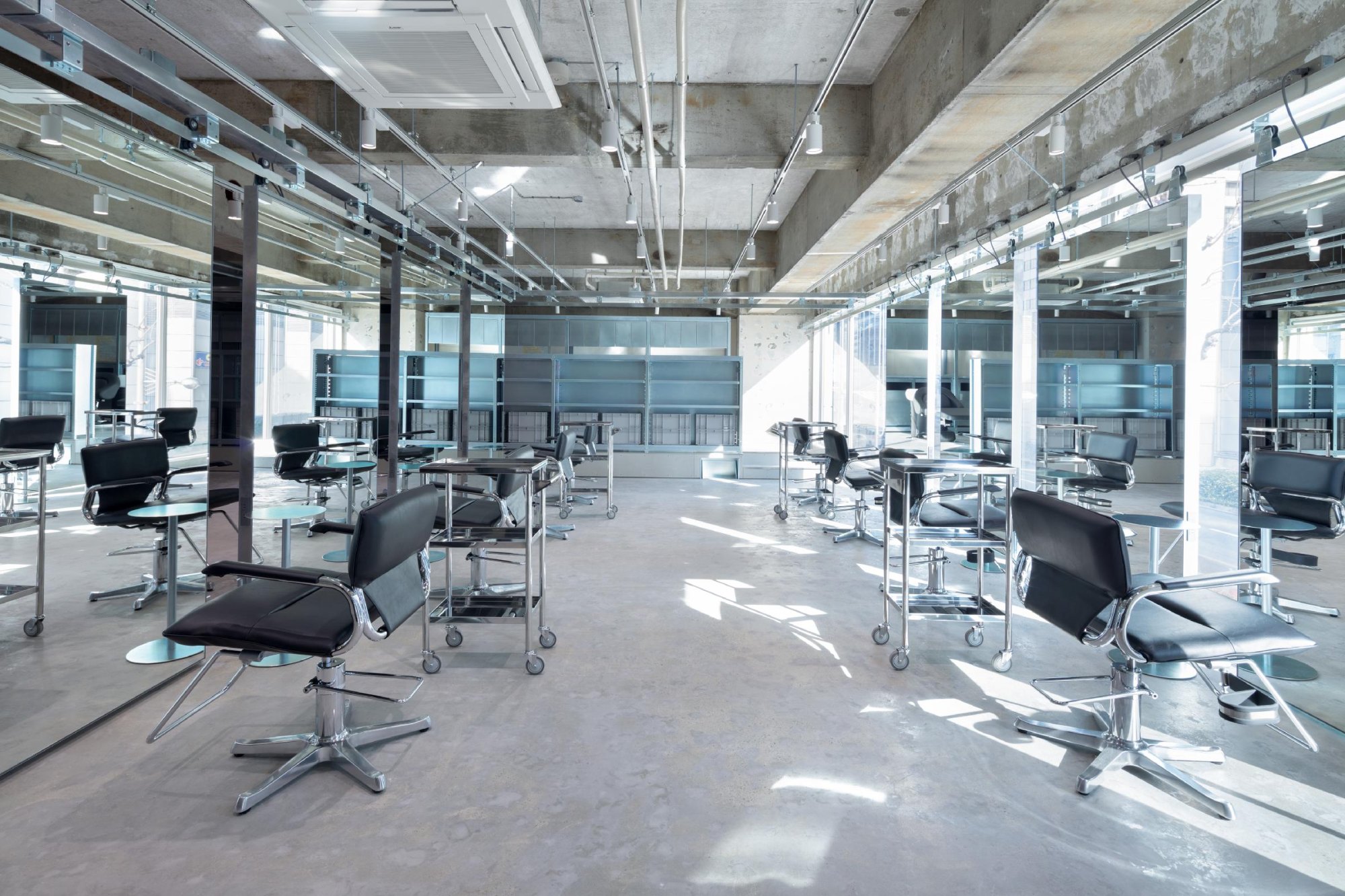
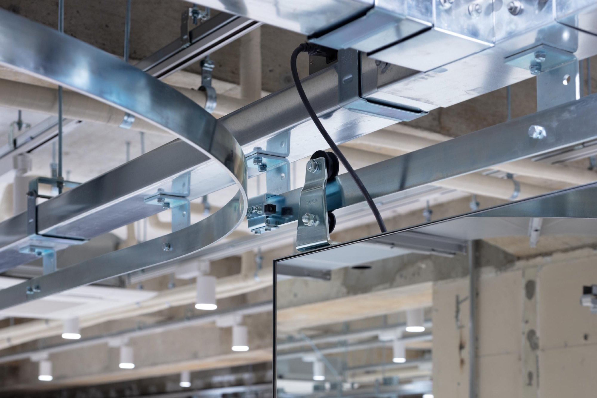
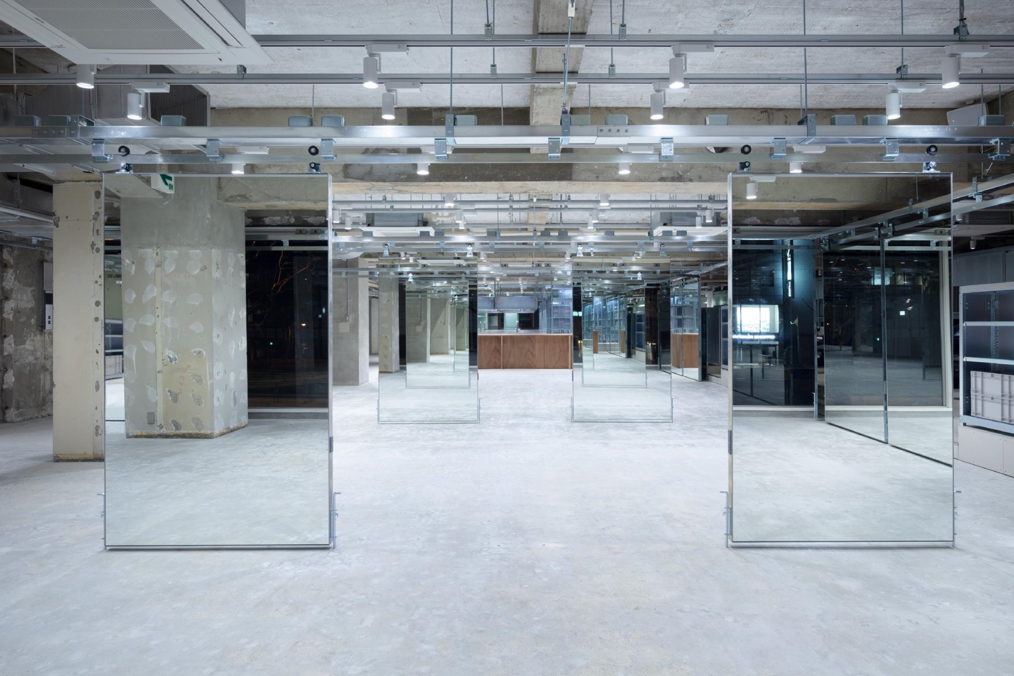
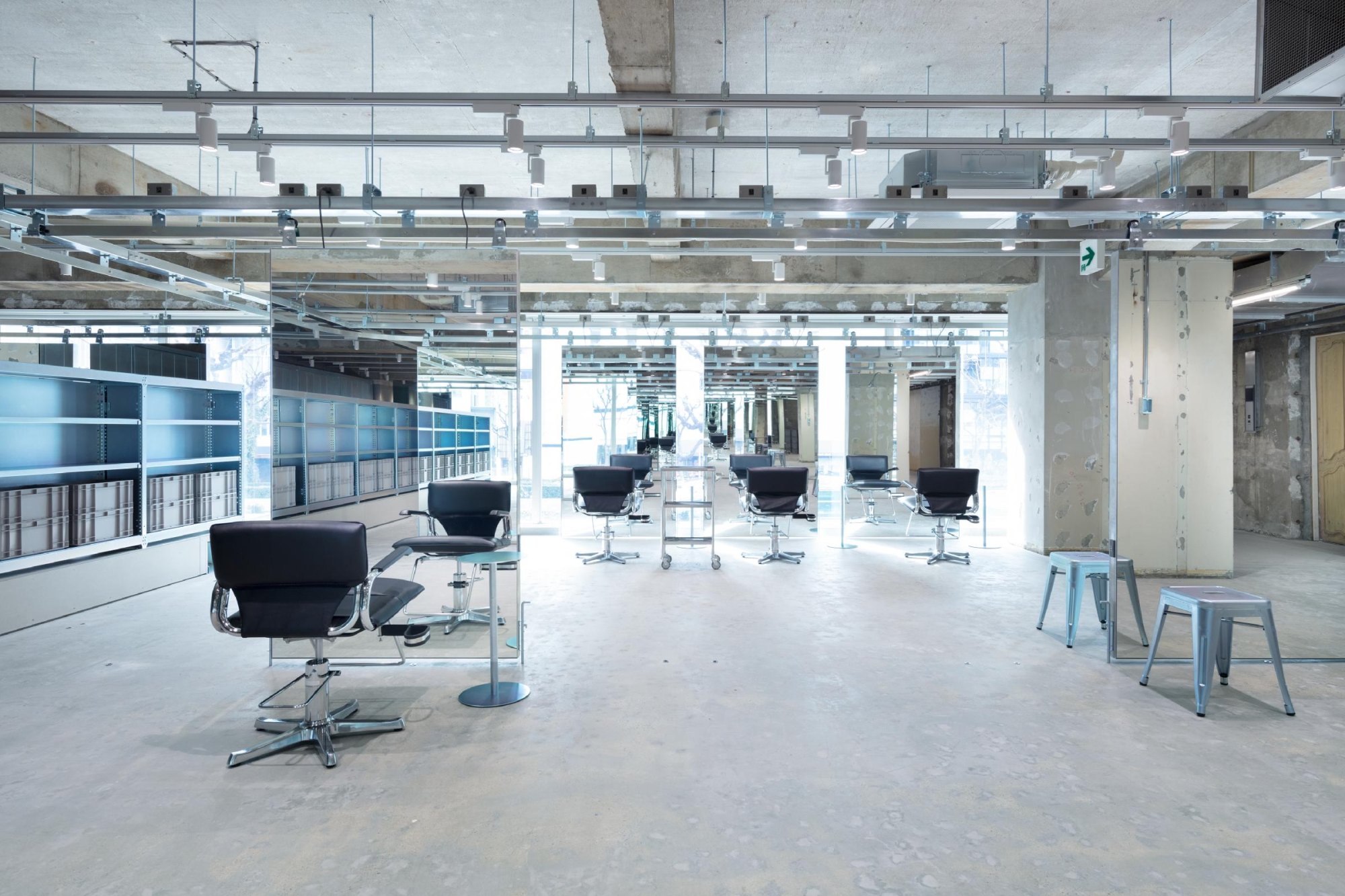
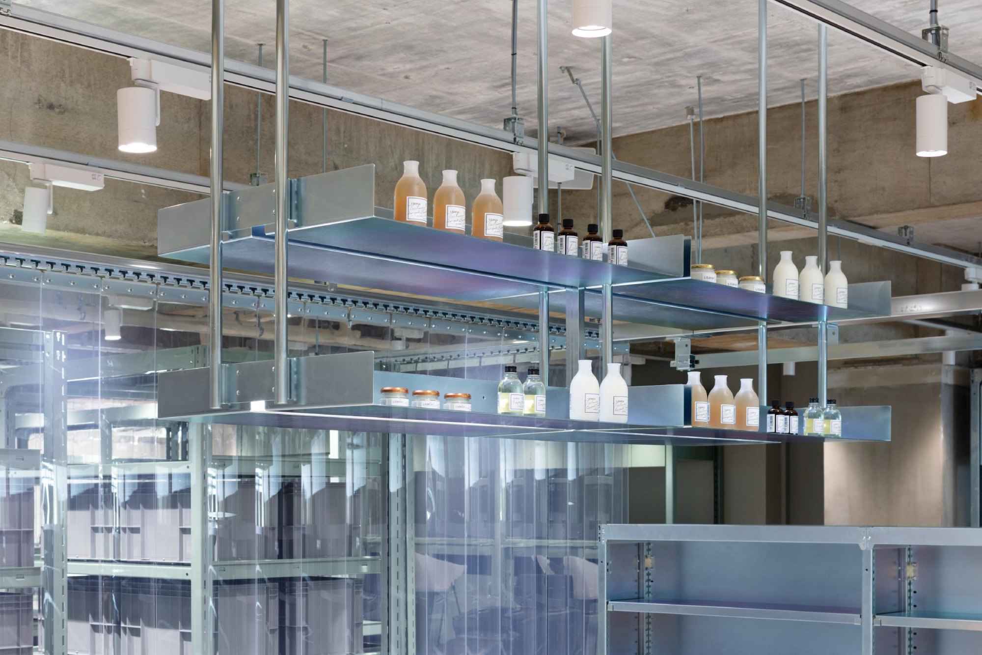
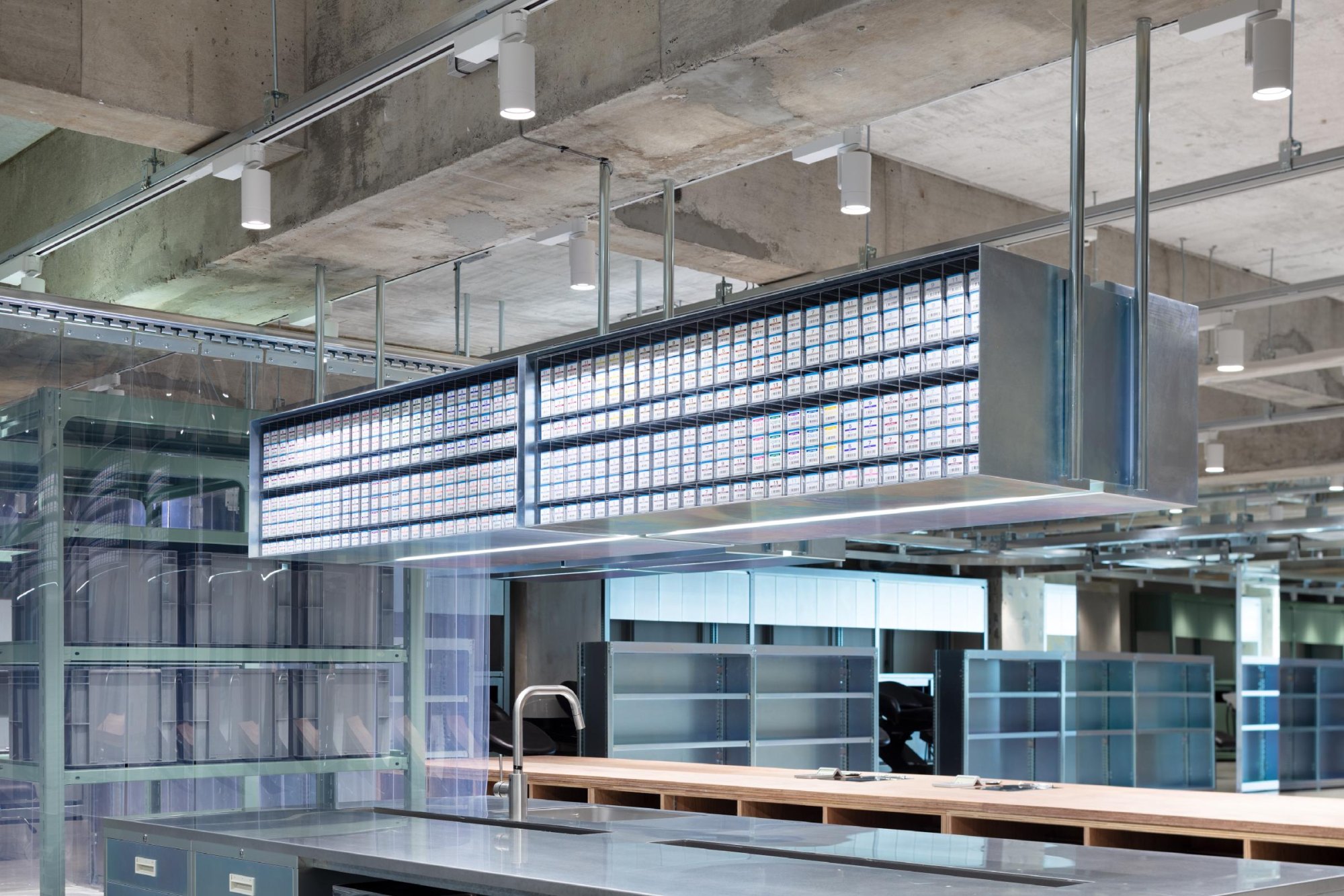
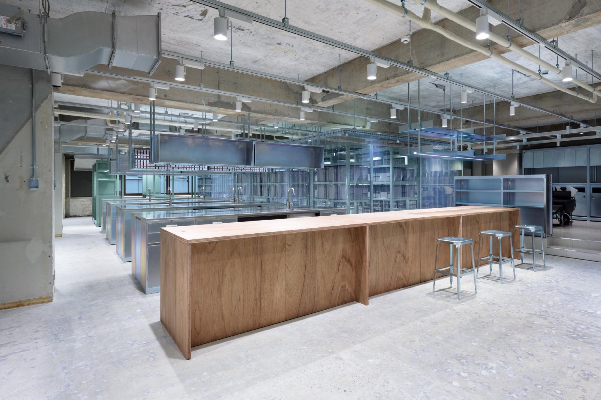
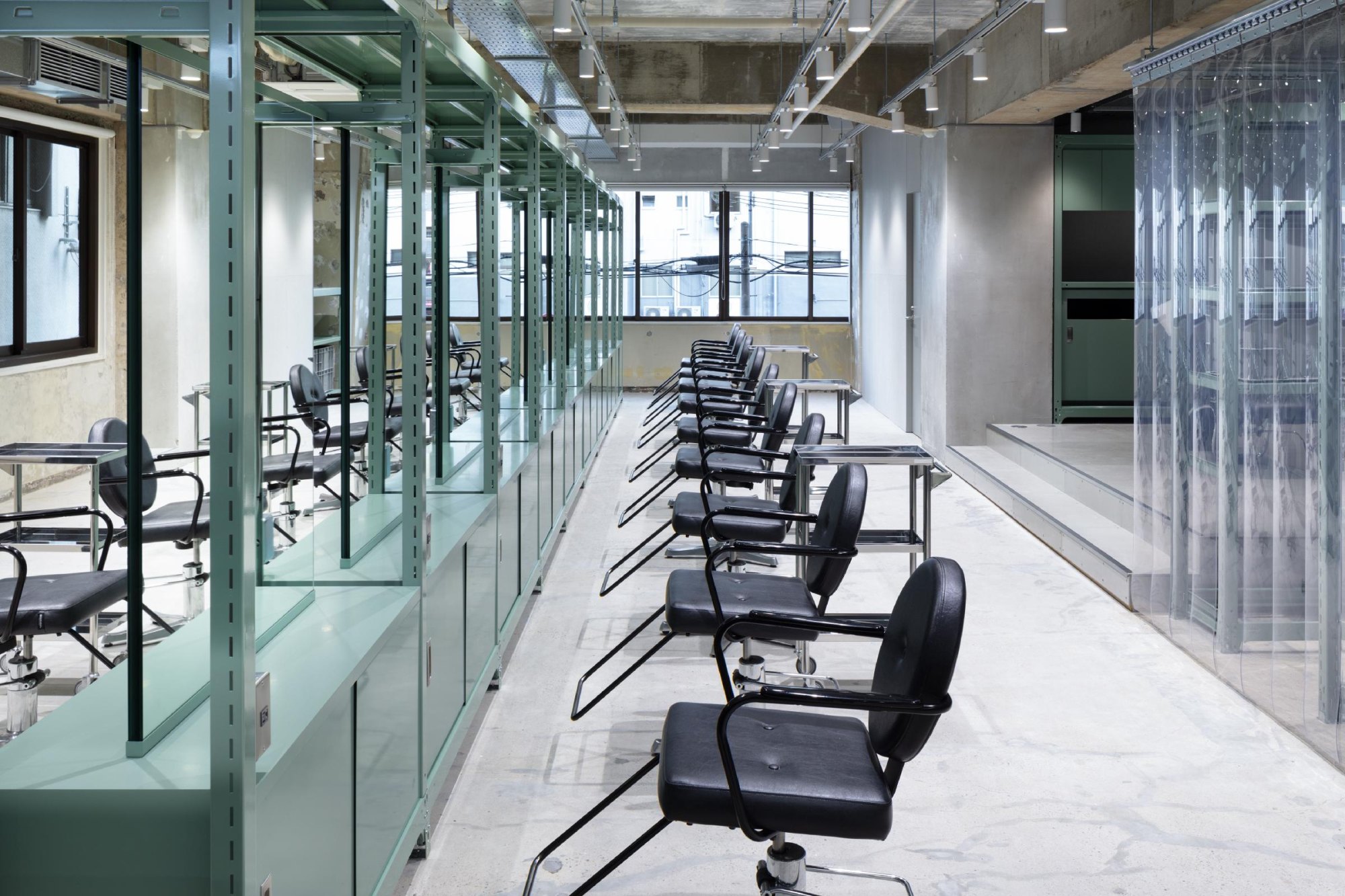
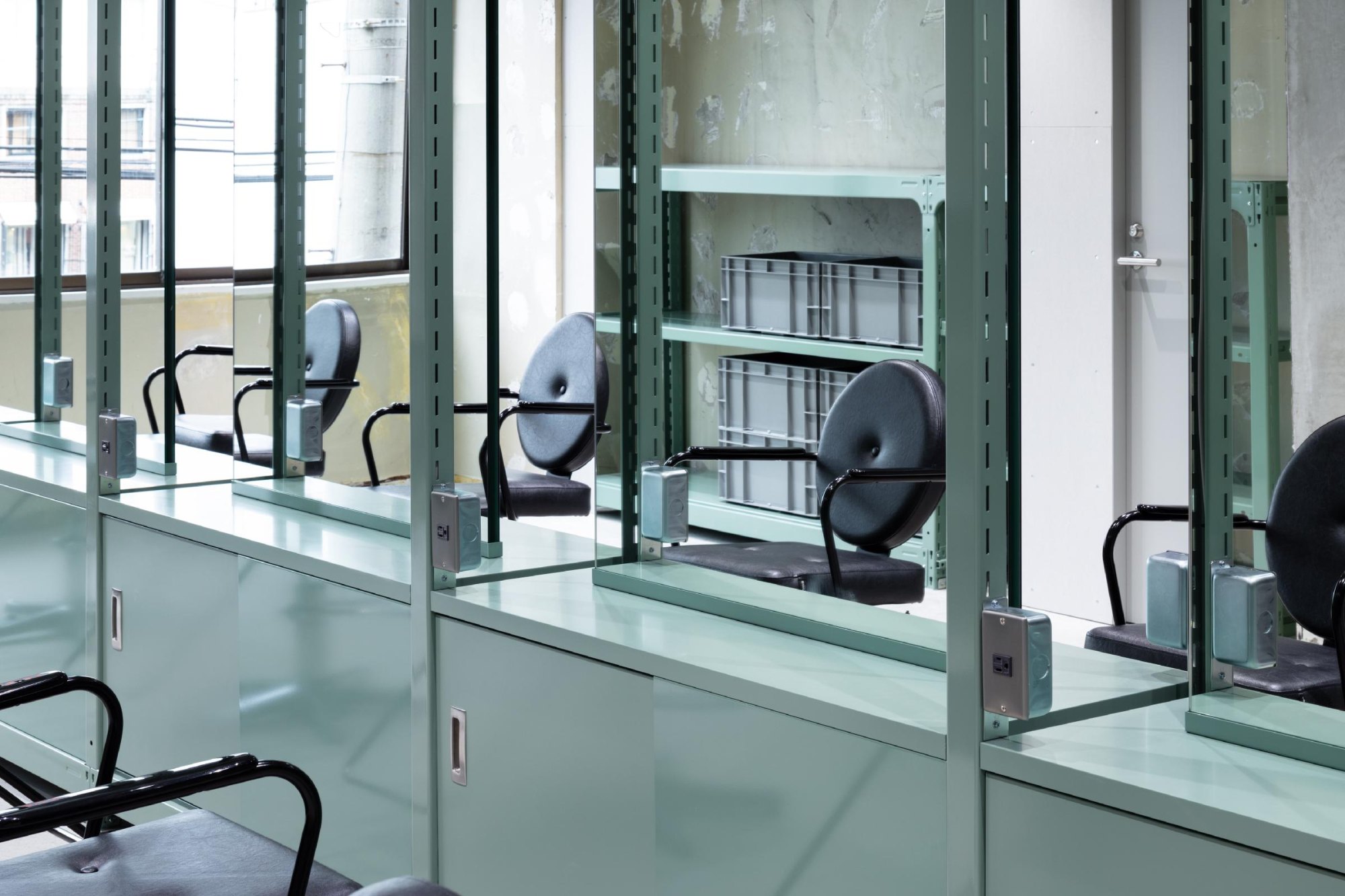
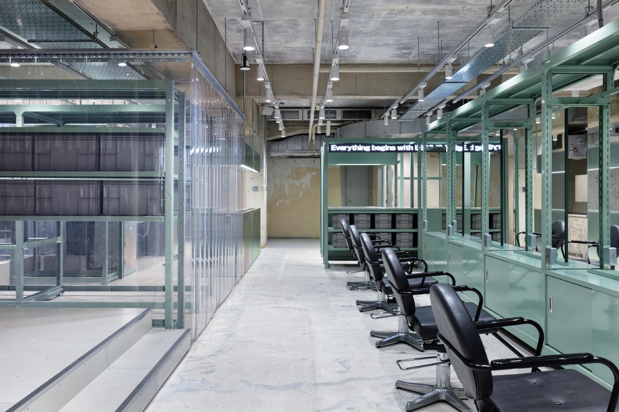
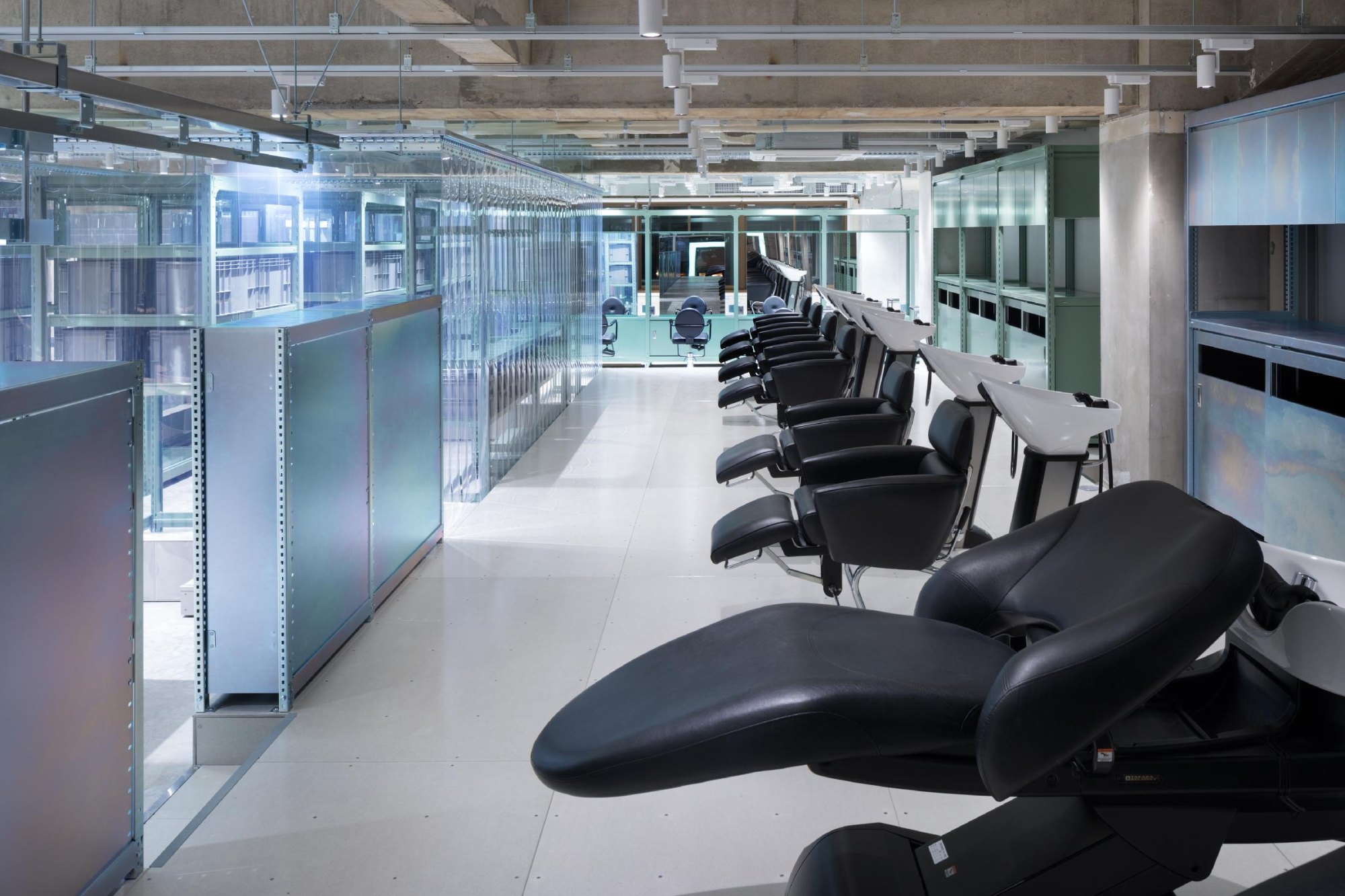
    The team read the brief as making the most of the minimum. Ready-made steel racks became the basic structure for shelves and fixtures, modified and re-plated in unichrome.
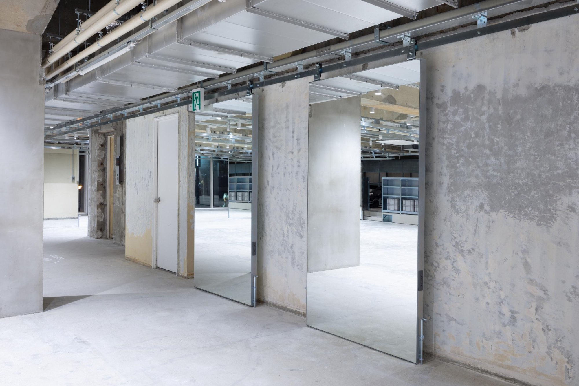
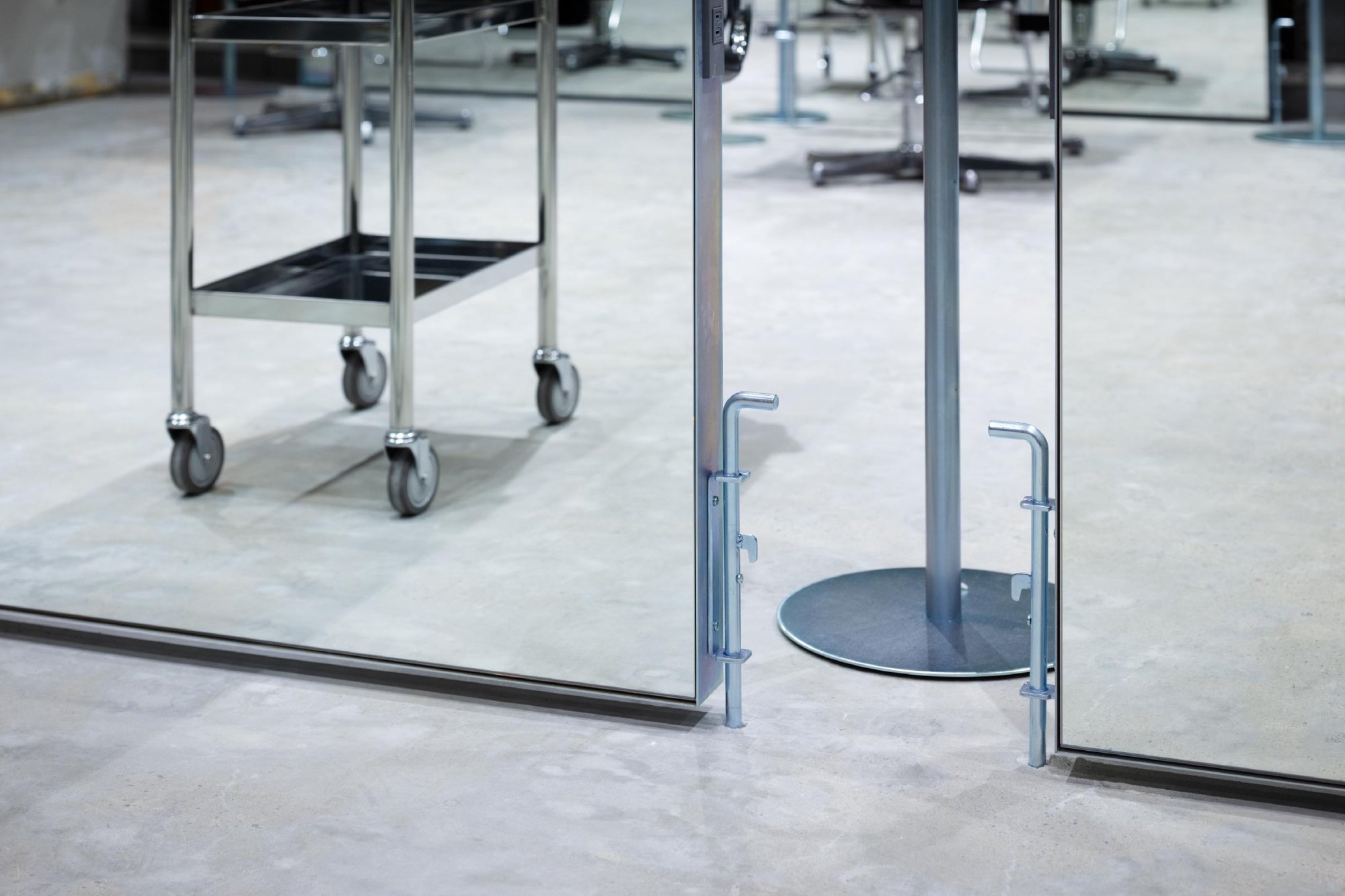
    Mirrors, essential in any salon, were made as large as possible and set at regular intervals. They can be moved to clear the floor for events such as flea markets, and the result is an unusually open, airy room.
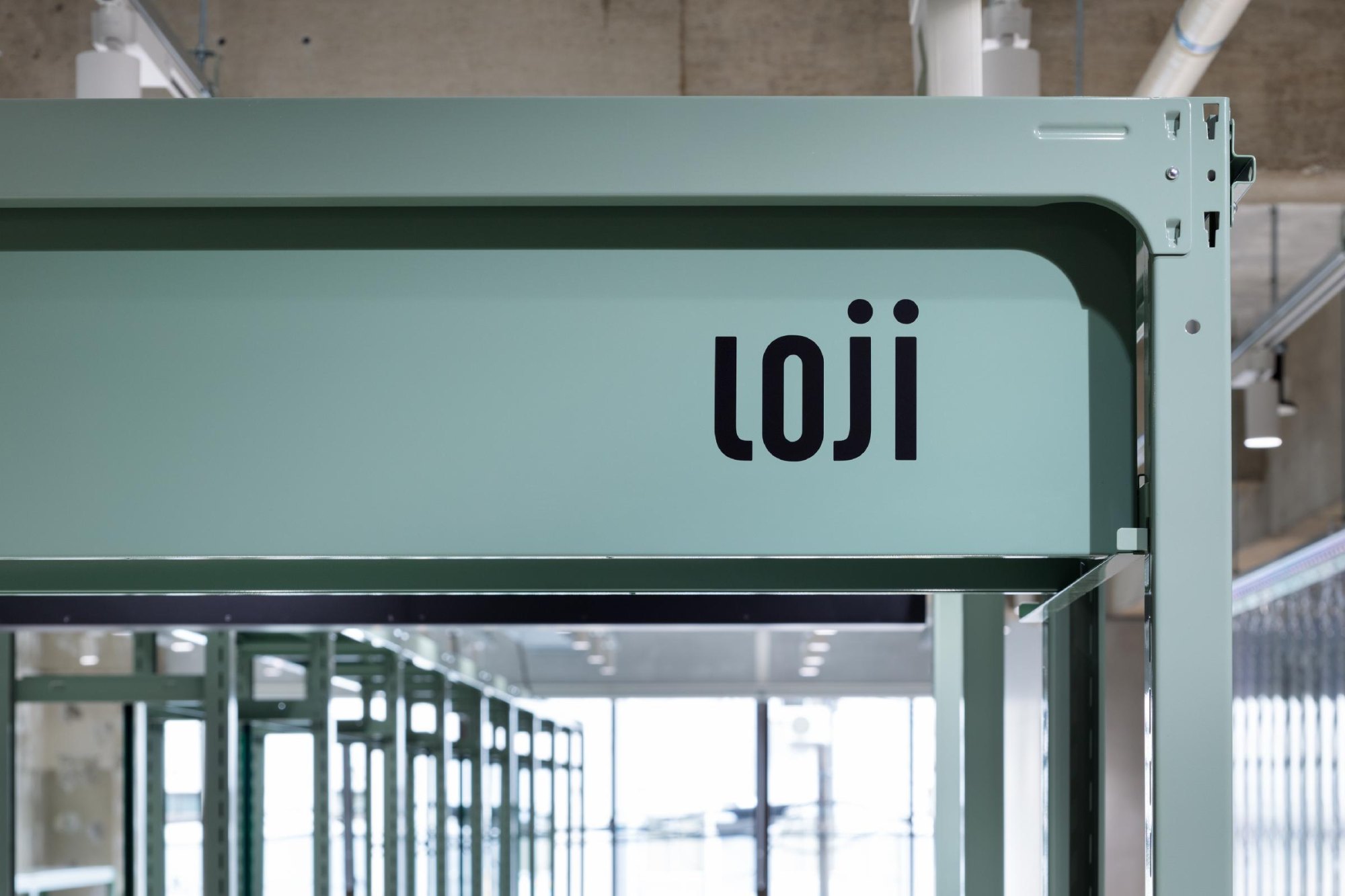
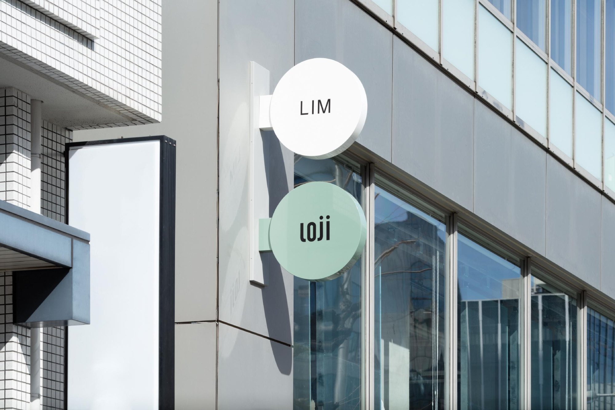
    At the back sits loji, a second salon without partitions. It serves young customers who change their hair as often as their clothes, with lower prices and stylists still in training, a first step before they move on to LIM. To save more money, the racks there keep their factory green and the ready-made parts are left largely as they are.
    Salon floor with ready-made steel racks and mirrors
    LIM, view 2
    LIM, view 3
    LIM, view 4
    LIM, view 5
    LIM, view 6
    LIM, view 7
    LIM, view 8
    LIM, view 9
    LIM, view 10
    LIM, view 11
    Long timber reception counter
    LIM, view 13
    LIM, view 14
    LIM, view 15
    The loji salon sign on a green steel frame
    LIM, view 17
    LIM, view 18
    Round shop sign at the entrance
    LIM, view 20
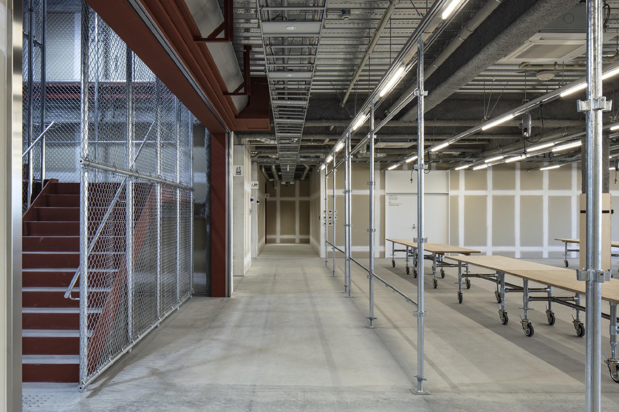
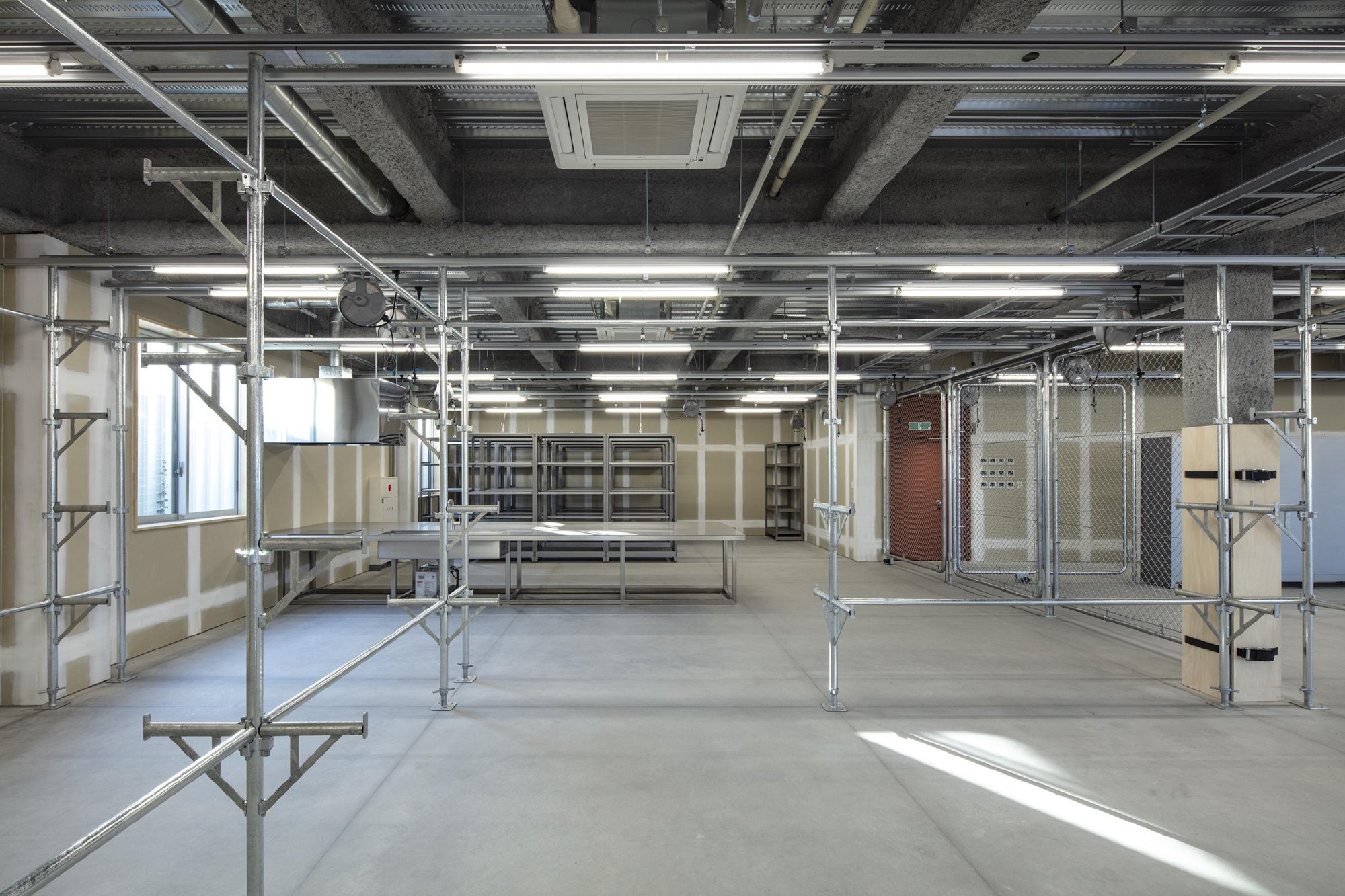
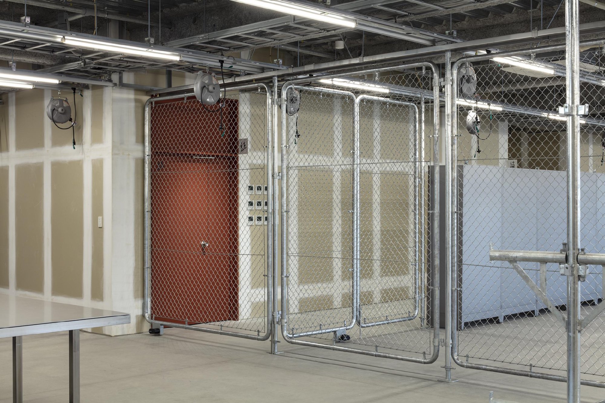
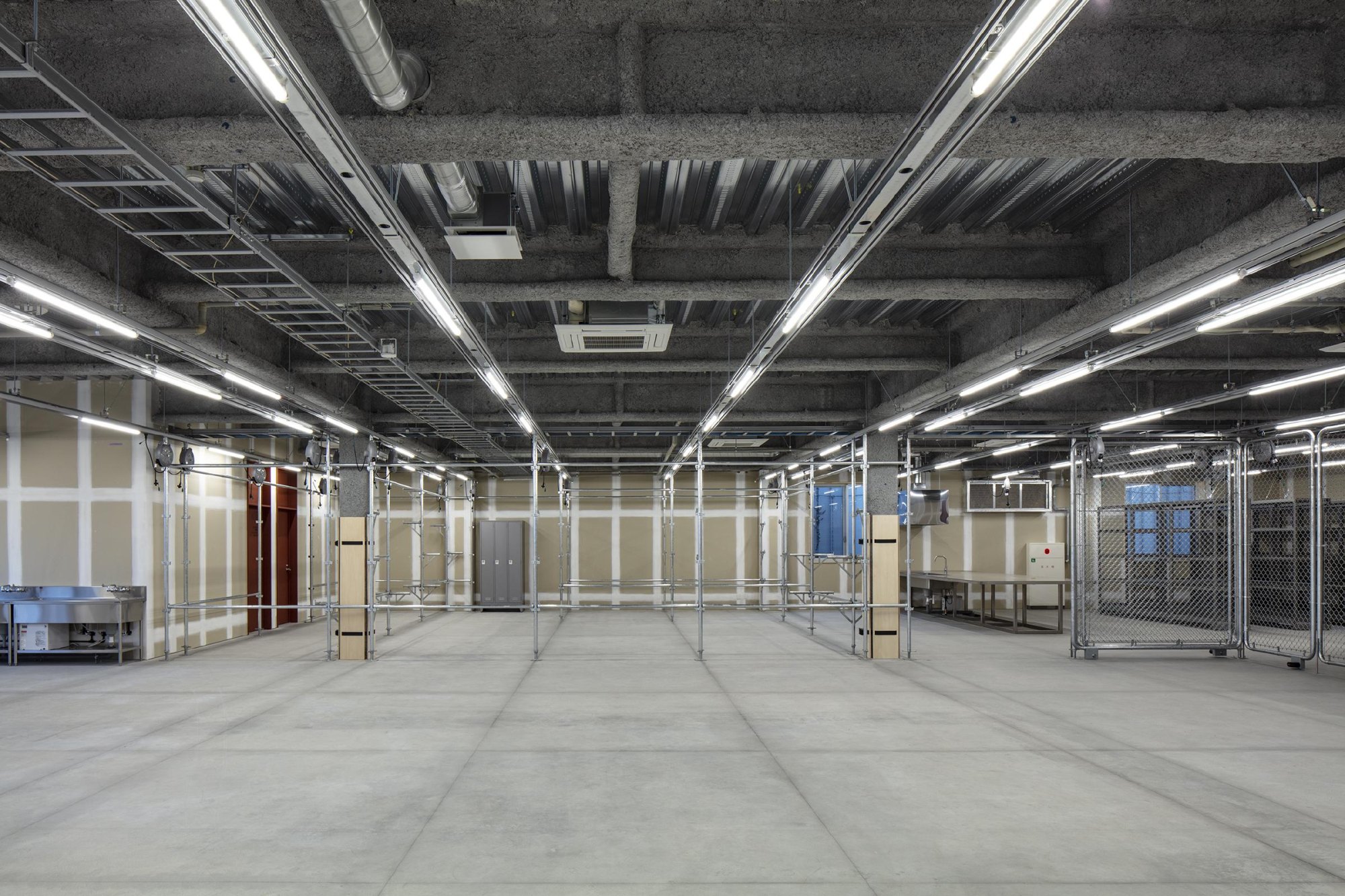
  • Musashino Art University No.16 Building

    Musashino Art University No.16 Building

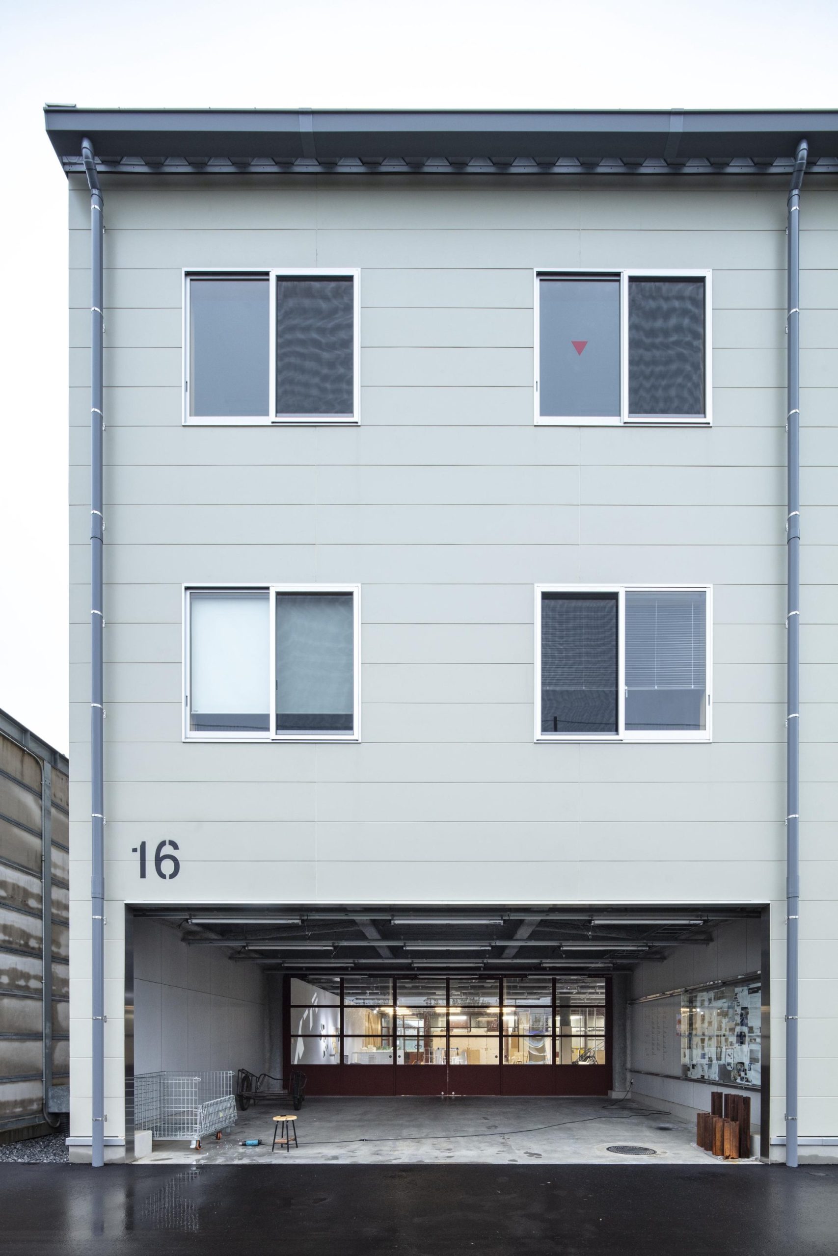
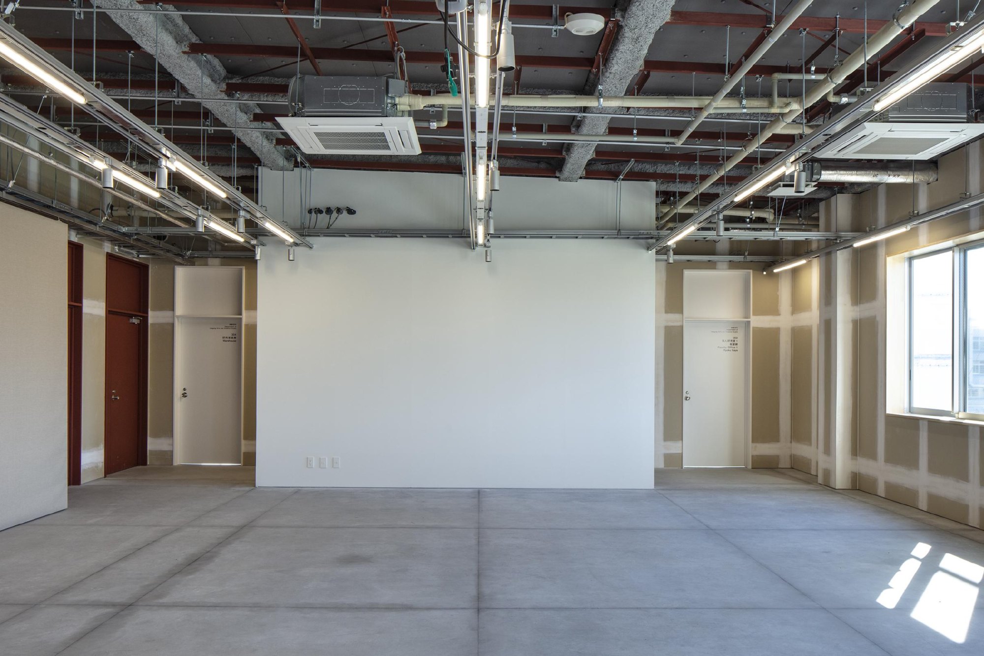
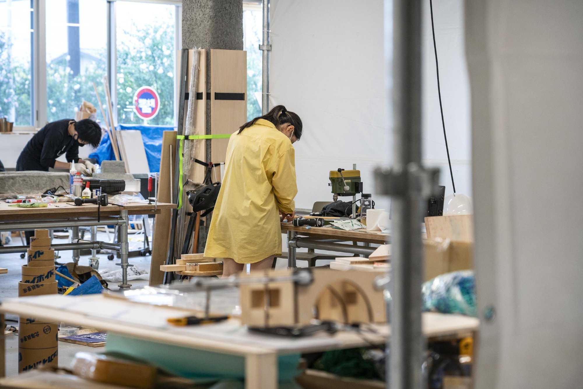
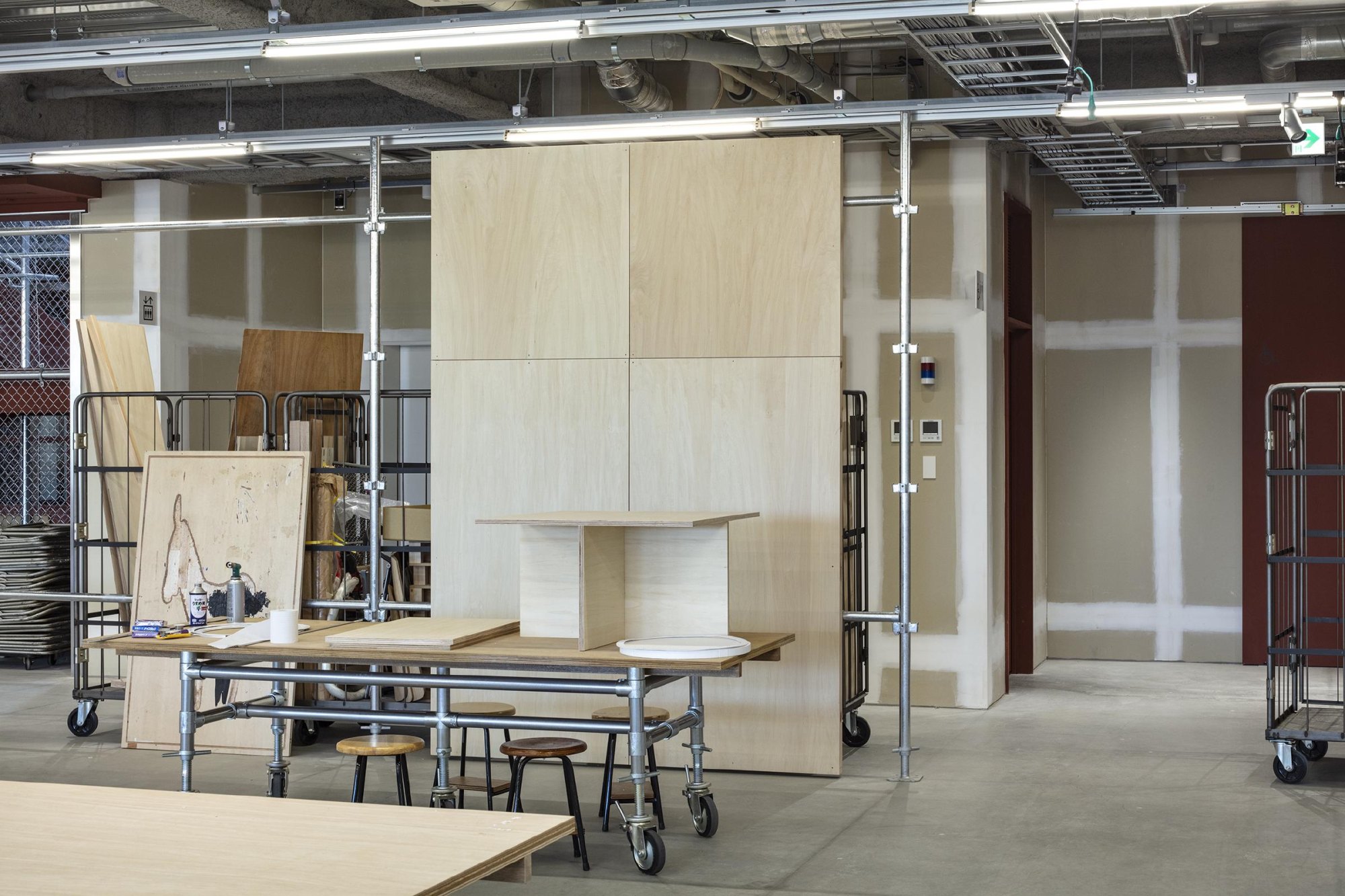
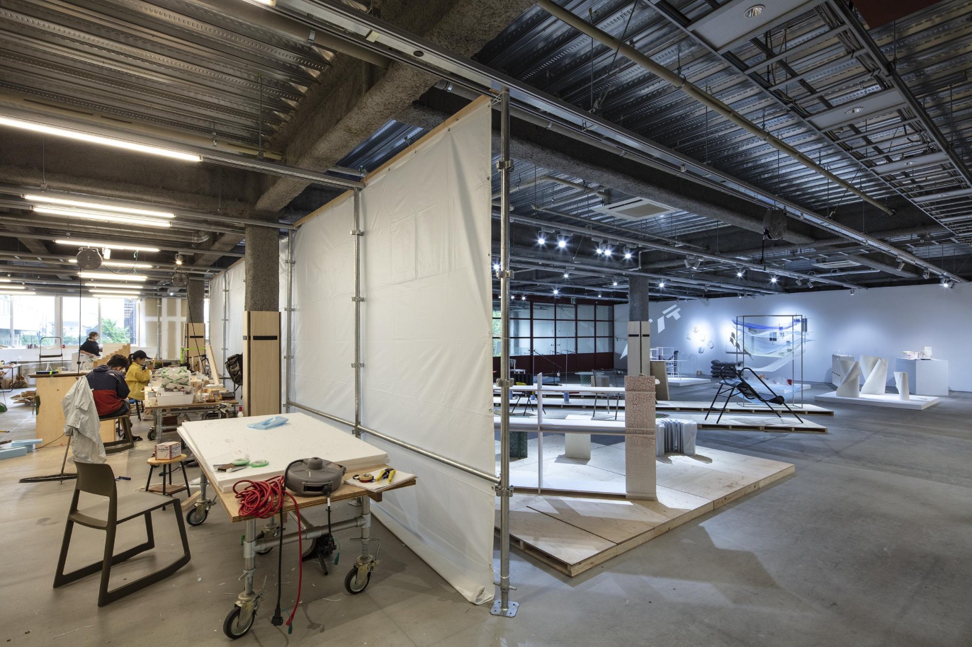
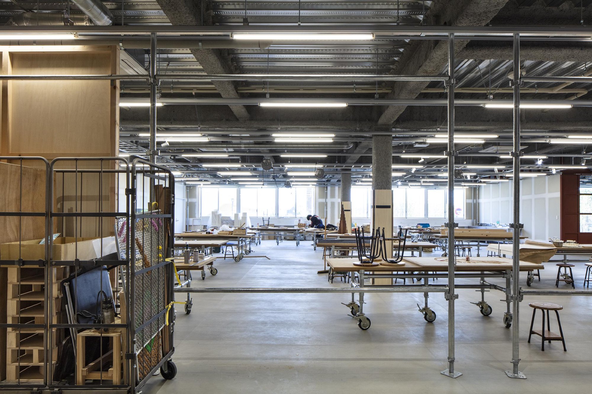
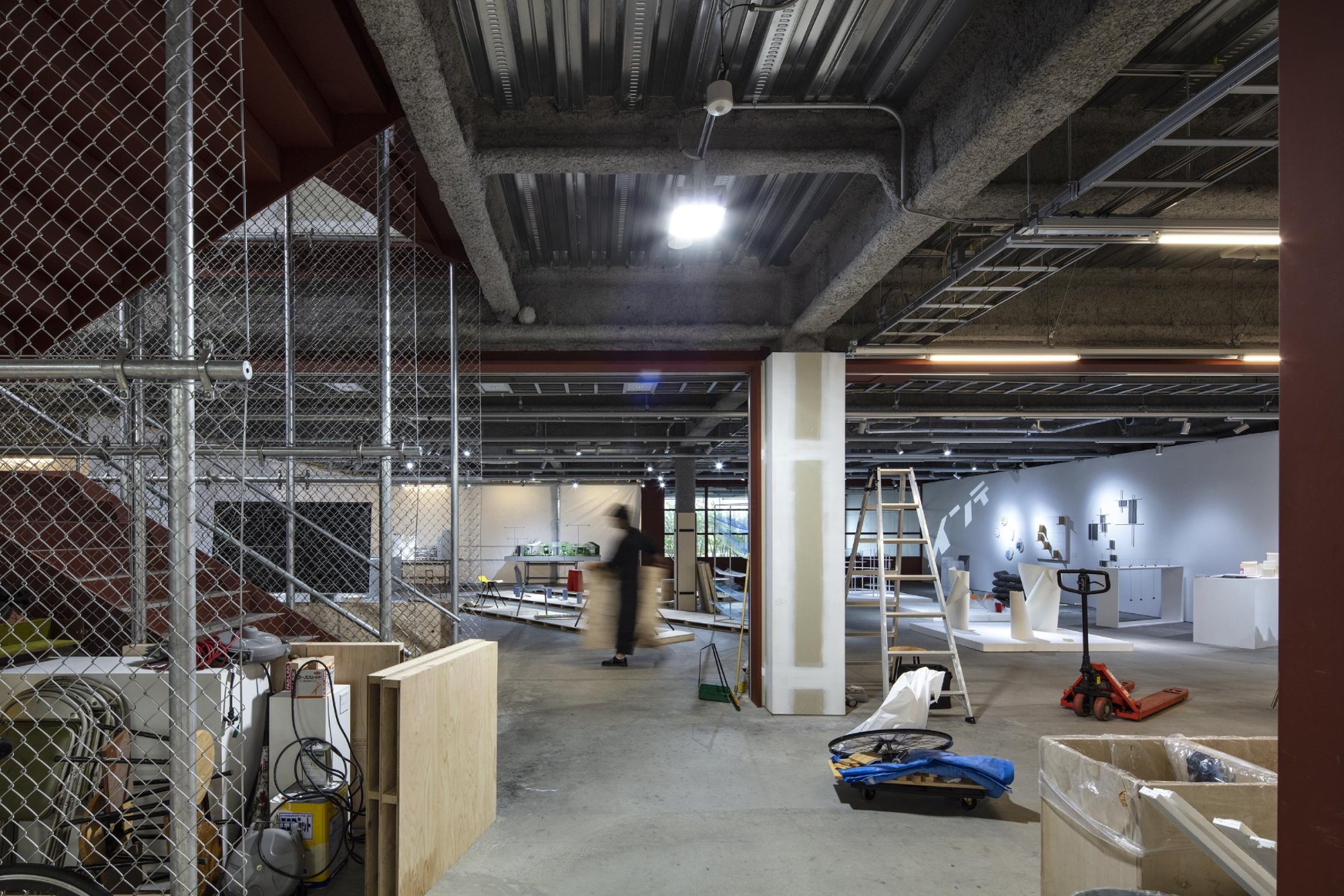
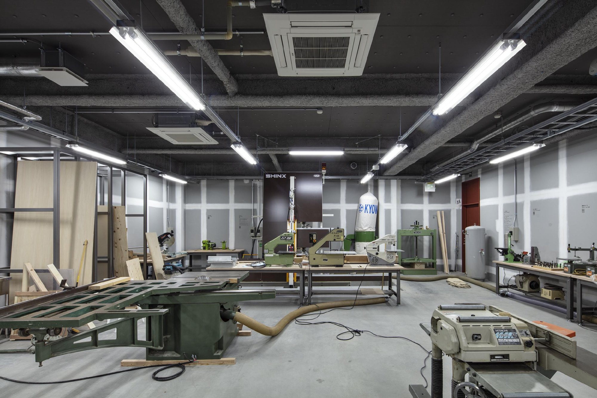
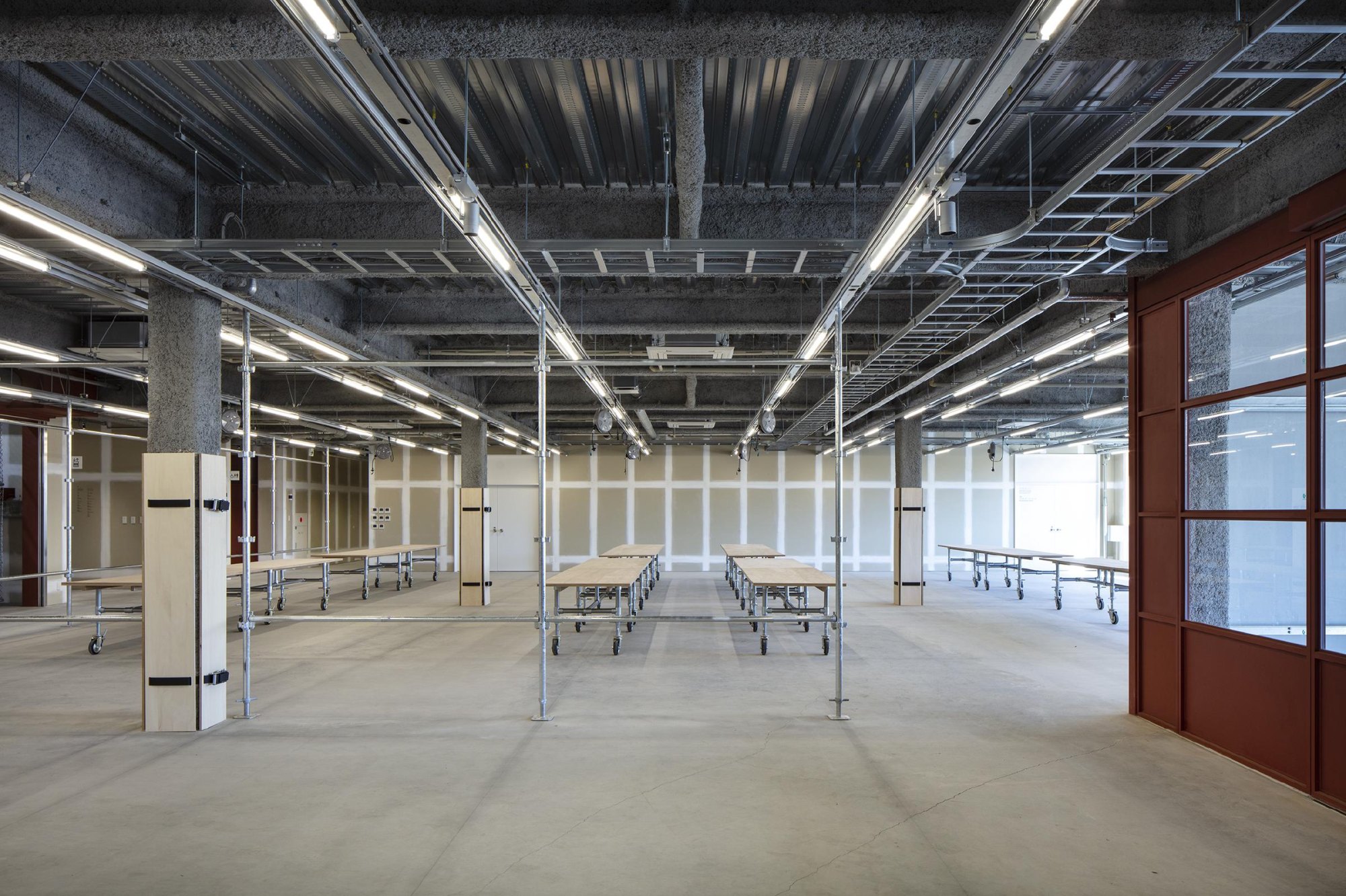
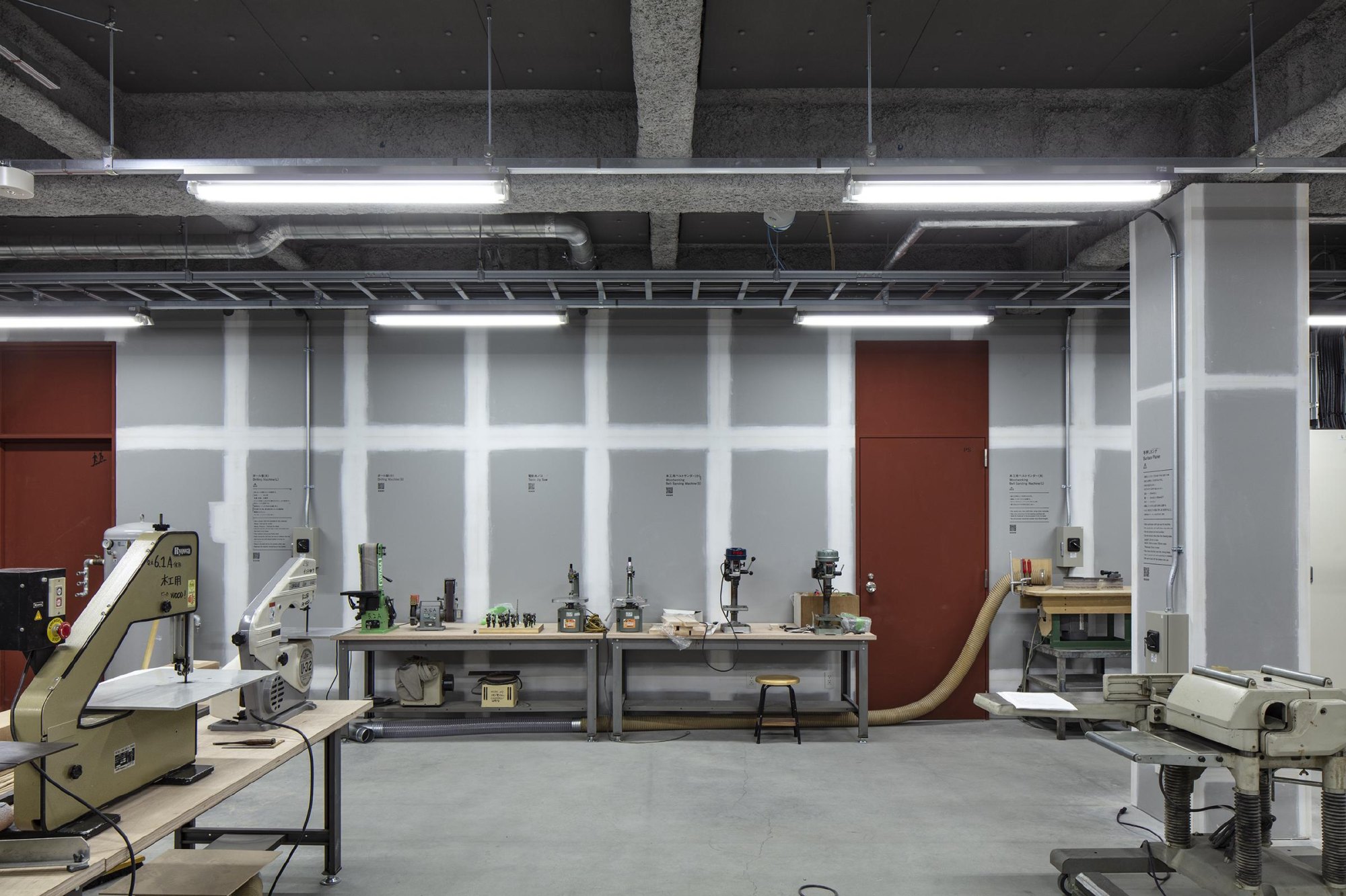
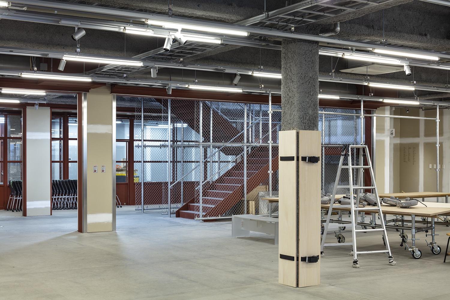
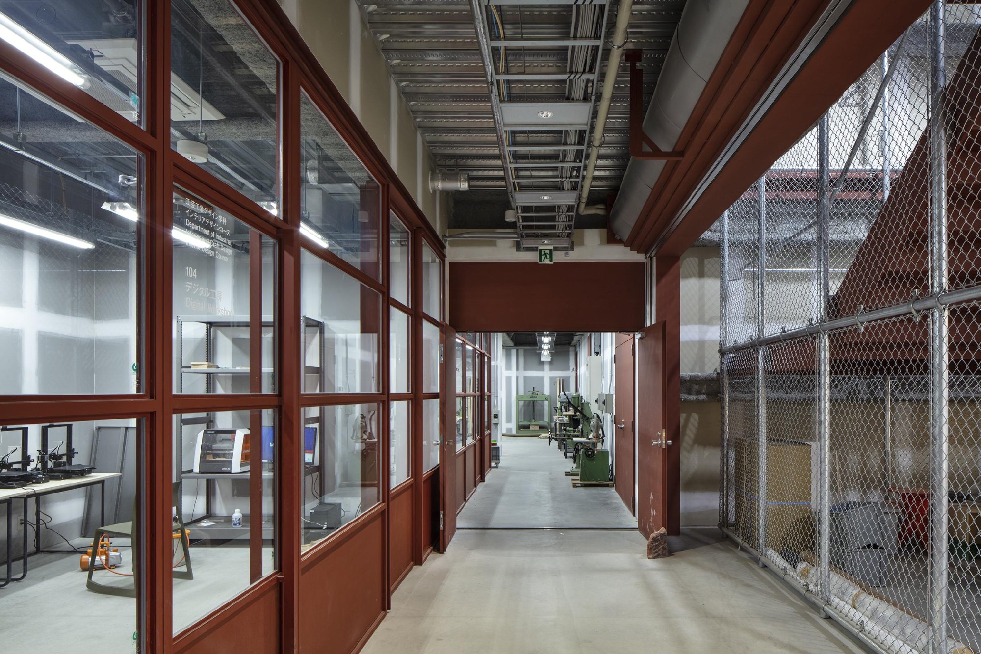
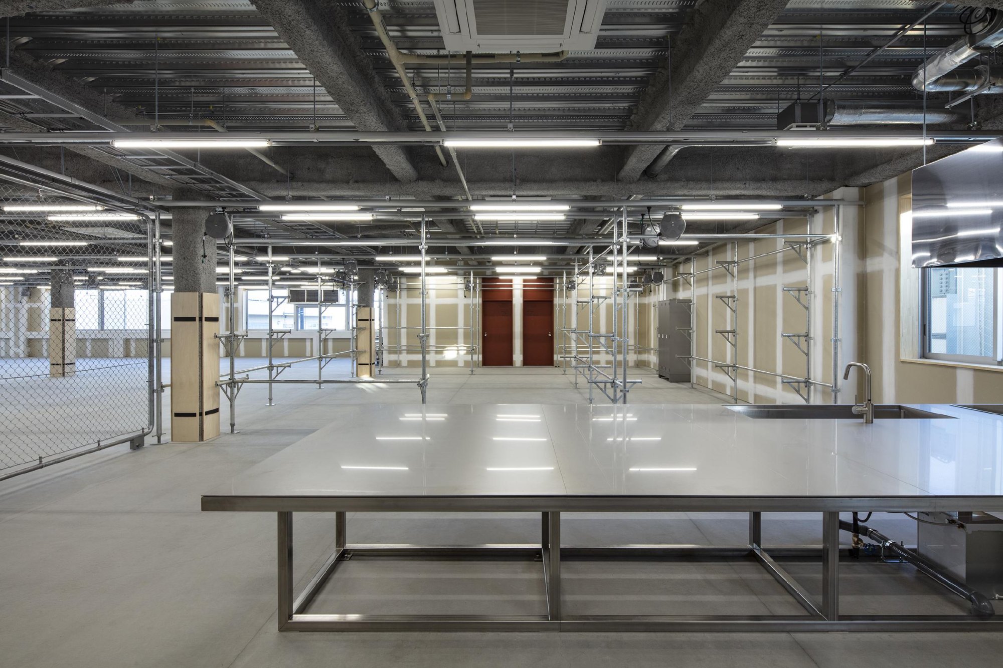
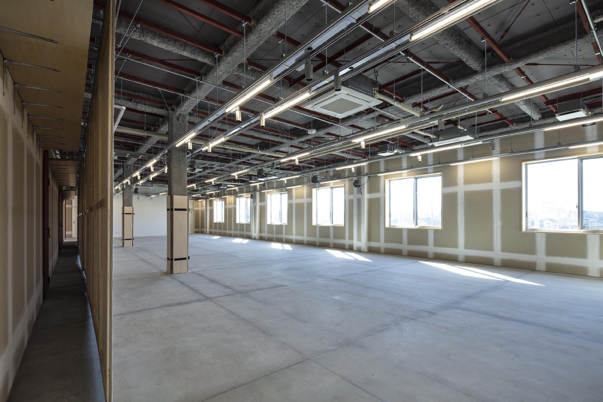
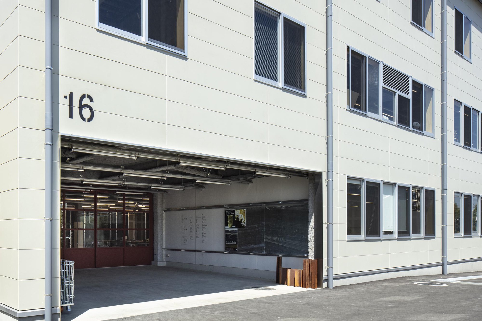
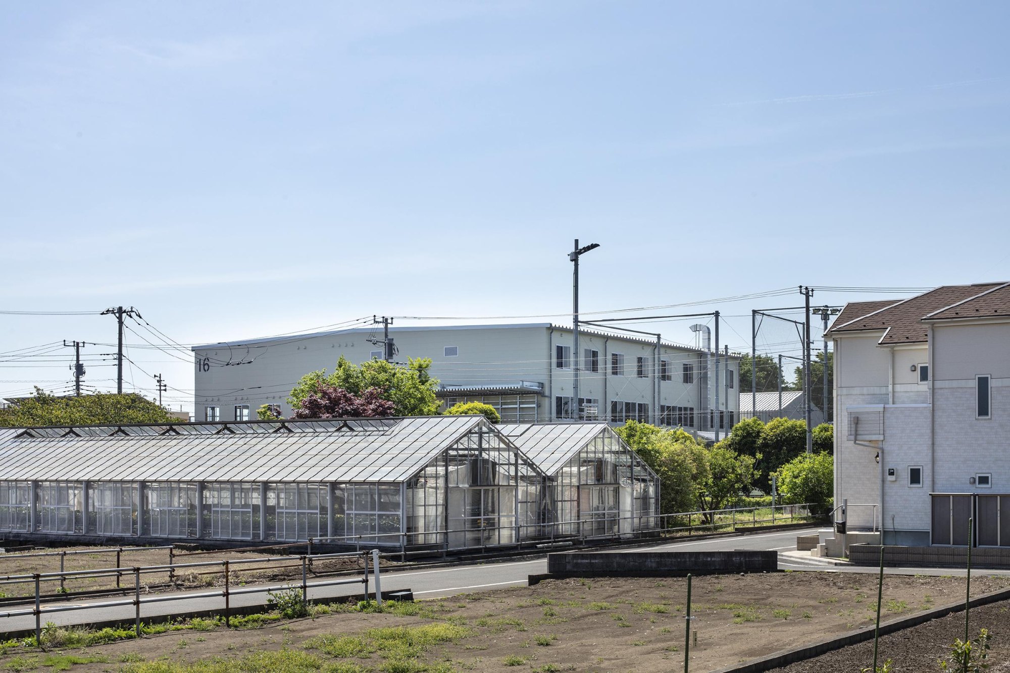
    The No.16 Building houses the interior design course at an art university. The design team calls it semi-architecture: a building left unfinished on purpose, so that the people who use it keep changing it.

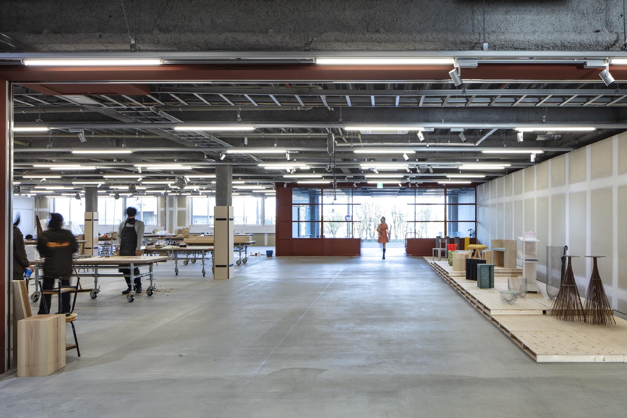
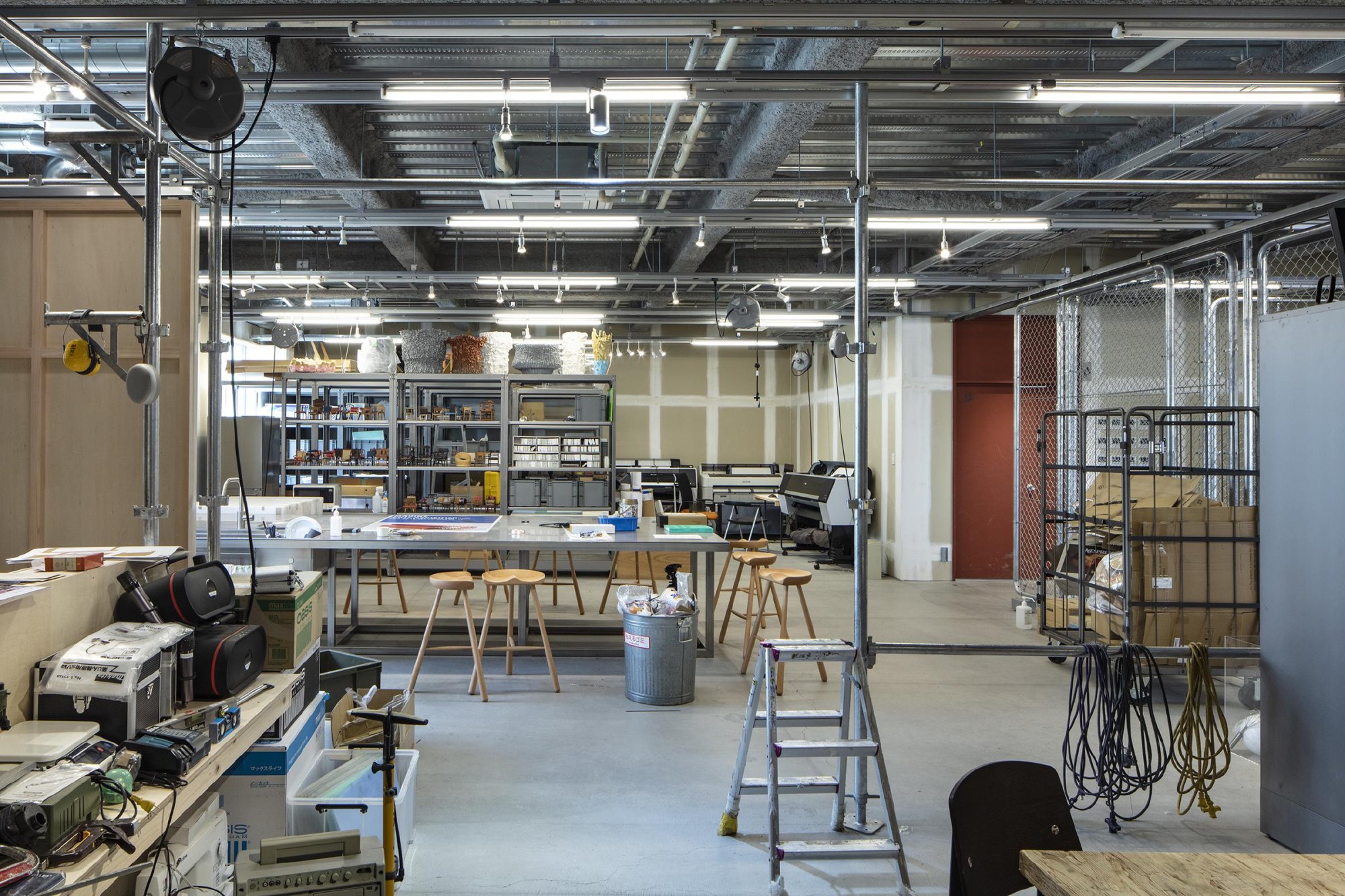
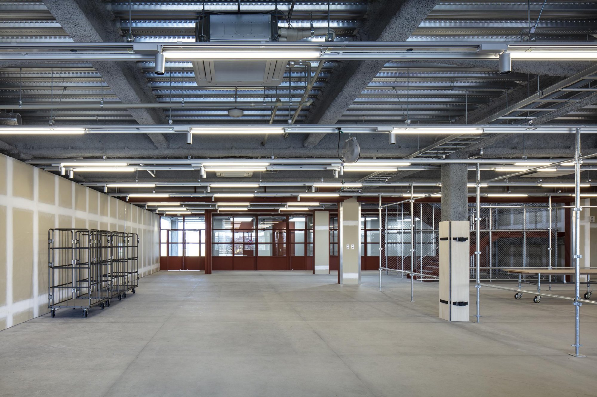
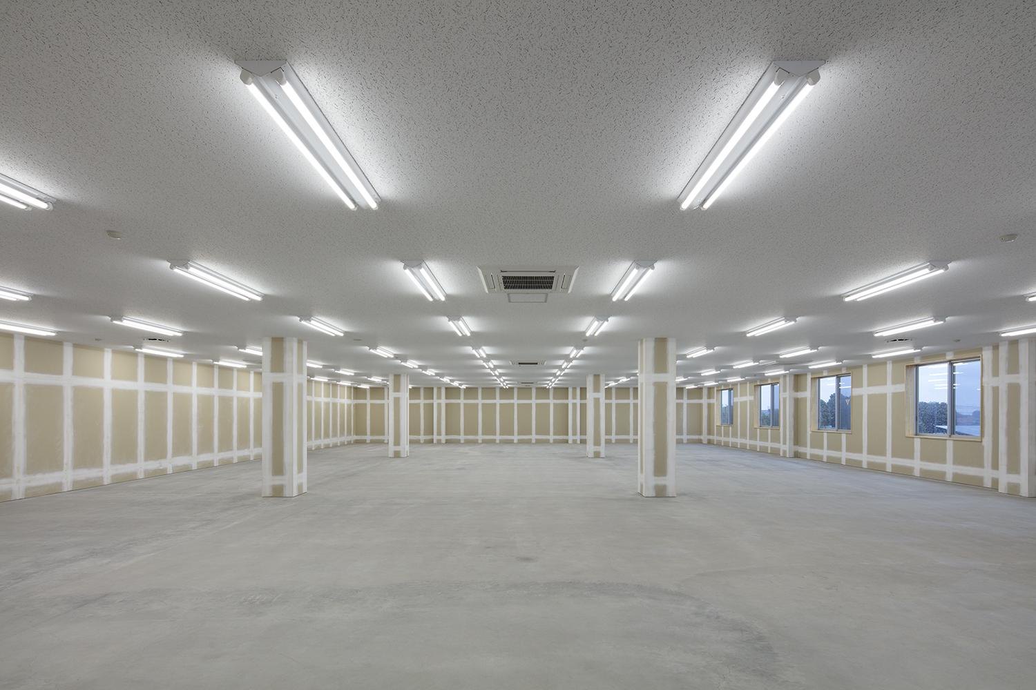
    Art school buildings are where students make work, hold critiques and give presentations. Rather than perfect white cubes that students worry about marking, the team set one common specification for the whole building, leaving room to imagine what each space could become.

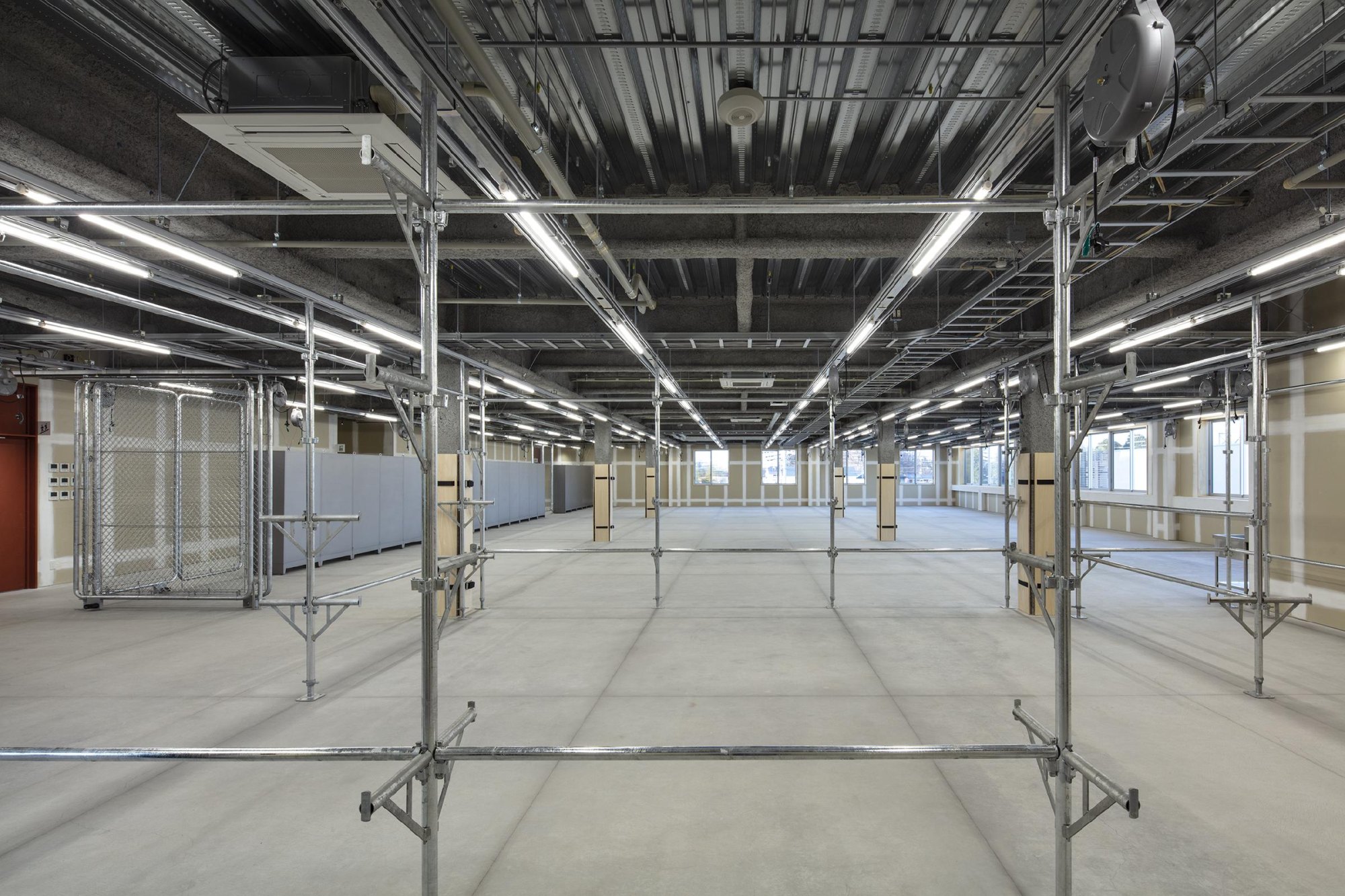
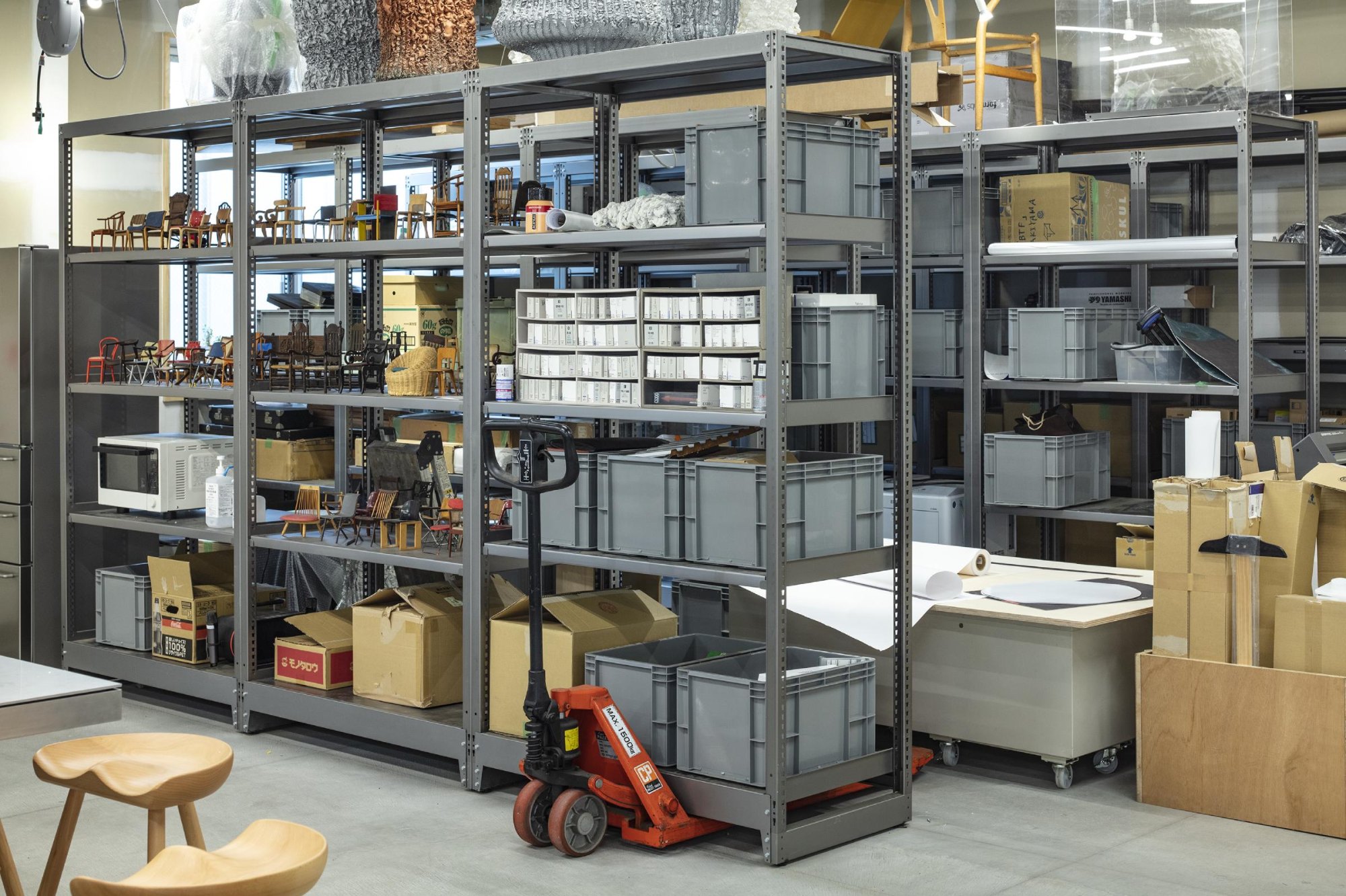
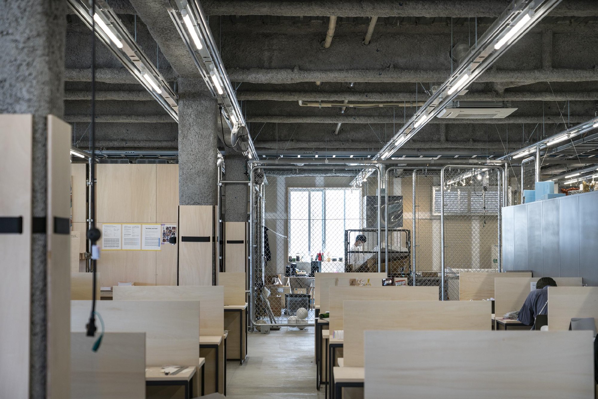
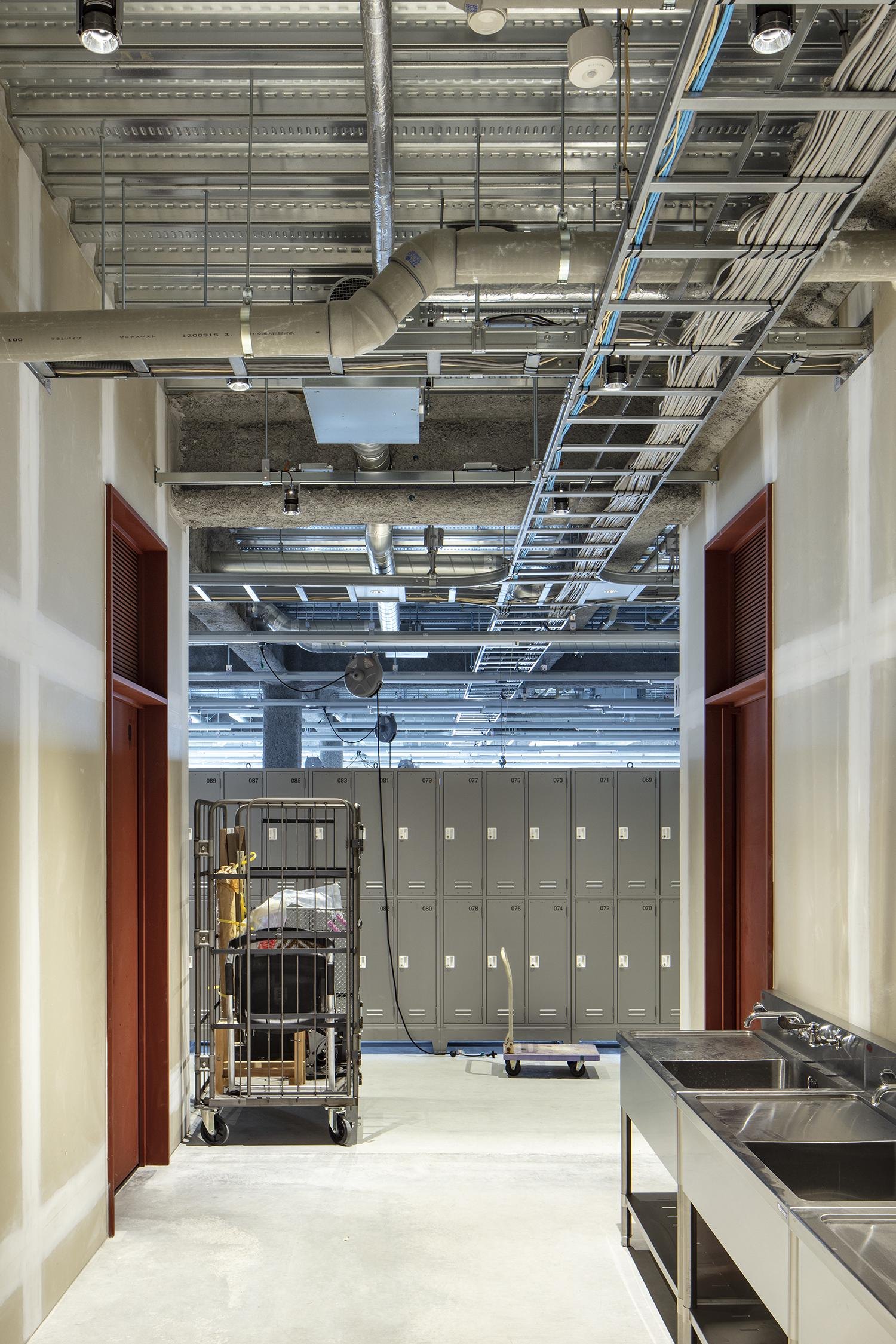
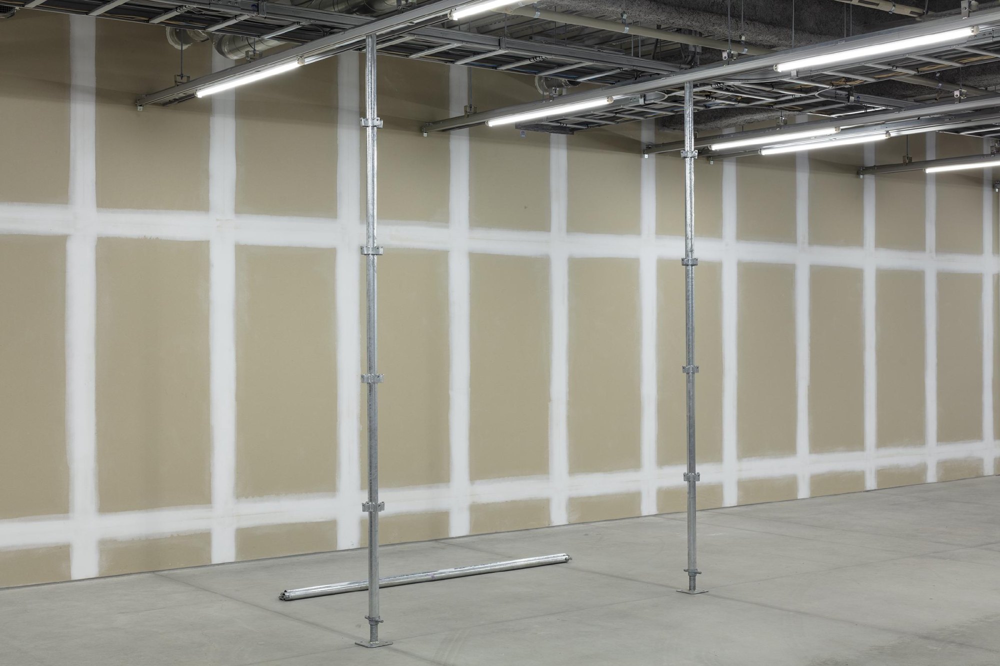
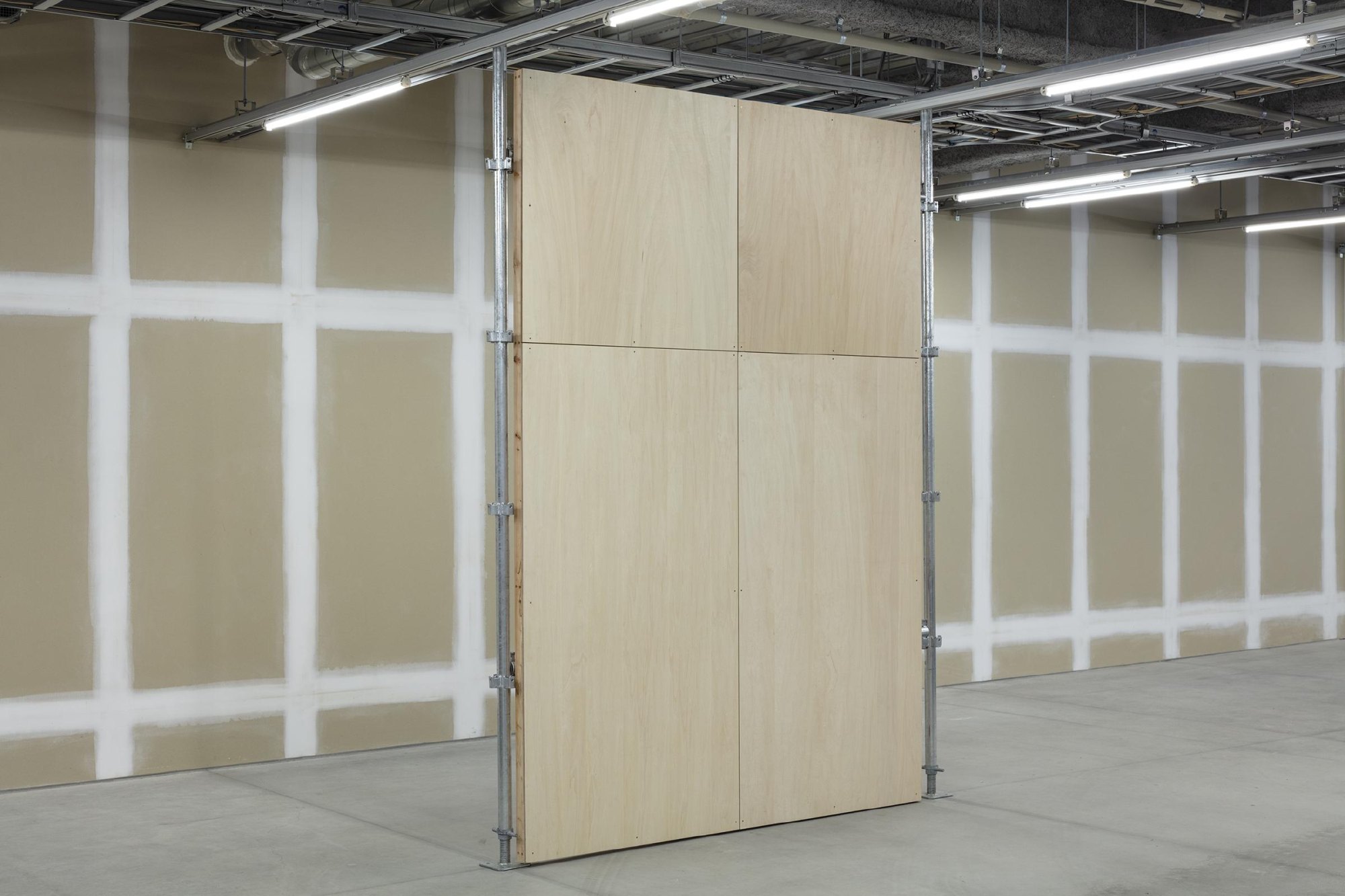
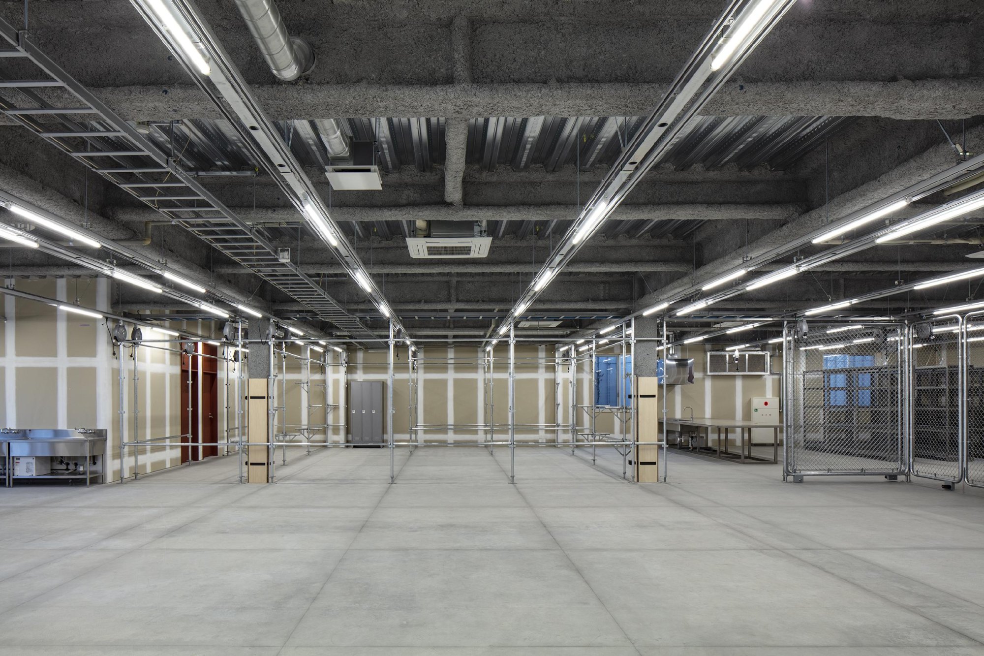
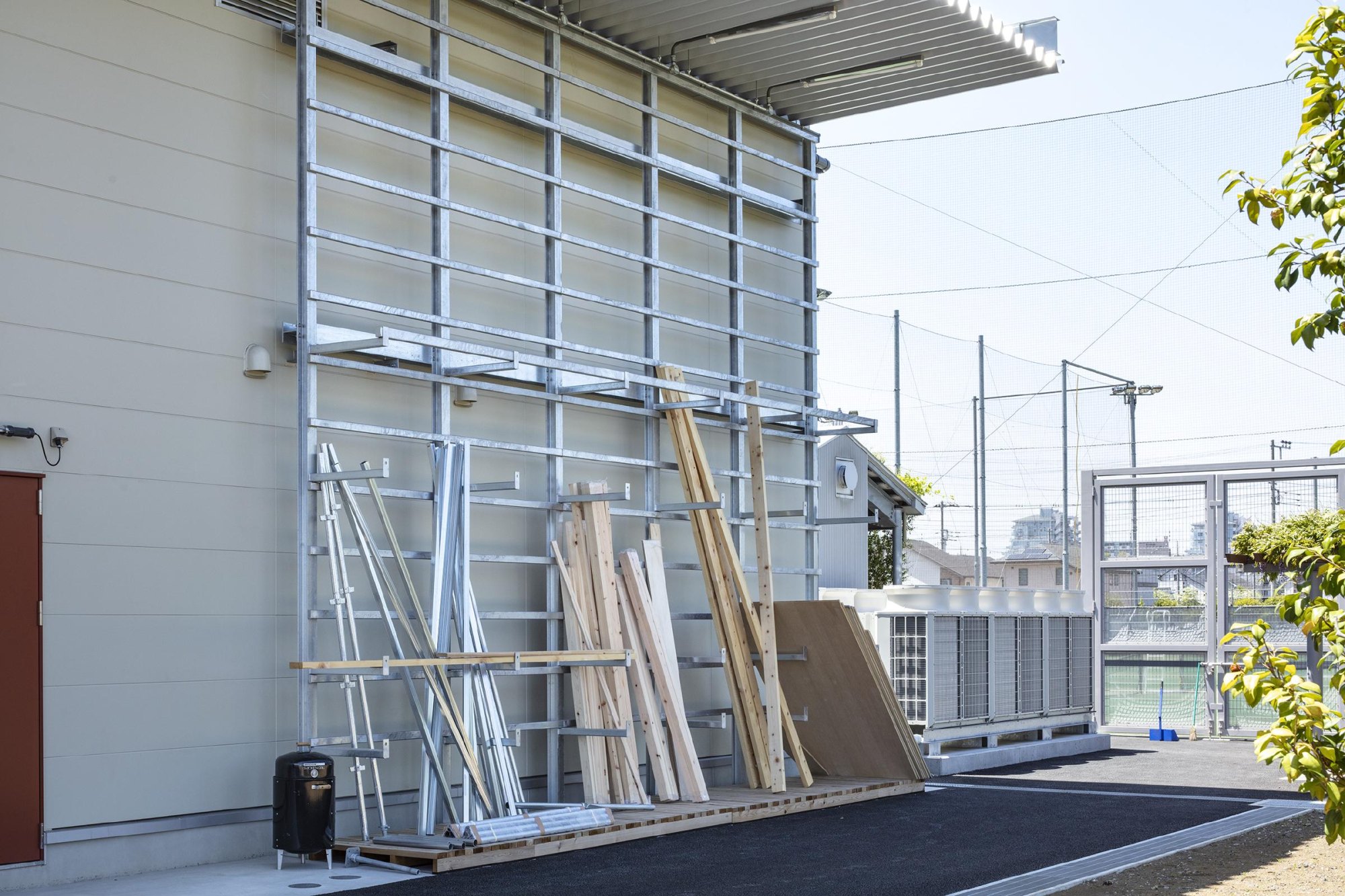
    Perforated raceways hang from a regular grid on the ceiling. Poles slot into the holes and link up to form walls, and wiring ducts, individually switched lights and movable reel-type outlets attach to the raceways, so rooms can be added or taken away with little effort. Shelves and lockers move on hand lifters, and stackable worktables can be rearranged as needed.

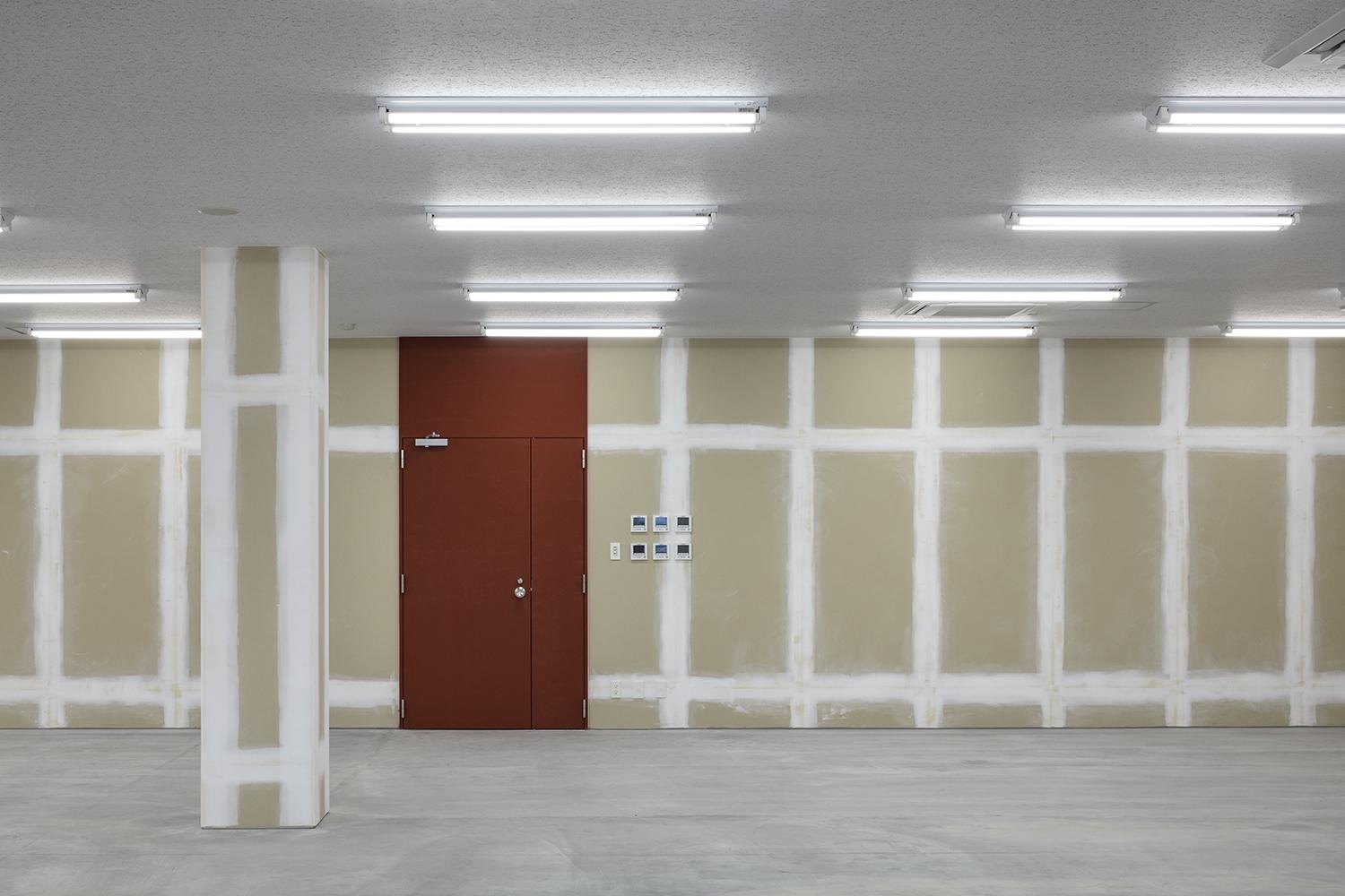
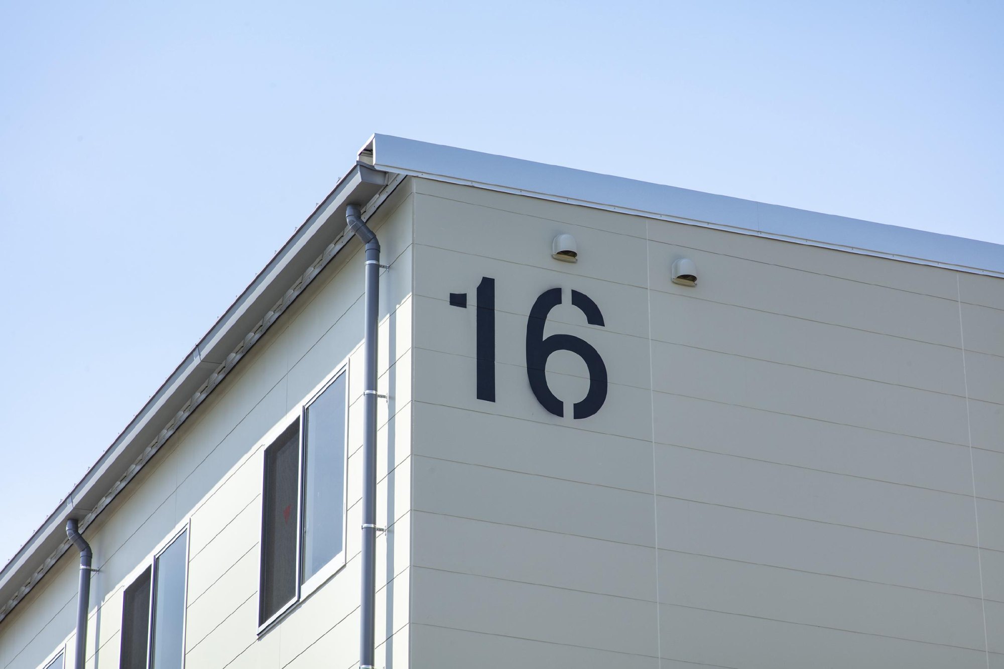
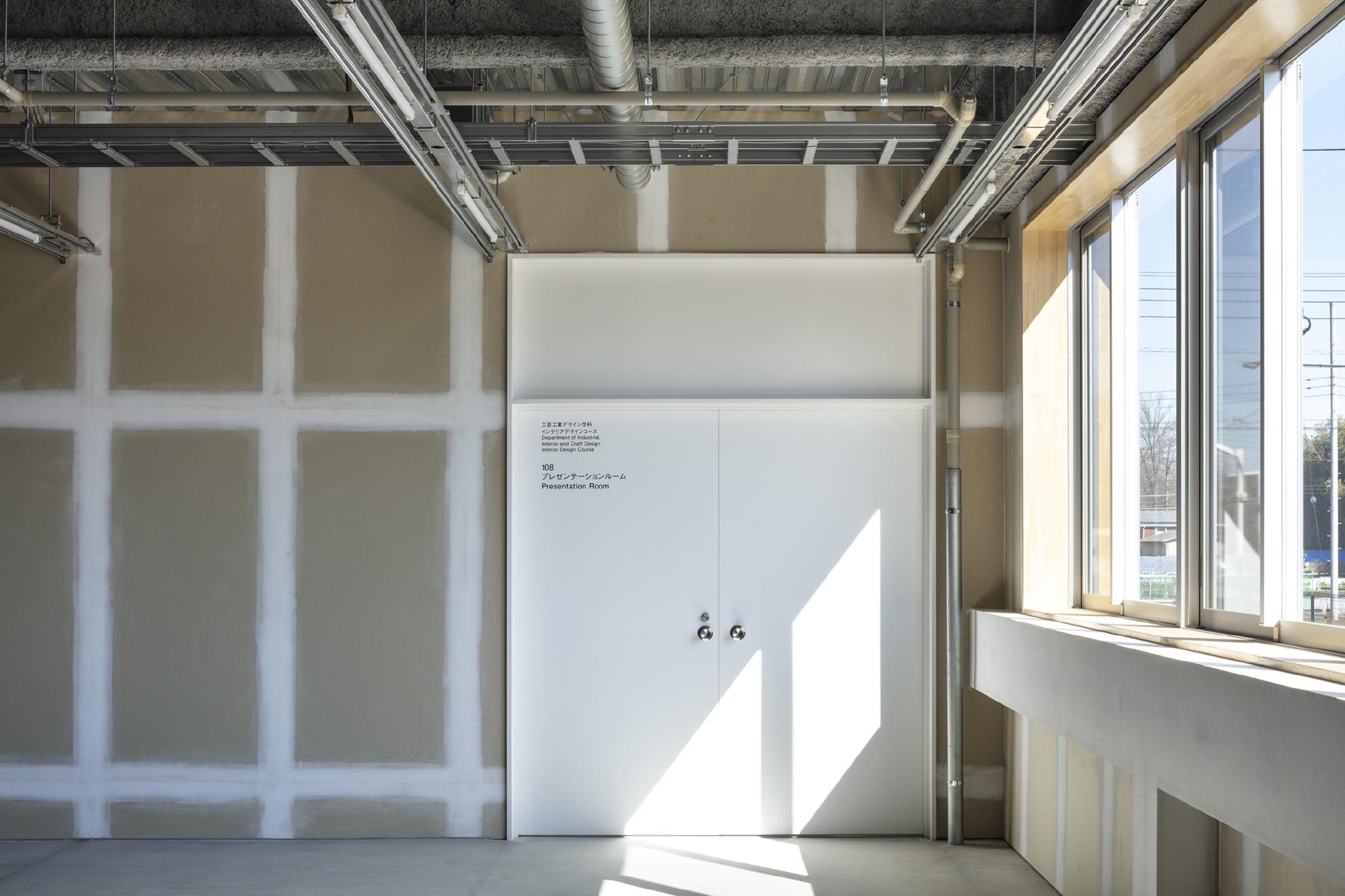
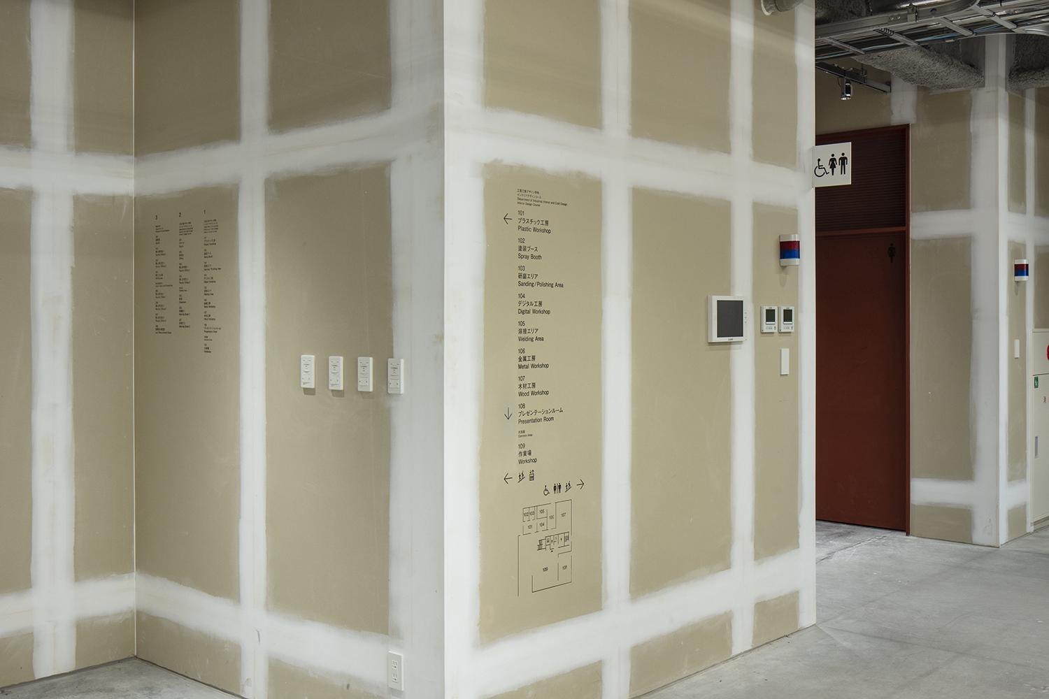
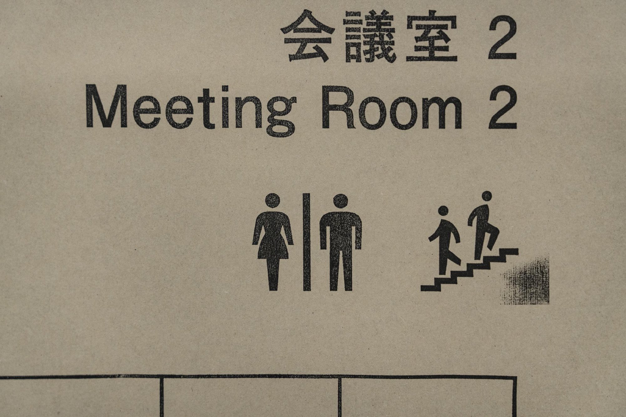
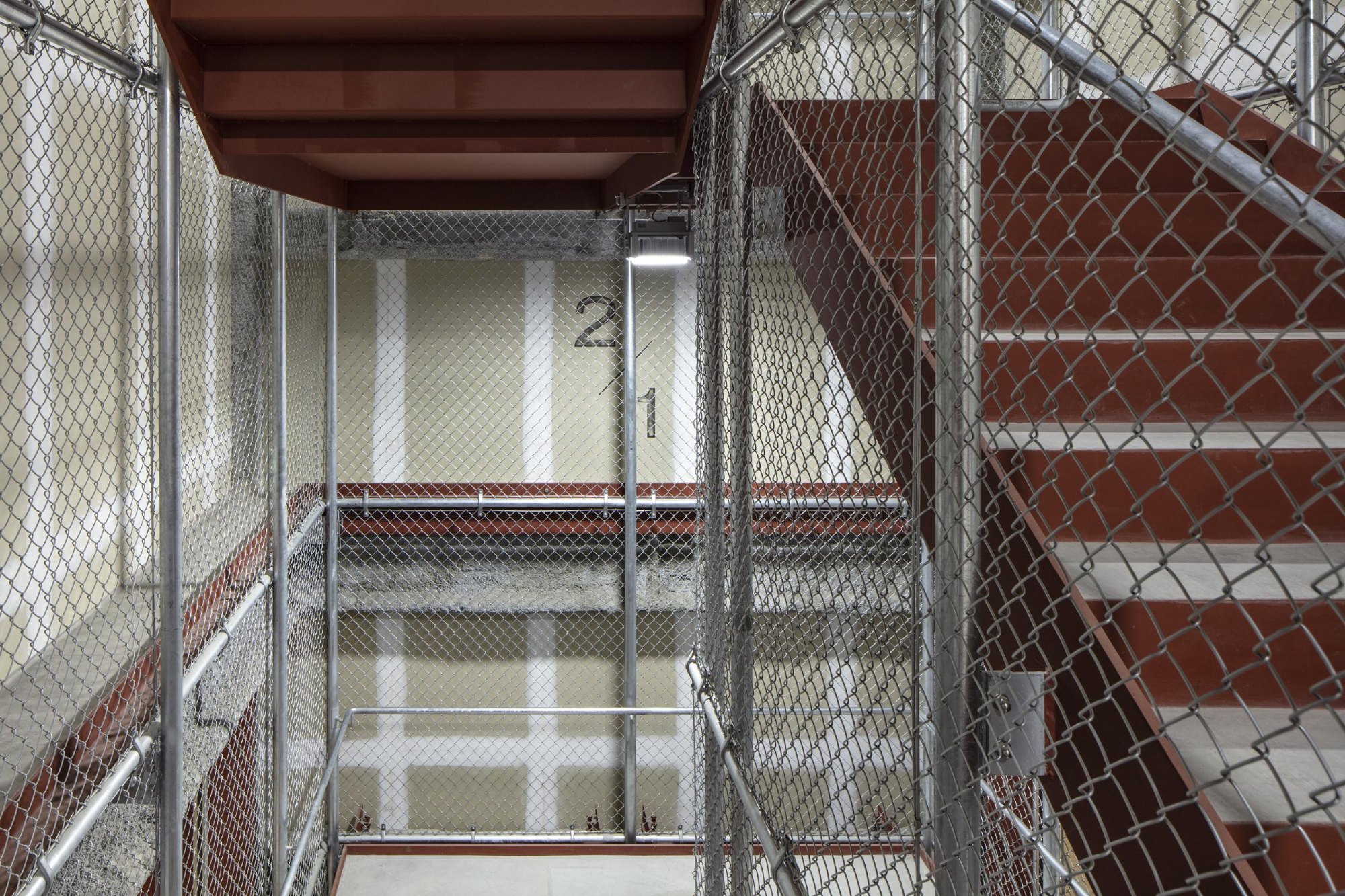
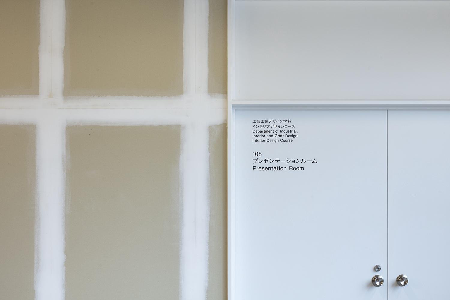
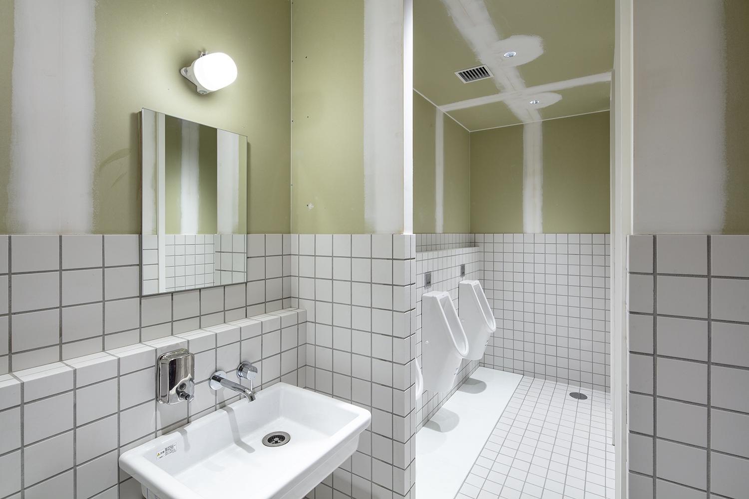
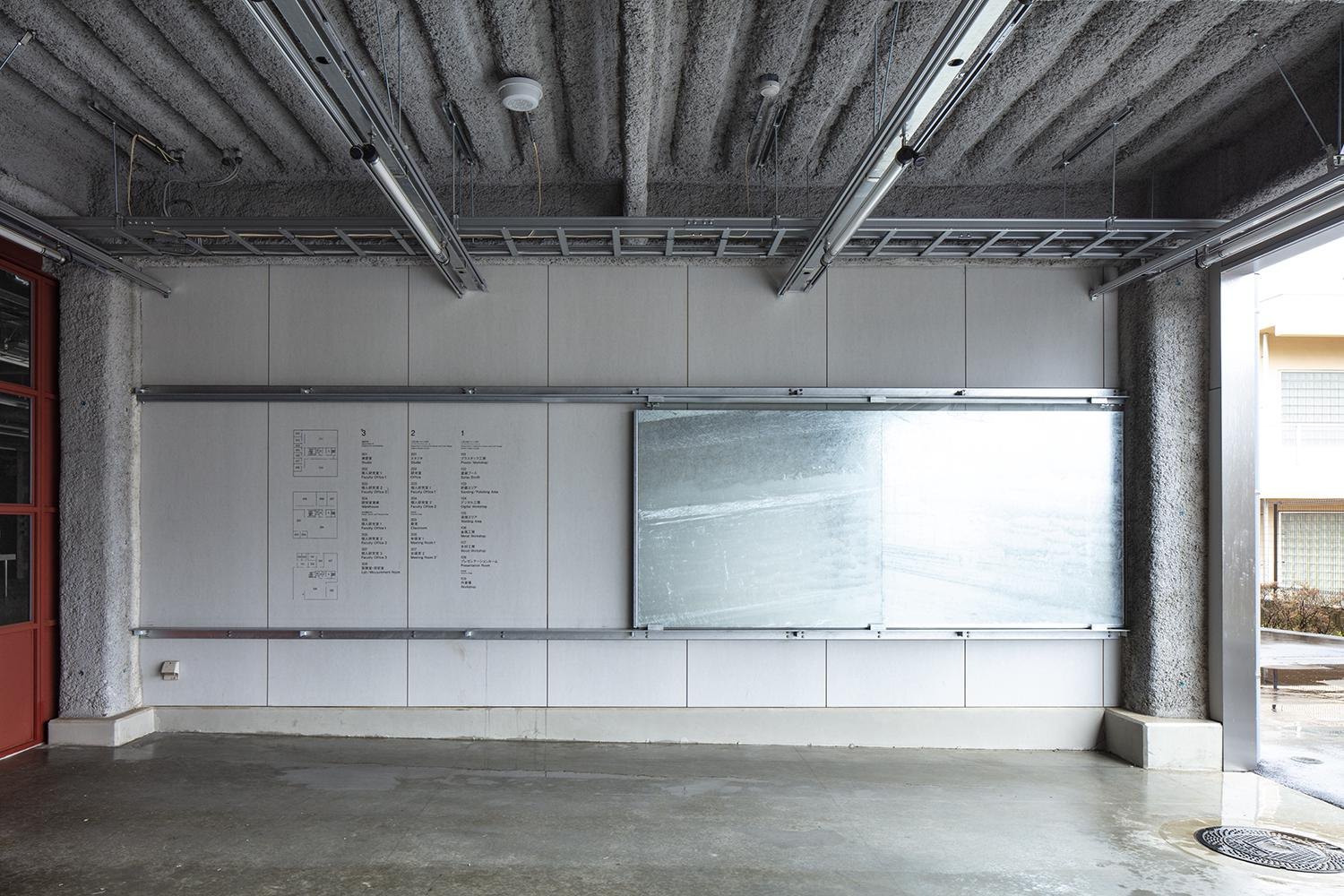
    Finishes are kept to a minimum, putty on plasterboard and rust-proof paint on steel, on the assumption that students will add their own. Signs are designed to be redrawn with stencils and stamps once the walls are painted over. The building changes a little every day in the hands of the students and teachers who have taken it over.

    The idea came from time spent in a historic European city, where buildings can hardly be altered yet the streets are full of life. Looking closely, the team saw how much of that life depends on quick temporary systems: market tents on poles set into ready-made holes in the ground, benches and planters moved on hand lifters, café terraces on rented pavement. They first proposed such an interface for another art university, built a version for a furniture showroom, and realised it most fully here.

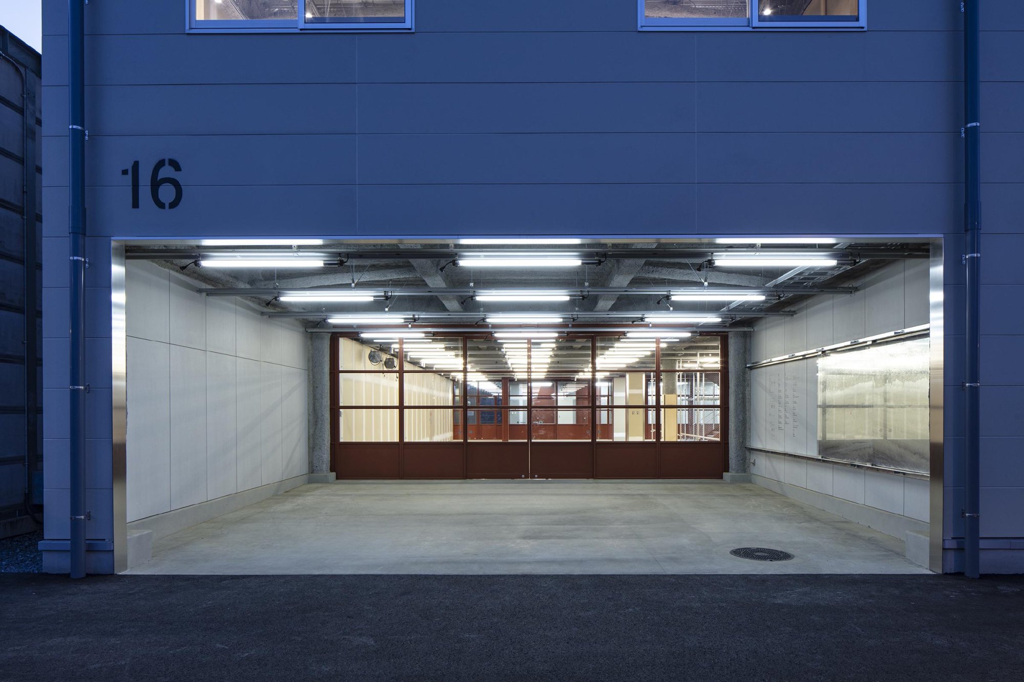
    The building front with its large number 16
    Musashino Art University No.16 Building, view 2
    Musashino Art University No.16 Building, view 3
    Musashino Art University No.16 Building, view 4
    Musashino Art University No.16 Building, view 5
    Musashino Art University No.16 Building, view 6
    Musashino Art University No.16 Building, view 7
    Musashino Art University No.16 Building, view 8
    Musashino Art University No.16 Building, view 9
    Musashino Art University No.16 Building, view 10
    Musashino Art University No.16 Building, view 11
    Corner of the building with the number 16
    Musashino Art University No.16 Building, view 13
    Musashino Art University No.16 Building, view 14
    Musashino Art University No.16 Building, view 15
    Musashino Art University No.16 Building, view 16
    Musashino Art University No.16 Building, view 17
    Musashino Art University No.16 Building, view 18
    Musashino Art University No.16 Building, view 19
    Musashino Art University No.16 Building, view 20
    Musashino Art University No.16 Building, view 21
    Musashino Art University No.16 Building, view 22
    Musashino Art University No.16 Building, view 23
    Musashino Art University No.16 Building, view 24
    Musashino Art University No.16 Building, view 25
    Musashino Art University No.16 Building, view 26
    Musashino Art University No.16 Building, view 27
    Meeting room sign stencilled on a wall
    Musashino Art University No.16 Building, view 29
    Musashino Art University No.16 Building, view 30
    Musashino Art University No.16 Building, view 31
    Musashino Art University No.16 Building, view 32
    Musashino Art University No.16 Building, view 33
    Musashino Art University No.16 Building, view 34
    Musashino Art University No.16 Building, view 35
    Washroom with simple tiled finishes
    Musashino Art University No.16 Building, view 37
    Musashino Art University No.16 Building, view 38
    Ground floor opening to the street
    Musashino Art University No.16 Building, view 40
    Musashino Art University No.16 Building, view 41
    The building from across the road
  • The Paper Cocoon

    The Paper Cocoon

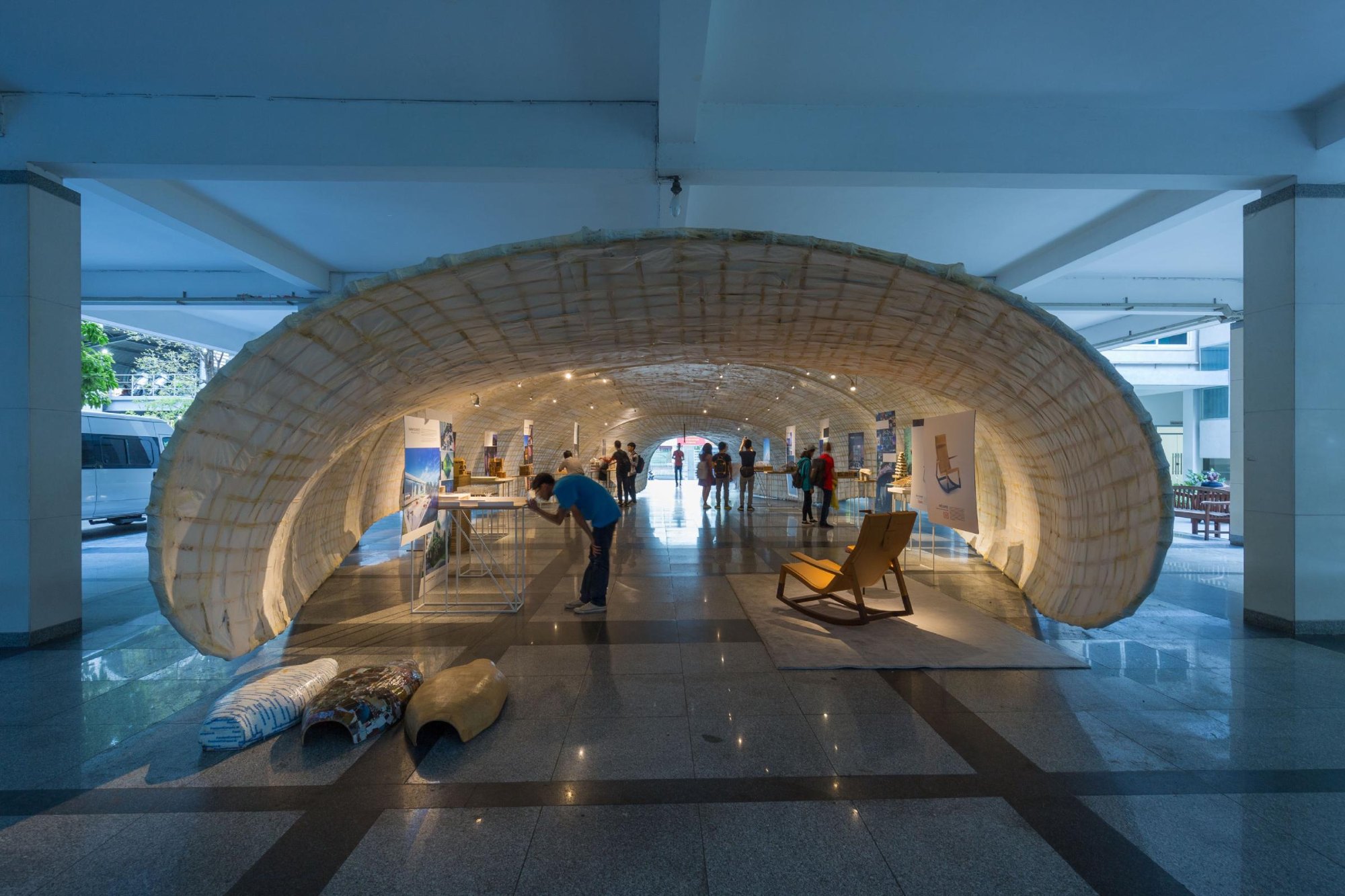
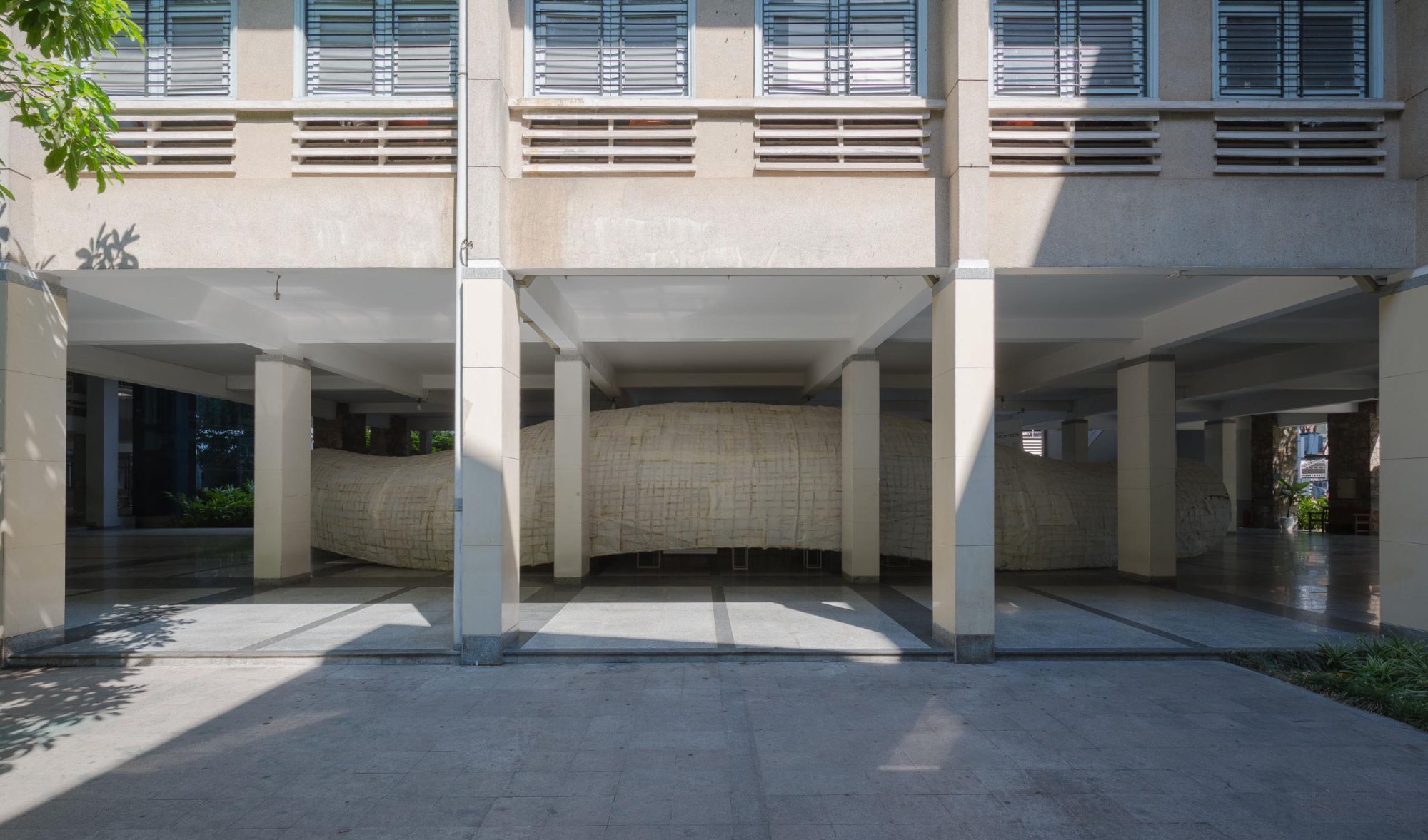
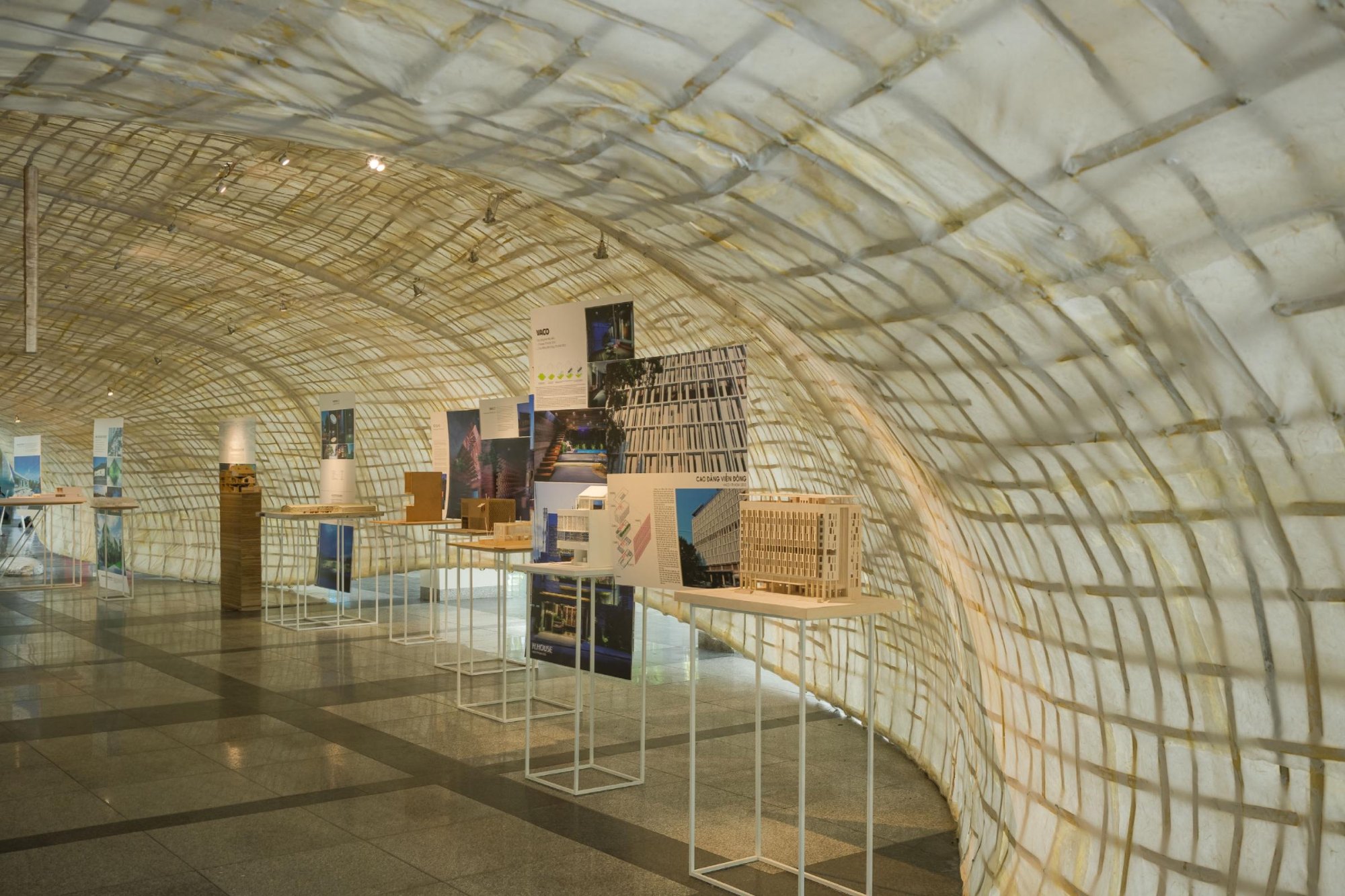
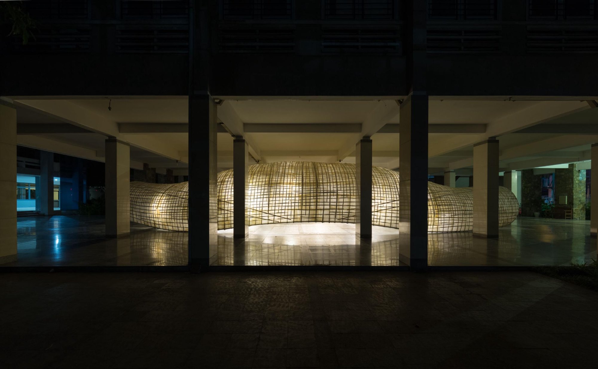
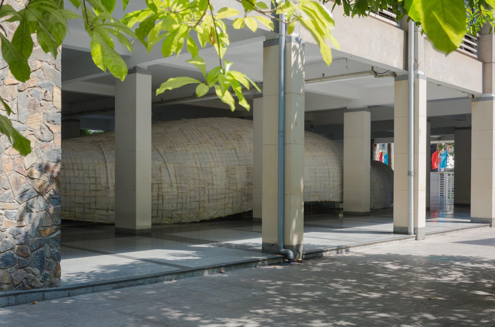
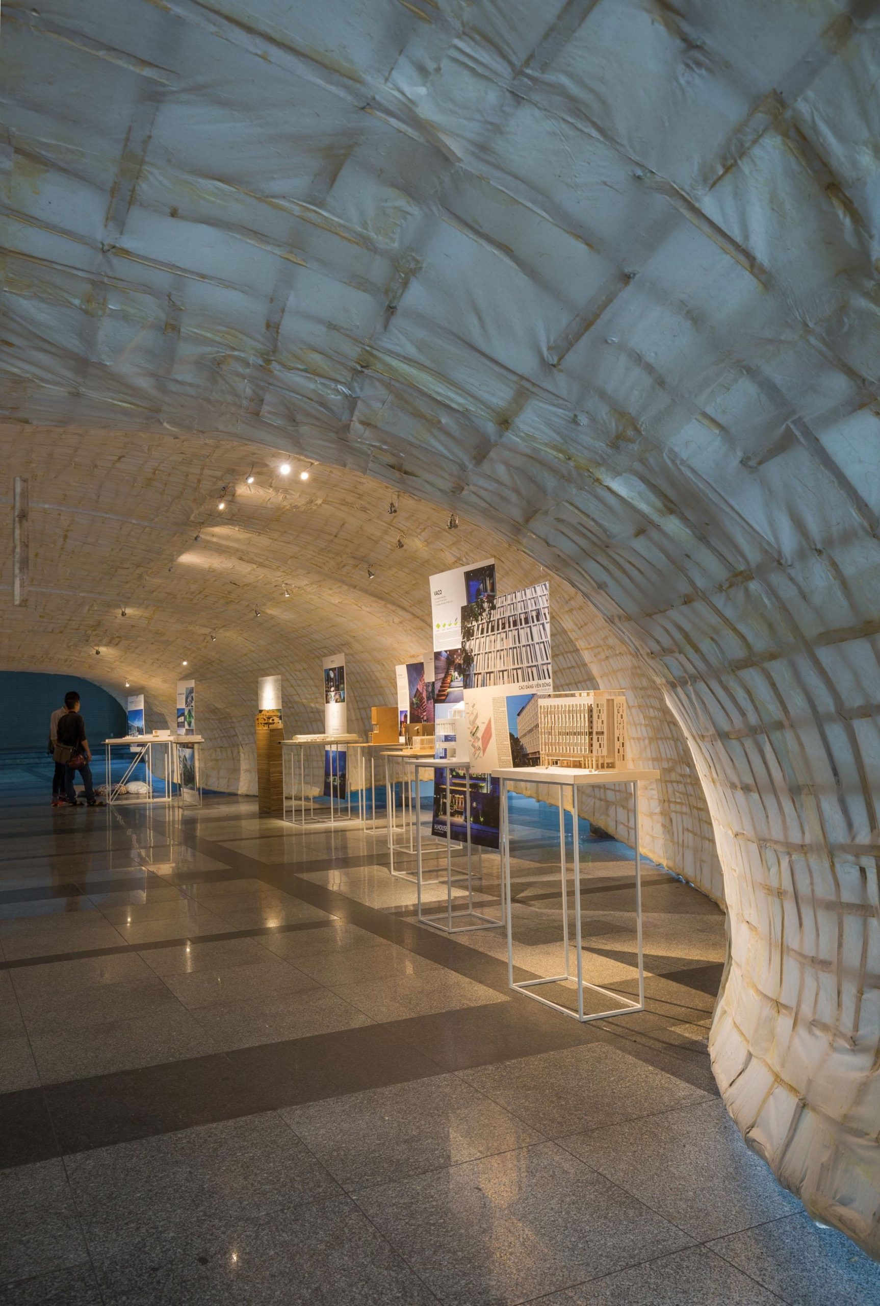
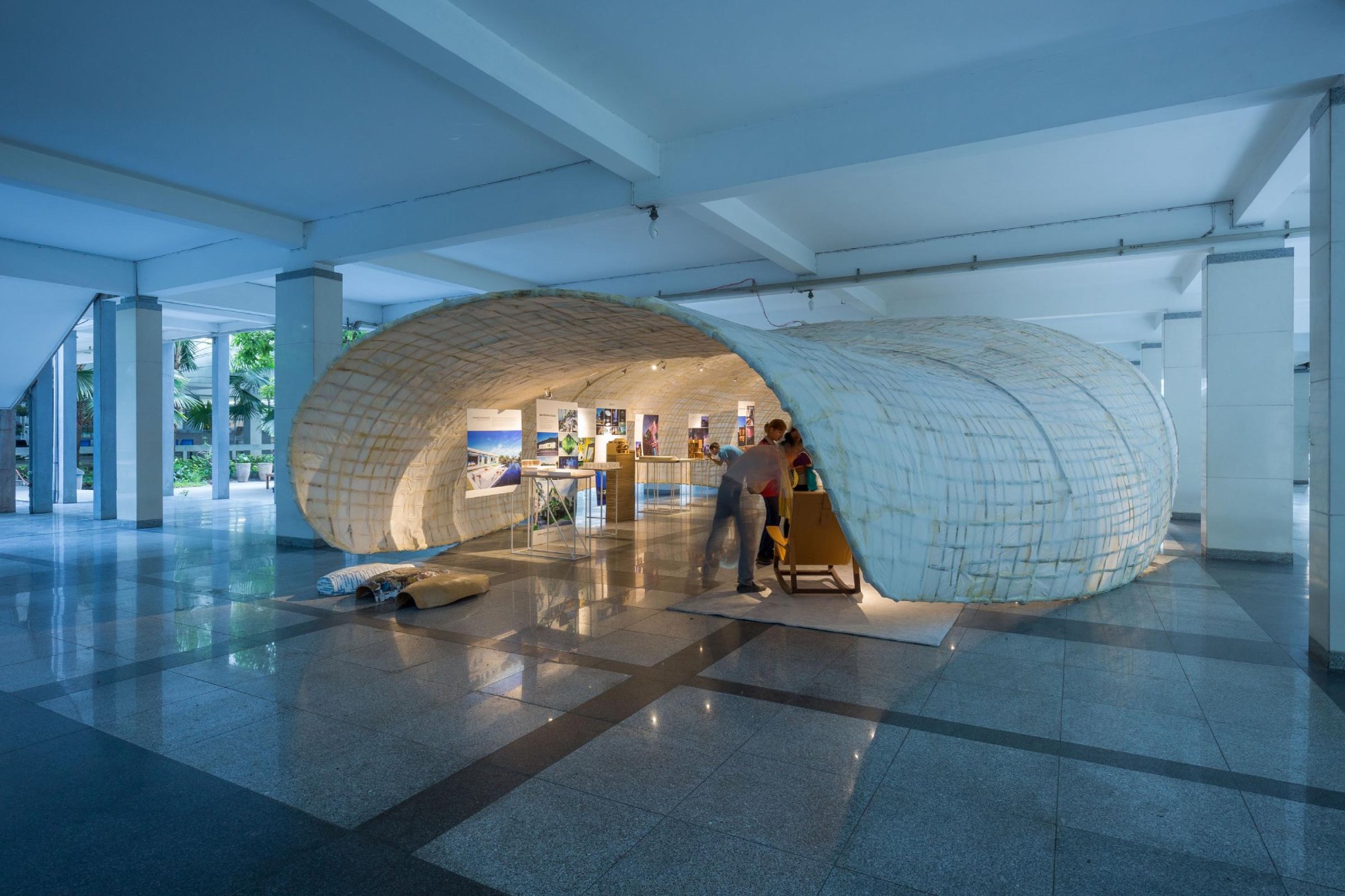
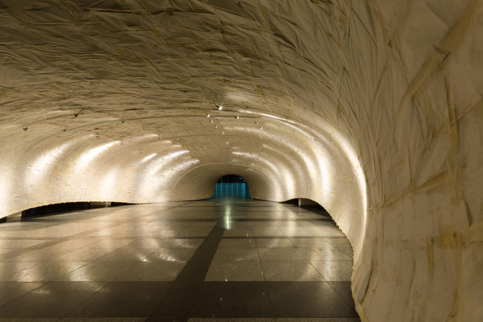
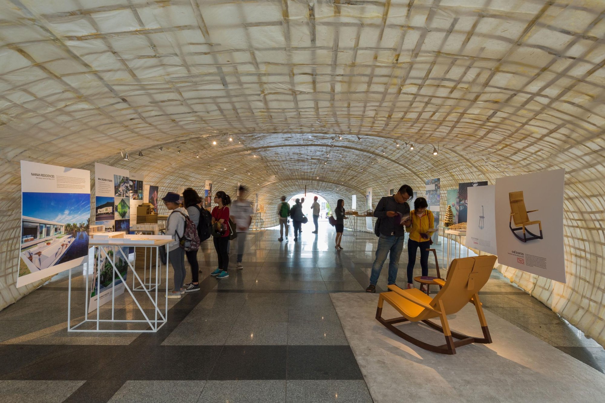
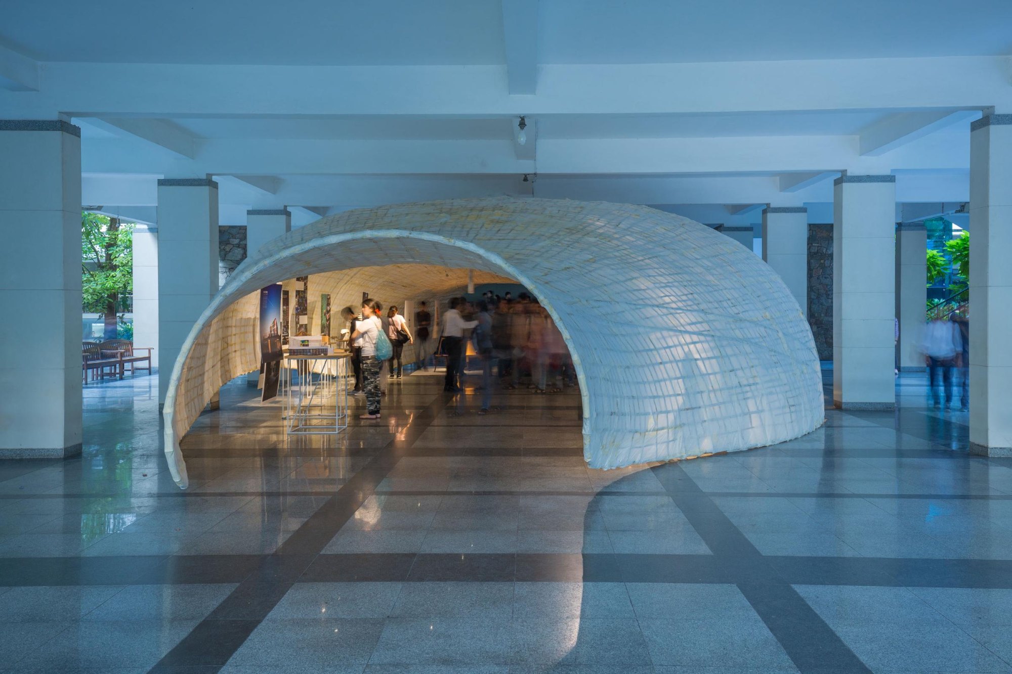
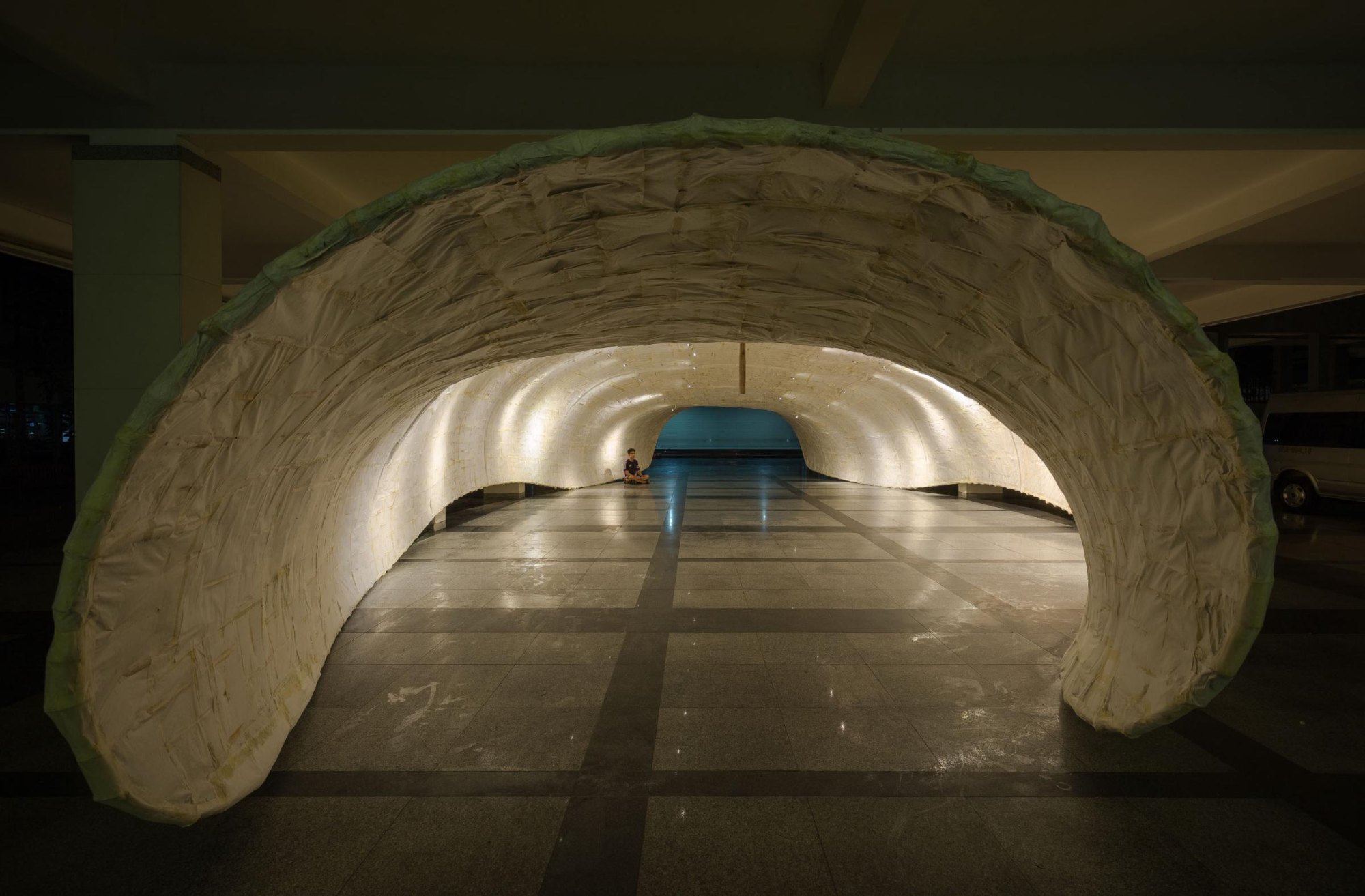
    The Paper Cocoon was a pavilion for an architecture exhibition held in April 2016. Built with architecture students, it was made mainly of bamboo and poonah paper, and took its form from the cocoons insects spin in nature.

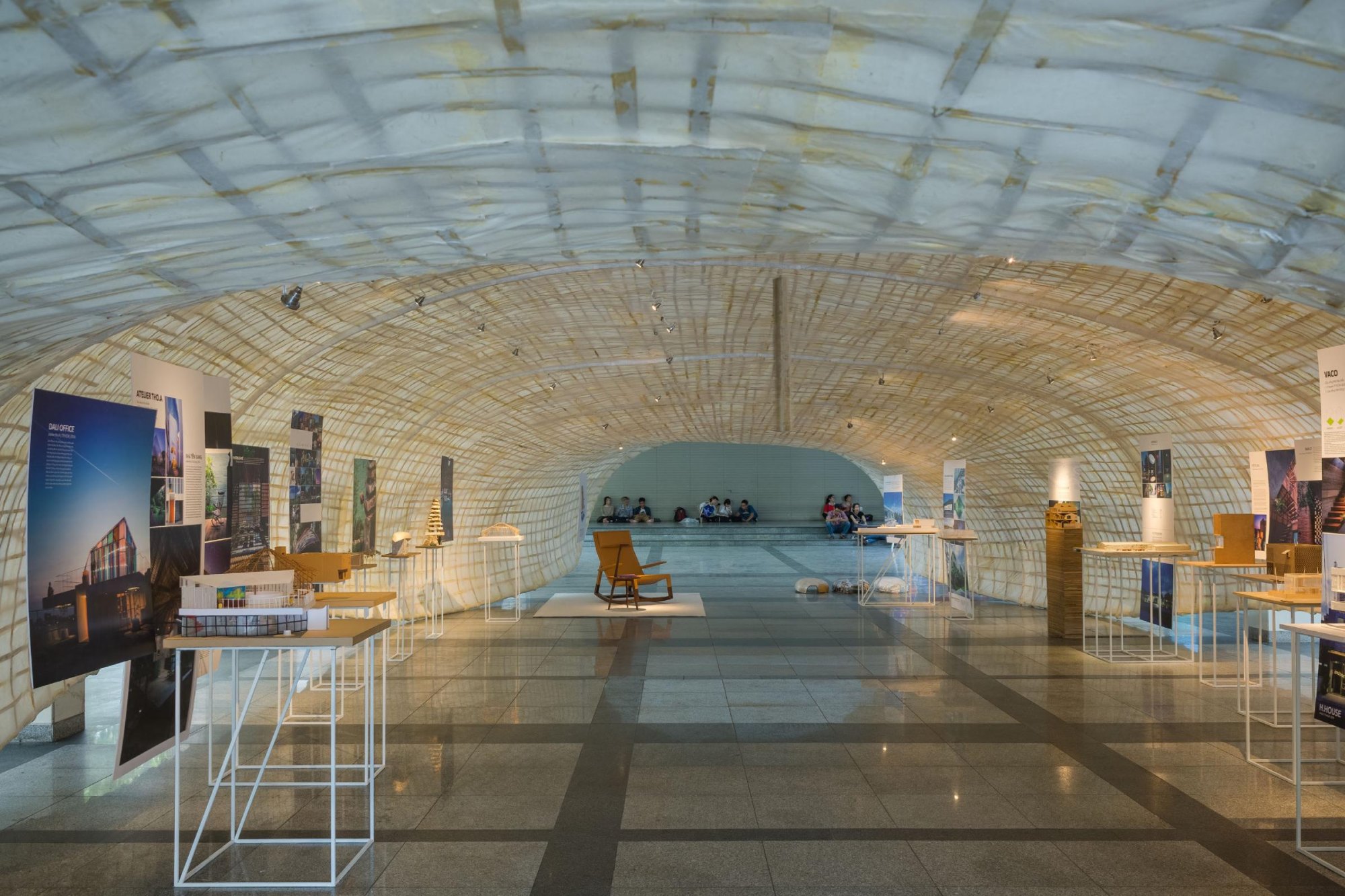
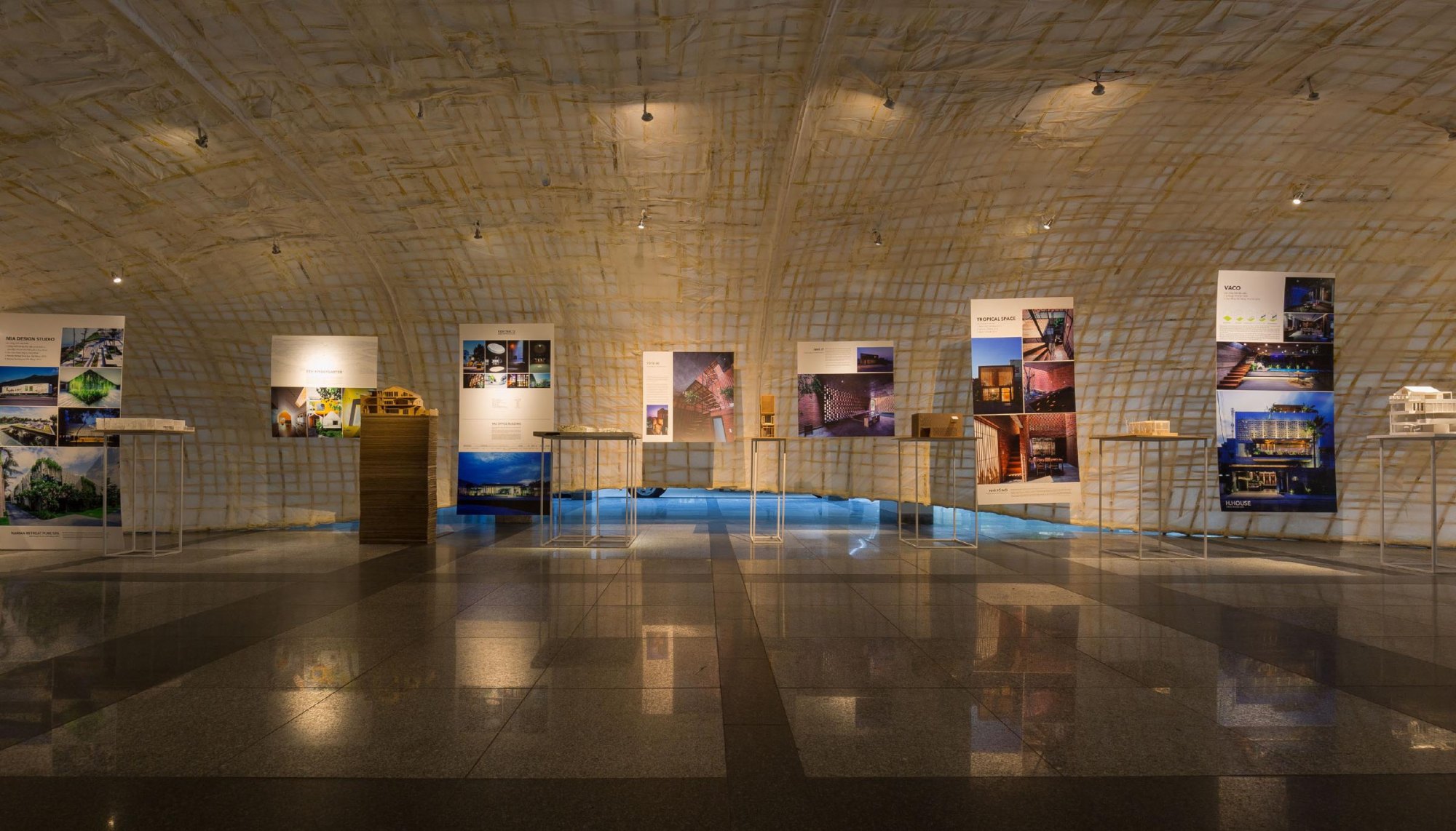
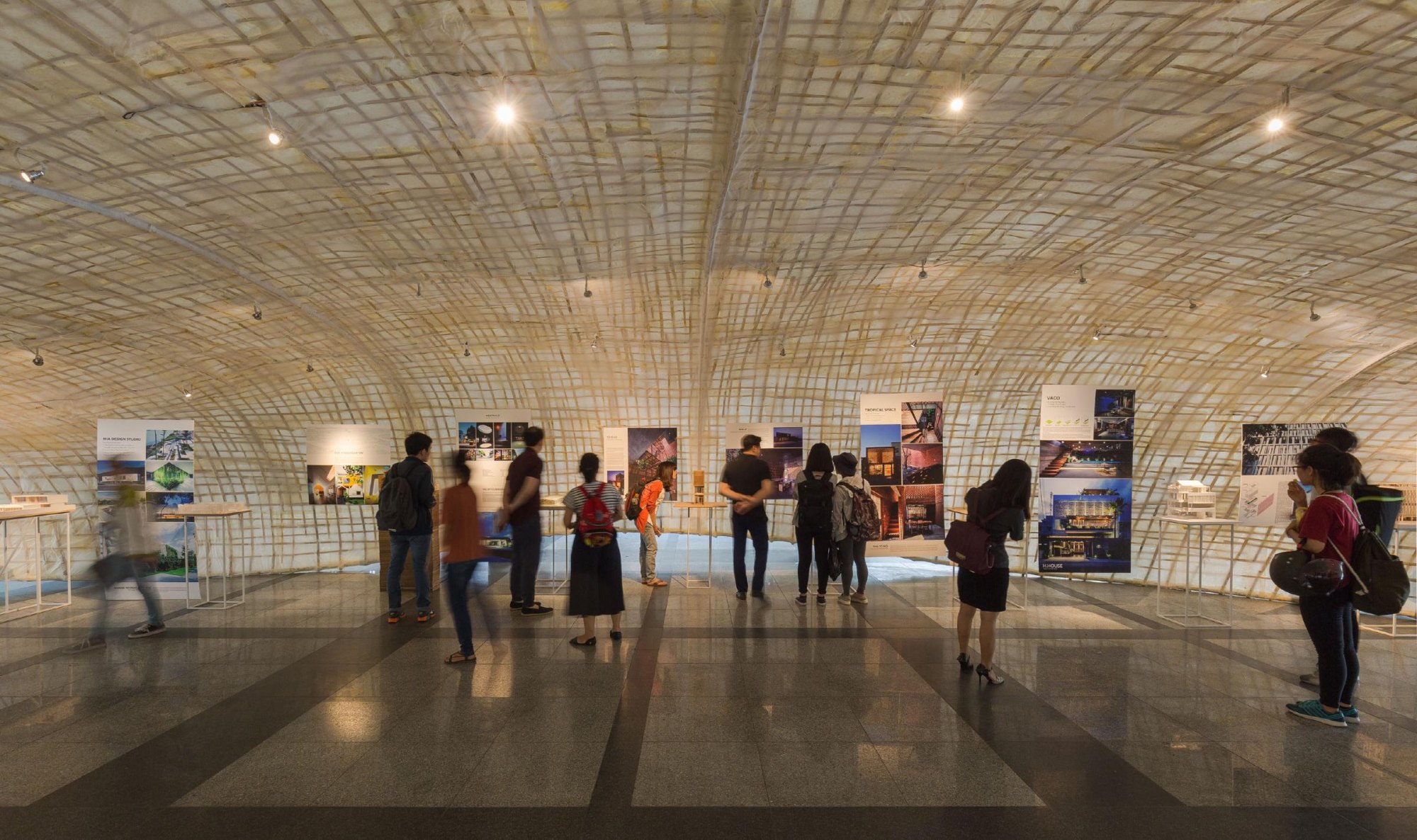
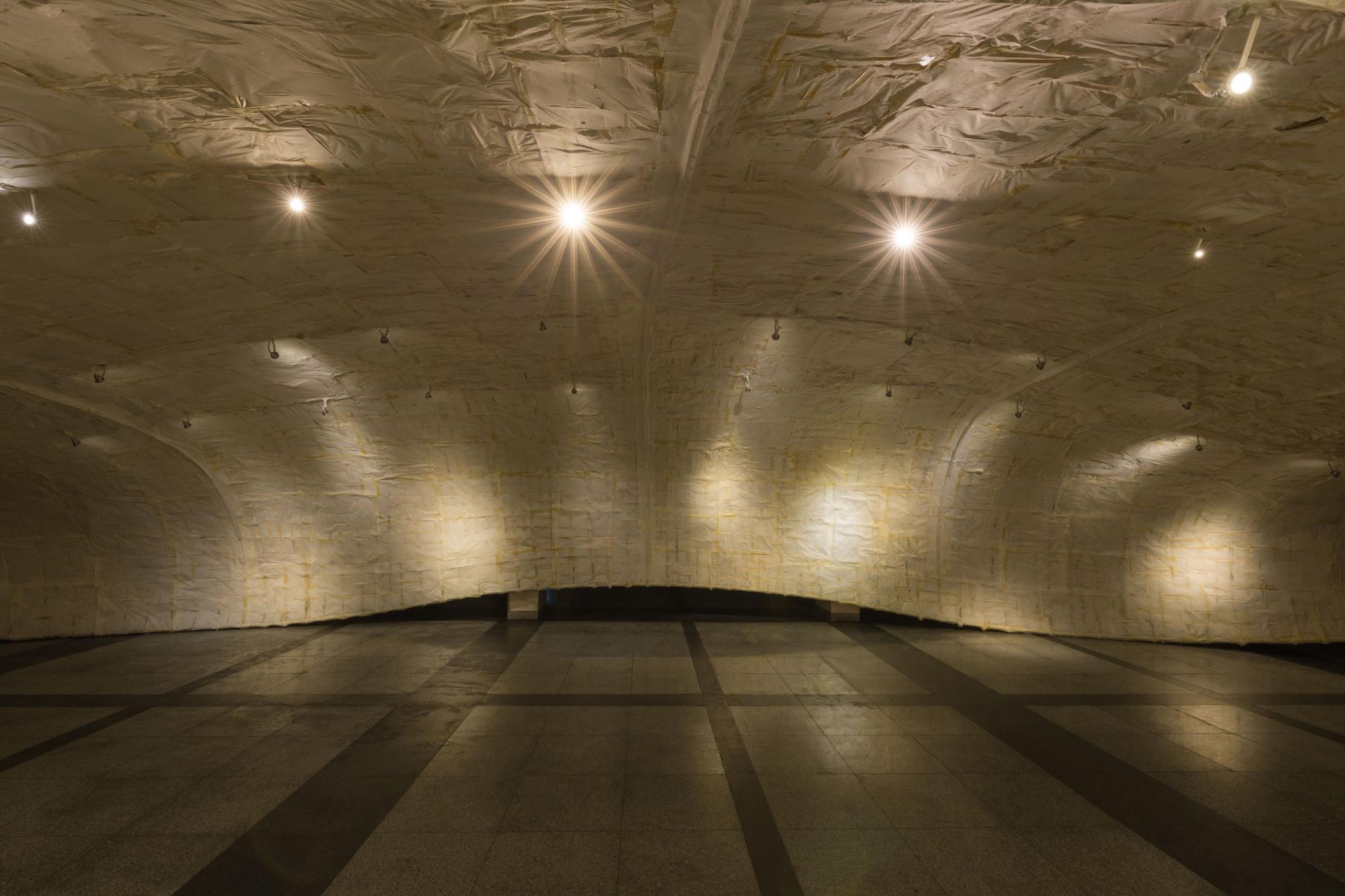
    Measuring 9 by 18 metres, the pavilion housed 17 works by seven architecture firms. Its frame used 800 bamboo sticks, and 1,200 sheets of poonah paper covered the shell inside and out.

    The construction followed the way artisans make paper lion heads, a craft passed down through generations on an old street known for its paper goods. Building the pavilion themselves gave the students a chance to practise, deepen their knowledge and learn to work as a team.

    The exhibition is organised every year by an online architecture community with more than 30,000 members, as a way to connect generations of architects with students.

    The exhibition hall before the pavilion
    Inside the paper shell with exhibits
    The cocoon seen from the open hall
    The hall at night
    Covered hall among trees
    Exhibition panels inside the cocoon
    Exhibits lit along the shell
    Curving paper vault
    The pavilion under the concrete hall
    Lit tunnel of paper and bamboo
    Visitors inside the cocoon
    Visitors viewing the exhibition
    The cocoon from outside in daylight
    The cocoon glowing at night
    Paper vault with points of light
  • Premier Office

    Premier Office

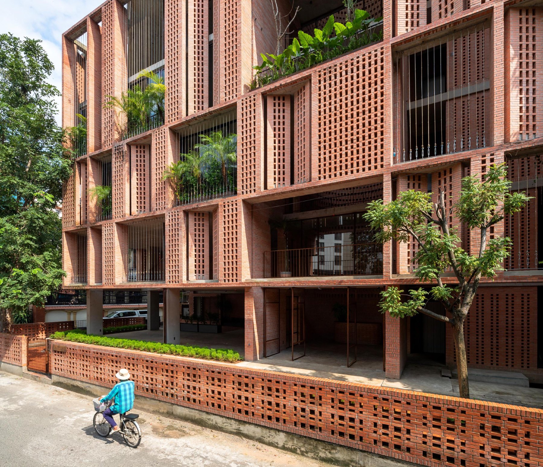
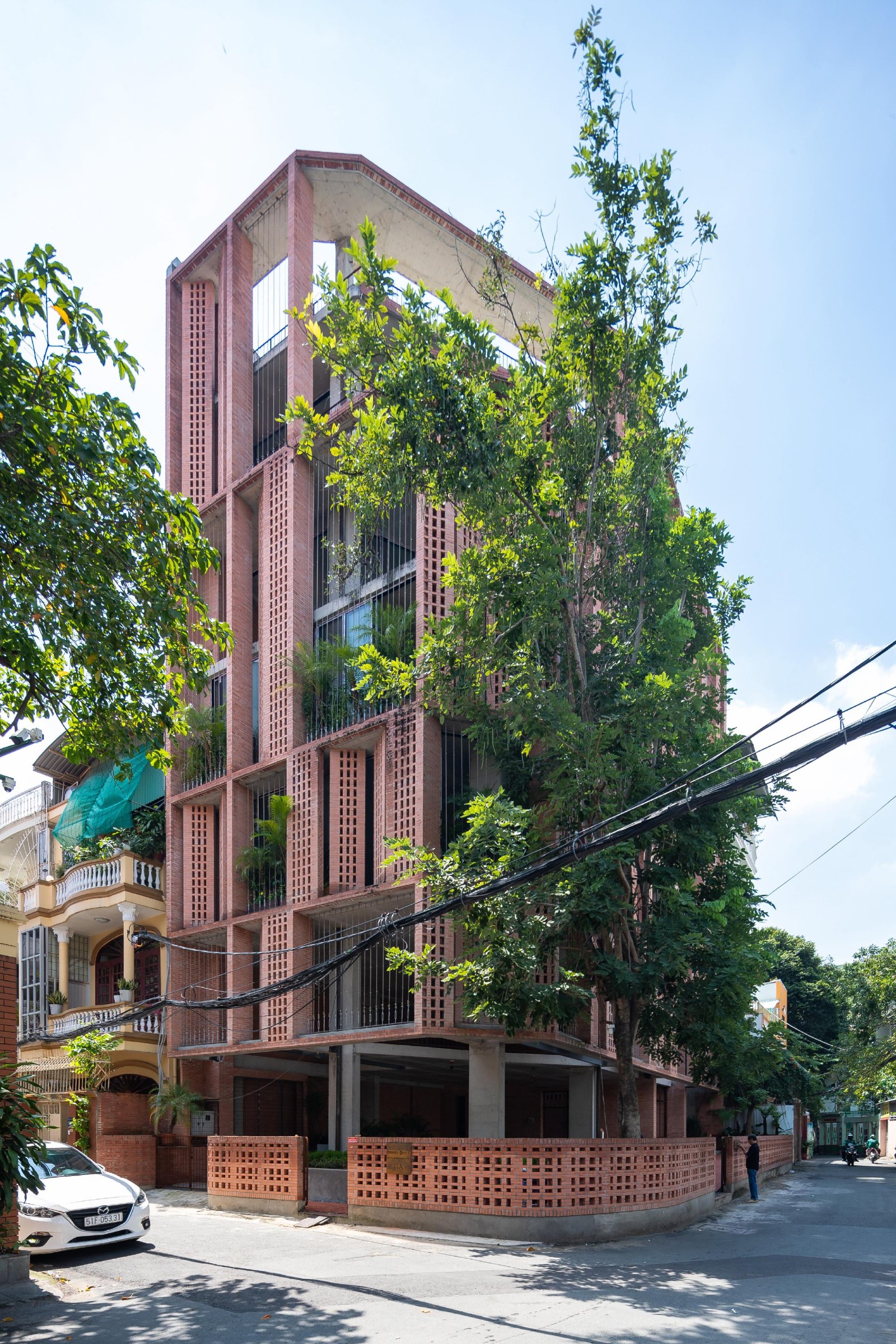
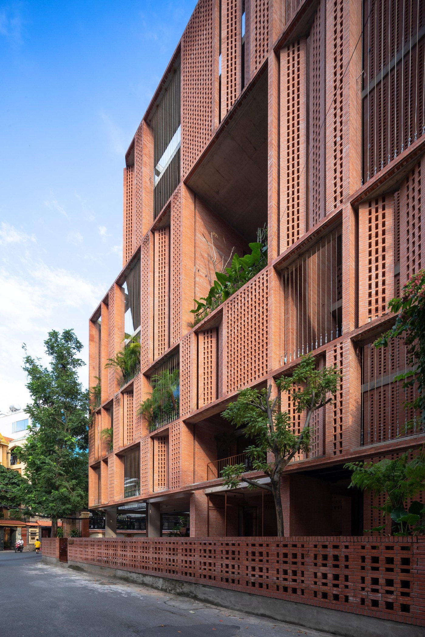
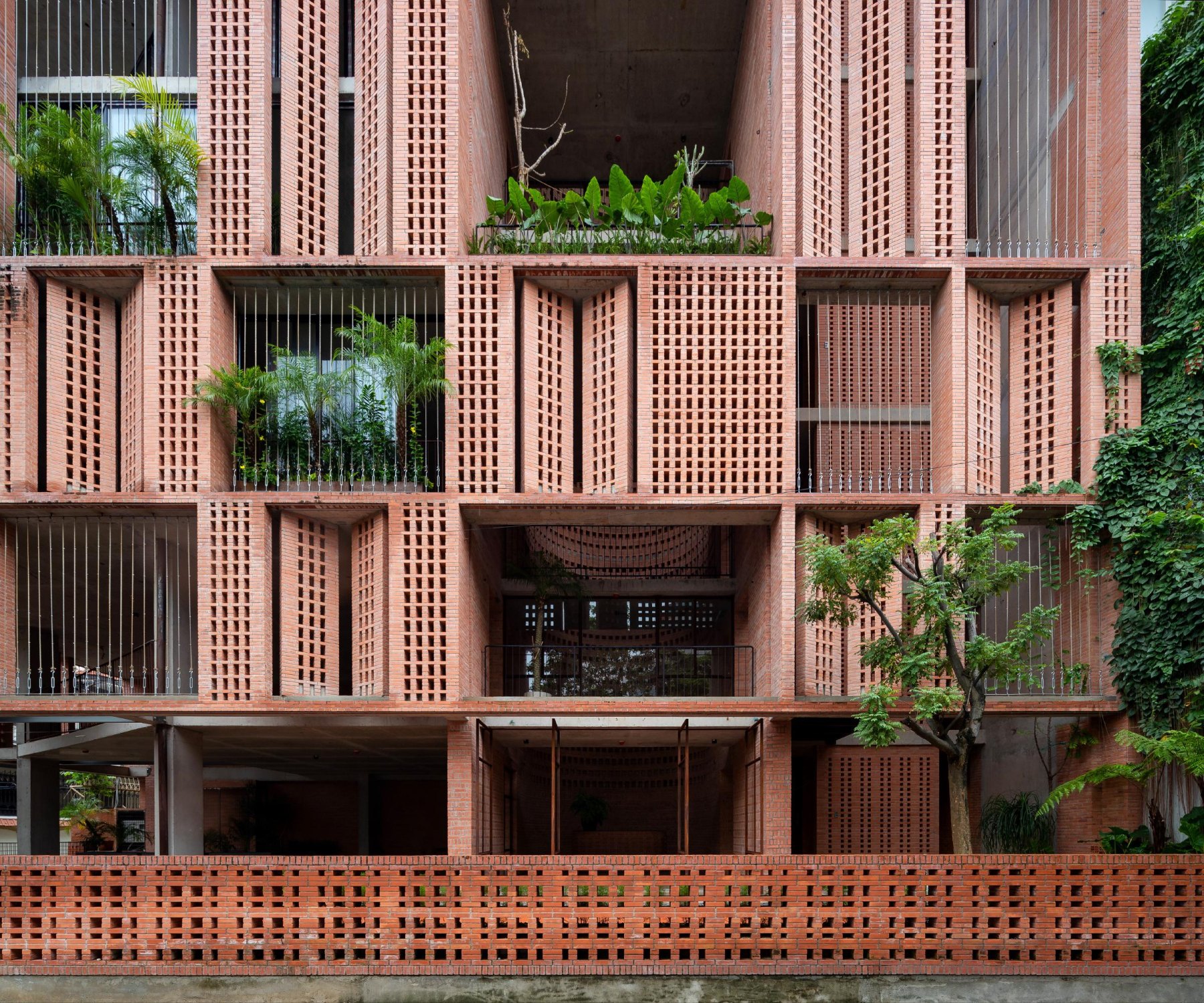
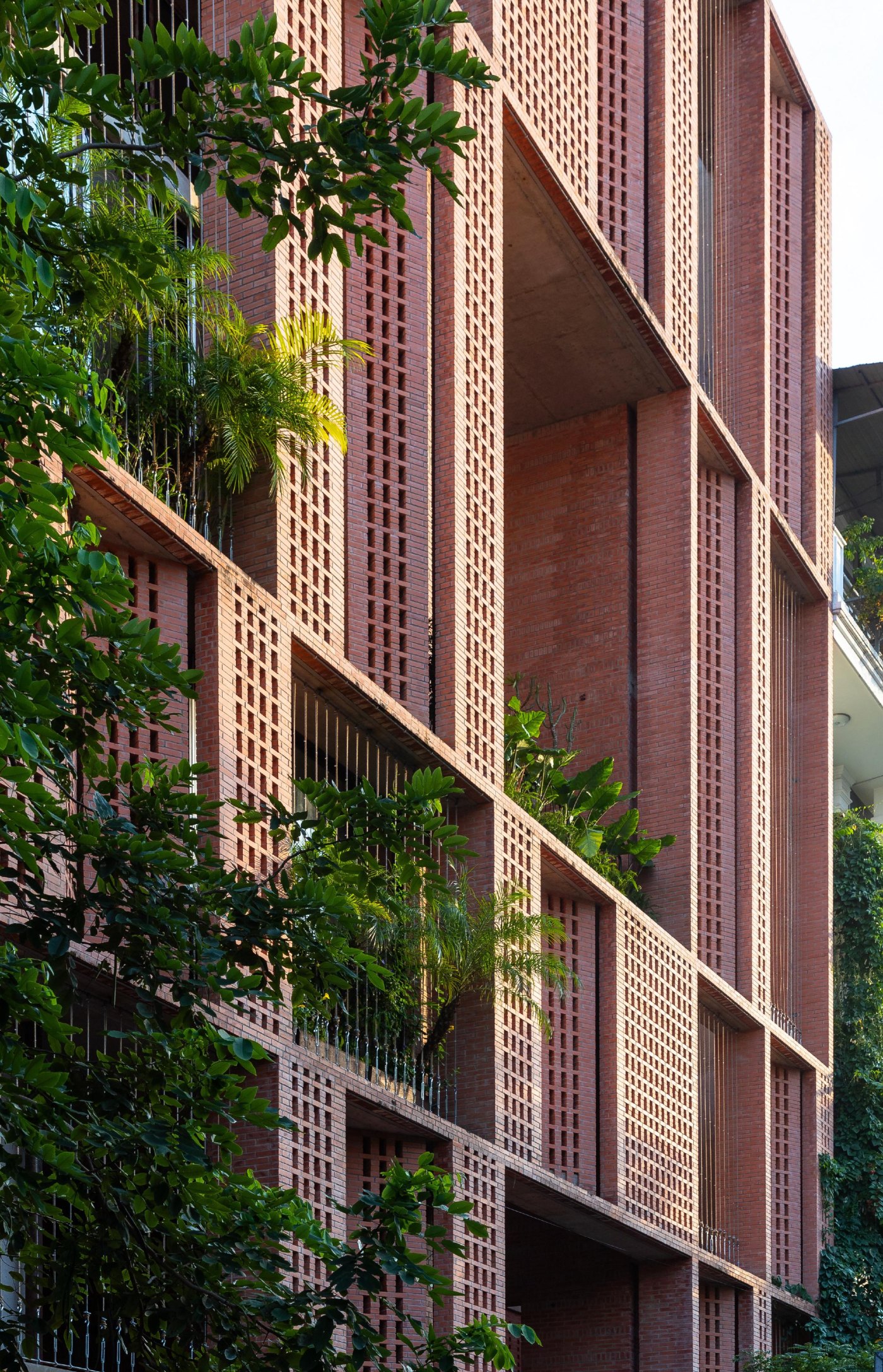
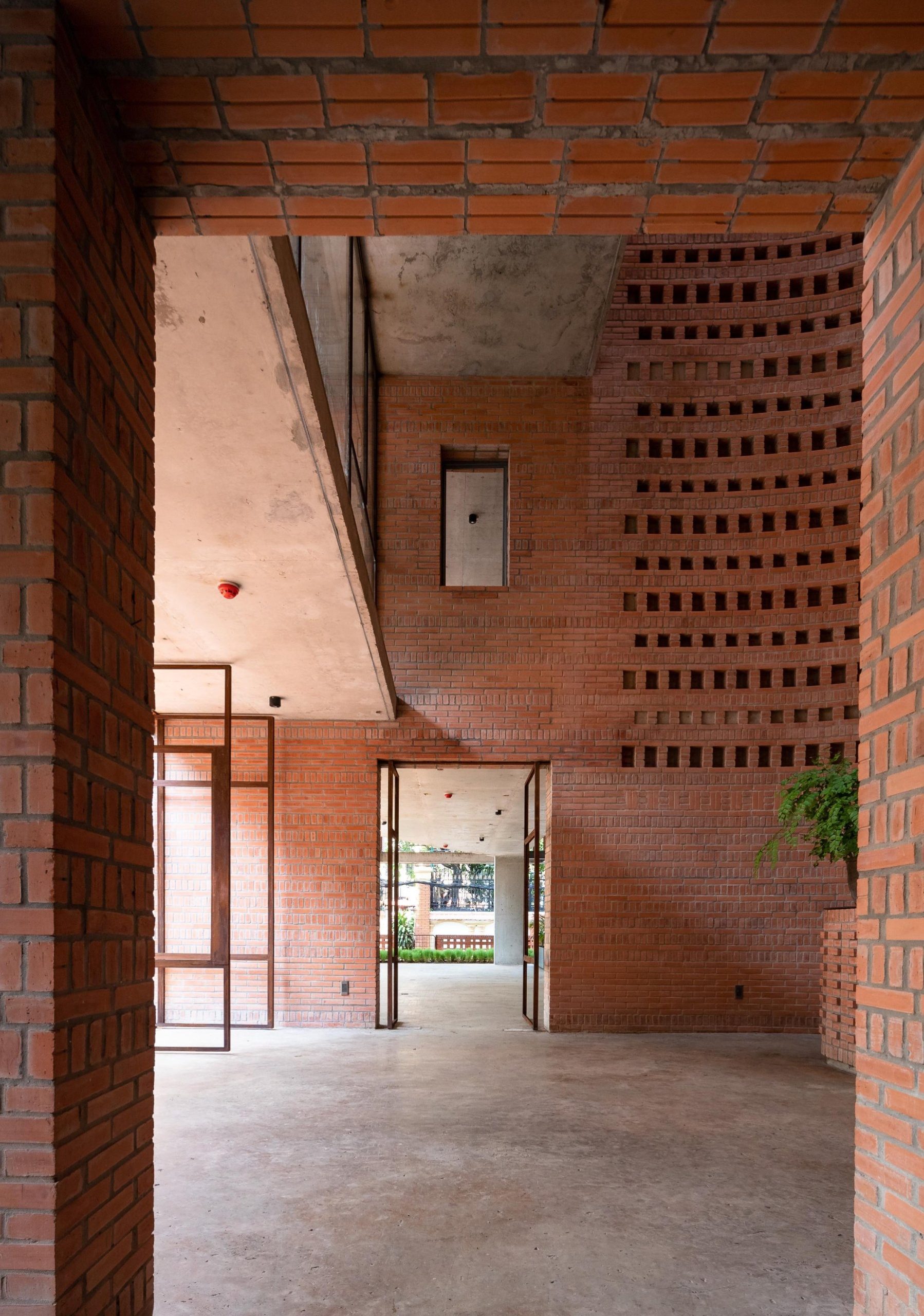
    Premier Office is a rental office building on a quiet street where several similar buildings have gone up. The design team wanted to make the most of daylight without the drawbacks of direct sun, and doors and windows can be opened when the weather allows.

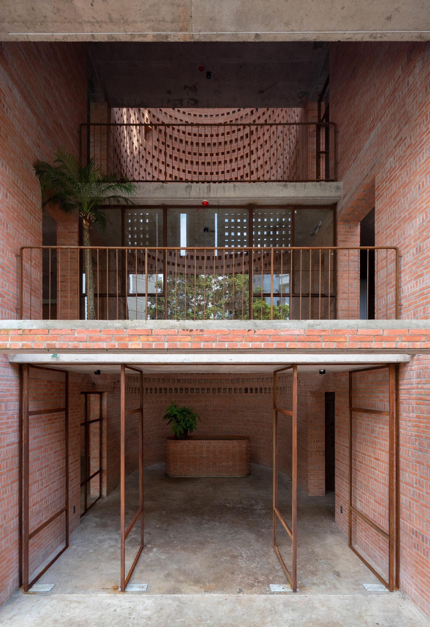
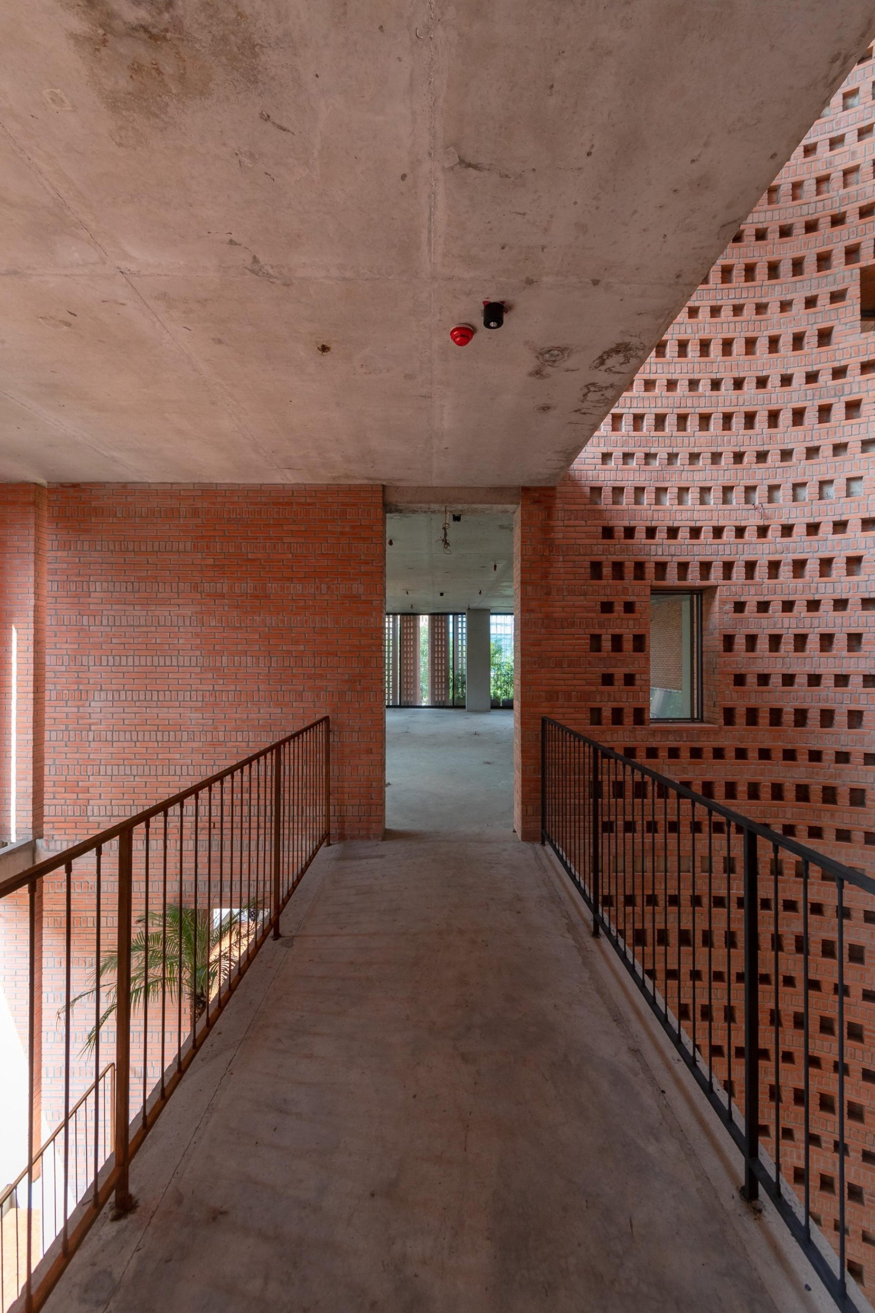
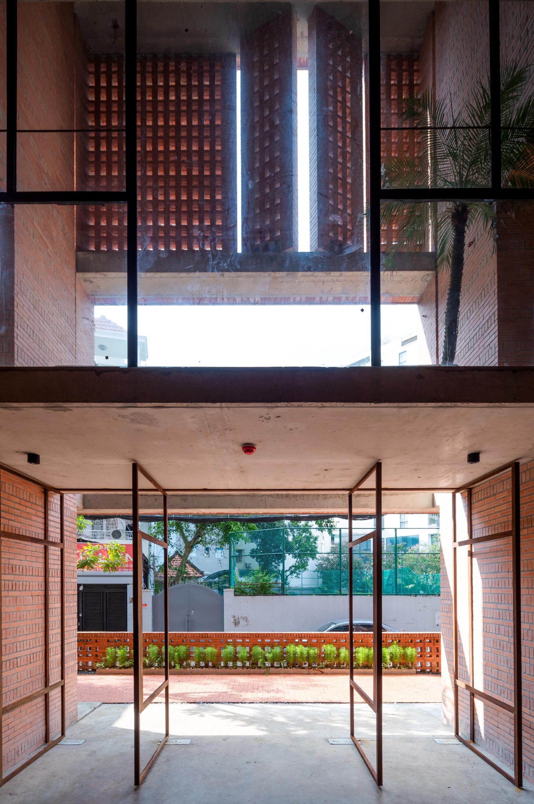
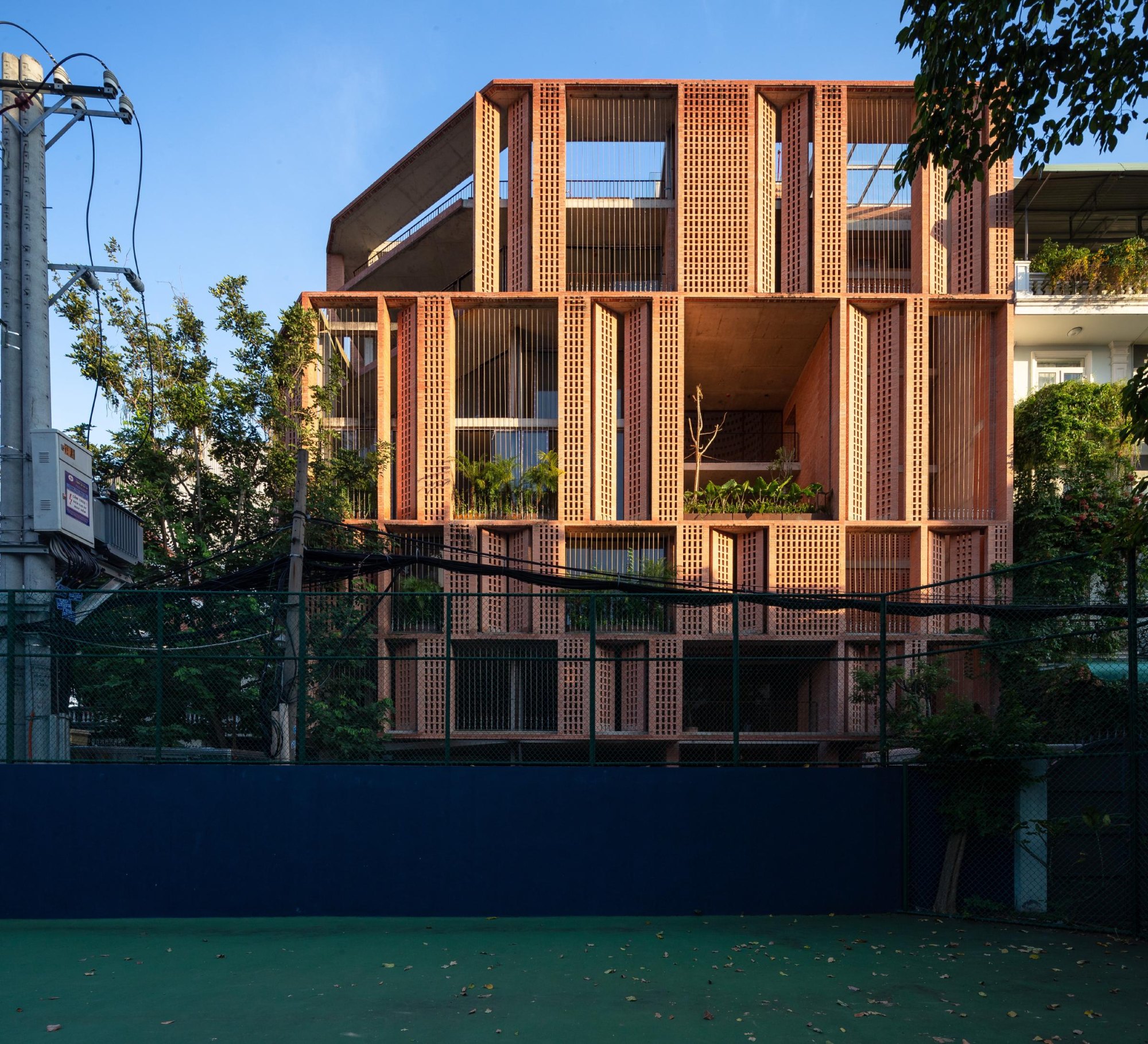
    The building is a concrete frame clad in brick. A continuous vertical void runs through the middle and carries light and air down through every floor. On one side of it are the offices, with two facades opened to catch sun and wind; on the other are the restrooms, storage, lift and stairs. Corridors bridge the void between the two, and as light moves through these gaps during the day the spaces keep shifting.

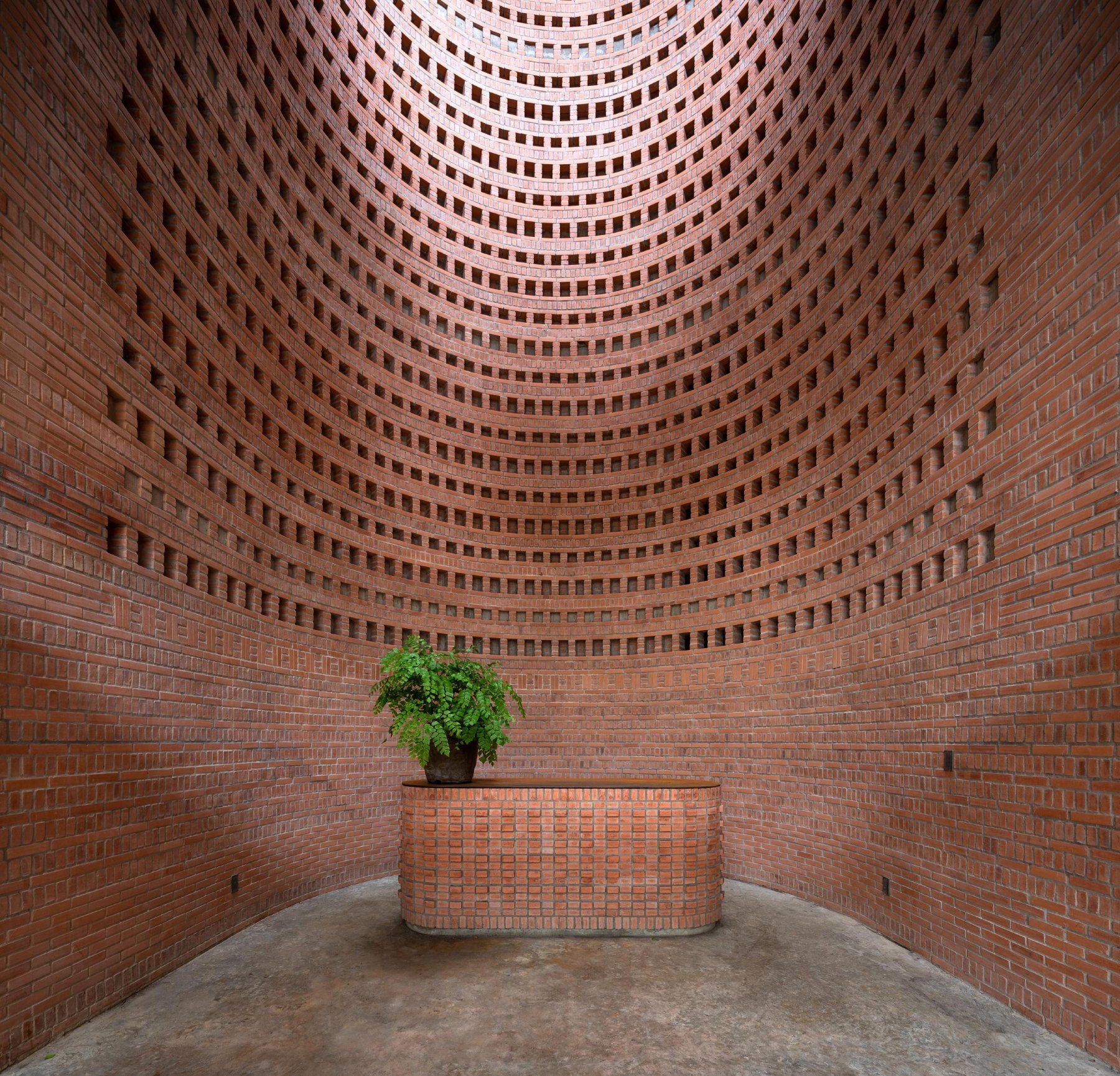
    Many people treat the office as a second home, so the architects aimed for interiors full of light and fresh air. The facade is a double layer: an outer brick curtain and, inside it, sliding glass doors framed in aluminium. The perforated brick wall is turned at 45 degrees, forming a buffer that softens the sun and casts moving shadows, and trees planted in this layer help clean the air and keep direct sun off the desks.

    Gaps, trees, light, brick and even rain are meant to make the workplace feel open and restful. With its perforated shell, rotated walls and voids, the building does not crowd the street, and its use of an old material lets it settle into the neighbourhood.

    Brick office building behind street trees
    Perforated brick facade along the street
    Rotated brick panels with planting
    Brick curtain and plants seen from below
    The building with its brick base wall
    Entrance under the brick facade
    Curved perforated brick wall around a planter
    Corridor bridging the central void
    Void and passages in brick and concrete
    Glazed entrance with steel-framed doors
    The building at dusk
  • Wasp House

    Wasp House

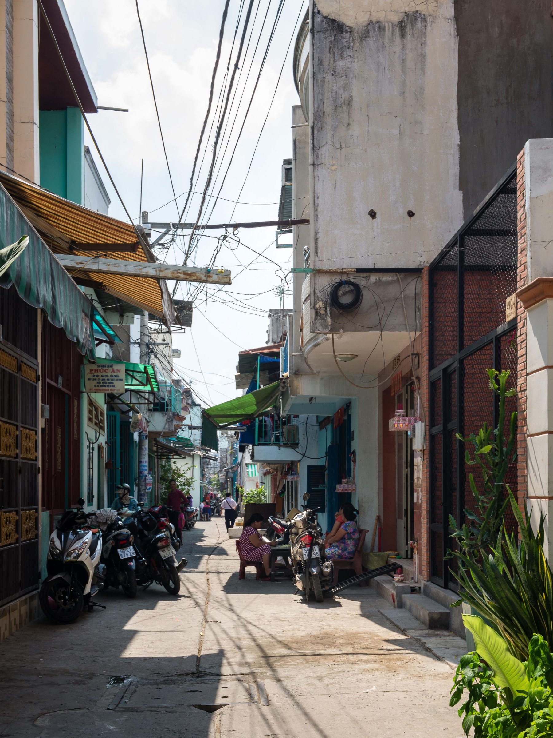
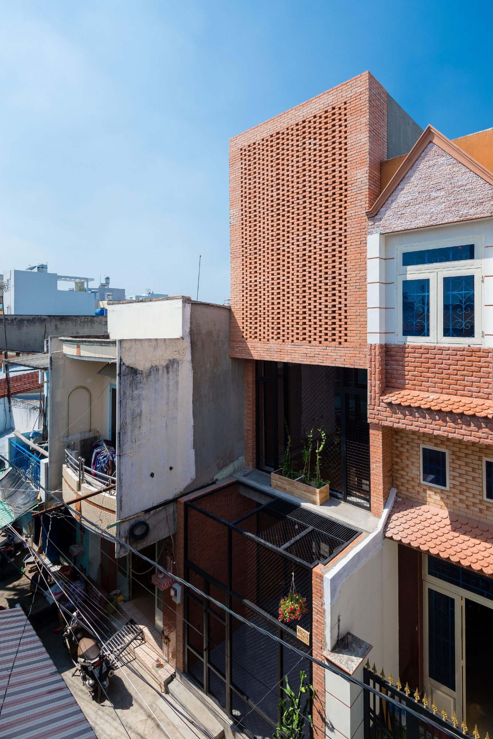
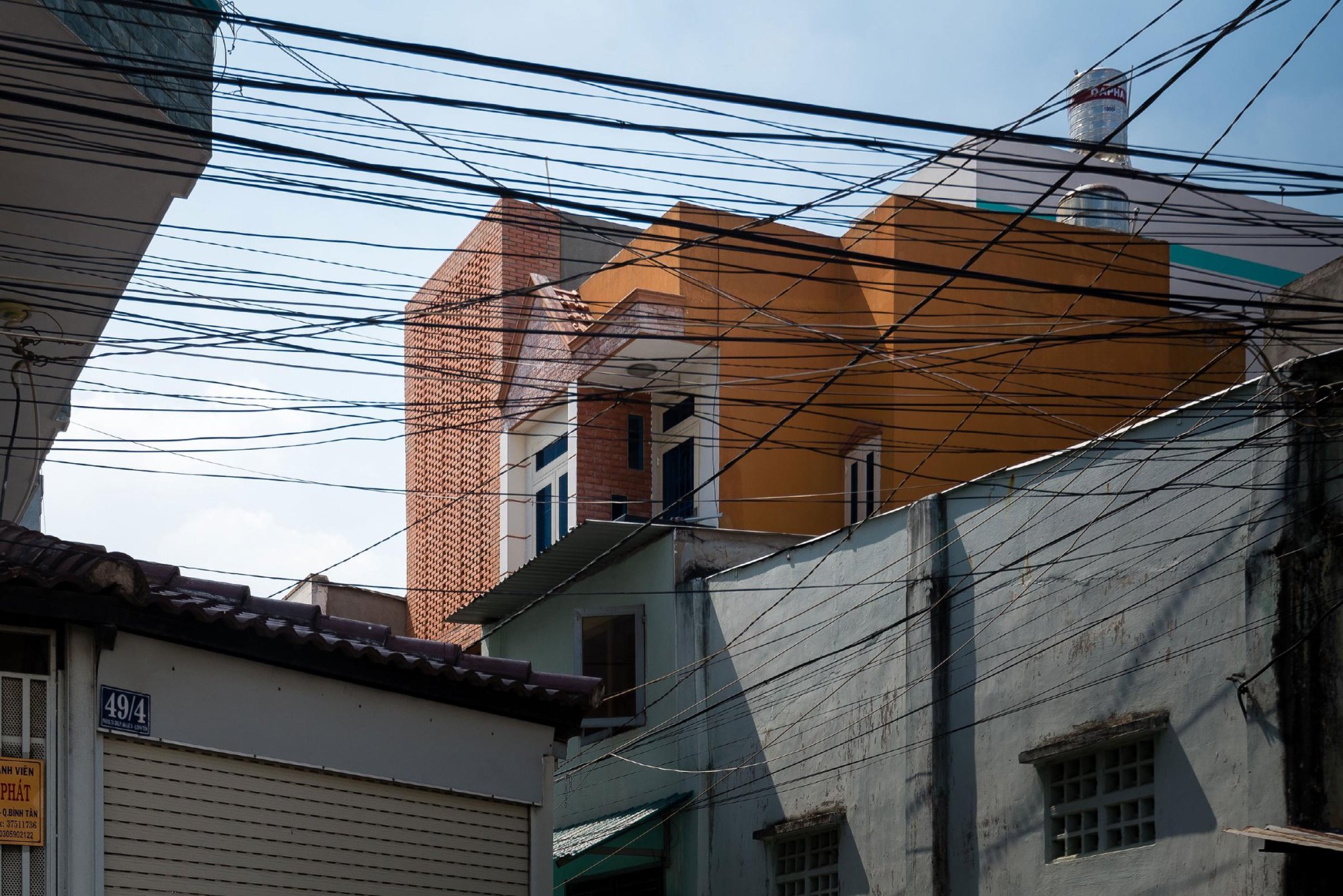
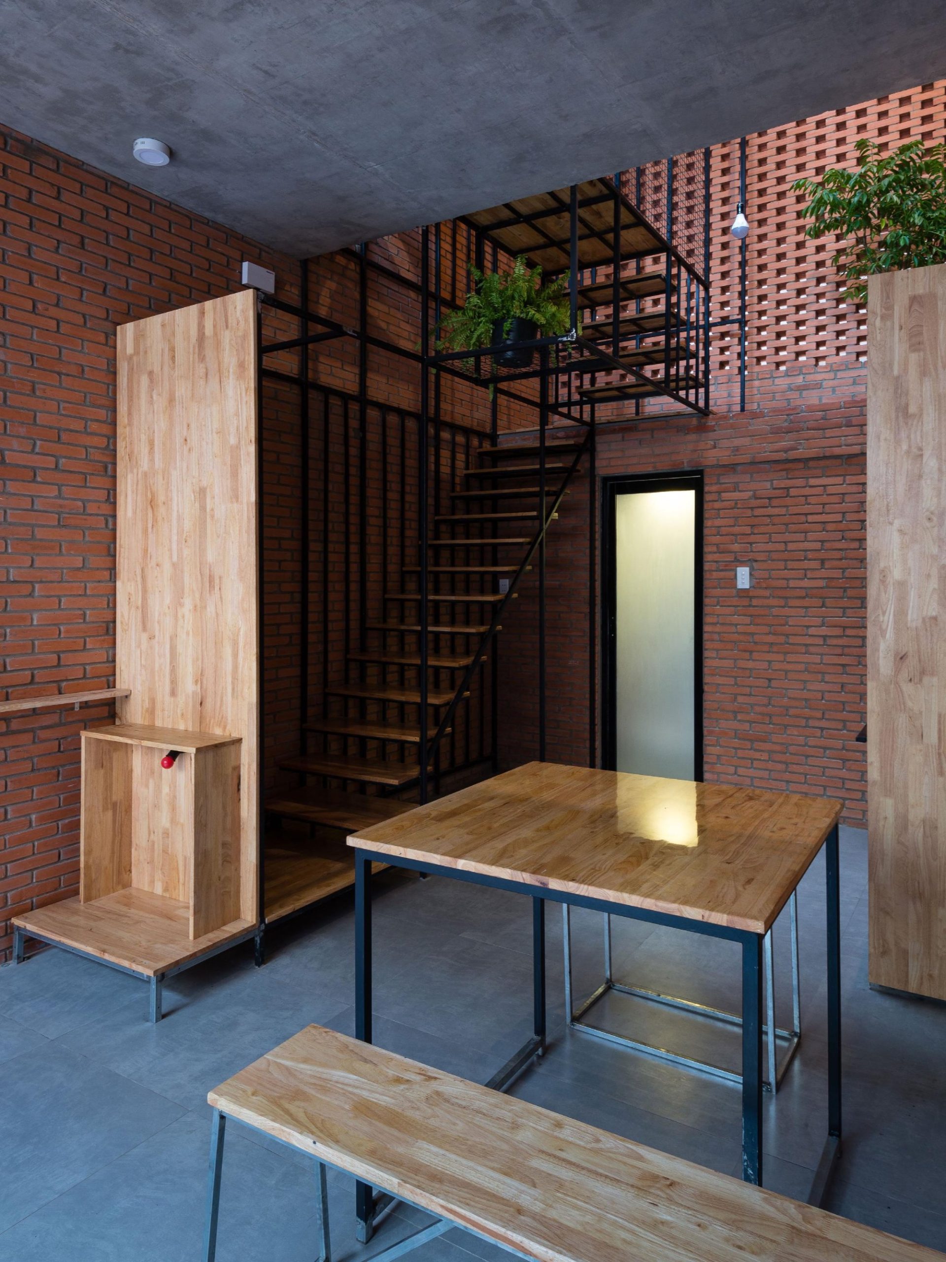
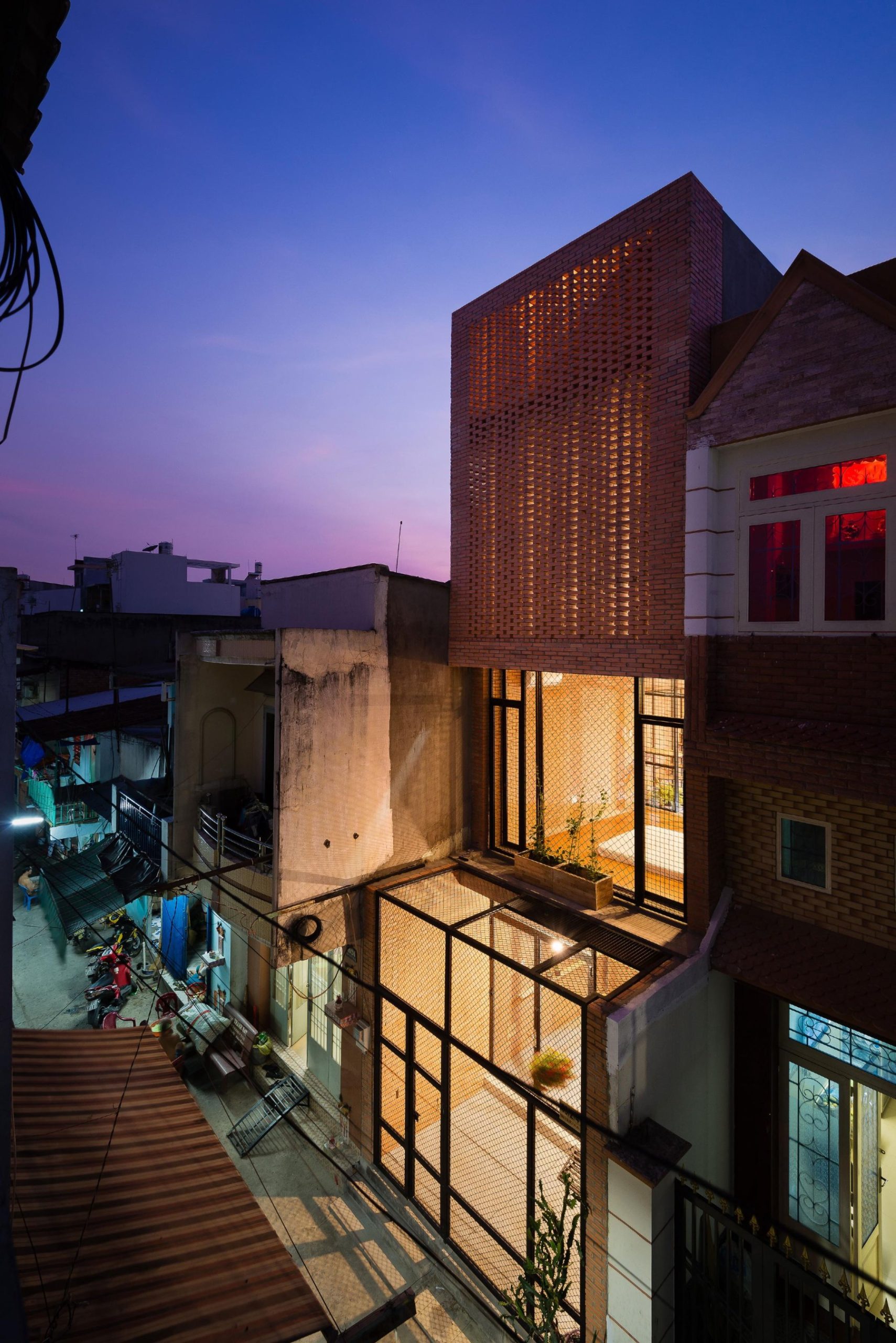
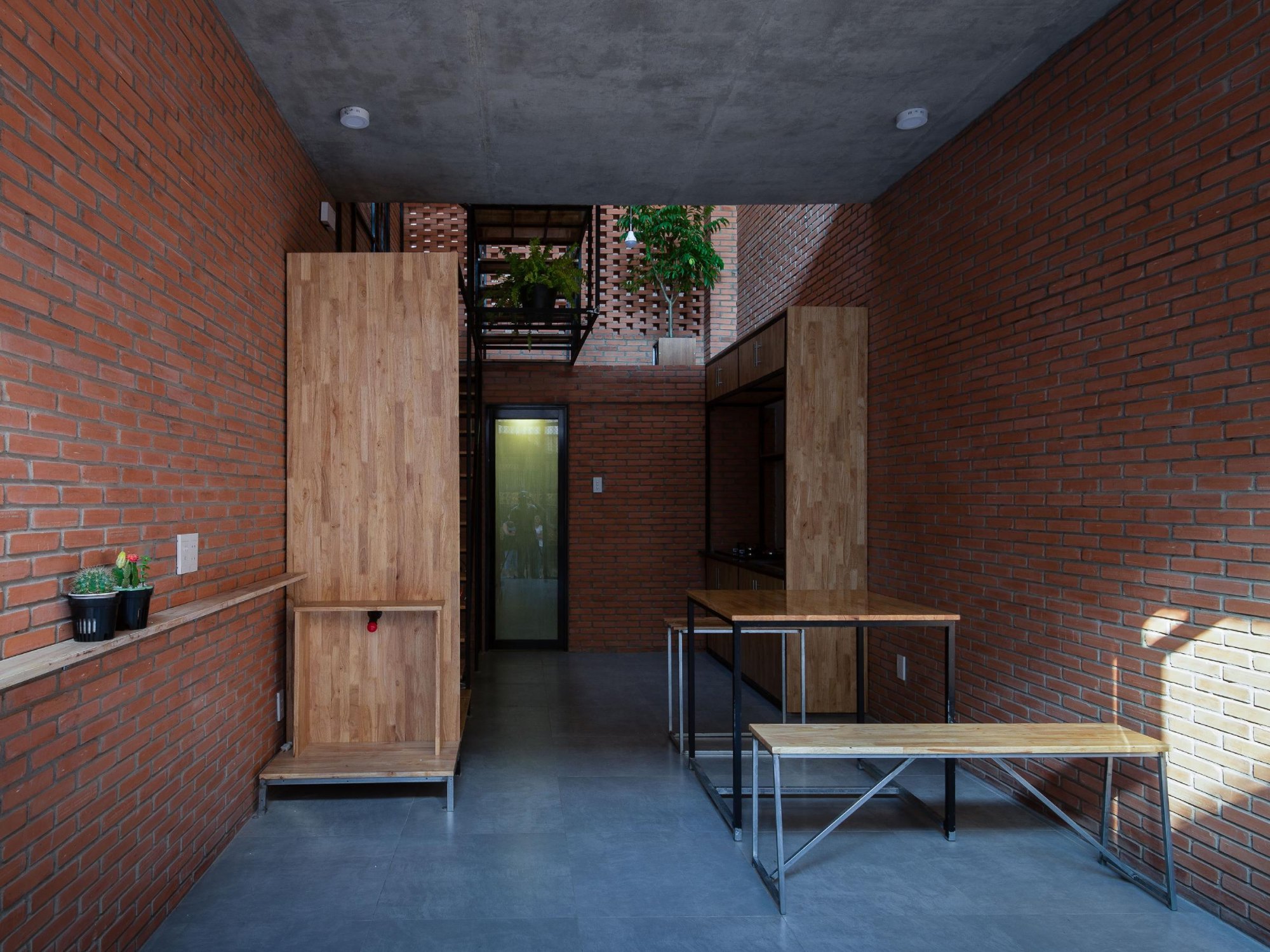
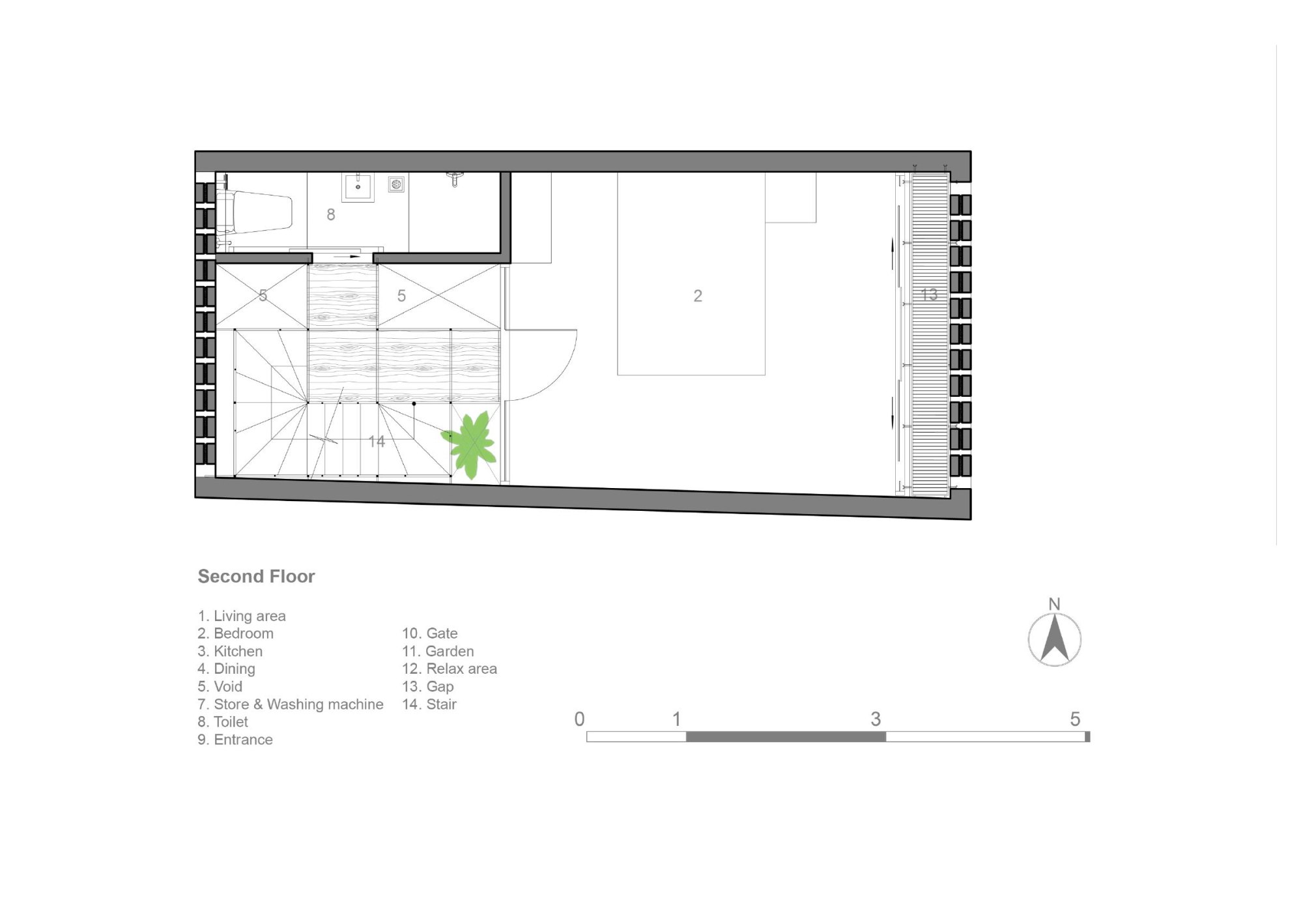
    Wasp House is a tiny home on a 3.5 by 7 metre plot in a dense neighbourhood, built for two siblings. It has two floors, with one bedroom on each.

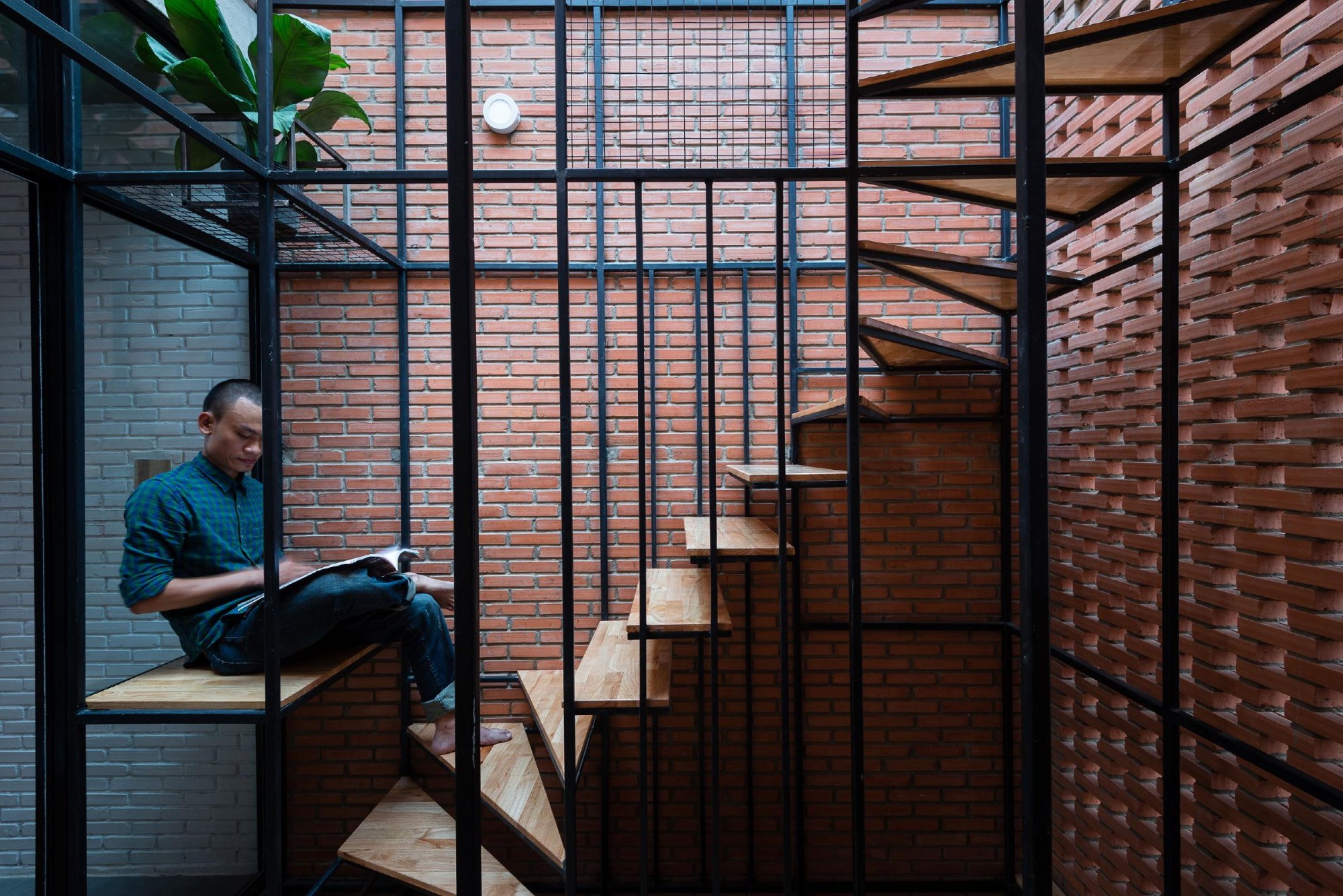
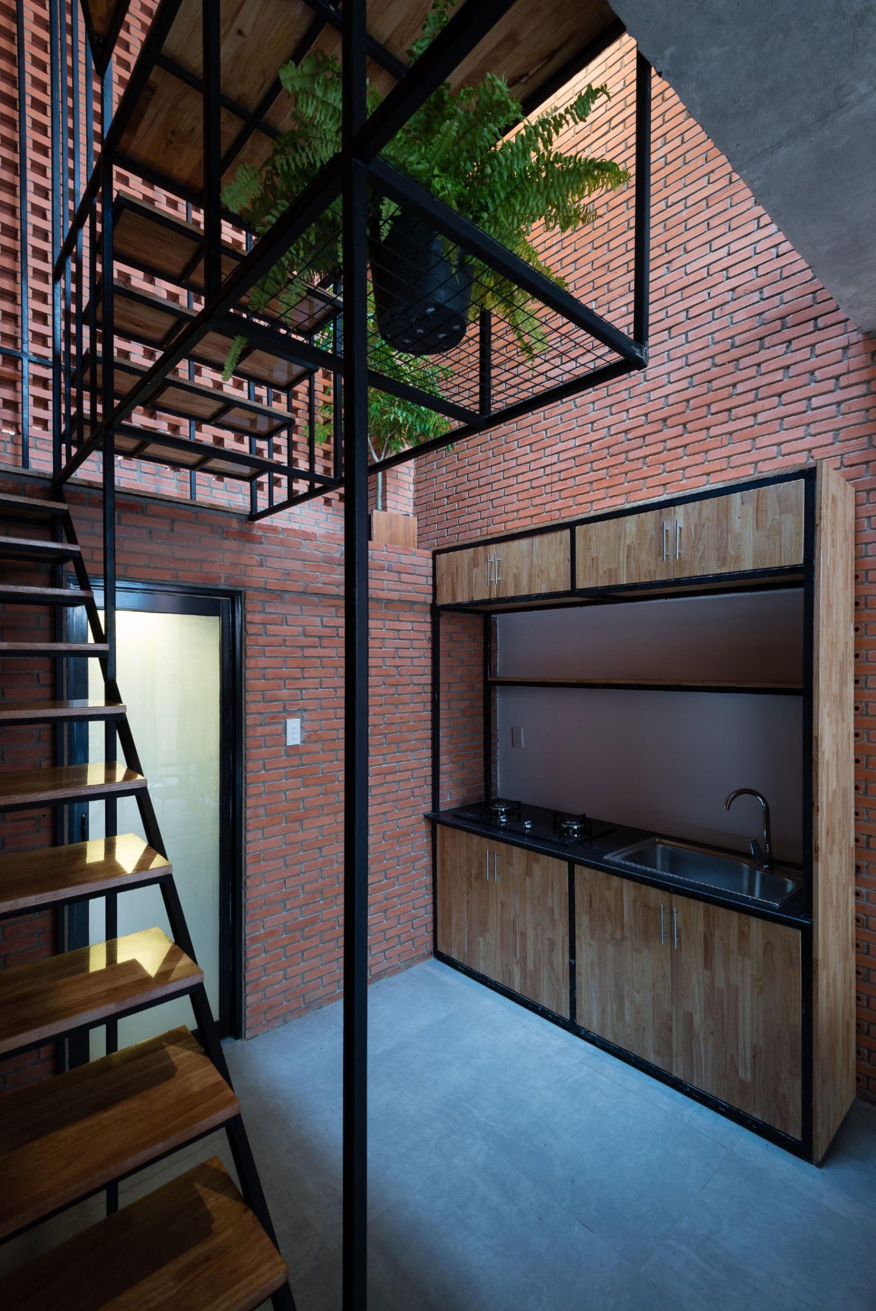
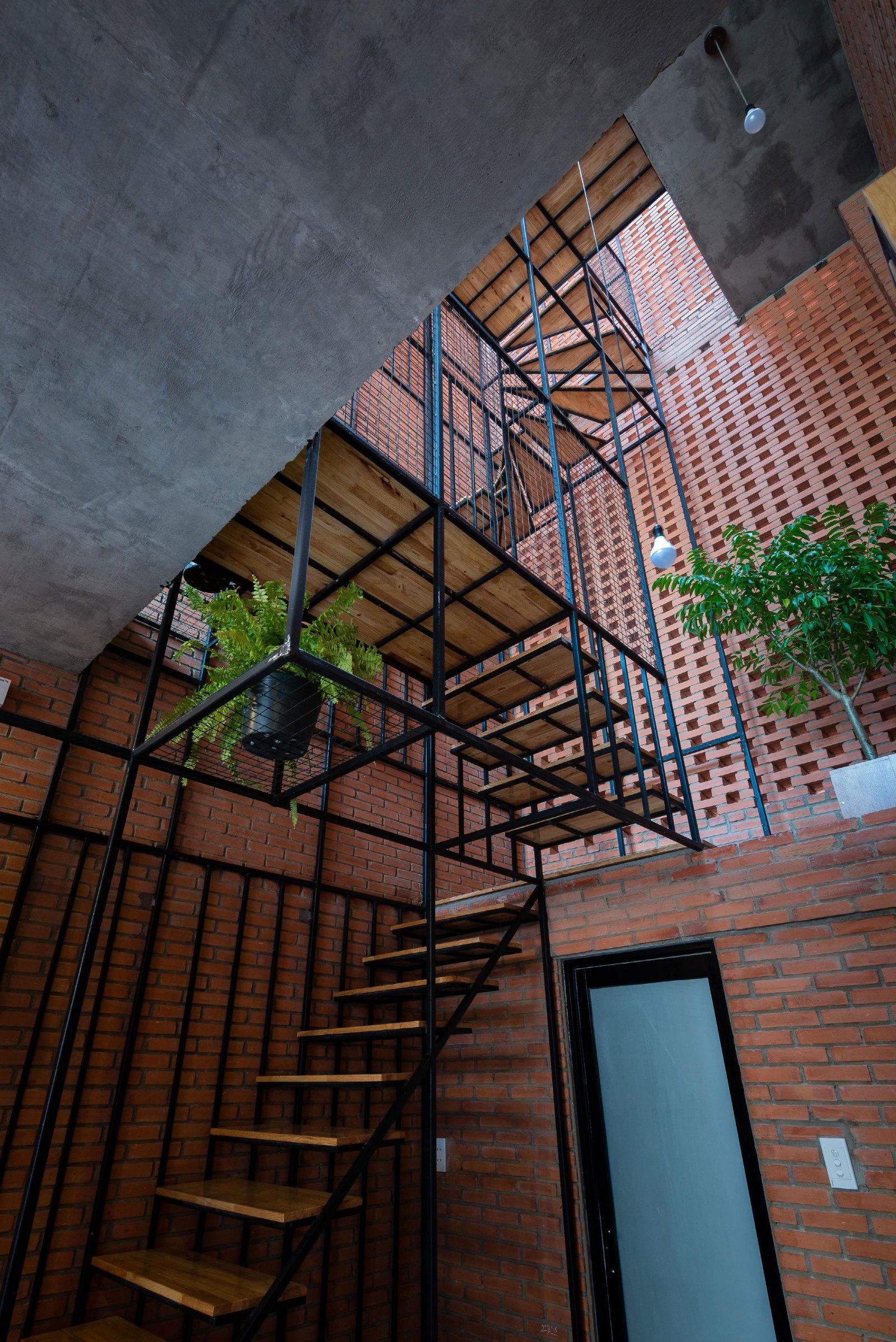
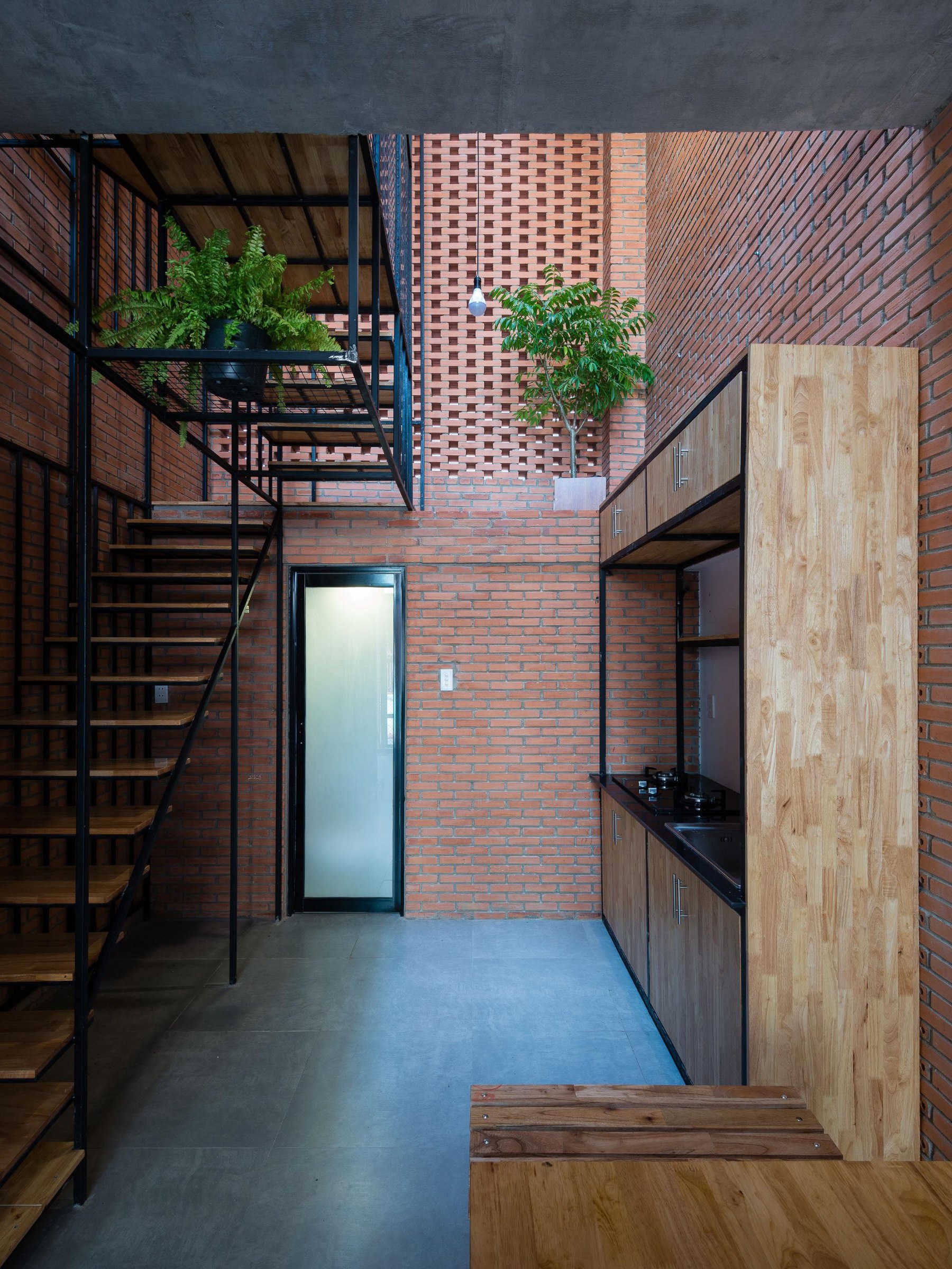
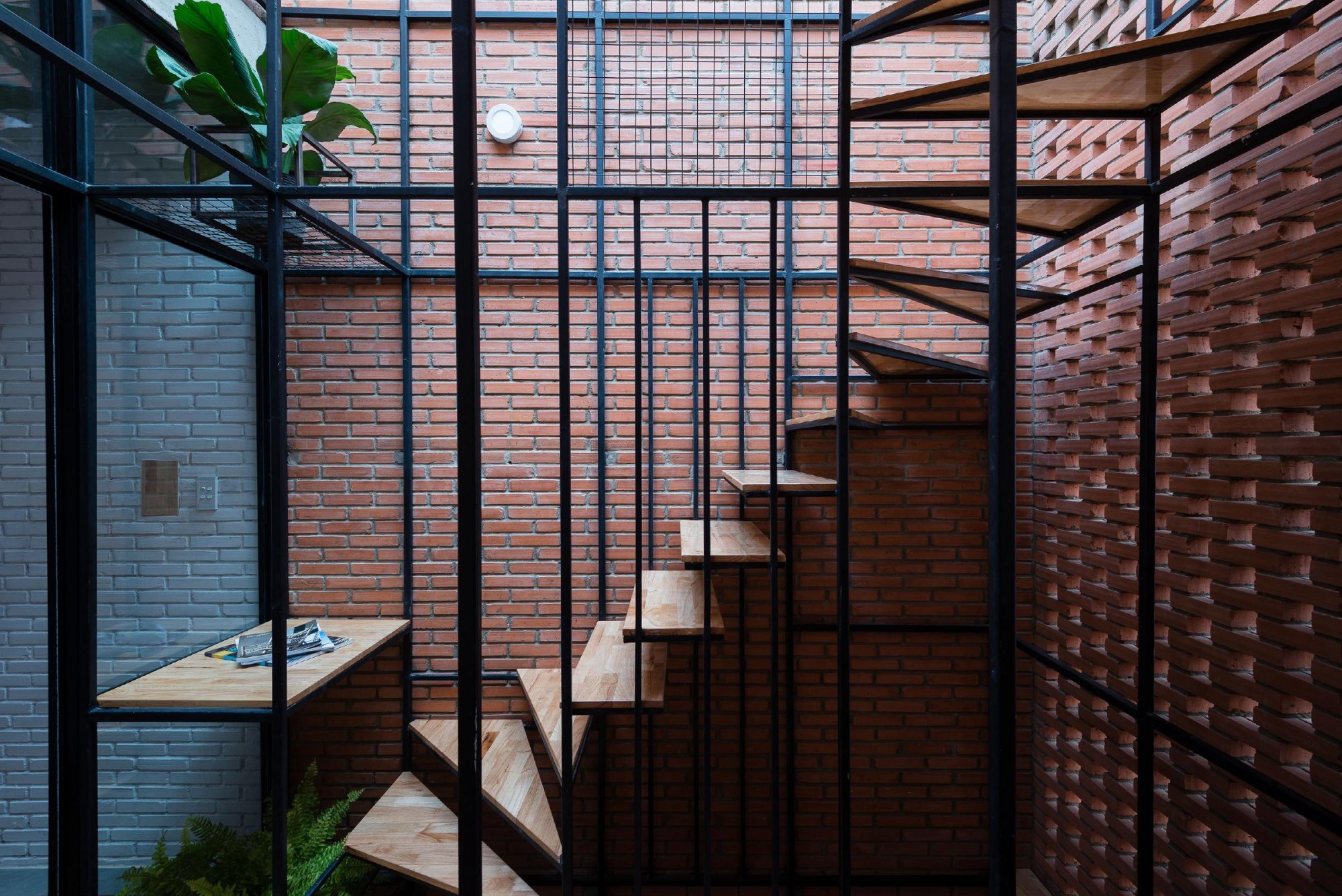
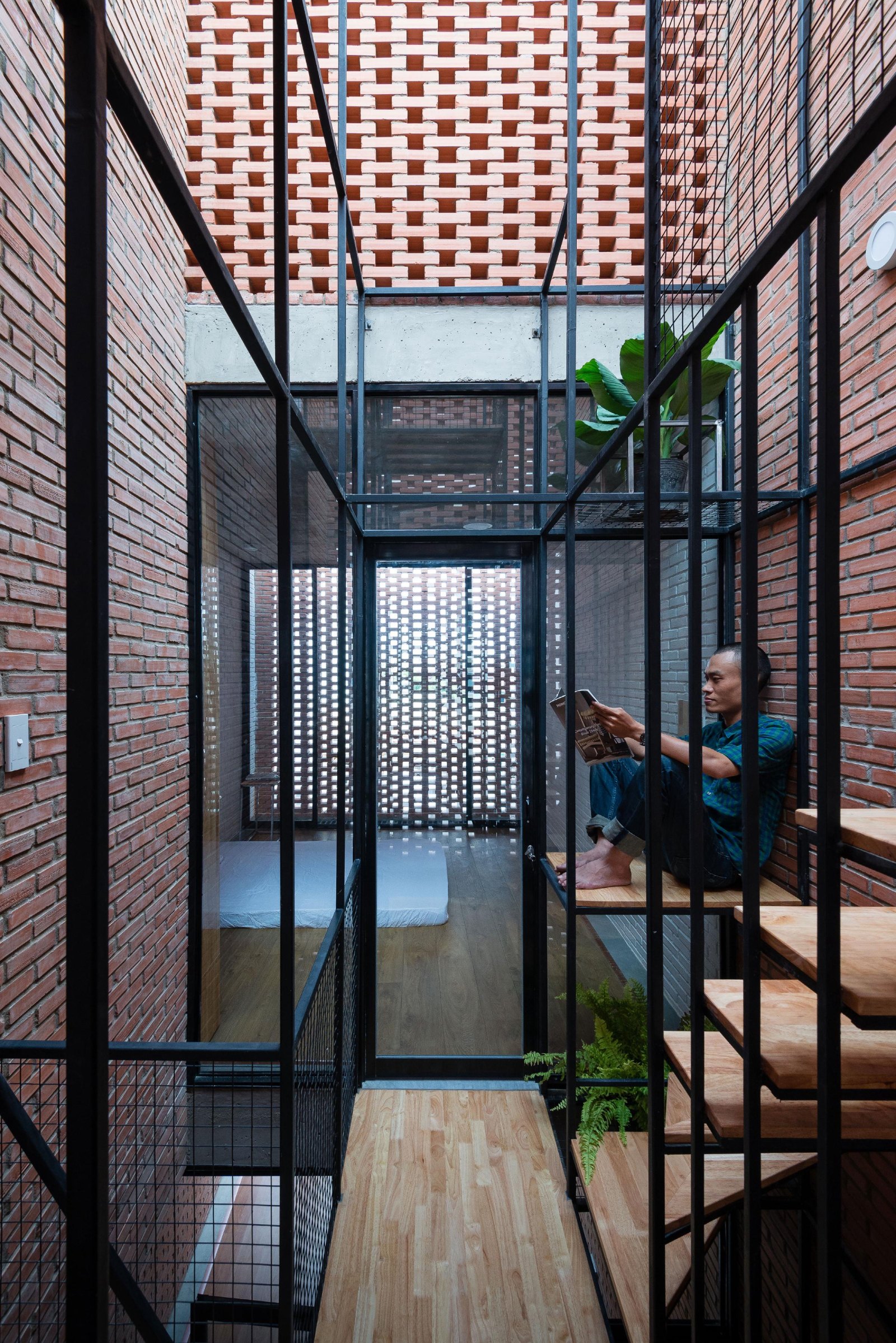
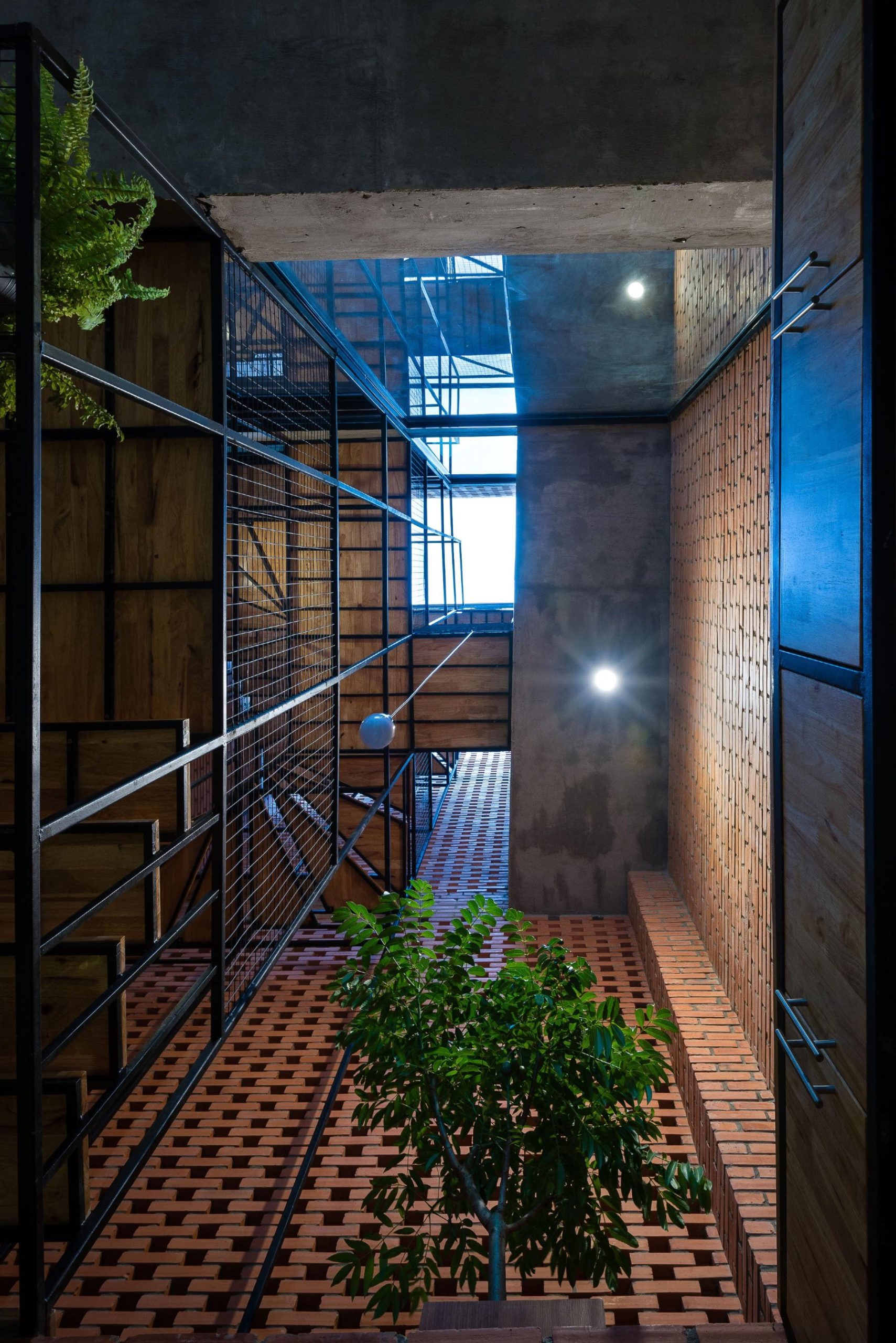
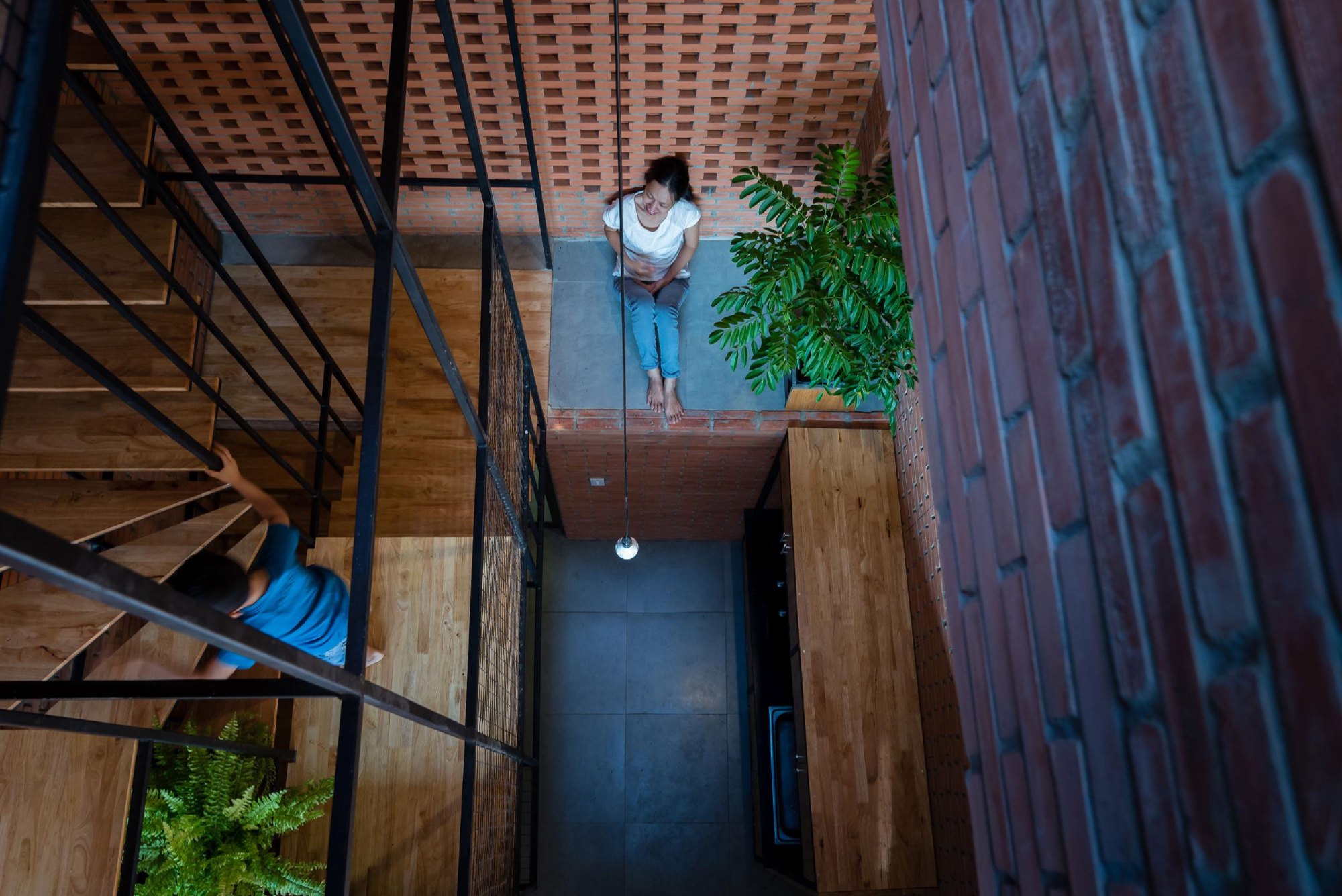
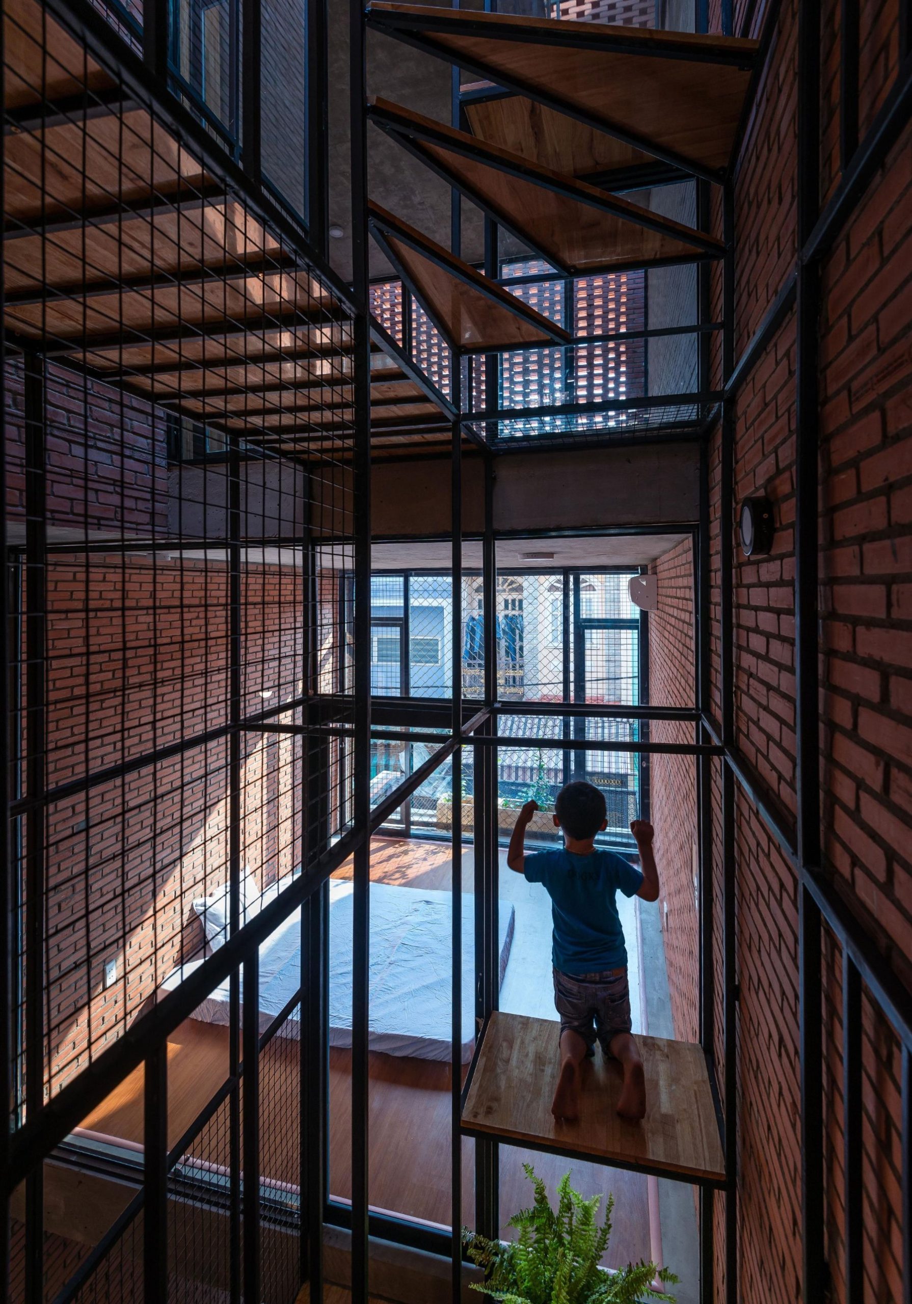
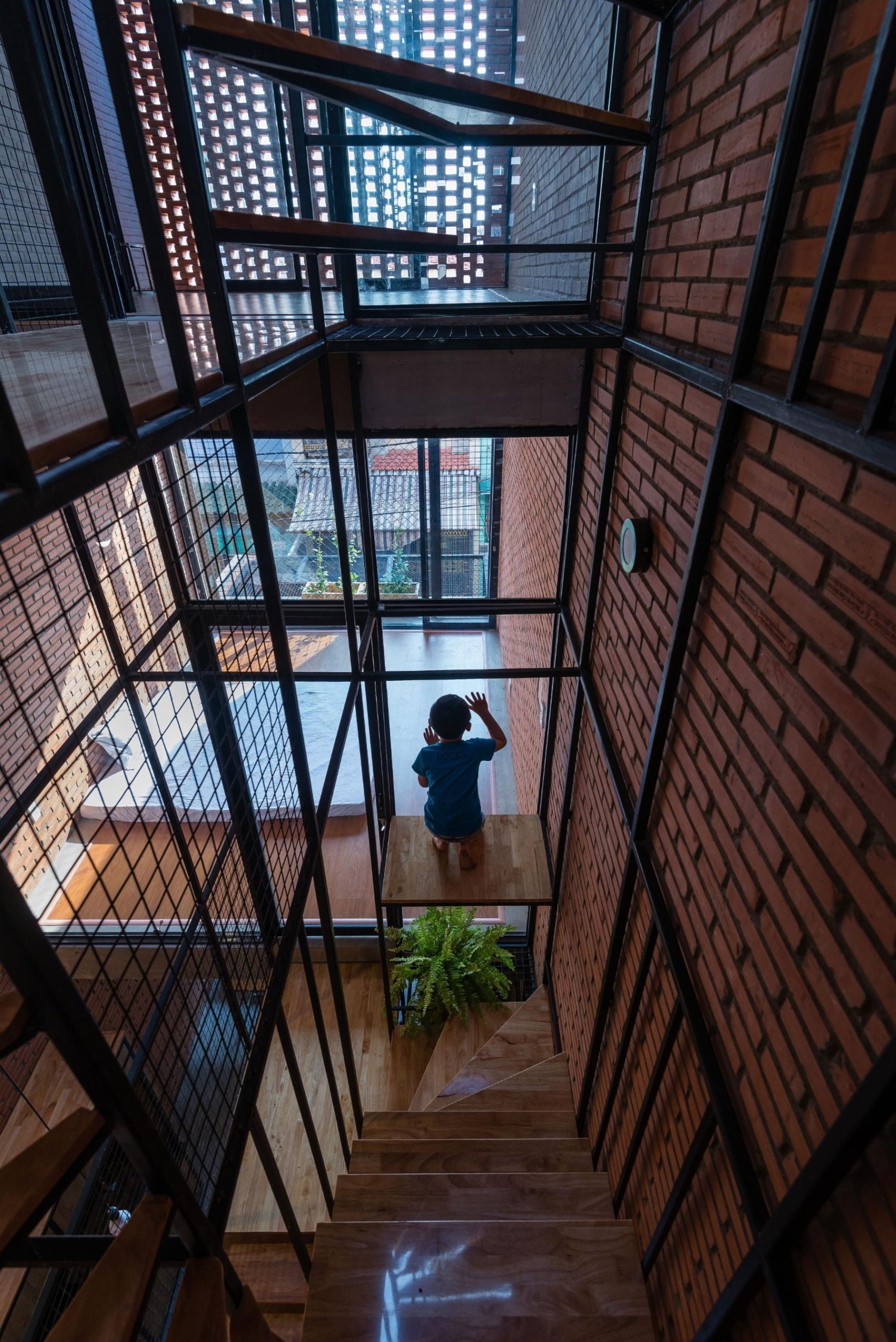
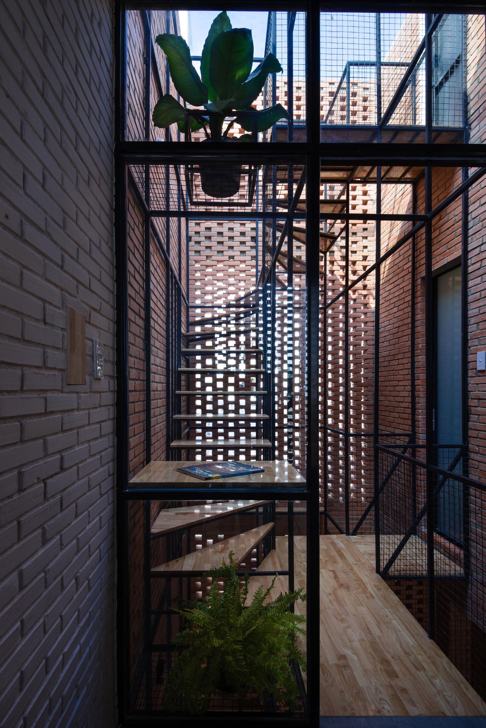
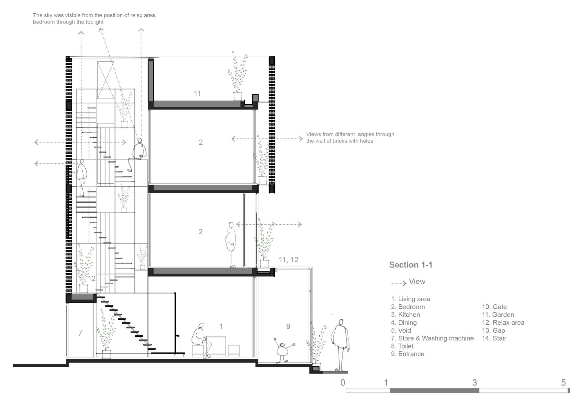
    The stair is the heart of the house. Beyond getting people up and down, it is a place to grow flowers, read or simply sit and rest.

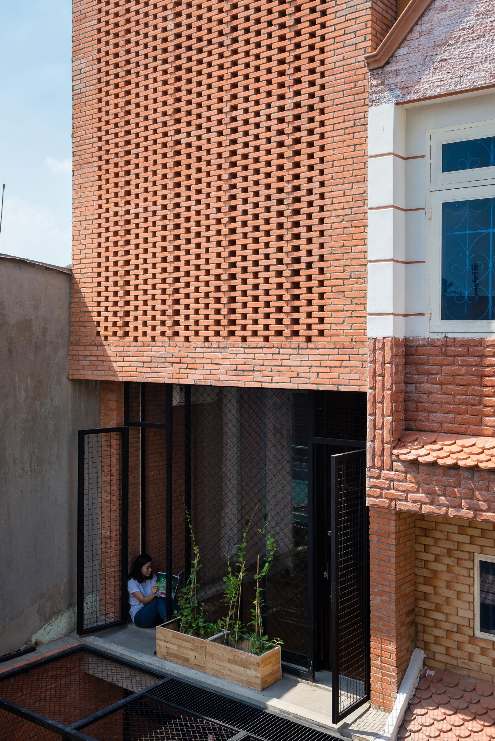
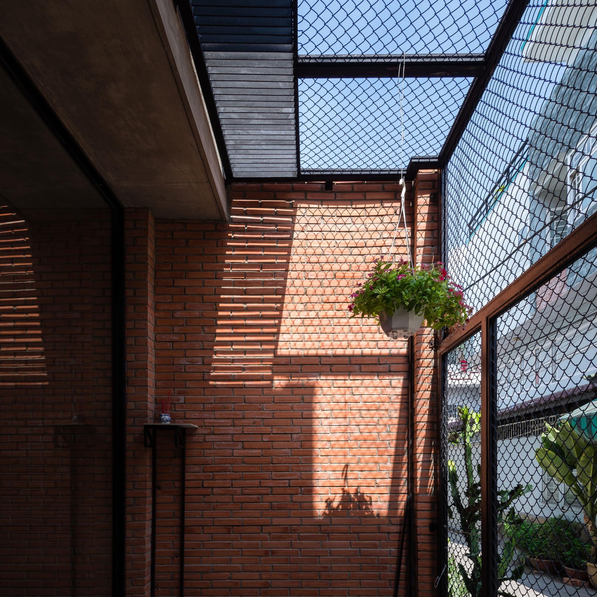
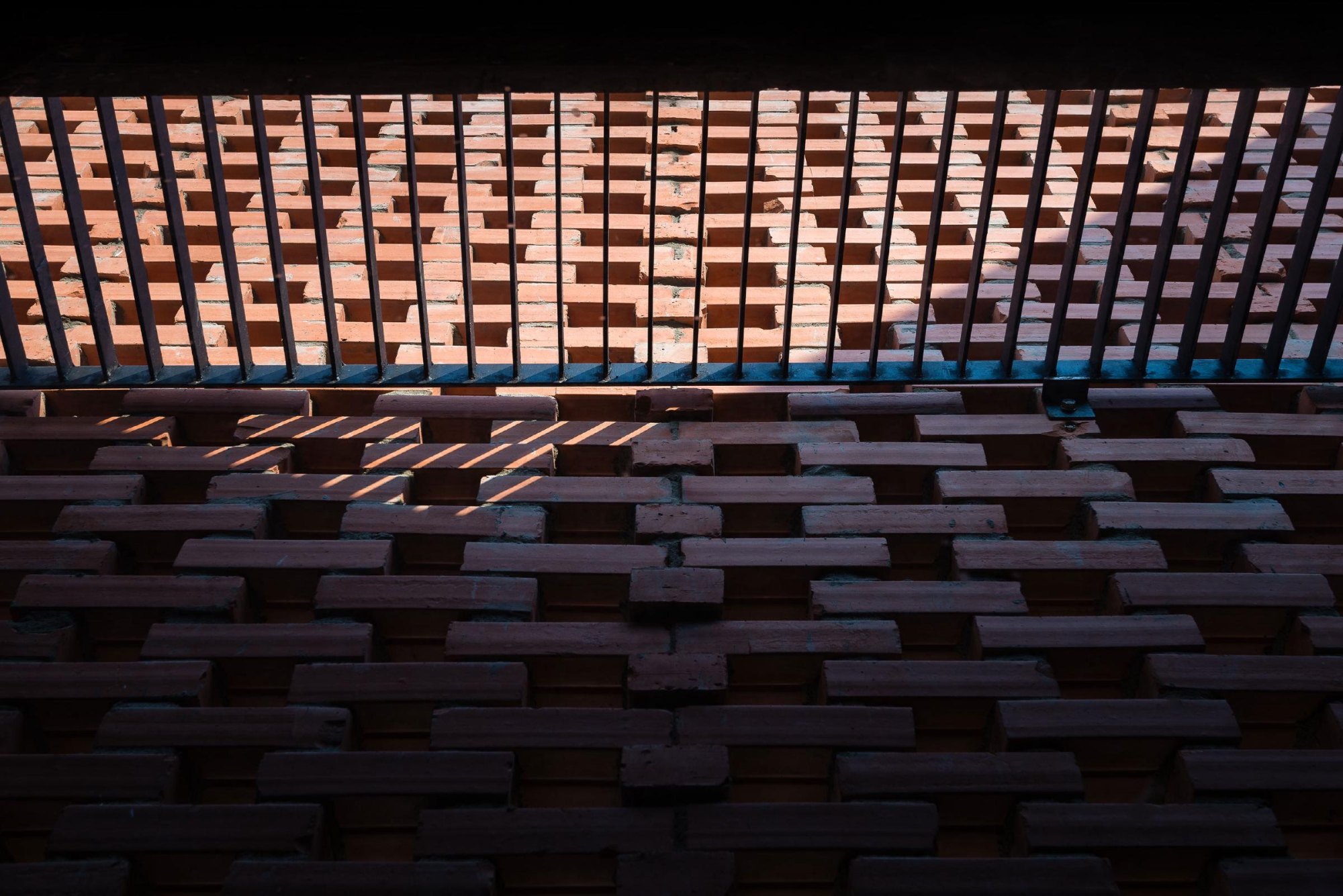
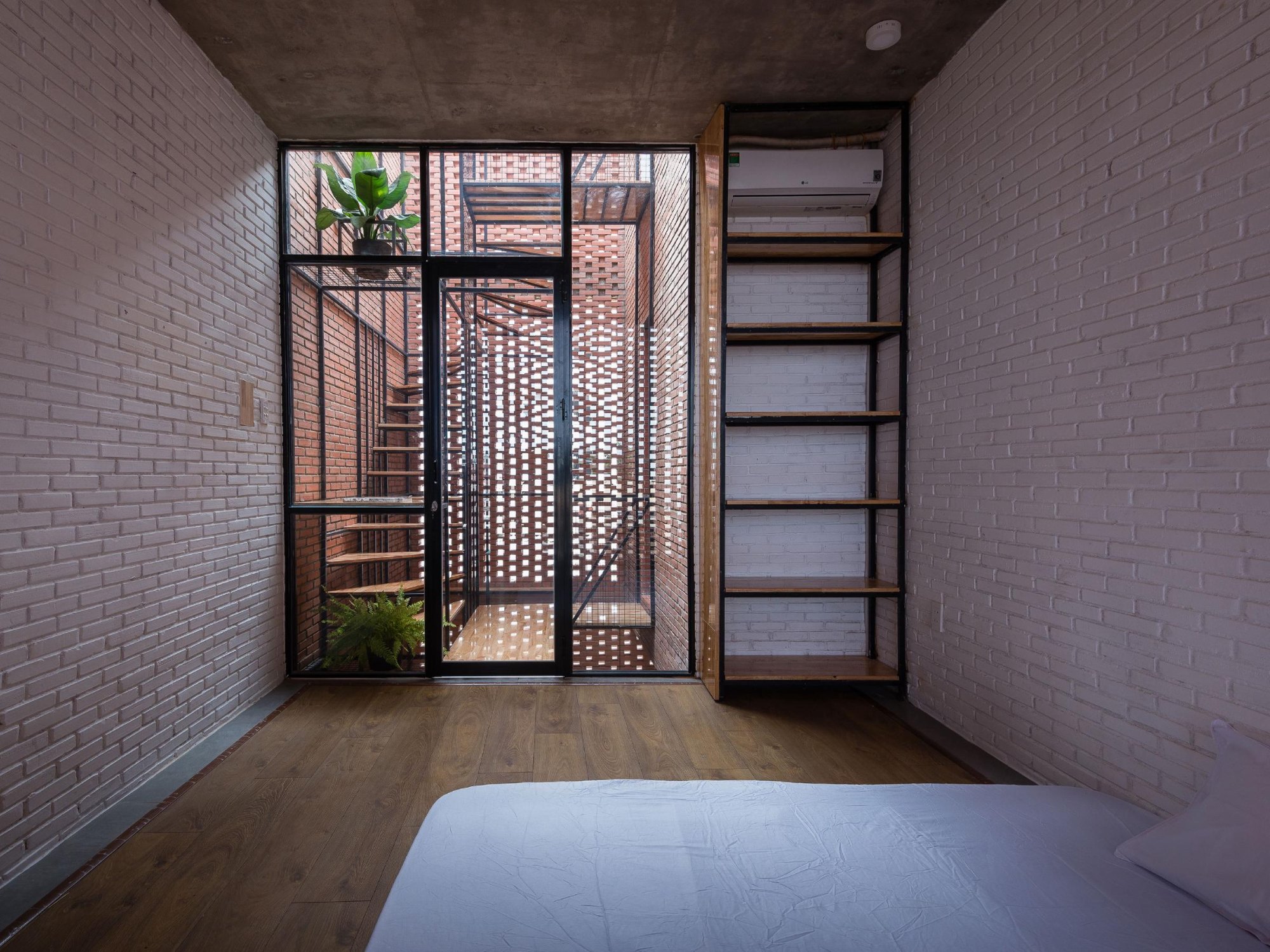
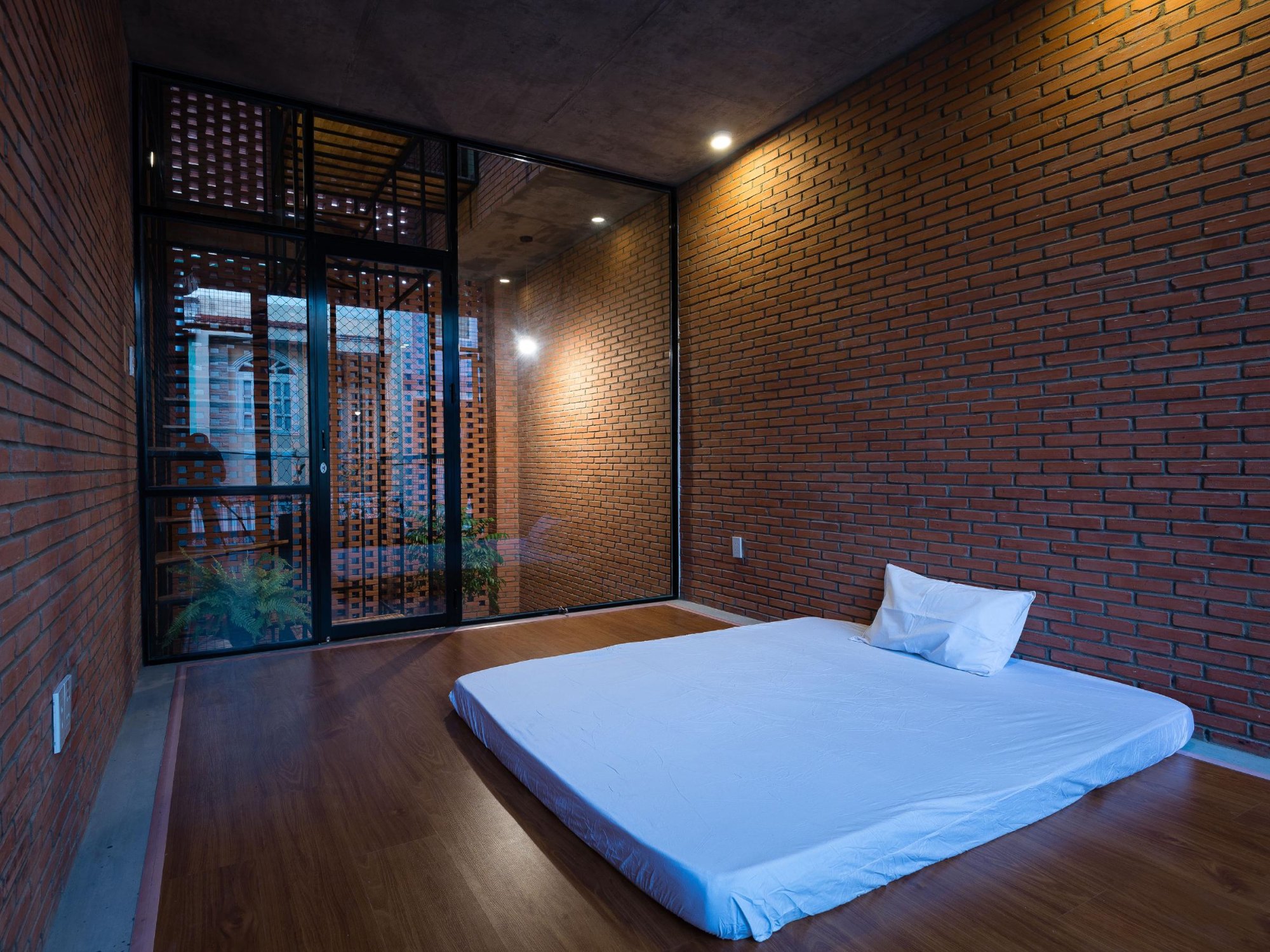
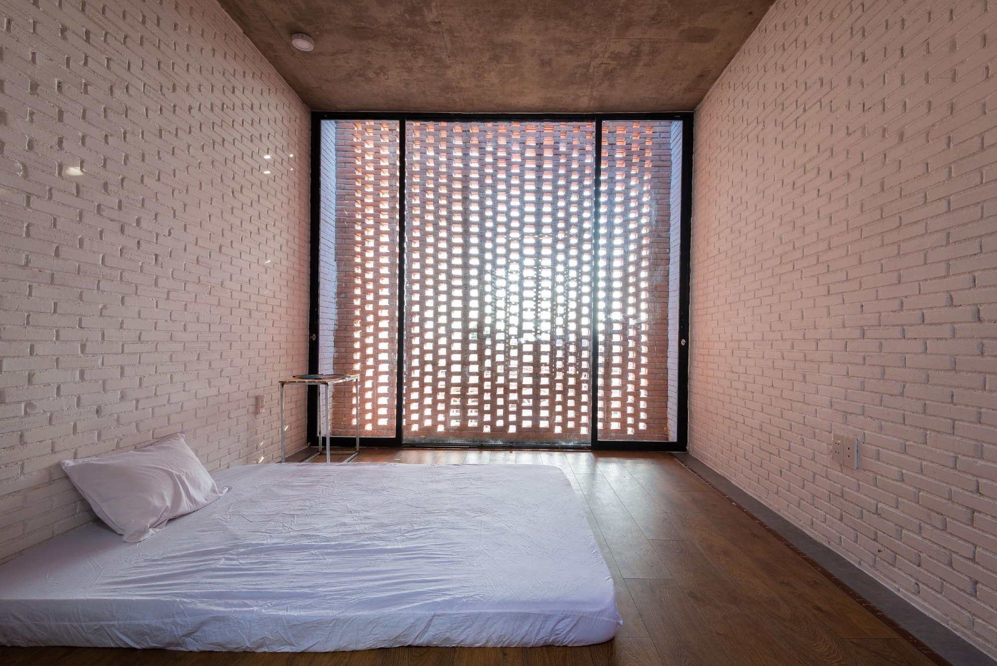
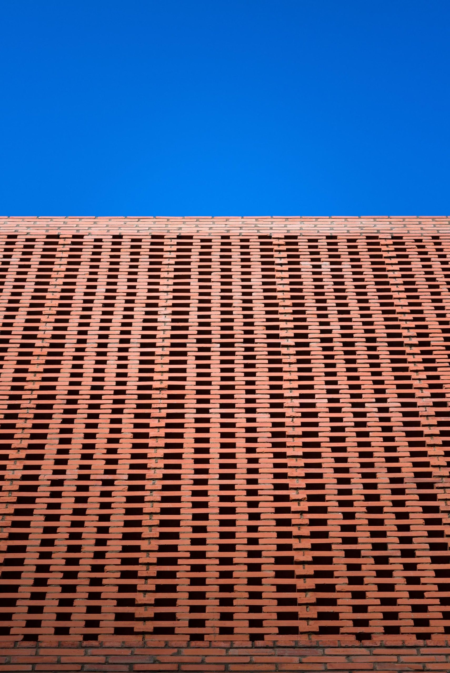
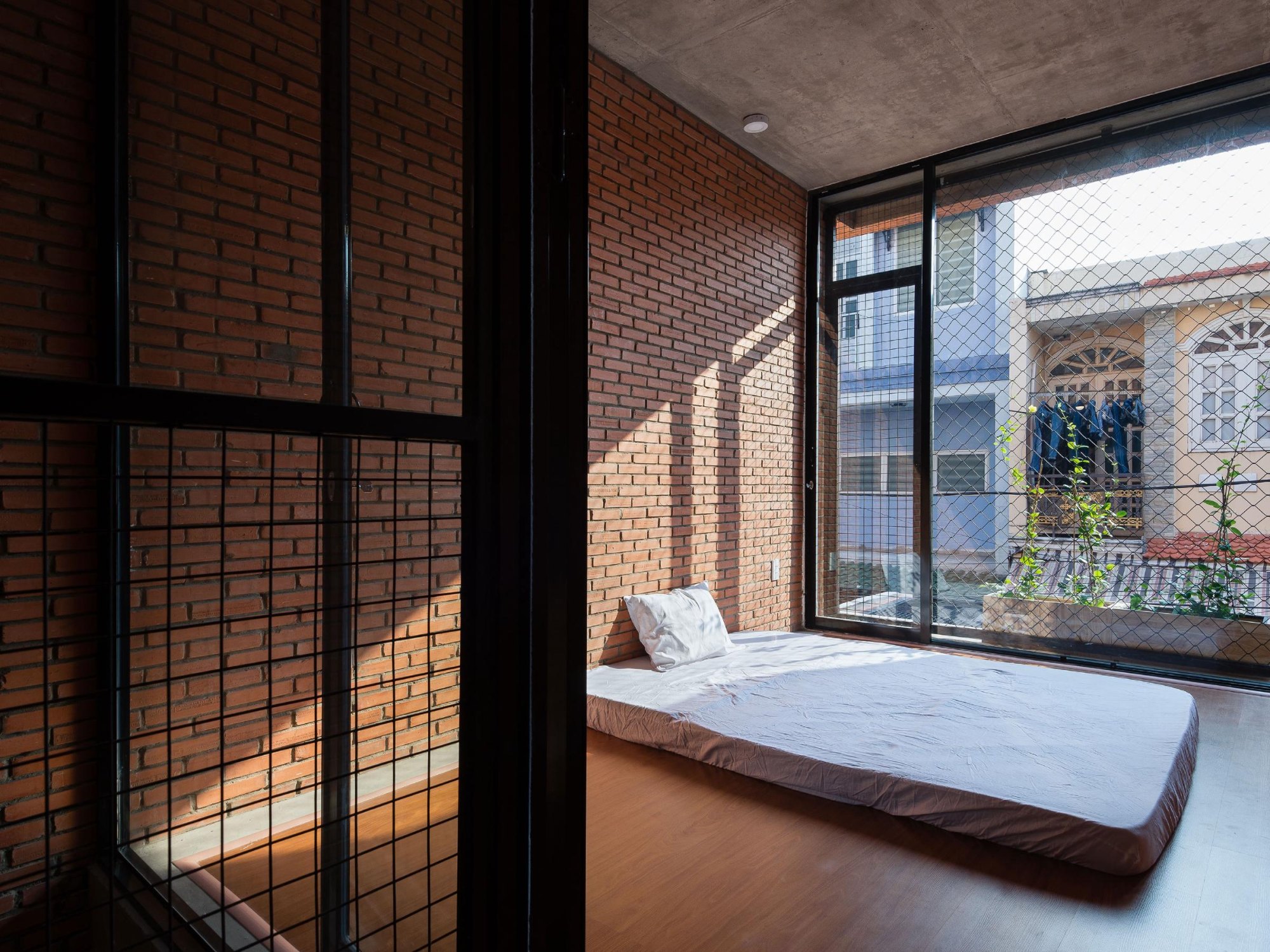
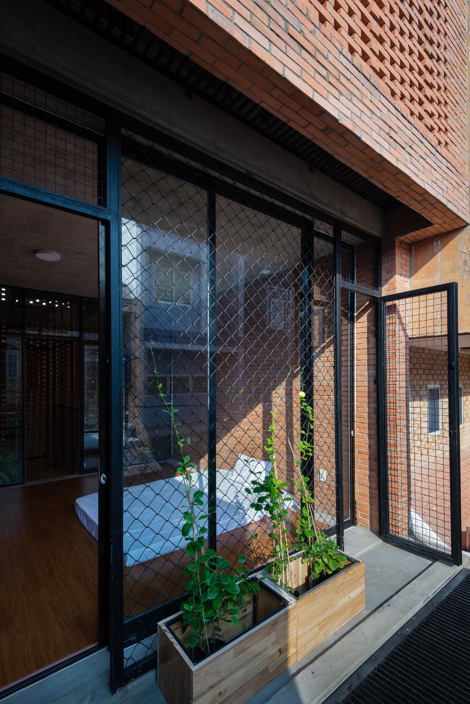
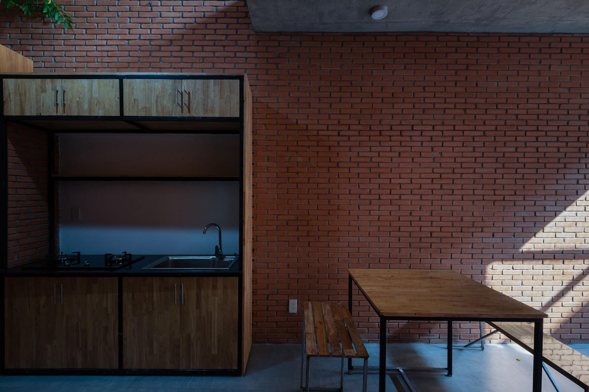
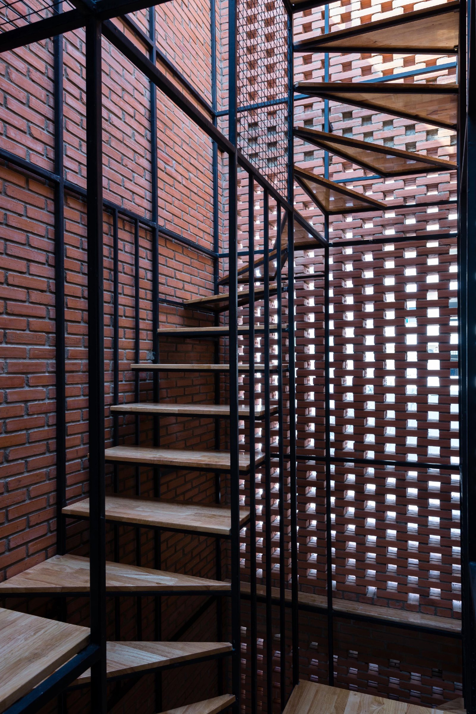
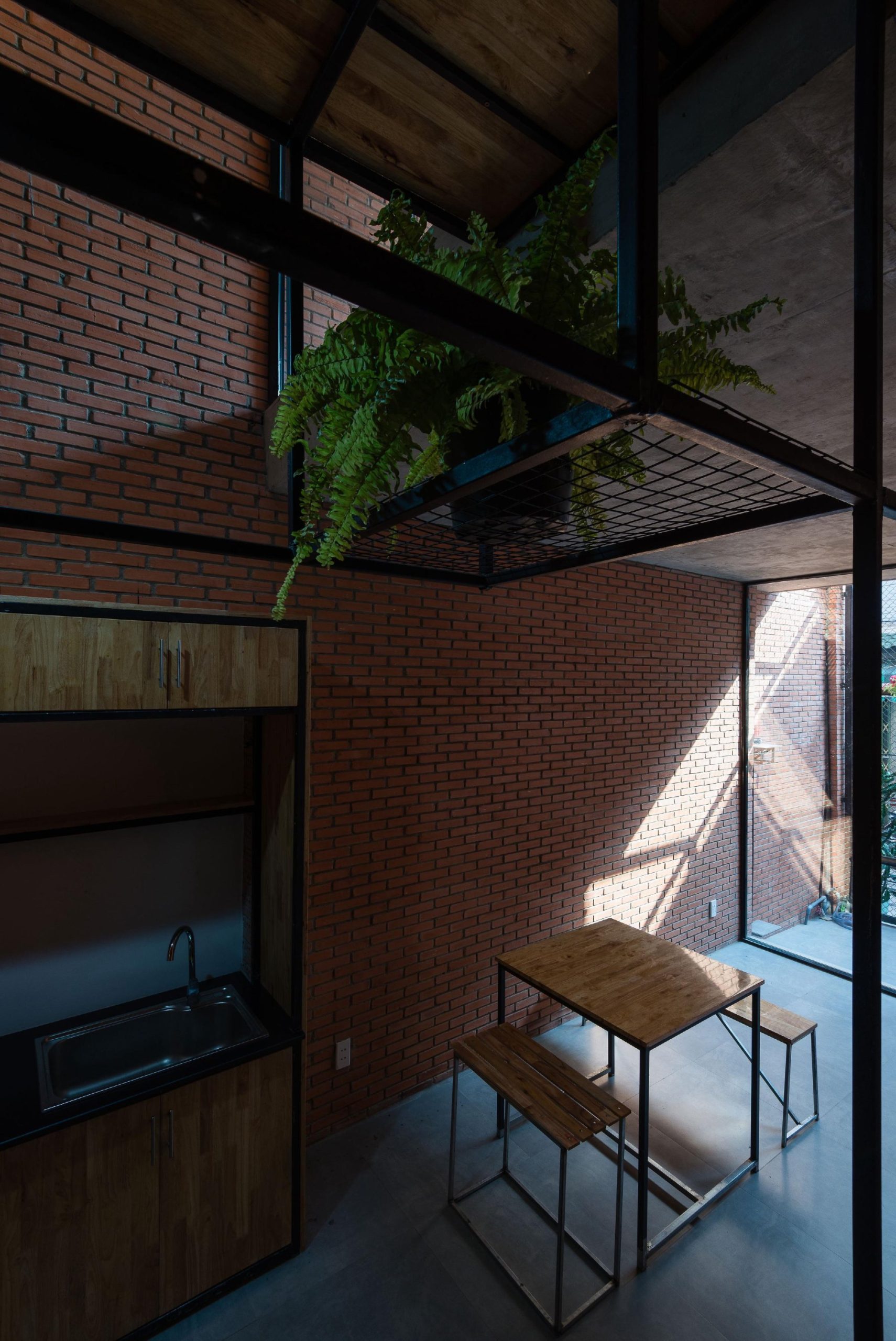
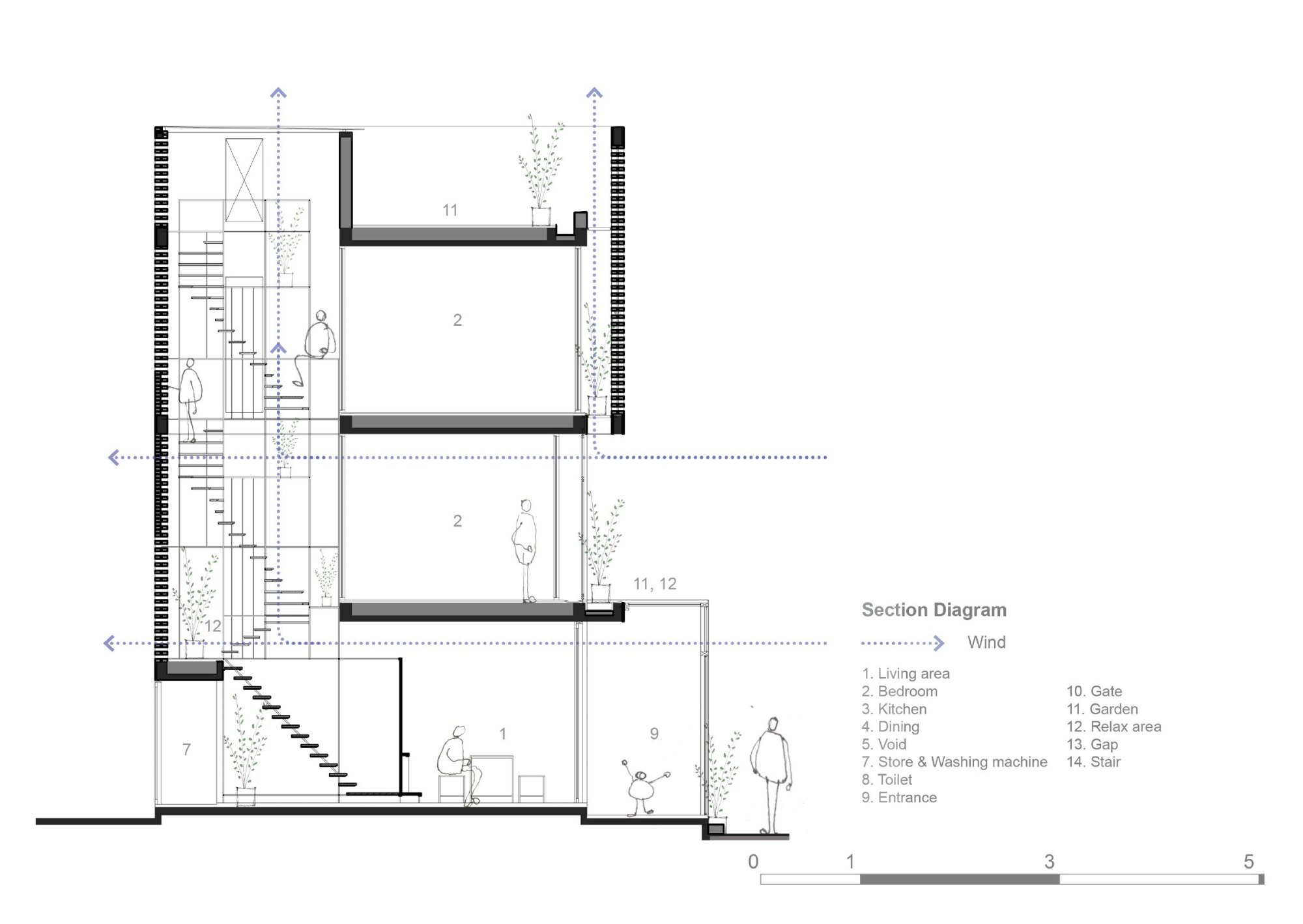
    Daylight fills the house through a glass roof and brick walls laid with gaps. Sun on the rough brick gives the small rooms a close, changing atmosphere.

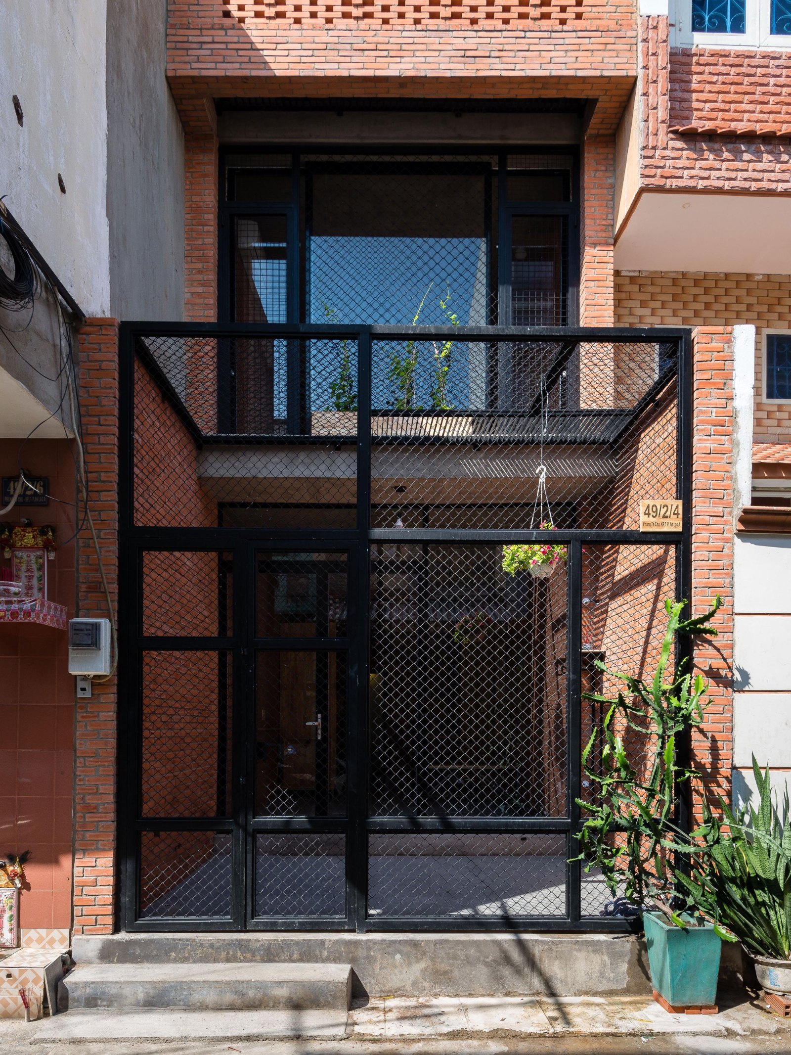
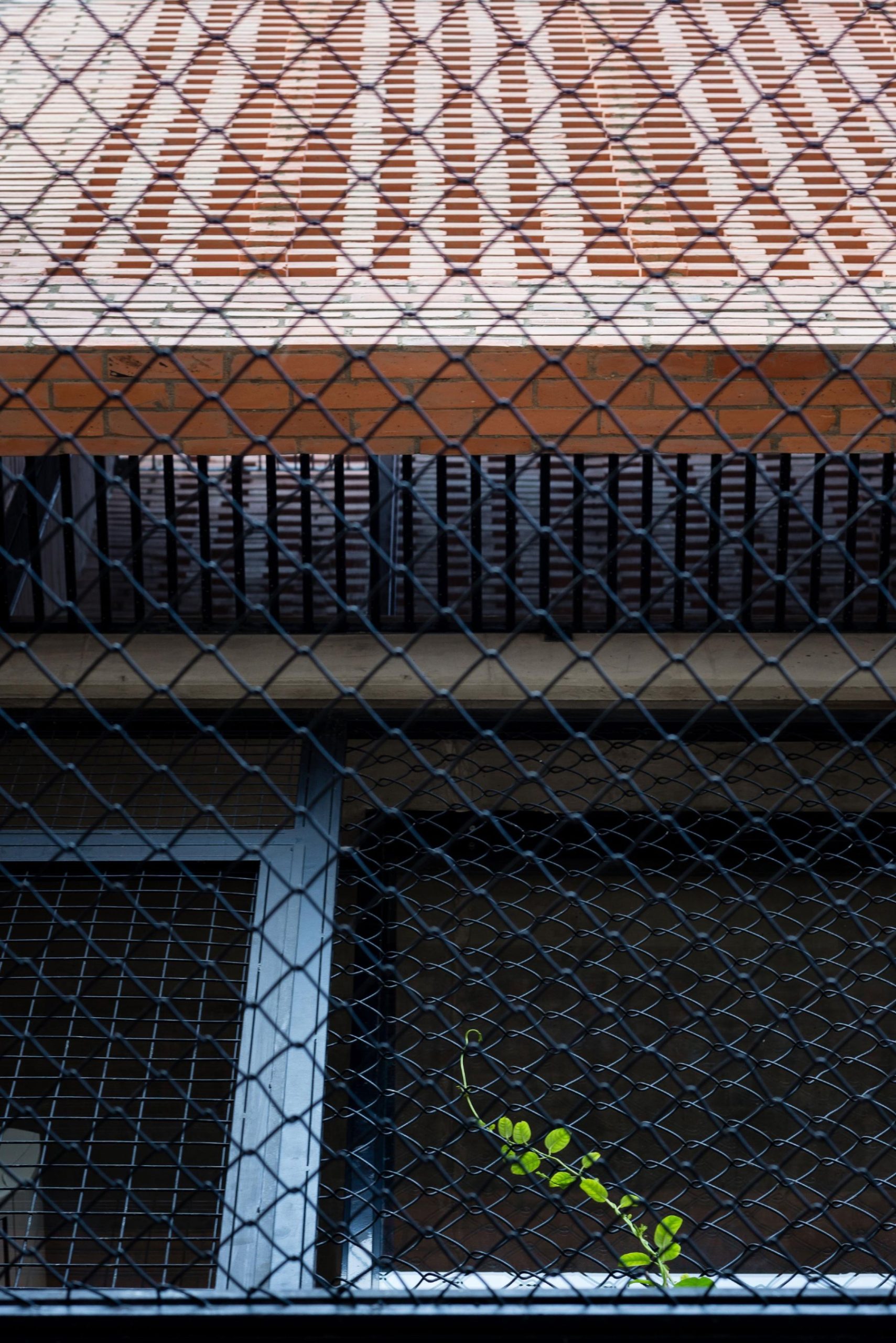
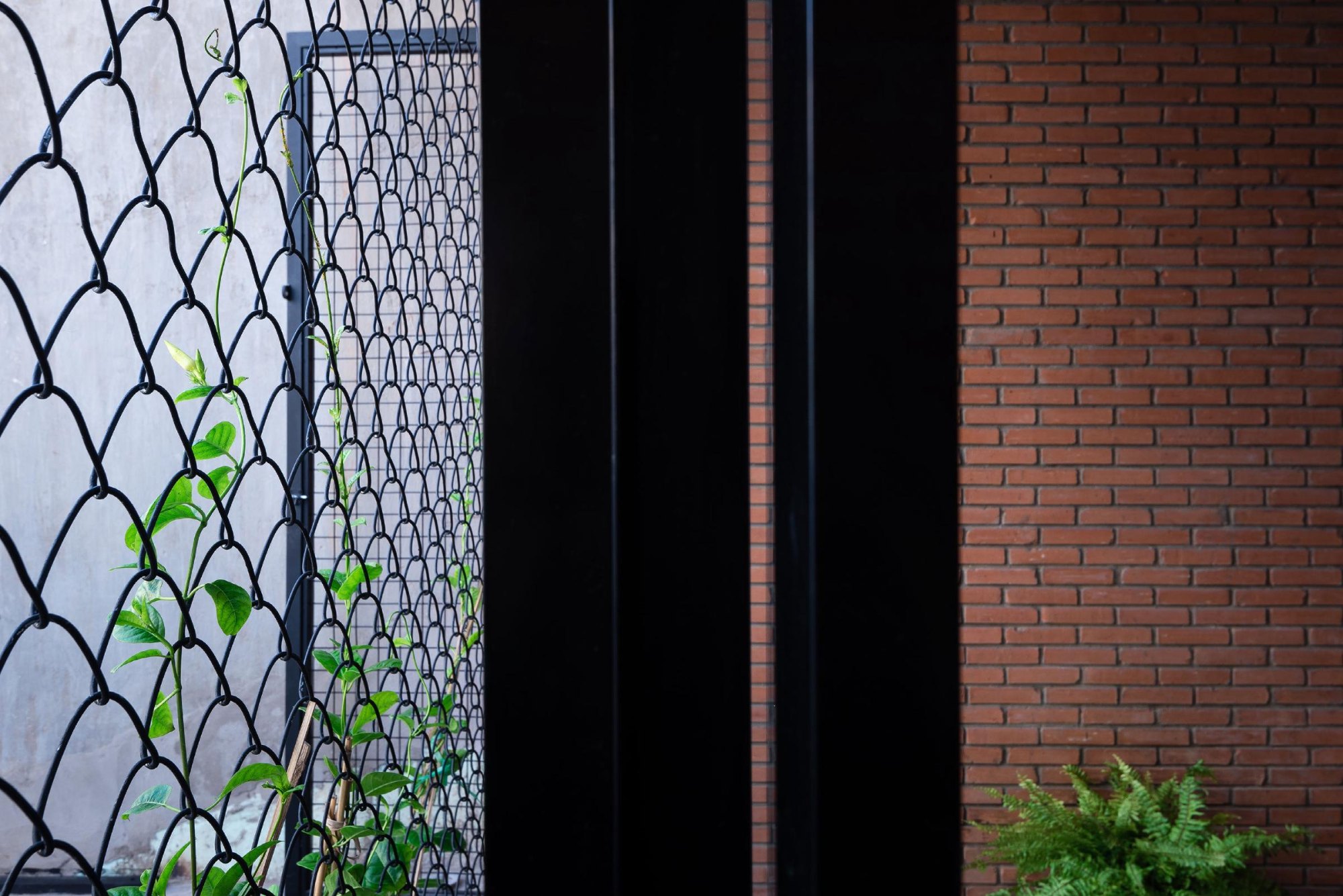
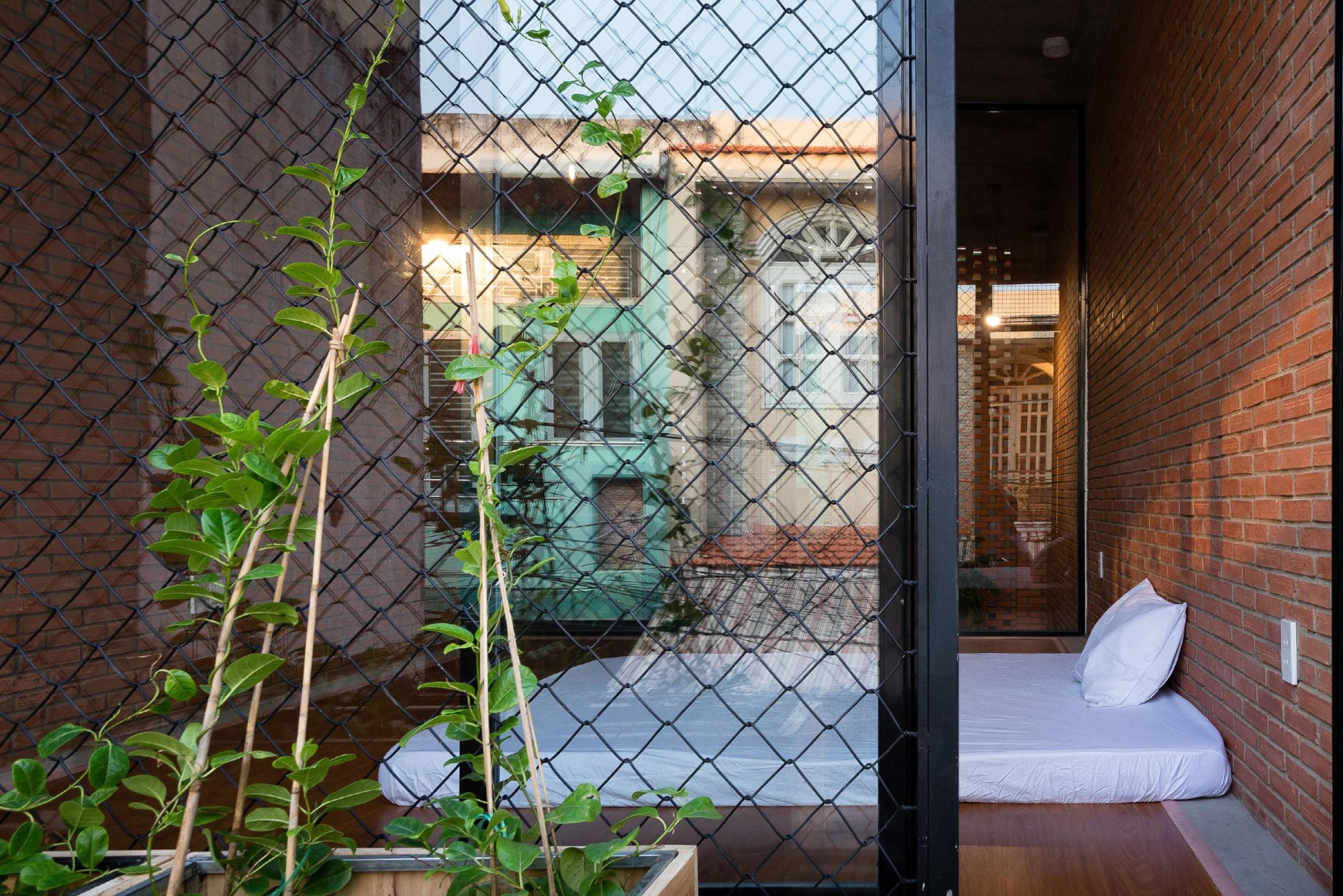
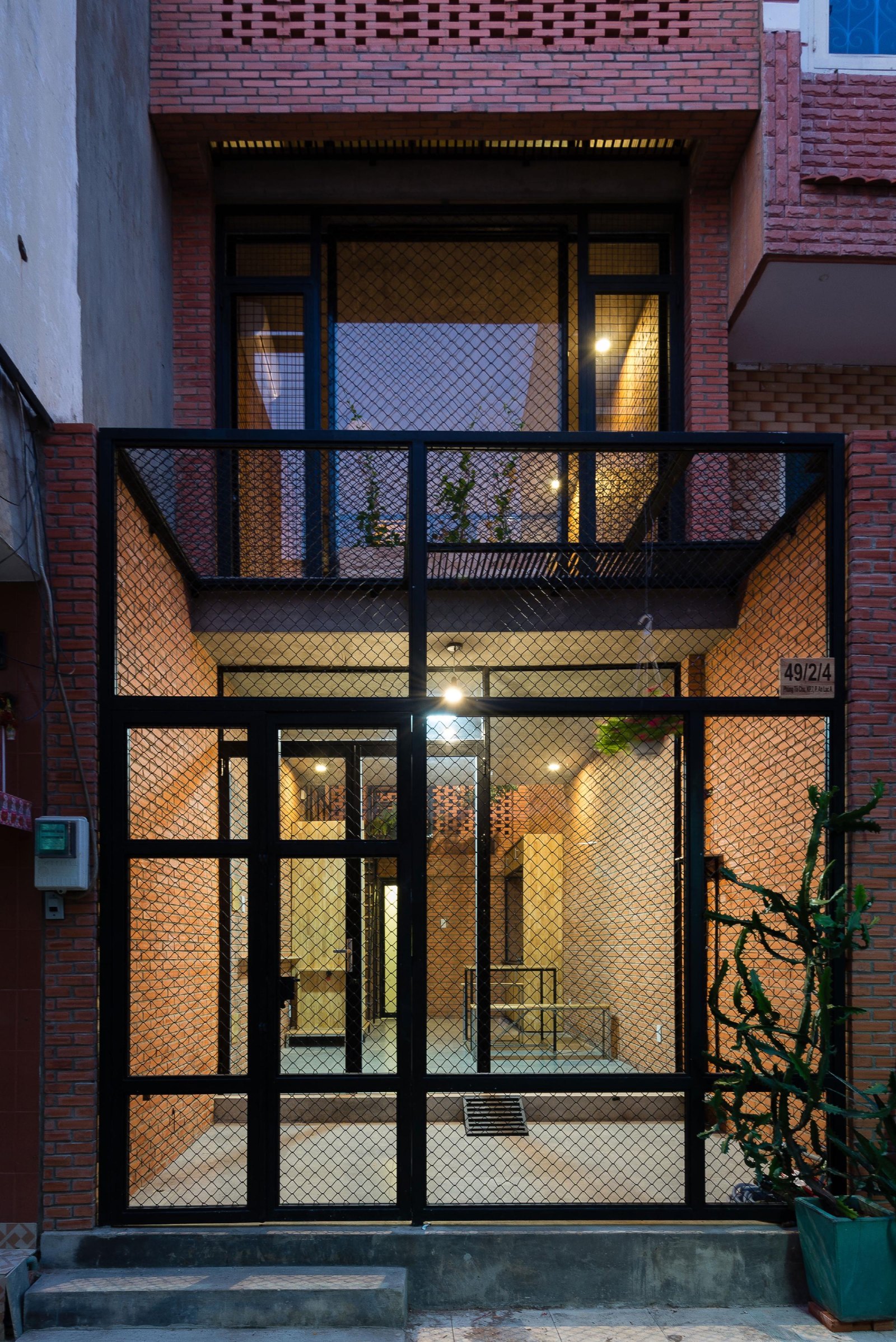
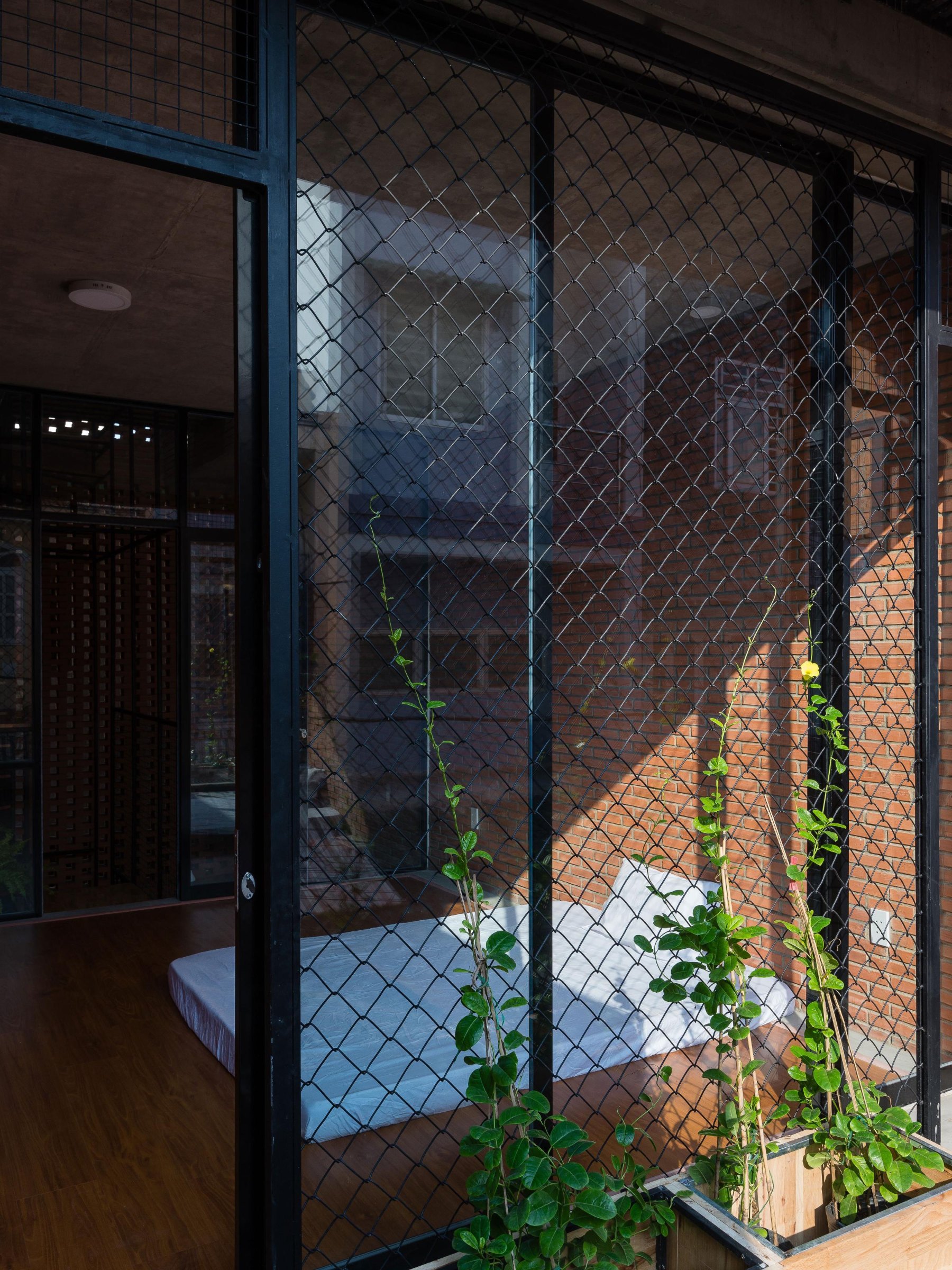
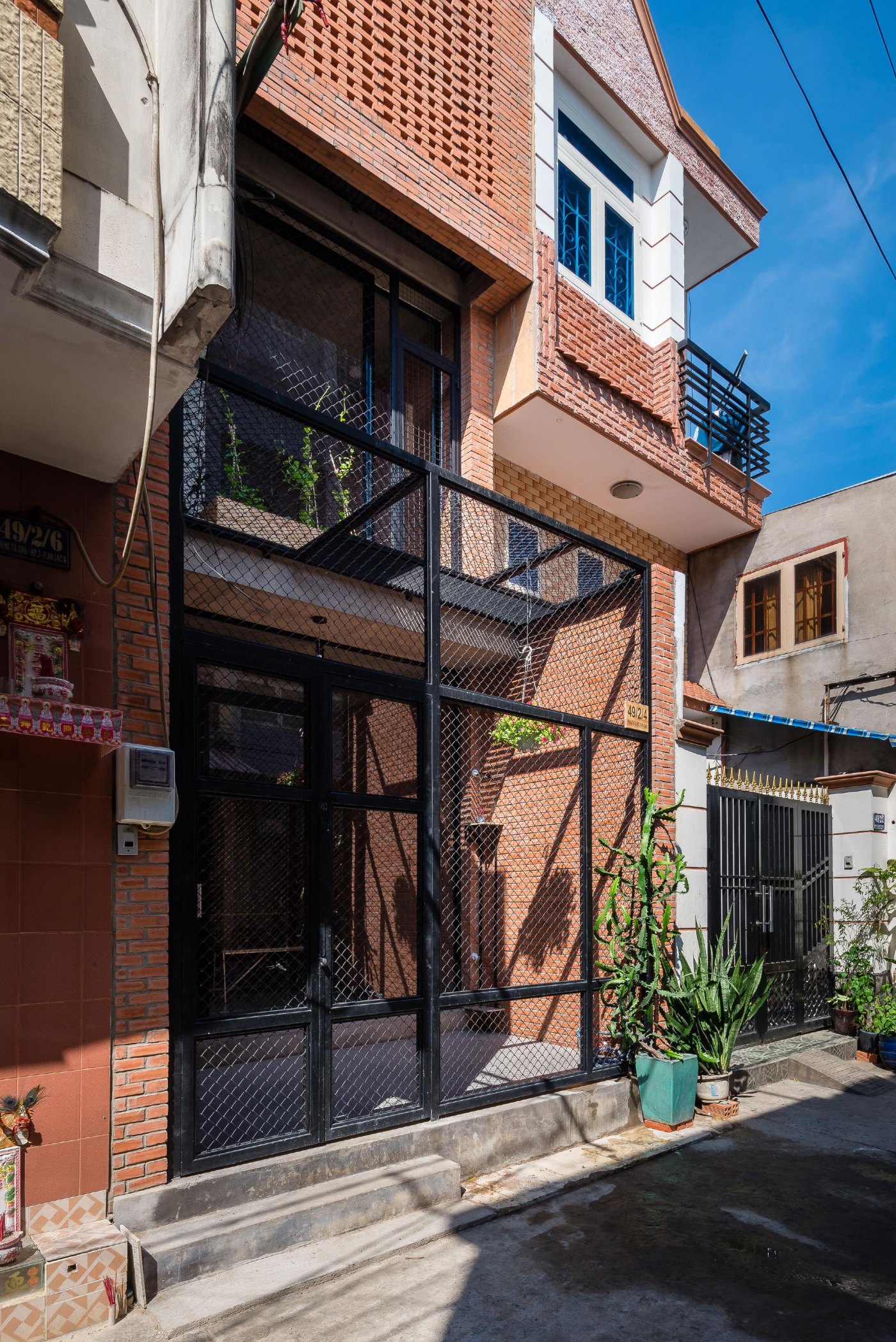
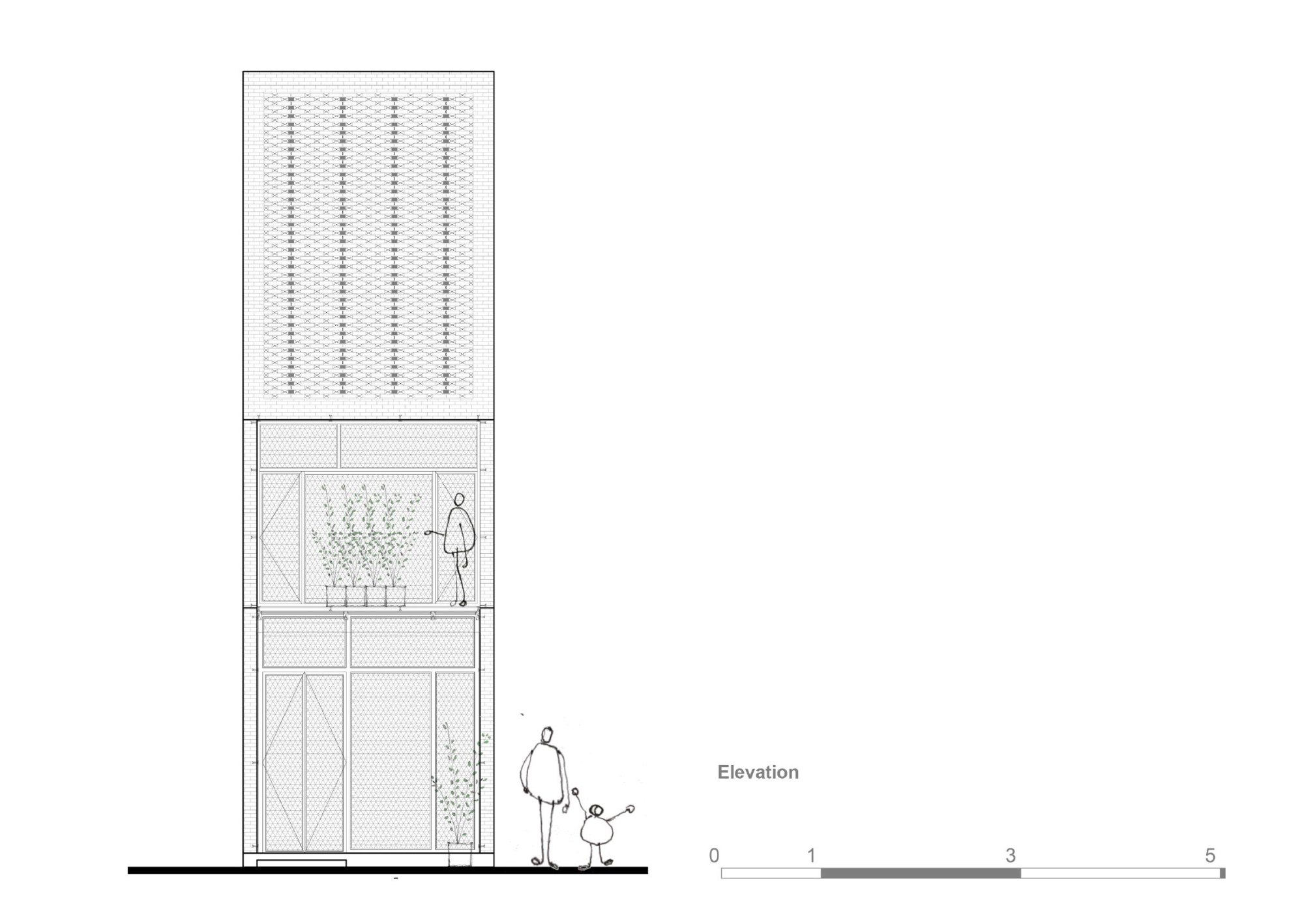
    The gate and fence are simple metal grilles meant for climbing plants. As the vines grow they will cover the front and filter the dust from the street.

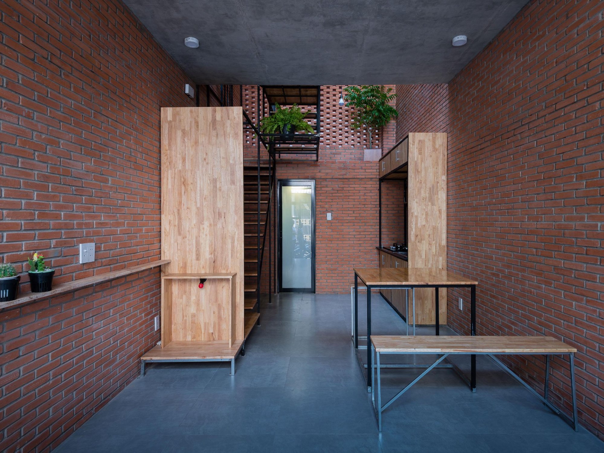
    To keep costs down, the architects simplified details, materials and furniture, made the most of every functional space and lowered the floor heights. The aim was a bright, lively home for the neighbourhood, on the belief that a beautiful house should not be only for people with high incomes.

    The narrow house in its alley
    Brick facade above neighbouring roofs
    Perforated brick front with planters
    Steel gate and grille at the entrance
    Steel stair along the perforated wall
    The house among overhead wires
    Stair with plants beside the kitchen
    Ground floor with timber cabinet
    Brick pattern above a steel grille
    Dining corner by the stair
    Steel stair rising past plants
    Stair and grille in the narrow plan
    Glass roof over the stair
    Reading on the stair
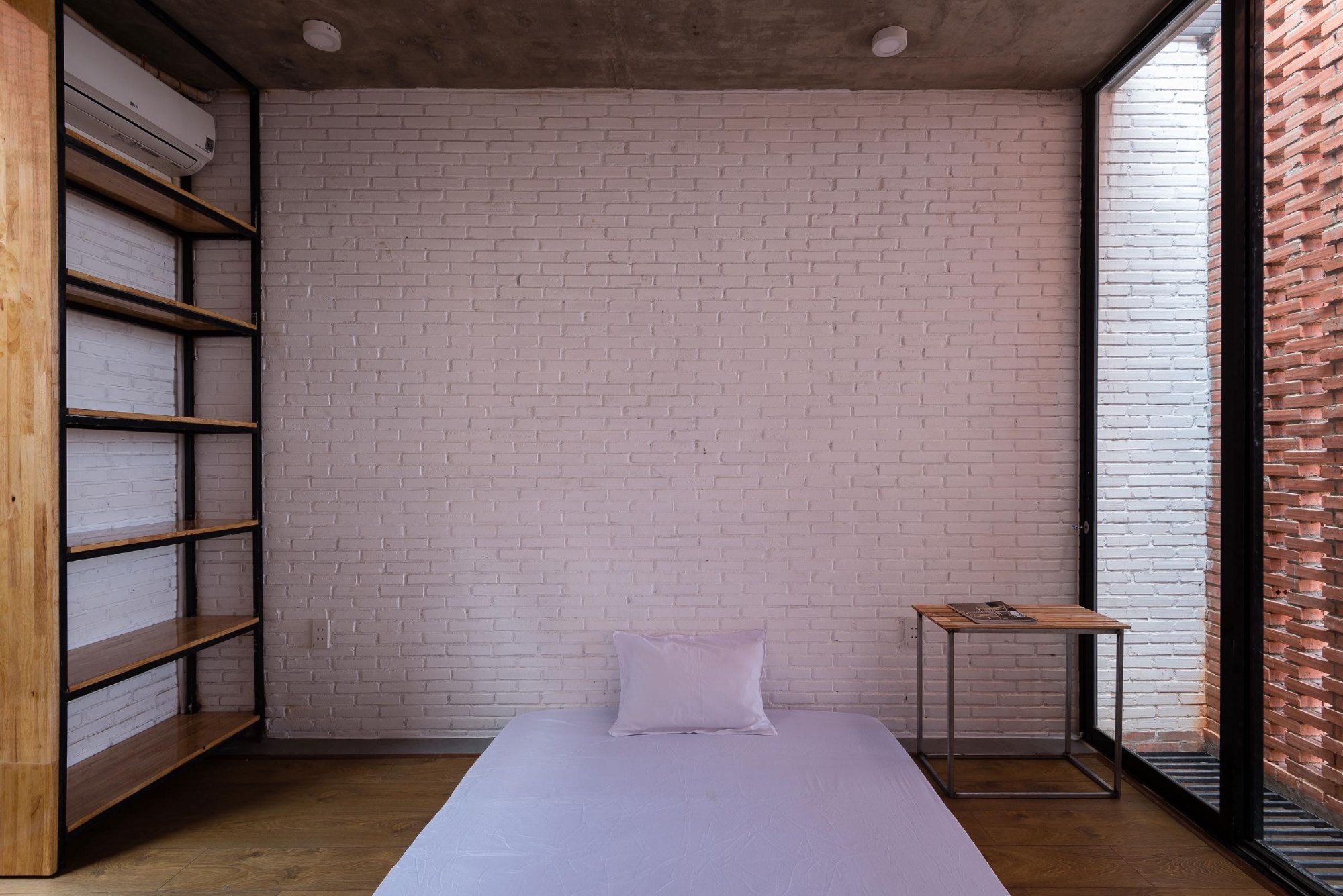
    Bedroom with pale brick walls
    Light through the brick onto the stair
    Looking up the stair void
    Grille with climbing plants
    Bedroom opening onto the stair
    Upper bedroom with a mattress on the floor
    Bed behind the planted grille
    Stair void with plants
    The house lit at dusk
    Bedroom with perforated brick window
    Looking down the stair from above
    Stair framed by steel and brick
    Brick roof against the sky
    Front of the house at night
    Bedroom with a window to the street
    Ground floor with desk and cabinet
    Glass doors behind the grille
    Kitchen along the brick wall
    Steel stair seen from below
    Glazed wall with plants
    Planted stair void
    Spiral of steps against the brick
    The house from the alley
    Steel frame and table on the landing
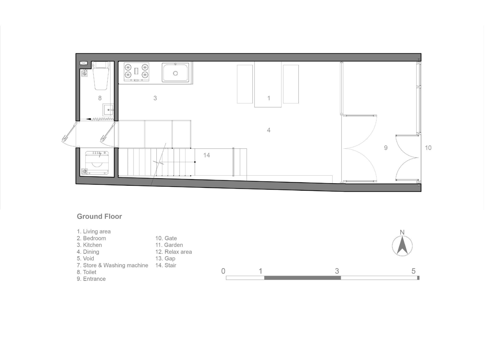
    Ground floor plan
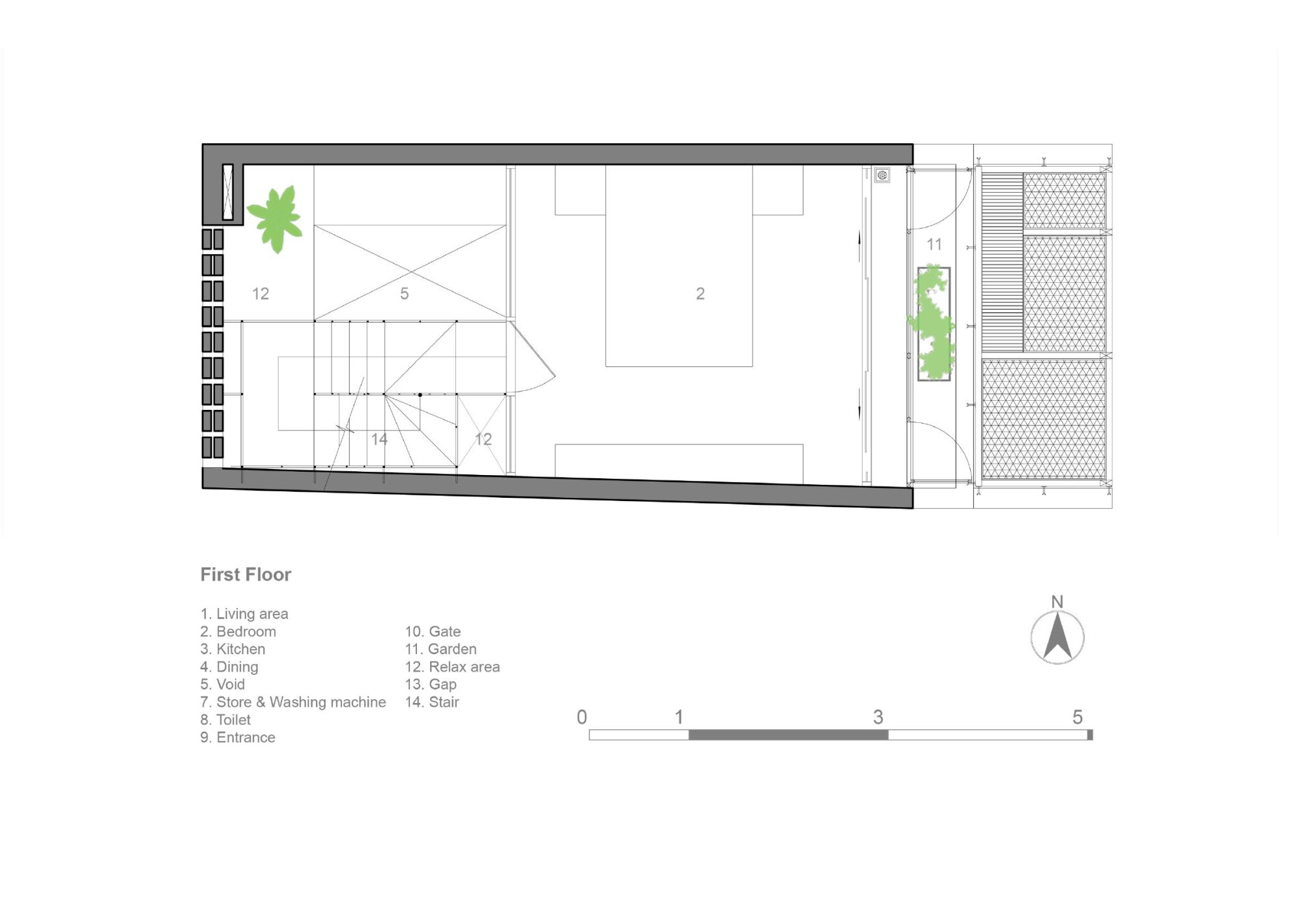
    First floor plan
    Second floor plan
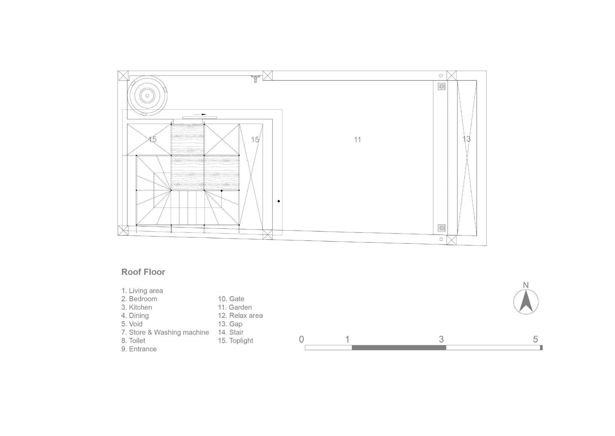
    Roof plan
    Section
    Section
    Elevation

Newsletter

A monthly letter from NOTES with new projects, dialogues and essays.